• Tired of adverts on RWI? - Subscribe by clicking HERE and PMing Trailboss for instructions and they will magically go away!

Skydweller Poll

Skydweller Poll


  • Total voters
    16
  • Poll closed .

KJ2020

Time Traveler
Supporter
12/3/18
32,945
59,730
113
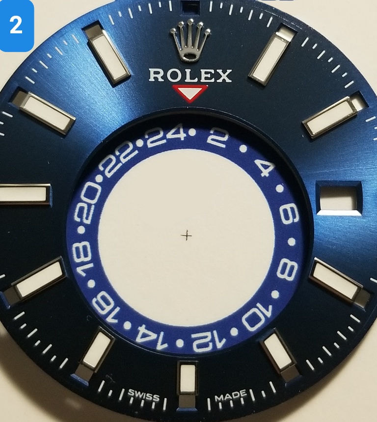
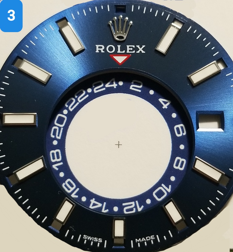
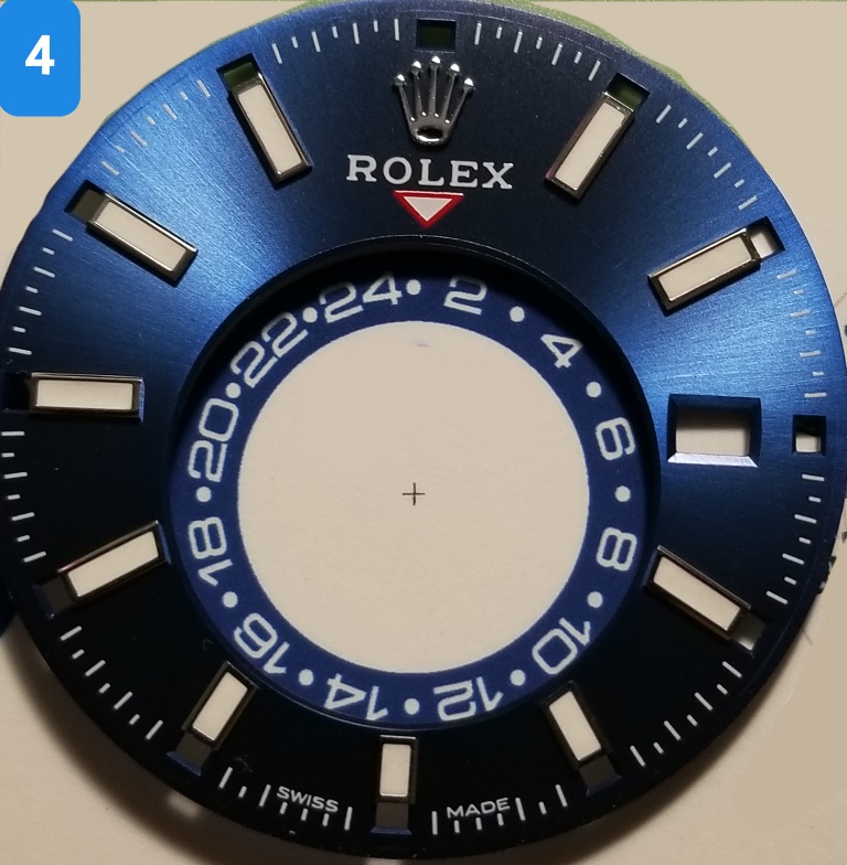
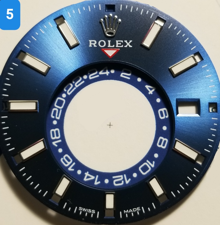
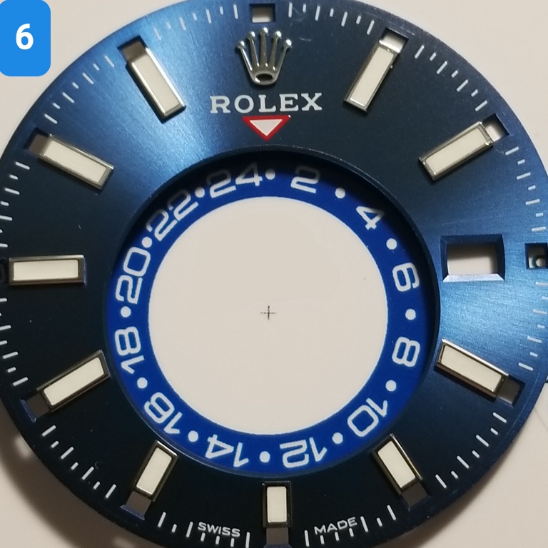
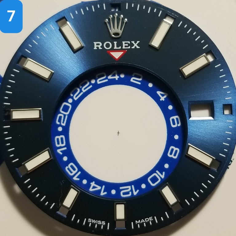
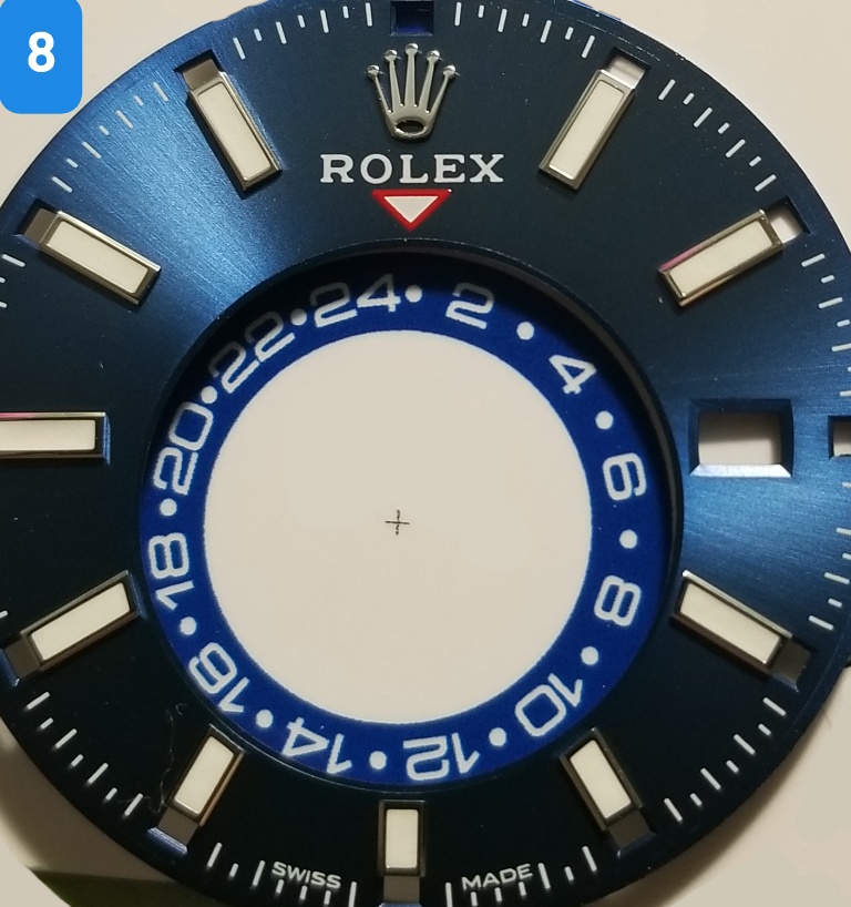
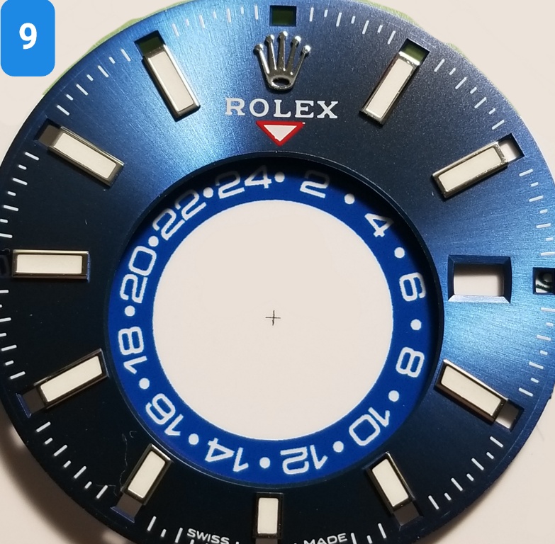
Which color GMT wheel do you like best?

Note - see next post in this thread for complete explanations.

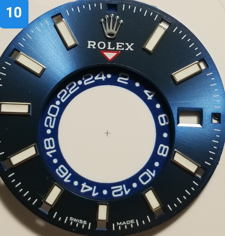
Here are the 10 choices - I know some of them look pretty similar but your choice will help me decide to be "safe" or "bold". Thanks for participating!

ZJQOd4.jpg


ZJQIOj.jpg


ZJQqj1.jpg


ZJQmuv.jpg


ZJQ5lL.jpg


ZJQeWQ.jpg


ZJQhIP.jpg


ZJQKZJ.jpg


ZJQ3uo.jpg


ZJQznk.jpg
 
Last edited:

KJ2020

Time Traveler
Supporter
12/3/18
32,945
59,730
113
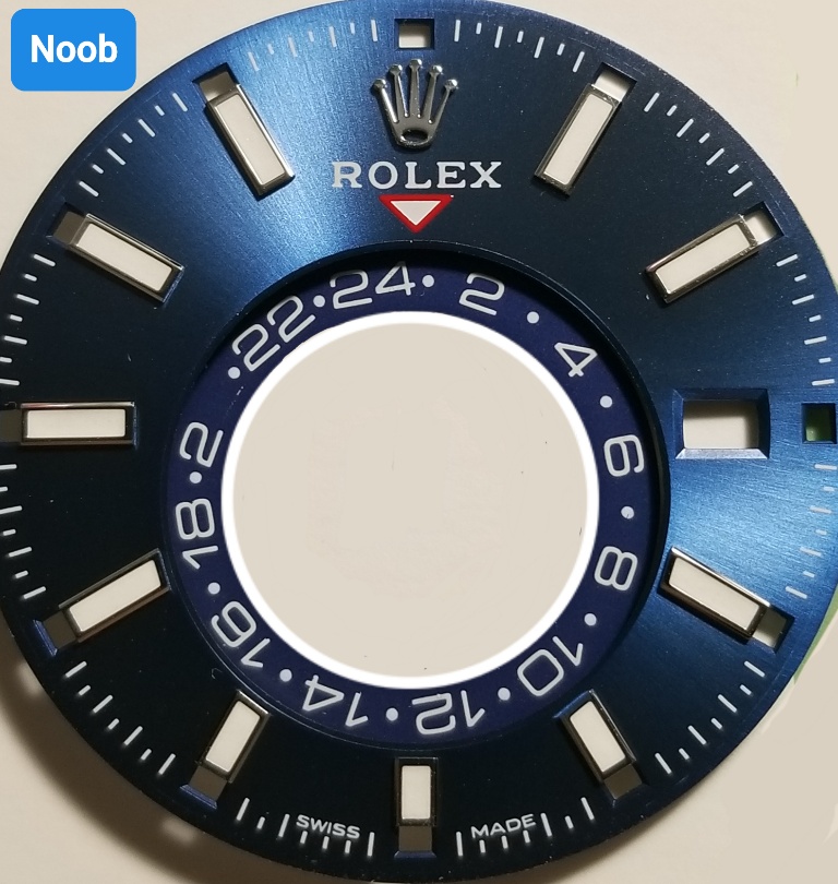
As some of you may know from other posts of mine, the Noob Skydweller is a favorite rep but it has a unique flaw that fortunately most owners won't encounter. The GMT wheel numbers are not printed on - they are STICKERS! So when I had the movement apart I removed the GMT wheel by lifting it out with Rodico as I usually do with datewheels and one of the stickers came off. It immediately got mangled up in the Rodico so there was no putting it back.

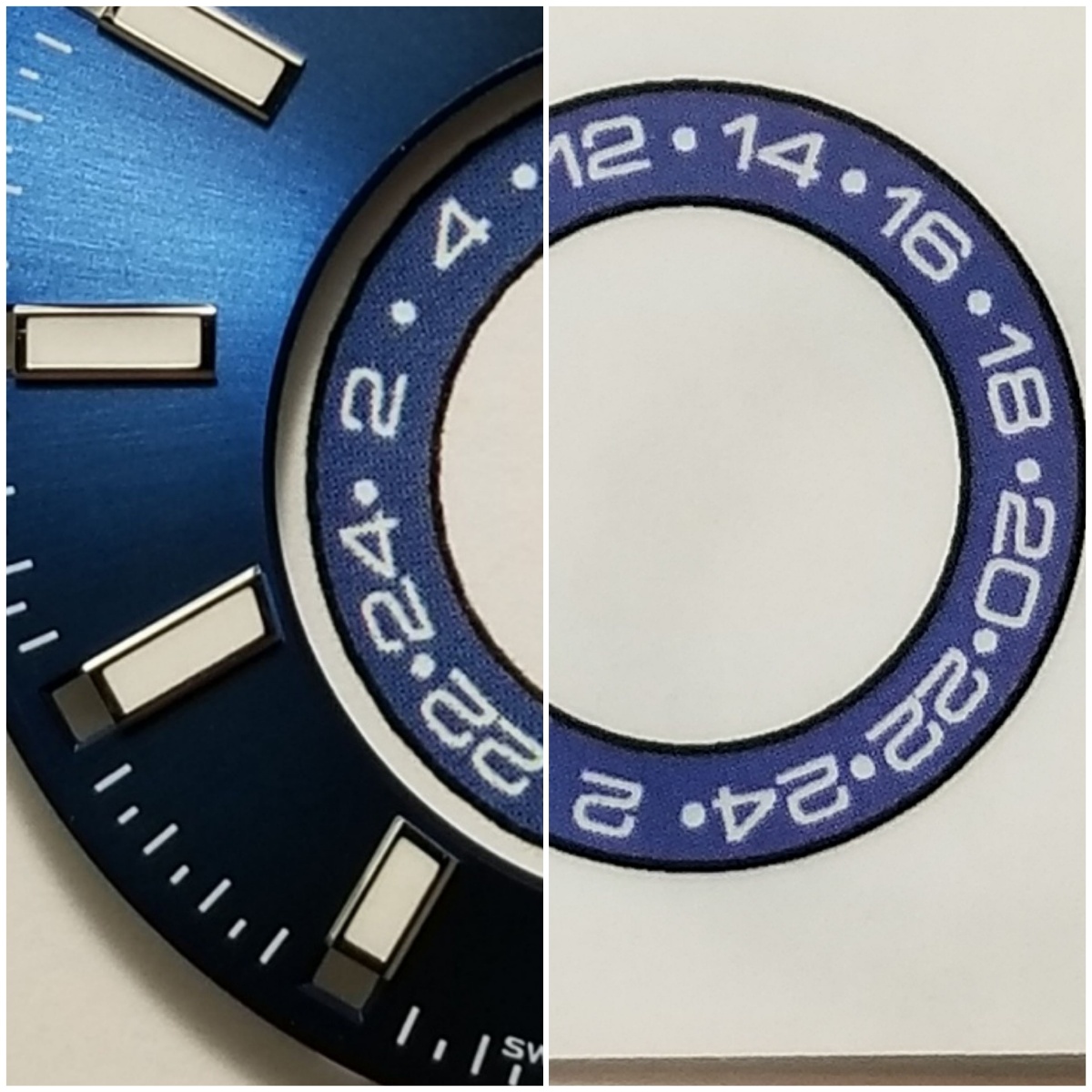
I tried unsuccessfully to get a replacement GMT wheel of course and even a new movement with the GMT wheel included but Noob wouldn't let either go. This was back in August 2020. I had my wife try painting the missing number and looked at some mini decals for train models, etc. All dead ends. Then member muiramas saw one of my posts and graciously offered to create the artwork for a new GMT wheel. (Thanks a million bro, your work is incredible!) After a few version tweaks with different weight fonts, etc. we had a good file. The really great thing about this new GMT wheel is muiramas made it with all the numbers properly oriented to center on the arc which eliminates the funky number alignment on the Noob wheel.

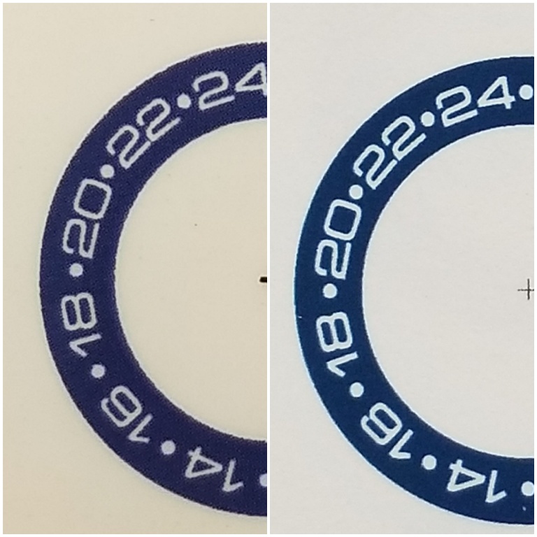
So we had the artwork printed on every kind of paper - matte, glossy, transparency, thick, thin, photo, sticker paper you name it, if it was available it was tried. Obviously if perfection is the goal only pad printing will deliver that but it costs hundreds of dollars ($500 +) just to get a cliche (stencil) made. So the printing method that worked best was Epson proofs. Those have a slight tendency for colors to run, so I chose a little thicker font which makes any bleeding into the white less evident. While not perfect, the results are completely satisfactory IMO, especially given the number alignment issue has been corrected and this will get my rep back into action. It's been sidelined for nearly all of it's one year life.

I spent hours tinkering with different CYMK color combos and narrowed it down to about 10 choices, which interestingly came out very different on different types of paper. I like a few different options here and am interested in what others think about a suitable color choice, hence the poll. This art will have to be cut out and glued onto the stock wheel like a DWO. I'll make a separate post about that later. There's a chance here to be safe and pick a color like Noob used, or be bold and unique with a brighter blue. Let me know what you would pick!

Stock Noob - note the missing 0 in 20. D'oh!
ZJQj2D.jpg


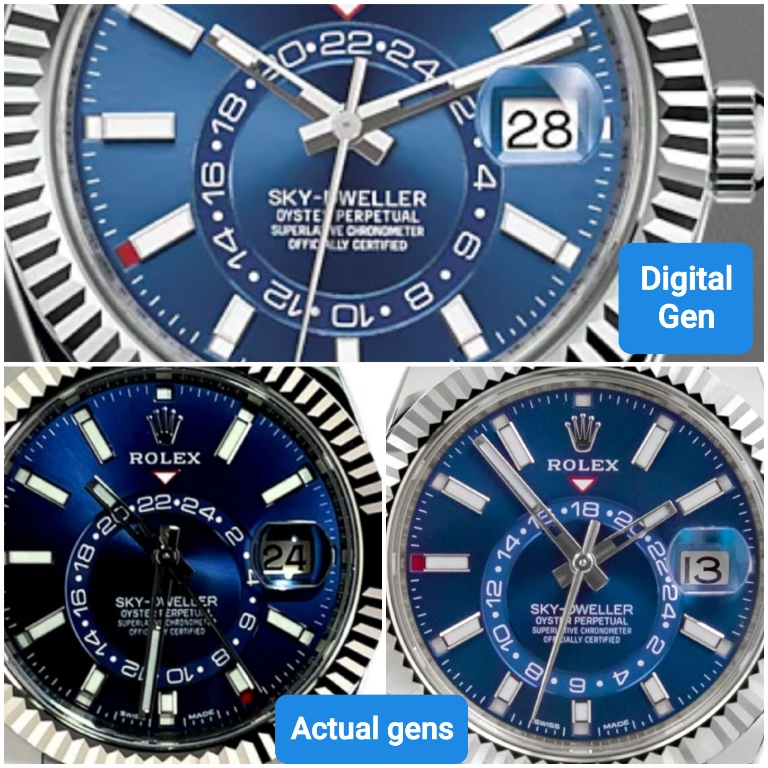
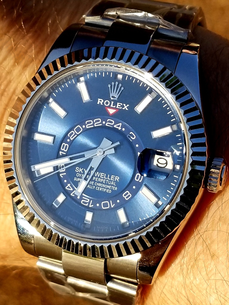
Some gen pics - they can look very different
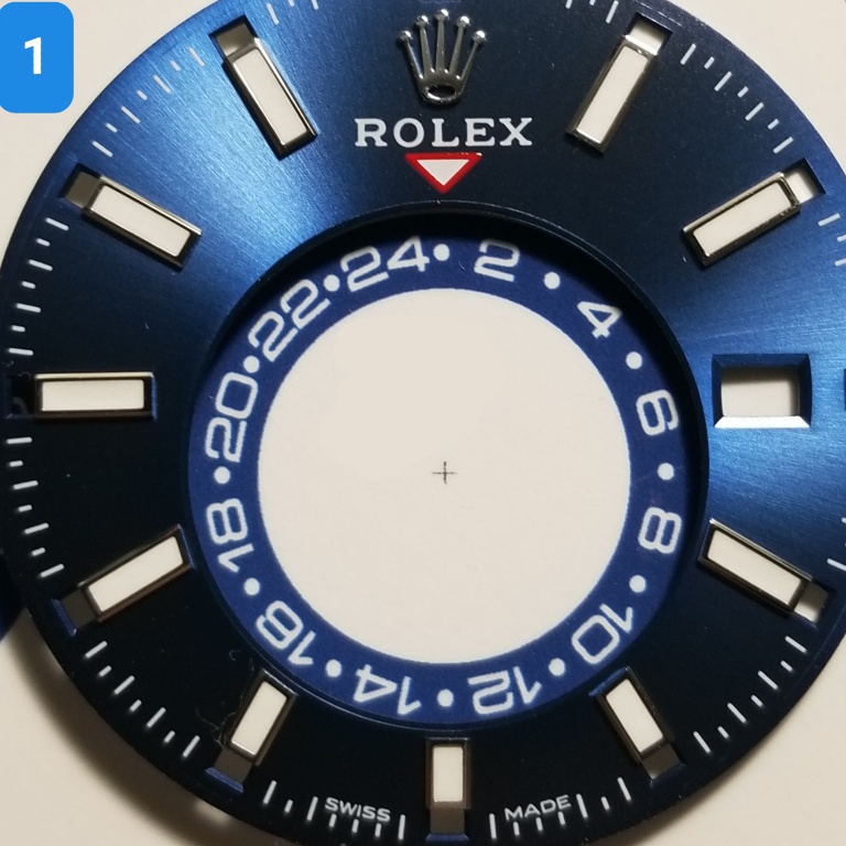
ZJQDfY.jpg
 
  • Like
Reactions: muiramas

p0pperini

patr0n h0arder
Gold Patron
Certified
29/1/19
9,010
30,387
113
UK
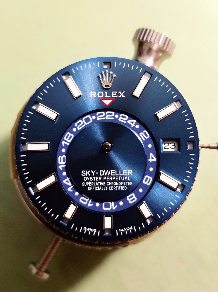
I voted for 3, but 10 was a very close 2nd choice. It's hard to be absolutely sure, but my preference is for the darkest, less vibrant blues. Does the gen datewheel have a metallic colour background? That would explain why it looks so different depending on the pic.
 
  • Like
Reactions: KJ2020

muiramas

Erect Aristocrat
18/1/17
5,732
7,109
113
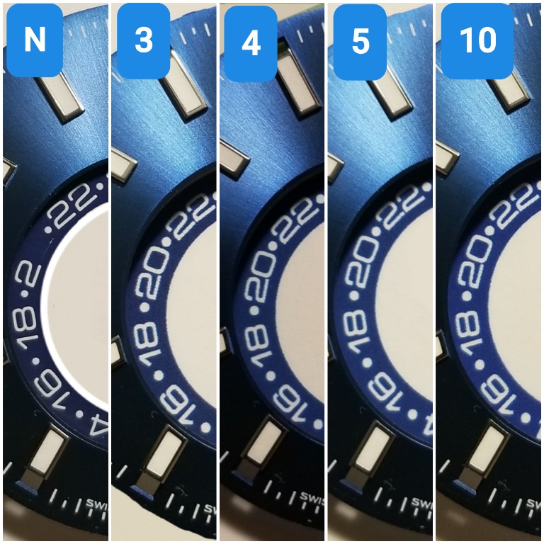
I'd go 4 or 5 bro. Tone on tone always works best for me and is more in line with a luxury aesthetic.

But decide with the saphire on - different white light can make blues jump around a bit - it may make quite a bit of difference.
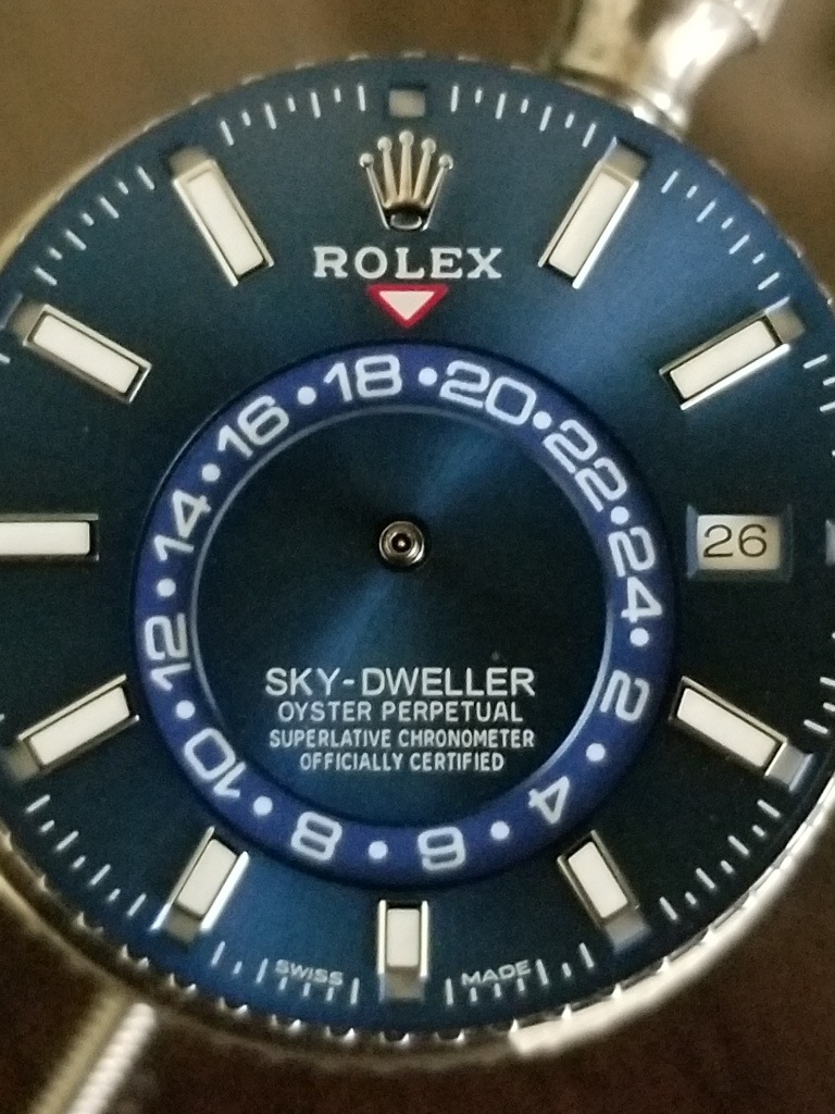
I'd go for the one you like the best. I'm pretty sure that R factory would not have had a bunch of dials made up in order to choose the best one - they actually seem to have a very random way of working!
 
Last edited:
  • Like
Reactions: KJ2020

VG87

I'm Pretty Popular
Patron
Certified
30/5/21
1,414
4,164
113
I voted for 4 because given the pics you provided under the specific light, it looks closer to gen in my eyes! Whichever you choose, good luck with the build!
 
  • Like
Reactions: KJ2020

Giannos7

You're Saying I Can Sell?
10/11/20
49
17
8
I voted for 10. Could a white color or bi-color (like DiW) GMT wheel be an option?
 
  • Like
Reactions: KJ2020

KJ2020

Time Traveler
Supporter
12/3/18
32,945
59,730
113
Thanks for the votes and comments guys. It looks like a consensus is forming, 3, 4, 5, and 10 are looking good.

ZJp7US.jpg
 
  • Like
Reactions: architekt

butler182

Renowned Member
14/12/20
634
655
93
4 or 5 look good to me. KJ2020 Is there a reason you can't simply send the image file (vector file format with cut lines) to a local print shop and just have them print the GMT wheel on some adhesive vinyl cut to the exact size you need (ie from the file you supply)? Then just peel and stick. I've made product labels that way and it's worked nicely...and it is fairly inexpensive (~$100 for several hundred pcs). You can also match the color you like to a standardized pantone color code and the print shop should be able to duplicate the color exactly.
 

KJ2020

Time Traveler
Supporter
12/3/18
32,945
59,730
113
4 or 5 look good to me. KJ2020 Is there a reason you can't simply send the image file (vector file format with cut lines) to a local print shop and just have them print the GMT wheel on some adhesive vinyl cut to the exact size you need (ie from the file you supply)? Then just peel and stick. I've made product labels that way and it's worked nicely...and it is fairly inexpensive (~$100 for several hundred pcs). You can also match the color you like to a standardized pantone color code and the print shop should be able to duplicate the color exactly.

Sticker sheets were the very first thing I tried bro, just like you described. The clarity wasn't there in the results I got. I think that shop tried 3 or 4 times with different papers and printers. Remember these GMT wheels are TINY, 19mm in diameter so getting high resolution crisp prints is quite difficult at that small size of font. The runner up sharpness of print quality to the Epson proofs posted above was clear transparencies but on those the blue backgrounds were somewhat mottled and the colors were way off.
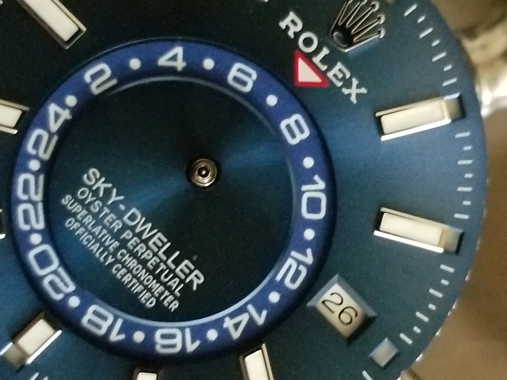
Sticker print compared to Epson proof
ZbUTtD.jpg


Some transparency samples
Zv5uuK.jpg


There were easily a couple dozen or more different combos of media and printers tried. The Epson proofs clearly stand out as the best combination of solid accurate color background and sharpest separation of color borders.
 

butler182

Renowned Member
14/12/20
634
655
93
Sticker sheets were the very first thing I tried bro, just like you described. The clarity wasn't there in the results I got. I think that shop tried 3 or 4 times with different papers and printers. Remember these GMT wheels are TINY, 19mm in diameter so getting high resolution crisp prints is quite difficult at that small size of font. The runner up sharpness of print quality to the Epson proofs posted above was clear transparencies but on those the blue backgrounds were somewhat mottled and the colors were way off.
I figured you probably thought of that given it's the most obvious route. I guess it's hard to appreciate just how small that font is and how difficult it is to get good resolution with no bleed. I suspect using very high-end printing equipment with a super high res image file would produce some nice results...but at a much higher cost as you suggested. Good luck with this project. Love the blue dial skydweller...awesome looking watch bro!
 
  • Like
Reactions: KJ2020

muiramas

Erect Aristocrat
18/1/17
5,732
7,109
113
I suspect using very high-end printing equipment with a super high res image file would produce some nice results...but at a much higher cost as you suggested. Good luck with this project. Love the blue dial skydweller...awesome looking watch bro!

There's oftentimes quite a misunderstanding between resolution (dpi) and print quality. If you were to look at anything printed in CMYK through a loup, you would see all colours are composed of dots - which are called a 'halftone'. The maximum dpi you can reasonably print is 400 dpi / 200 lpi for a fine art application. If the dot pattern becomes finer it will start to clump and fill in if there is a lot of ink. So even if the resolution of your file is far higher, it won't make any difference to the print itself.

The exception is using a resolution-independent file - such as a vector - but only if you are pad or lithographically printing, using solid/ single colours (like a Pantone) rather than a mix of CMYK. It would have certainly been possible to make a lithographic print (if we know exactly which Pantone and on what paper), but this would have been incredibly expensive, with only one colour to chose from.

Generally, the printer you are using is far more important than the resolution of the file. Things like posters and stickers are really for viewing at 4-10 feet - nothing like a watch face, so the printers for these applications would never have achieved the result we needed for this project.

The file used in this case is an EPS file (vector) - see pic, which is resolution independent - it will only print at the maximum resolution of the printer. The output device used for KJ's GMT Wheel is an Epson Surecolour proofer, which has a 1,200 x 2,400 dpi actual resolution which is at the top end of what is possible (unless you are pad / litho in single colour). It is true that you can get inkjets with resolutions up to 5,000 dpi, but these 'consumer' grade printers do not use the same metrics - it's all interpolation, stretched truths and nonsense...

Screenshot-2021-06-10-at-11-44-05.png
 
Last edited:
  • Like
Reactions: KJ2020

butler182

Renowned Member
14/12/20
634
655
93
There's oftentimes quite a misunderstanding between resolution (dpi) and print quality. If you were to look at anything printed in CMYK through a loup, you would see all colours are composed of dots - which are called a 'halftone'. The maximum dpi you can reasonably print is 400 dpi / 200 lpi for a fine art application. If the dot pattern becomes finer it will start to clump and fill in if there is a lot of ink. So even if the resolution of your file is far higher, it won't make any difference to the print itself.

The exception is using a resolution-independent file - such as a vector - but only if you are pad or lithographically printing, using solid/ single colours (like a Pantone) rather than a mix of CMYK. It would have certainly been possible to make a lithographic print (if we know exactly which Pantone and on what paper), but this would have been incredibly expensive, with only one colour to chose from.

Generally, the printer you are using is far more important than the resolution of the file. Things like posters and stickers are really for viewing at 4-10 feet - nothing like a watch face, so the printers for these applications would never have achieved the result we needed for this project.

The file used in this case is an EPS file (vector) - see pic, which is resolution independent - it will only print at the maximum resolution of the printer. The output device used for KJ's GMT Wheel is an Epson Surecolour proofer, which has a 1,200 x 2,400 dpi actual resolution which is at the top end of what is possible (unless you are pad / litho in single colour). It is true that you can get inkjets with resolutions up to 5,000 dpi, but these 'consumer' grade printers do not use the same metrics - it's all interpolation, stretched truths and nonsense...

Wow...amazing post! I had no idea. It's funny how something so seemingly simple is actually quite complex when you dig beneath the surface. Thanks for sharing!
 
  • Like
Reactions: KJ2020

KJ2020

Time Traveler
Supporter
12/3/18
32,945
59,730
113
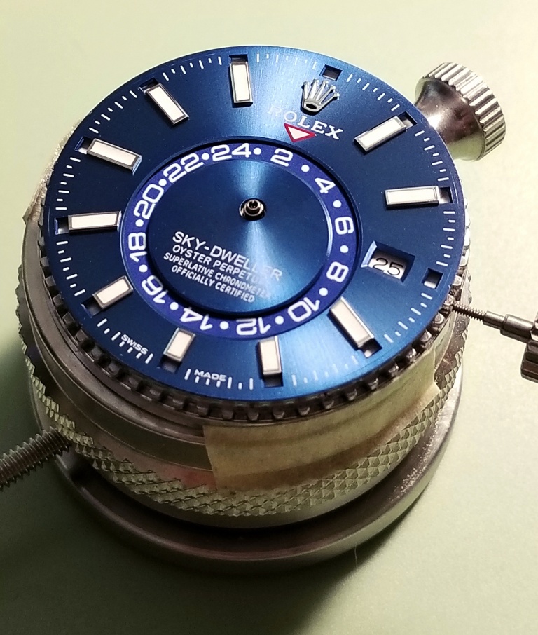
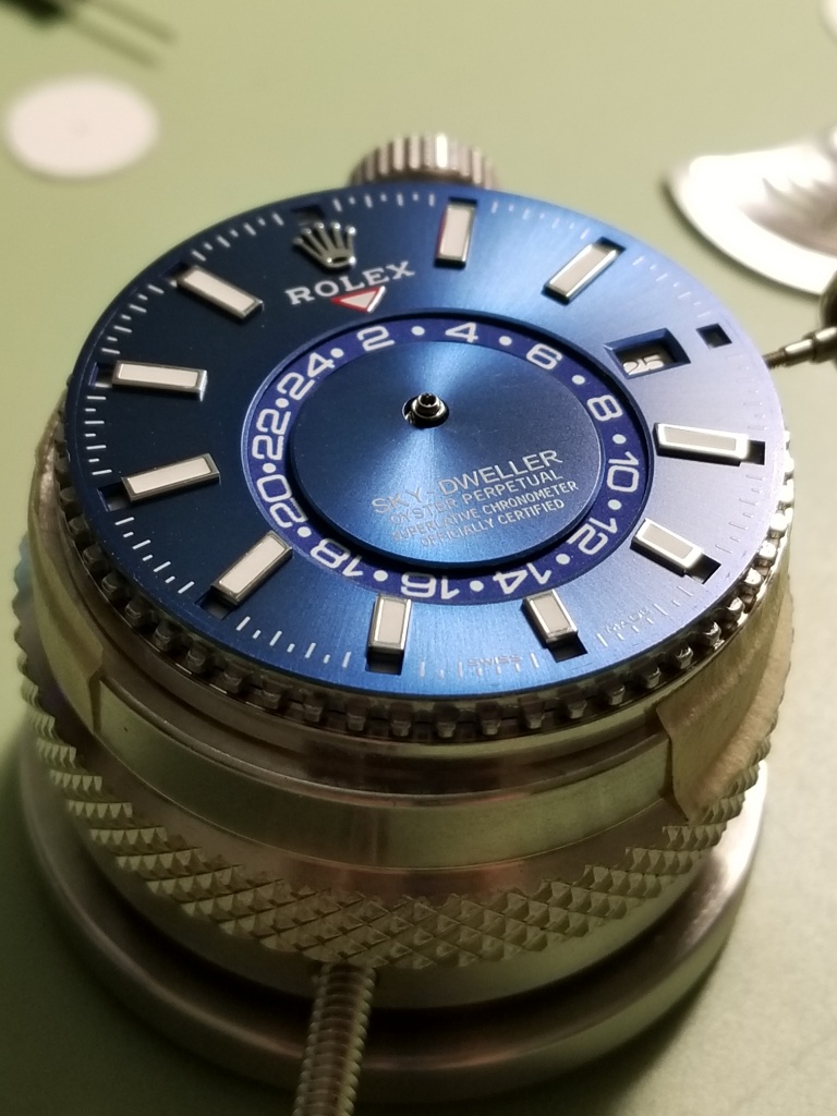
OK thanks everyone for your votes. I picked #4 and just finished the heavy lifting. The new GMT overlay is in. The tolerances between the DW, DWO, GMT wheel and GMT overlay were all really tight so there were a few extra steps needed. But it's in and everything is working well. SO good to see this thing fixed, yay!

I'll make another post with some more details and pics after it's back in the case.

muiramas I owe it all to you bro, many thanks! :drinks_cheers:

ZVQZE8.jpg


ZVQDrR.jpg


ZVQzHK.jpg
 
Last edited:
  • Like
Reactions: muiramas

muiramas

Erect Aristocrat
18/1/17
5,732
7,109
113
is the alignment of the numbers on the disk OK bro - or is it just sitting a bit high in the pics...
 

KJ2020

Time Traveler
Supporter
12/3/18
32,945
59,730
113
is the alignment of the numbers on the disk OK bro - or is it just sitting a bit high in the pics...

Number alignment is perfect. It's hard to show that in pics due to shadows from the main dial. I'll have a lot more pics in the new thread.
 

muiramas

Erect Aristocrat
18/1/17
5,732
7,109
113
Number alignment is perfect. It's hard to show that in pics due to shadows from the main dial. I'll have a lot more pics in the new thread.

Ah, phew. I checked it all at 4,000% so wondered if the proofs were off! Glad its OK bro - we’re near the end of the path we’ve been walking together for the last months and you’re about to get you Skydweller back!
 
  • Like
Reactions: KJ2020

KJ2020

Time Traveler
Supporter
12/3/18
32,945
59,730
113
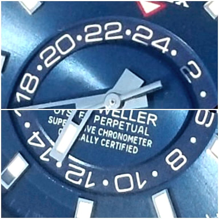
Some pics with shadows minimized. Even a slight angle off produces some parallax too but overall it couldn't be any better alignment.

ZVQ0Kb.jpg


ZVQb9p.jpg
 

KJ2020

Time Traveler
Supporter
12/3/18
32,945
59,730
113
Even on the original GMT wheel you can see the parallax error. The 10 looks high and the 20 looks low (same pic). Or compare the 8 and the 18.

ZVlLZo.jpg


ZVleqJ.jpg
 
Last edited: