• Tired of adverts on RWI? - Subscribe by clicking HERE and PMing Trailboss for instructions and they will magically go away!

ARF Batman 3186 final sample

puretime

Trusted Dealer
Trusted Dealer
16/3/06
13,888
4,564
113
New bezel
86e28773c545cff1206d7986b70a2bdc.jpg


Sent from my iPhone using Tapatalk Pro
 

Sundek

I'm Pretty Popular
Supporter
Certified
24/3/18
1,669
530
113
Italy
fantastic
yes now it's the real batman insert


Inviato dal mio iPhone utilizzando Tapatalk
 
  • Like
Reactions: vcappp

Shany

Active Member
24/6/19
257
73
28
:D could be a bit darker !
but looks nice yes and please tell ARF to use VR movements and not those SH.. IN ALL WATCHES PLEASE!
 
  • Like
Reactions: vcappp

preppyr6

I'm Pretty Popular
29/10/15
1,233
402
83
Hmm, insert looks decent. Still in Noob camp for BLNR for now, but ARF is coming along. Just need to fix the case and use a VR.
 
  • Like
Reactions: vcappp and Fervid

KJ2020

Time Traveler
Supporter
12/3/18
32,398
56,878
113
The insert looks very good. The blue color, the marker thickness, and the color transition points are all good. Some minor indications of speed bumps, but shouldn't be too noticeable on the wrist. Tbe datewheel looks good. The hands are awesome as always and it looks like the hour markers have a little curve to the corners finally.

The SH3186 movement is a significant deterrent if it wasn't changed. The VR3185 is so much better, and ARF hands don't always fit properly. Maybe that's why ARF hasn't made the switch. Personally I can't justify a purchase knowing what a movement and hands swap entails. Better off buying a VRF or new Noob V11 and swap in the ARF insert. Here we go again.

This ARF has the wrong CGs for a 116710. The CGs changed pretty significantly on the 126710, ARFs cases were obviously modeled after them. This won't bother some people but it's there if you care. This won't be a factor when ARF releases the 126710's.

ZAae7n.jpg


ZAkYdX.jpg
 
Last edited:

srhoque

Put Some Respect On My Name
28/11/18
3,259
2,461
113
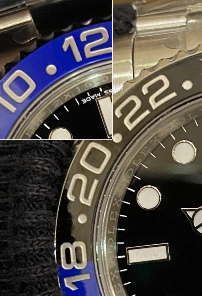
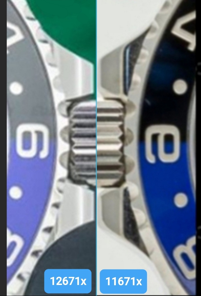
Insert markers in the black are noticeably thinner than the ones in blue. Arghh.

ZA4h0R.jpg

^ This, that was my first observation too. They got the 1 serif font correct, the 18 transition corrected but the blue color is a lighter shade (maybe its TD harsh LED lighting)

I was getting excited to order but then my hopes deflated :(
 

cjt202020

Renowned Member
Supporter
3/2/14
762
3,114
93
I’ll never unsee these flaws ! Why do you do it to me expert rep crew !