• Tired of adverts on RWI? - Subscribe by clicking HERE and PMing Trailboss for instructions and they will magically go away!

116500 White Dial 2016, 2017, 2018, 2019, ARF V1, V2 & Noob V1 & V2 Evaluation

ssouthall6

Put Some Respect On My Name
10/10/13
3,539
1,562
113
VVE7cf.jpg


Basically

ARF V1 copied the 2016 Gen - Good Effort 7/10
ARF V2 copied the 2018 Gen - Amazing Effort 9/10
Noob V1 copied the 2017 but used the prototype in the Rolex 2017 Guide as a reference - Bad 4/10
Noob V2 copied the 2017 Gen - Great Effort 6.5/10

EDIT 06.03 - after a few weeks of QC evaluation and further research, it appears we have another v9 sub style scenario, with the quality varying from dial to dial. They appear to have changed the shape of the O slightly to make it marginally wider on the white dial. The subdials appear to be pot luck, although as shown above, the gen subdials differ between variations too.

All in all, ARF clearly have a better consistency when it comes to the dial and I stand by the decision to use the ARF dial over keeping the noob if you really want to get the best result from the watch.

Please ignore the colour of the dials, these pics were taken from either QC's or gens with differing lighting conditions.
 
Last edited:

lpl

Renowned Member
3/1/17
649
147
43
New Zealand
Thanks for your input. This is going to be helpful to those who are looking for a 116500.
I wonder what the case is for the 116520!
 

ssouthall6

Put Some Respect On My Name
10/10/13
3,539
1,562
113
The noob v2 subdials still look a bit fat though don't they?

Within tolerance IMO, very close to the 2017 gen. Now they got the font right it's fantastic.

ARF is a 2018 copy.


Sent from my iPhone using Tapatalk
 
Last edited:

hackkakid

Active Member
18/1/19
441
123
43
Merica
Nice comparison, been looking for something like this! I am putting together a white 116500 build now, still think I want to throw a gen dial and bezel on a noob v2 but this gets me thinking...
 

kopite81

Active Member
2/12/18
268
127
43

So looking at this the Noob Bezel is still slightly off comparing to the ARF V2 bezel

I have ordered the Noob V2 just awaiting QC

When it arrives I will be sourcing ARF bezel, Clasp and Dial
 

goldman555

Known Member
4/8/16
184
123
43
One thing from these pictures that you can see is that the noob V2 has got a substantially better sub- dial than the V1 which in my opinion was the only major flaw. You could certainly pass it off if someone calls you out. The fatty sub dials version was easily spotted and on a number of occasions, I have seen people with it.

The other thing I can see from these pictures is that the 2018 and 2019 genuine depict different diameters of the subdial surely this is incorrect. Are we saying that the 2019 version has slightly thinner sub dials than 2018? Surely not why would they go to all that bother when it has the same reference number?

Another thing that people seem to forget so often with the ceramic Daytona versus previous versions of the Daytona the previous versions had really really thin sub dials so people for some reason think that the ceramic version should have similar subdials. That's not the case the panda has fairly substantial sub dials.

Having had various versions of the black-faced Daytona with silver subdials I find it really hard to tell the time with that watch because there is so much silver and black contrast. It really is a crappy watch if you want to tell the time... Which is kind of the main use case for a watch right?

In my opinion, the white offers much better contrast and is easier to tell what the actual time is.

When it's all said and done this new SA4130 movement is a game changer and like the submariner, I think secondary market values are going to tank based on the fact that these reps are getting so good.
 

ssouthall6

Put Some Respect On My Name
10/10/13
3,539
1,562
113
The other thing I can see from these pictures is that the 2018 and 2019 genuine depict different diameters of the subdial surely this is incorrect. Are we saying that the 2019 version has slightly thinner sub dials than 2018? Surely not why would they go to all that bother when it has the same reference number?

Yes, Rolex is known for regularly changing and evolving its dials to reflect customer and internal R&D feedback
 

M Scott

Renowned Member
22/9/18
817
1,047
93
This exercise is very interesting to me and has helped me learn more about these Ceramic Daytonas.
However, the small pictures used as examples were making it difficult for me to see and understand any differences.

So I decided to try and find larger, higher resolution pictures from the four years that these Genuine Ceramic Daytonas have been produced.
I started by searching Google for "2016 116500" and then for model years 2017, 2018, and 2019. I found a number of dealers posting really good pictures of the actual watches for sale along with their model year.

I didn't use any stock Rolex pictures from catalogs or other advertising. You can see that all of the pictures have the hands in different positions so they are all different watches.

I found multiple high quality pictures from each model year and started overlaying all of them in Photoshop to make them all the same size and to balance the light levels so that each dial would have similar lighting and contrast between light and dark.

As I worked though all of the pictures that I found, and not just the four shown below, I found that they all look the same for every year.
I really don't see any differences. I am not a watch expert, but I am pretty good at Photoshop so I will just post what I found and you can decide...

BTW, when I overlaid the ARF V2 dial, it was the closest match to all of these Gens.

If you Right Click and open this image in a new tab or new window, it will get even larger...
VVxrqq.jpg
 
Last edited:

M Scott

Renowned Member
22/9/18
817
1,047
93
The fatty sub dials version was easily spotted and on a number of occasions, I have seen people with it.

Having had various versions of the black-faced Daytona with silver subdials I find it really hard to tell the time with that watch because there is so much silver and black contrast. It really is a crappy watch if you want to tell the time... Which is kind of the main use case for a watch right?

In my opinion, the white offers much better contrast and is easier to tell what the actual time is.

When it's all said and done this new SA4130 movement is a game changer and like the submariner, I think secondary market values are going to tank based on the fact that these reps are getting so good.


Always great to hear this kind of first hand experience...
 

ssouthall6

Put Some Respect On My Name
10/10/13
3,539
1,562
113
This exercise is very interesting to me and has helped me learn more about these Ceramic Daytonas.
However, the small pictures used as examples were making it difficult for me to see and understand any differences.

So I decided to try and find larger, higher resolution pictures from the four years that these Genuine Ceramic Daytonas have been produced.
I started by searching Google for "2016 116500" and then for model years 2017, 2018, and 2019. I found a number of dealers posting really good pictures of the actual watches for sale along with their model year.

I didn't use any stock Rolex pictures from catalogs or other advertising. You can see that all of the pictures have the hands in different positions so they are all different watches.

I found multiple high quality pictures from each model year and started overlaying all of them in Photoshop to make them all the same size and to balance the light levels so that each dial would have similar lighting and contrast between light and dark.

As I worked though all of the pictures that I found, and not just the four shown below, I found that they all look the same for every year.
I really don't see any differences. I am not a watch expert, but I am pretty good at Photoshop so I will just post what I found and you can decide...

BTW, when I overlaid the ARF V2 dial, it was the closest match to all of these Gens.

If you Right Click and open this image in a new tab or new window, it will get even larger...
VVxrqq.jpg

You are quite right, to the eye they look almost identical.

Finding large images of the watches was tough so fair play for you to finding them, but one of the reasons I kept the images small was to show that, although I'm an analyst and a bit OCD, you are quite right in your conclusion that the differences can only really be seen extremely close up and if you know what you're looking for. It kinda highlights we are really stressing over the minuscae, when at the wrist, these things are impossible to diffferentiate.

The main differences are the shape of the R and the spacing around ROL. I'll do some close up comparisons below but my conclusion is the same as yours - ARF v2 is the best dial around. Noob v2 is wholly passable.
 

ssouthall6

Put Some Respect On My Name
10/10/13
3,539
1,562
113
So the real issue was with the spacing of the letters in ROLEX.

Here is an illustration that shows the new noob dial has copied the 2017 dial, which has a narrower space inside the R and marginally closer spacing.

From top to bottom:

Gen 2017
Noob v2
ARF V2
Gen 2018

57fd0bdd9aa3c011e4e801bda7038173.jpg


The original noob v1 was miles off any of the traditional dials and was based on a prototype, that I haven't seen in the wild

e44f9ff70e44c05a578c16580fb16c07.jpg


Sent from my iPhone using Tapatalk
 

ssouthall6

Put Some Respect On My Name
10/10/13
3,539
1,562
113
To highlight the differentiation to aid you in evaluating your dial, pay attention to the below

5299557e0d56485683b2b5e671879a29.jpg


This is what I mean about the spacing within the R

c3fa61e4484c204518f43cdb961d7b62.jpg


And this is the issue noob had with v1. No rolex dial has ever had an O with consistent thickness. The top is always thinner. Even this prototype with bigger spacing between the letters reflects this.


Sent from my iPhone using Tapatalk
 
  • Like
Reactions: racingeagle

ssouthall6

Put Some Respect On My Name
10/10/13
3,539
1,562
113
My conclusion on this is that both ARF V2 and Noob V2 have a dial where the ROLEX spacing, font, thickness and nuances have been addressed.


Sent from my iPhone using Tapatalk
 

M Scott

Renowned Member
22/9/18
817
1,047
93
...although I'm an analyst and a bit OCD, you are quite right in your conclusion that the differences can only really be seen extremely close up and if you know what you're looking for. It kinda highlights we are really stressing over the minuscae, when at the wrist, these things are impossible to diffferentiate.

Thanks for your replies. I am also a bit OCD, so I understand.
I am not a watch expert by any means. I worked in professional Sportscar Racing for many years, so the Daytona is the only watch that I have any interest in.

Your posts, ssouthall6, have helped me see and learn more and more fine details about Rolex Daytonas, both Gen and Reps.

The main differences are the shape of the R and the spacing around ROL. I'll do some close up comparisons below but my conclusion is the same as yours - ARF v2 is the best dial around. Noob v2 is wholly passable.

I understand exactly what you mean with the Rolex logo here...
Thanks to your posts, you have pushed me to study this issue more and now it is pretty easy for me to tell a 116500 Noob from an ARF or Gen.
The "Rs and S" differences that you have pointed out on the Noob Ceramic bezels are now also very easy to see.

I agree that part of the problem is that Noob is just making the O wrong. It should be a little wider on the sides and narrower on the top to match that style of font better. Also, the whole R should be just a little bit wider.
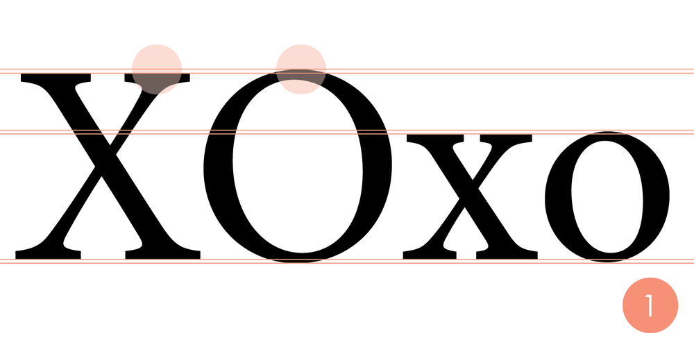
It first I thought Noob might not be using a thing called "font overshoot". This is a trick used in almost all fonts to make spacing look right, but most people never realize it's there.
Noob is using font overshoot correctly, as shown in this picture, but the R O LEX spacing is just still a little off.
.
1396892102273


"In typeface design, the overshoot of a round or pointed letter (like O or A) is the degree to which it extends higher or lower than a comparably sized "flat" letter (like X or H), to achieve an optical effect of being the same size; it compensates for inaccuracies in human visual perception."


To be honest, I really think that most people will never see small these differences on the actual watch without magnification.
I would forgive most of these small differences, but you would think they would put an extra effort into getting the Rolex logo right.

Yes, this is all a little over the top OCD, but I've learned a lot reading these forums and with all the help from other members, it's nice to be able to tell the difference between a Noob, an ARF, and a Gen now.