-
Tired of adverts on RWI? - Subscribe by clicking HERE and PMing Trailboss for instructions and they will magically go away!
You are using an out of date browser. It may not display this or other websites correctly.
You should upgrade or use an alternative browser.
You should upgrade or use an alternative browser.
3KF Nautilus vs PPF Nautilus
- Thread starter XLR8R
- Start date
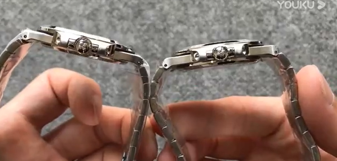
Looks like the 3K crown is bigger than than ppf in this video? Am I mistaken ? I've read the opposite, the PPF has a bigger crown / protrudes more??
The issue is in how far out the crown protrudes when viewing the watch normally, as you can see on the right:
swink6112
Known Member
- 15/7/20
- 103
- 91
- 28
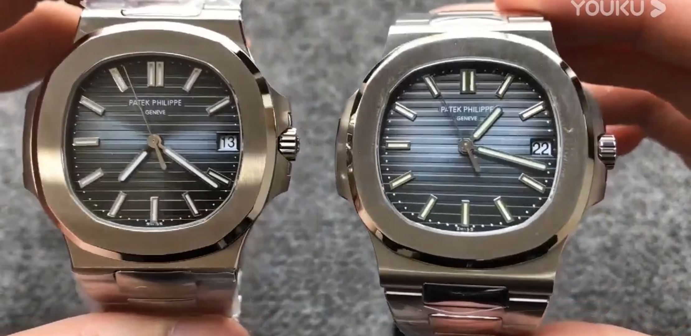
From having own both PPF v4 and 3KF v2, here's my two cents.. please don't filet me lol
For me the 3KF is an easy win due to 5 factors.
1) The dial color
Compared to gen the color on the 3KF is very close on different kind of lighting. It has the correct grey blue with a hint of green like the gen. The PPF v4 dial color while beautiful on it's own with a far superior dw, but when compared to gen it is very apparent that the color is wrong. It looks blue with a hint of purple. Very wrong when compared next to a gen.
***Check out this youtube video where it was compared to a gen MK2 dial***
Link: https://www.youtube.com/watch?v=faTFFSsOJ7o
2) The crown guard shape(or the sunken crown effect)
While the 3KF cg aint perfect. It gives the correct illusion that the cg covers a significant proportion of the crown when screwed all the way in like gen. The angle while not exactly like gen gives the same effect. While the PPF v4 cg looks good on close inspection. But on the wrist it doesn't provide the same "sunken crown" effect that the gen has. The 3KF has this effect.
3) The crown protrusion issue
While 3KF does have a better crown length I must admit, the first polished link is quite large compared to gen. But on the wrist, the eyes naturally tend to not really see or focus on the first link but rather on the dial and crown and cg part more. On the wrist the 3KF crown does not protrude at all and when screwed all the way down it gives the same silhouette as the gen. The PPF v4's crown sticks out like a sore thumb and there's no way that someone who has handled a gen or have seen the crown sticking out will not immediately notice it. This is more apparent than the large first link on the 3KF.
4) The clone movement
Say what you will but I can take off my 3KF and stare at the movement all day. Yes, it isn't engraved but it isn't bad looking at all. I'm shocked at how 3KF was able to replicate this.
5) The over all look
From having own both and having compared it to my boss's gen 5711, I'd have to say the 3KF looks more gen on the wrist than the PPF v4.
Here's my 3KF v2

KilltheDeath
Known Member
- 4/10/20
- 129
- 36
- 28
From having own both PPF v4 and 3KF v2, here's my two cents.. please don't filet me lol
For me the 3KF is an easy win due to 5 factors.
1) The dial color
Compared to gen the color on the 3KF is very close on different kind of lighting. It has the correct grey blue with a hint of green like the gen. The PPF v4 dial color while beautiful on it's own with a far superior dw, but when compared to gen it is very apparent that the color is wrong. It looks blue with a hint of purple. Very wrong when compared next to a gen.
***Check out this youtube video where it was compared to a gen MK2 dial***
Link: https://www.youtube.com/watch?v=faTFFSsOJ7o
2) The crown guard shape(or the sunken crown effect)
While the 3KF cg aint perfect. It gives the correct illusion that the cg covers a significant proportion of the crown when screwed all the way in like gen. The angle while not exactly like gen gives the same effect. While the PPF v4 cg looks good on close inspection. But on the wrist it doesn't provide the same "sunken crown" effect that the gen has. The 3KF has this effect.
3) The crown protrusion issue
While 3KF does have a better crown length I must admit, the first polished link is quite large compared to gen. But on the wrist, the eyes naturally tend to not really see or focus on the first link but rather on the dial and crown and cg part more. On the wrist the 3KF crown does not protrude at all and when screwed all the way down it gives the same silhouette as the gen. The PPF v4's crown sticks out like a sore thumb and there's no way that someone who has handled a gen or have seen the crown sticking out will not immediately notice it. This is more apparent than the large first link on the 3KF.
4) The clone movement
Say what you will but I can take off my 3KF and stare at the movement all day. Yes, it isn't engraved but it isn't bad looking at all. I'm shocked at how 3KF was able to replicate this.
5) The over all look
From having own both and having compared it to my boss's gen 5711, I'd have to say the 3KF looks more gen on the wrist than the PPF v4.
Here's my 3KF v2
Agree with all your points!


Tobel
Put Some Respect On My Name
- 6/7/17
- 5,425
- 3,618
- 113
Just got my PPF
It's gorgeous mate, wear it in good health

PPF/3kf hybrid
What are the specs? Hands seem pretty white compared to the greenish hour markers. Rest looks stunning.
Sent from the RWI App
Kobe88
Horology Curious
- 25/10/20
- 13
- 15
- 0
What are the specs? Hands seem pretty white compared to the greenish hour markers. Rest looks stunning.
Sent from the RWI App
Its a ppf v3 with all the mods (case reshape, crown shortened, bevel cutting and polish, bracelet re done too), with 3kf v2 movement/hands and spongebob tiffany stamp dial..
The color in the hands do look different on the pic not noticeable in real life plus lume is the same brightness and color
Its a ppf v3 with all the mods (case reshape, crown shortened, bevel cutting and polish, bracelet re done too), with 3kf v2 movement/hands and spongebob tiffany stamp dial..
The color in the hands do look different on the pic not noticeable in real life plus lume is the same brightness and color
Nice. For me atm The One would be a refinished, thinned PF case with a PPF v4 or a 3KF (?) dial and a 3KF movement. PPF v4 bracelet seems / is said to be more genlike but I'm satisfied with my PF one. My ordered blue 3KF 5711 is still in transit so I don't know yet which dial and bracelet I will prefer.

KilltheDeath
Known Member
- 4/10/20
- 129
- 36
- 28
What case is it?
PF case modded by legend with PPF dial, spongebob datawheel and additional work on the dial made by Srzmod plus other works made by Legend.
KilltheDeath
Known Member
- 4/10/20
- 129
- 36
- 28
PF case modded by legend with PPF dial, spongebob datawheel and additional work on the dial made by Srzmod plus other works made by Legend.
this is pretty gen-like, although I like 3kf dial a lot more.
this is pretty gen-like, although I like 3kf dial a lot more.
the work made by the modders is to have the watch like the gen… 3kf unfortunately isn’t like the gen..