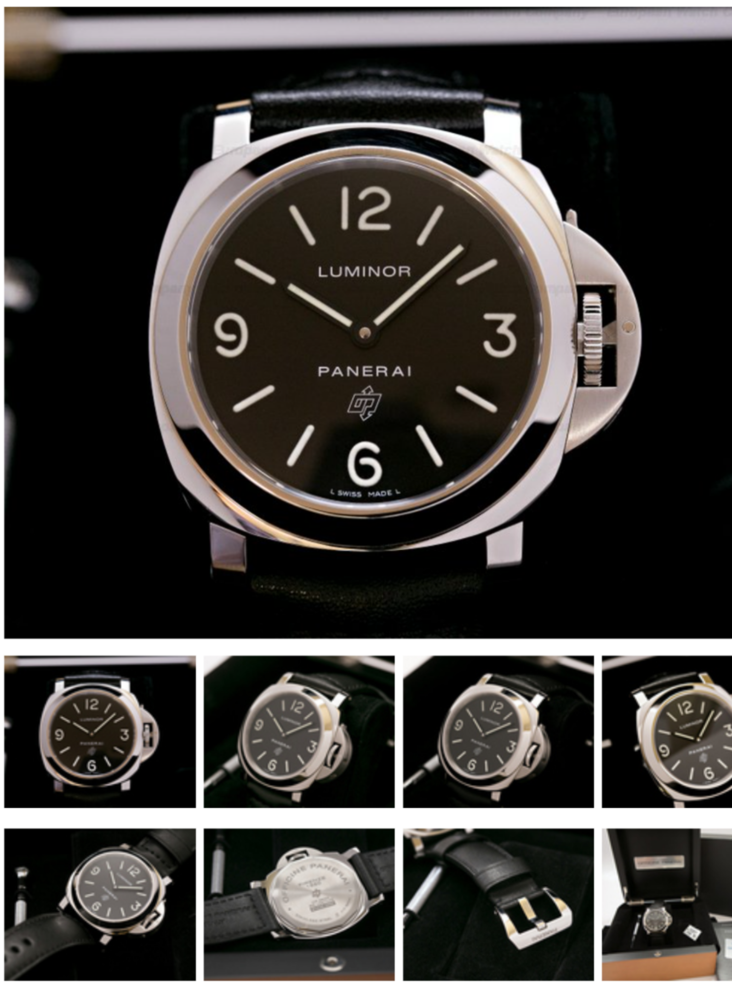
Good day.
I propose to discuss the basic model again. Their selection was never great, and many of the marina counterparts like pairs 111/112, 177/176, and of course 005/000 usually had a smaller production run and were available for less time. At the moment, the choice is not at all great, this is 390 noob, which lags far behind its own previous version, as you can see from the link:
https://forum.replica-watch.info/forum/panerai/9531941-pam390-noob-old-vs-new
Models 634 and 774 from the new HWF factory, which clearly fall short of their previous versions from the V6F factory.
And of course, pam000 from the XF factory. The situation here is no less interesting than with 390.
- Firstly, this is the most classic and demanded basic pam.
- Secondly, 000 is simple enough. If you do not fulfill it perfectly, then whom?
- Thirdly, there was already a version XF / V6F, it is not perfect, but it is definitely very good.
Now that we have received the long awaited re-release of PAM000 from XF, it would be nice to know if they gave us more than last time?
In fact, over the past couple of years, while the basic panerai could not be bought from TD with a new one, there were regular topics of thirsty people, in numerous topics, desires for re-releases, always pam000. Nevertheless, quite a long time has passed, and there are not so many in the topic of issue 000, and there are not so many photos on the forum that allow you to see it in life.
I don't have a single version of this model, but a couple of old members (Special thanks to the man who has almost ALL the interesting rep pams ever made dadog13 andtominjo ) took some number of photos that I collected and decided to show you what 000 is today, and whether it is worth buying it, or looking for the previous version of m2m.
I warn you in advance that the photos were taken by different people, on different cameras, so I apologize for the mismatching frames, different cameras and clarity.
Some photos were processed, for comparison, under too different lighting conditions, some were not. I do not want to strain neither those who read and watch, nor those who take these photos, therefore, I consider only the basic aspects of the forms.
In this model, I am not evaluating color schemes, so this requires a side-by-side comparison in my opinion.
Well, a rather lengthy preface, let's start:
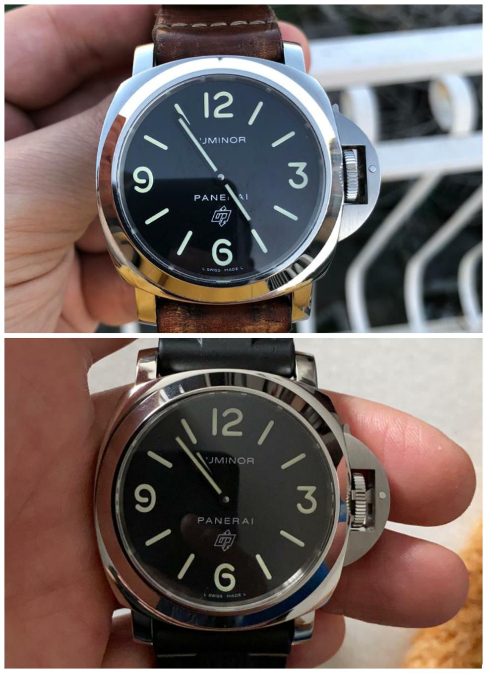
1. General appearance.
No unnecessary comments, just photos from the front, as you would see them from the wrist.
Old on top in the first photo and below in the second.




2. Back case
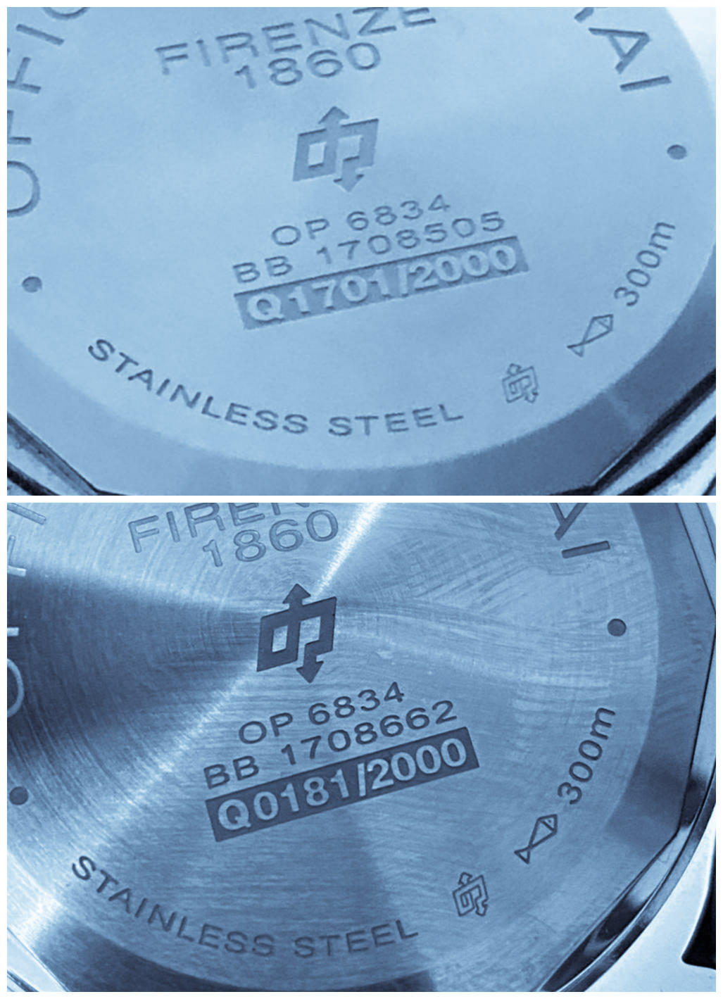
If there are differences, then they are difficult to detect. All engravings are correct, beautiful, in place and extremely similar. By the way, the episode is one, it's still "Q" 2014.
(Which, by the way, can make it difficult to quickly identify, the old version is, or the new one)
Old, it's number 181


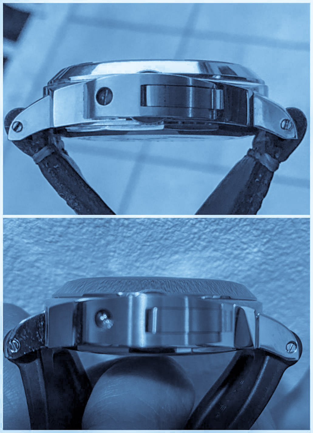
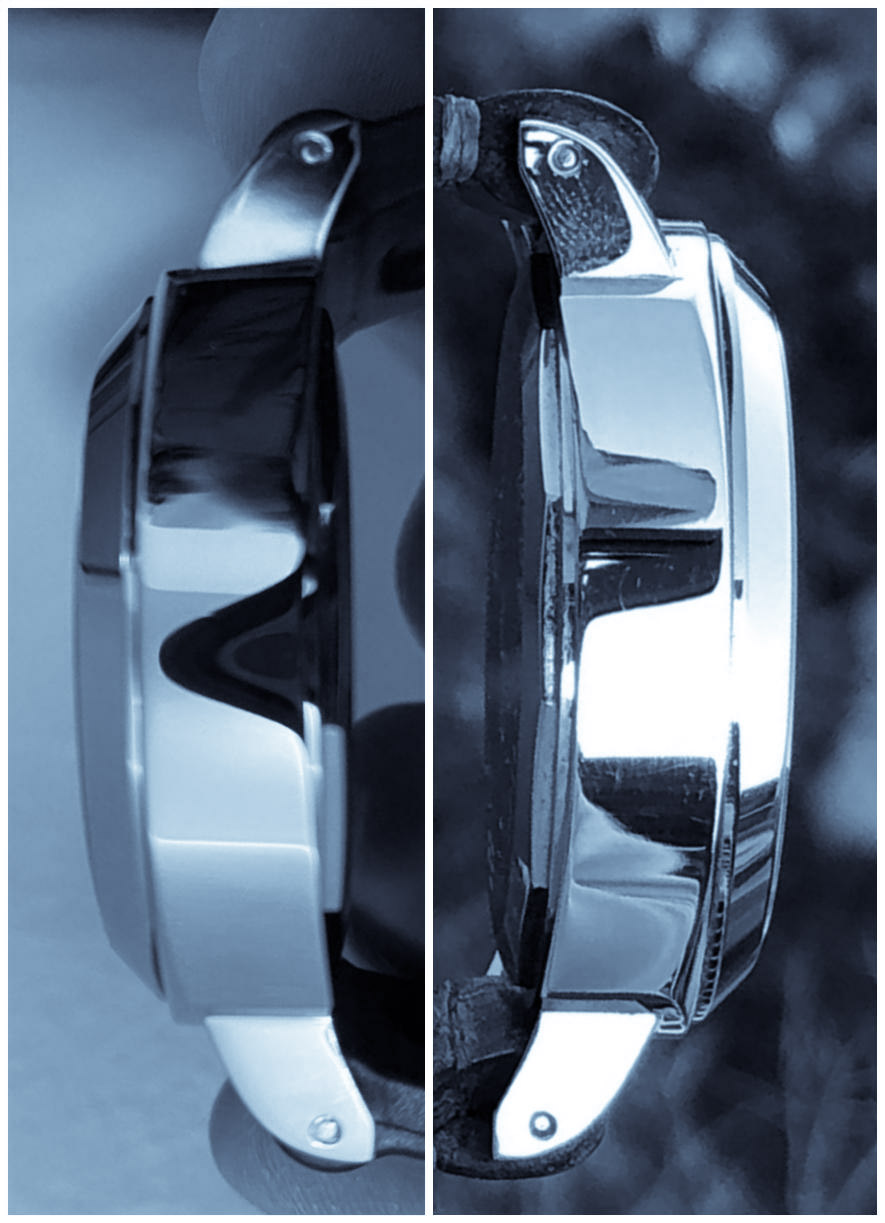
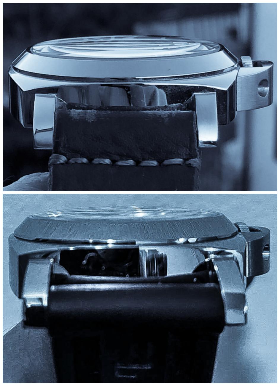
3. Case.
The cases are obviously different, it is noticeable in all the details and from all sides:
- The height of the bezel's chamfer and the angle of inclination.
- The shape of the protrusions, the position of the screws on them.
- Pillow bevels.
Old top, right and top again.






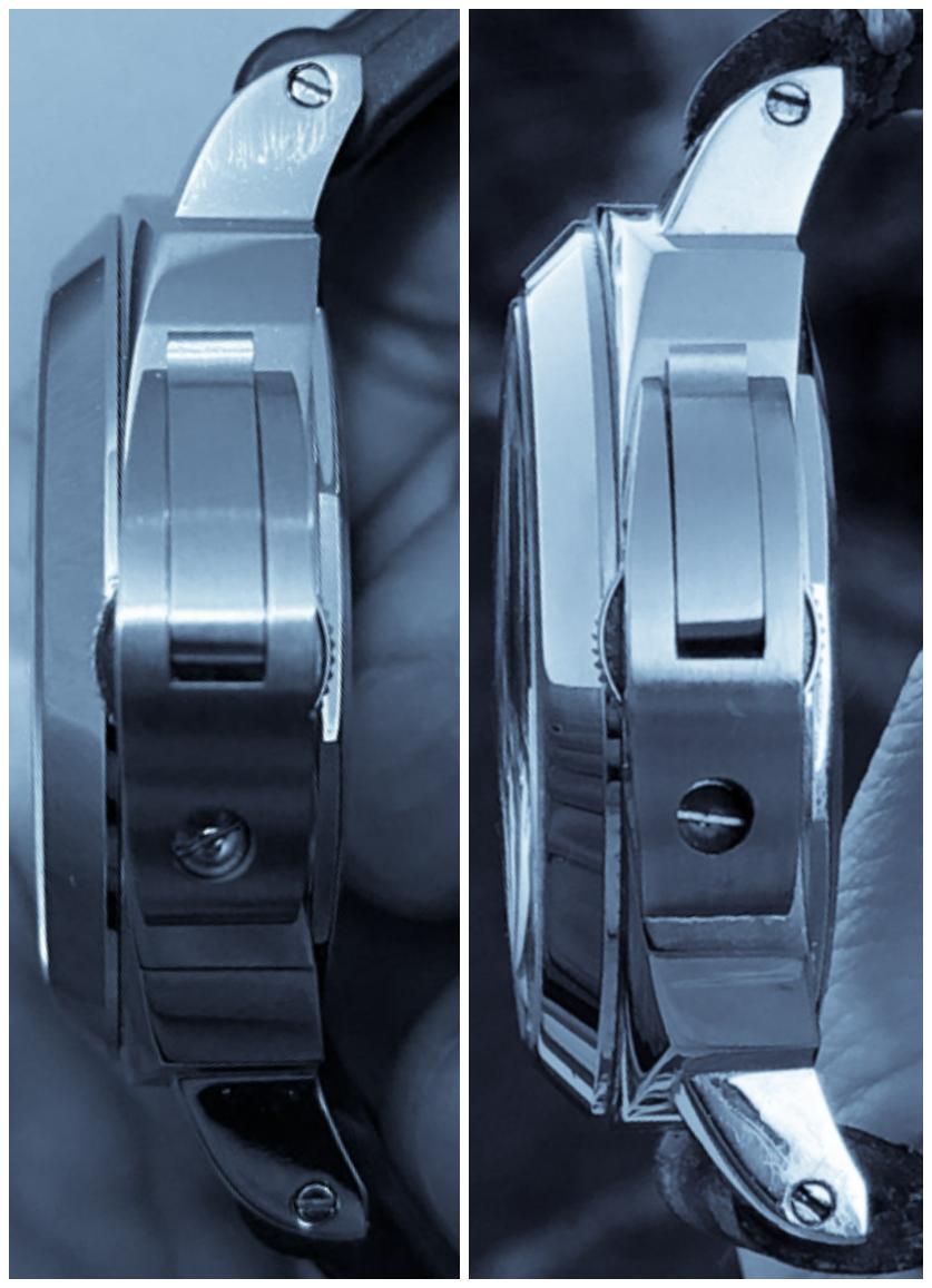
4. CG
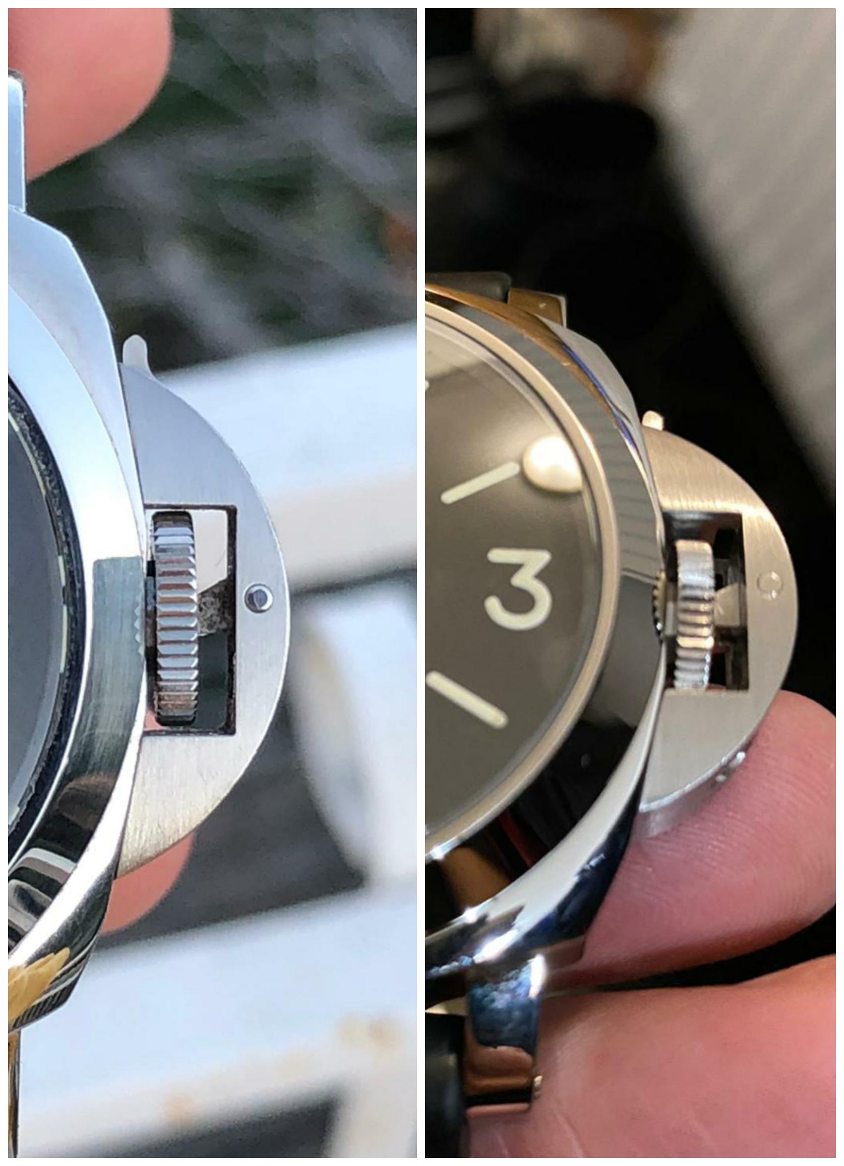
For a full comparison, they should be removed, but even from such angles, it seems that:
- The new one is slightly thicker in profile in the middle of the length.
- The pin of the lever on the old one has a circular chamfer, so that it sticks out a little, I think it should be attributed to the specifics of the sample.
- Lever support stopper and tail of different shapes.
Old on the left, then on down, then on the right.




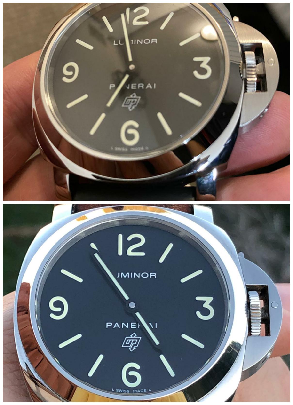
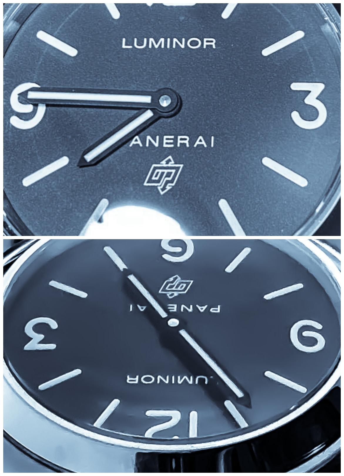
5. Hands.
But here is one of the most striking changes. The new, right hands for the Q series are finally in place. Not the most obvious change, but this change is not a "quality improvement" but an actual error.
New on top in both photos.


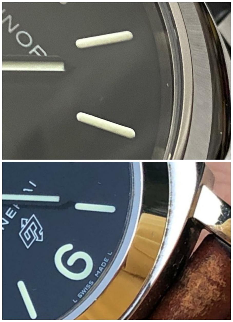


6. Dial.
Now, for a snack, it seems to me, the most important and difficult.
- Placement, thickness and font of the labels and logo do not seem to have changed. I cannot compare the color.
- The thickness of markers and numbers seems to have not changed, but the font "6" and "9" in some places looks different, especially in the first one.
- There was no way to compare the color, but from the photo xf005, which the members post, we can assume that it is a little greener.
- CP on the new one looks a little worse, but I think this is again a more QC moment than the real feature of the model version, because, I saw flatter ones.
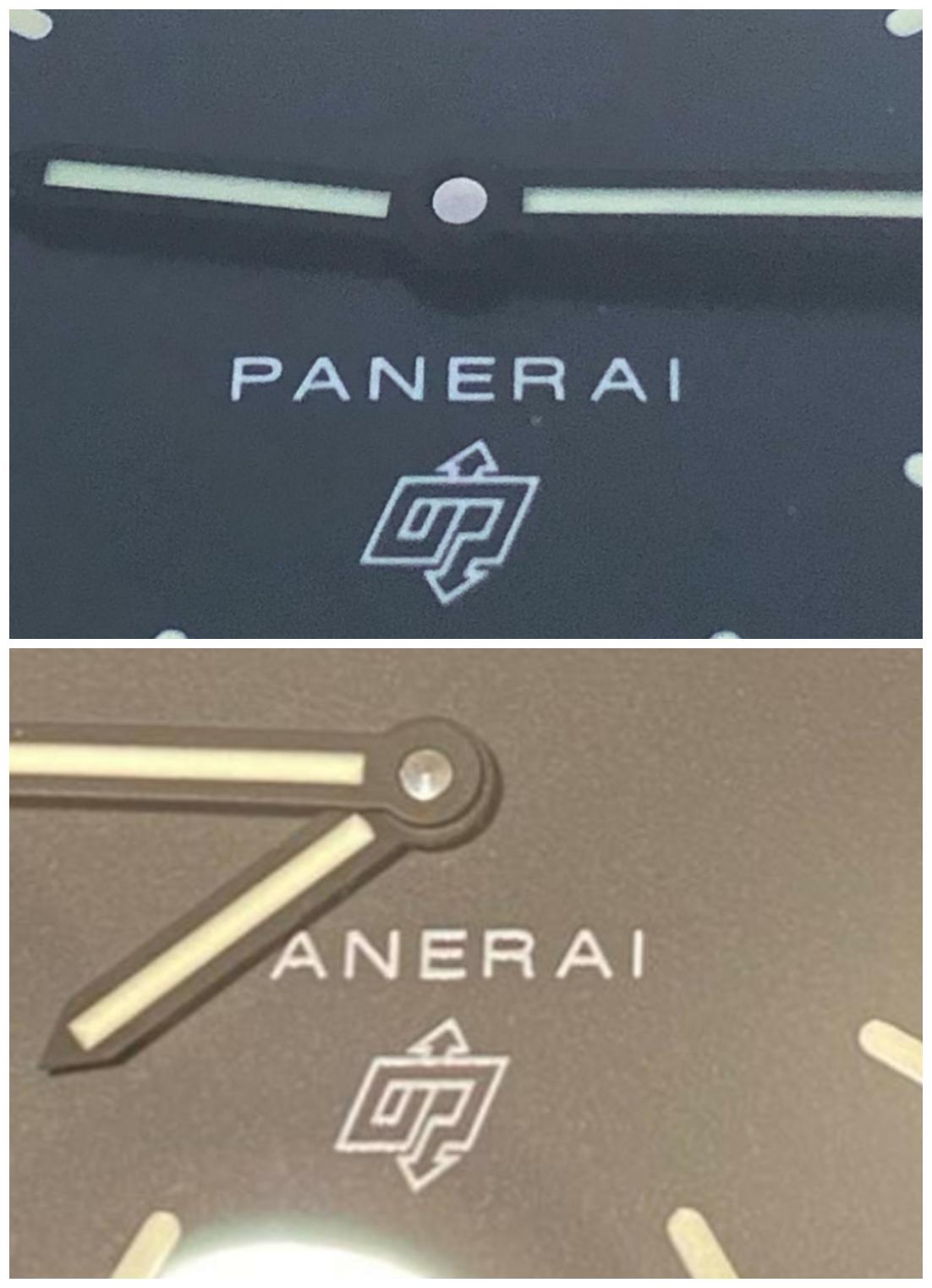


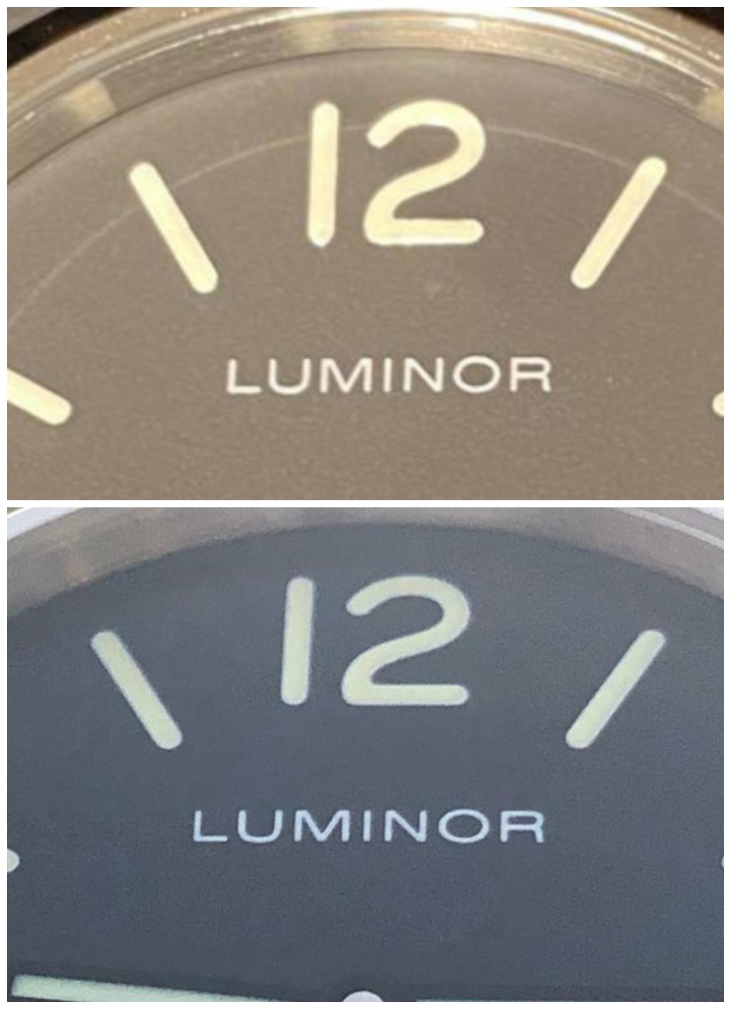


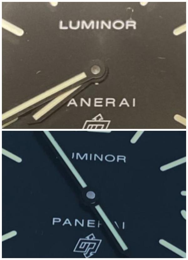


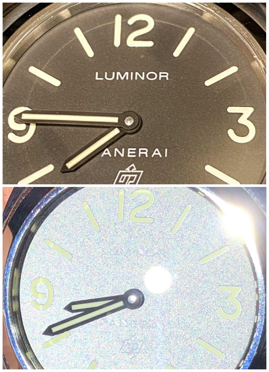


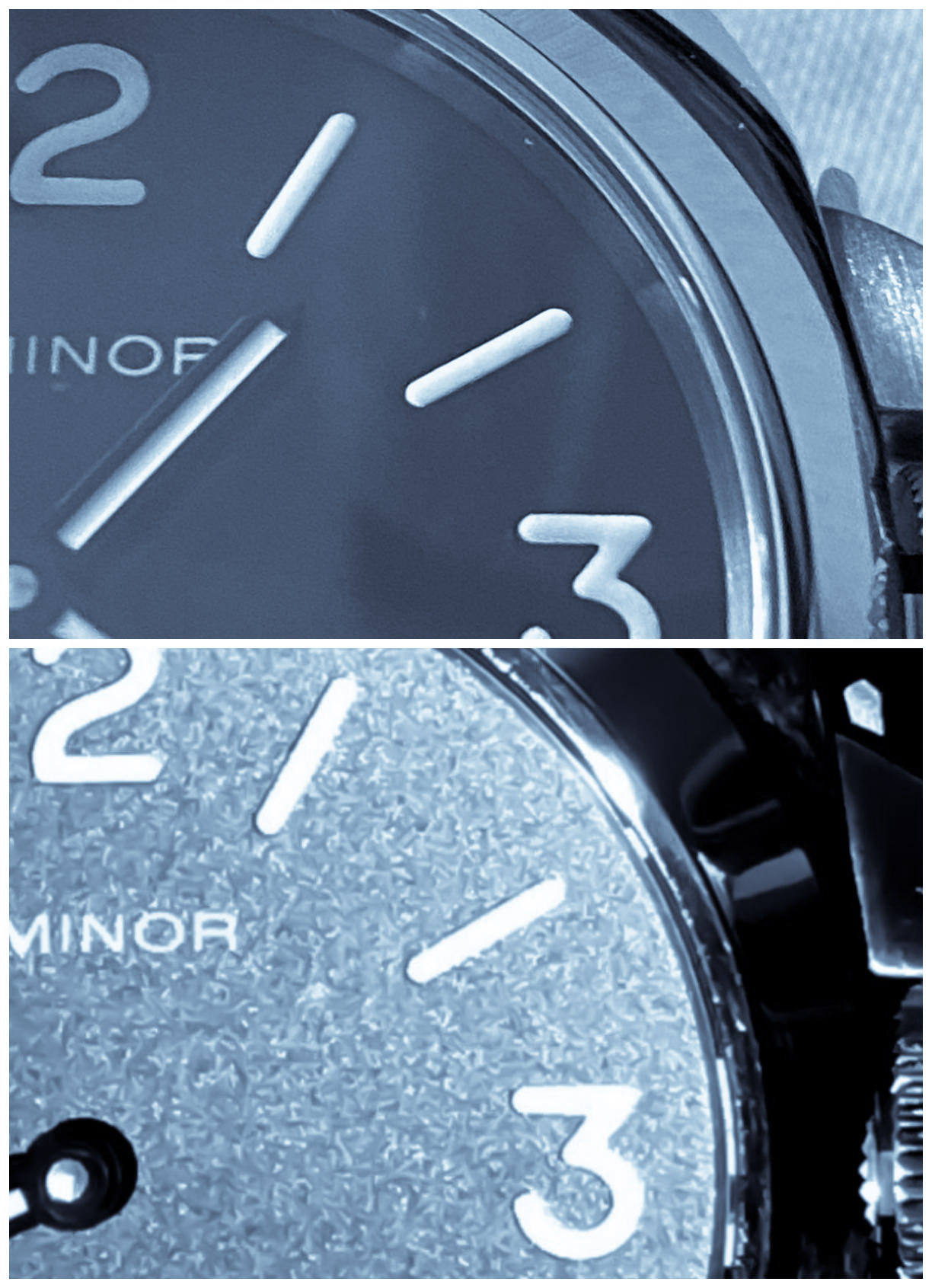


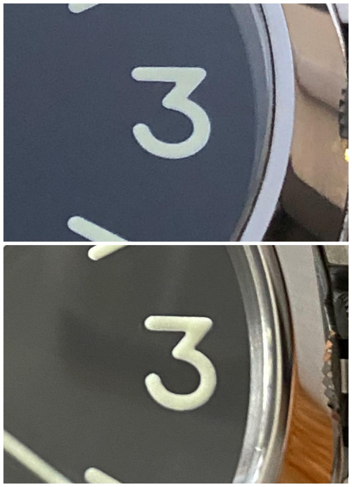


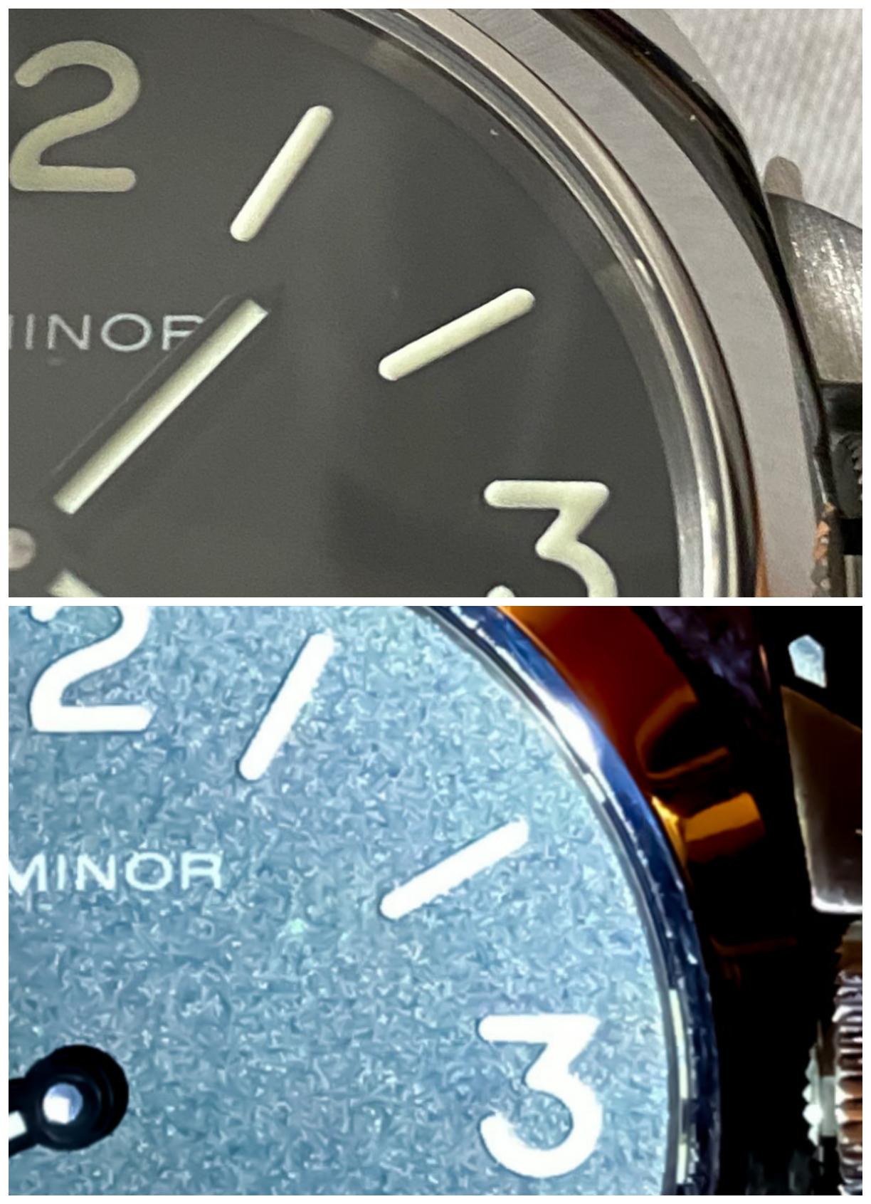


(The dial in one photo looks brown, but not like that. It's just the specifics of the lighting, due to which I "cooled" the comparison sets, it's just that some volumetric details are lost during this kind of processing)
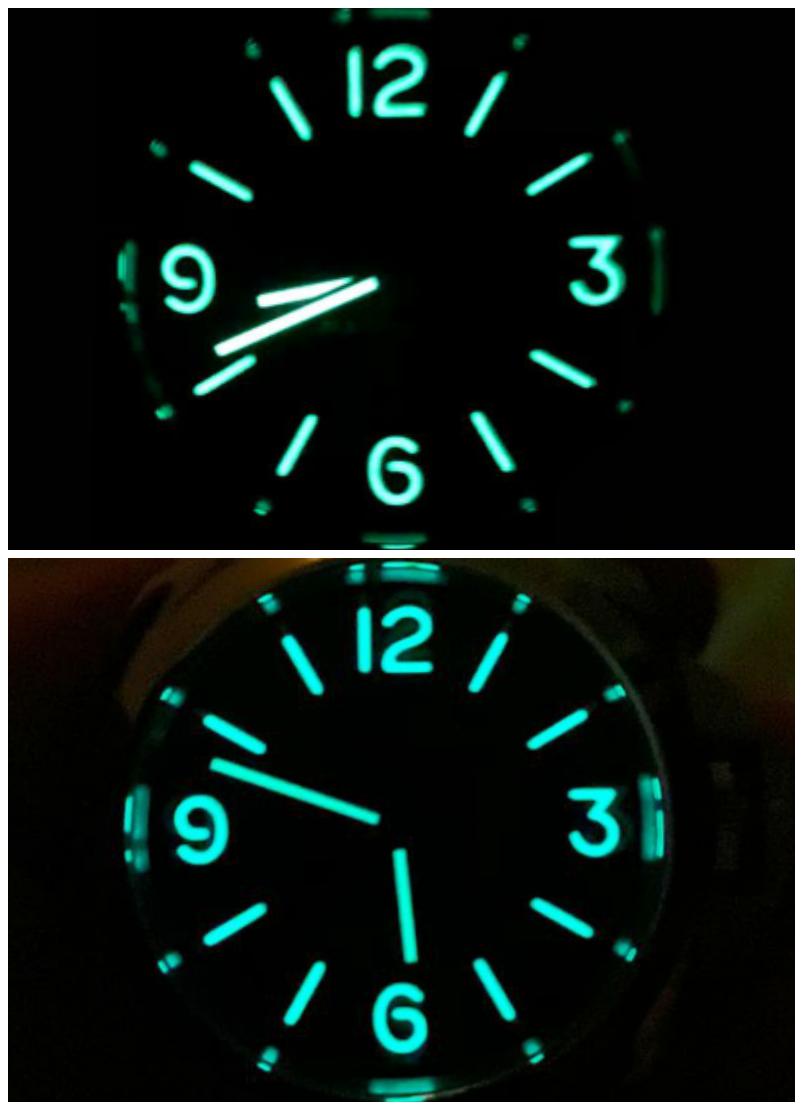
7. Lumshoot
- As noted many times before, the old xf had the problem that the brightness between hands and indices was different. Now this is clearly not the case.
(Old at the top)


Well, unfortunately, I have no more photos for you.


But, what conclusions can be drawn?
This seems to be a long-awaited example where the factory has done a good job.
- The first and most obvious fact, they changed hands to the correct ones for this series. It seems that at the same time, the return of the correspondence to the glow of the hands and the dial is connected. in the last issue, they put their hands, they found in grandfather's chest from the attic.
- Pin CG looks really better, although many new releases neglect it. It would be fixable, but modifying panerai, even so slightly, has long been out of fashion.
- The shape of the case has been improved. The bezel chamfer is thinner, the projections are thicker, the screw holes are closer to the edge, the shape of the pillow is difficult to compare from someone else's photos, but it seems to me that the corners could be taken lower, in any case, the profile in some frames (the height of the edges of the corners) seems a little thicker, than necessary.
- The CG lever from the profile looks better in terms of matching the CG in length. I do not exclude that it is not necessary once at a time, but this is an advantage that I could not fail to fix.
- The lever stopper has become thinner, which is good.
- Also, it is interesting that 000 and 005 have the same case, did not compare in detail, but I believe that everything that is true for 000 can be applied to 005.
Now about the sad things.
- Dial, It is expected that the factory could change suppliers or technologies over these several years, but the main danger of sausage dials is the structure of the sausage. If it was done as well as a sandwich, then there would be hardly any questions 111 or 005 (in terms of accuracy).
XF made good sausage.
It was flat, but had an indent from the edge of the slots, and most importantly, it was below the level of the dial.
Only HF was better at this task.
Now, we see what looks a lot like the dials of the new noob (390, 005 "N" new). The lum is convex, glossy, without indents, and it seems that it was painted on the surface of the dial, without cutouts (I can only guess).
- Also the fonts "6" and "9" seem to differ. Is it for the better? It's hard to tell from these photos, but it seems to me not.
As a result:
We got a lot of small improvements and an obvious bug fix, but apparently lost the main advantage.
What does it mean?
For each, the answer will be different.
My personal conclusion:
All these little things are what we are obliged to receive from rep today, as well as the absence of factual errors, but a good lume structure is a gem that deserves not only a purchase "out of hunger" according to the basic model, but true love.
However, this is a great, high quality and very accurate rep, which is a must for anyone who hasn't gotten the classic PAM base yet.
And from the wrist, and even twisting in the hands, it will not be easy to distinguish them. Many of my friends who have a rep or gen pam with a sausage dial did not even know about the height of the lume, and how it should look.
After all, who knows how long this factory stock will last.
And yes, this is the only and best 000 that TD has today


 .
.
With respect to everyone who decided to see my post of many letters and few photos, and with the coming year 2021.
I believe we will see many more interesting things in it.
I propose to discuss the basic model again. Their selection was never great, and many of the marina counterparts like pairs 111/112, 177/176, and of course 005/000 usually had a smaller production run and were available for less time. At the moment, the choice is not at all great, this is 390 noob, which lags far behind its own previous version, as you can see from the link:
https://forum.replica-watch.info/forum/panerai/9531941-pam390-noob-old-vs-new
Models 634 and 774 from the new HWF factory, which clearly fall short of their previous versions from the V6F factory.
And of course, pam000 from the XF factory. The situation here is no less interesting than with 390.
- Firstly, this is the most classic and demanded basic pam.
- Secondly, 000 is simple enough. If you do not fulfill it perfectly, then whom?
- Thirdly, there was already a version XF / V6F, it is not perfect, but it is definitely very good.
Now that we have received the long awaited re-release of PAM000 from XF, it would be nice to know if they gave us more than last time?
In fact, over the past couple of years, while the basic panerai could not be bought from TD with a new one, there were regular topics of thirsty people, in numerous topics, desires for re-releases, always pam000. Nevertheless, quite a long time has passed, and there are not so many in the topic of issue 000, and there are not so many photos on the forum that allow you to see it in life.
I don't have a single version of this model, but a couple of old members (Special thanks to the man who has almost ALL the interesting rep pams ever made dadog13 andtominjo ) took some number of photos that I collected and decided to show you what 000 is today, and whether it is worth buying it, or looking for the previous version of m2m.
I warn you in advance that the photos were taken by different people, on different cameras, so I apologize for the mismatching frames, different cameras and clarity.
Some photos were processed, for comparison, under too different lighting conditions, some were not. I do not want to strain neither those who read and watch, nor those who take these photos, therefore, I consider only the basic aspects of the forms.
In this model, I am not evaluating color schemes, so this requires a side-by-side comparison in my opinion.
Well, a rather lengthy preface, let's start:
1. General appearance.
No unnecessary comments, just photos from the front, as you would see them from the wrist.
Old on top in the first photo and below in the second.


2. Back case
If there are differences, then they are difficult to detect. All engravings are correct, beautiful, in place and extremely similar. By the way, the episode is one, it's still "Q" 2014.
(Which, by the way, can make it difficult to quickly identify, the old version is, or the new one)
Old, it's number 181


3. Case.
The cases are obviously different, it is noticeable in all the details and from all sides:
- The height of the bezel's chamfer and the angle of inclination.
- The shape of the protrusions, the position of the screws on them.
- Pillow bevels.
Old top, right and top again.


4. CG
For a full comparison, they should be removed, but even from such angles, it seems that:
- The new one is slightly thicker in profile in the middle of the length.
- The pin of the lever on the old one has a circular chamfer, so that it sticks out a little, I think it should be attributed to the specifics of the sample.
- Lever support stopper and tail of different shapes.
Old on the left, then on down, then on the right.


5. Hands.
But here is one of the most striking changes. The new, right hands for the Q series are finally in place. Not the most obvious change, but this change is not a "quality improvement" but an actual error.
New on top in both photos.


6. Dial.
Now, for a snack, it seems to me, the most important and difficult.
- Placement, thickness and font of the labels and logo do not seem to have changed. I cannot compare the color.
- The thickness of markers and numbers seems to have not changed, but the font "6" and "9" in some places looks different, especially in the first one.
- There was no way to compare the color, but from the photo xf005, which the members post, we can assume that it is a little greener.
- CP on the new one looks a little worse, but I think this is again a more QC moment than the real feature of the model version, because, I saw flatter ones.


(The dial in one photo looks brown, but not like that. It's just the specifics of the lighting, due to which I "cooled" the comparison sets, it's just that some volumetric details are lost during this kind of processing)
7. Lumshoot
- As noted many times before, the old xf had the problem that the brightness between hands and indices was different. Now this is clearly not the case.
(Old at the top)


Well, unfortunately, I have no more photos for you.


But, what conclusions can be drawn?
This seems to be a long-awaited example where the factory has done a good job.
- The first and most obvious fact, they changed hands to the correct ones for this series. It seems that at the same time, the return of the correspondence to the glow of the hands and the dial is connected. in the last issue, they put their hands, they found in grandfather's chest from the attic.
- Pin CG looks really better, although many new releases neglect it. It would be fixable, but modifying panerai, even so slightly, has long been out of fashion.
- The shape of the case has been improved. The bezel chamfer is thinner, the projections are thicker, the screw holes are closer to the edge, the shape of the pillow is difficult to compare from someone else's photos, but it seems to me that the corners could be taken lower, in any case, the profile in some frames (the height of the edges of the corners) seems a little thicker, than necessary.
- The CG lever from the profile looks better in terms of matching the CG in length. I do not exclude that it is not necessary once at a time, but this is an advantage that I could not fail to fix.
- The lever stopper has become thinner, which is good.
- Also, it is interesting that 000 and 005 have the same case, did not compare in detail, but I believe that everything that is true for 000 can be applied to 005.
Now about the sad things.
- Dial, It is expected that the factory could change suppliers or technologies over these several years, but the main danger of sausage dials is the structure of the sausage. If it was done as well as a sandwich, then there would be hardly any questions 111 or 005 (in terms of accuracy).
XF made good sausage.
It was flat, but had an indent from the edge of the slots, and most importantly, it was below the level of the dial.
Only HF was better at this task.
Now, we see what looks a lot like the dials of the new noob (390, 005 "N" new). The lum is convex, glossy, without indents, and it seems that it was painted on the surface of the dial, without cutouts (I can only guess).
- Also the fonts "6" and "9" seem to differ. Is it for the better? It's hard to tell from these photos, but it seems to me not.
As a result:
We got a lot of small improvements and an obvious bug fix, but apparently lost the main advantage.
What does it mean?
For each, the answer will be different.
My personal conclusion:
All these little things are what we are obliged to receive from rep today, as well as the absence of factual errors, but a good lume structure is a gem that deserves not only a purchase "out of hunger" according to the basic model, but true love.
However, this is a great, high quality and very accurate rep, which is a must for anyone who hasn't gotten the classic PAM base yet.
And from the wrist, and even twisting in the hands, it will not be easy to distinguish them. Many of my friends who have a rep or gen pam with a sausage dial did not even know about the height of the lume, and how it should look.
After all, who knows how long this factory stock will last.
And yes, this is the only and best 000 that TD has today


With respect to everyone who decided to see my post of many letters and few photos, and with the coming year 2021.
I believe we will see many more interesting things in it.


