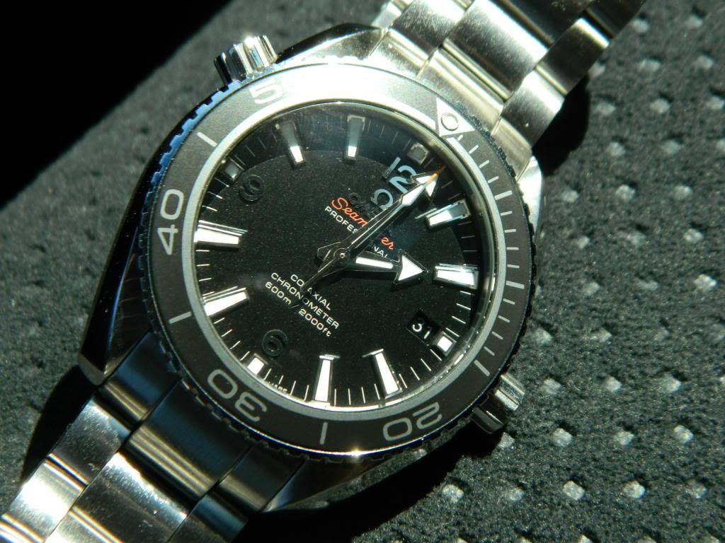
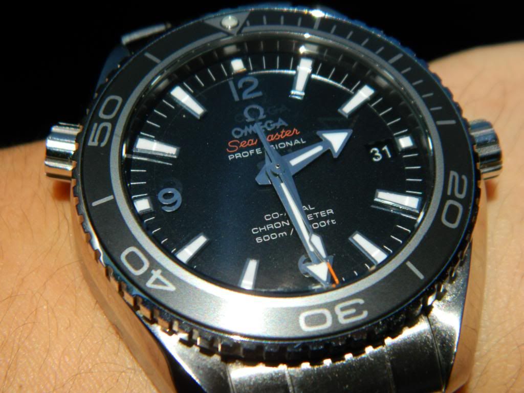
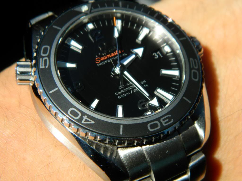
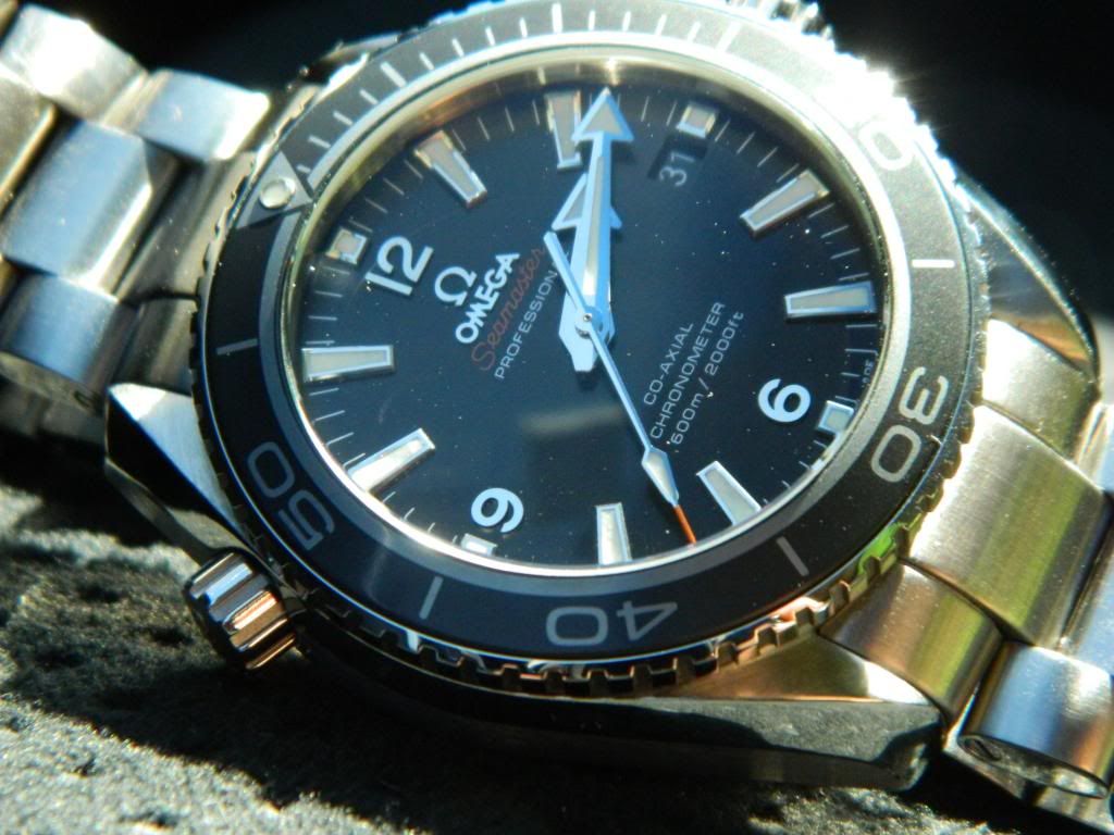
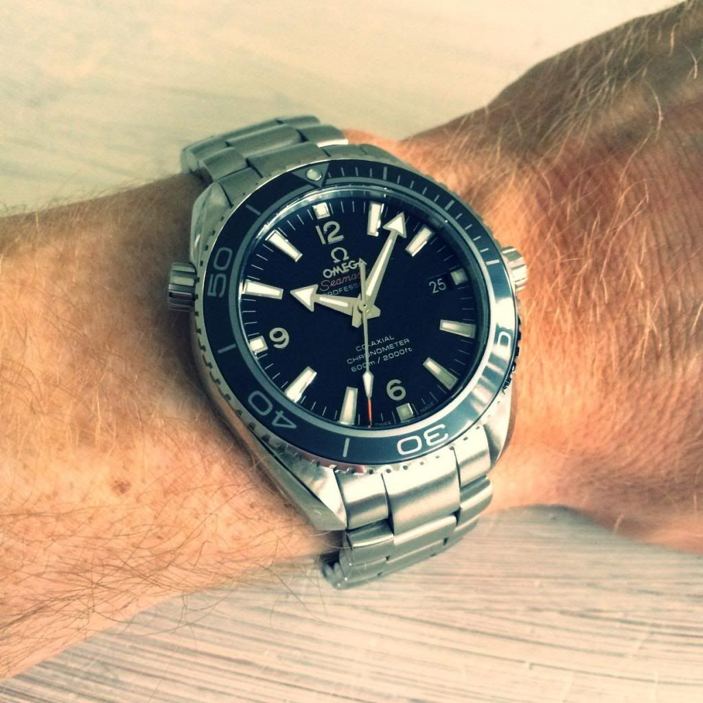
Overall:
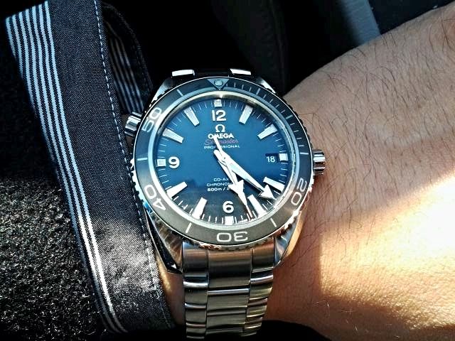
This a superb rep. Except for the obvious movement differences, on the wrist, it is almost indistinguishable from gen. For 350 USD, you get a high-fidelity rep that is also a high quality watch despite the fact that it is a fake.
Crystal:
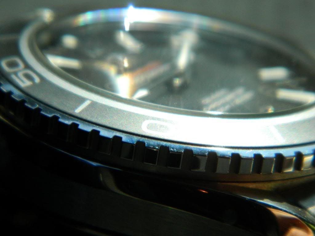
Super AR like everyone says. The pics look hazy because I had just soaked the bracelet in baby oil the night before. Some of the haze, I think, is attributable to stray oil finding its way onto the crystal.
Case:
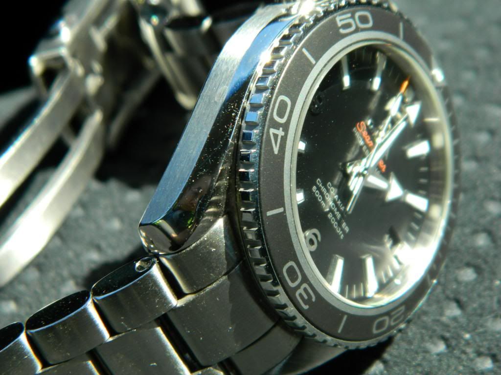
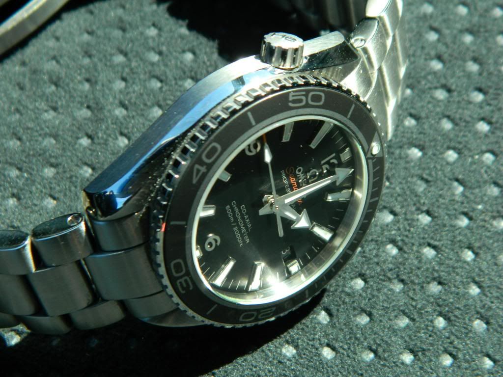
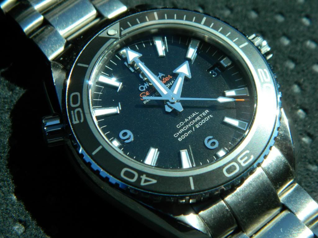
Very well executed and faithful replication of the classic twisted lug case that has come to define Omega’s professional models (i.e. seamaster, PO, speedmaster). Mine had a minor scratch near 2 o’clock. It’s hard to see unless you look for it but it’s there. Rep QC… In Sunnydale’s excellent comparison of the 45.5 gen and rep, he notes that the brushing on the gen appears different whereas the direction of the rep’s case brushing is more pronounced and the gen is less so.
People talk about “gen feelâ€. I’m not really sure what that is. I can say that the quality of the steel seems pretty good in that it does not pick up nicks and scratches easily. Apparently, not all watch steel is created equally. The case and bracelet of an older a7750 SMP chrono rep, for example, was noticeably softer than my other watches. On the other hand, I daily wore a Seiko Sumo for a year and it only has some minor hairlines to show for it. This rep seems to be holding up well so far.
Bezel:
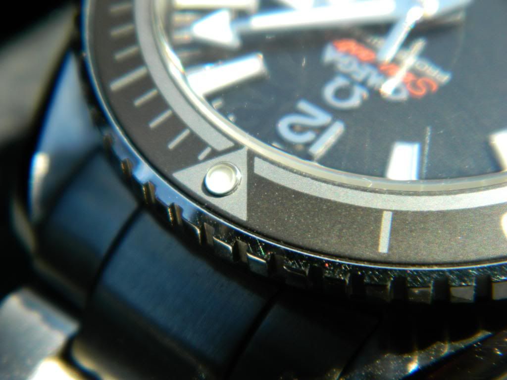
I like this bezel. 120 clicks and each click feels positive with little play. There is tight clearance between the case and bezel which I take as a sign of quality; this one does not make a cheap sound if you tap the bezel with your finger. It clicks through around the dial with uniform resistance. Omega reps have come a long way. I use the timing bezel a lot so the feel of the bezel ratcheting around the case is really important to me. This is a far cry from other diver reps I’ve owned that were either too stiff or too loose, never just right.
That pearl is perfect. Look at the damn pics. Why did it take so long for the factories to make an Omega with a centered pearl? God, v1, v2, v3, v4, v5 and they still couldn’t get it right on the last one.
Crown:
From the factory, the crown teeth had some gunk stuck in the recesses. A quick cleaning with some handsoap and my wife’s toothbrush cleaned that up fine. Just like gen, the crown is signed with a matte background contrasting against the polished Omega logo.
What I like most is the screw down action. Again, Omegas and PO’s have come a long way. Remember the crappy crown and tubes of the pre Cr PO reps? ½ a screw or 1 whole screw if you’re lucky. This is the complete opposite. A good number of full turns to get the crown all the way in. Zero play and on mine I can even feel the crown seating against the rubber gaskets at the bottom. Out of the box, I had no doubts that this thing is waterproof.
Dial:
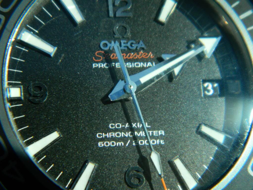
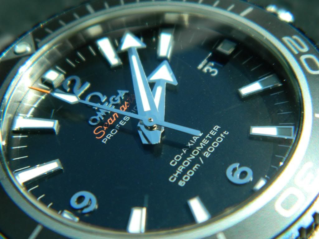
Very close to gen. Dial markers are all pretty straight. Lume is applied evenly. The date cutout is sharp without any distortion to the surface of the dial. Dial print looks very high quality and the font below the stem looks really well done with very glossy, white print that is thickly printed on. No complaints and indistinguishable from gen to me. Some other members have noted the orange “Seamaster†font doesn’t pop as much as the gen.
The hands are also really nice. In the gen Seiko diver range, you need to go all the way up to the beveled hands of the MM300 to get a handset that is more elaborate than simple flat stamped steel. I’m not saying the hands of the noob are anywhere near that nice or 1:1 with the gen. But they are nice for a 350 USD watch. Both have a crease down the middle along the length which flattens out to a plane at their base. Nicely replicated and there are few other affordable watches in the sub 500 USD range with hands as complex and well done.
Datewheel:
Sunnydale notes the font is not quite as bold as gen. I’m sure he’s right since he has the gen to compare it against. Still, the silver font is a step above the BP’s inaccurate white font. Unfortunately on mine, some of the dates sit a bit high in the window. In my pics, the 31[SUP]st[/SUP], today’s date, is luckily one of the well-aligned ones.
Bracelet:
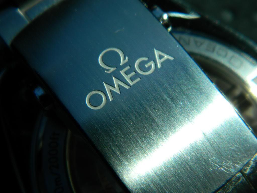
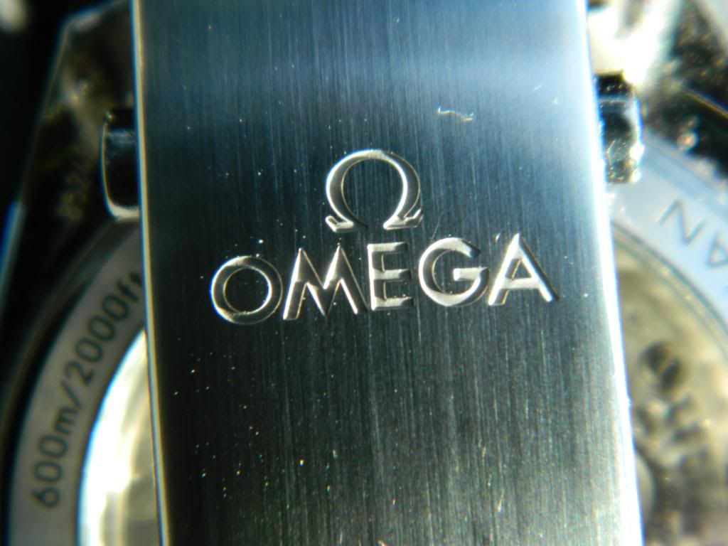
The best. There is universal praise for the screwed links bracelet. It’s better than any watch in its price range ought to be. Members have observed it is indistinguishable from gen. I really like it of course and it feels even better after an overnight soak in baby oil. You’ll see in my photos that the engraving is nice and deep and, just like the case, it seems fairly resistant to scratches.
My only issue with the bracelet, both the gen’s and rep’s, is that there is no micro adjustment but only a single half link for fine tuning. But that’s Omega’s fault not Noob’s.
Lume:
Not bad. Can’t compare to gen but Sunnydale posted the 45.5 is pretty close. I know my gen Seiko divers are much brighter but they also have much bigger hands and markers. Once again, reps have come a long way. My older seamaster had the $hittiest pearl lume and the dial was barely readable at night. The noob is not as bright as the Seikos after a fresh charge but is just as visible in the middle of the night. I had thought about sending it to a modder for a relume but after seeing rep vs gen lume shots, I think I’ll pass. It’s good enough to see the time at 4am so it’s good enough for me.
Movement:
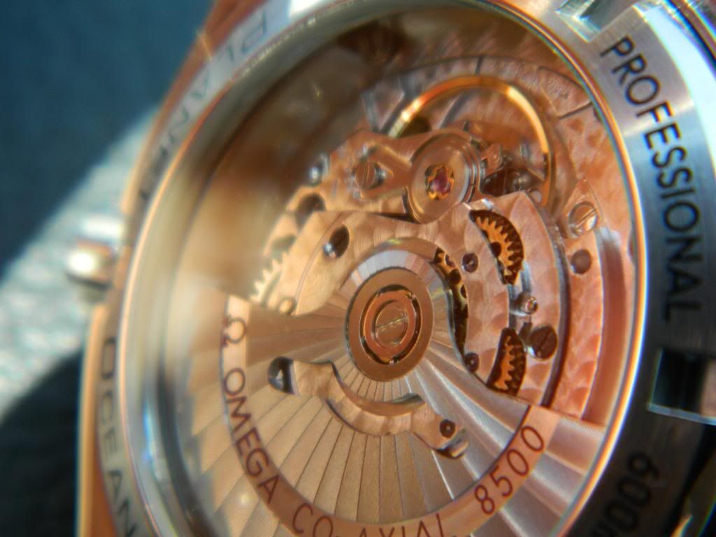
Out of the box, the Seagull ST-21 2824 clone was +15s / day. Not bad but not great. Within the specs for this movement. I cracked it open and twisted the fine adjuster a bit more to the left. It was already adjusted to almost all the way to perpendicular so I could only move it 1 ½ marks more. Now, it’s about +10. I think I’ll leave it at that because getting any closer will involve removing the rotor and bridge in order to push the coarse regulator arm. What do you guys think? Leave it as is or try to get within COSC?
Tells:
Not many. I like to nitpick, that’s what brings all of us here, isn’t it? So I will:
- Bezel ring is too thick vs gen
- Date wheel font not bold enough
- Seamaster font is wrong shade of orange
- Under a loupe, there are minor imperfections in the insert print
- Not all dial markers are perfectly straight
- Movement, duh
In closing, if you’re on the fence, don’t be. It’s so well executed that I wonder why noob can’t get their $hit together and make a convincing sub C, but I digress. This is a fine watch and worth purchasing even if noob didn’t put Omega on the dial and were selling an homage instead.
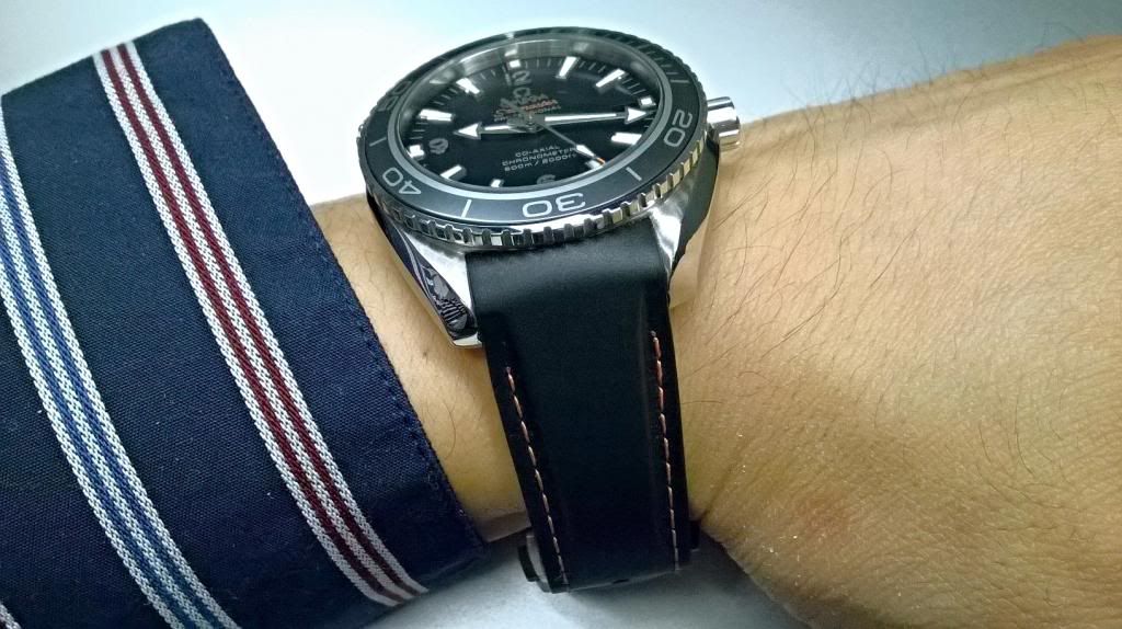
Finally, a parting shot on the BP rubber and a cell phone wristie. Thanks for reading.
