Subjectively, I feel that this watch deserves to be given a community review treatment. I have seen that the IWC St Exupery has been covered pretty well in the first community review. Before I begin, I would like to highlight the point that you may add to this review and edit this review.
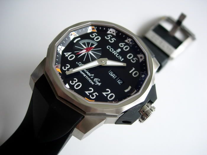
Let's start with full specifications of this watch:
Name: Corum Admiral's Cup Competition 48
Dial Colour: Dark Blue or Black (2 choices only for the moment)
Movement: Asian 7750 (disabled chronograph module), hi beat rate (28 800bph)
Crystal: Sapphire with single side AR coating.
Longest length on the crystal: ~40mm
Case Material: Titanium
Case Size: ~48mm
Caseback: Titanium, polished Titanium (for the cup).
Strap: Only in rubber (at the moment).
Strap size: 24/24 Effective length: 125/85
Buckle: Tongue Buckle, Titanium
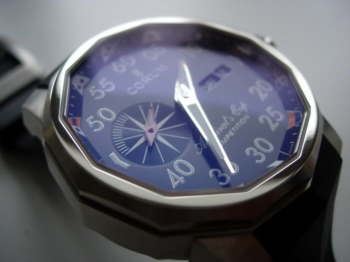
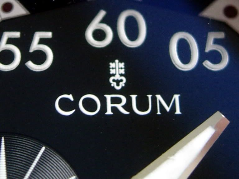
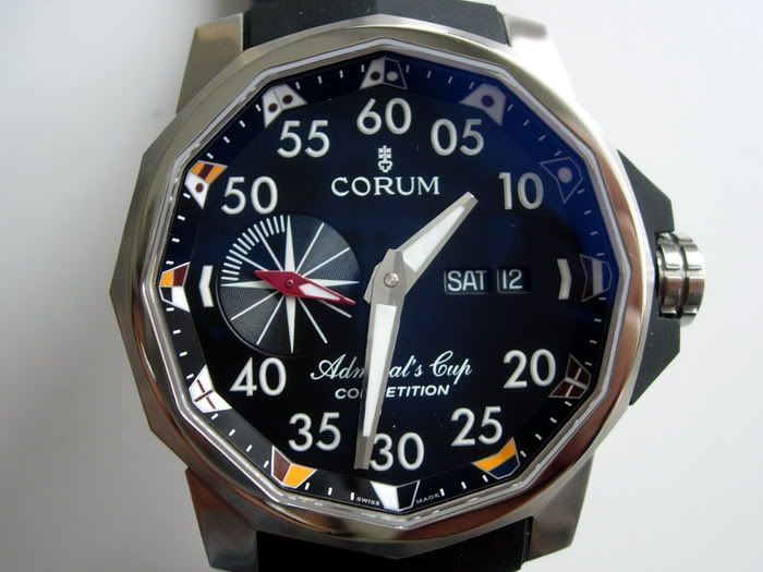
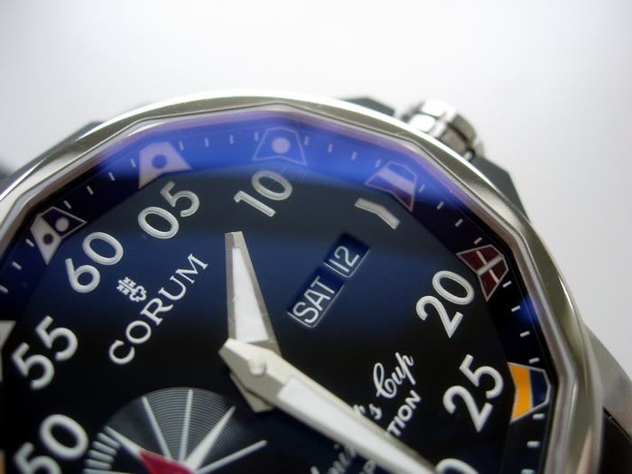
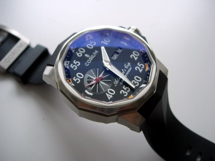
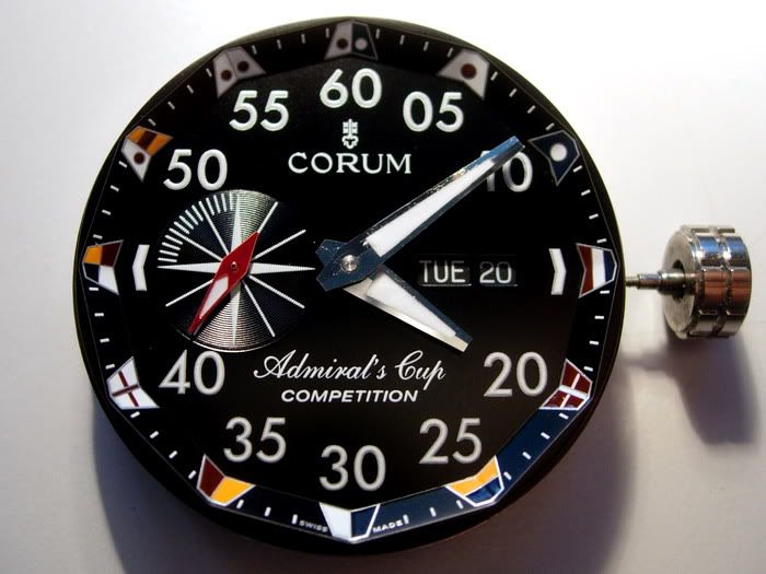
A few pictures of the watch:
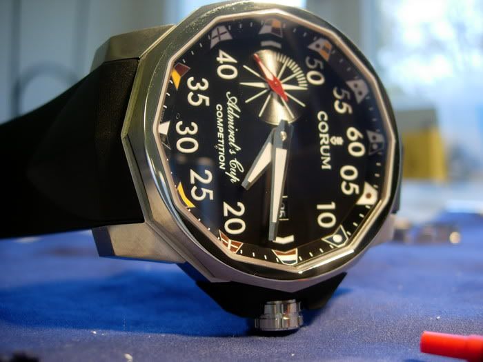
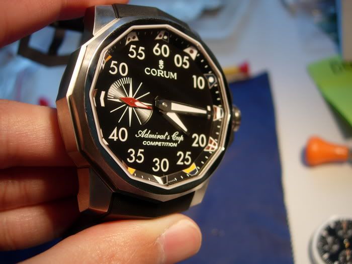
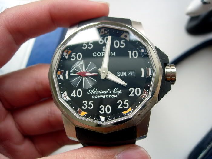
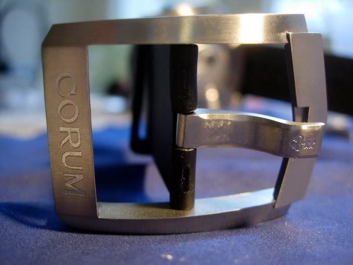
In general, this watch is well built. It has a genuine watch feeling in almost every parts. Case, caseback and buckle are machined properly, giving them sharp appearance. Usually, a replica is associated with rough and sharp edges which may cause discomfort or injuries to the wearer. This is certainly not the case in this replica watch.
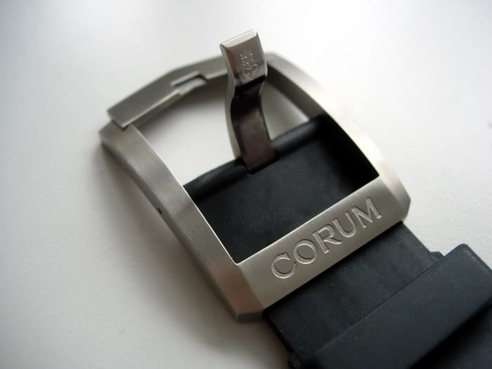
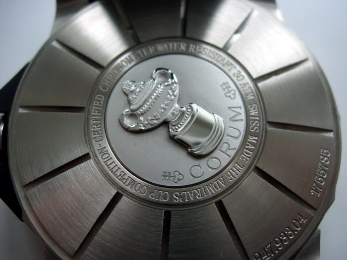
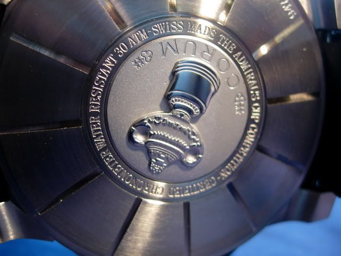
Pictures of the caseback as well as the buckle:
Many people are concerned about the size of this watch (being labeled 48mm, it's certainly not a small watch). Rest assured, if you have a wrist size of 7" and larger, it should be OK. This is again very subjective. This is how the watch looks like on my wrist (6,5"):
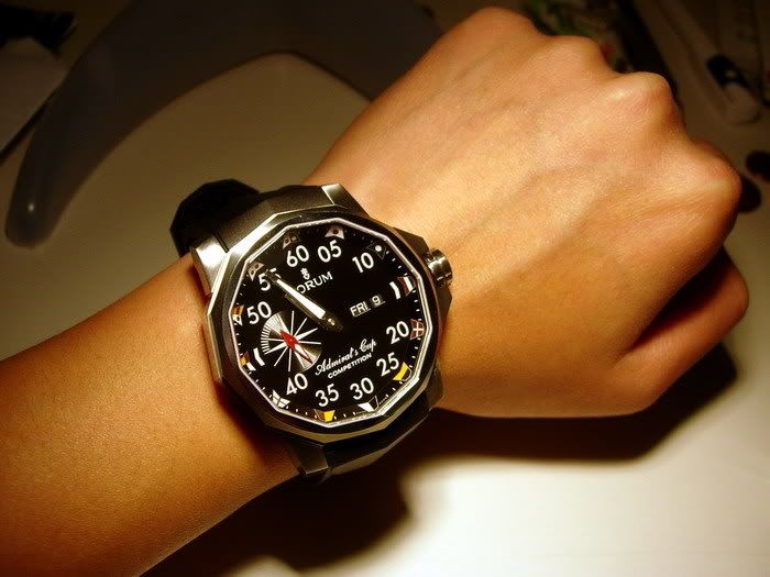
Sure it looks huge but I will definitely still wear it (unlike 47mm PAM127.. I just don't feel right wearing it on my wrist).
.....
For the moment, as compared the the genuine article, caseback looks spot on. The most obvious flaw which I can tell is the date and day font. It is incorrect on the replica. Unfortunately, ETA date/daywheel swap will not rectify this flaw. The genuine seems to use it's own date and day wheel font. Just as a side note, the font on the genuine looks exactly just like the numbers on the dial. Secondly, the genuine article clearly has double side AR coated crystal.
Initially I thought polished SS colour on the crown is wrong but it has been proven otherwise.
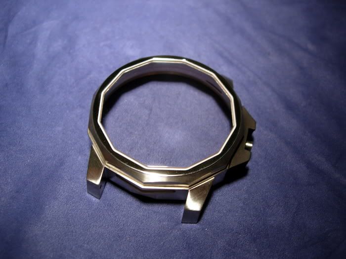
Here is the case of this watch. Very big:
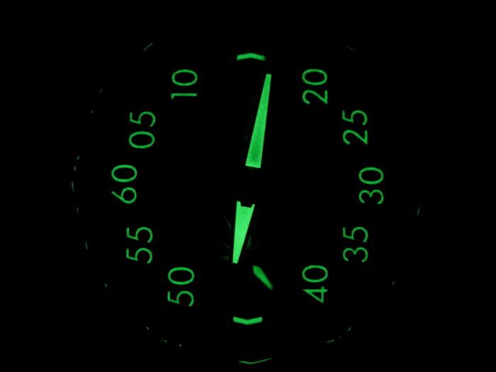
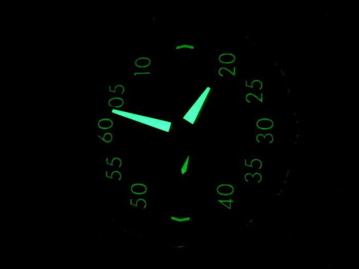
Lume comparison on the replica vs relumed hour and minute hands (C1 Superluminova).
Lastly, a picture which I just took a while ago, showing that day and datewheel in ETA font.
Let's start with full specifications of this watch:
Name: Corum Admiral's Cup Competition 48
Dial Colour: Dark Blue or Black (2 choices only for the moment)
Movement: Asian 7750 (disabled chronograph module), hi beat rate (28 800bph)
Crystal: Sapphire with single side AR coating.
Longest length on the crystal: ~40mm
Case Material: Titanium
Case Size: ~48mm
Caseback: Titanium, polished Titanium (for the cup).
Strap: Only in rubber (at the moment).
Strap size: 24/24 Effective length: 125/85
Buckle: Tongue Buckle, Titanium
A few pictures of the watch:
In general, this watch is well built. It has a genuine watch feeling in almost every parts. Case, caseback and buckle are machined properly, giving them sharp appearance. Usually, a replica is associated with rough and sharp edges which may cause discomfort or injuries to the wearer. This is certainly not the case in this replica watch.
Pictures of the caseback as well as the buckle:
Many people are concerned about the size of this watch (being labeled 48mm, it's certainly not a small watch). Rest assured, if you have a wrist size of 7" and larger, it should be OK. This is again very subjective. This is how the watch looks like on my wrist (6,5"):
Sure it looks huge but I will definitely still wear it (unlike 47mm PAM127.. I just don't feel right wearing it on my wrist).
.....
For the moment, as compared the the genuine article, caseback looks spot on. The most obvious flaw which I can tell is the date and day font. It is incorrect on the replica. Unfortunately, ETA date/daywheel swap will not rectify this flaw. The genuine seems to use it's own date and day wheel font. Just as a side note, the font on the genuine looks exactly just like the numbers on the dial. Secondly, the genuine article clearly has double side AR coated crystal.
Initially I thought polished SS colour on the crown is wrong but it has been proven otherwise.
Here is the case of this watch. Very big:
Lume comparison on the replica vs relumed hour and minute hands (C1 Superluminova).
Lastly, a picture which I just took a while ago, showing that day and datewheel in ETA font.