- 18/3/13
- 2,912
- 23
- 0
Big Review of the IWC 3789 Top Gun + ADDON
Hi RWI People
So i find a little bit Time on the easter Days to Present you an Review of the IWC 3789 Top Gun...
I know there was some Threads already, but the most of them wasn´t really Complete in my Eyes")
And there was some Infos missing...
But ok enought about the Blah blah i hope you guys enjoy it...
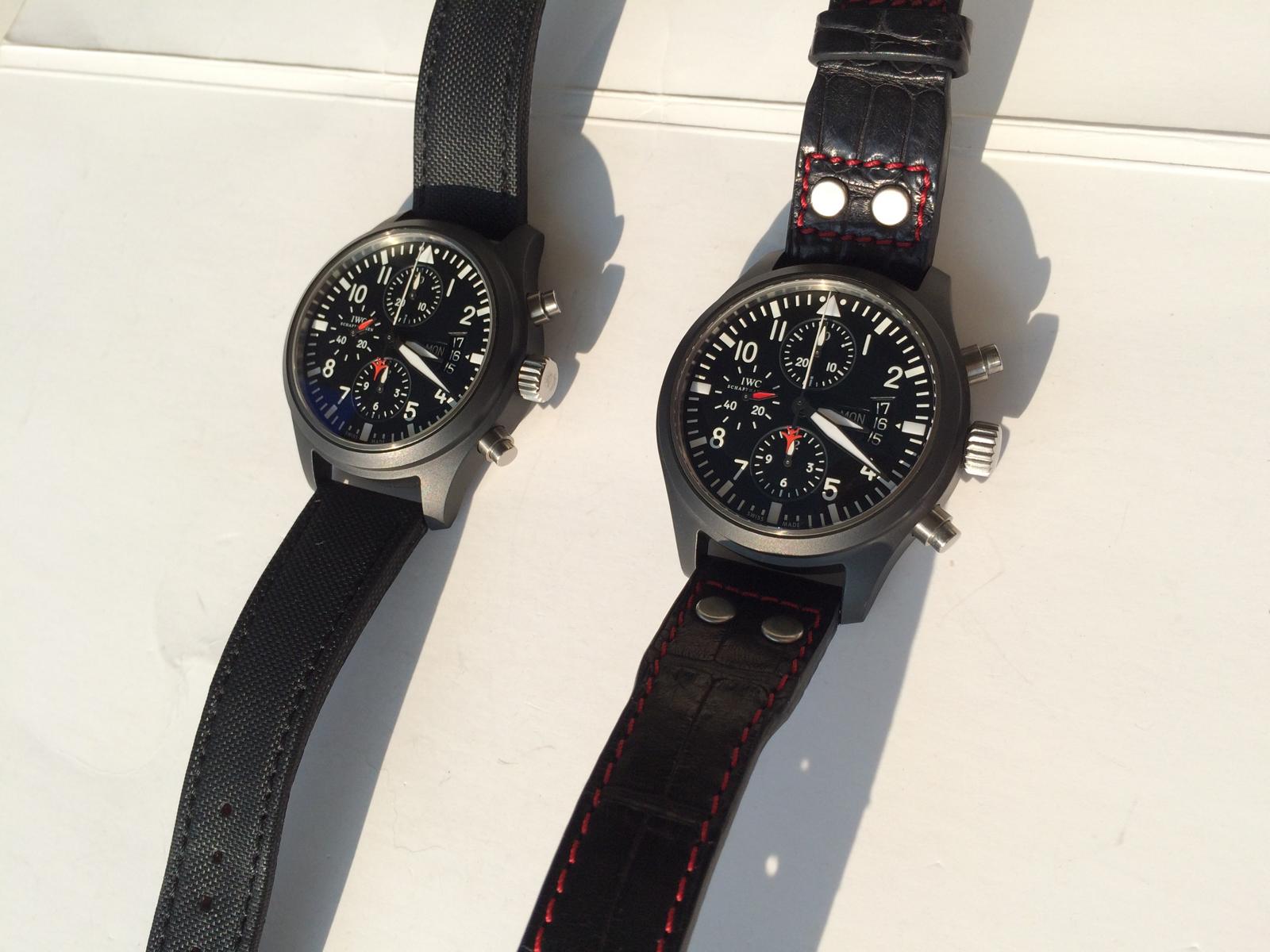
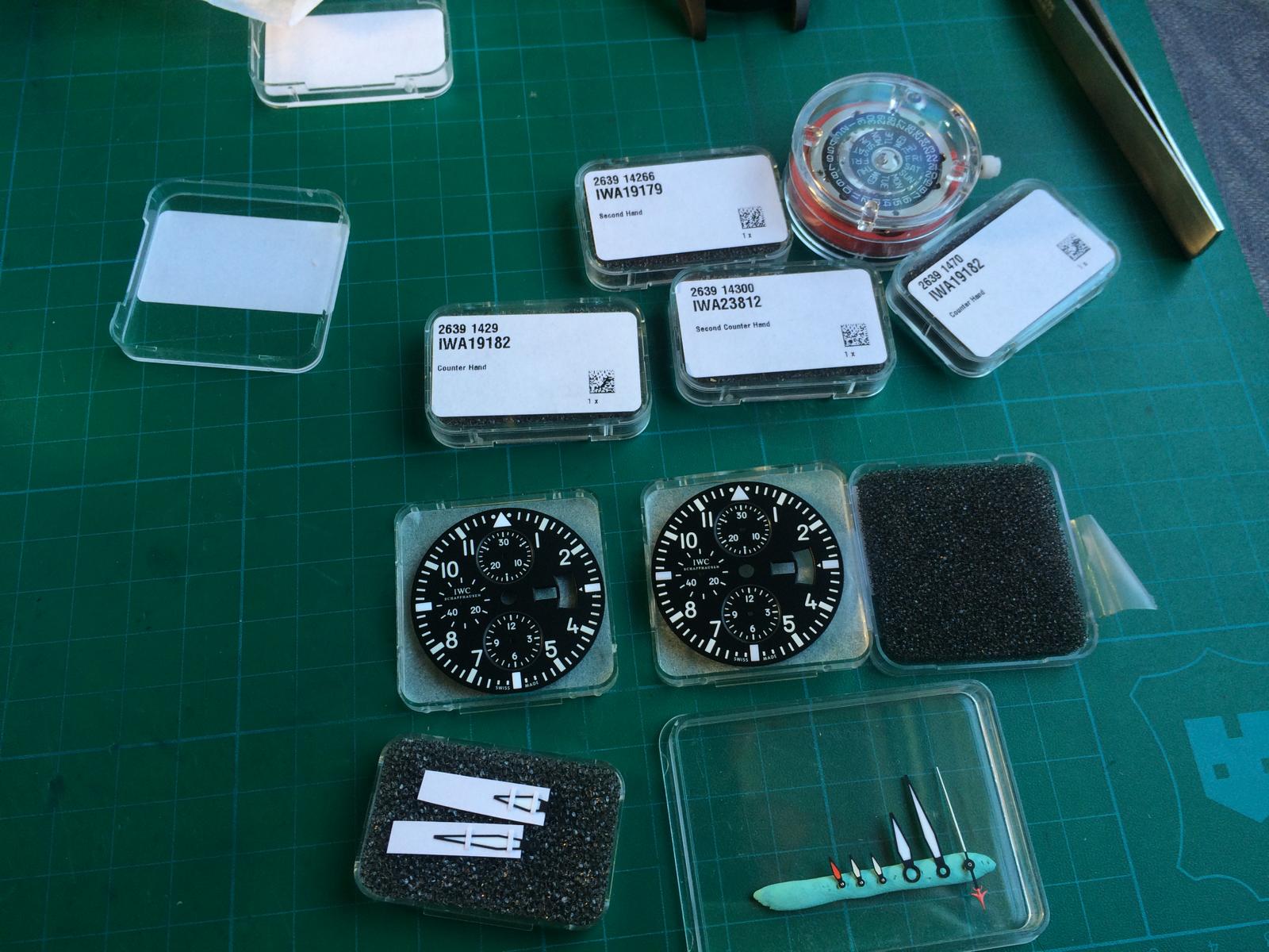
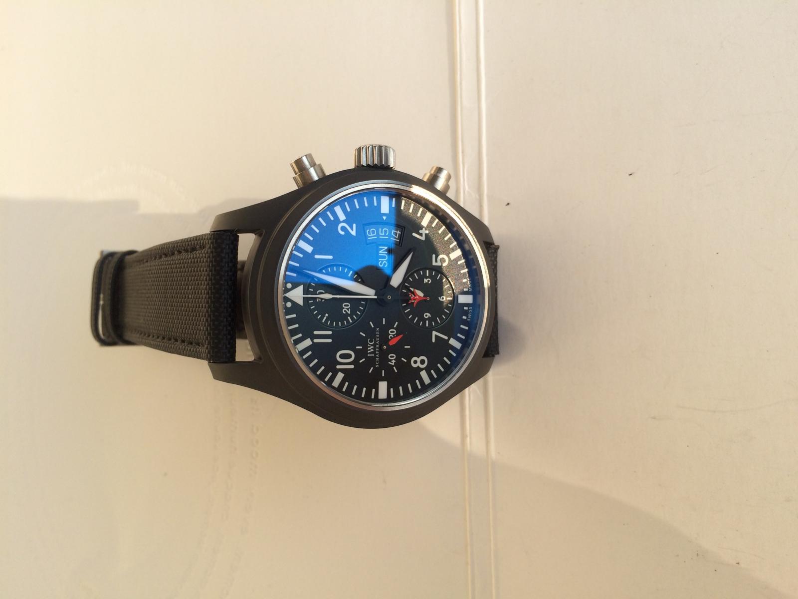
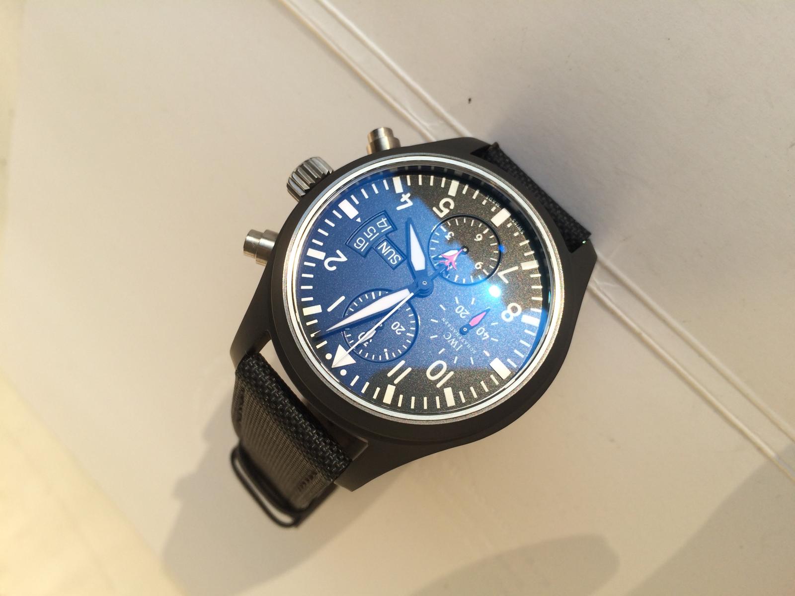
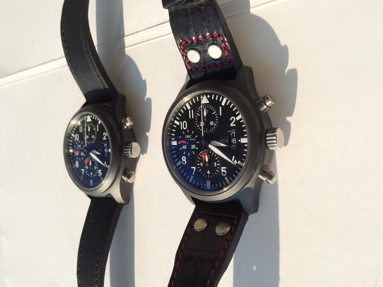
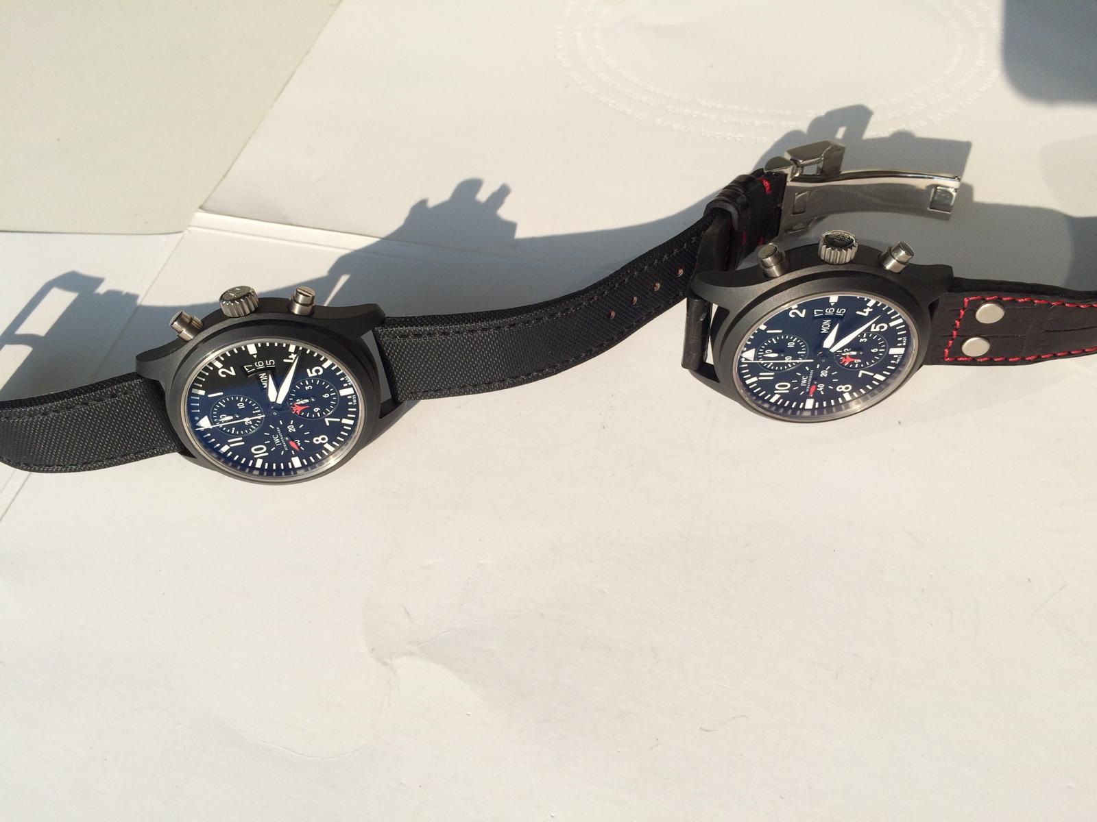
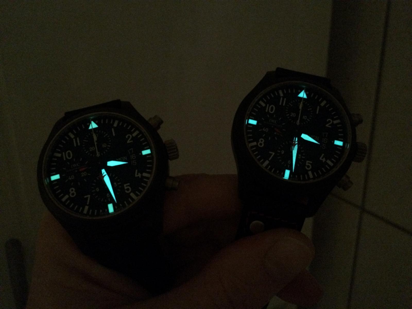
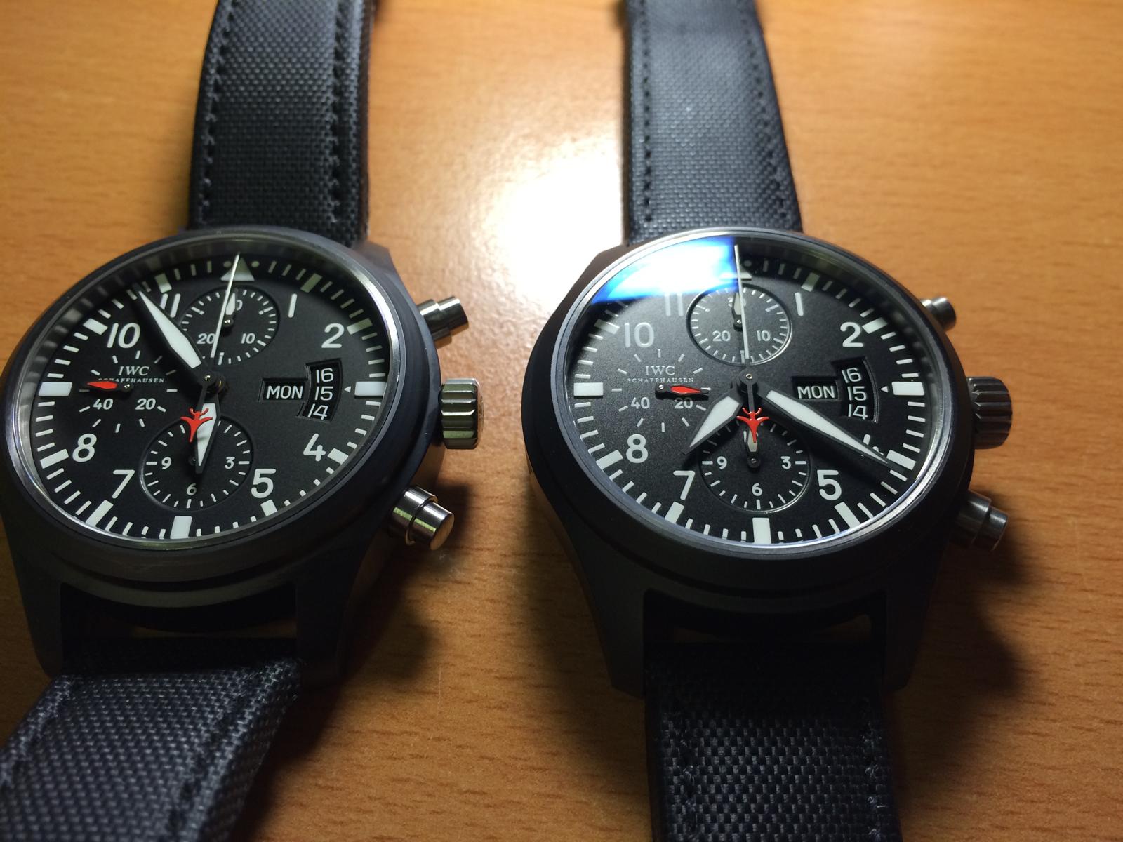
Ok let us take an Look at these what i have done for an nice Member and good Friend here on the Forum
Left my Own and right Customer Franken...
Are they not Beautiful?!??
But ok let us take an Look not to the Complete Watch only
Let us Start from Top to Bottom.
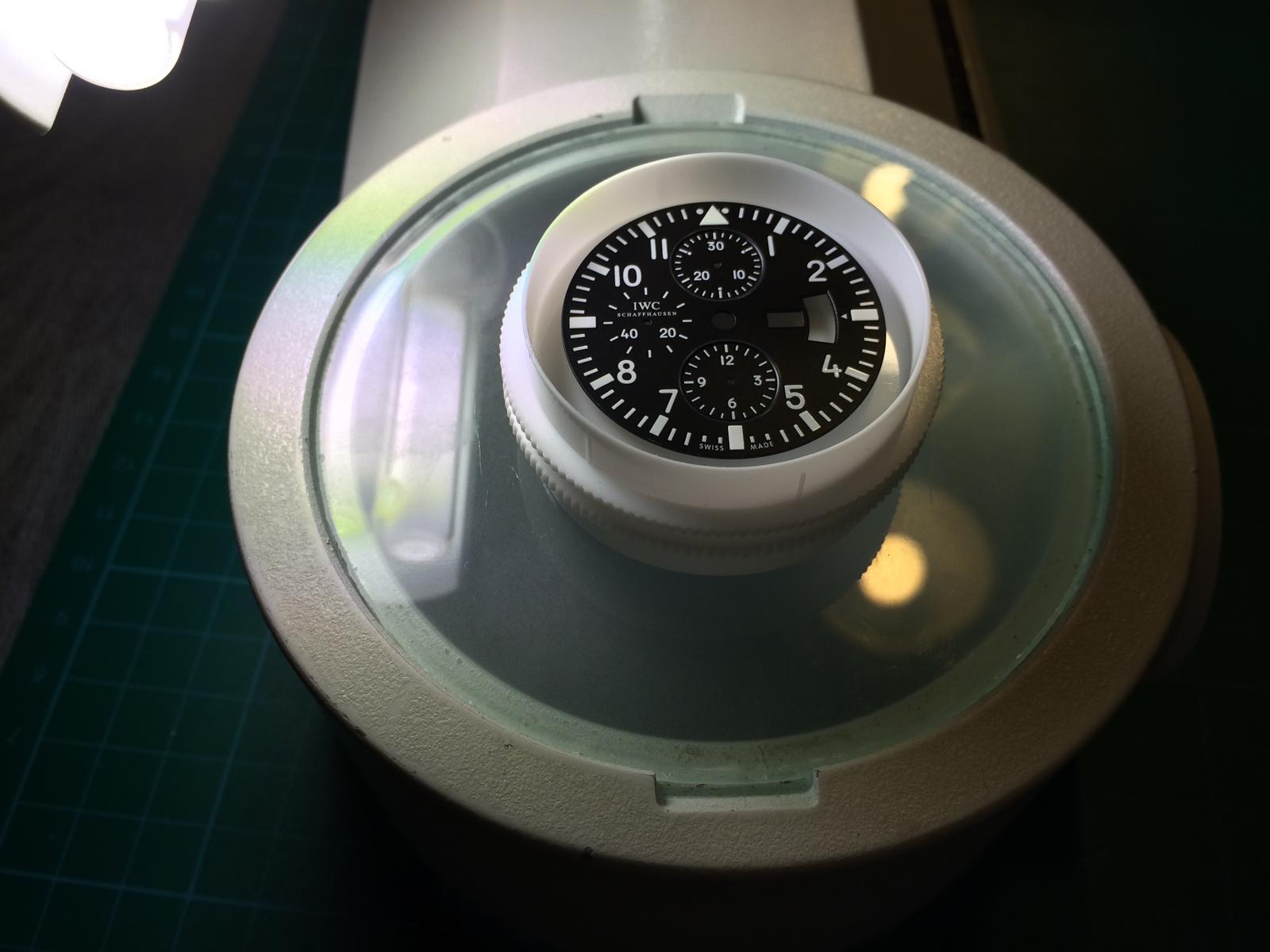
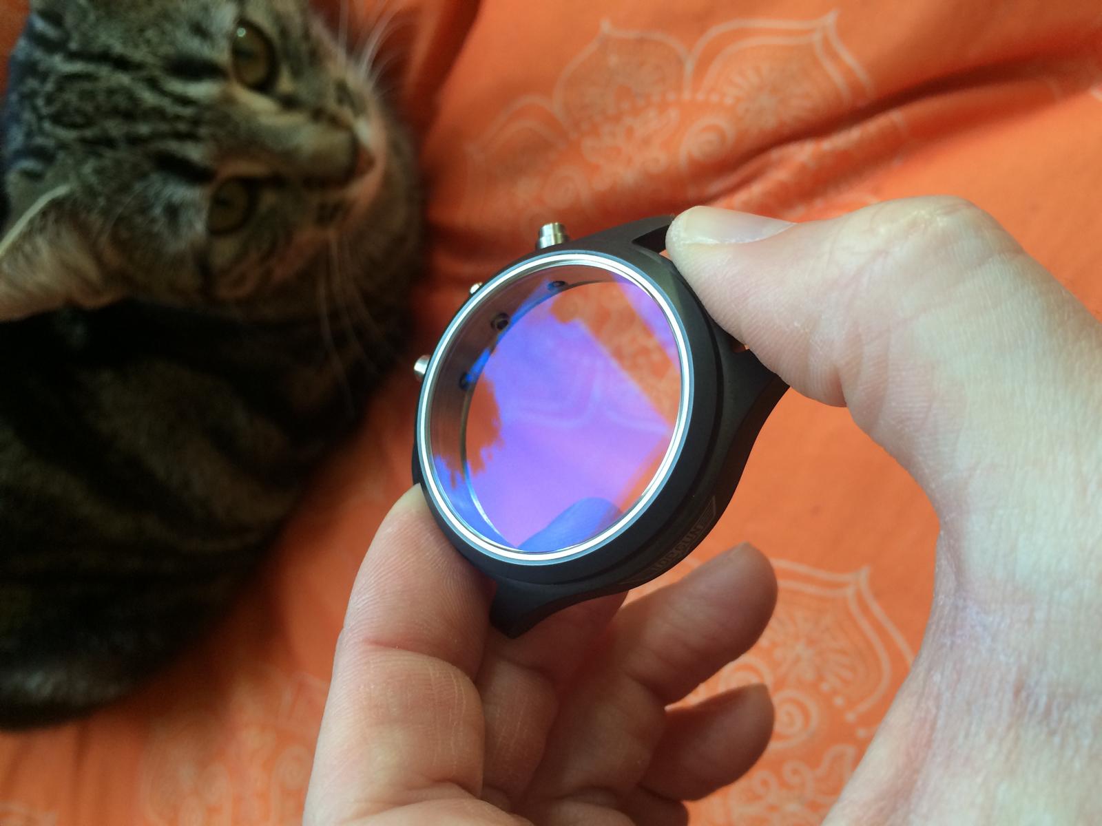
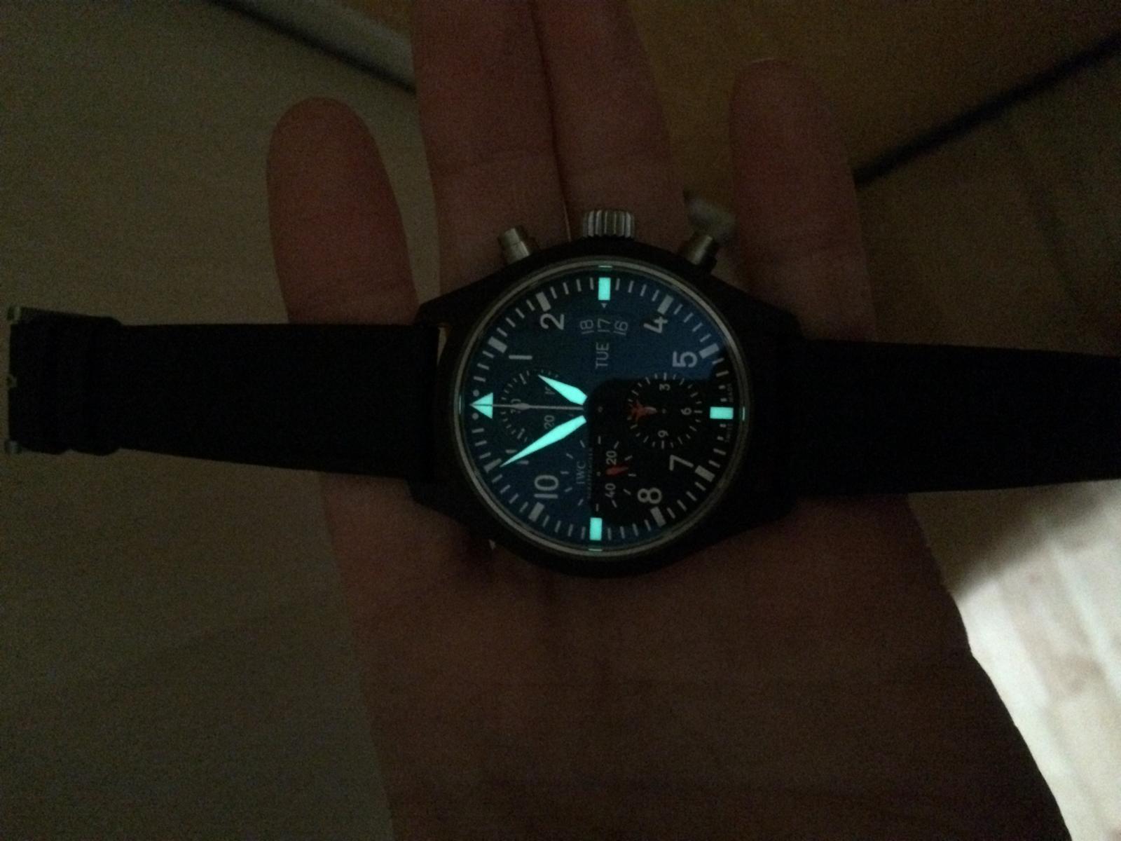
CRYSTAL:
Ok unfortunately I gave the Rep Crystal away, before I photographed it.
Therefore, you must believe me just as
So the Installed Crystals in the Franken are GEN Crystals.
I Compared them before, and i must say the Rep Crystal are not Bad but the AR isn´t soooo good as the GEN.
The GEN Crystal has an much Harder AR and the Saphir Edge of the GEN is much better.
The GEN AR has an nice Blueish Tint that gives the Dial an Special look.
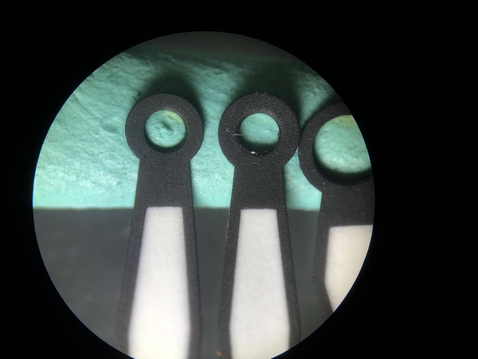
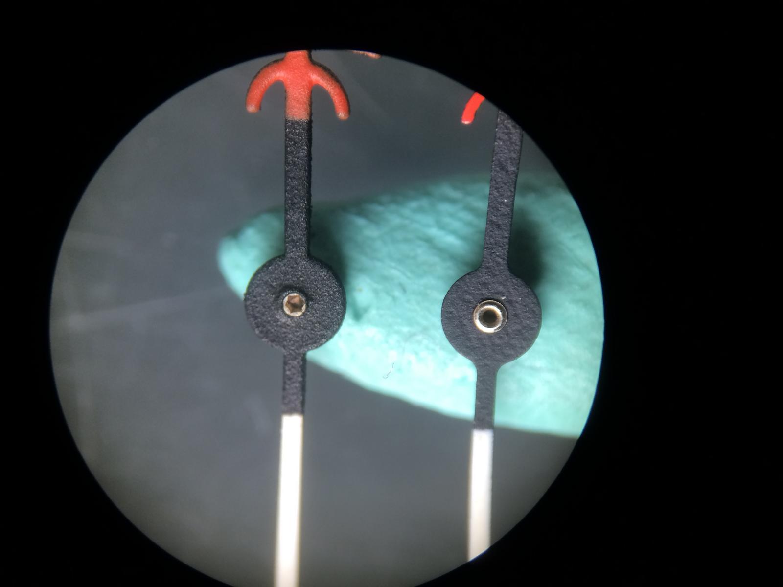
HANDS:
There are 2 Batches of GEN Hands out from IWC for the Ref.3789
The different is only visible on the Counter Hands and the Second Counter Hand
The Old Batch you will see in my Own Watch has an more light Red and the White isn´t Glossy Painted.
The Newer Batch has an more intensive Red and the White is Glossy.
So the Big difference between GEN and Rep is the total Quailtät.
You´ll see it in the Pics.
Some still claim that the Second Counter Hand is bent at the top, that is only at the Rep Hands so.
The GEN Hands have no Bent.
The 2nd Point on the Second Counter Hand is the Plane Logo, the GEN isn´t so far Painted Red.
The pointer shot pin on the GEN Hands are also much better.
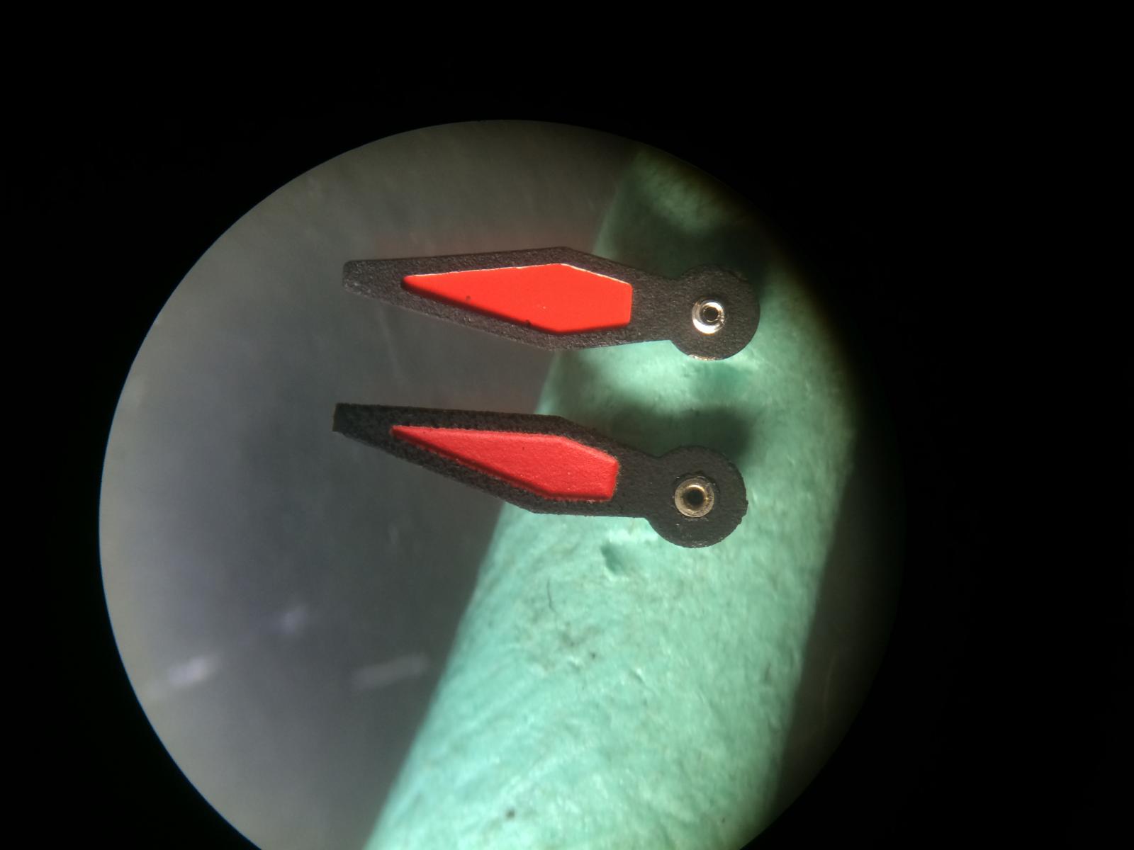
Ok let us come to the Pics
This is the OLD Batch set (My Own)
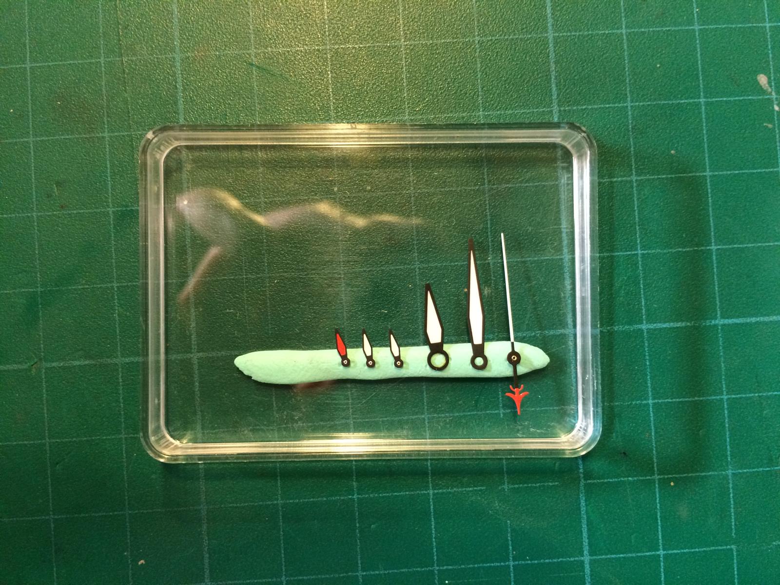
The Red on the Counter Hand have the same Color as the Plane
The White is here Matt
See the Texture it´s very nice and no Rough Parts
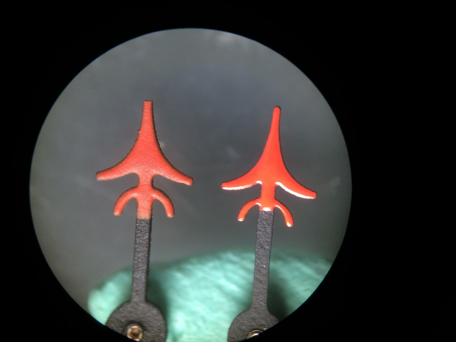
Here we see the Plane is only Colored Red a little over the End
Here you see the Point Shot Pin looks much better as on the Rep
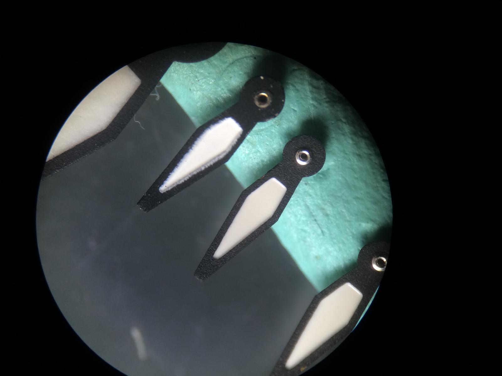
Ok let us Compare the GEN Hands vs the Rep Hands v6
I think i didn´t need much to say.
Here we see the GEN Minute Hand, that there is no Bent on the Hand.
And that is not only at my GEN Hands it was or is also on the the Customers GEN Hand.
Here we see the Rep Hand
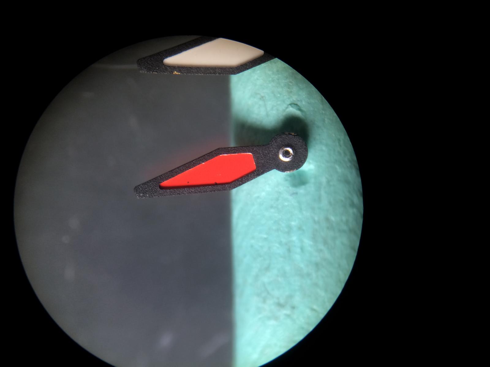
Here we see the Second Counter Hand, the overall Quailty on the GEN is much better.
Also the Airplane looks better.
The Color is Close.
Any Questions?
The Tip of the Second Counter Hand on the GEN is much nicer
Ok let us Compare the GEN Hands vs the Rep Hands v1
We see the Red on the Counter Hand is Darker on the Old Rep Hands
The White isn´t Painted sooooo nice on the v1 Hands
The Airplane on the Old Rep Hands is smaller at the End and so much closer to the GEN
The Red is the same as on the v6
The Texture and the Pointer Shot Pin isn´t really nice but ok.
The Tip of the v1 Second Counter Hand is also smaller and closer to the GEN

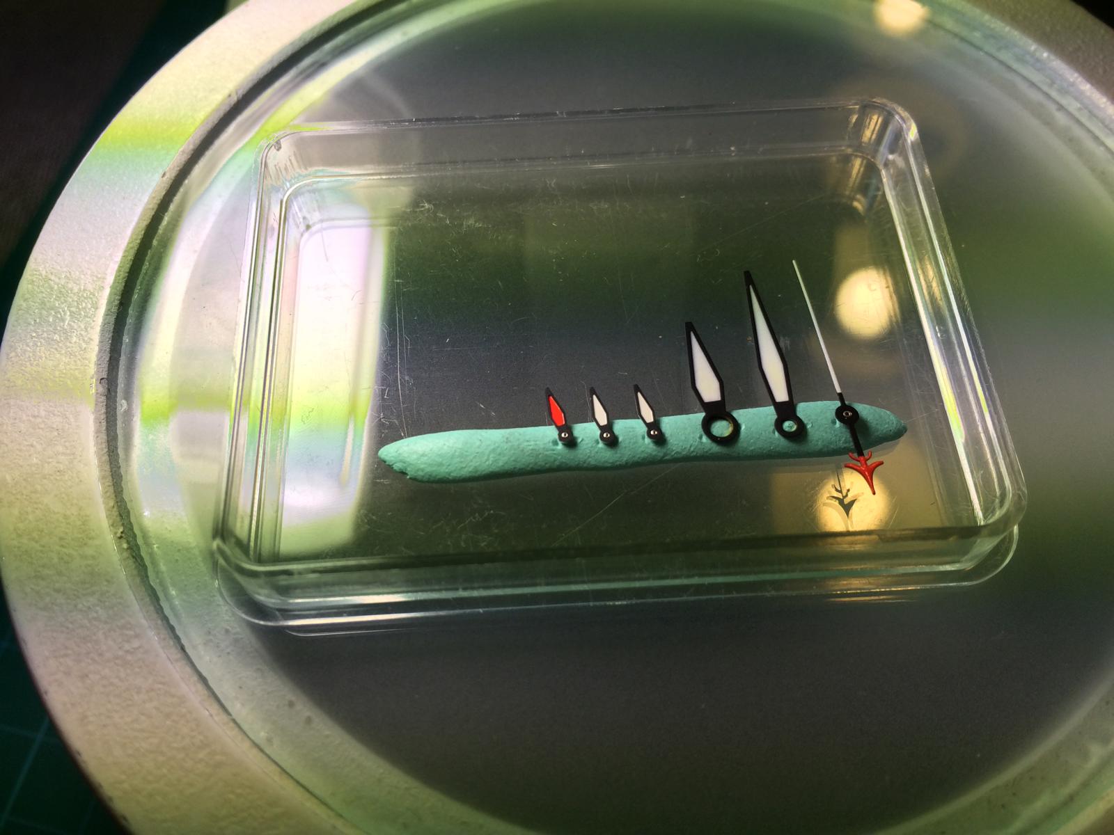
So here we have an Comparision btw GEN Old Batch and the New Batch
The Red of the Newer Batch is Darker
In the Macro with much Light you´ll see no big different in the Color
But from the distance you see it clear.
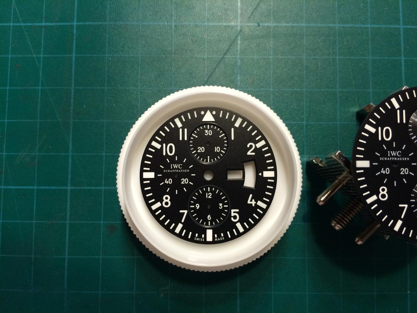
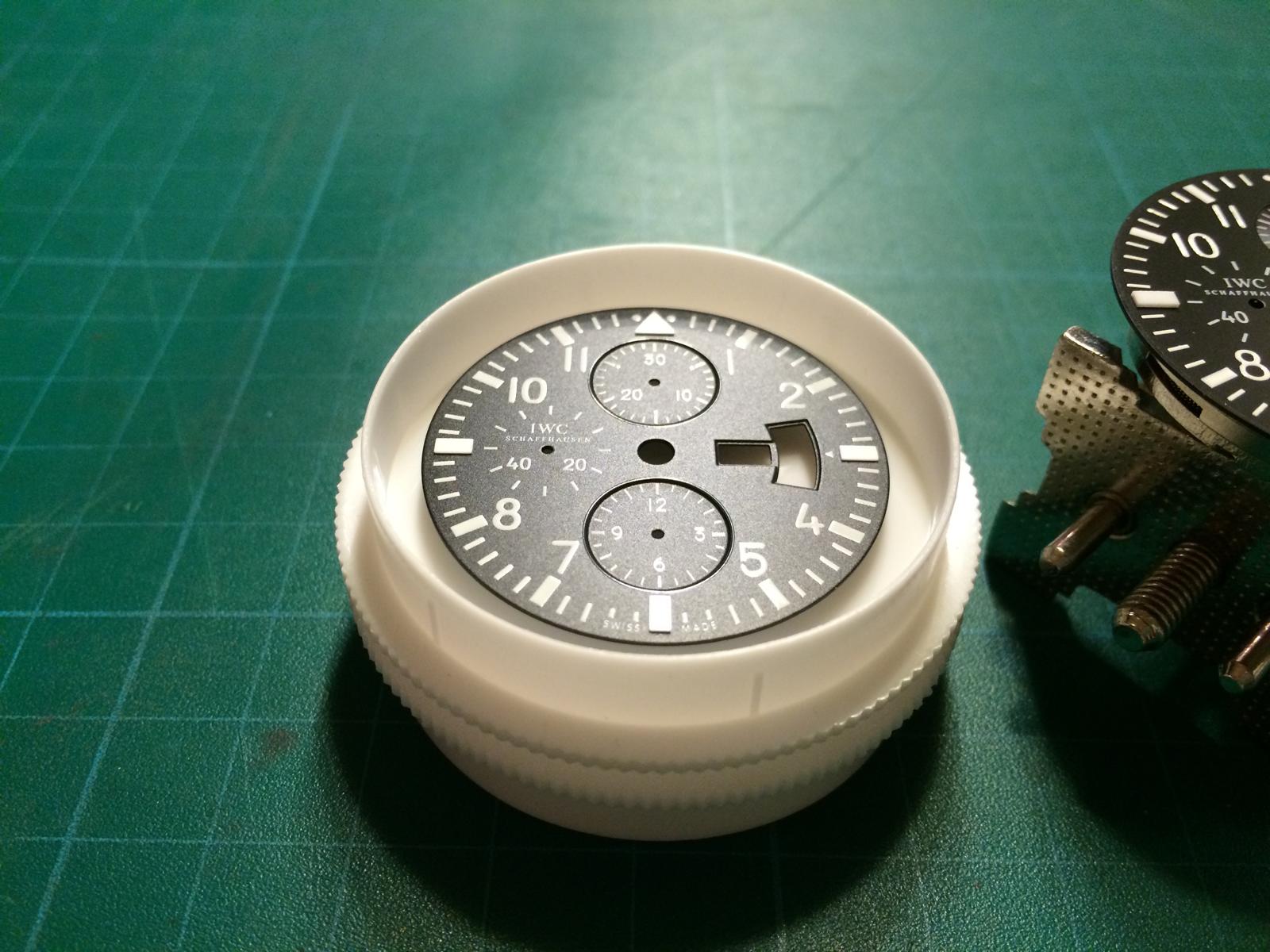
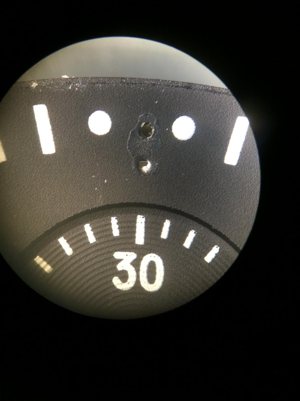
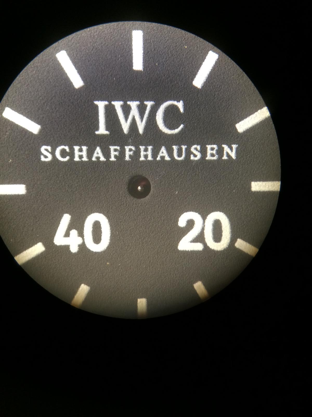
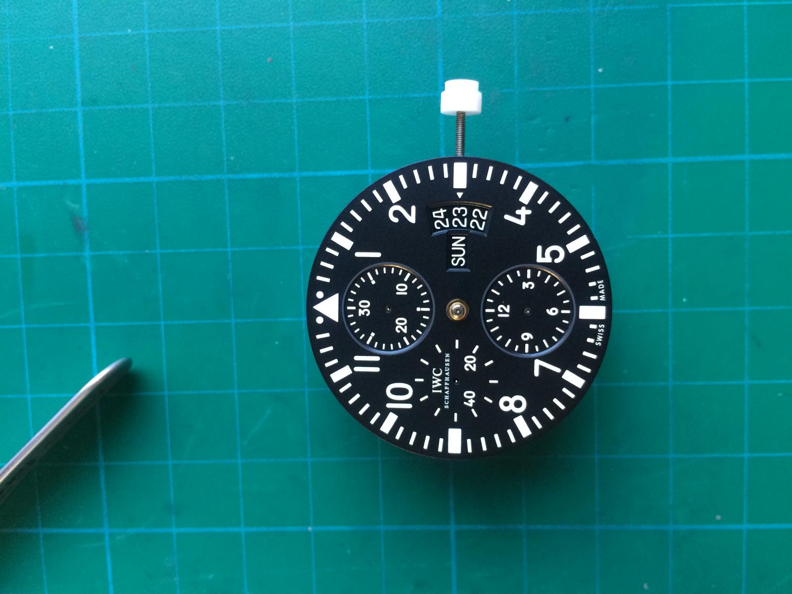
DIAL:
Ok there are 2 Rep Dials out
but only 1 GEN and on the GEN there is no different in Older or Newer Batches
But Ok let us check the Different Dials.
From Left to the Right
GEN , V6 , V1/V2
At the first look we see 3 different Dials
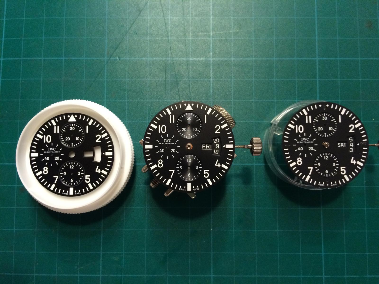
Ok the GEN Dial has a very nice overall Quality
The Main different that is really good visible is the Grey Rings around the Chronos
The v6 looks at the first look not Bad, but the Grey Rings around the Chronos are not there.
Also the Subrings in the Chronos are really hard visible
The v1/v2 Dial both are the same, looks too Matt but the the Chronos looks a little better
because they Colored the Rings Glossy Black.
SORRY for the missing Lume Dots!
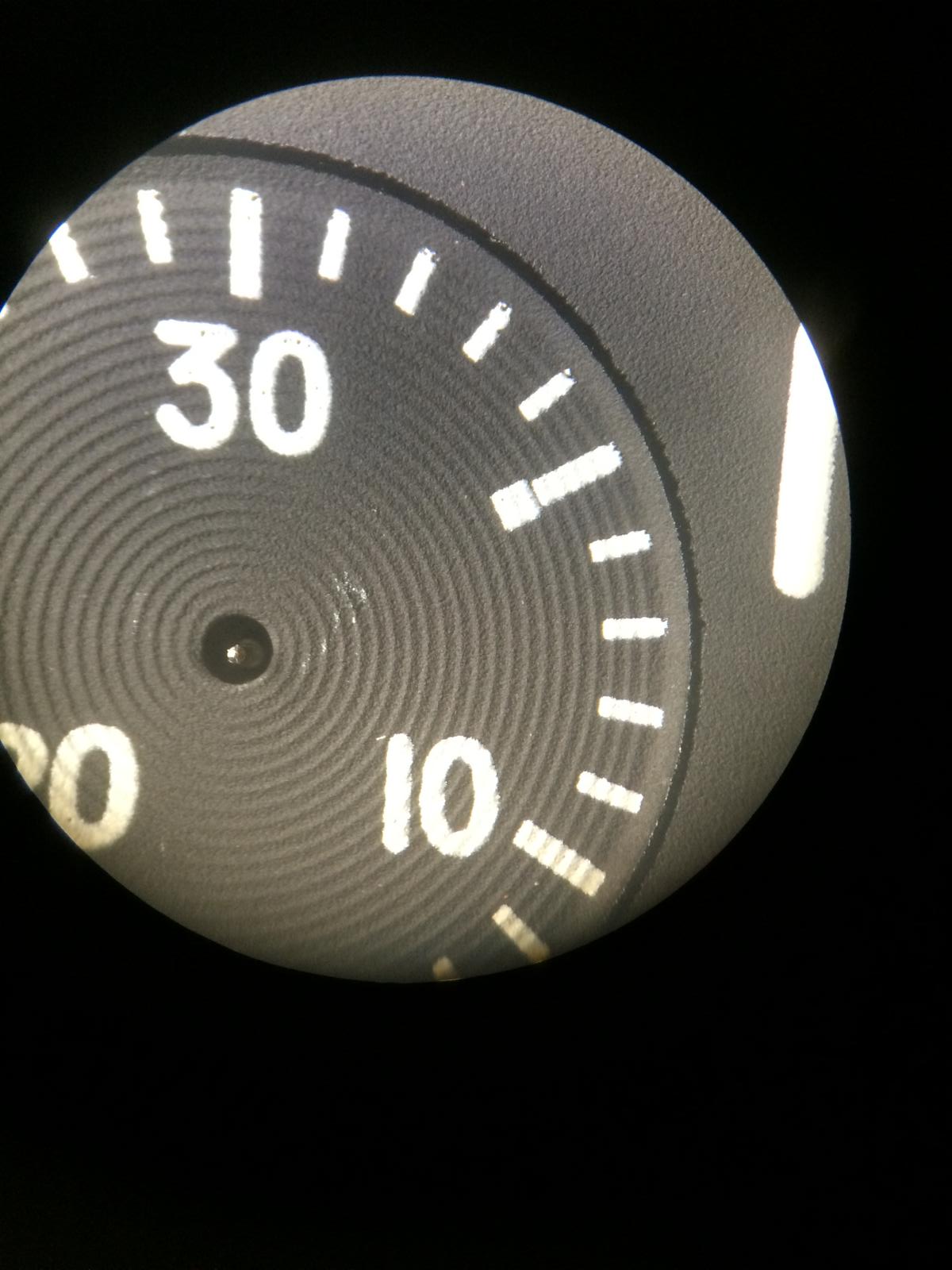
Ok let us take an look at the Dials from the Side
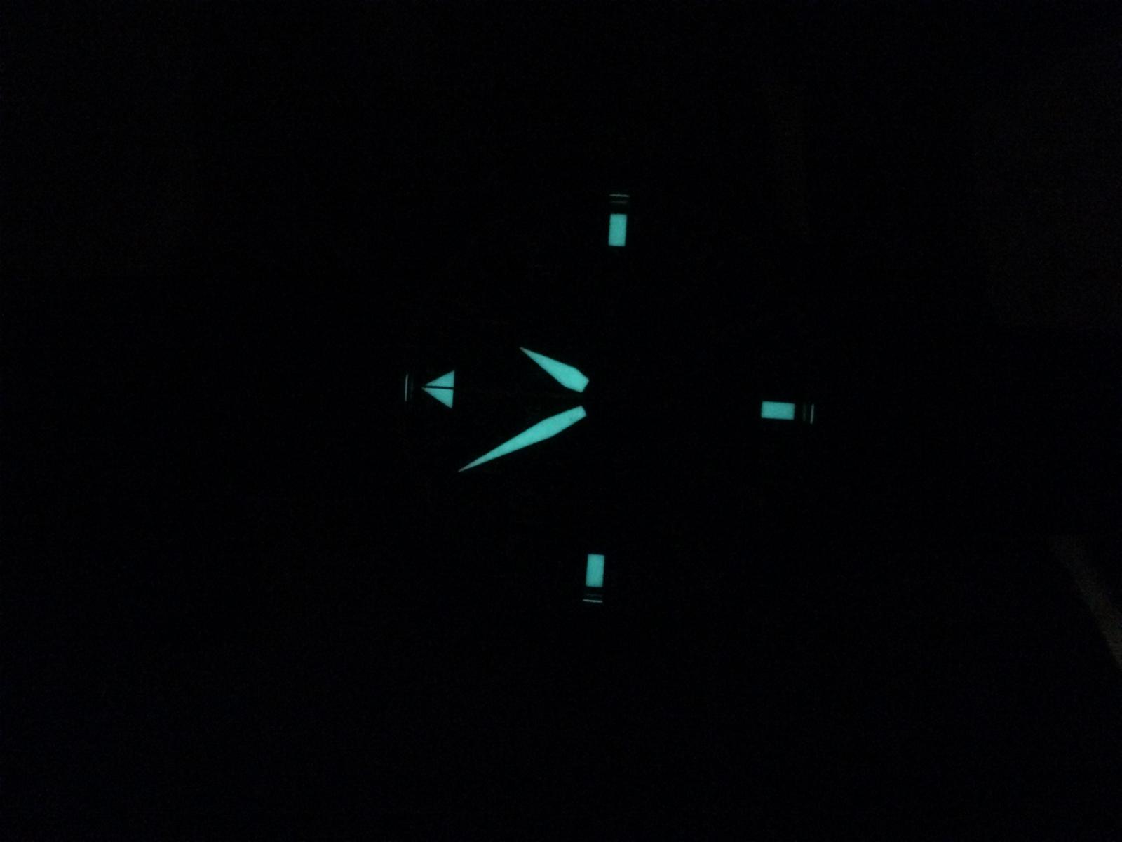
The Gen Dial has an nice Glossy Texture and really Flat Lume Dots
The v6 Dial has also an Glossy Texture but it looks a little more Matt
We see also very good the SubRings on the Chronos
The Lume Dots are same as on the v1/2 etc it looks like LEGO Stones Especial the Triangle
The v1/v2 Dial is Dark Matt in the Texture and it looks like an Rubber Texture.
The Lume Dots are not on, on this Dial but looks same as on the v6
The Chronos have the same Structure as the GEN
So let us take an closer look at the Dial under Microscope
We start with the GEN
First we see the nice Texture that looks like an Sandpaper
The Triangle is very nice cutted
We also see the Grey Ring that is around the Chronos
The Print on the Dial is very nice and even
If we look right on the Chrono we´ll see the SubRings but they are not soooo strong as on the Rep
The IWC Logo looks also very nice
Looks at this Texture
The Lume Squares looks also very nice and Flat
Ok let us take an Closer look to the v6 Dial
We see the Texture of the v6 isn´t Bad and looks very close.
The Triangle is also nice cutted but it´s much thicker as the GEN
The GreyRing around the Chronos is missing
The Print isn´t soooo nice as on the GEN but it´s more then ok
The SubRings are very strong.
The IWC Logo Print isn´t soooo nice and sharp as on the GEN but also ok
The Texture is close but different
The Lume Squares are the same as the Triangle too thick.
Print is overall not soooo sharp as on the GEN
And the Closer look to the v1/v2 Dial
We see the Texture is totally Matt
The Black Paint is only inside the Chrono
Ok the Triangle is missing but it is the same as on the v6 too Thick
Here we see the Black Ring again
The Print is on that Dial also not soooo nice.
We see also the SubRings in the Chronos
The IWC Logo Print is very unsharp i think i don´t need much to say
The Texture is totally wrong
The Print here is also very unsharp
Lume Dots are same as on the v6
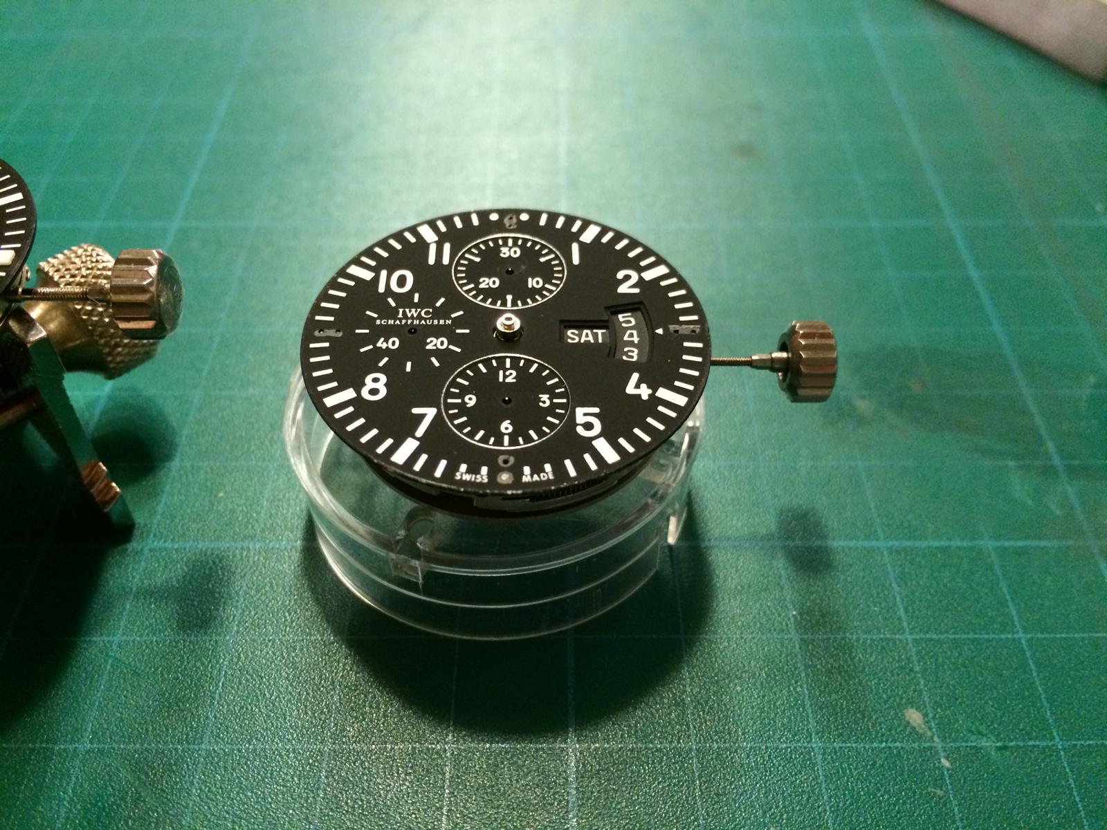
DATE DISCS:
From Left to the Right
GEN, v6, v1/v2
The GEN DateDisc looks a little different from the GEN ETA Disc
Especial the 4 and 7 also the Thickness is different.
That is also the different btw the Rep Discs
The v6 Discs looks really close to the GEN Discs
The Typo is a little thinner but really close
The v1/v2 Discs are to thick in the Typo
On the GEN Discs we´ll see from the side view very good the Glossy Color
The v6 Discs are Matt and the Color is too light
The v1/v2 Discs are also Matt but the Color is more Dark and so closer to the GEN
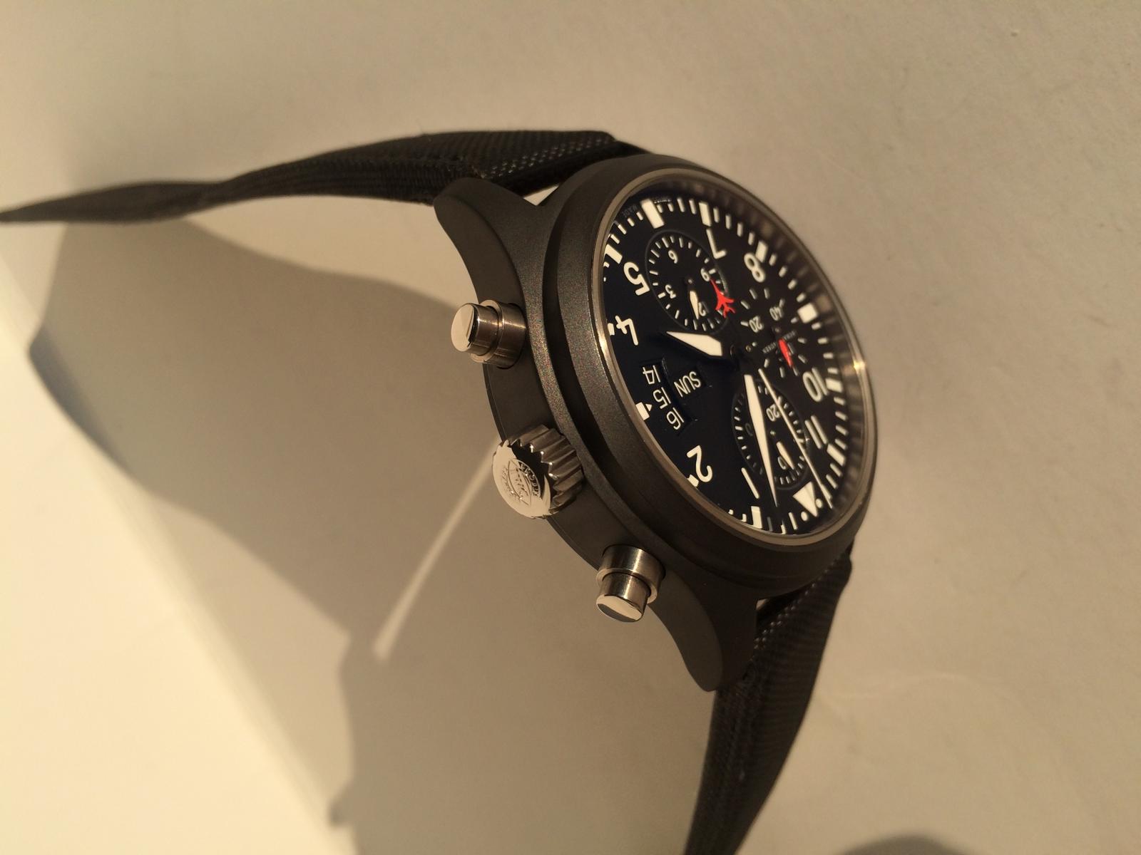
CASES:
So let us take an look at the different Cases.
The Cases have much differents
And which is the best or not must choose everyone self!
In my Eyes the v1.2 Case is the Best Cases that is out in the Wild.
Why i think it is the best i will show you.
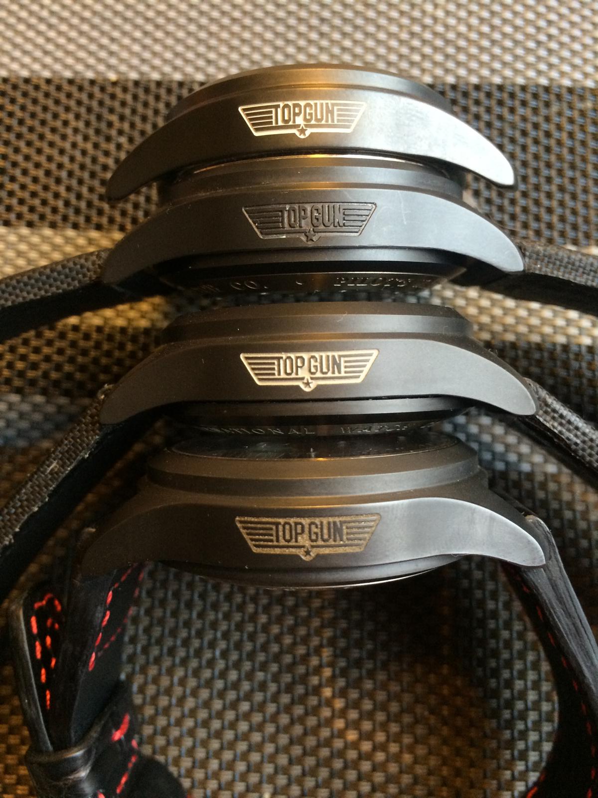
Cases from Top to Bottom
V6, v2, v1.2, v1
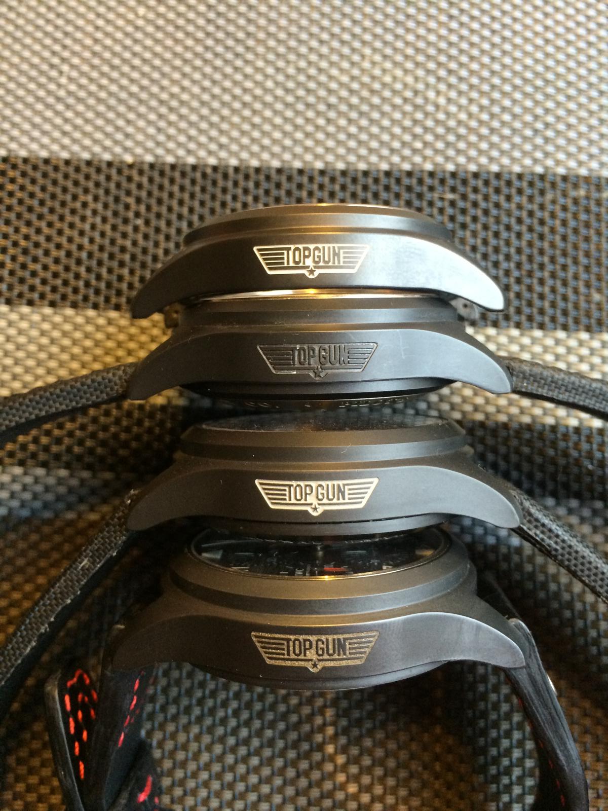
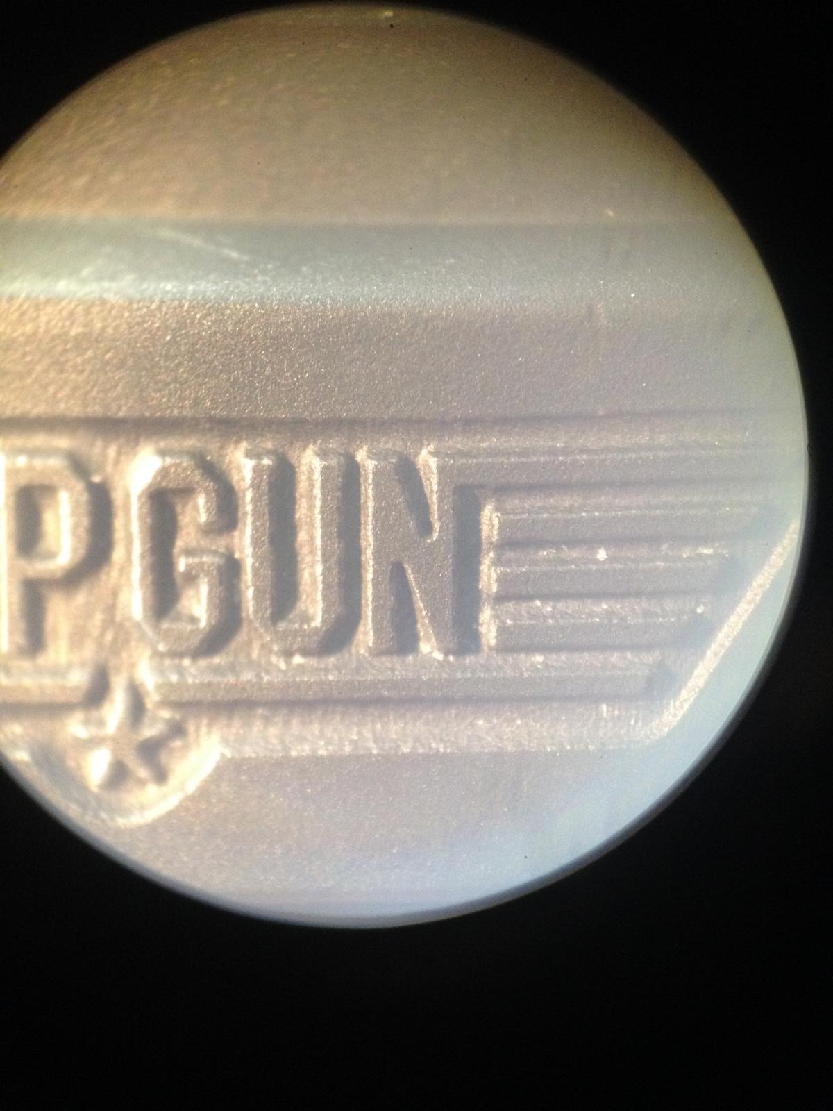
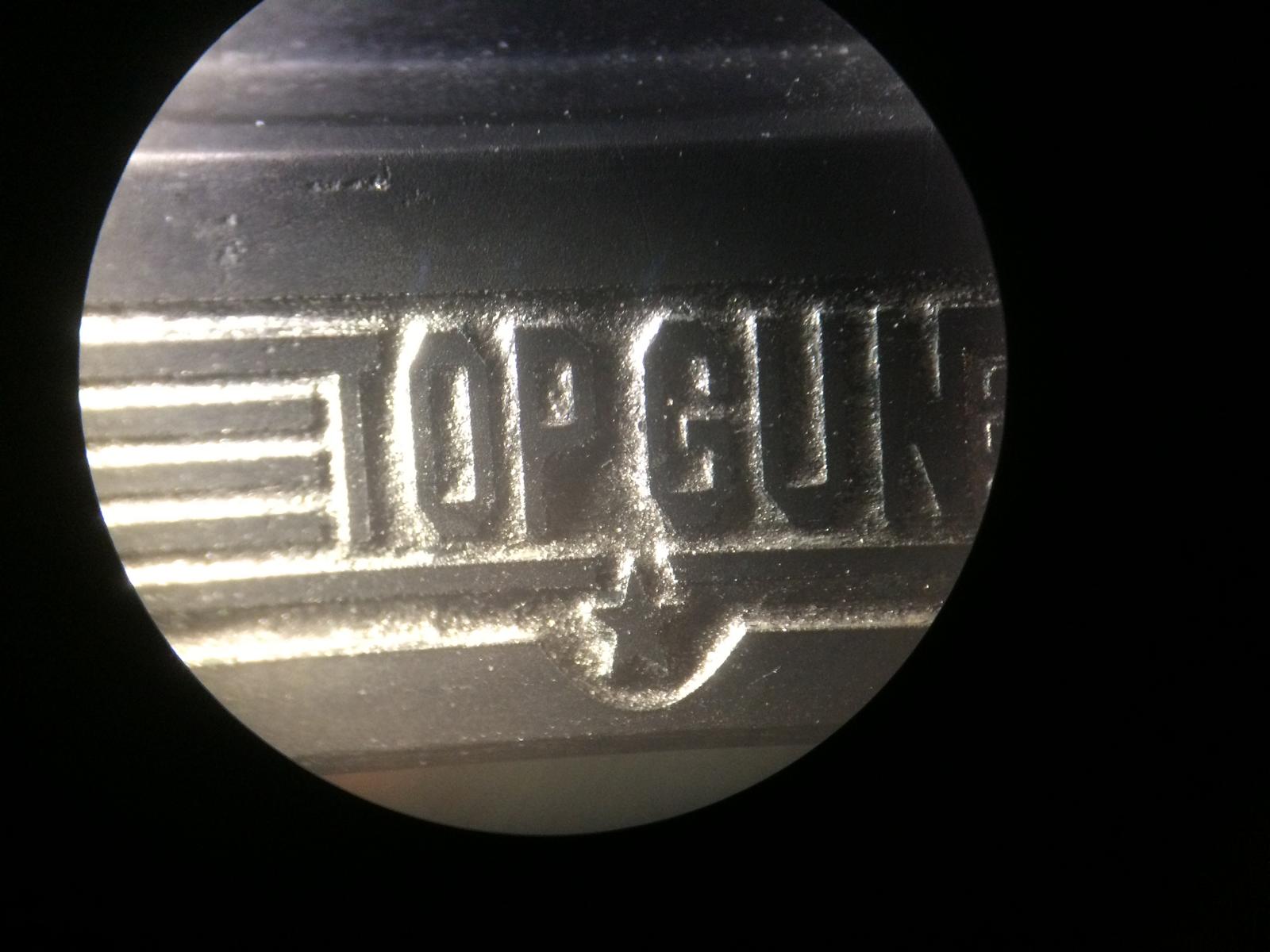
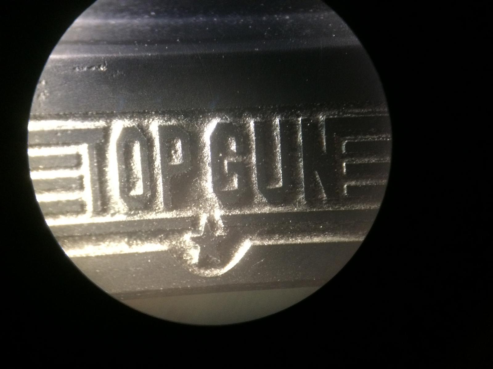
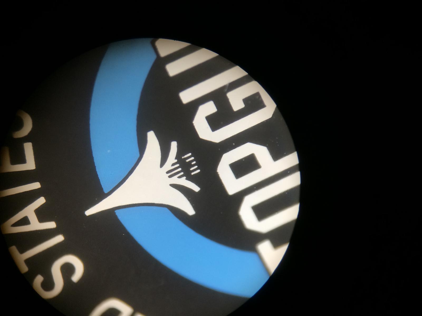
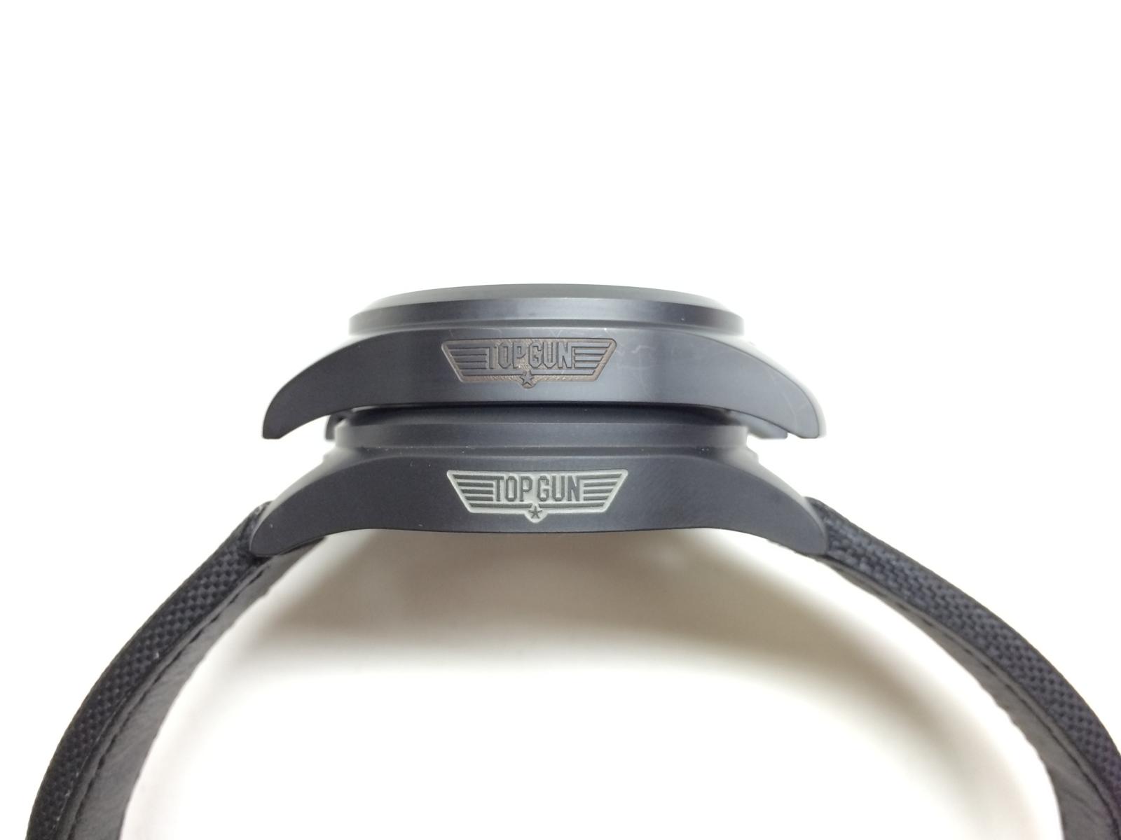
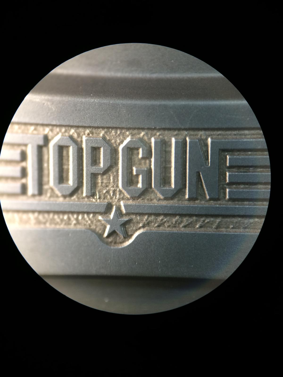
The most People look at the Top Gun Logo, so let us start with that
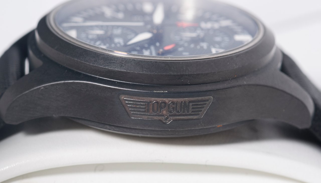
This is the GEN Watch
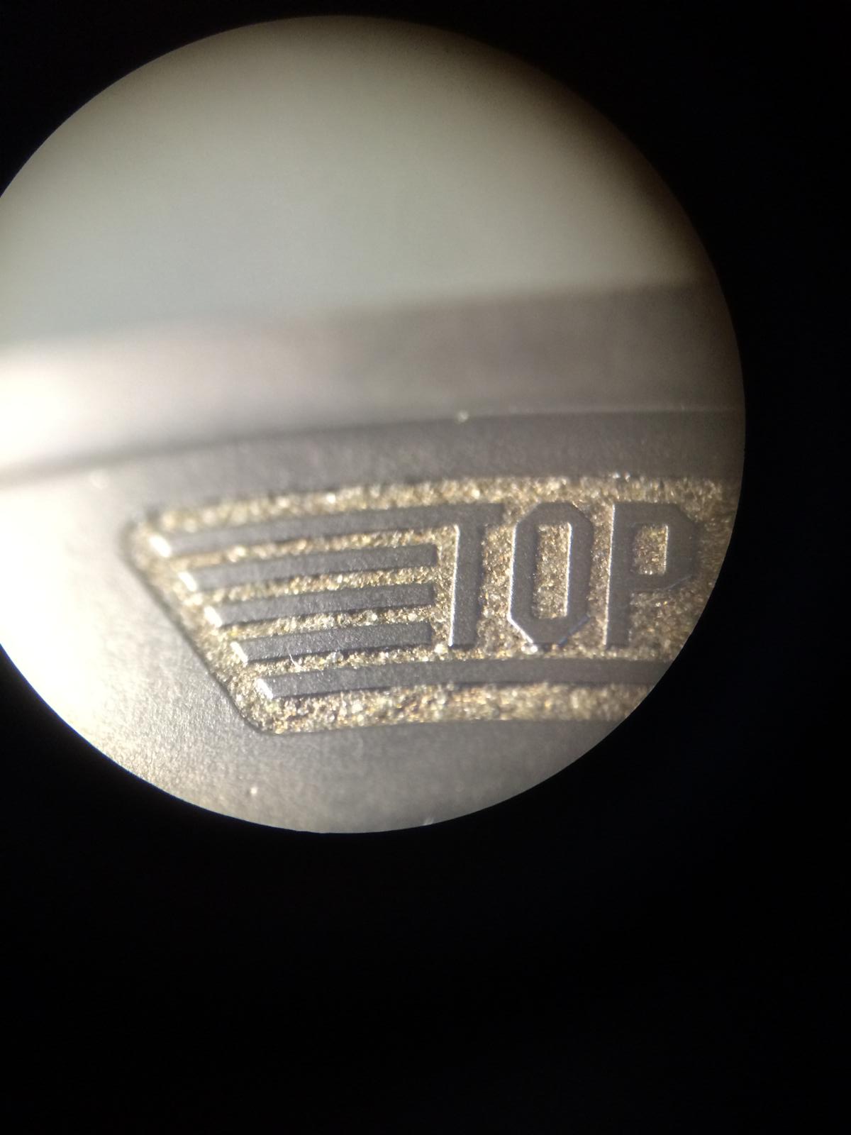
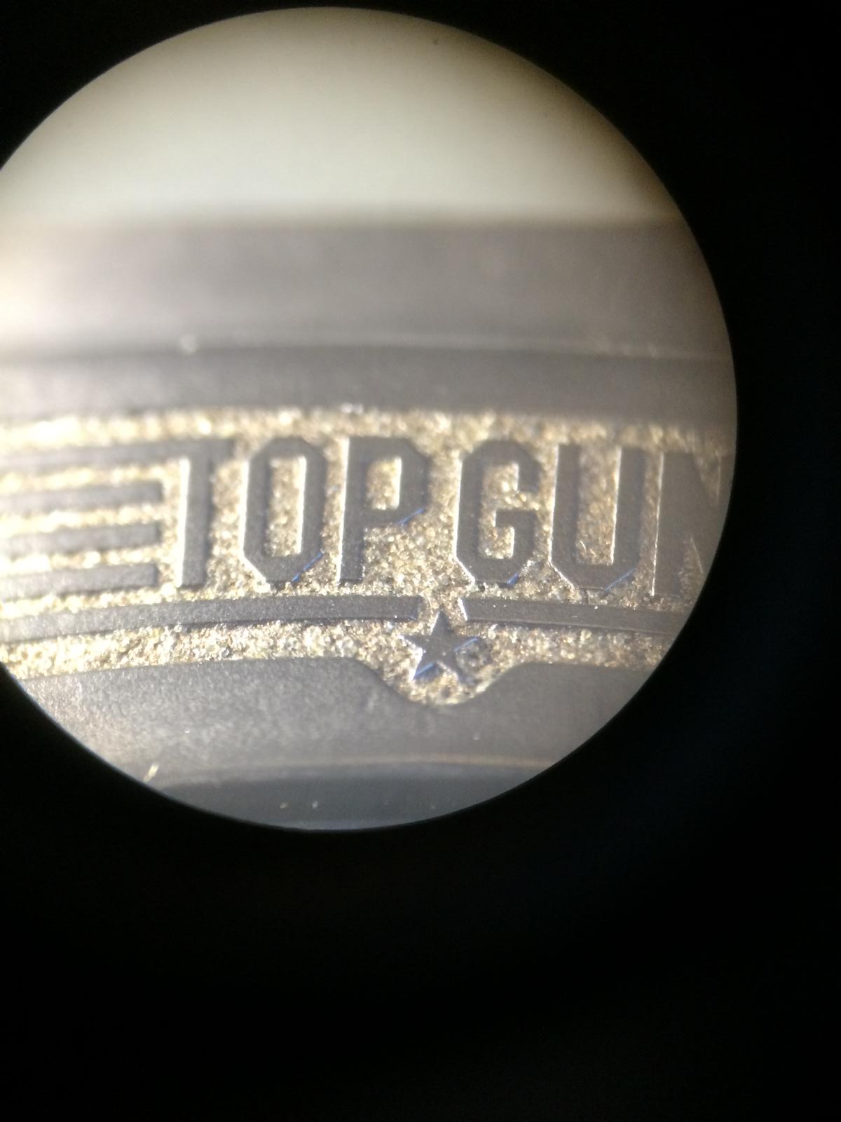
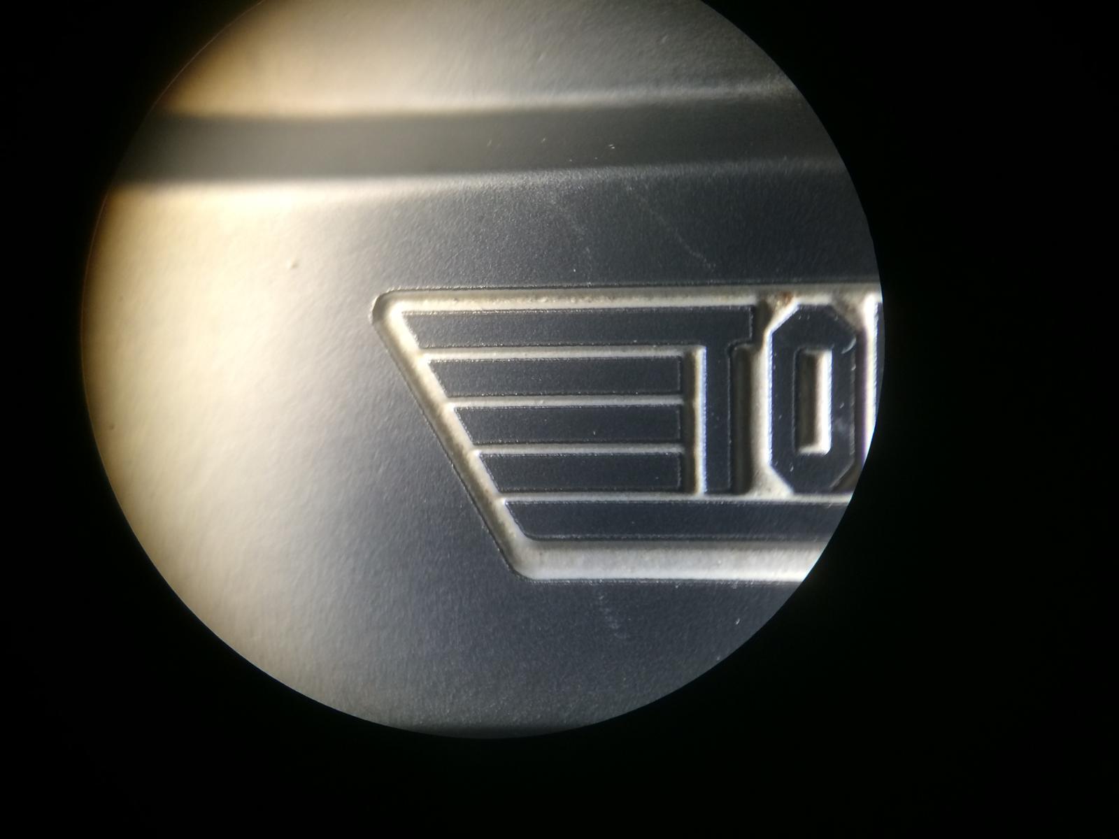
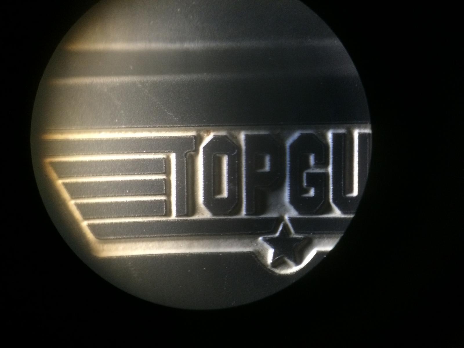
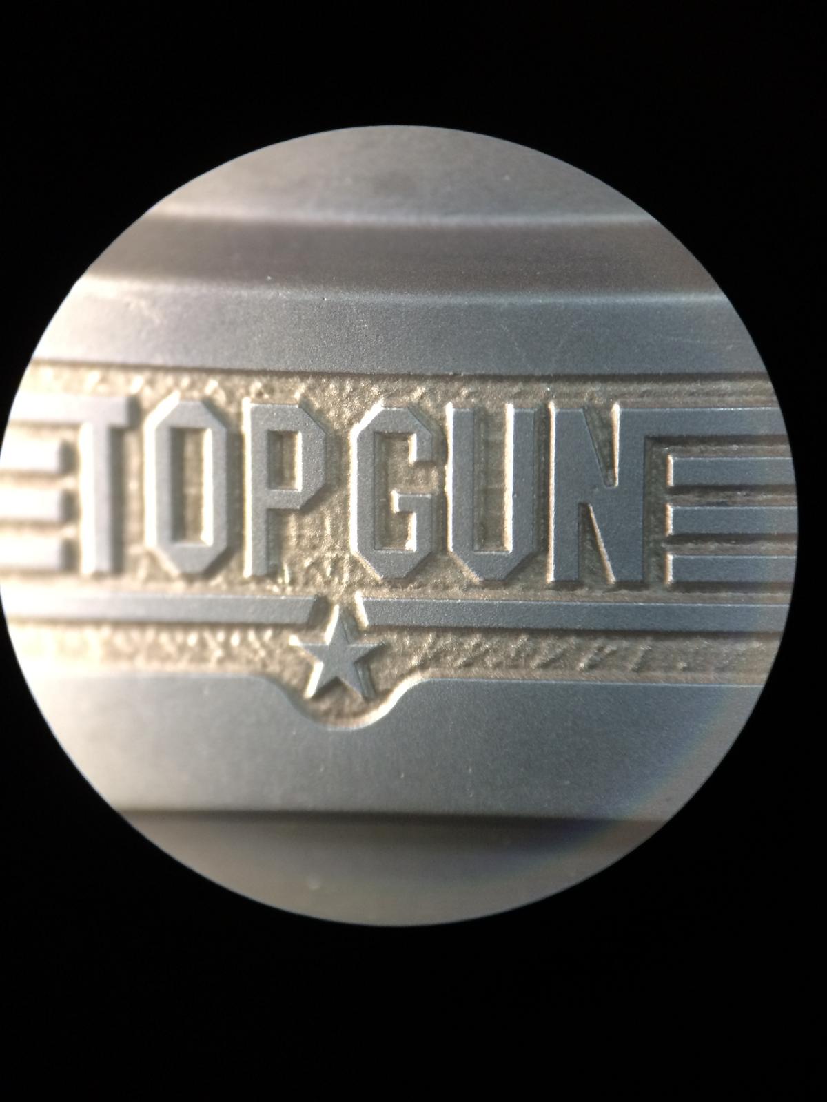
So we Start with the v1.2 Case (the best one in my Eyes)
So the TG Logo looks really close but there are differents!
The Wings have a good distance from Top and Bottom and the side.
The GEN Watch have an Exactley distance on each side.
The little Star in the middle is a little to small, but there was some v1.2 Cases that have an little thicker Star (v1)
The Distance btw the P and G is also very good.
The Typo self is near Perfect and looks at the first look a little too small but it have the same size.
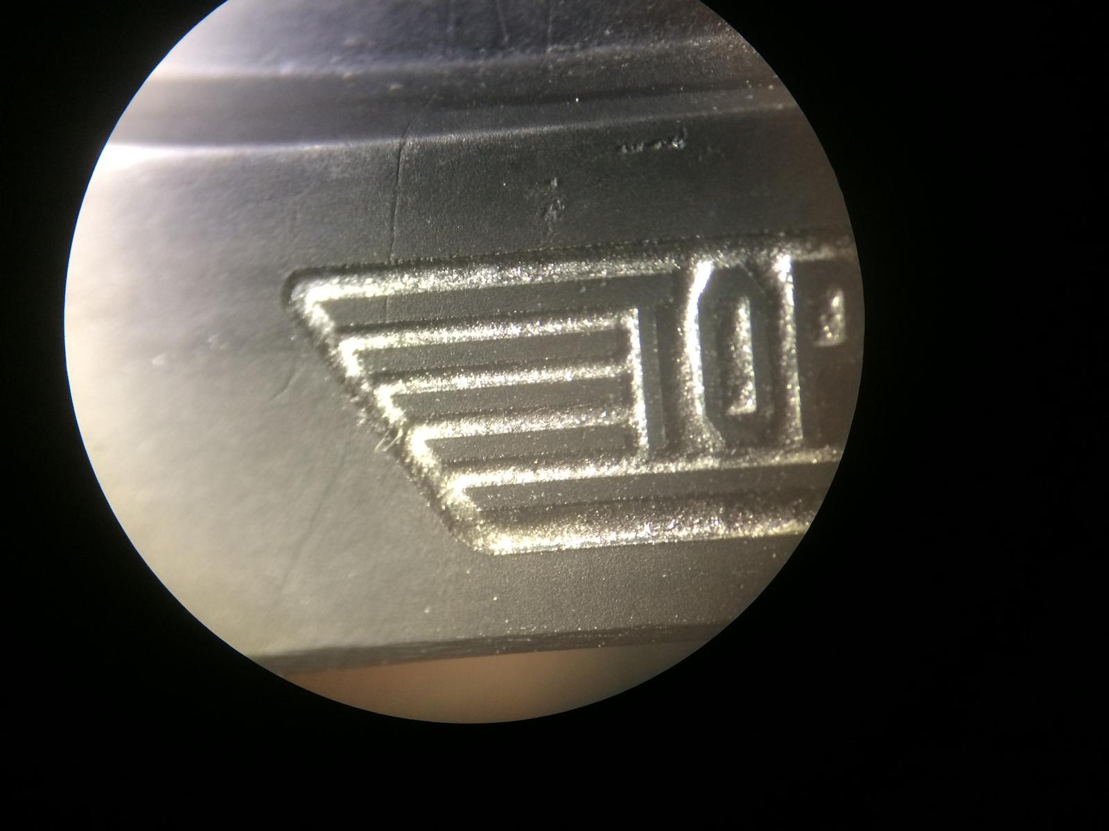
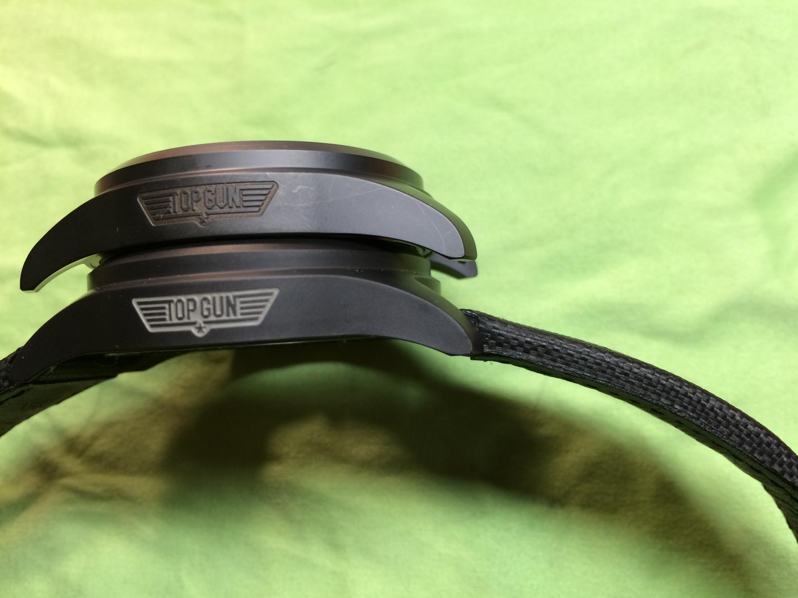
Now the older v1 Case
The distance of the Wings are a little wrong, Bottom and Top have different size (Bottom have more Space)
The little Star is thicker and looks so more GEN like, but the Star is so small that you want look on it.
The Distance btw the P and G is also good.
The Typo is a little wrong, Especial if you look at the G it looks wrong.
The v2 Case
The distance of the Wings are a little wrong also, Bottom and Top have different size (Bottom have more Space)
The little Star is here also thicker and looks so more GEN like
The Distance btw the P and G is wrong there is a little bit to much space.
The Typo is here also wrong, Especial if you look at the G and N it looks wrong.
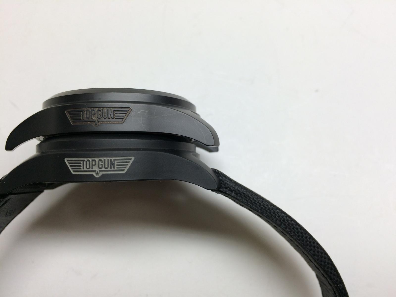
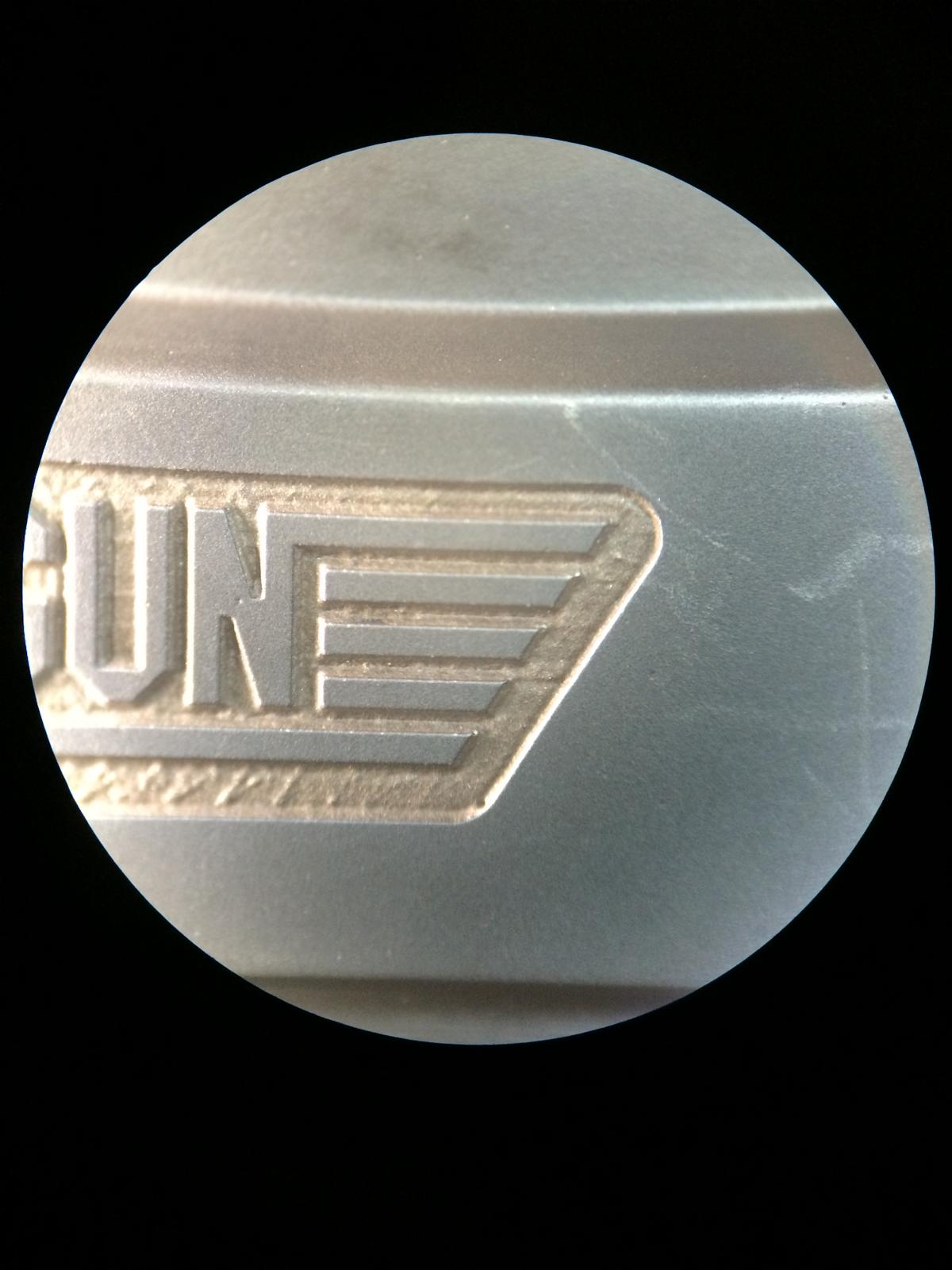
The v6 Case
The distance of the Wings are totally wrong not only the Bottom and Top have different size.
The Space btw the Wings self is wrong.
The little Star is here too thick and looks too FAT
The Distance btw the P and G is wrong there is not really an space.
The Typo here is totally wrong, all letters are too thick and the Typo looks soooo Crazy
So if we see only the Top Gun Logo of the Case i would say the v1 or v1.2 Case is the Best.
In my Eyes the little Star is no big deal, so the Complete look must be good. And at this Point the v1.2 Case Wins in my eyes.
Ok lets go on on the cases.
As i have said allready the Complete look must be good, and for that the Case self must be good.
Especial we have an Ceramic Case, so we can´t do much here.
So i don´t wanna post now from every Case every Edge and Corner
So i think we can see the differents on the Complete Picture.
So i have spend many Time at my Local AD (Friend) he had an GEN 3789 there and i have check all the Edges etc.
I show you guys 2 Pictures what we talking about.
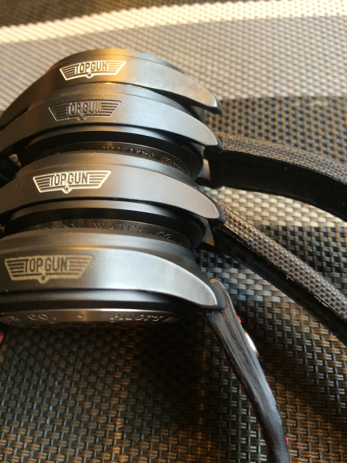
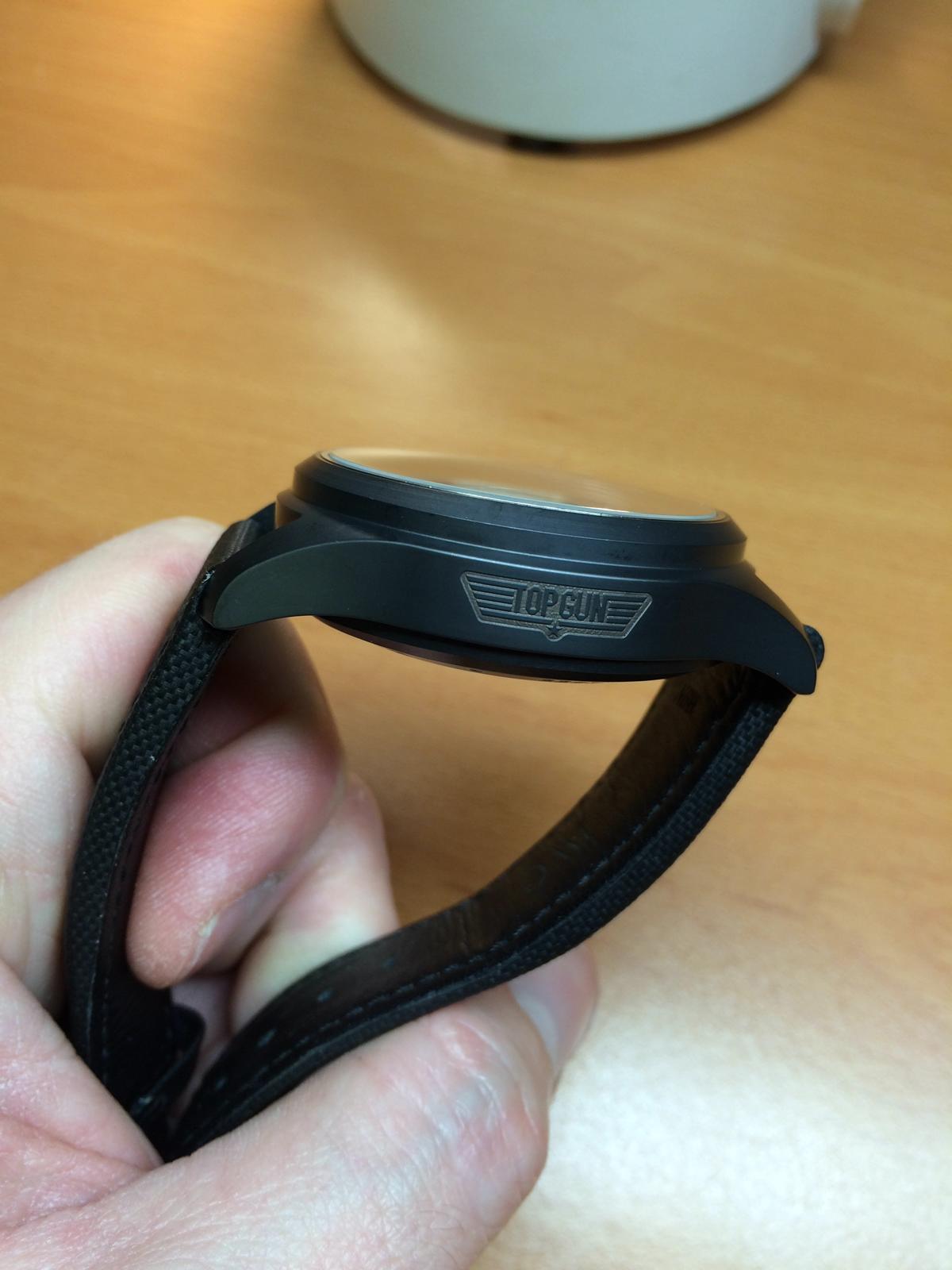
- Lugs: If we look at the Lugs from the side we will see many differents.
We Start from Top to Bottom.
The v6 the case end runs to straight Down and the Edges are too round.
The v2 the case end runs very nice out, but the Edge on the Ends are shapen too much.
The v1.2 the case end runs very nice out, also the edges are nice rounded and not too Hard.
The v1 the case end runs at the last end to straight down, the edges are shaped too much.
- Bezel: If we look at the Bezel from the side we will also see differnts.
The v6 the Edge is too soften and the Top of the Bezel is too small
The v2 the Edge is nice and sharp but a little too sharp but not bad
The v1.2 the Edge looks very nice not to soft not to sharp
The v1 the Edge looks same as on the v1.2
Here are the Cases
Cases from Top to Bottom
V6, v2, v1.2, v1
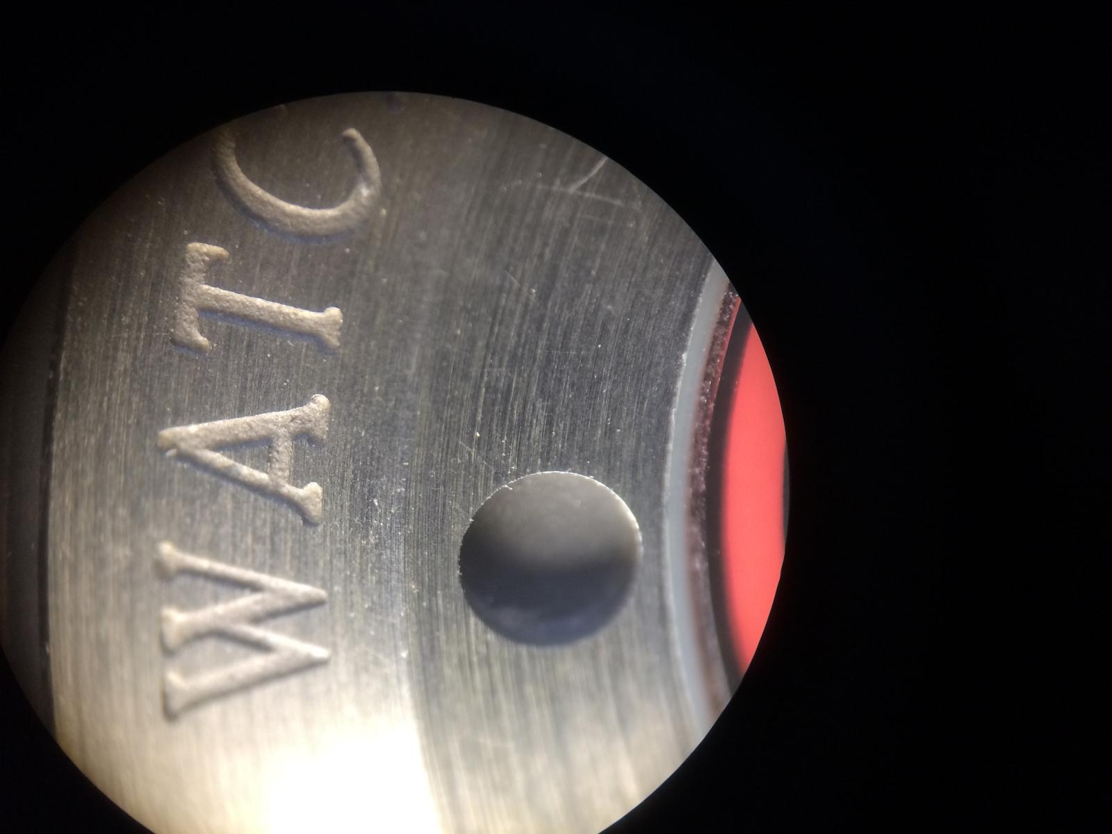
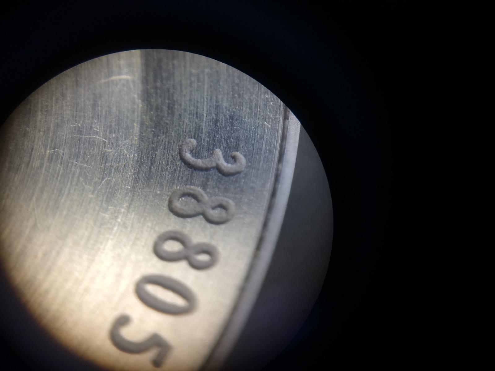
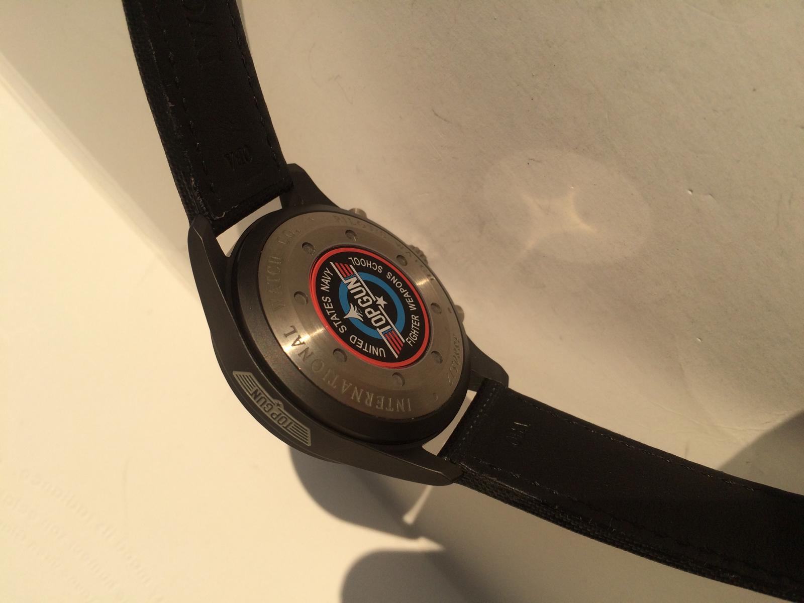
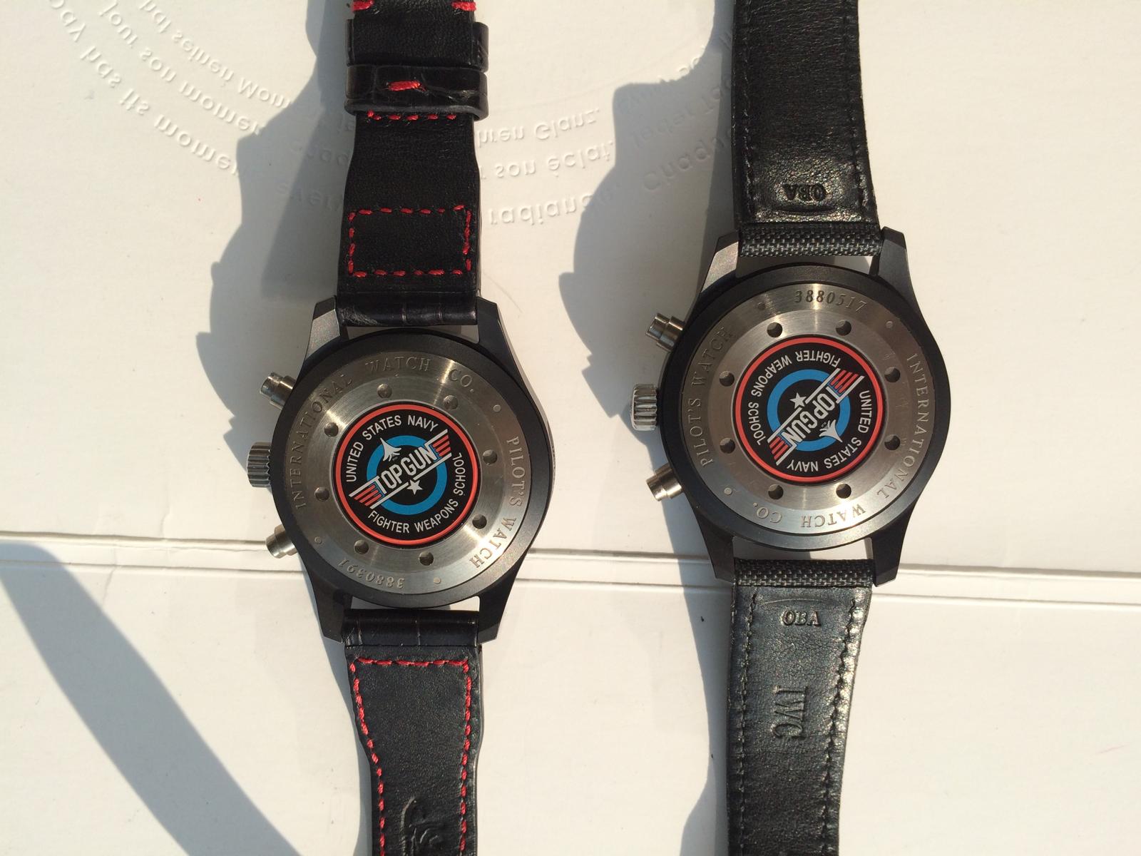
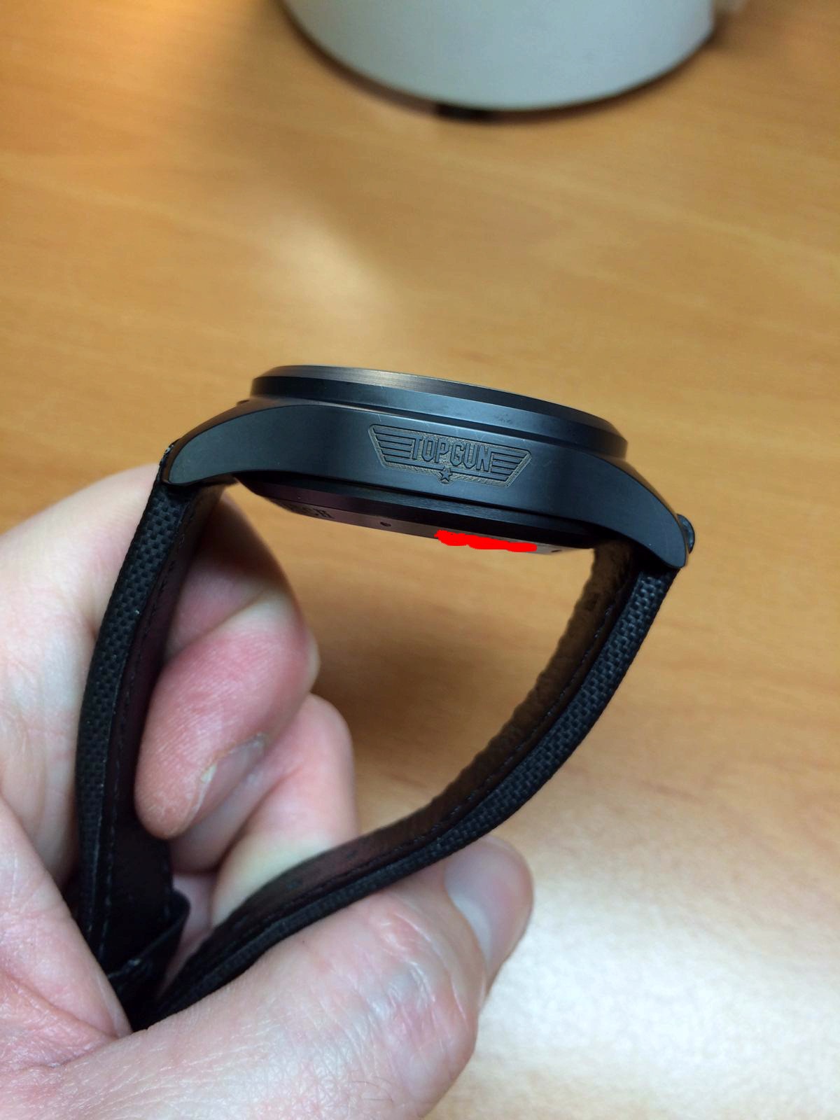
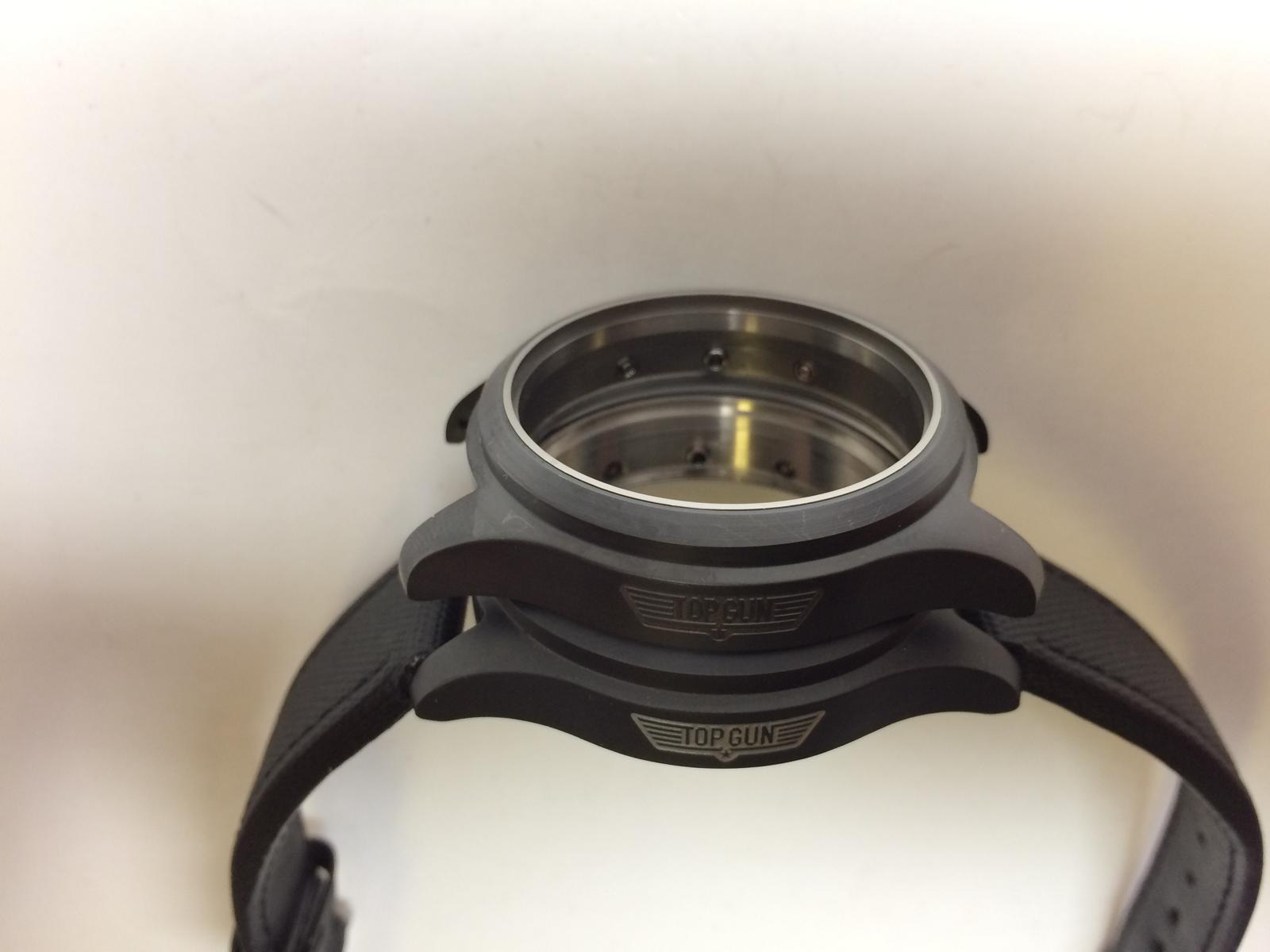
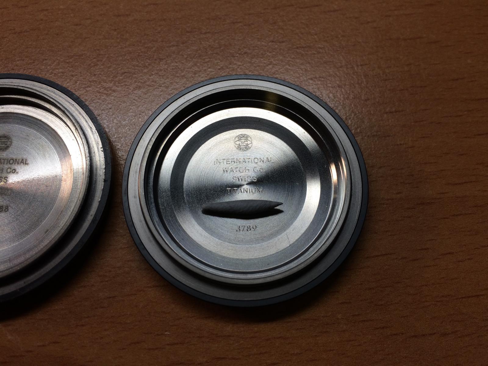
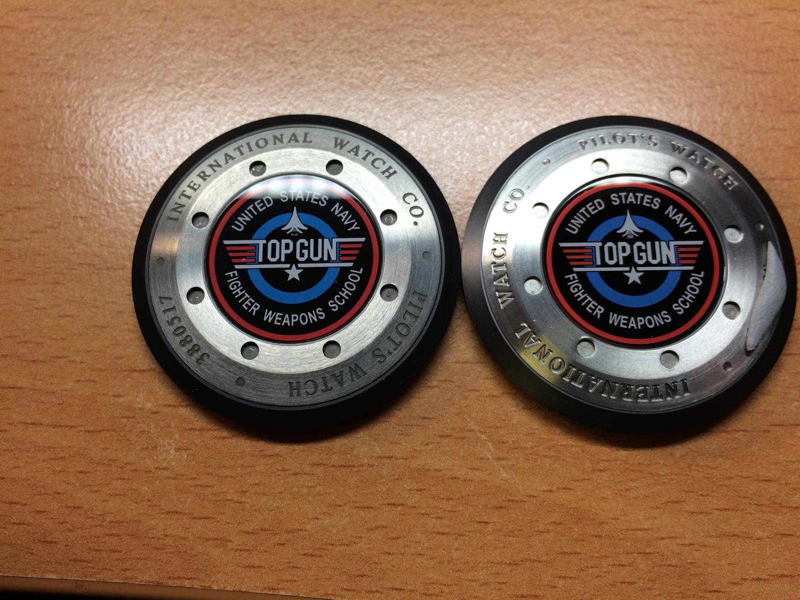
CASEBACK:
The Casebacks are also different, we can make it short here
The Best Caseback is the v6 Caseback
But let us check some Casebacks
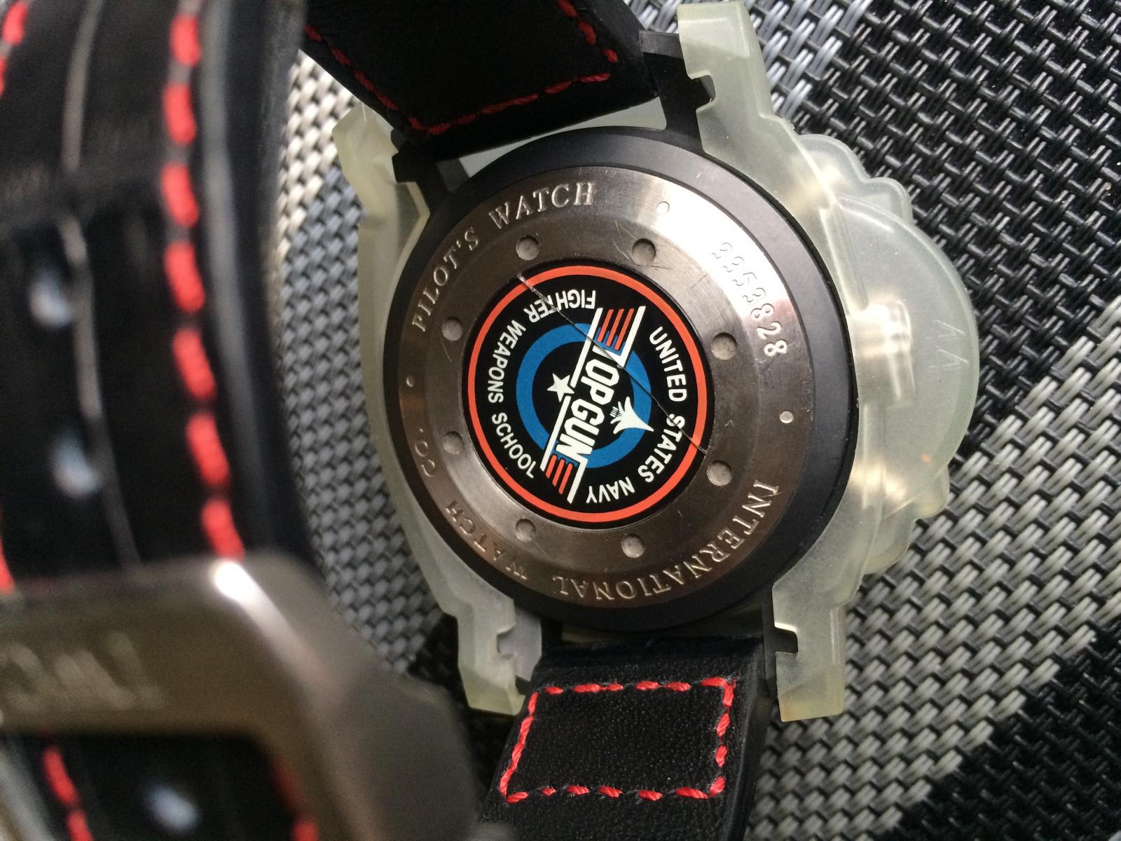
The v1.2 Caseback
The v1/v2 Caseback
The v6 Caseback
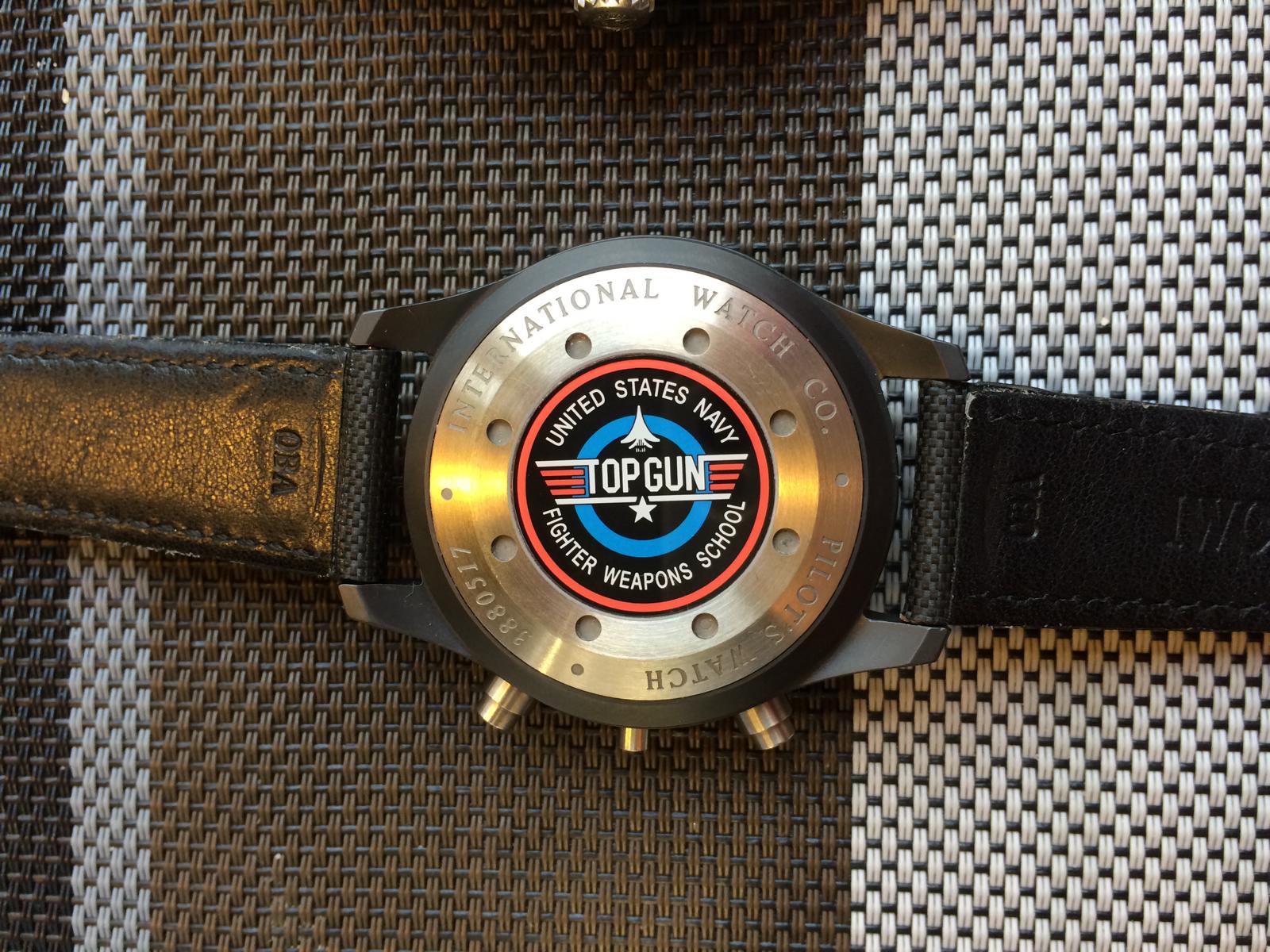
So the v6 Caseback has same Specs as the GEN! There is an Gasket btw the Metal and the Crystal
Let us take an closer look.
Here we see the Gasket btw Metal and Crystal
The Engrave of the Case isn´t Bad
The Logo isn´t 100% but the Color is good and makes an Complete nice look
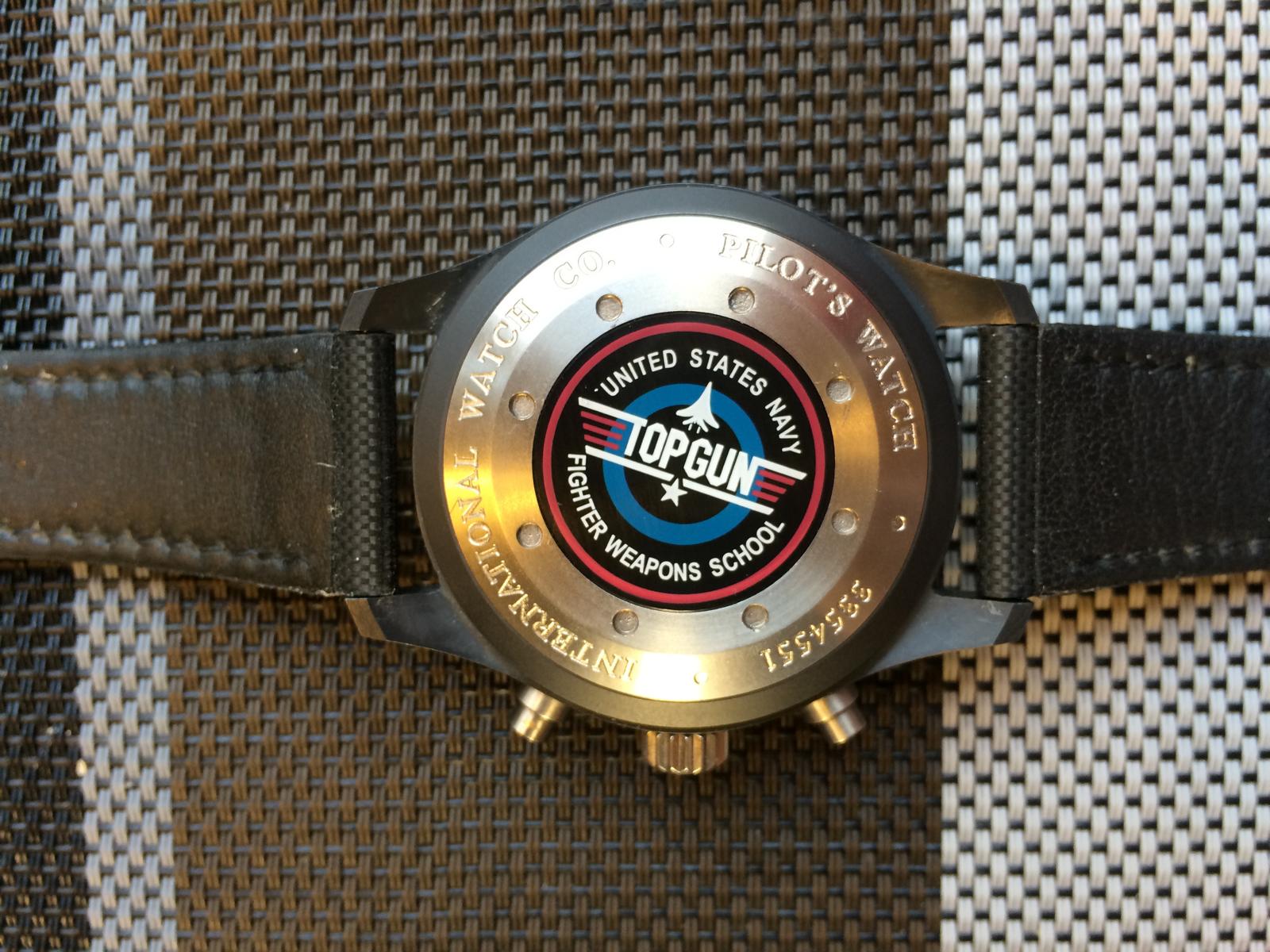
So let us take an fast look at the v1 Caseback
The Logo looks Terrible
So that´s all the differents that is important i think, to choose the right Case
I hope you guys enjoy it so far...
I would say we go over to a little bit Franken Build...
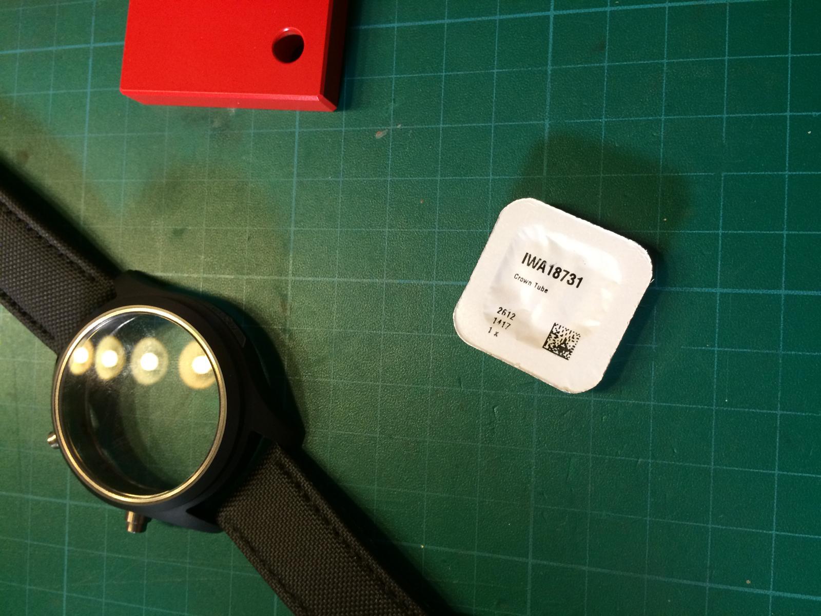
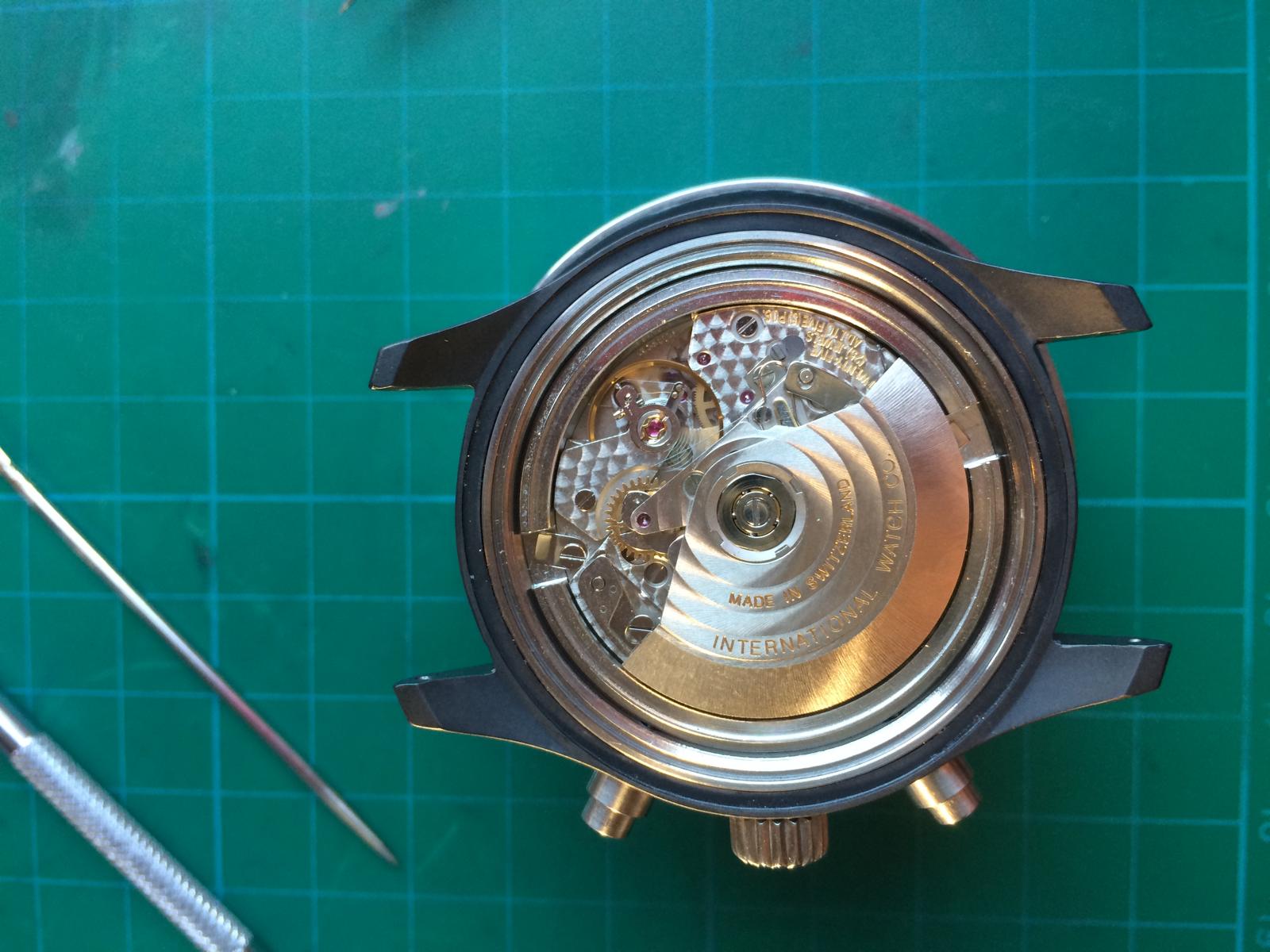
So let us start
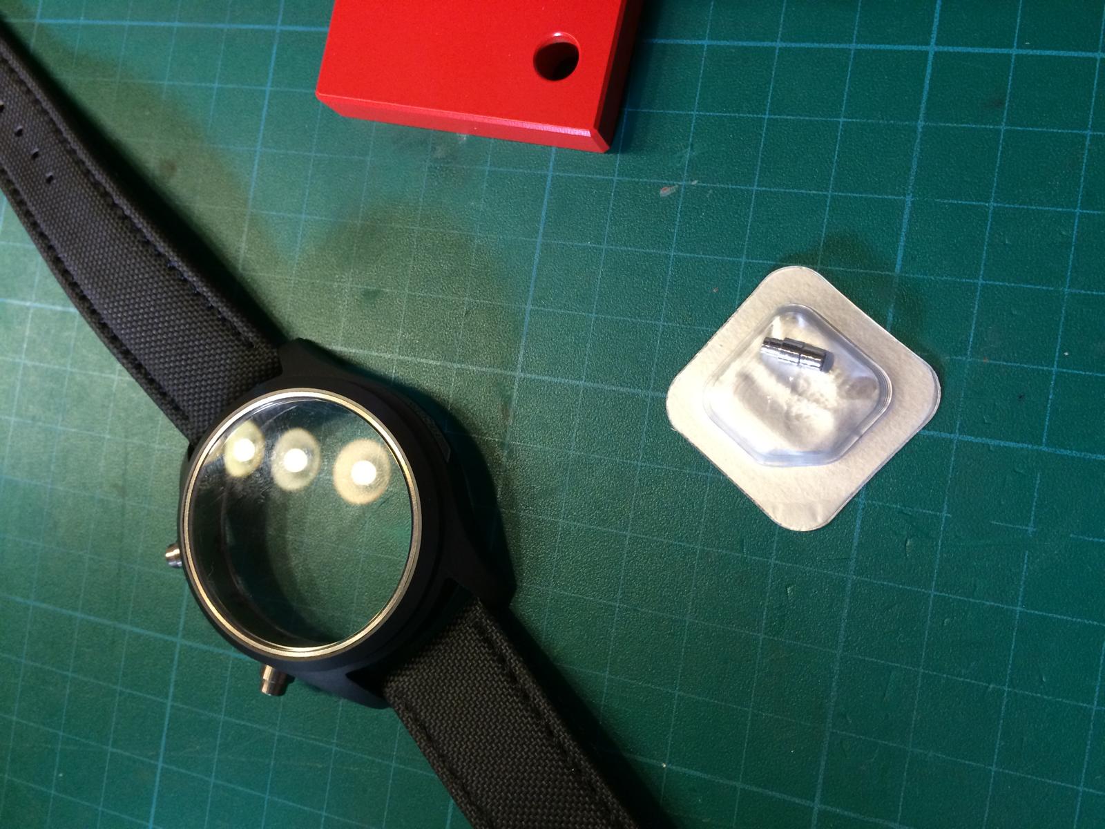
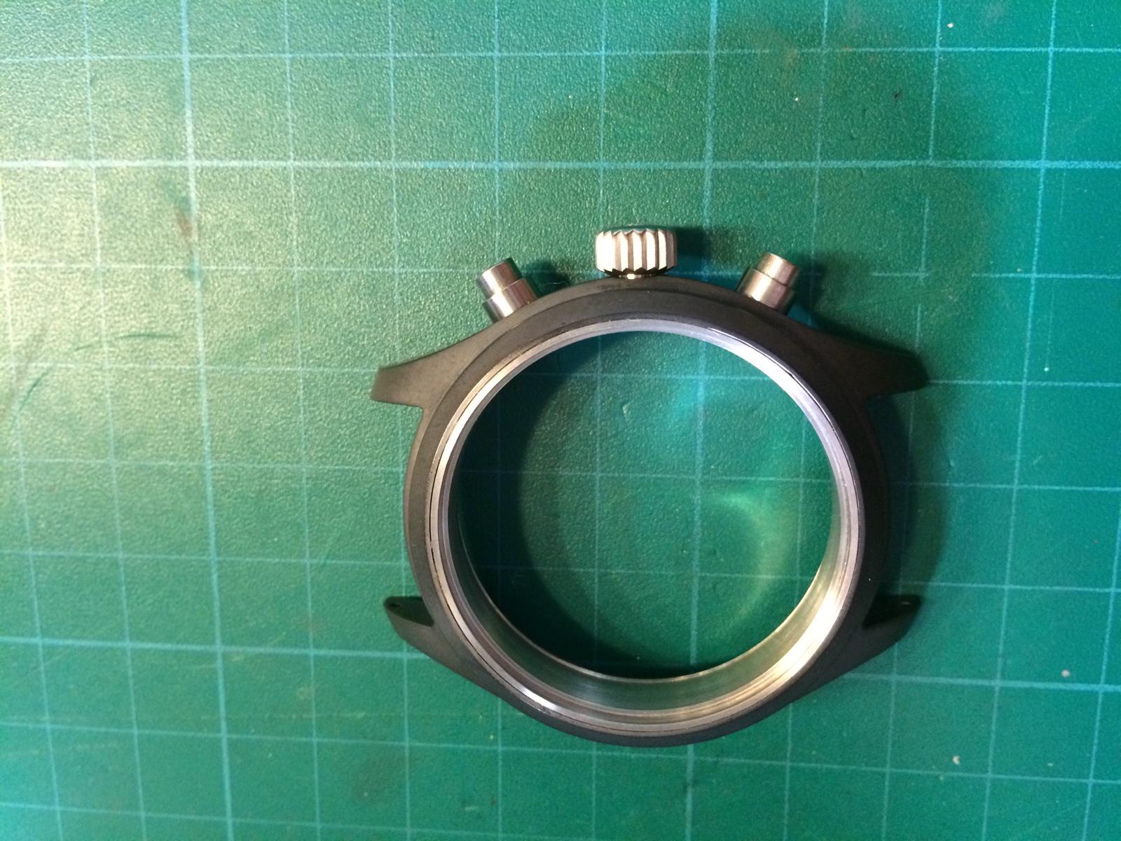
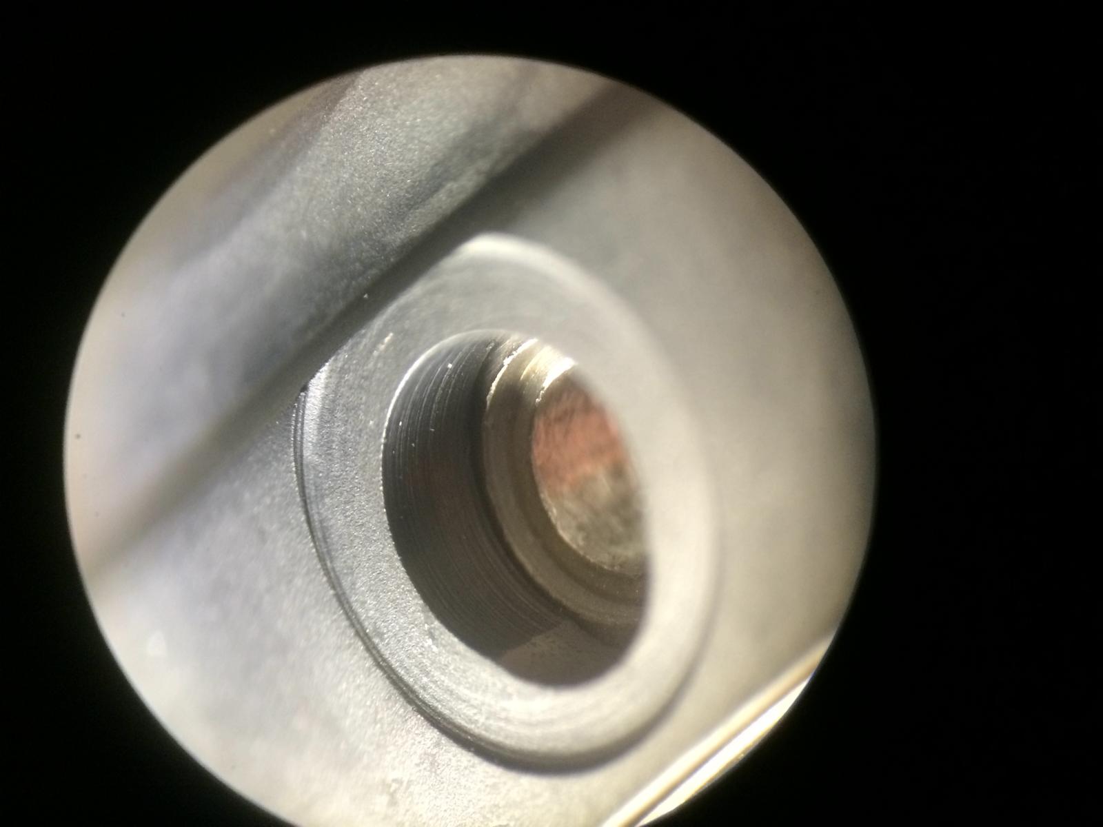
First we must Pop out the Rep Tube to build in the GEN
Time for the New Tube
Ok the Tube is in
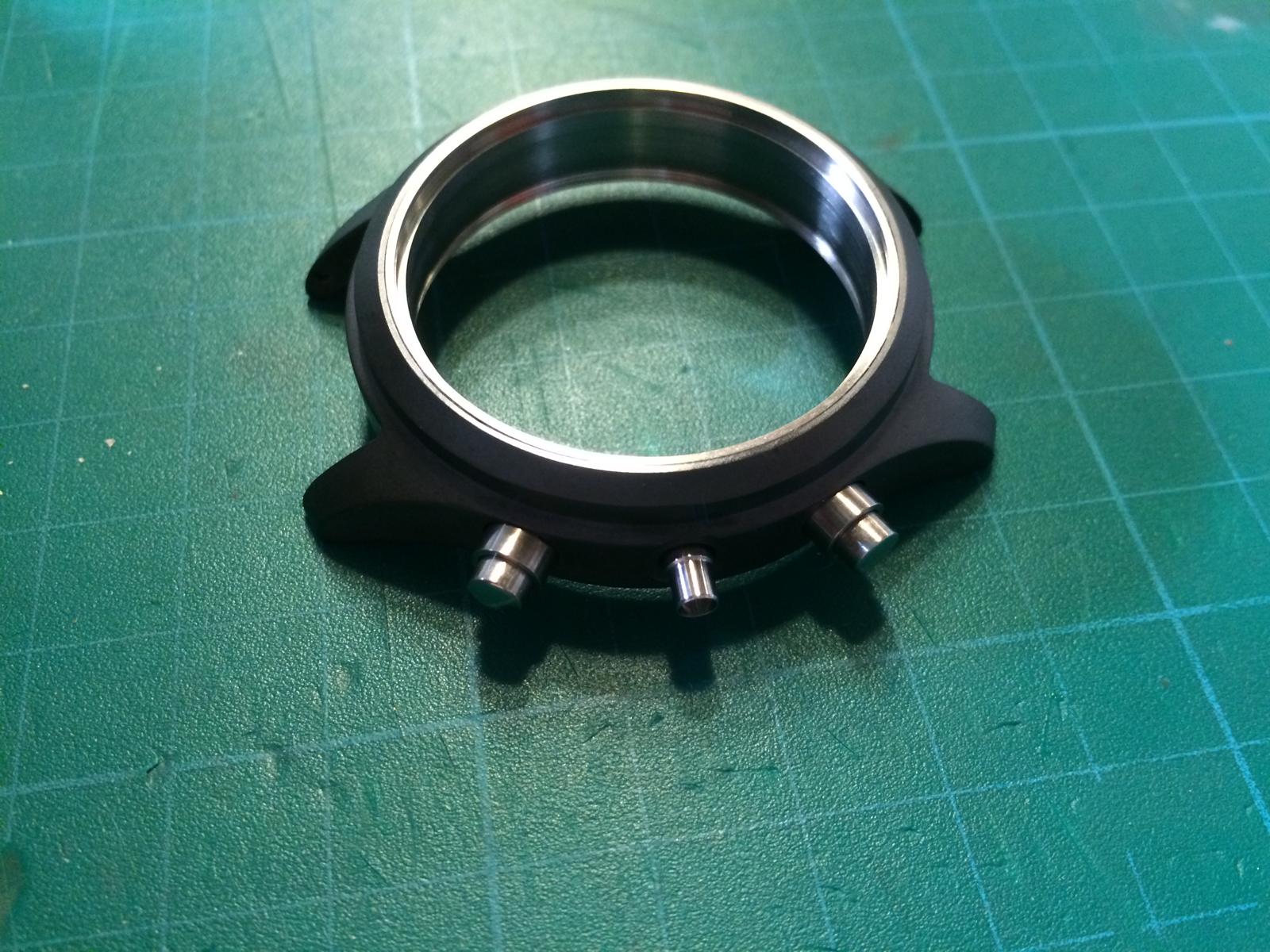
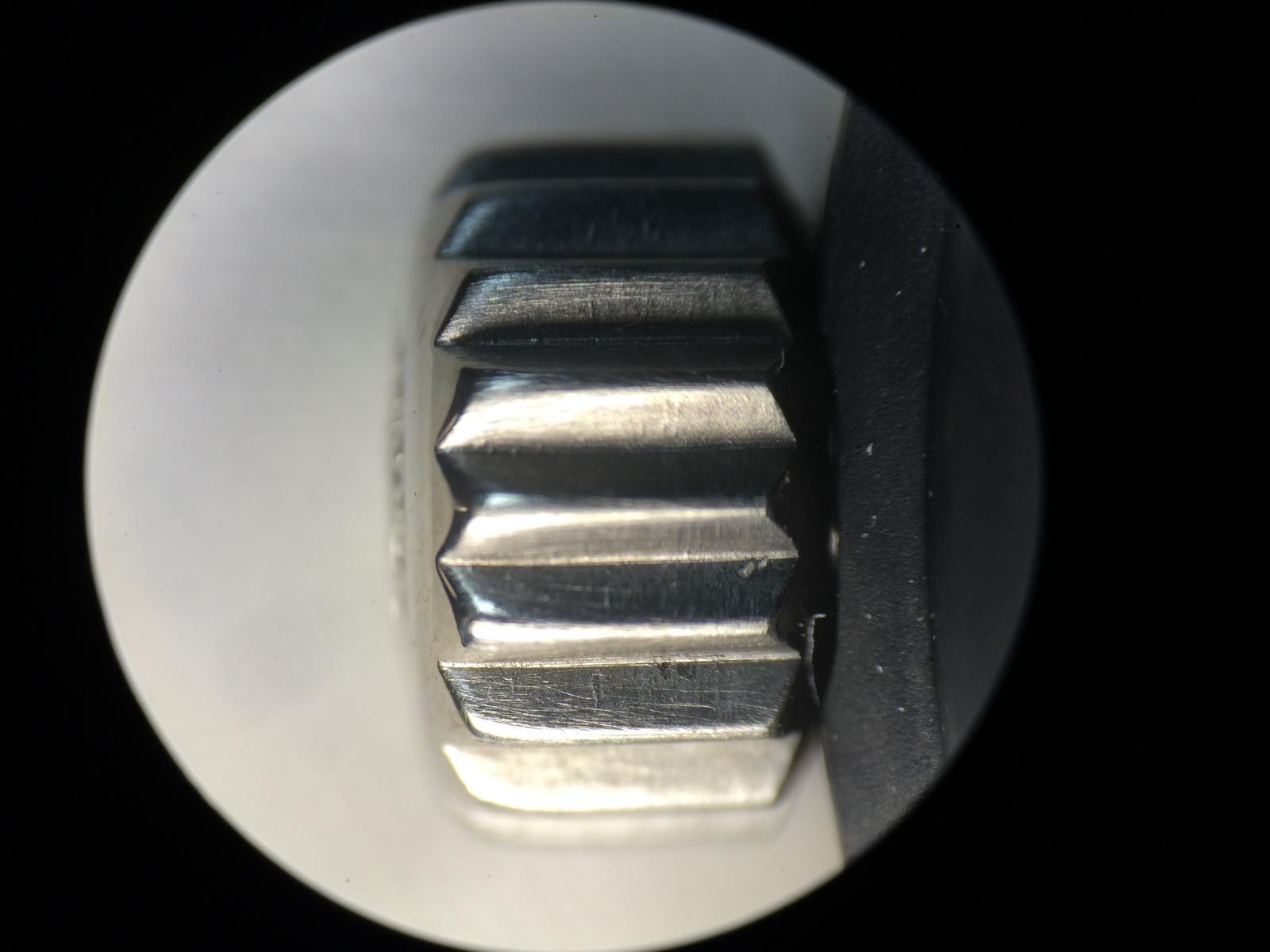
Time for the New Crown
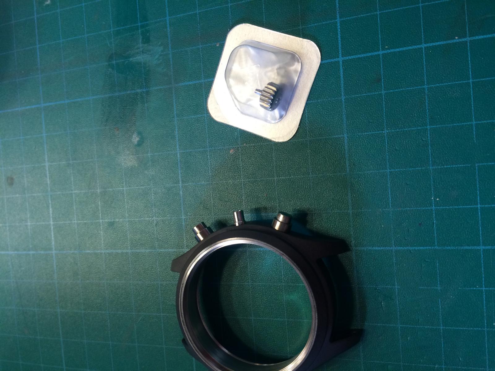
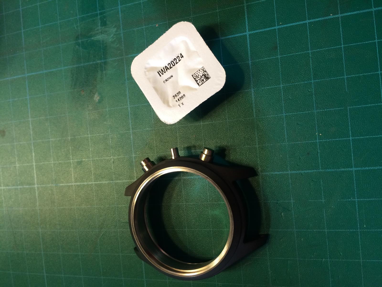
The GEN Crown doesn´t look soooo different from the Rep but the Feeling with the GEN Tube is an totally different
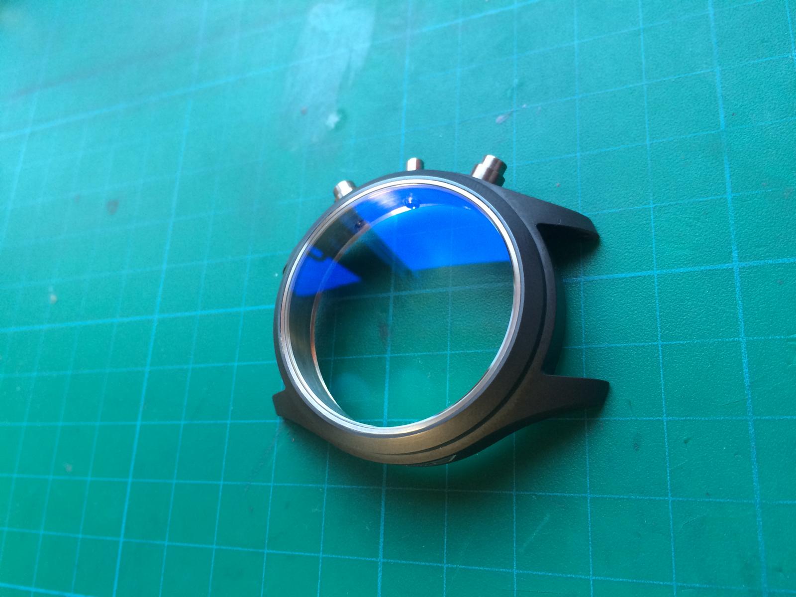
Ok the Tube doesn´t Fit in the Case without Mod
Too much Distance
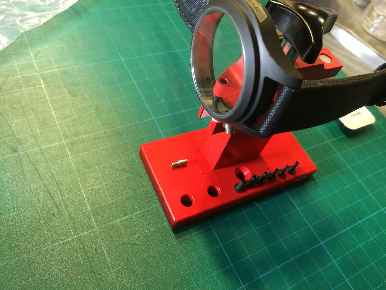
Time to Drill the Case
After a few trys and Mins later the Crown Fit nice
Installed the GEN Tube and Crystal
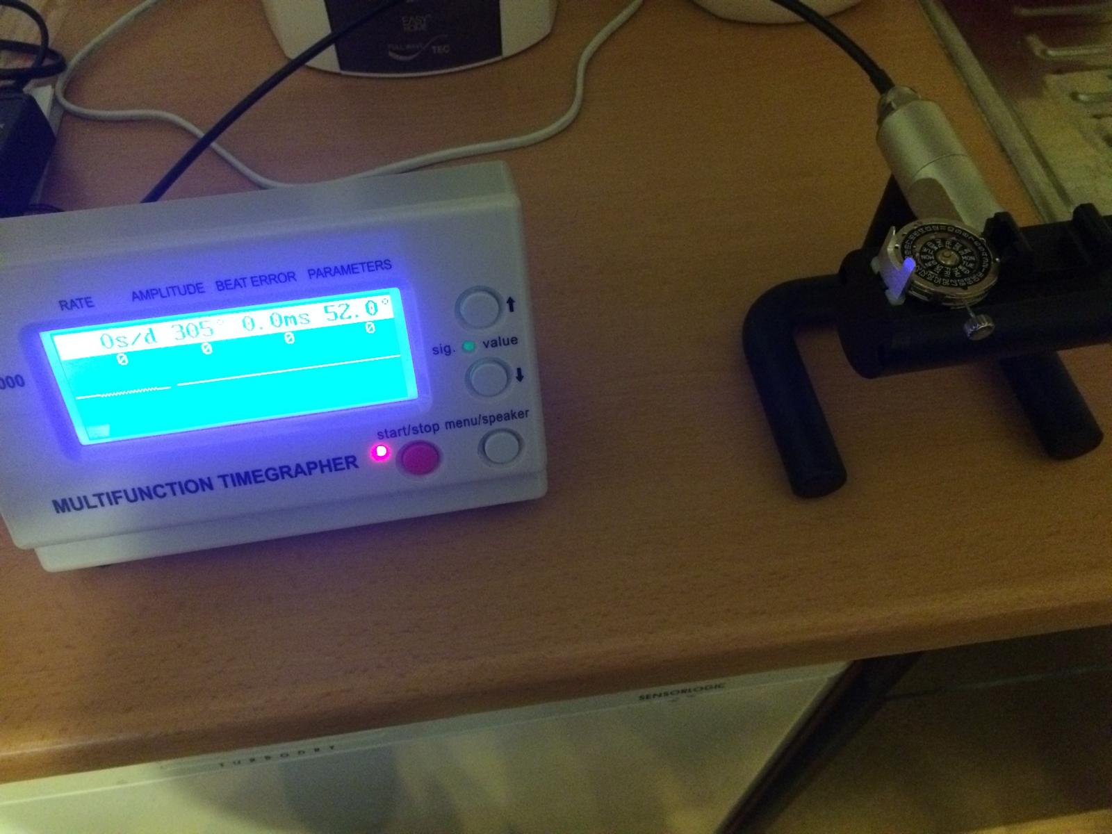
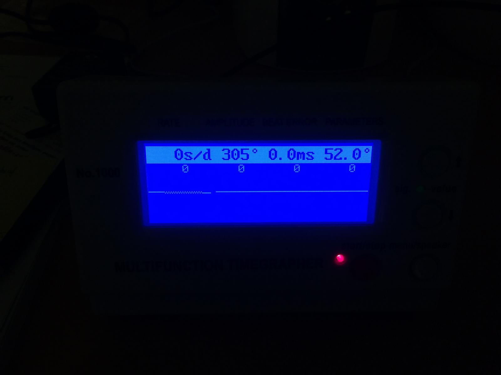
Regulate the GEN 79320 after Service
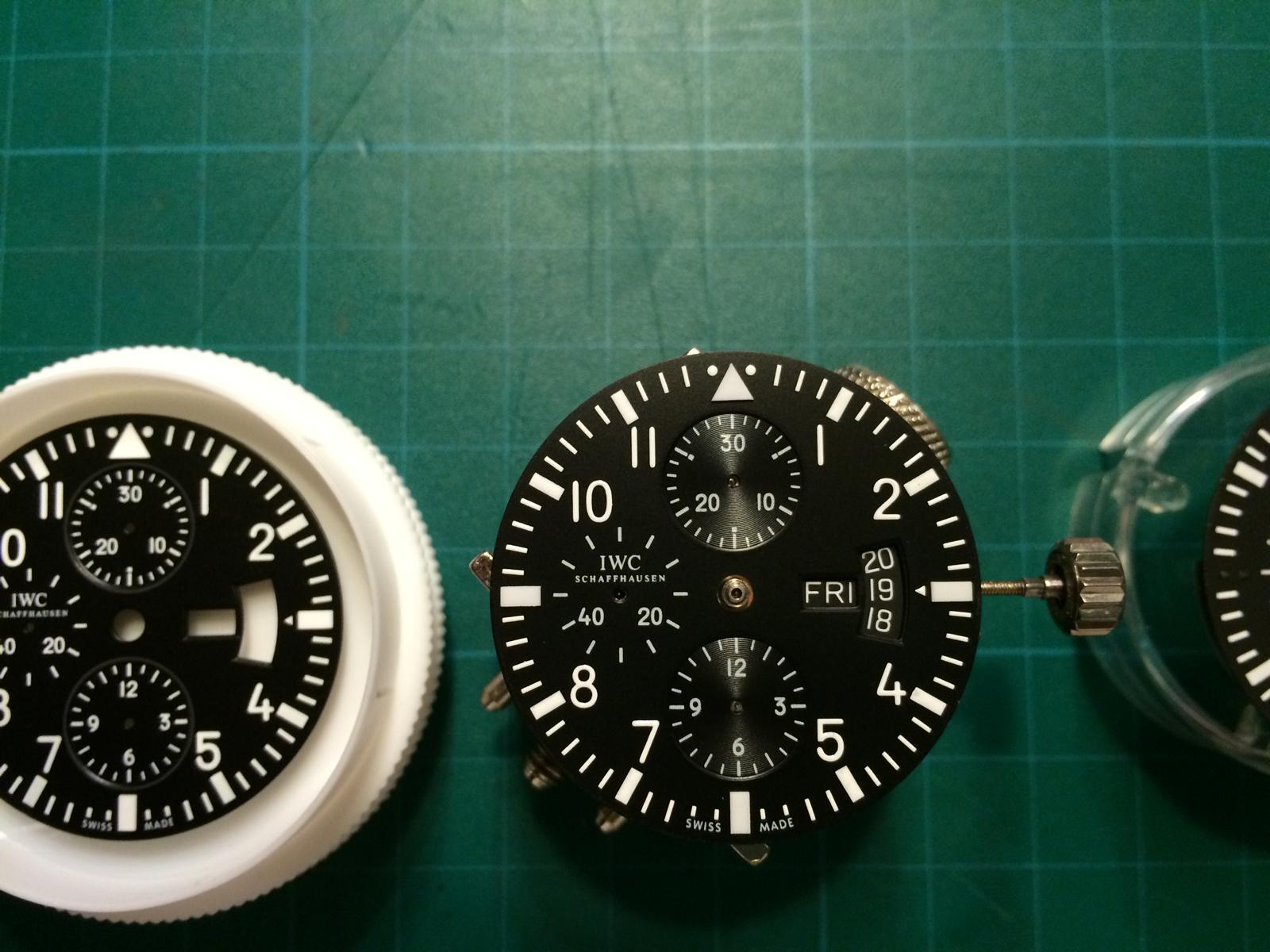
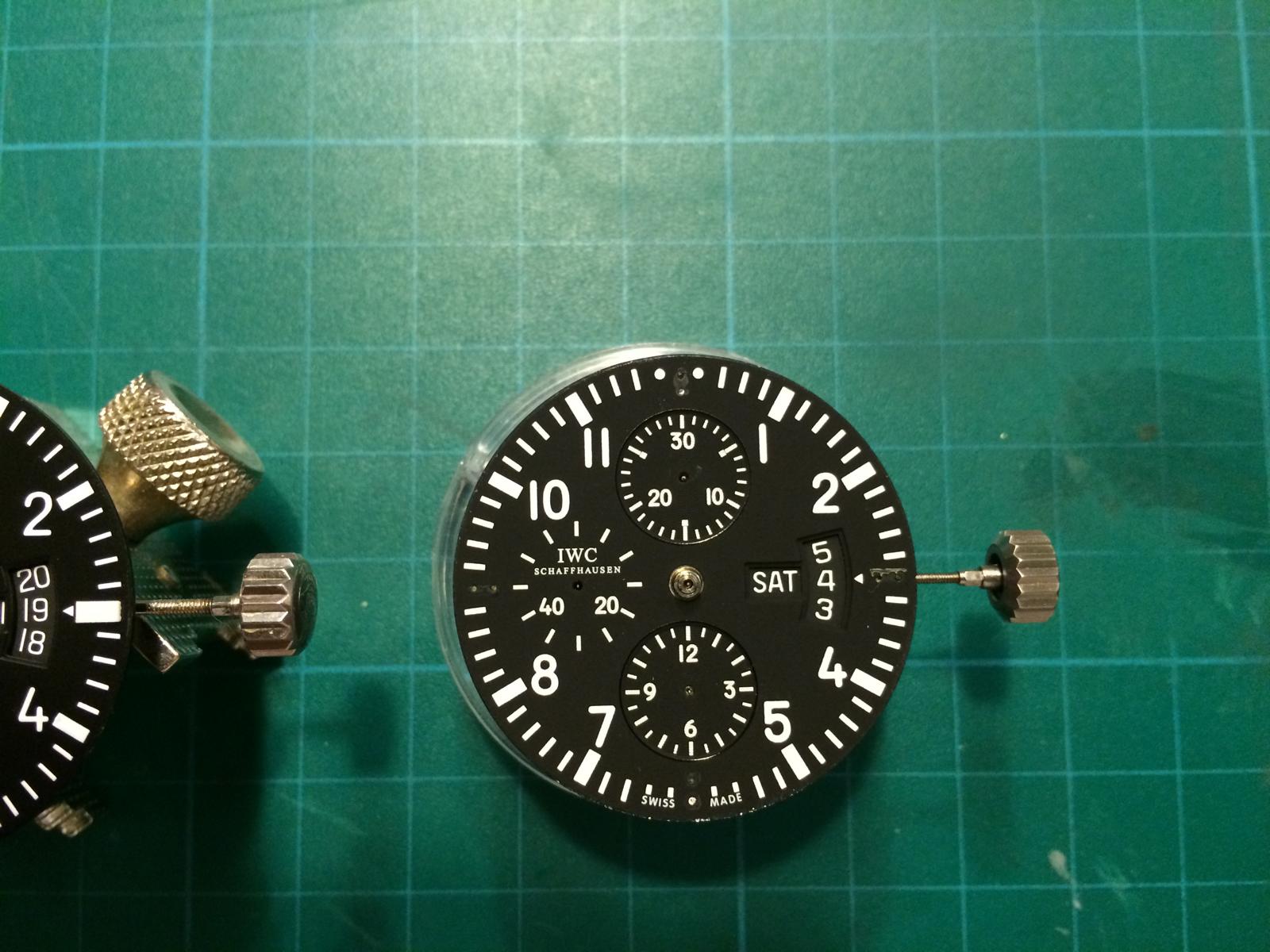
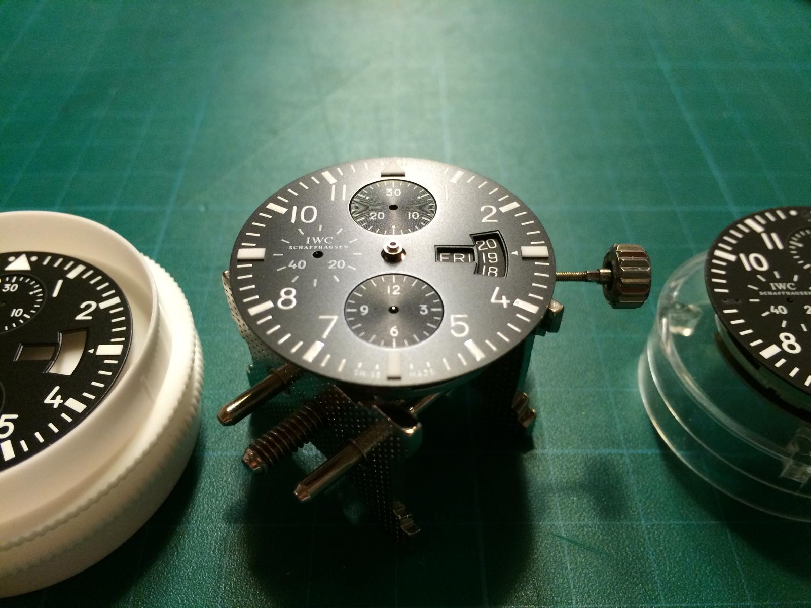
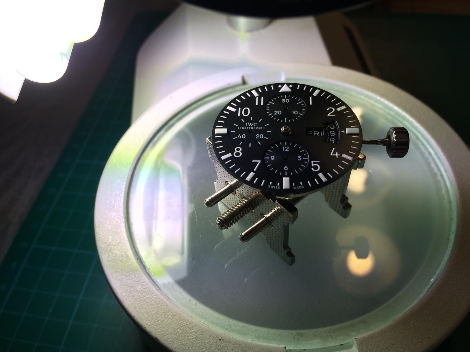
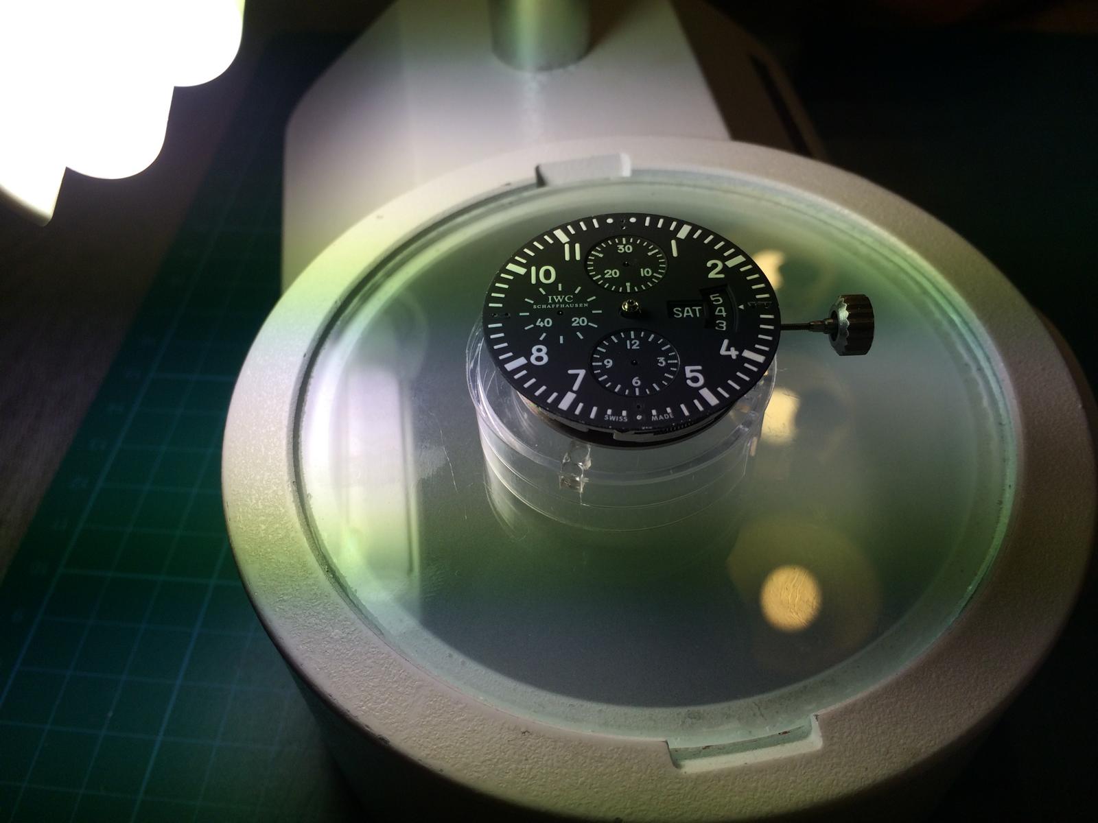
Time for the Inside Stuff
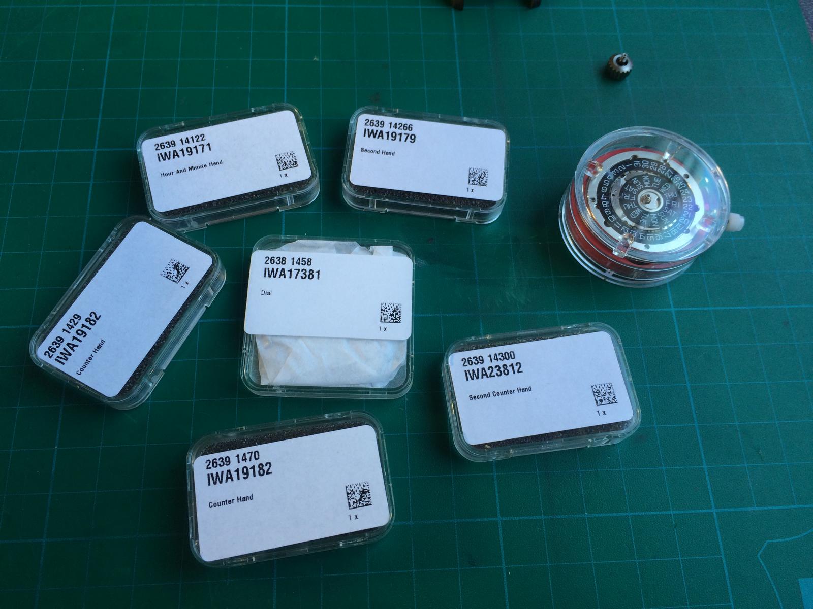
Add the GEN DateDiscs and the Dial on the GEN Movement
Add the GEN Hands
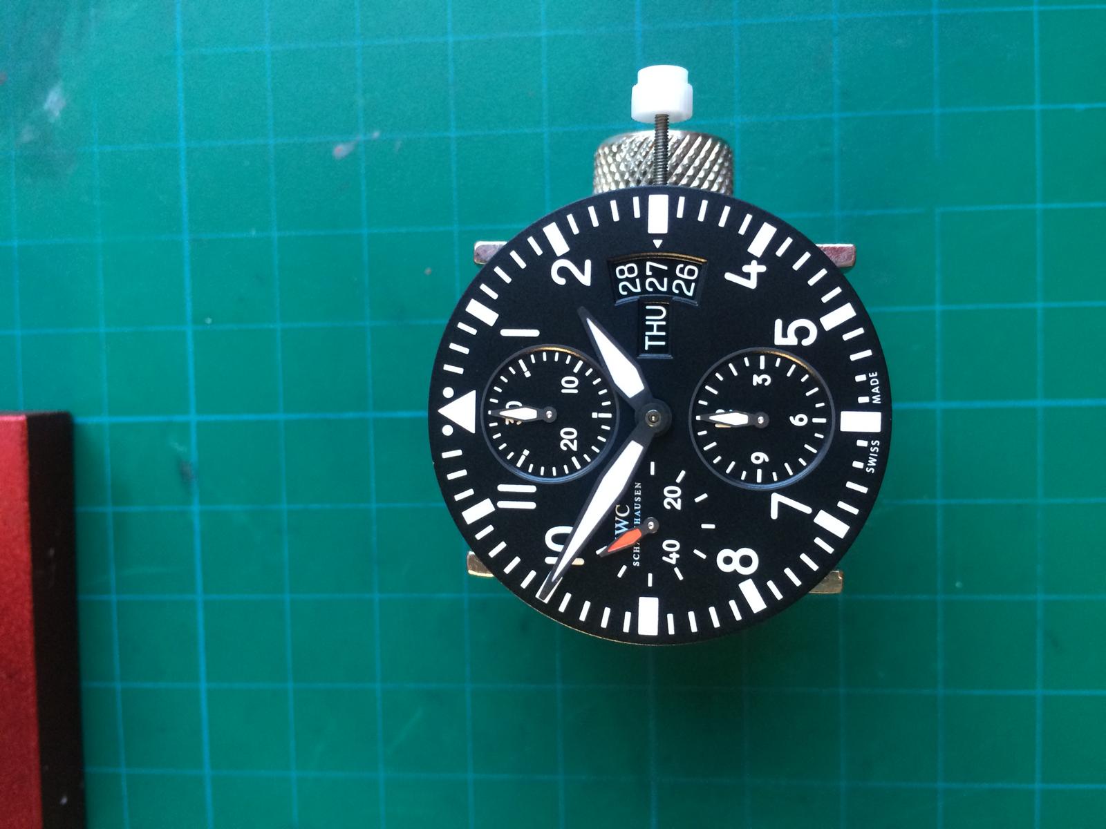
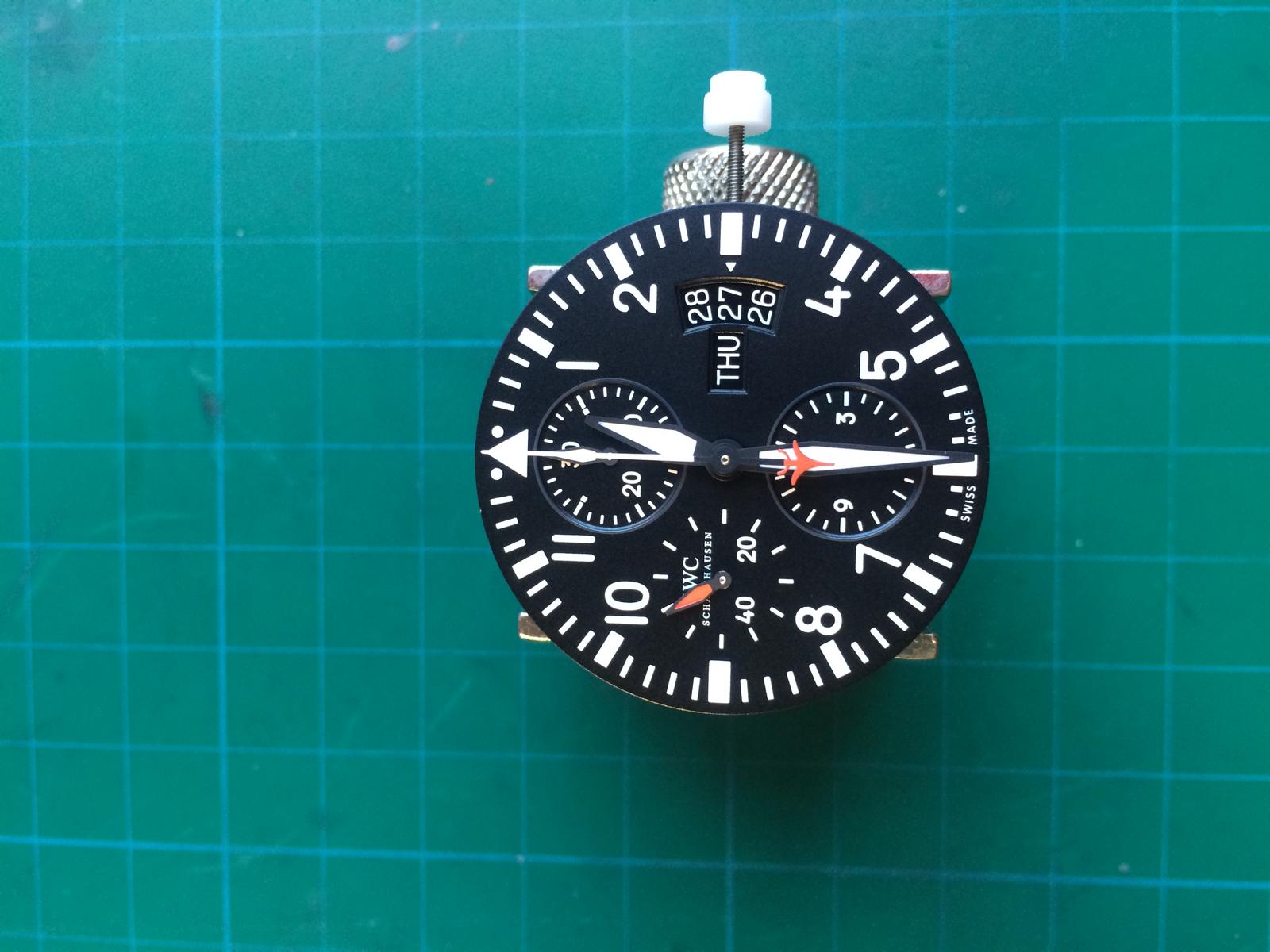
Add the Gaskets and the Caseback etc.
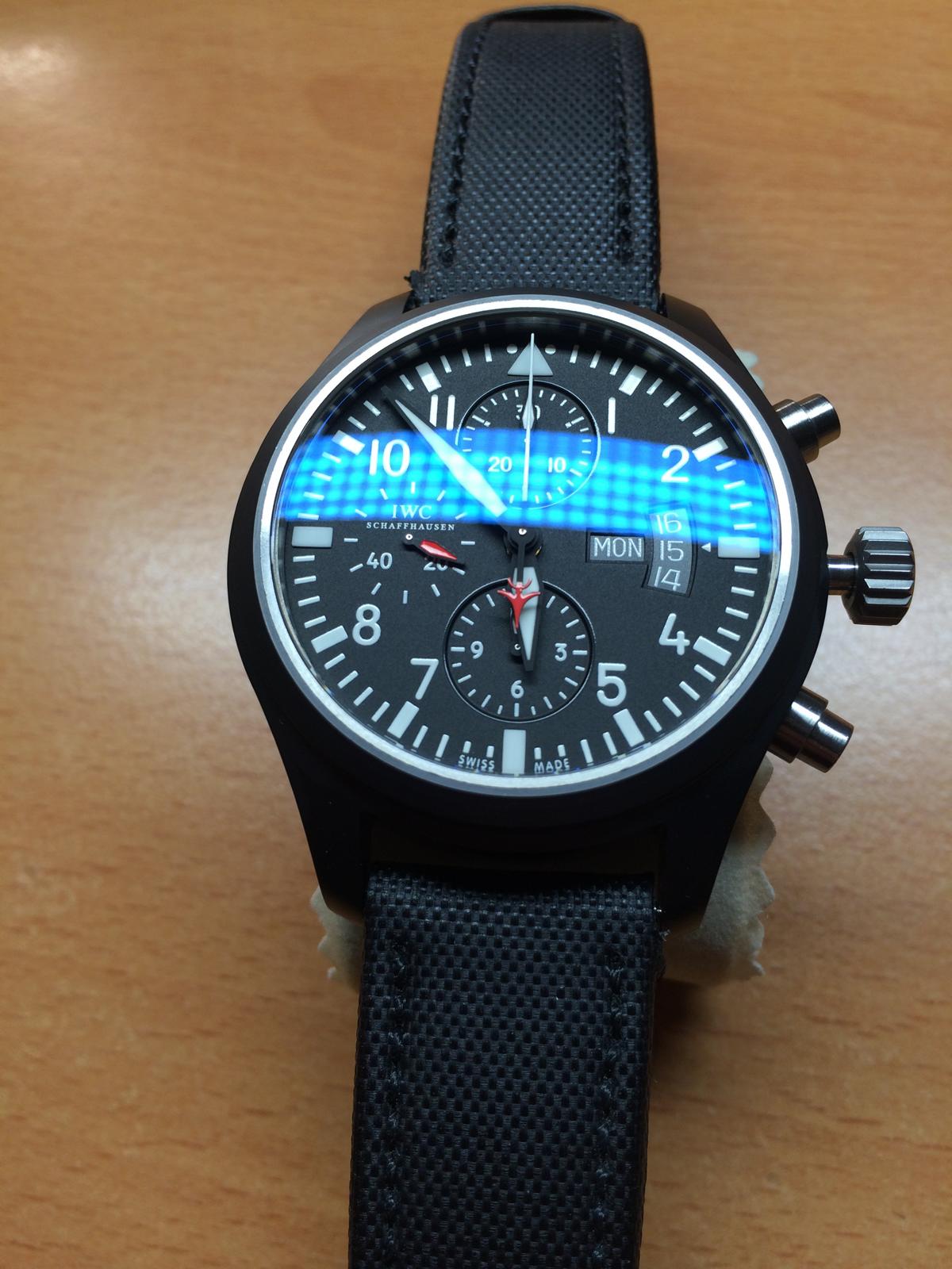
And after all that the SUN is going up
And at the next Day i saw her with her Husband in the Sun
Sweet Hand in Hand
Let we leave them alone
I say Thanks for Looking! Hope you had enjoy it and
See you on the next Episode...
----------------------------------------------------------------------------------------------------------------------------------------------------
So the First Episode had End here...
Now it´s Time for some interesting Addon
So what we have ?!??
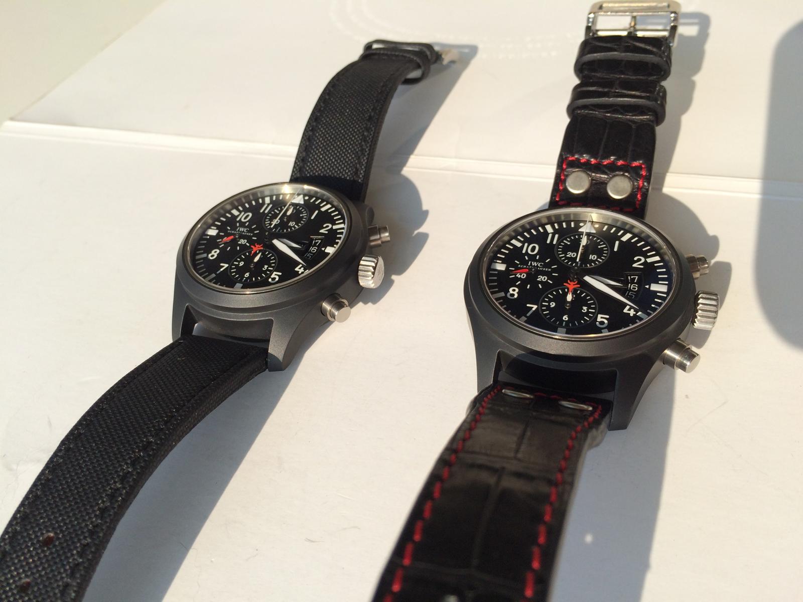
I add the Comparison Franken v1.2 vs GEN
So let us Start with the Logo Color
So here we have now the right GEN Color...
And a little Closer
So i can´t Compare the other Versions 1:1 but i have Compare them with my Pic Archive and as i already said, the V1.2 have the best an Closest Case Shape.
Followed by the V2 Case. At some Angels the V2 looks better, but i think in overall the V1.2 Wins.
Let us take a look at the Shape v1.2 vs GEN
As we see the GEN have an harder curve at the end and the Lugs on bottom are a little shorter and much nicer in shape.
But from the side view we see that the v1.2 Case isn´t bad
From the Back we can see the Shorter Lugs. If you put the Case Flat on the Table the GEN Stand 100% on her Feets (Lugs) the Reps are a little out of Angle
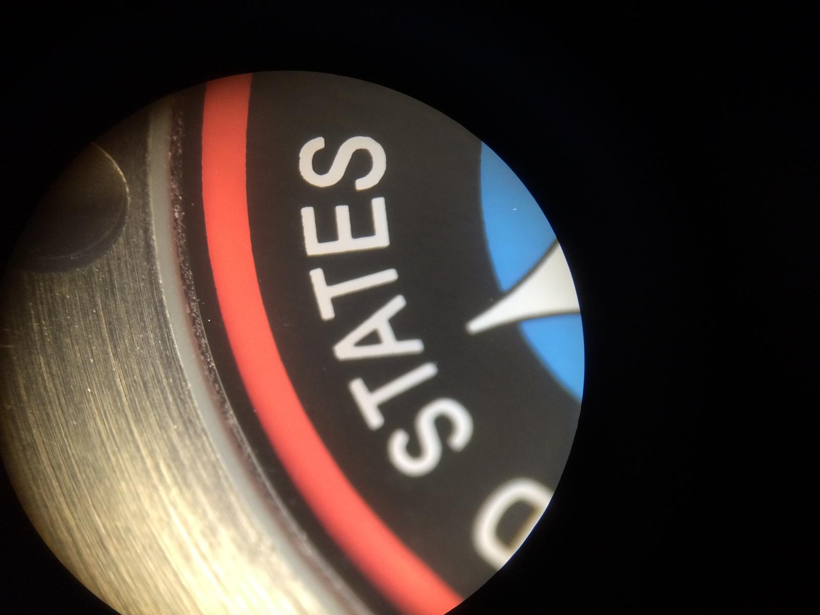
The Inside is also different... The GEN is much better Quality and the inner Metall Fit absolut Perfect to the Ceramic... And this makes the different that the GEN Watch is absolutley Waterproofe
But also the Rehaut is different... We see how nice and Bright the GEN is...
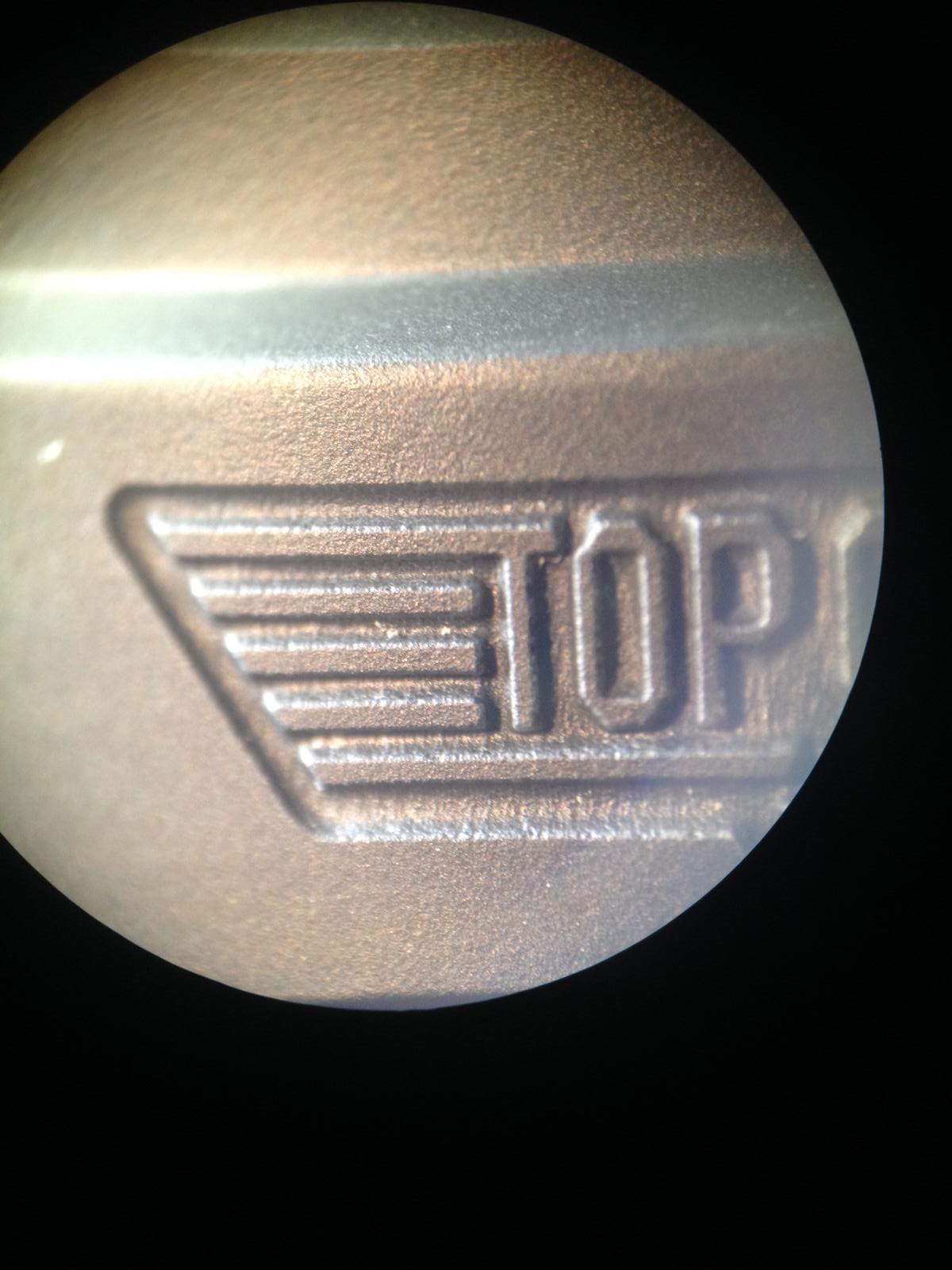
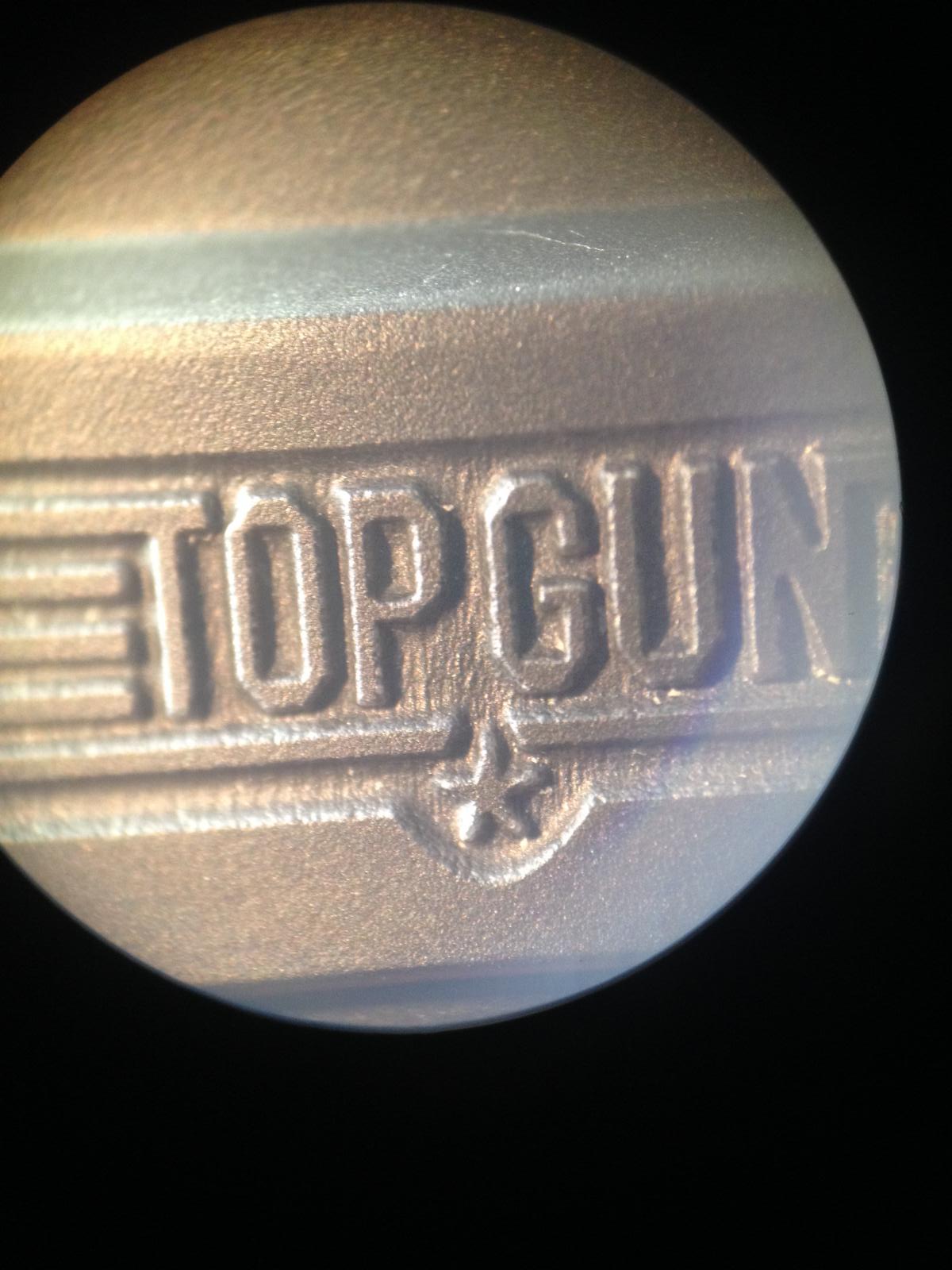
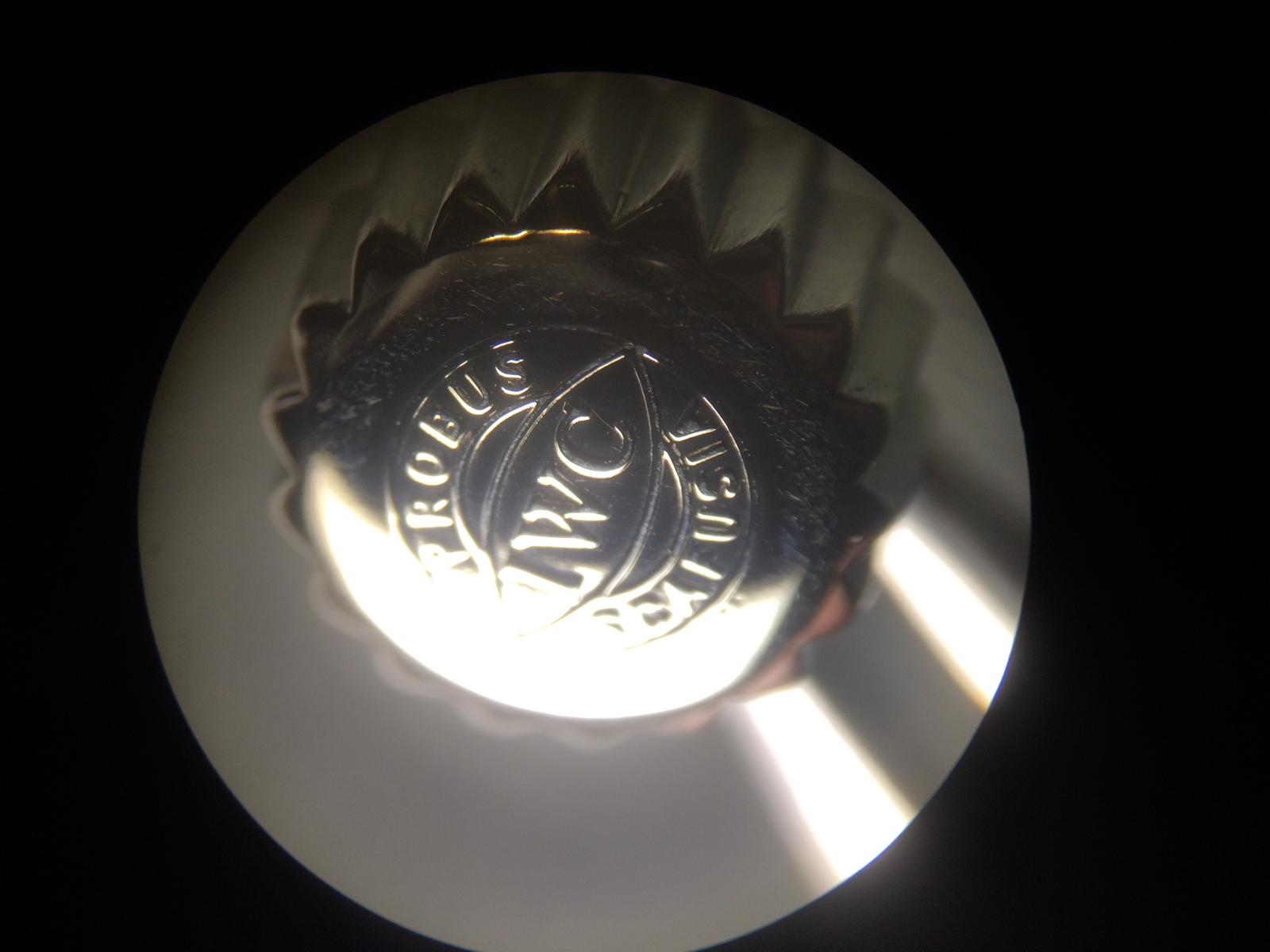
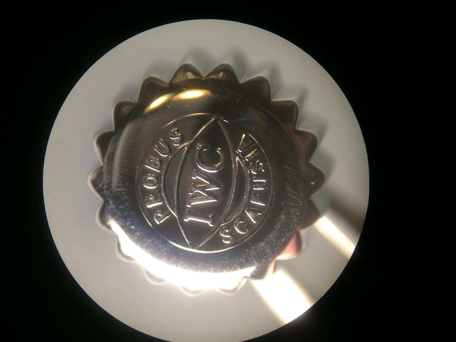
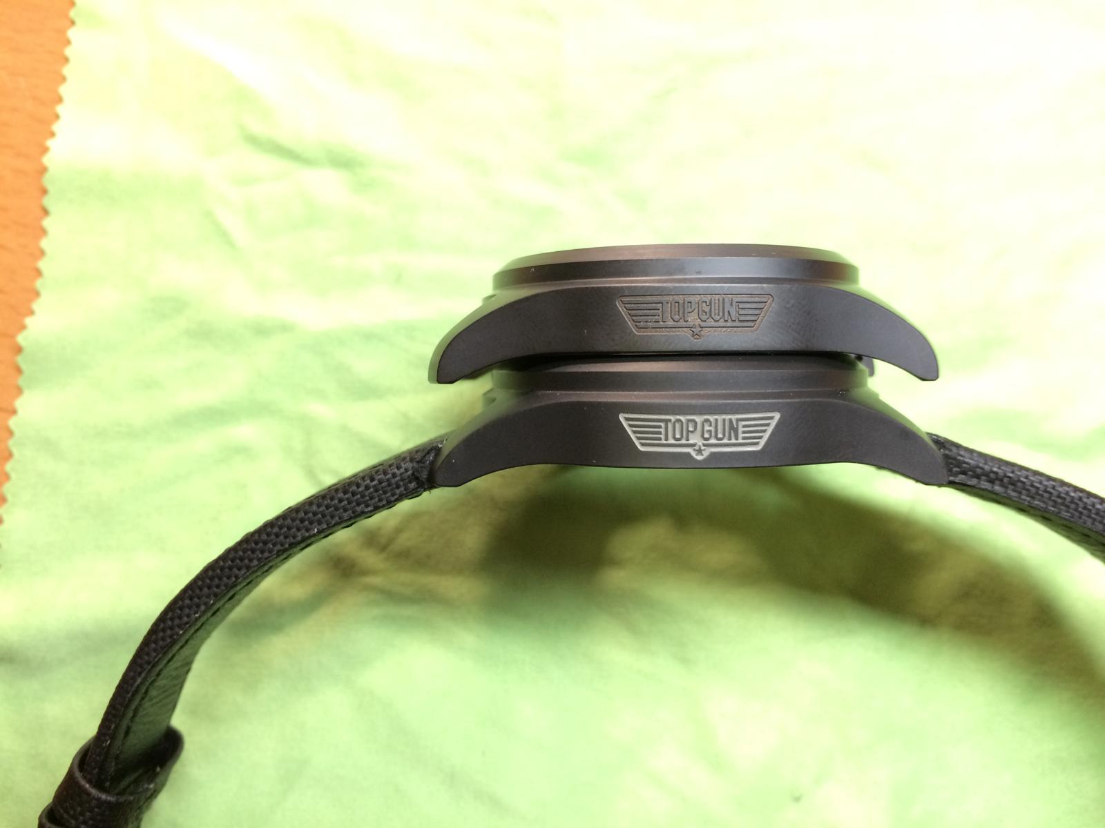
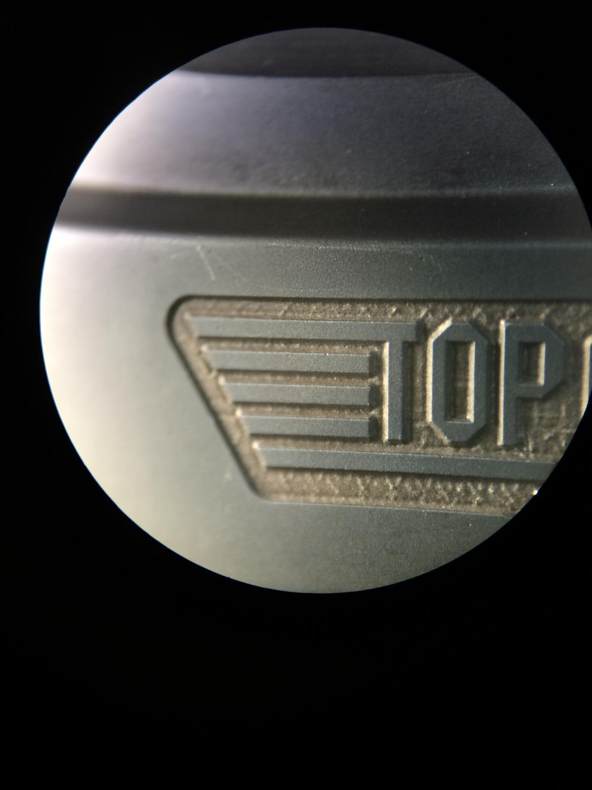
Ok so let us come to some Marco Pics of the Logo
We can see the Color now into Details... And the Logo Engrave...
The Engrave self is really nice an even, but under the hood it looks like same as the Rep Engrave...
So many of you have Speculate which Color is the right one and which not... Let me tell you that you can´t see it by Pictures!!! You´ll have on every Picture an different Color.
But i can tell you how IWC made the Logo
They did it same way as Rolex did on there Ceramic Inserts. So that means that IWC have DLC Coated Ceramic before Rolex it did.
You don´t believe it isn´t DLC´d ?!?? It is!
So i have try many Chemical Stuff on it. 96% Alcohol, Aceton and and and... And nothing of that Substances have Touch the Color in anyway.
You can´t rub it off. It´s clear when it is DLC´d
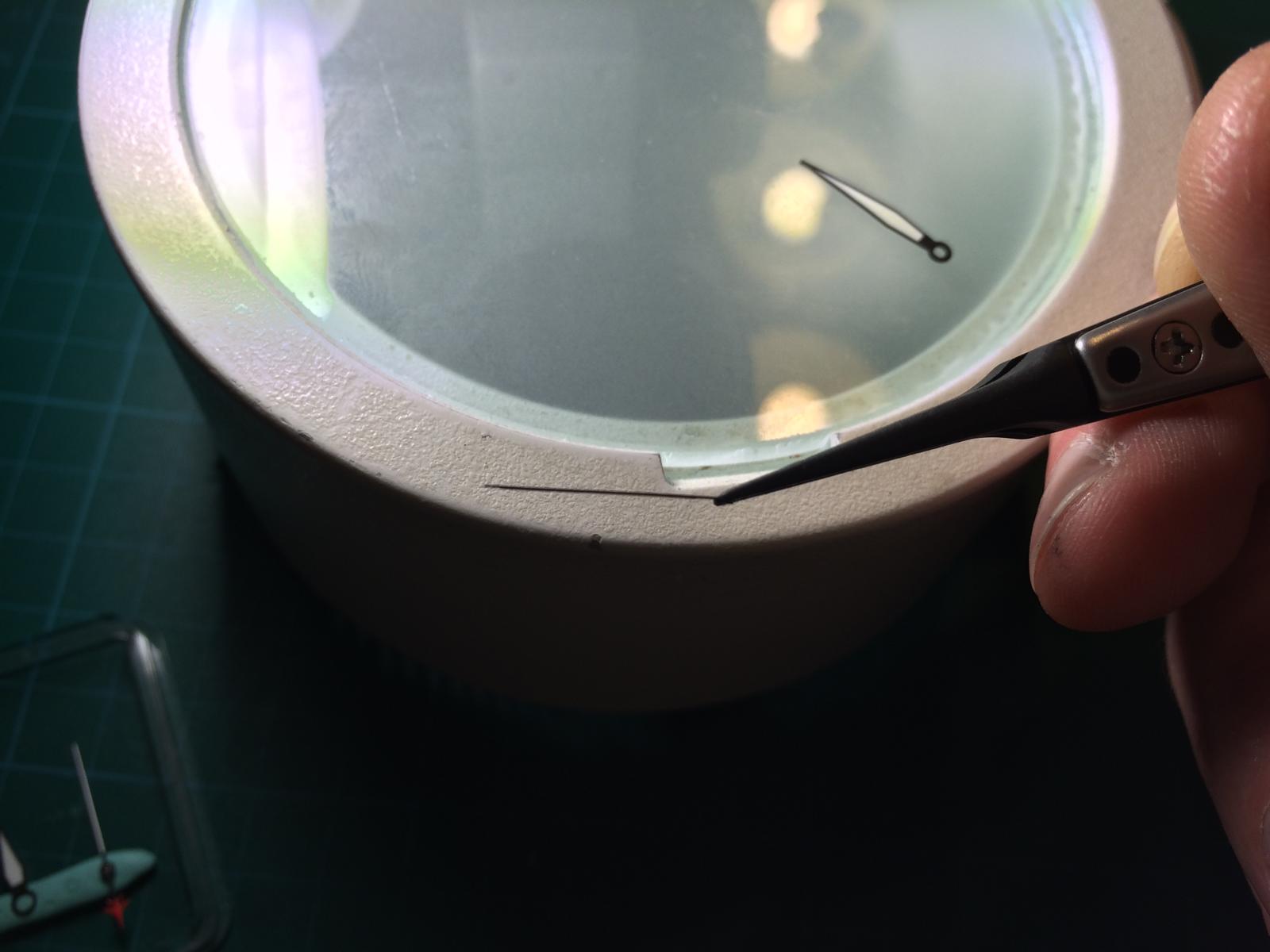
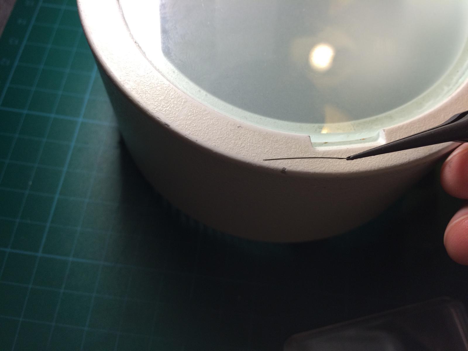
Then i have take an Needle and scrub at an Corner a Bit. And then it happend. It didn´t come off but the Color become from Dark to Bright.
And what did i see ??? Brass the Color is DLC´d with Brass.
And so we have our Color. The Color is no really Color it´s Brass that was Sputed into the Engrave.
So now it´s Time to find some nice Brass Color to Emulate the GEN Color
Let us take an Closer look at it...
As you can see the v1 Franken that i have SOLD had Brass on the Logo and it looks really Similar.
Ok I have to withdraw my statement about the Dials and the Minute Hand!!!
I mean not Complete but this was new for me too. There are Two sorts of Dials out from IWC.
It seems so that there is an older Batch and an Newer updated.
What does this mean?
So it means that the first Watches had other Dials Build in as the newer ones. Same as by Rolex and other Manufactors have they change the Dials.
The Dial we see here in the GEN Watch have an Matt Rough Texture very Close to the newer v6 Dial... The Dial looks in real Dark Matt, the Dials that i have Build in the Frankens was Brand new and they look like light Glossy.
The Texture of the newer Dials are also a little Rough but it seems so as had they an Finish.
Also the Printed Texts are much better at the newer Dials. They are much more Clear. The old GEN Dial looks a little Bit like the Print of the v1,v2 Dials.
They are surley better with naked eye, but under Microscope you can clearly see.
So let us take an look
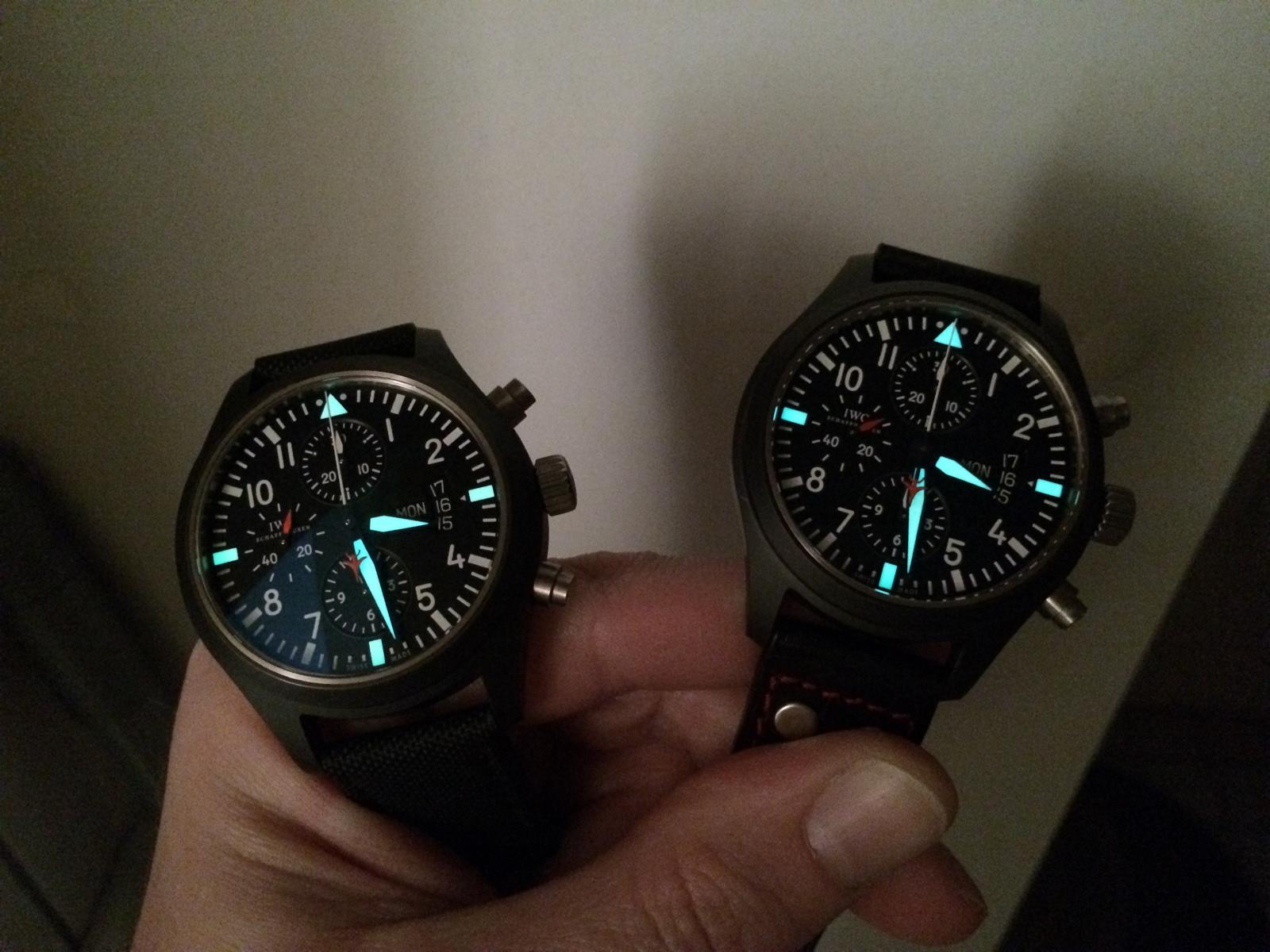
The Triangle and Squares looks identical to the new Dials only different is, they have changed the Lume Color! the new Dial is much stronger.
The Concetric Cycles are much better Visible at the Old Dial. The Greyish ring is also there as at new Dial.
But we see the Print is a little Rough
We can see it also at the Hour Numbers
The Date Window is also different! At the old Dial it looks much more sharp, i think the newer Dials are Painted with more Color. Because there are no Hard Edges as on the Old Dial.
I dunno why, but the Distance btw Dial and Date is marginal smaller... This looks great! It seems like the DW sit directley under the Window.
Here we see the Square
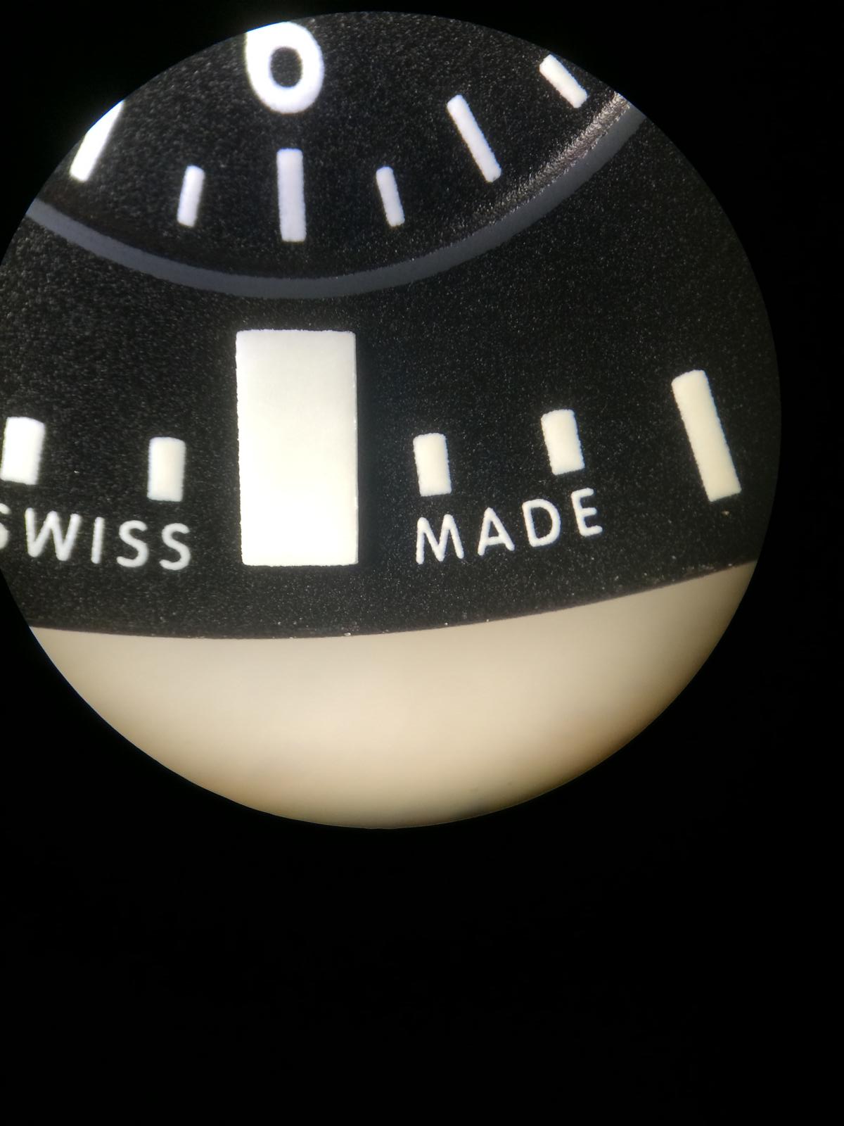
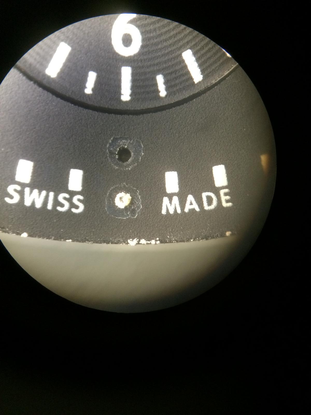
And the SWISS MADE Print is also little more Rough
Best visible Part is the Schaffhausen Print
Ok here we see the GEN Dial alone. It looks Matt. First i had think this sucks a little, but it looks really nice in Combination with the GEN Ceramic.
The GEN Ceramic Color is a little Darker. This isn´t really visible at the Pics but in real the GEN Ceramic have an different Color.
So the unsharp Print isn´t that nice but it´s in real not Visible but it´s in the Mind
But the Matt Dial looks absolut Perfect with the Ceramic... It makes an real Tactical Watch look...
And Compare with the Franken... I have try to make it a little visible... We see the different Colors
So there is another different!
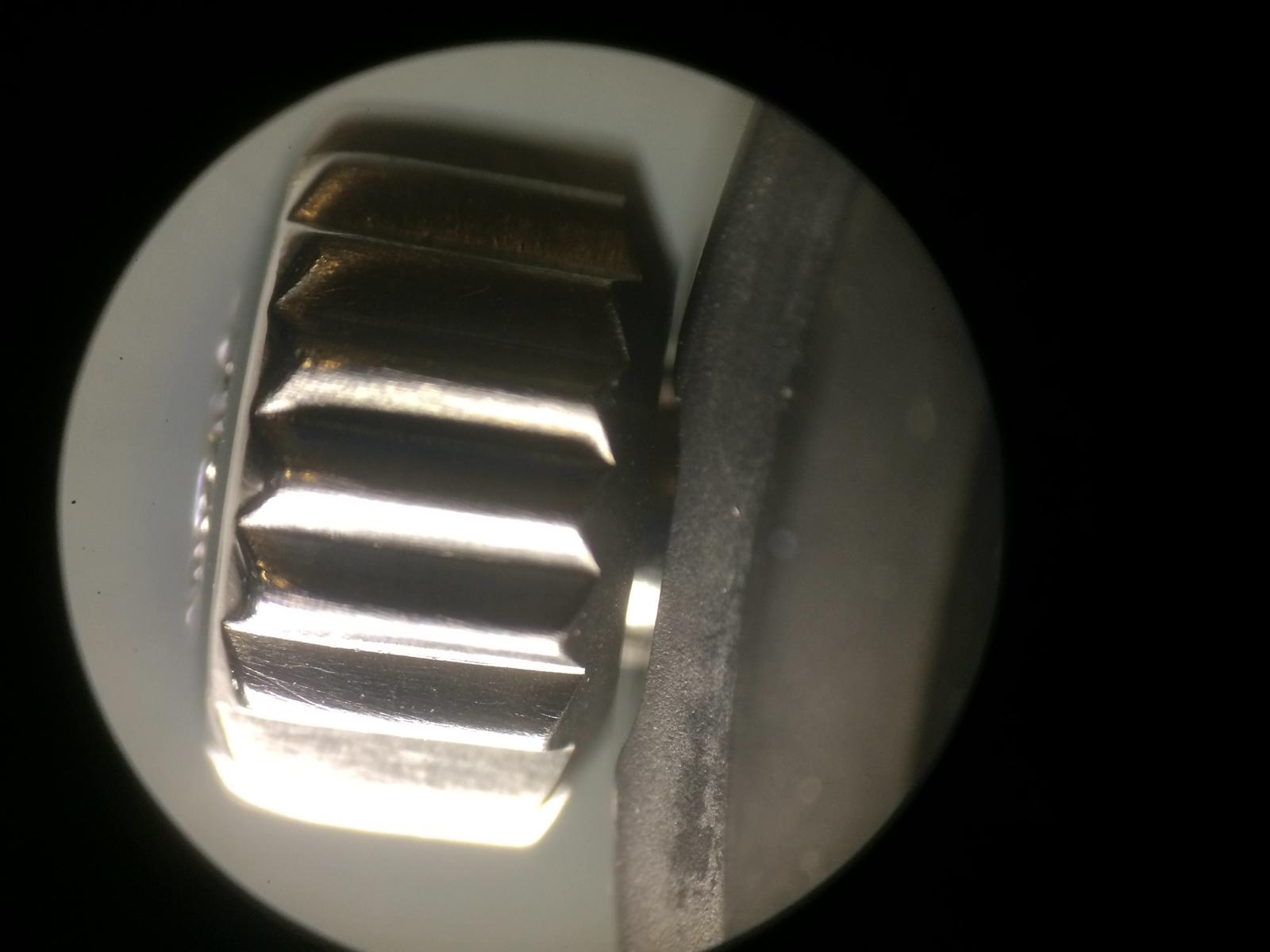
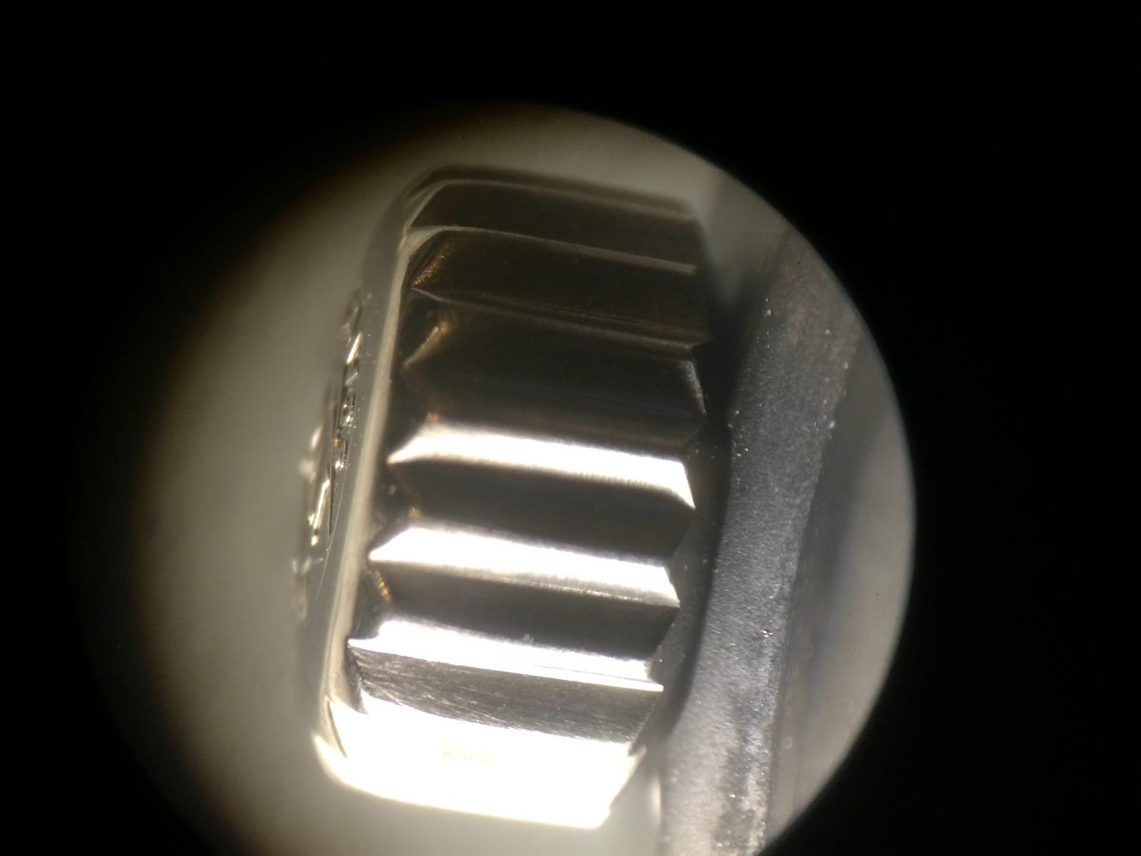
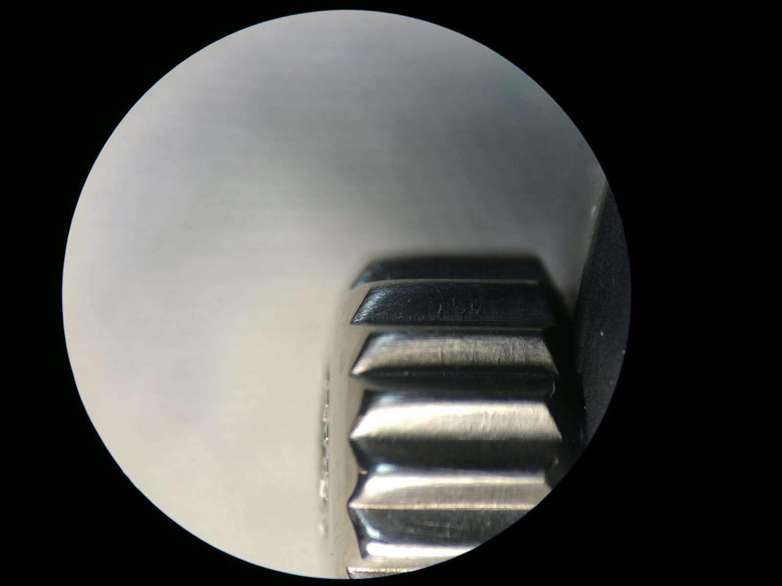
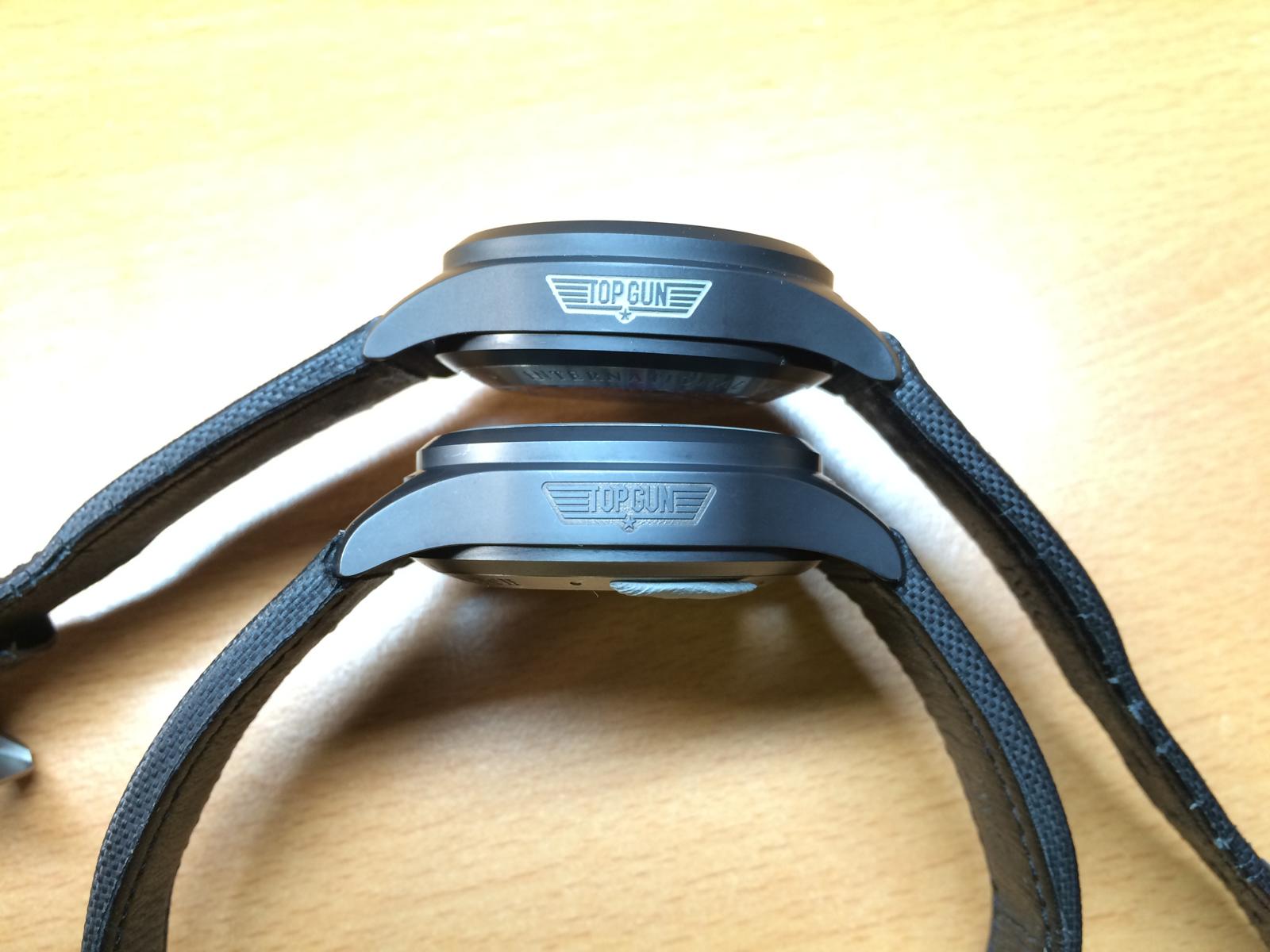
The Crown... There are two Types of GEN Crowns, didn´t know that too the old Crown looks much nicer! In my Eyes...
Because the Old Crown is more edgy... The New Crown looks like Repolished... Let us take an look first at the old Crown.
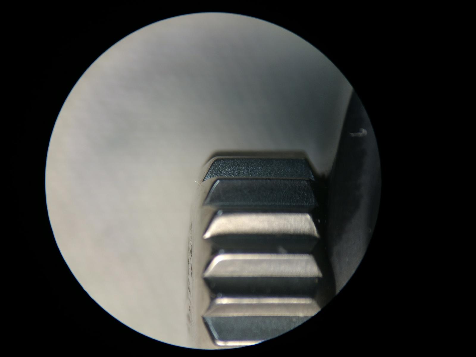
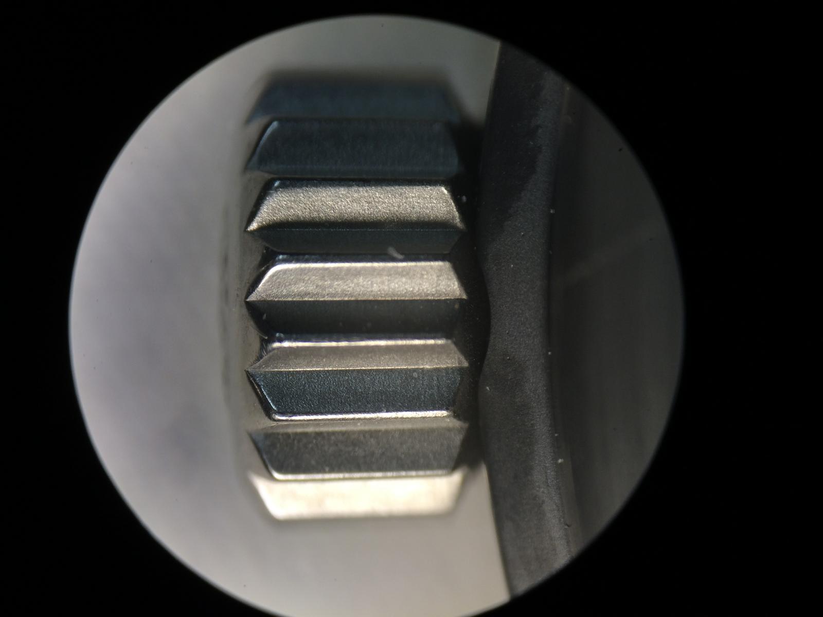
And the New Crown
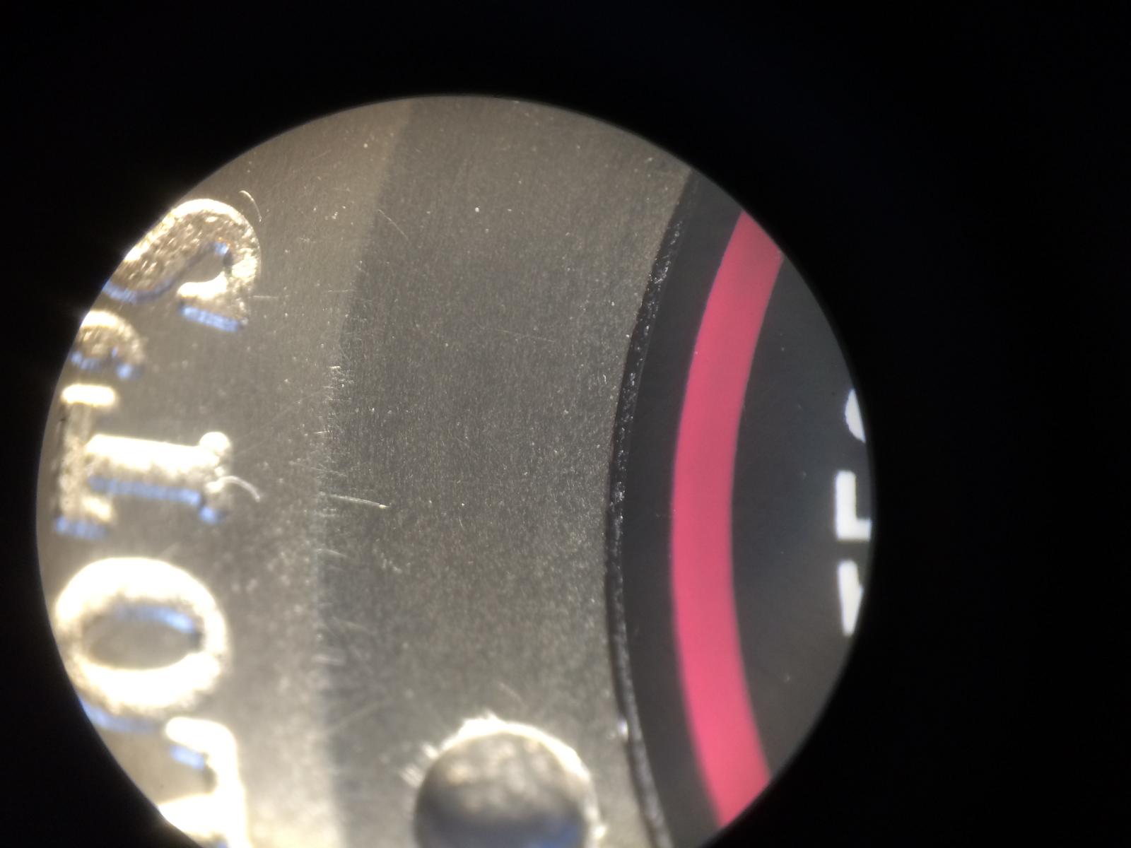
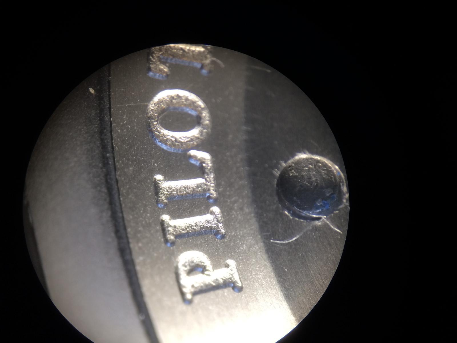
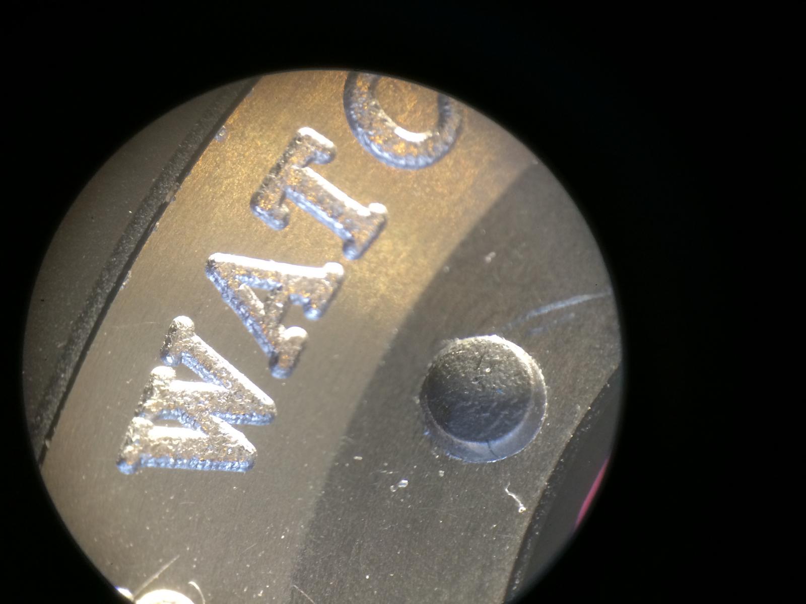
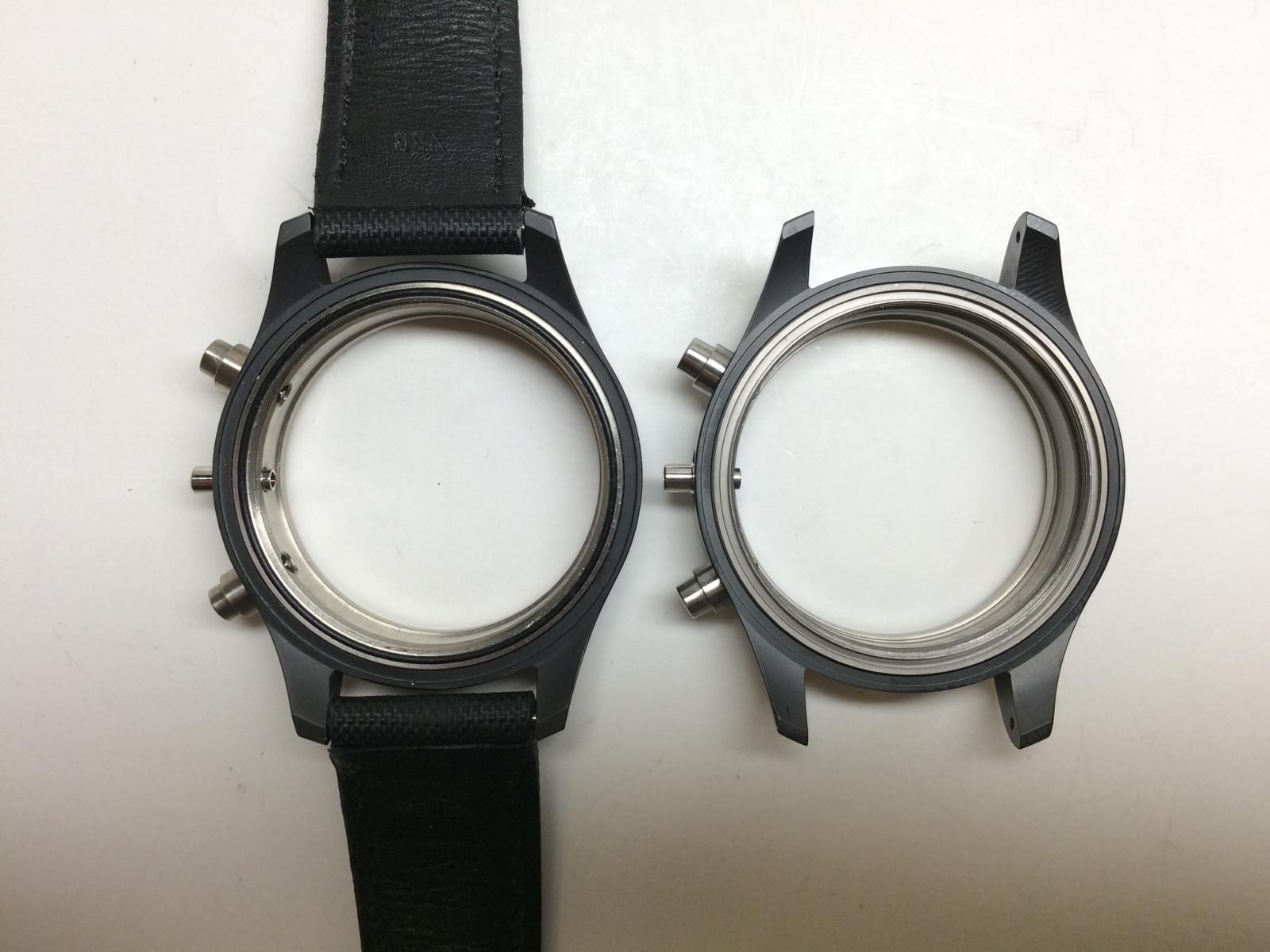
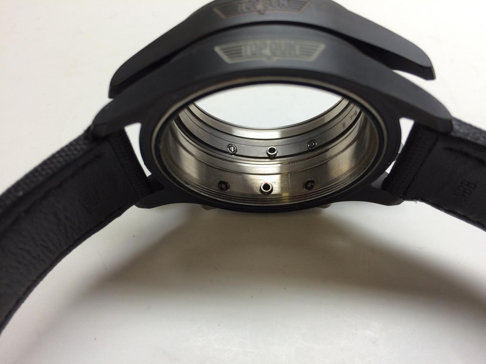
And the last different is the Case back... The GEN Ceramic Part of the Caseback is smaller... Here we can see...
The inner Engrave of the Caseback are massiv different... But i think this we know already... The Caseback is the v6 Caseback!
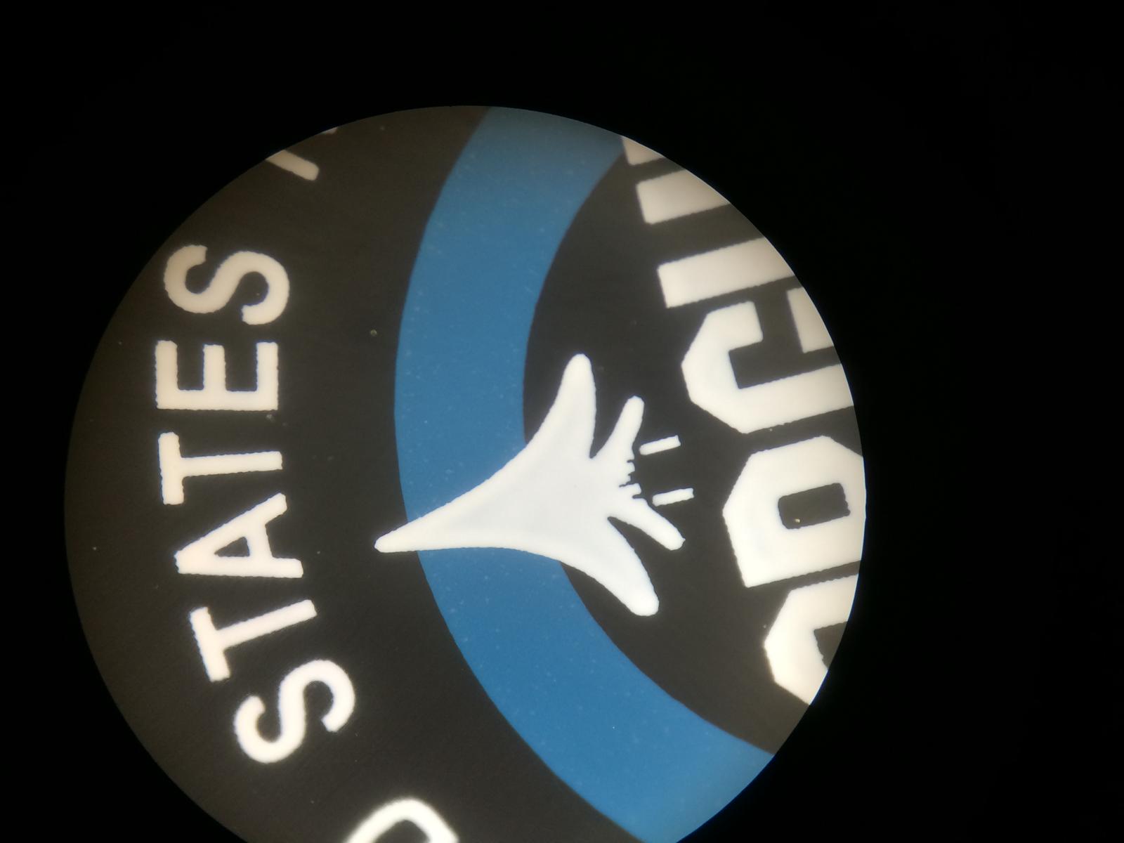
The Logo on the Back looks really good... The Airplanes Afterburner isn´t soooo nice Printed at the Rep but there are Casebacks out that are really Perfect.
The Engrave is at the GEN much Deeper and nicer... So cool would be maybe an mix of the older v1, v2 Caseback and the v6
So this are the little Addon Facts
So there are a few differents here and there... I didn´t make now for every little these and that an Pic so you can see at the most Pics.
What are different too?
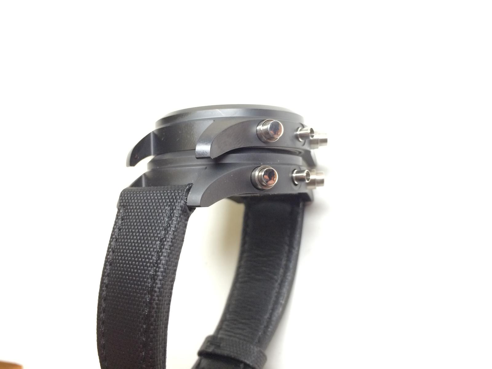
The GEN Pusher Outerrings are thinner and the Pusher self is a little thicker. The feeling is also much much different. Much more Stable.
The Complete Pusher Construction is different, but these can be changed if you add an set GEN Pushers at the Rep Case.
The Tube have with the Mod the same distance, the Ceramic around the Tube is a little different at the GEN but only Marginal and not really visible.
The Cutted Parts are much better at the GEN for Exsample btw the Lugs, the drilled Holes for the Spring Bars are better.
The Ceramic Color is different, the GEN is a little Darker but the Rep Ceramic isn´t not as prone to fingerprints.
So all in all as i already said, the v1.2 Case is in my Eyes one of the Best Cases to Start an Franken
So I say Thanks again for Looking! Hope you had enjoy the little Addon and would say
See you on the next Episode...
Hi RWI People
So i find a little bit Time on the easter Days to Present you an Review of the IWC 3789 Top Gun...
I know there was some Threads already, but the most of them wasn´t really Complete in my Eyes
And there was some Infos missing...
But ok enought about the Blah blah
i hope you guys enjoy it...Ok let us take an Look at these what i have done for an nice Member and good Friend here on the Forum
Left my Own and right Customer Franken...
Are they not Beautiful?!??
But ok let us take an Look not to the Complete Watch only
Let us Start from Top to Bottom.
CRYSTAL:
Ok unfortunately I gave the Rep Crystal away, before I photographed it.
Therefore, you must believe me just as
So the Installed Crystals in the Franken are GEN Crystals.
I Compared them before, and i must say the Rep Crystal are not Bad but the AR isn´t soooo good as the GEN.
The GEN Crystal has an much Harder AR and the Saphir Edge of the GEN is much better.
The GEN AR has an nice Blueish Tint that gives the Dial an Special look.
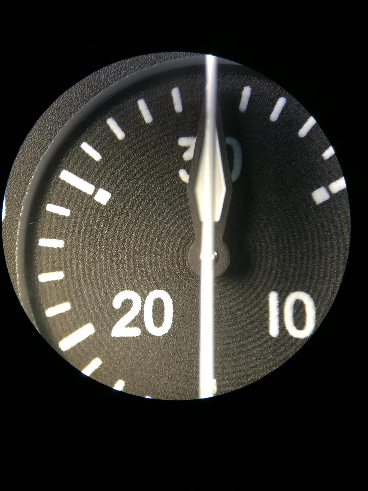
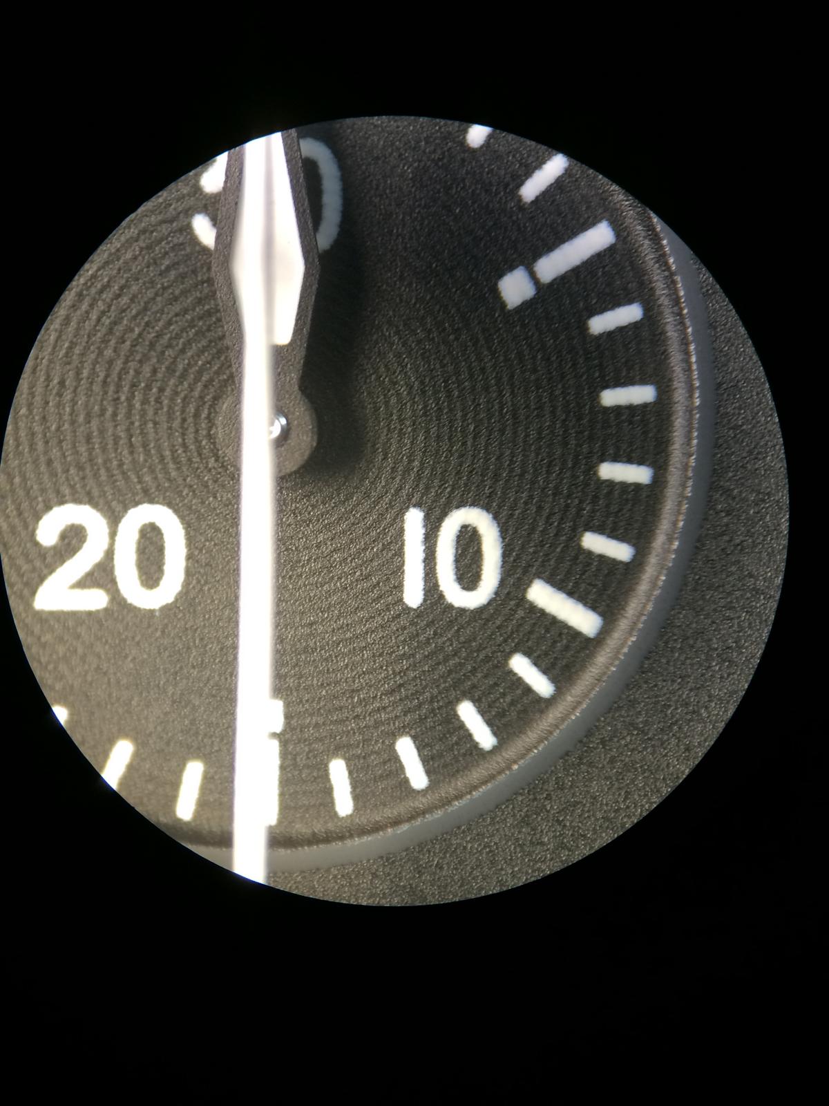
HANDS:
There are 2 Batches of GEN Hands out from IWC for the Ref.3789
The different is only visible on the Counter Hands and the Second Counter Hand
The Old Batch you will see in my Own Watch has an more light Red and the White isn´t Glossy Painted.
The Newer Batch has an more intensive Red and the White is Glossy.
So the Big difference between GEN and Rep is the total Quailtät.
You´ll see it in the Pics.
Some still claim that the Second Counter Hand is bent at the top, that is only at the Rep Hands so.
The GEN Hands have no Bent.
The 2nd Point on the Second Counter Hand is the Plane Logo, the GEN isn´t so far Painted Red.
The pointer shot pin on the GEN Hands are also much better.
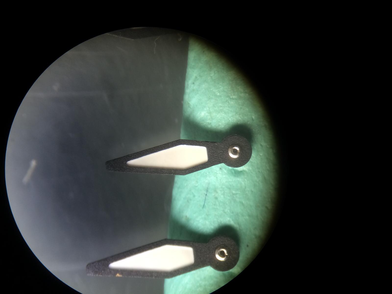
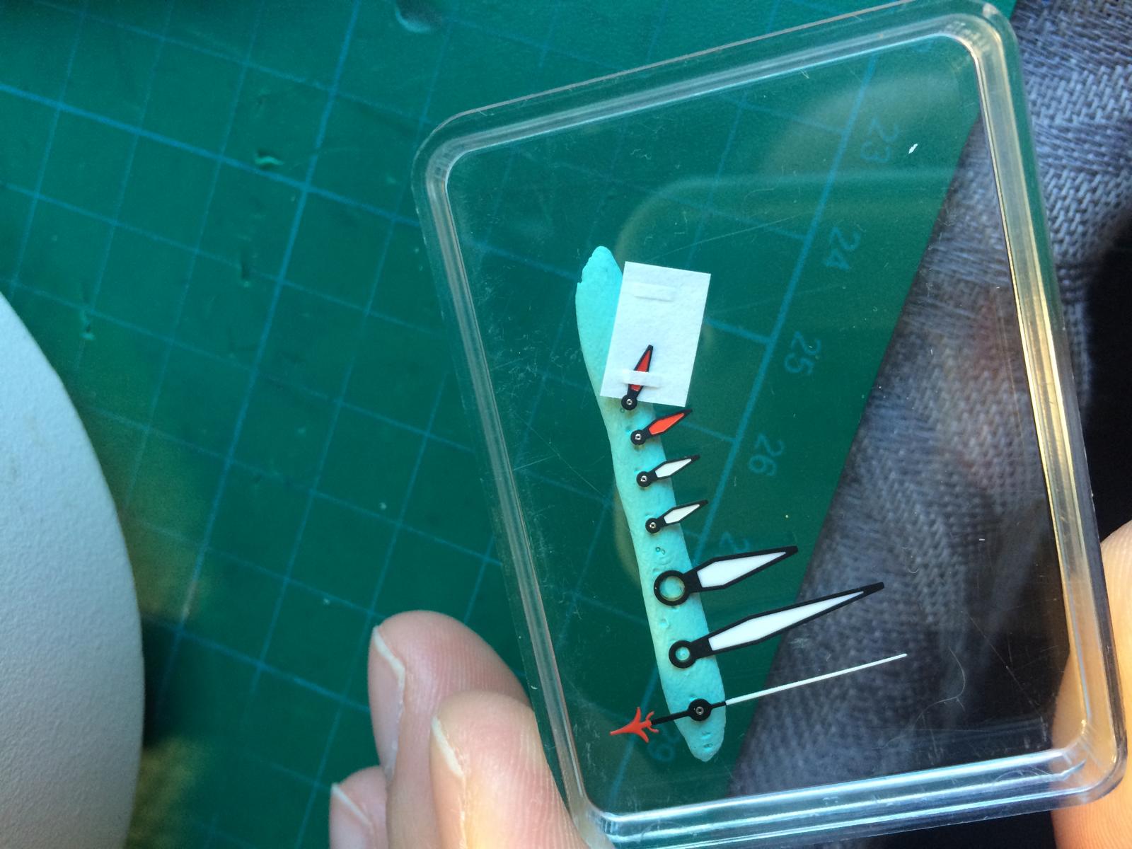
Ok let us come to the Pics
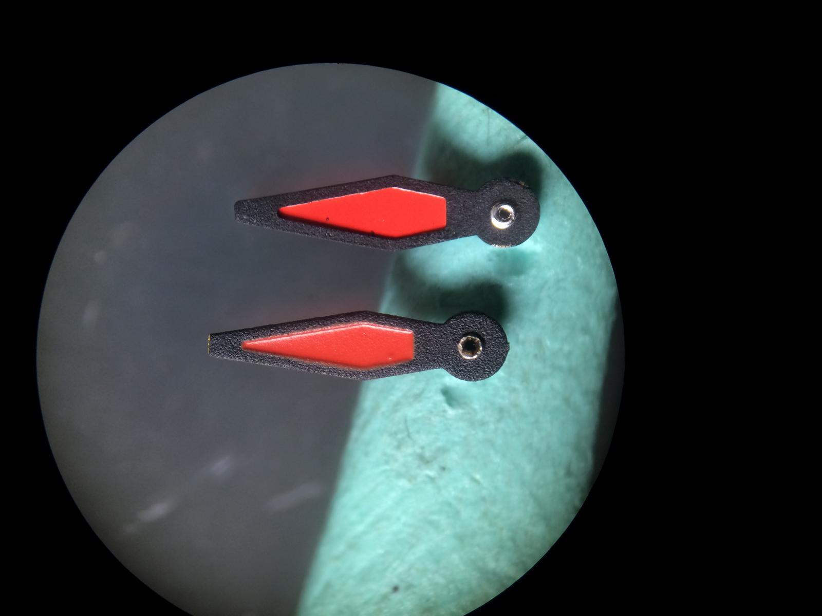
This is the OLD Batch set (My Own)
The Red on the Counter Hand have the same Color as the Plane
The White is here Matt
See the Texture it´s very nice and no Rough Parts
Here we see the Plane is only Colored Red a little over the End
Here you see the Point Shot Pin looks much better as on the Rep
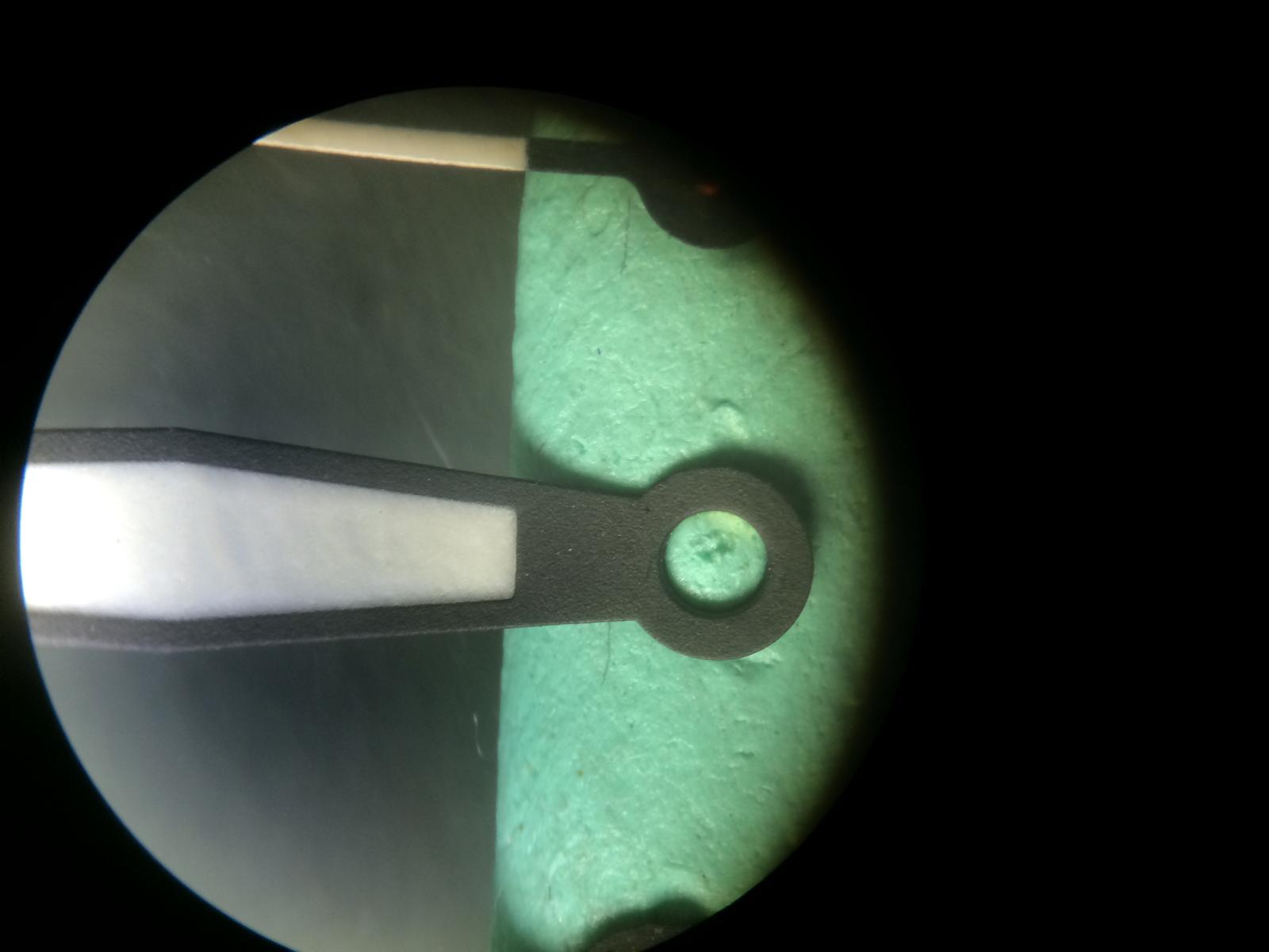
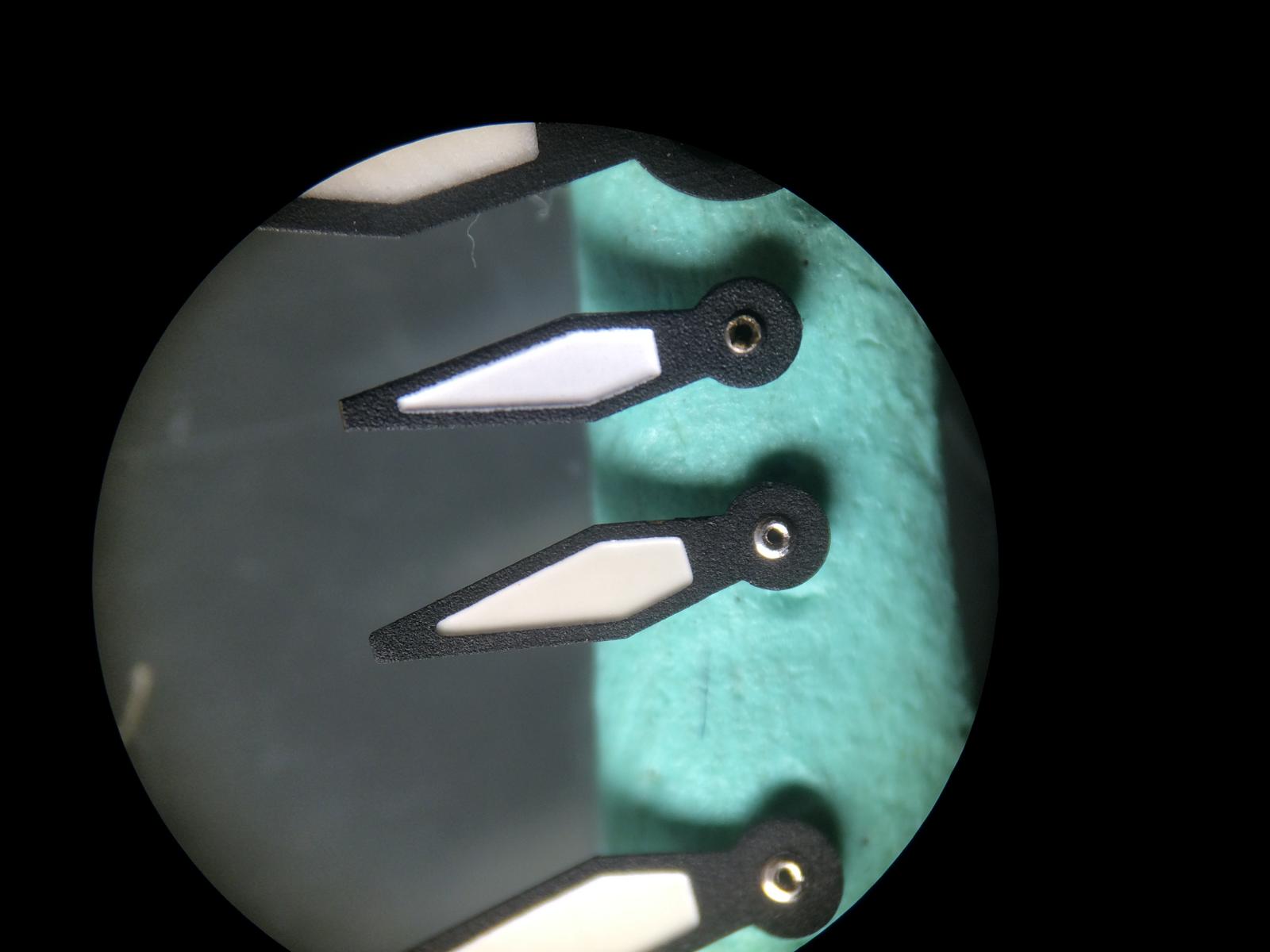
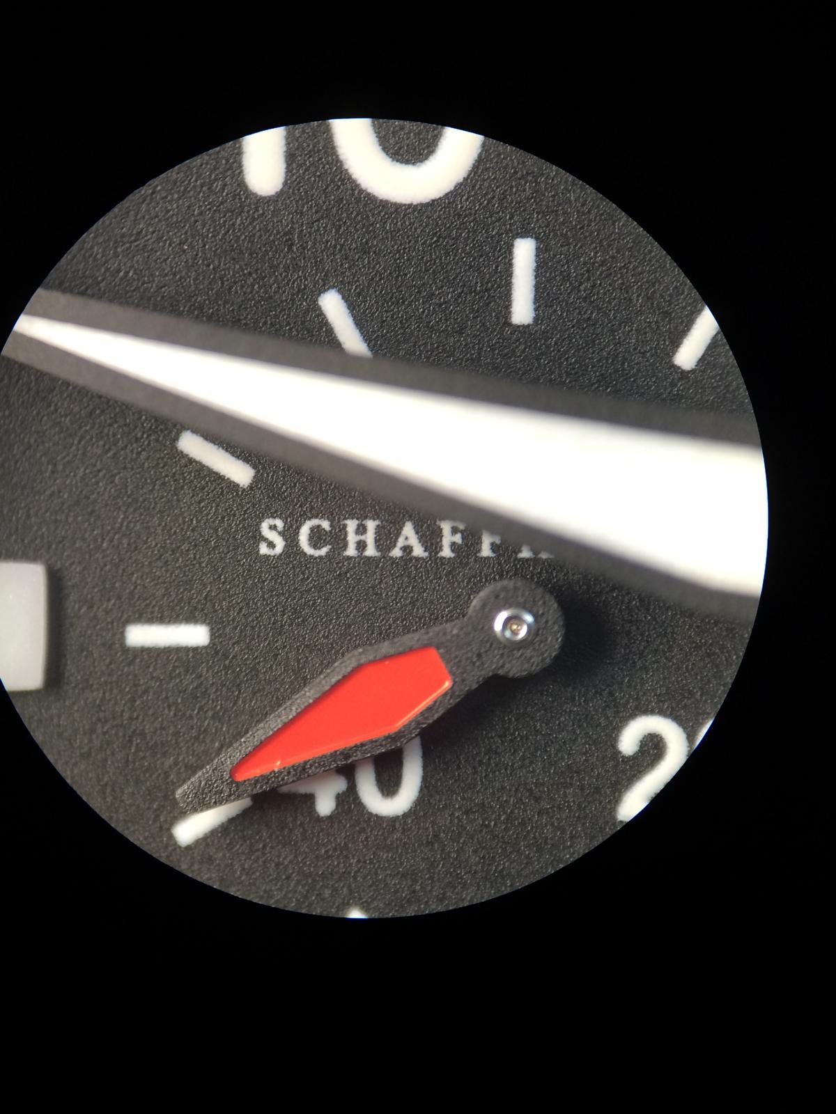
Ok let us Compare the GEN Hands vs the Rep Hands v6
I think i didn´t need much to say.
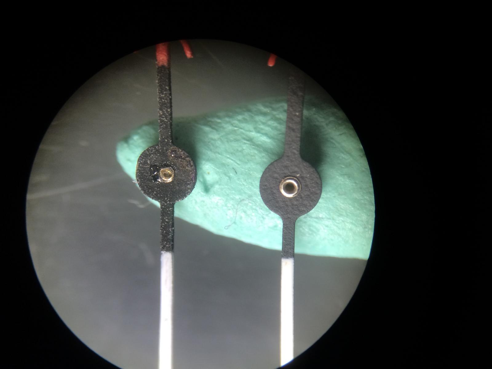
Here we see the GEN Minute Hand, that there is no Bent on the Hand.
And that is not only at my GEN Hands it was or is also on the the Customers GEN Hand.
Here we see the Rep Hand
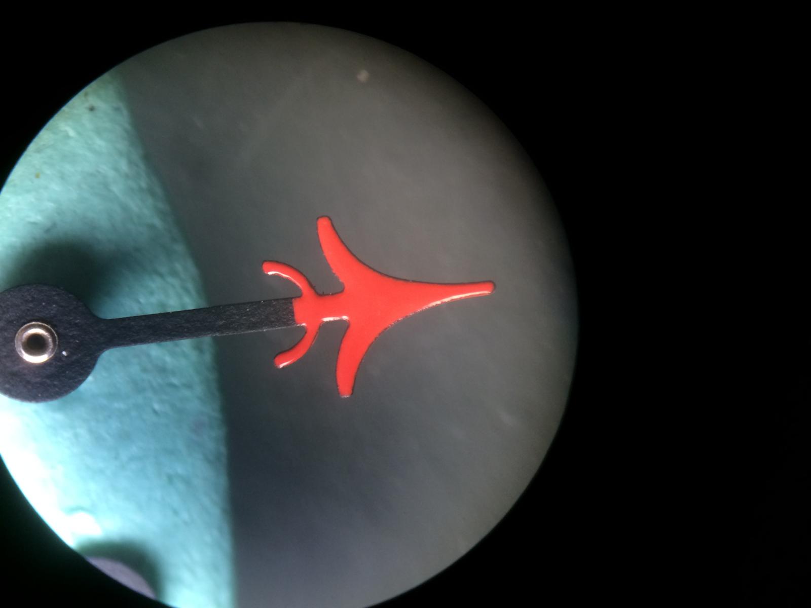
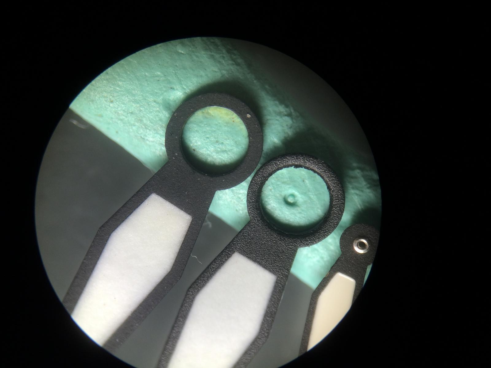
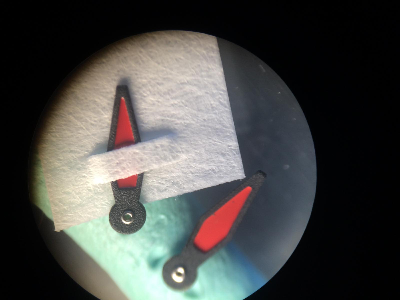
Here we see the Second Counter Hand, the overall Quailty on the GEN is much better.
Also the Airplane looks better.
The Color is Close.
Any Questions?
The Tip of the Second Counter Hand on the GEN is much nicer
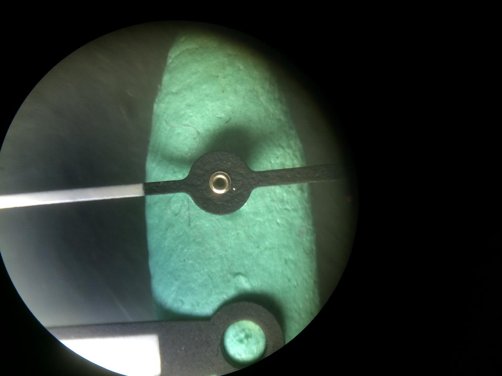
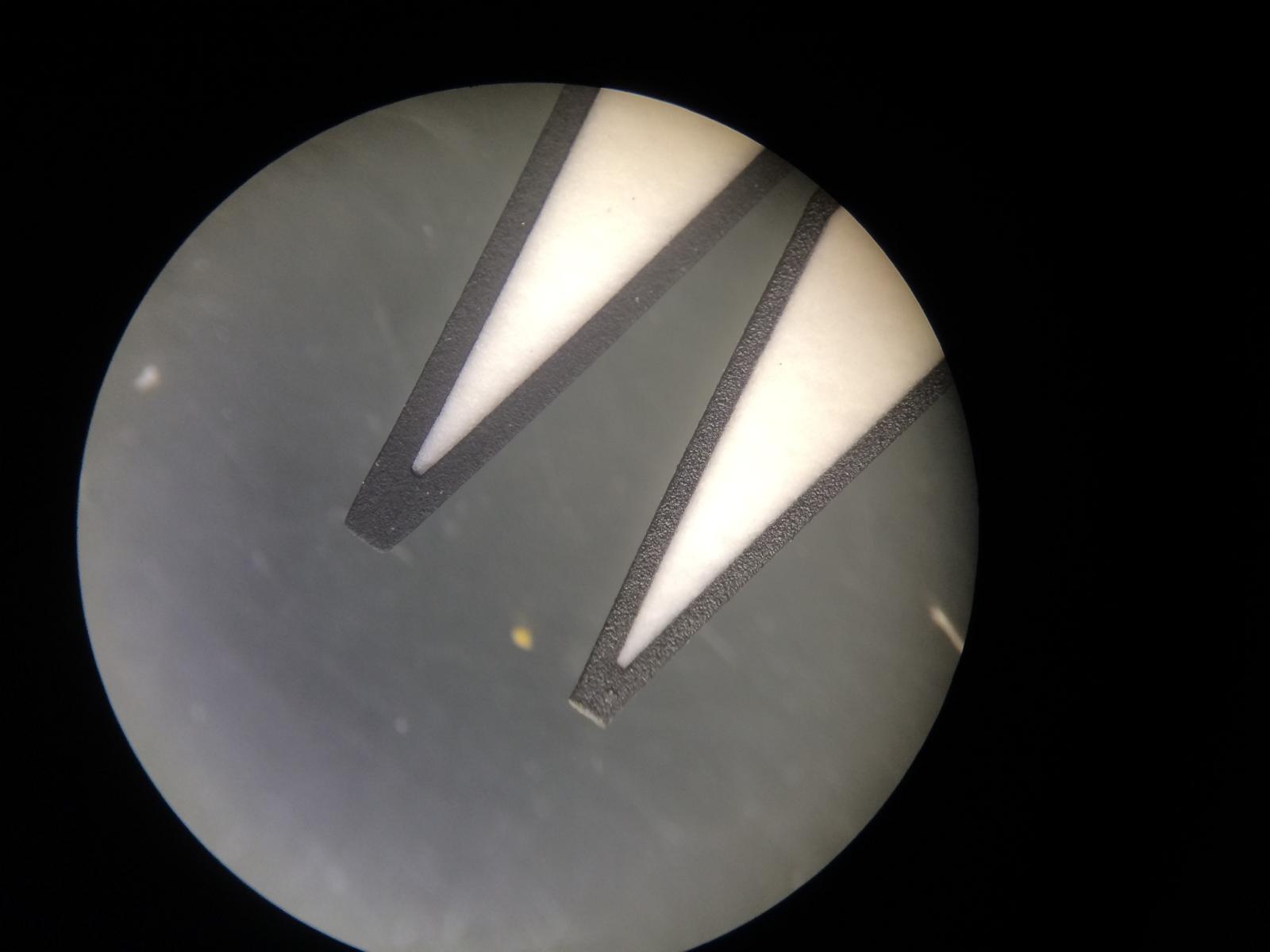
Ok let us Compare the GEN Hands vs the Rep Hands v1
We see the Red on the Counter Hand is Darker on the Old Rep Hands
The White isn´t Painted sooooo nice on the v1 Hands
The Airplane on the Old Rep Hands is smaller at the End and so much closer to the GEN
The Red is the same as on the v6
The Texture and the Pointer Shot Pin isn´t really nice but ok.
The Tip of the v1 Second Counter Hand is also smaller and closer to the GEN
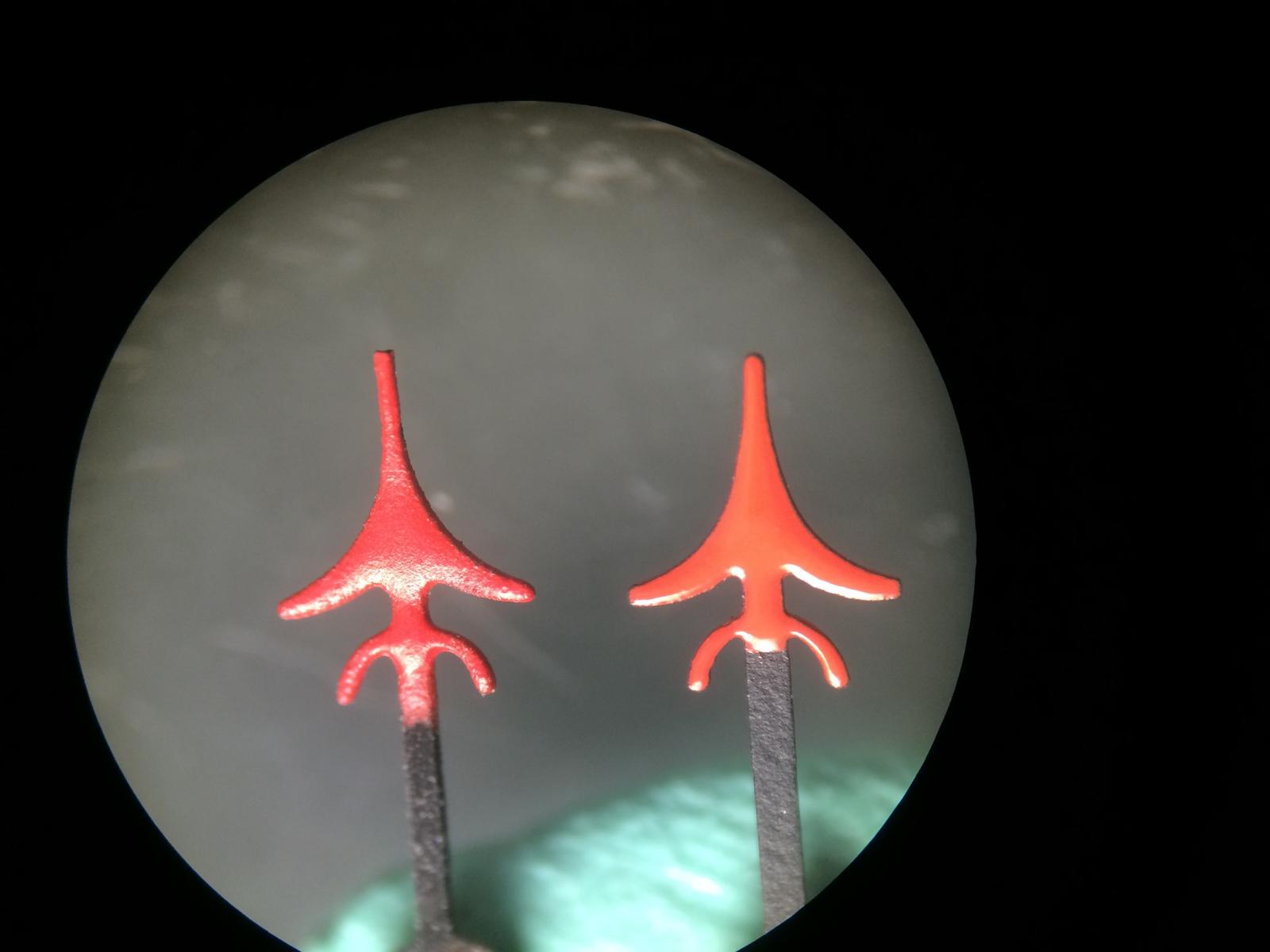
So here we have an Comparision btw GEN Old Batch and the New Batch
The Red of the Newer Batch is Darker
In the Macro with much Light you´ll see no big different in the Color
But from the distance you see it clear.
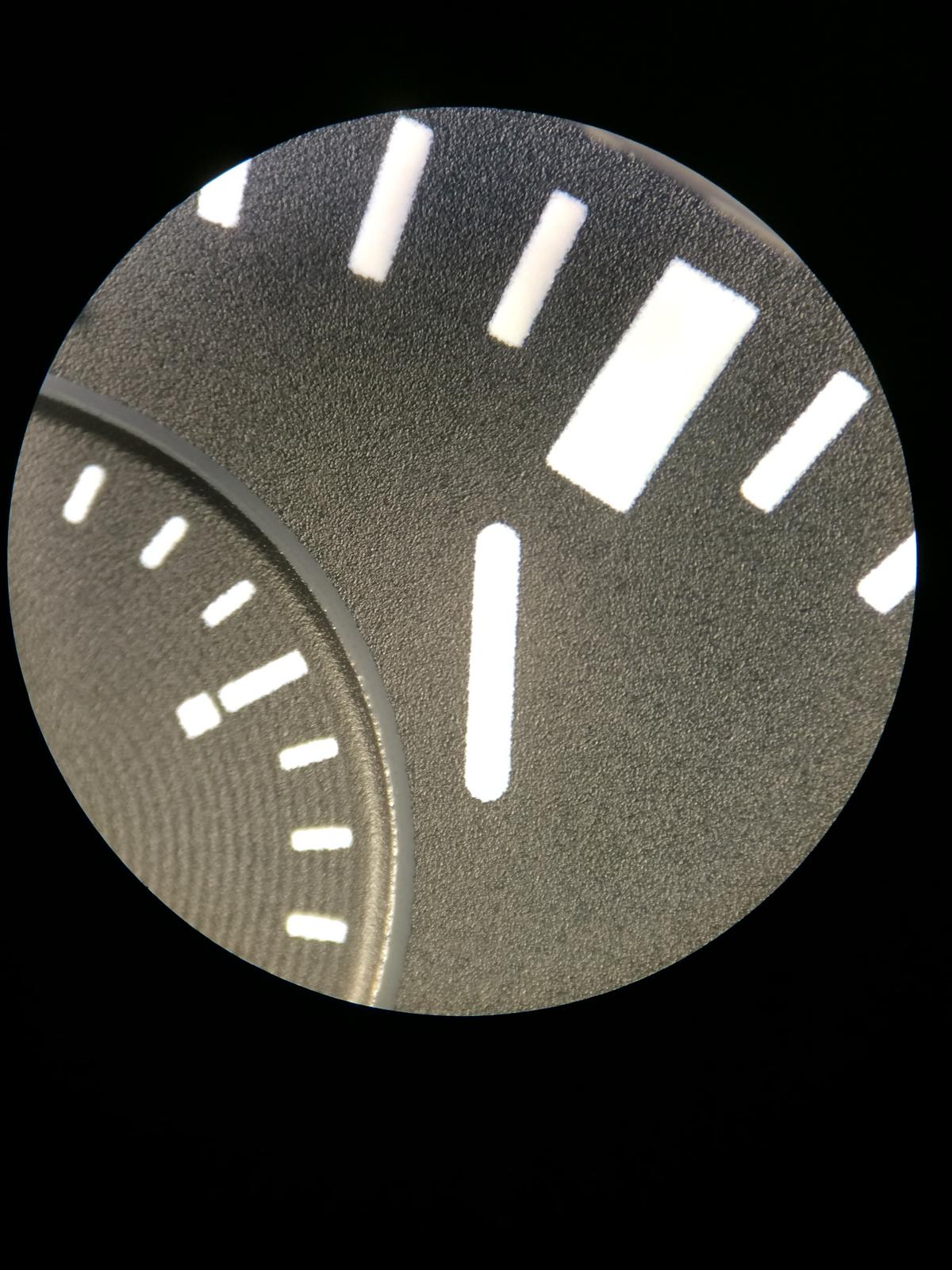
DIAL:
Ok there are 2 Rep Dials out
but only 1 GEN
and on the GEN there is no different in Older or Newer BatchesBut Ok let us check the Different Dials.
From Left to the Right
GEN , V6 , V1/V2
At the first look we see 3 different Dials
Ok the GEN Dial has a very nice overall Quality
The Main different that is really good visible is the Grey Rings around the Chronos
The v6 looks at the first look not Bad, but the Grey Rings around the Chronos are not there.
Also the Subrings in the Chronos are really hard visible
The v1/v2 Dial both are the same, looks too Matt but the the Chronos looks a little better
because they Colored the Rings Glossy Black.
SORRY for the missing Lume Dots!
Ok let us take an look at the Dials from the Side
The Gen Dial has an nice Glossy Texture and really Flat Lume Dots
The v6 Dial has also an Glossy Texture but it looks a little more Matt
We see also very good the SubRings on the Chronos
The Lume Dots are same as on the v1/2 etc it looks like LEGO Stones
Especial the Triangle
The v1/v2 Dial is Dark Matt in the Texture and it looks like an Rubber Texture.
The Lume Dots are not on, on this Dial but looks same as on the v6
The Chronos have the same Structure as the GEN
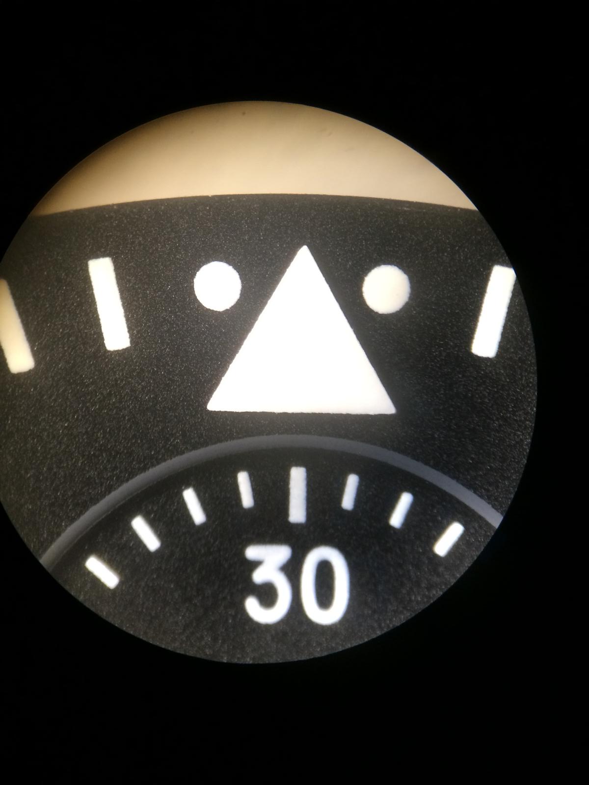
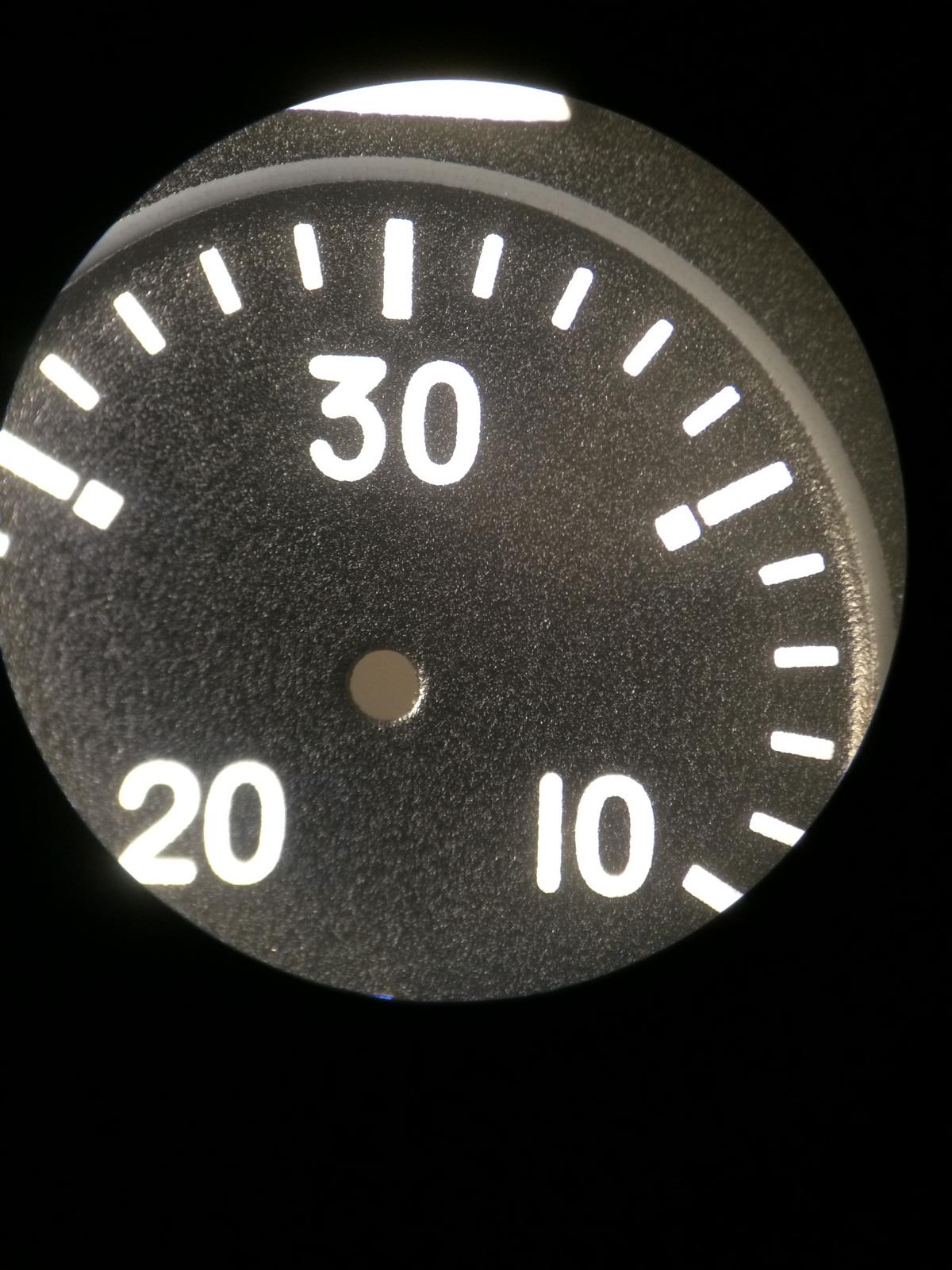
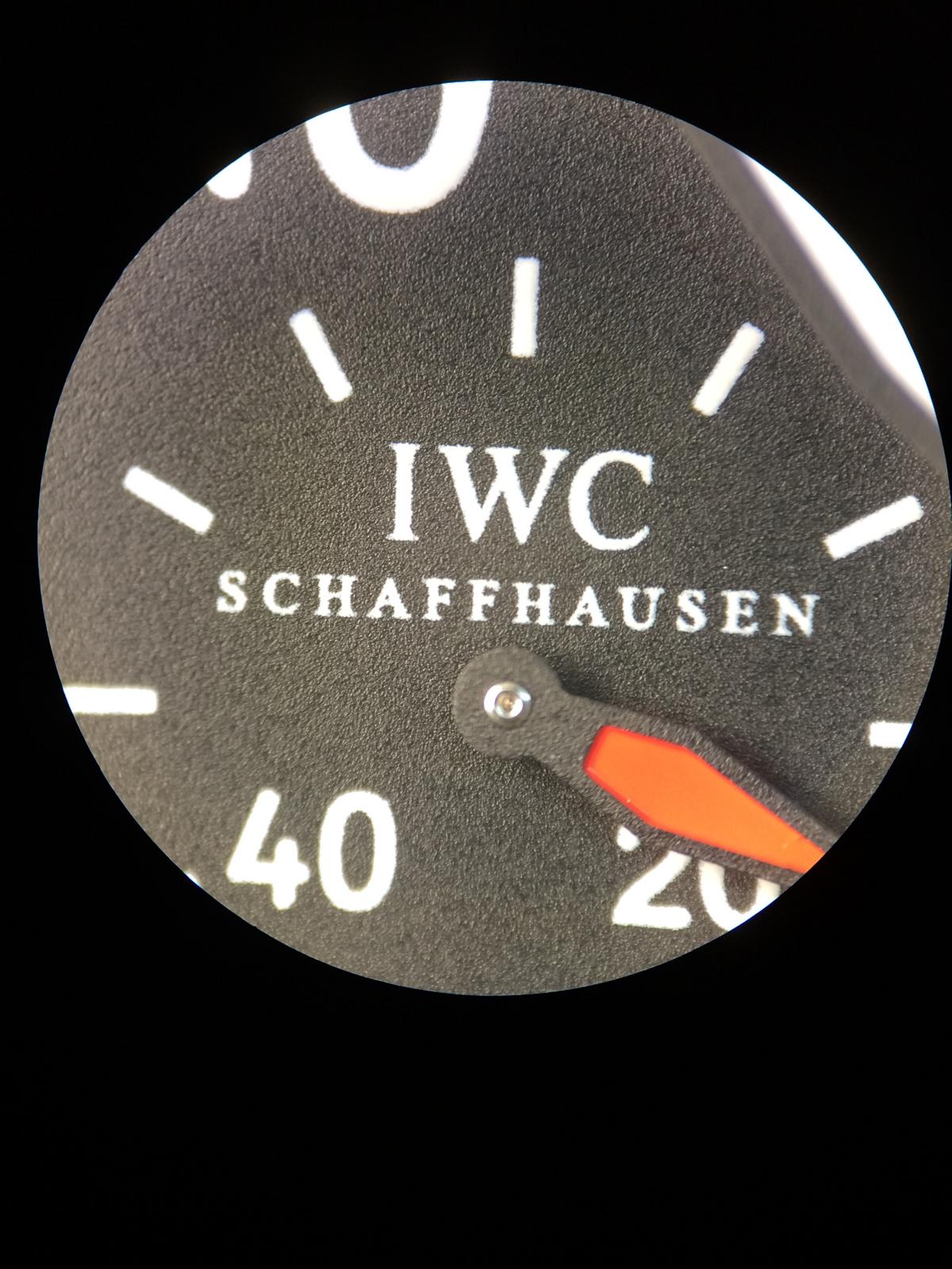
So let us take an closer look at the Dial under Microscope
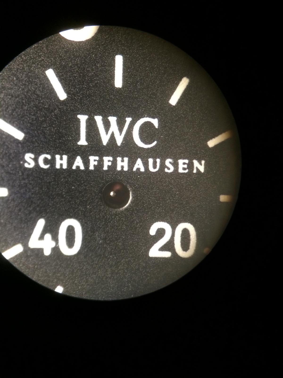
We start with the GEN
First we see the nice Texture that looks like an Sandpaper
The Triangle is very nice cutted
We also see the Grey Ring that is around the Chronos
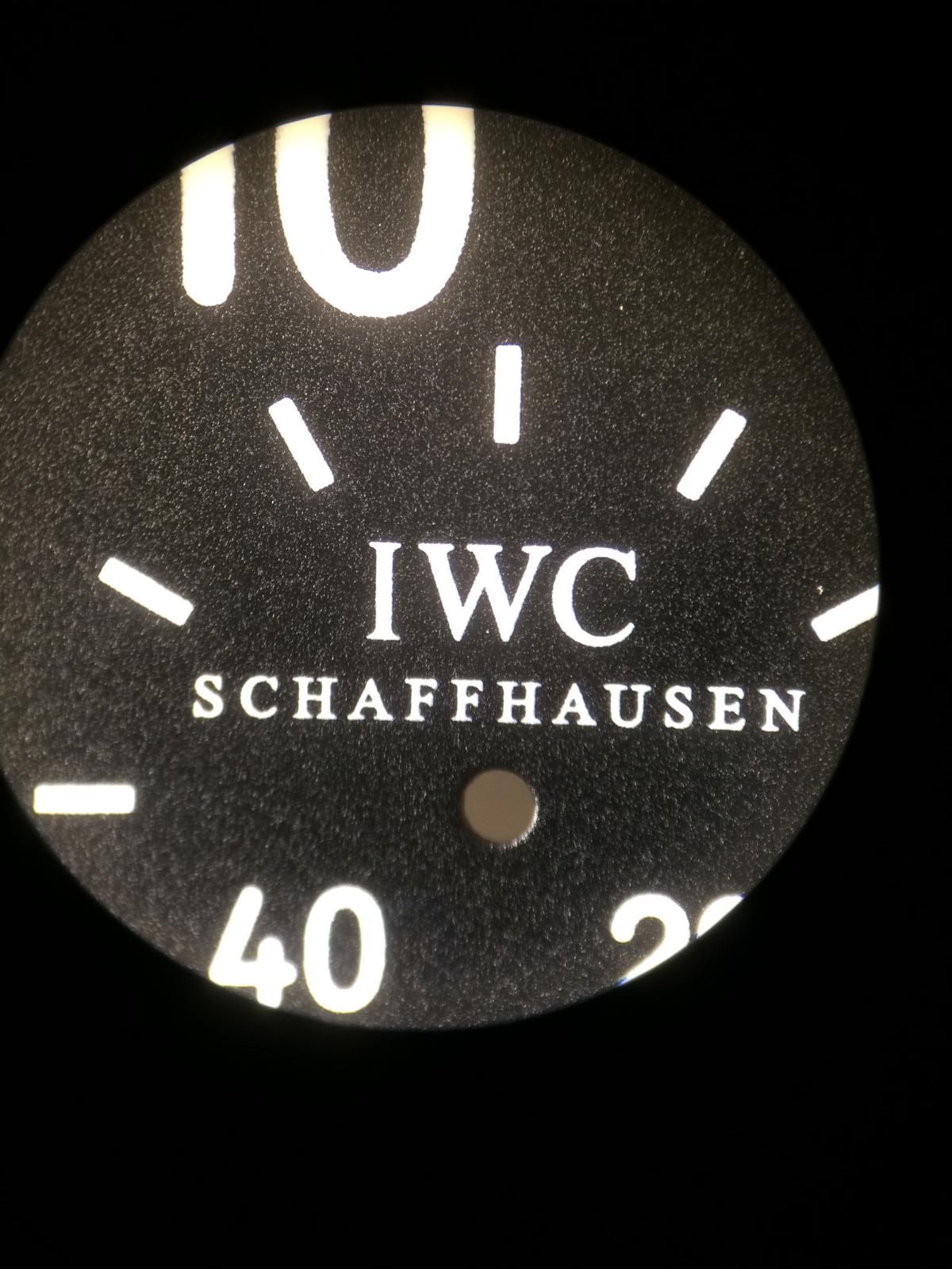
The Print on the Dial is very nice and even
If we look right on the Chrono we´ll see the SubRings but they are not soooo strong as on the Rep
The IWC Logo looks also very nice
Looks at this Texture
The Lume Squares looks also very nice and Flat
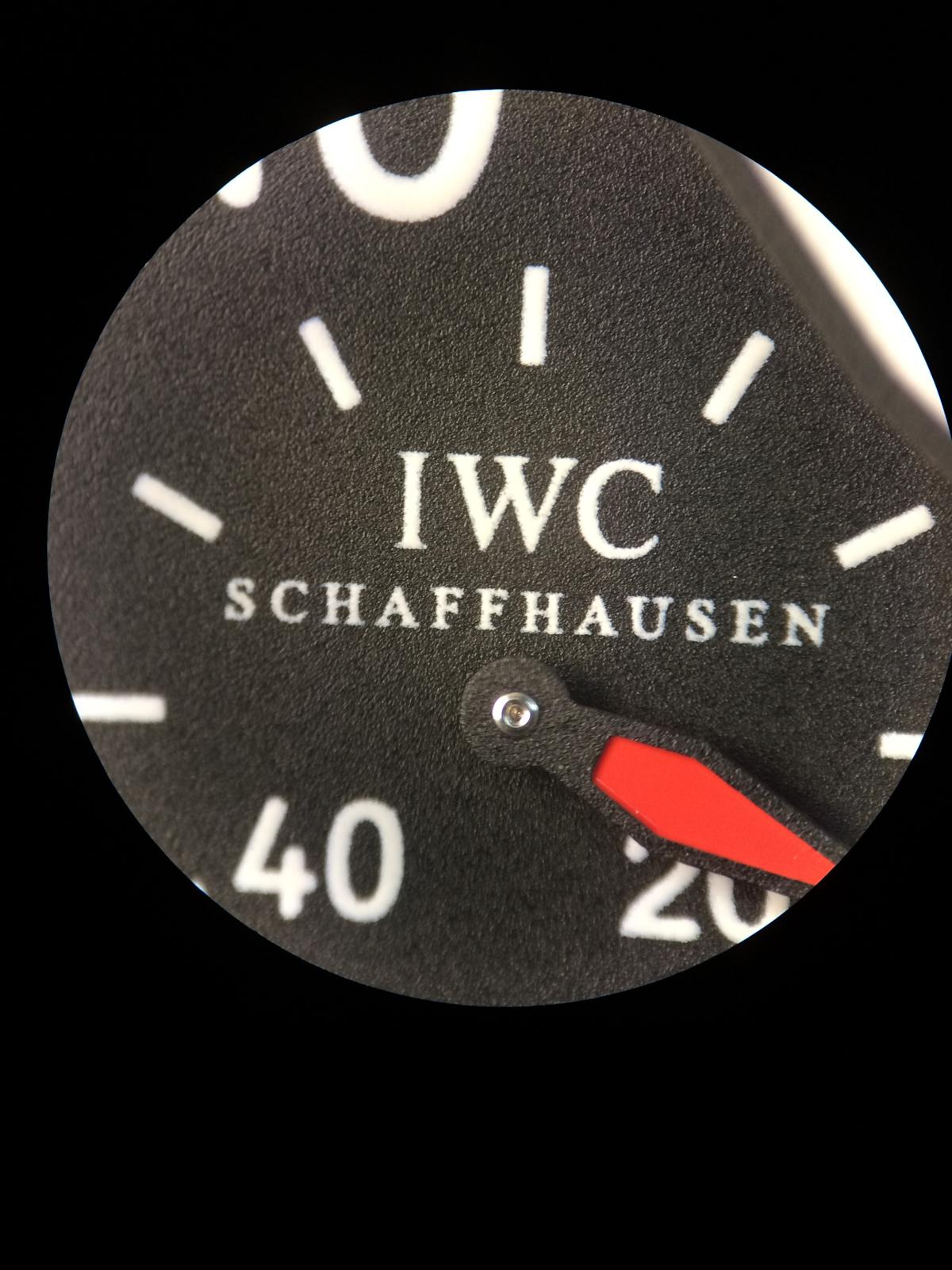
Ok let us take an Closer look to the v6 Dial
We see the Texture of the v6 isn´t Bad and looks very close.
The Triangle is also nice cutted but it´s much thicker as the GEN
The GreyRing around the Chronos is missing
The Print isn´t soooo nice as on the GEN but it´s more then ok
The SubRings are very strong.
The IWC Logo Print isn´t soooo nice and sharp as on the GEN but also ok
The Texture is close but different
The Lume Squares are the same as the Triangle too thick.
Print is overall not soooo sharp as on the GEN
And the Closer look to the v1/v2 Dial
We see the Texture is totally Matt
The Black Paint is only inside the Chrono
Ok the Triangle is missing but it is the same as on the v6 too Thick
Here we see the Black Ring again
The Print is on that Dial also not soooo nice.
We see also the SubRings in the Chronos
The IWC Logo Print is very unsharp i think i don´t need much to say
The Texture is totally wrong
The Print here is also very unsharp
Lume Dots are same as on the v6
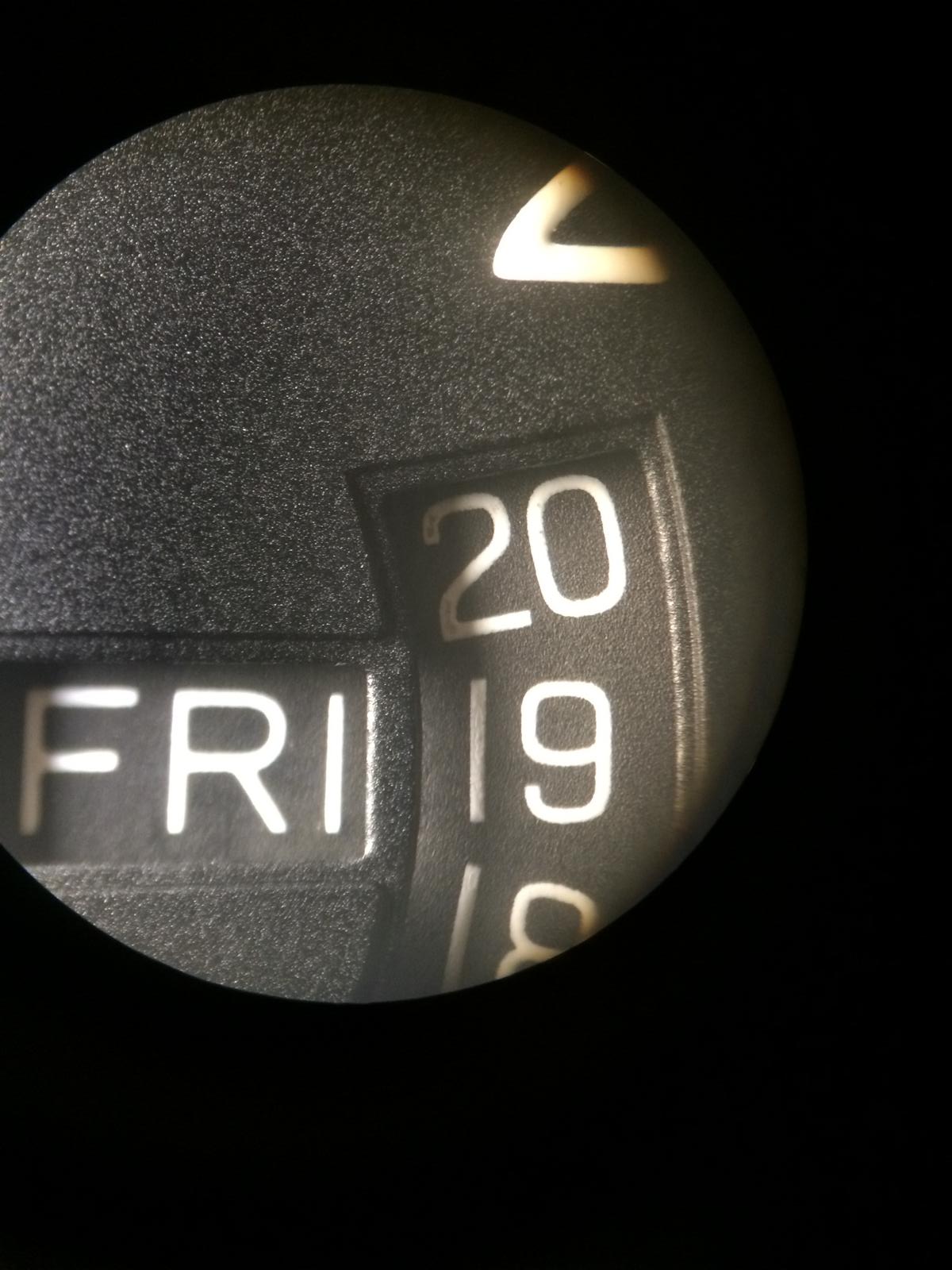
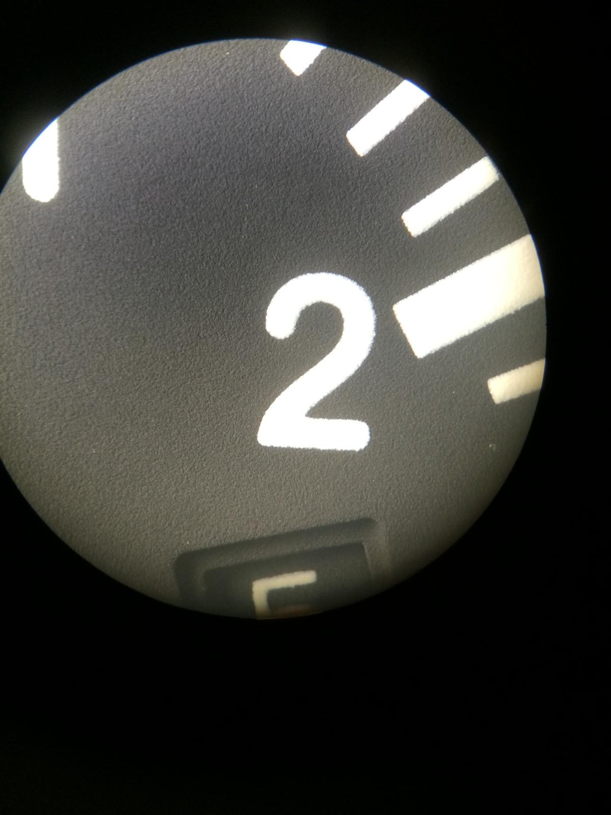
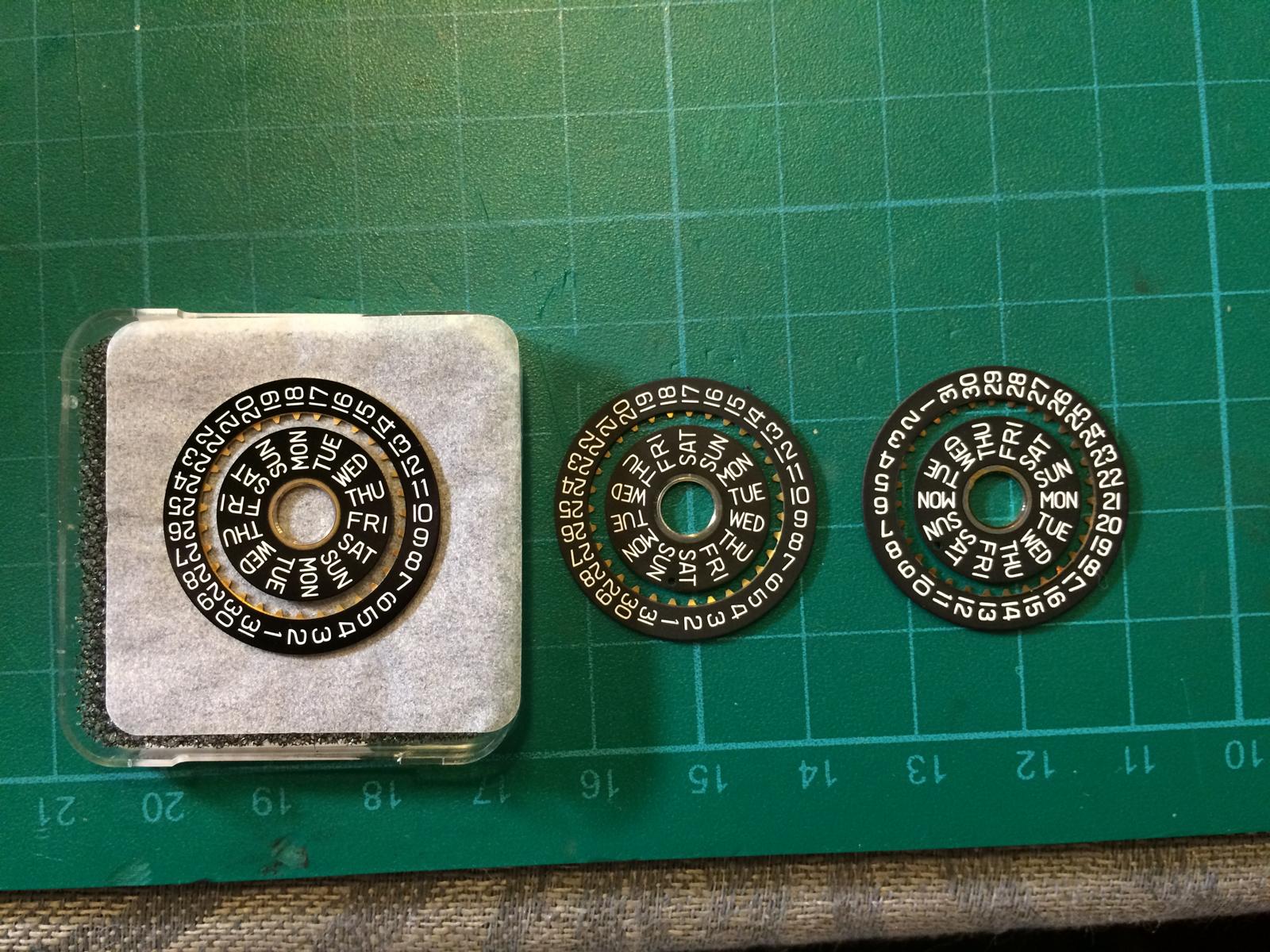
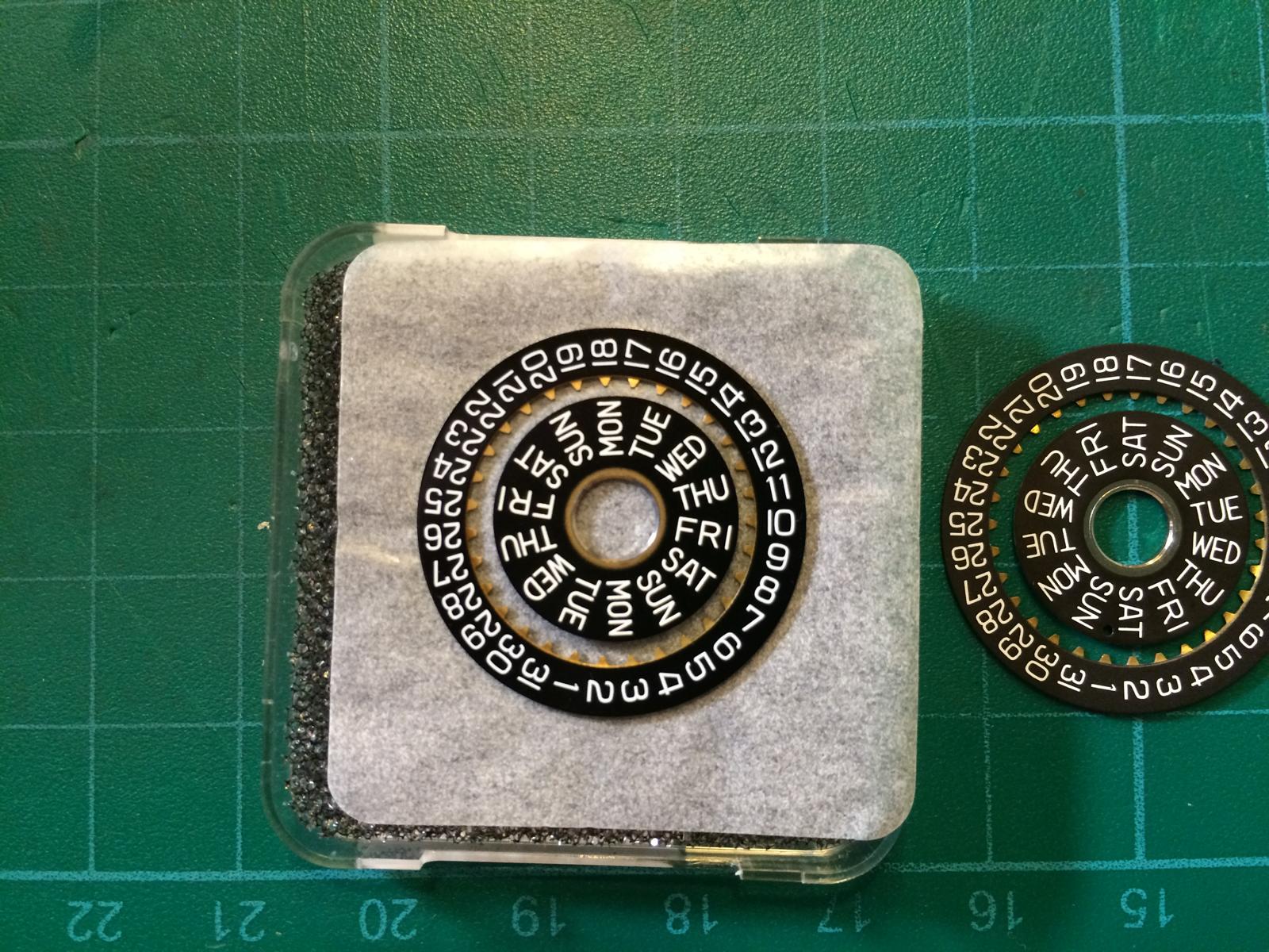
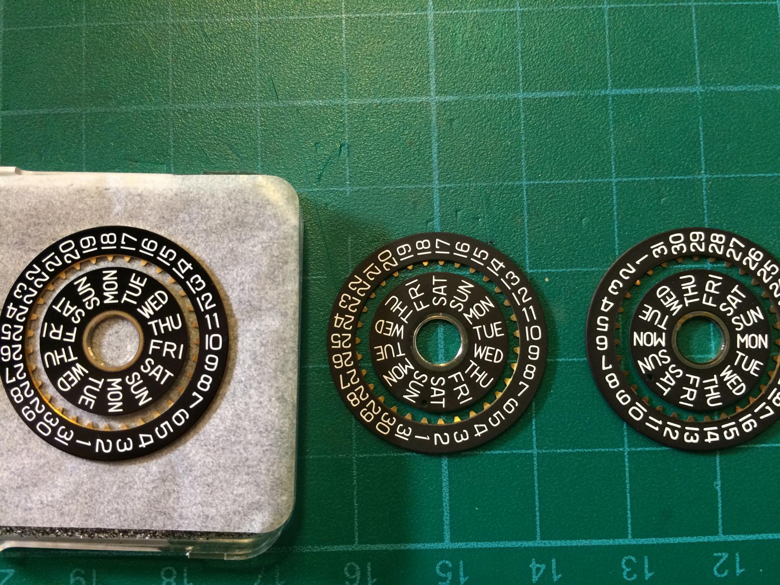
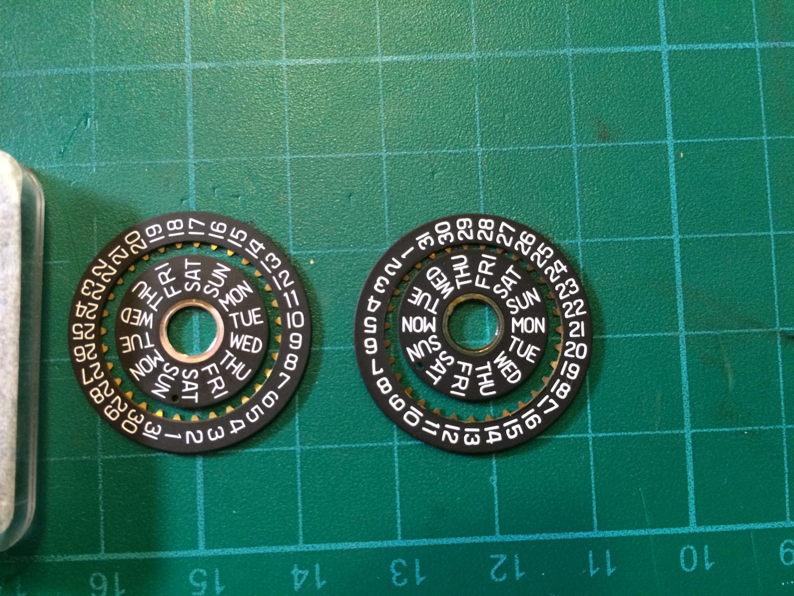
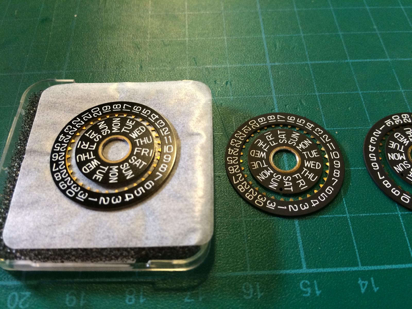
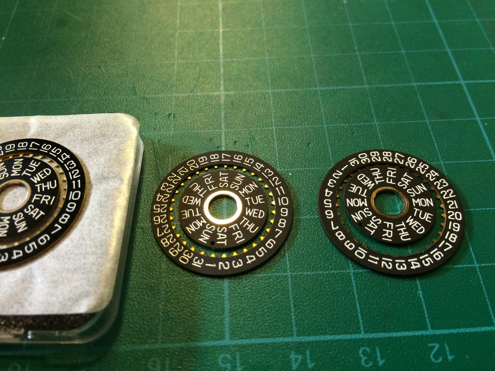
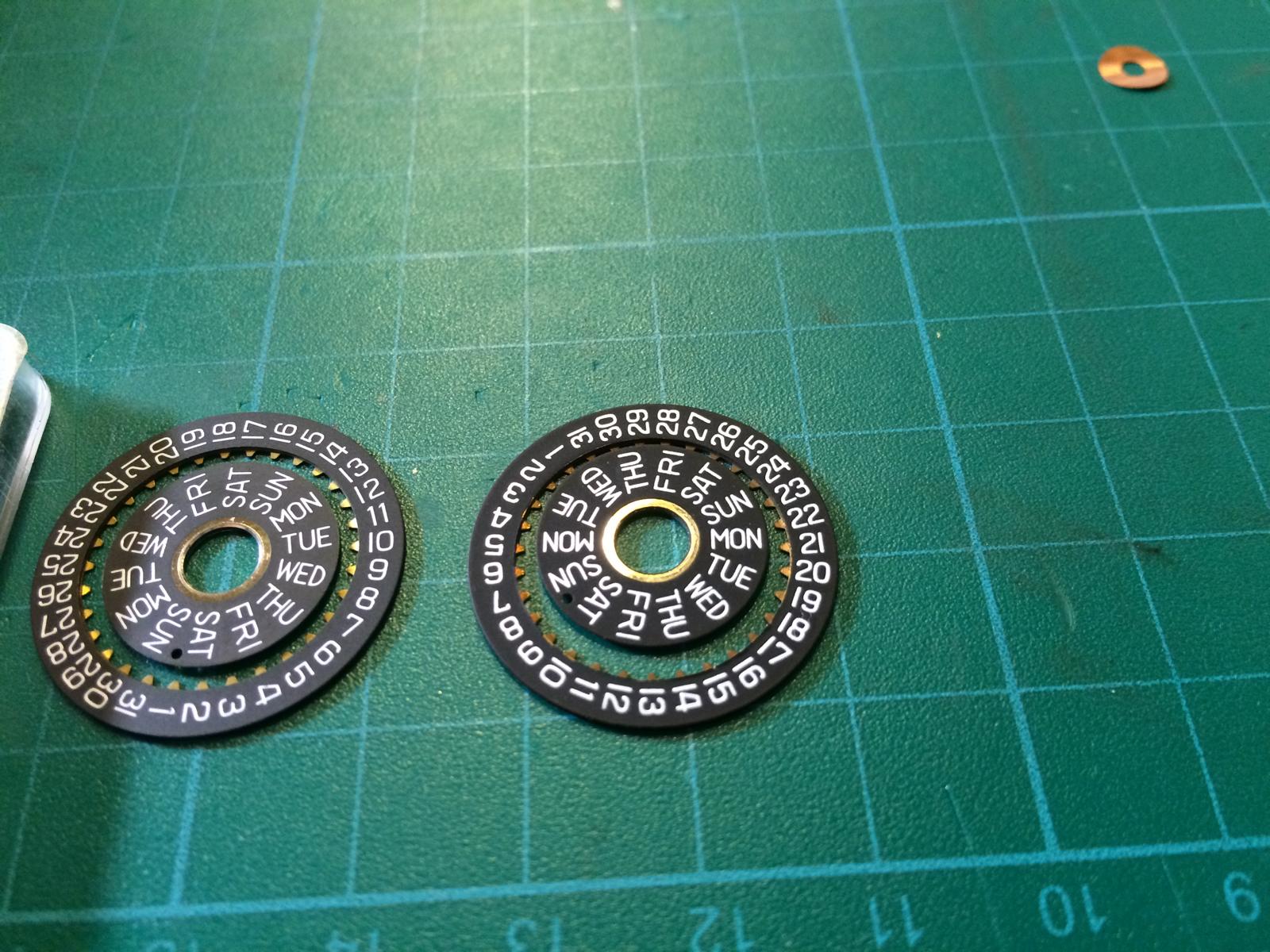
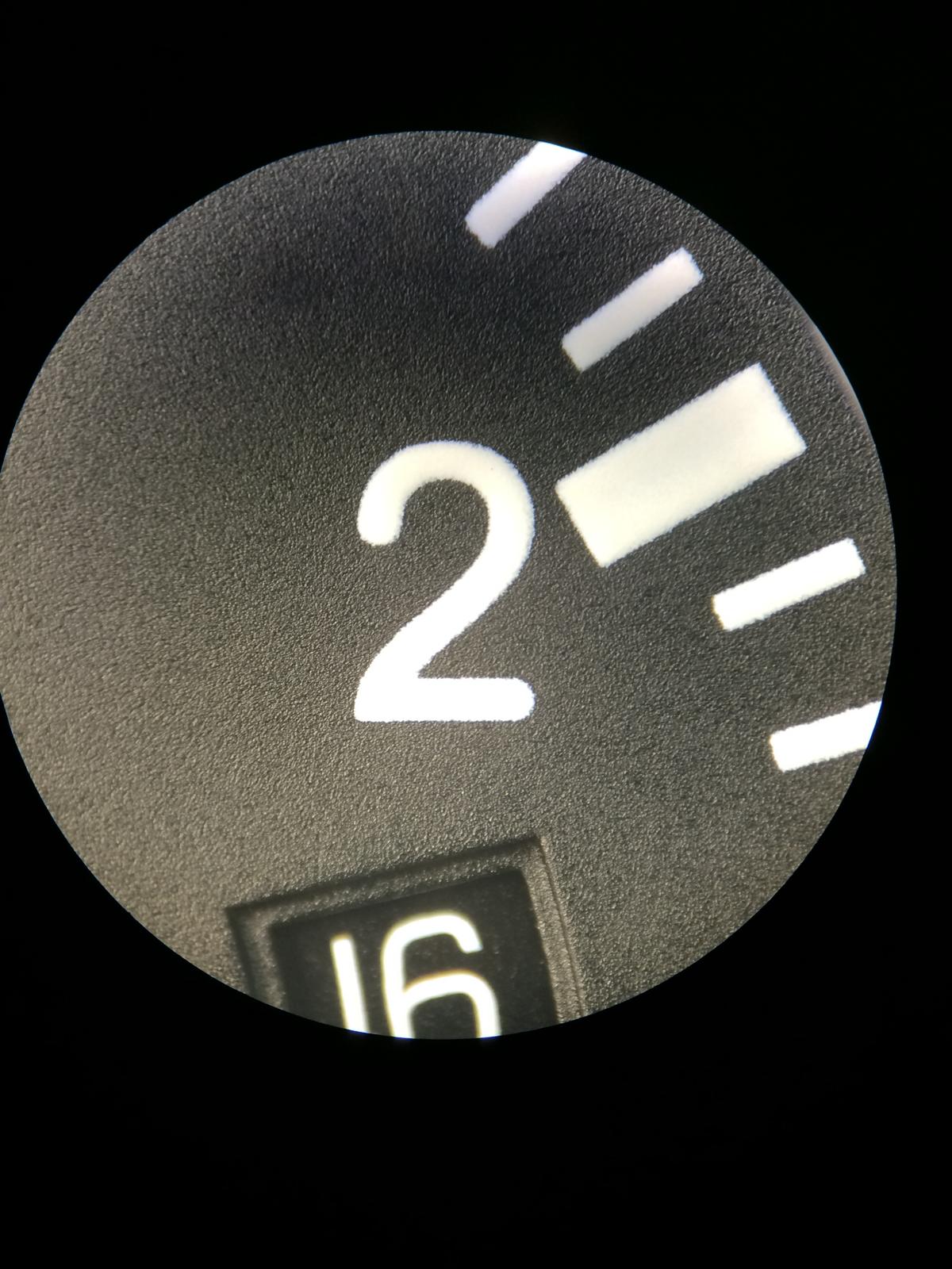
DATE DISCS:
From Left to the Right
GEN, v6, v1/v2
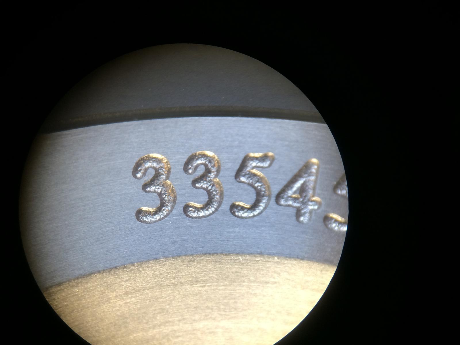
The GEN DateDisc looks a little different from the GEN ETA Disc
Especial the 4 and 7 also the Thickness is different.
That is also the different btw the Rep Discs
The v6 Discs looks really close to the GEN Discs
The Typo is a little thinner but really close
The v1/v2 Discs are to thick in the Typo
On the GEN Discs we´ll see from the side view very good the Glossy Color
The v6 Discs are Matt and the Color is too light
The v1/v2 Discs are also Matt but the Color is more Dark and so closer to the GEN
CASES:
So let us take an look at the different Cases.
The Cases have much differents
And which is the best or not must choose everyone self!
In my Eyes the v1.2 Case is the Best Cases that is out in the Wild.
Why i think it is the best i will show you.
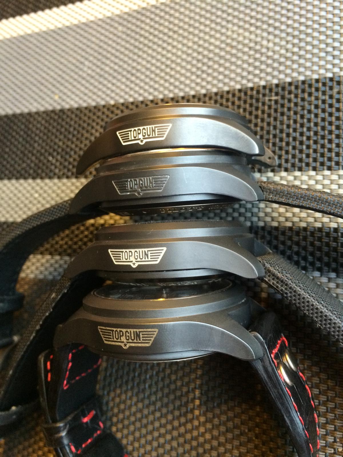
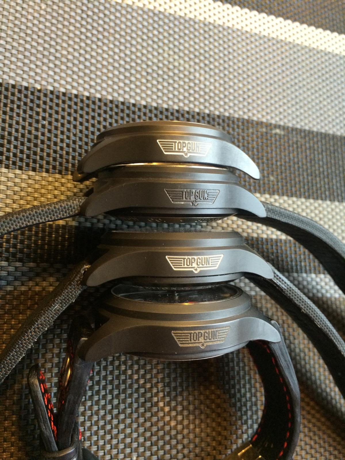
Cases from Top to Bottom
V6, v2, v1.2, v1
The most People look at the Top Gun Logo, so let us start with that
This is the GEN Watch
So we Start with the v1.2 Case (the best one in my Eyes)
So the TG Logo looks really close but there are differents!
The Wings have a good distance from Top and Bottom and the side.
The GEN Watch have an Exactley distance on each side.
The little Star in the middle is a little to small, but there was some v1.2 Cases that have an little thicker Star (v1)
The Distance btw the P and G is also very good.
The Typo self is near Perfect and looks at the first look a little too small but it have the same size.
Now the older v1 Case
The distance of the Wings are a little wrong, Bottom and Top have different size (Bottom have more Space)
The little Star is thicker and looks so more GEN like, but the Star is so small that you want look on it.
The Distance btw the P and G is also good.
The Typo is a little wrong, Especial if you look at the G it looks wrong.
The v2 Case
The distance of the Wings are a little wrong also, Bottom and Top have different size (Bottom have more Space)
The little Star is here also thicker and looks so more GEN like
The Distance btw the P and G is wrong there is a little bit to much space.
The Typo is here also wrong, Especial if you look at the G and N it looks wrong.
The v6 Case
The distance of the Wings are totally wrong not only the Bottom and Top have different size.
The Space btw the Wings self is wrong.
The little Star is here too thick and looks too FAT
The Distance btw the P and G is wrong there is not really an space.
The Typo here is totally wrong, all letters are too thick and the Typo looks soooo Crazy
So if we see only the Top Gun Logo of the Case i would say the v1 or v1.2 Case is the Best.
In my Eyes the little Star is no big deal, so the Complete look must be good. And at this Point the v1.2 Case Wins in my eyes.
Ok lets go on on the cases.
As i have said allready the Complete look must be good, and for that the Case self must be good.
Especial we have an Ceramic Case, so we can´t do much here.
So i don´t wanna post now from every Case every Edge and Corner
So i think we can see the differents on the Complete Picture.
So i have spend many Time at my Local AD (Friend) he had an GEN 3789 there and i have check all the Edges etc.
I show you guys 2 Pictures what we talking about.
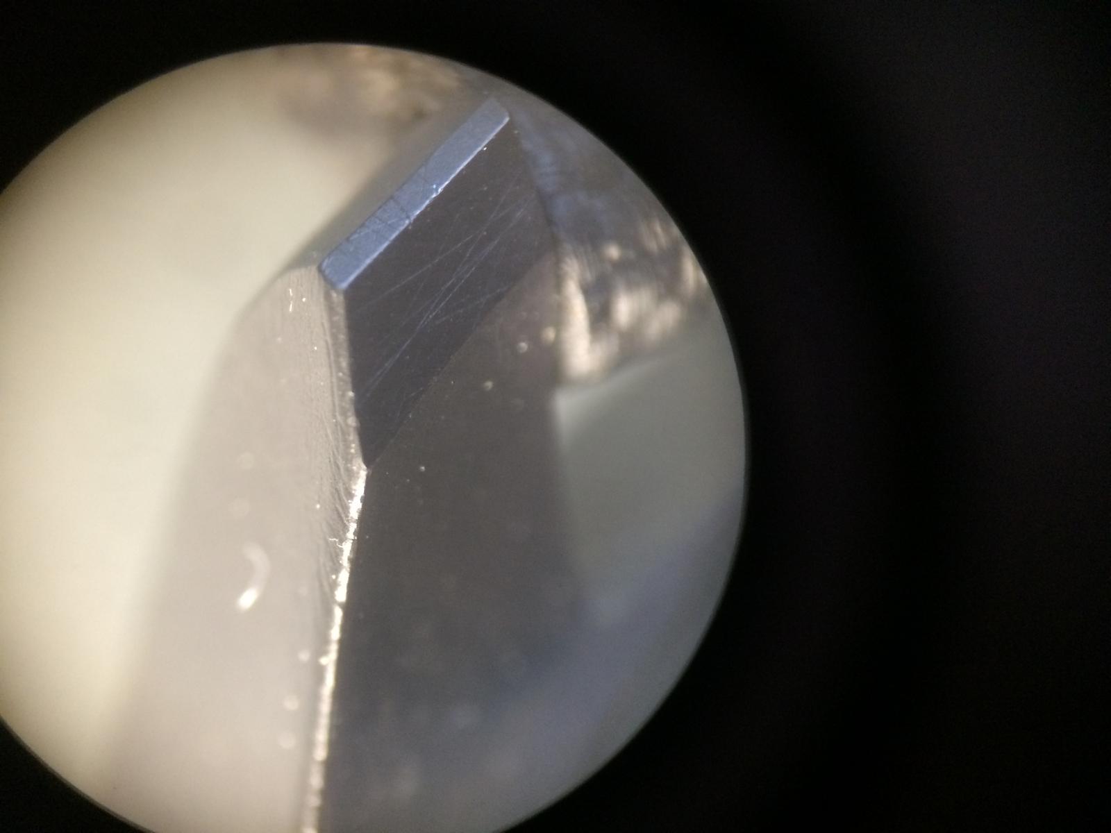
- Lugs: If we look at the Lugs from the side we will see many differents.
We Start from Top to Bottom.
The v6 the case end runs to straight Down and the Edges are too round.
The v2 the case end runs very nice out, but the Edge on the Ends are shapen too much.
The v1.2 the case end runs very nice out, also the edges are nice rounded and not too Hard.
The v1 the case end runs at the last end to straight down, the edges are shaped too much.
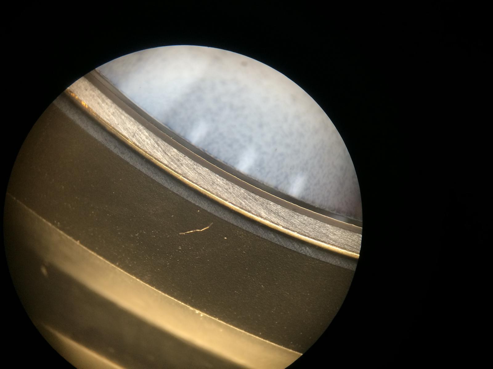
- Bezel: If we look at the Bezel from the side we will also see differnts.
The v6 the Edge is too soften and the Top of the Bezel is too small
The v2 the Edge is nice and sharp but a little too sharp but not bad
The v1.2 the Edge looks very nice not to soft not to sharp
The v1 the Edge looks same as on the v1.2
Here are the Cases
Cases from Top to Bottom
V6, v2, v1.2, v1
CASEBACK:
The Casebacks are also different, we can make it short here
The Best Caseback is the v6 Caseback
But let us check some Casebacks
The v1.2 Caseback
The v1/v2 Caseback
The v6 Caseback
So the v6 Caseback has same Specs as the GEN! There is an Gasket btw the Metal and the Crystal
Let us take an closer look.
Here we see the Gasket btw Metal and Crystal
The Engrave of the Case isn´t Bad
The Logo isn´t 100% but the Color is good and makes an Complete nice look
So let us take an fast look at the v1 Caseback
The Logo looks Terrible
So that´s all the differents that is important i think, to choose the right Case
I hope you guys enjoy it so far...
I would say we go over to a little bit Franken Build...
So let us start
First we must Pop out the Rep Tube to build in the GEN
Time for the New Tube
Ok the Tube is in
Time for the New Crown
The GEN Crown doesn´t look soooo different from the Rep but the Feeling with the GEN Tube is an totally different
Ok the Tube doesn´t Fit in the Case without Mod
Too much Distance
Time to Drill the Case
After a few trys and Mins later the Crown Fit nice
Installed the GEN Tube and Crystal
Regulate the GEN 79320 after Service
Time for the Inside Stuff
Add the GEN DateDiscs and the Dial on the GEN Movement
Add the GEN Hands
Add the Gaskets and the Caseback etc.
And after all that the SUN is going up
And at the next Day i saw her with her Husband in the Sun
Sweet Hand in Hand
Let we leave them alone
I say Thanks for Looking! Hope you had enjoy it and
See you on the next Episode...
----------------------------------------------------------------------------------------------------------------------------------------------------
So the First Episode had End here...
Now it´s Time for some interesting Addon
So what we have ?!??
I add the Comparison Franken v1.2 vs GEN
So let us Start with the Logo Color
So here we have now the right GEN Color...
And a little Closer
So i can´t Compare the other Versions 1:1 but i have Compare them with my Pic Archive and as i already said, the V1.2 have the best an Closest Case Shape.
Followed by the V2 Case. At some Angels the V2 looks better, but i think in overall the V1.2 Wins.
Let us take a look at the Shape v1.2 vs GEN
As we see the GEN have an harder curve at the end and the Lugs on bottom are a little shorter and much nicer in shape.
But from the side view we see that the v1.2 Case isn´t bad
From the Back we can see the Shorter Lugs. If you put the Case Flat on the Table the GEN Stand 100% on her Feets (Lugs) the Reps are a little out of Angle
The Inside is also different... The GEN is much better Quality and the inner Metall Fit absolut Perfect to the Ceramic... And this makes the different that the GEN Watch is absolutley Waterproofe
But also the Rehaut is different... We see how nice and Bright the GEN is...
Ok so let us come to some Marco Pics of the Logo
We can see the Color now into Details... And the Logo Engrave...
The Engrave self is really nice an even, but under the hood it looks like same as the Rep Engrave...
So many of you have Speculate which Color is the right one and which not... Let me tell you that you can´t see it by Pictures!!! You´ll have on every Picture an different Color.
But i can tell you how IWC made the Logo
They did it same way as Rolex did on there Ceramic Inserts. So that means that IWC have DLC Coated Ceramic before Rolex it did.
You don´t believe it isn´t DLC´d ?!?? It is!
So i have try many Chemical Stuff on it. 96% Alcohol, Aceton and and and... And nothing of that Substances have Touch the Color in anyway.
You can´t rub it off. It´s clear when it is DLC´d
Then i have take an Needle and scrub at an Corner a Bit. And then it happend. It didn´t come off but the Color become from Dark to Bright.
And what did i see ??? Brass the Color is DLC´d with Brass.
And so we have our Color. The Color is no really Color it´s Brass that was Sputed into the Engrave.
So now it´s Time to find some nice Brass Color to Emulate the GEN Color
Let us take an Closer look at it...
As you can see the v1 Franken that i have SOLD had Brass on the Logo and it looks really Similar.
Ok I have to withdraw my statement about the Dials and the Minute Hand!!!
I mean not Complete but this was new for me too. There are Two sorts of Dials out from IWC.
It seems so that there is an older Batch and an Newer updated.
What does this mean?
So it means that the first Watches had other Dials Build in as the newer ones. Same as by Rolex and other Manufactors have they change the Dials.
The Dial we see here in the GEN Watch have an Matt Rough Texture very Close to the newer v6 Dial... The Dial looks in real Dark Matt, the Dials that i have Build in the Frankens was Brand new and they look like light Glossy.
The Texture of the newer Dials are also a little Rough but it seems so as had they an Finish.
Also the Printed Texts are much better at the newer Dials. They are much more Clear. The old GEN Dial looks a little Bit like the Print of the v1,v2 Dials.
They are surley better with naked eye, but under Microscope you can clearly see.
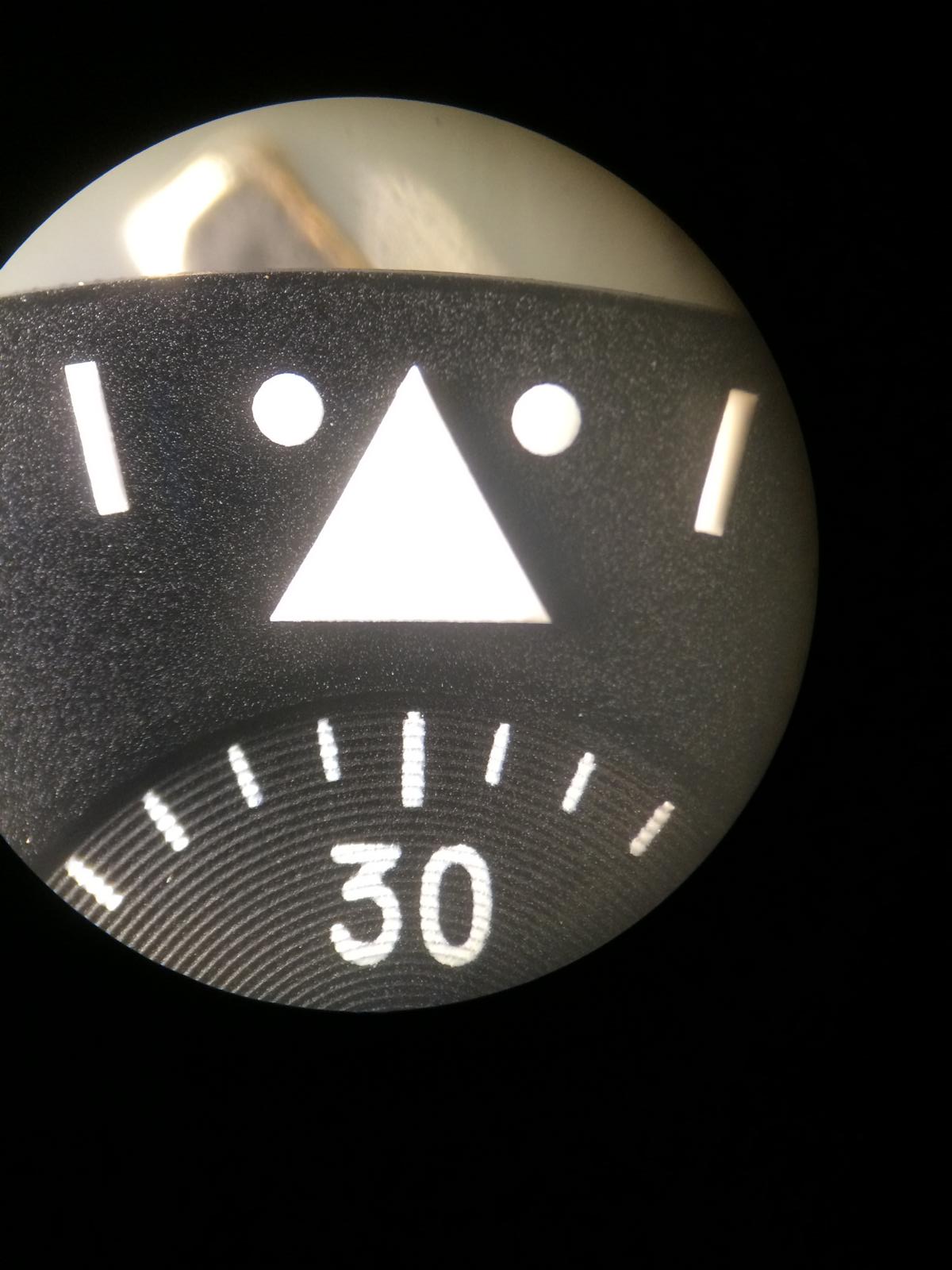
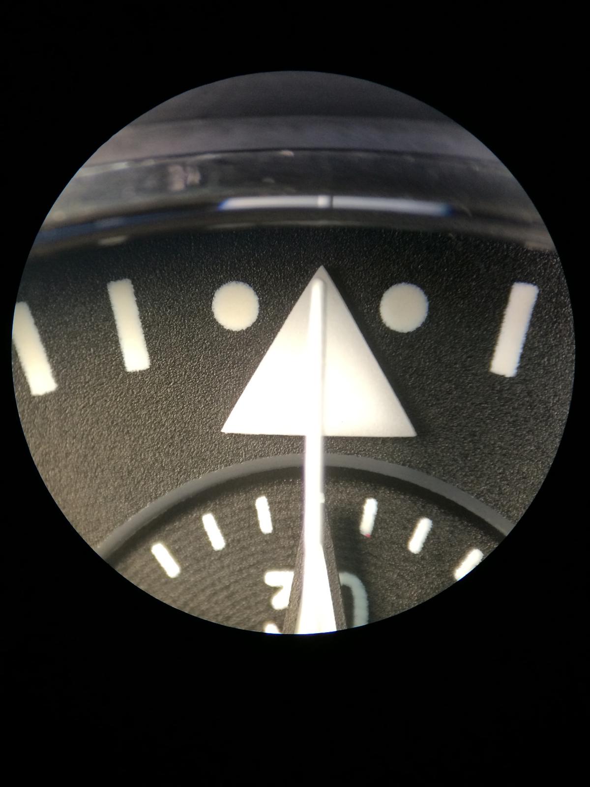
So let us take an look
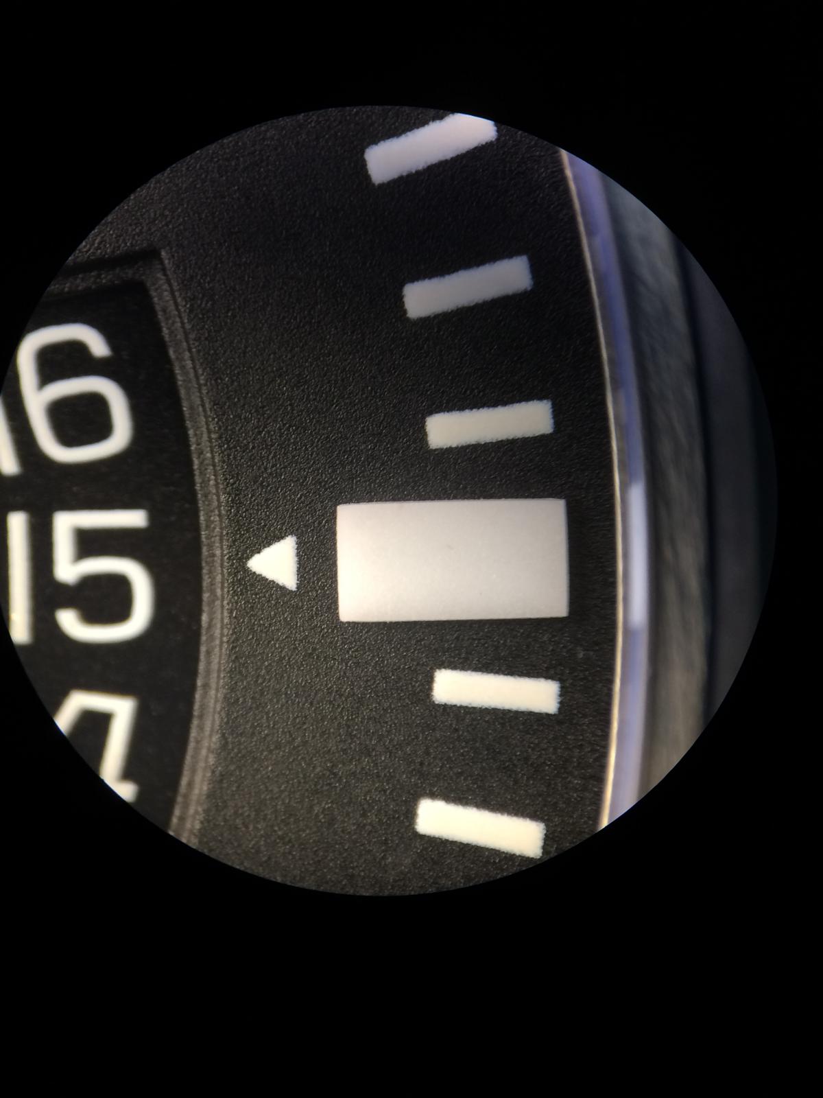
The Triangle and Squares looks identical to the new Dials only different is, they have changed the Lume Color! the new Dial is much stronger.
The Concetric Cycles are much better Visible at the Old Dial. The Greyish ring is also there as at new Dial.
But we see the Print is a little Rough
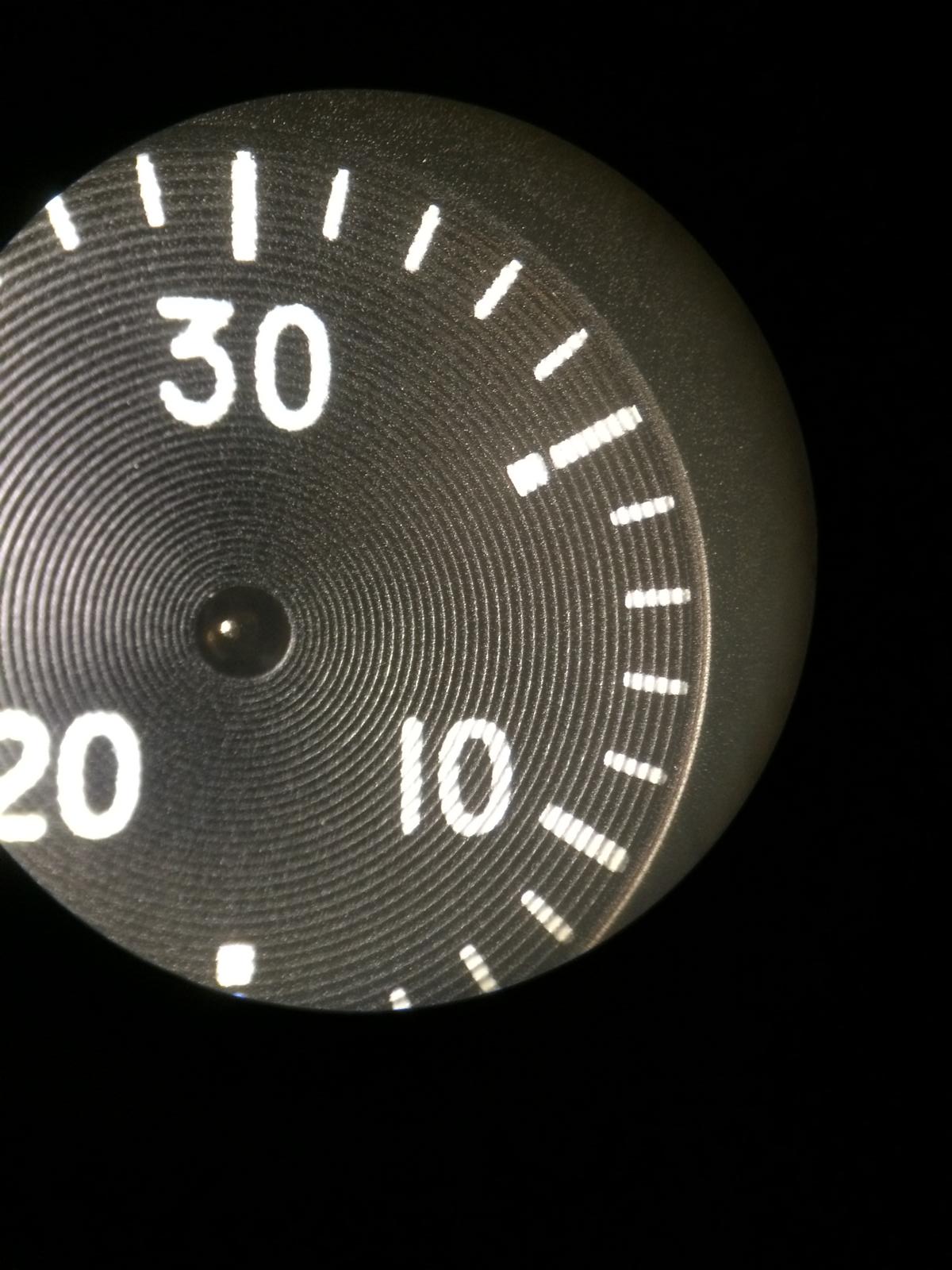
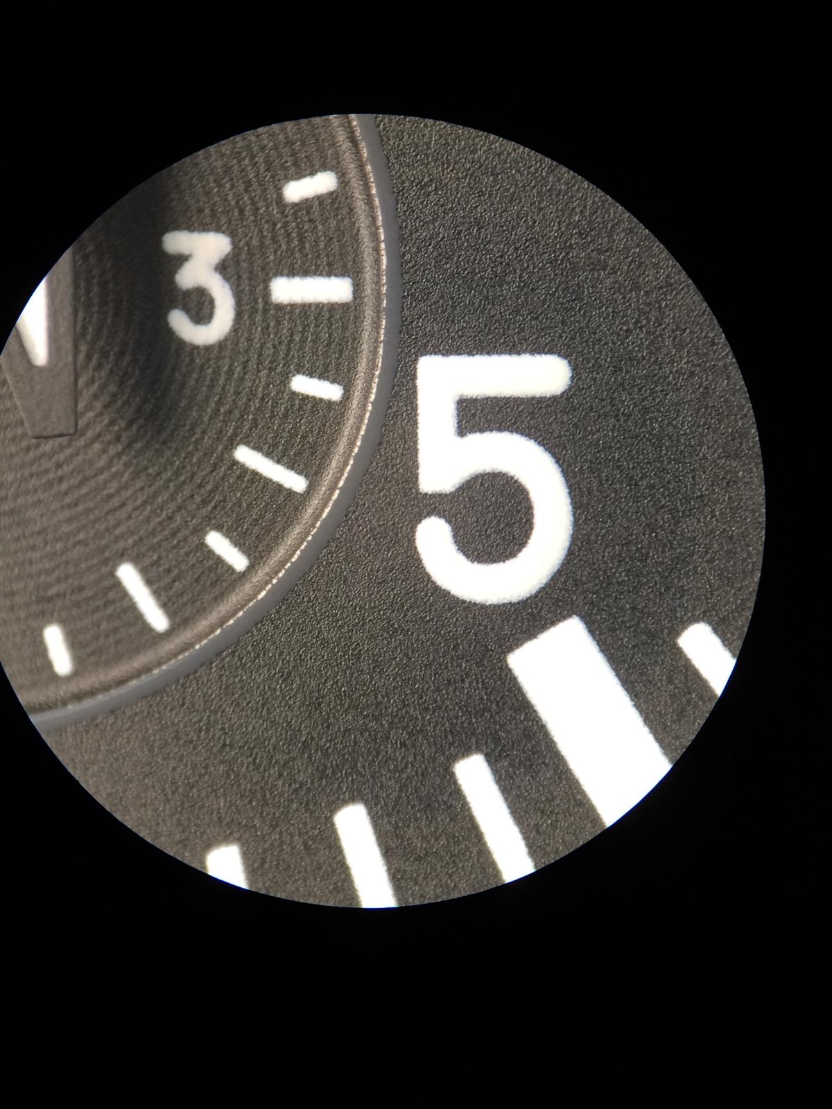
We can see it also at the Hour Numbers
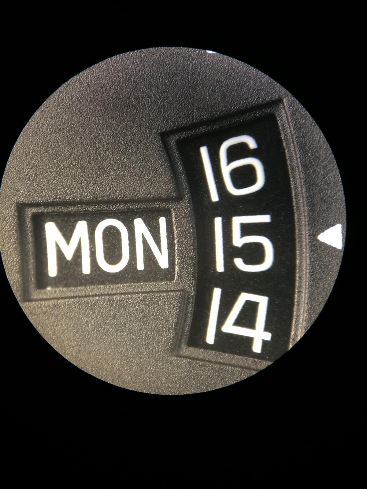
The Date Window is also different! At the old Dial it looks much more sharp, i think the newer Dials are Painted with more Color. Because there are no Hard Edges as on the Old Dial.
I dunno why, but the Distance btw Dial and Date is marginal smaller... This looks great! It seems like the DW sit directley under the Window.
Here we see the Square
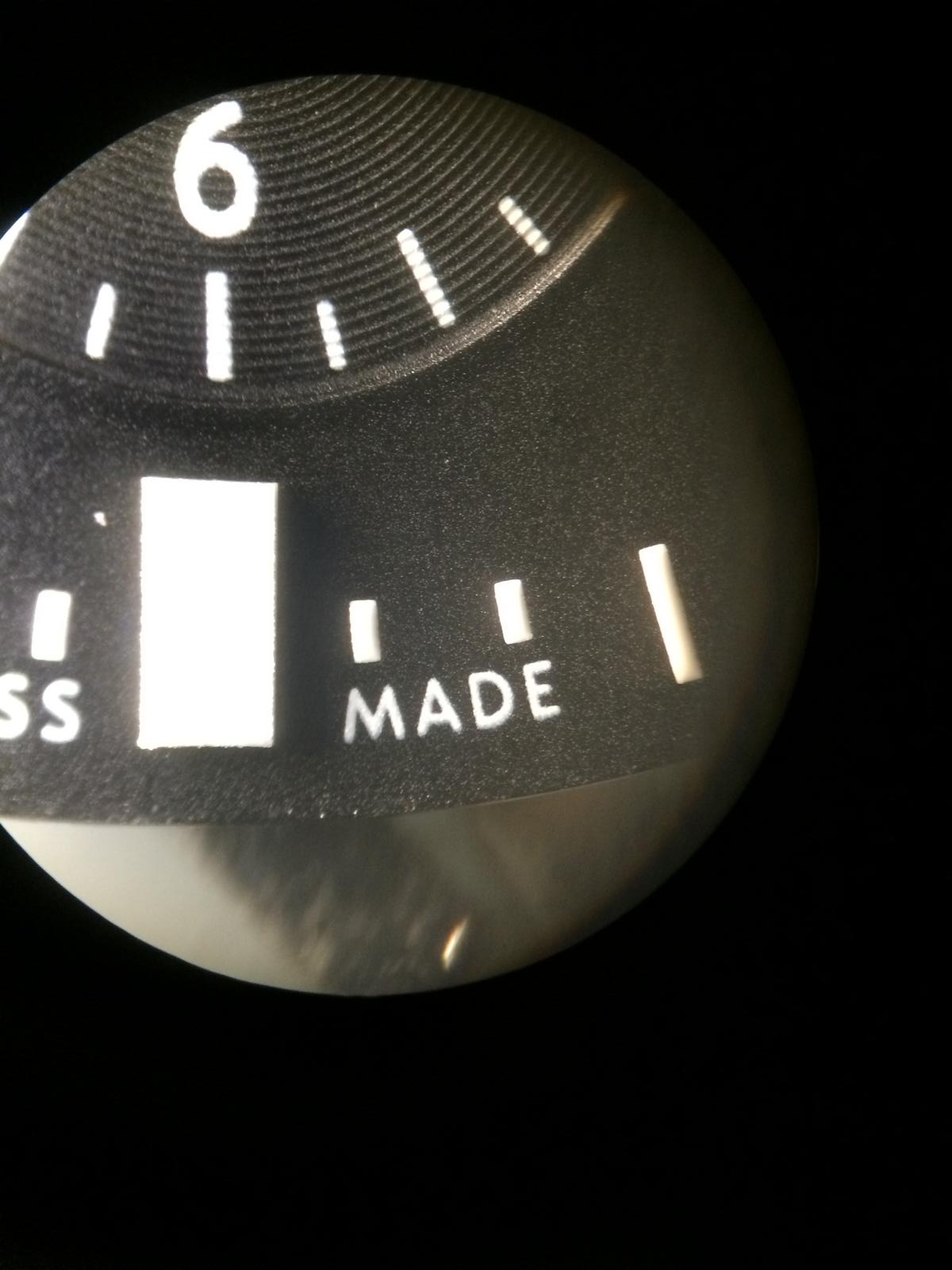
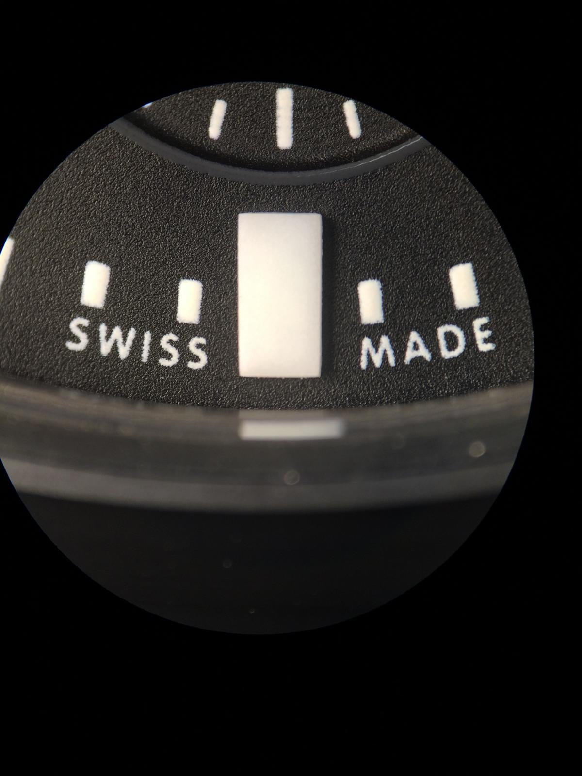
And the SWISS MADE Print is also little more Rough
Best visible Part is the Schaffhausen Print
Ok here we see the GEN Dial alone. It looks Matt. First i had think this sucks a little, but it looks really nice in Combination with the GEN Ceramic.
The GEN Ceramic Color is a little Darker. This isn´t really visible at the Pics but in real the GEN Ceramic have an different Color.
So the unsharp Print isn´t that nice but it´s in real not Visible but it´s in the Mind
But the Matt Dial looks absolut Perfect with the Ceramic... It makes an real Tactical Watch look...
And Compare with the Franken... I have try to make it a little visible... We see the different Colors
So there is another different!
The Crown... There are two Types of GEN Crowns, didn´t know that too
the old Crown looks much nicer! In my Eyes...Because the Old Crown is more edgy... The New Crown looks like Repolished... Let us take an look first at the old Crown.
And the New Crown
And the last different is the Case back... The GEN Ceramic Part of the Caseback is smaller... Here we can see...
The inner Engrave of the Caseback are massiv different... But i think this we know already... The Caseback is the v6 Caseback!
The Logo on the Back looks really good... The Airplanes Afterburner isn´t soooo nice Printed at the Rep but there are Casebacks out that are really Perfect.
The Engrave is at the GEN much Deeper and nicer... So cool would be maybe an mix of the older v1, v2 Caseback and the v6
So this are the little Addon Facts
So there are a few differents here and there... I didn´t make now for every little these and that an Pic
so you can see at the most Pics.What are different too?
The GEN Pusher Outerrings are thinner and the Pusher self is a little thicker. The feeling is also much much different. Much more Stable.
The Complete Pusher Construction is different, but these can be changed
if you add an set GEN Pushers at the Rep Case.The Tube have with the Mod the same distance, the Ceramic around the Tube is a little different at the GEN but only Marginal and not really visible.
The Cutted Parts are much better at the GEN for Exsample btw the Lugs, the drilled Holes for the Spring Bars are better.
The Ceramic Color is different, the GEN is a little Darker but the Rep Ceramic isn´t not as prone to fingerprints.
So all in all as i already said, the v1.2 Case is in my Eyes one of the Best Cases to Start an Franken
So I say Thanks again for Looking! Hope you had enjoy the little Addon and would say
See you on the next Episode...