D
d4m.test
Guest
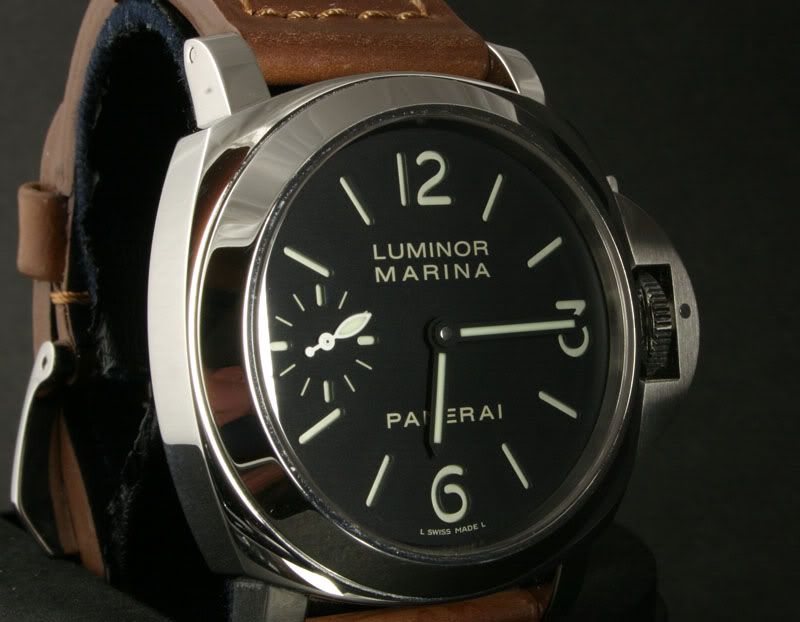
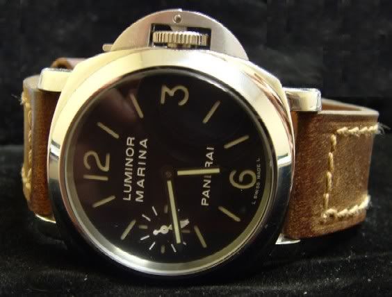
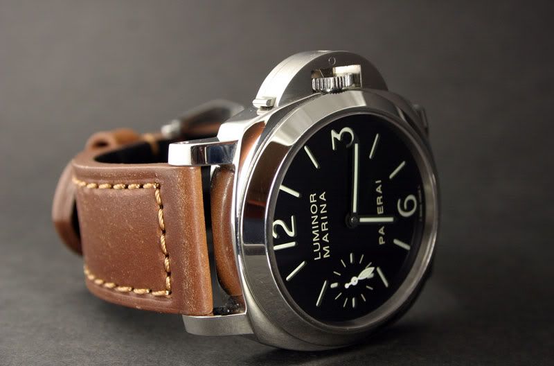
I know it's a known issue. I have no doubt davidsen will get to it sooner or later. But I'm thinking maybe if we talk more about it, davidsen will do it earlier. Look at his 005, http://replica-watch.info/forum/viewtop ... d&start=15. In case the images are missing, I backed up briank996 images (sorry brian, I don't mean to hijack your images, but when I went back to the link above, your images don't load. I went to my cache and uploaded your images to photobucket so everybody can still see the pics).


Look at the watch, paricularly the thick crown and CG. The CG is perfect, the space above and below the lever is even, with the former just a tad thinner than the latter. It totally matches the current HISTORIC pannies. The case, crown, and CG are a perfect foundation for the current 000, 111, 112, 005 models. You know how good his superlume dial and hands, AR sapphire, and movements (even his CN movements are very good - read ziggy's report). If only he makes the dial letters bolder, proper spacing between them, proper position of the words (e.g. the word Panerai should be lower, closer to the indices). That should be very doable. If eddielee can do it, I'm sure davidsen can do it. I think we just have to tell him we want that done very much.


Look at the watch, paricularly the thick crown and CG. The CG is perfect, the space above and below the lever is even, with the former just a tad thinner than the latter. It totally matches the current HISTORIC pannies. The case, crown, and CG are a perfect foundation for the current 000, 111, 112, 005 models. You know how good his superlume dial and hands, AR sapphire, and movements (even his CN movements are very good - read ziggy's report). If only he makes the dial letters bolder, proper spacing between them, proper position of the words (e.g. the word Panerai should be lower, closer to the indices). That should be very doable. If eddielee can do it, I'm sure davidsen can do it. I think we just have to tell him we want that done very much.


