-
Tired of adverts on RWI? - Subscribe by clicking HERE and PMing Trailboss for instructions and they will magically go away!
You are using an out of date browser. It may not display this or other websites correctly.
You should upgrade or use an alternative browser.
You should upgrade or use an alternative browser.
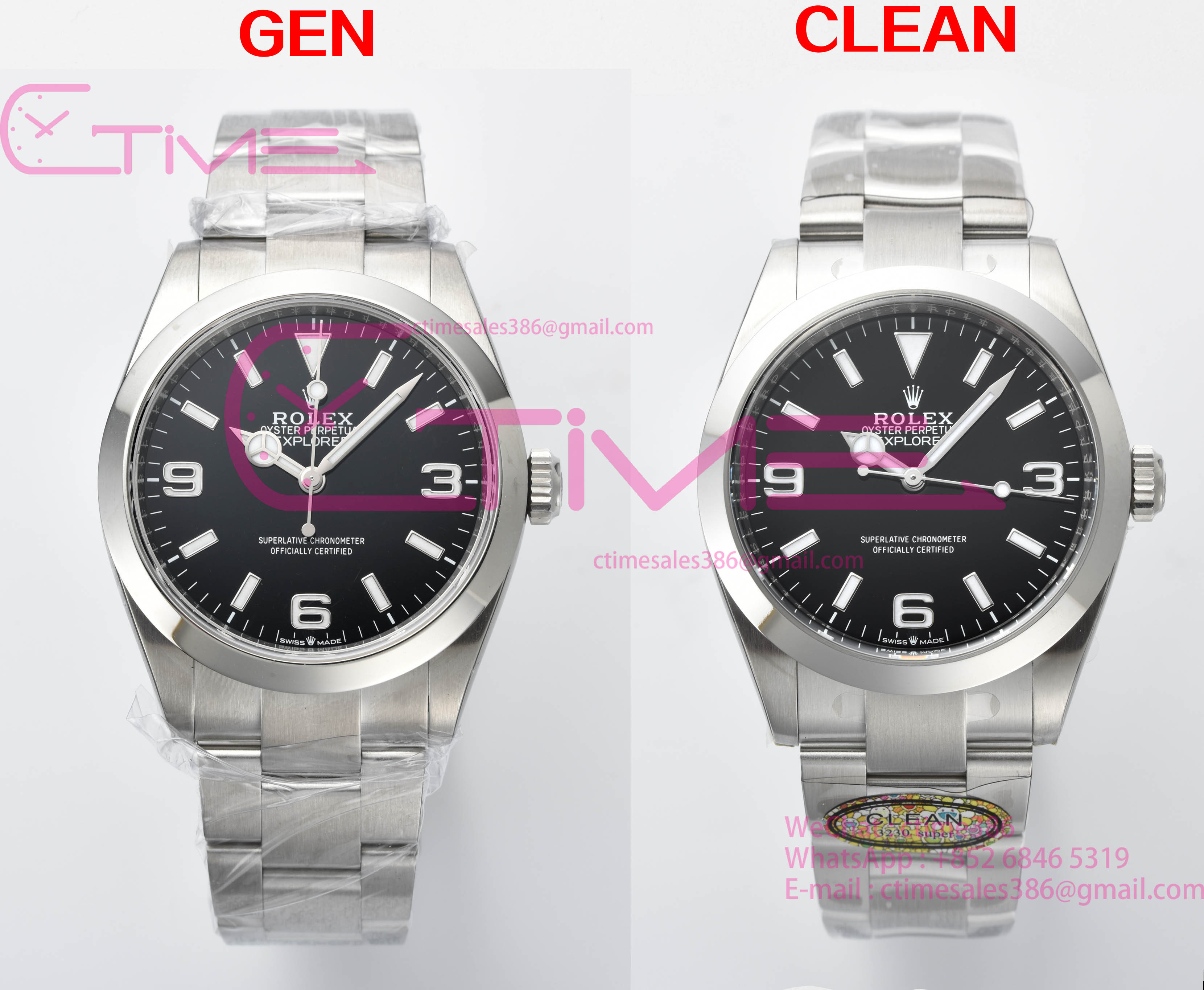
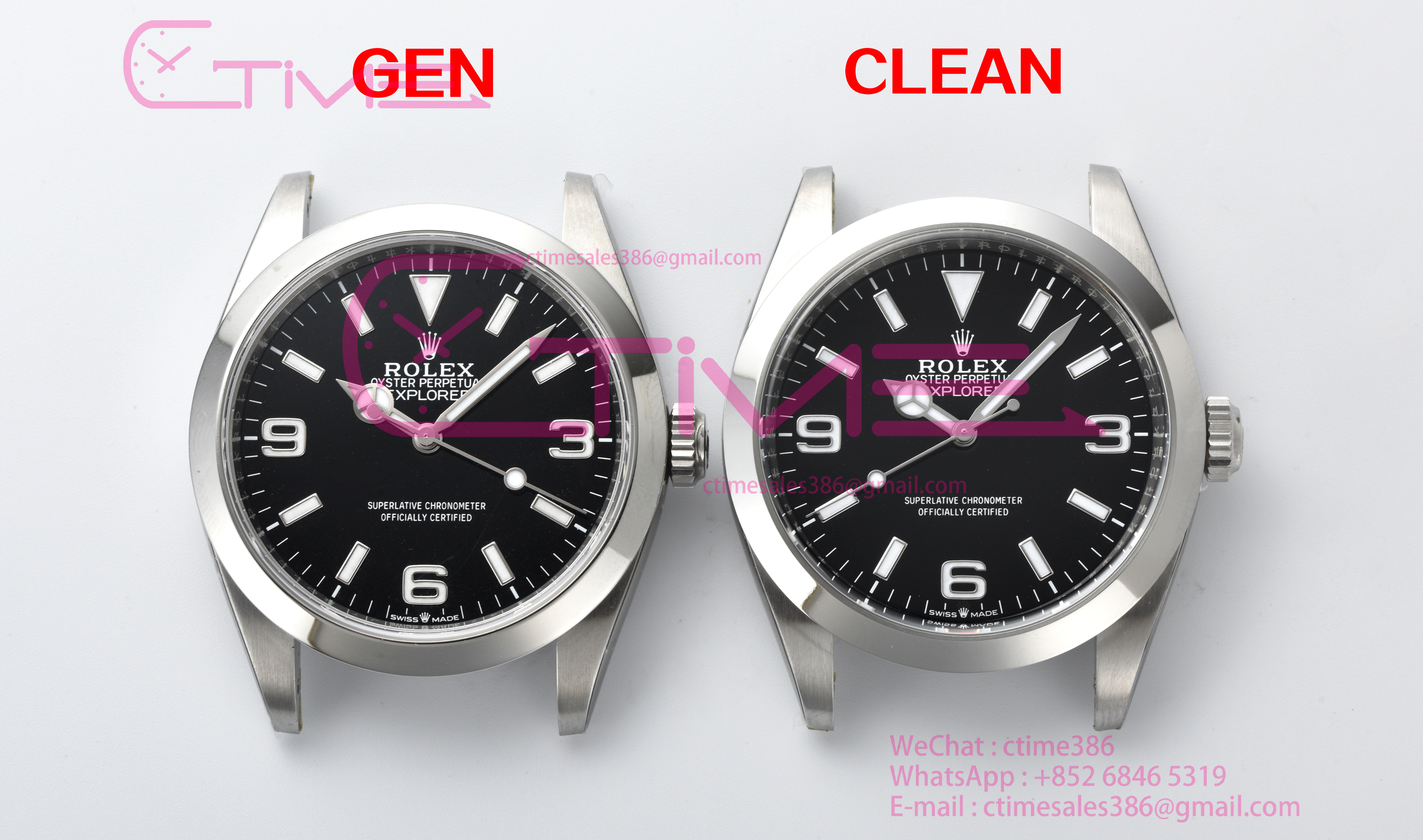
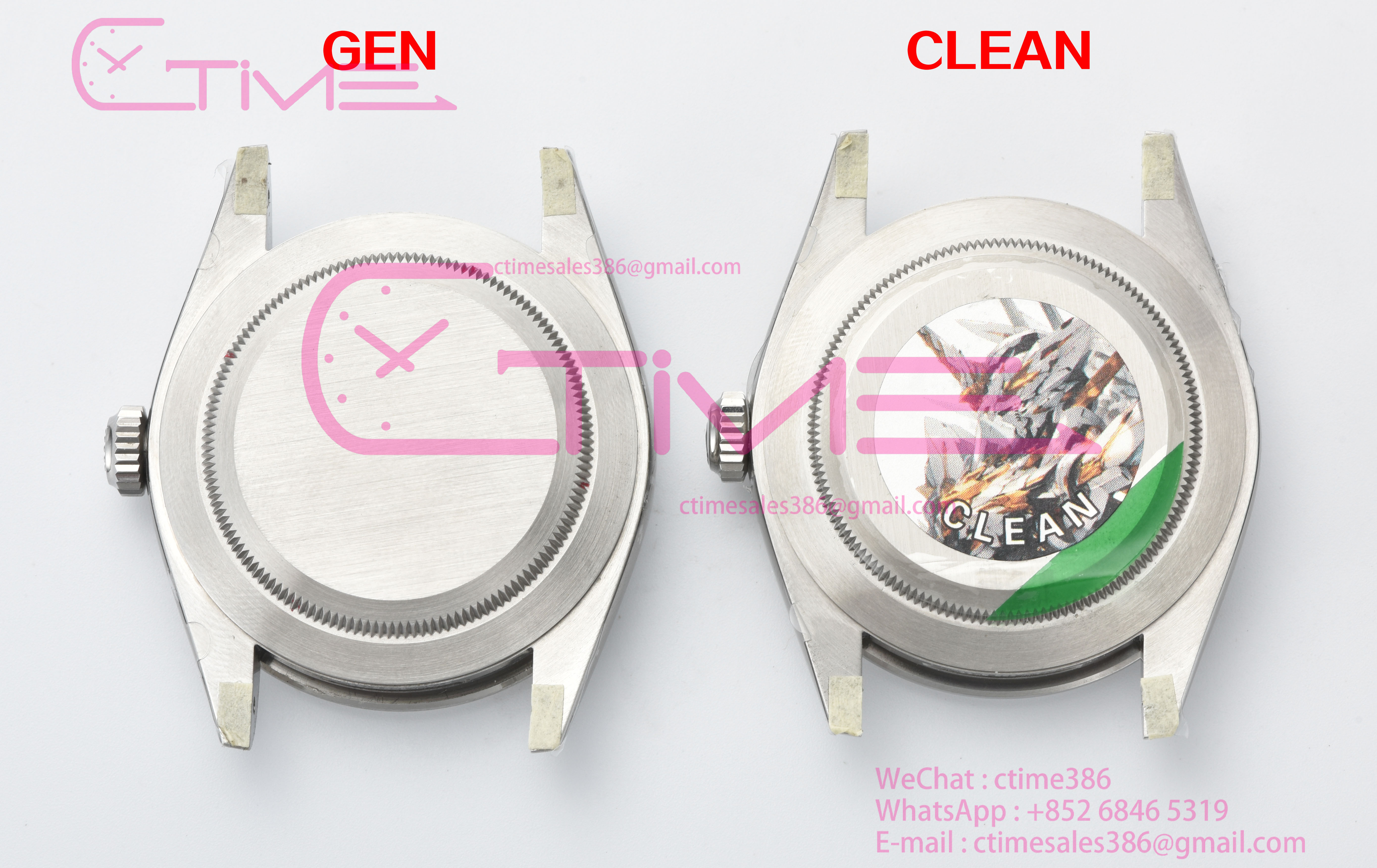
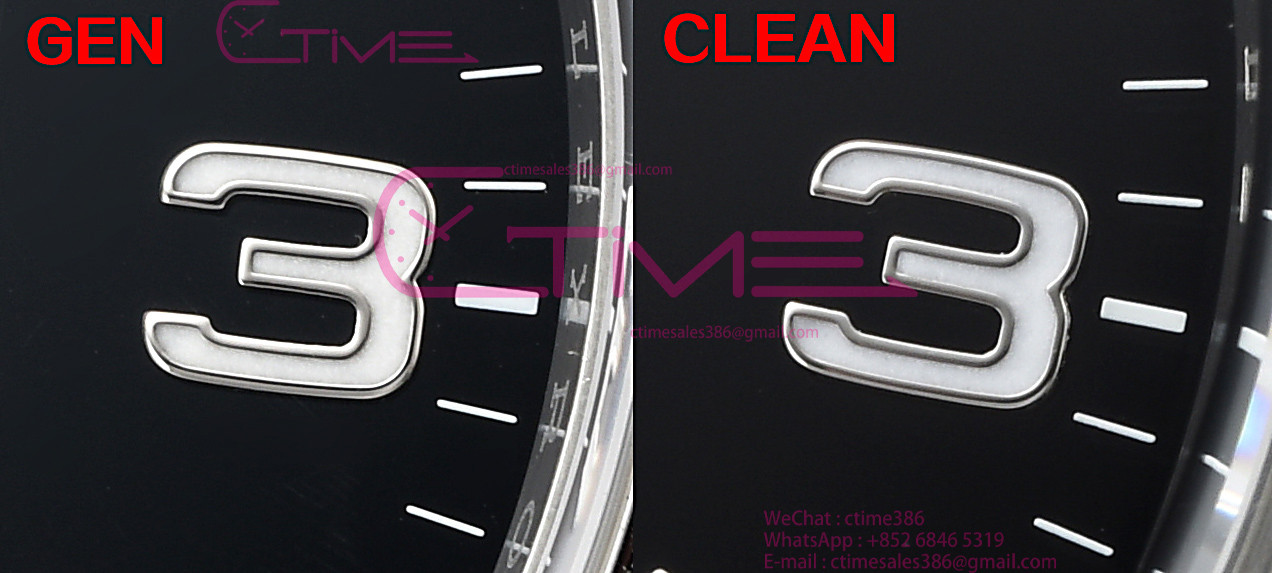
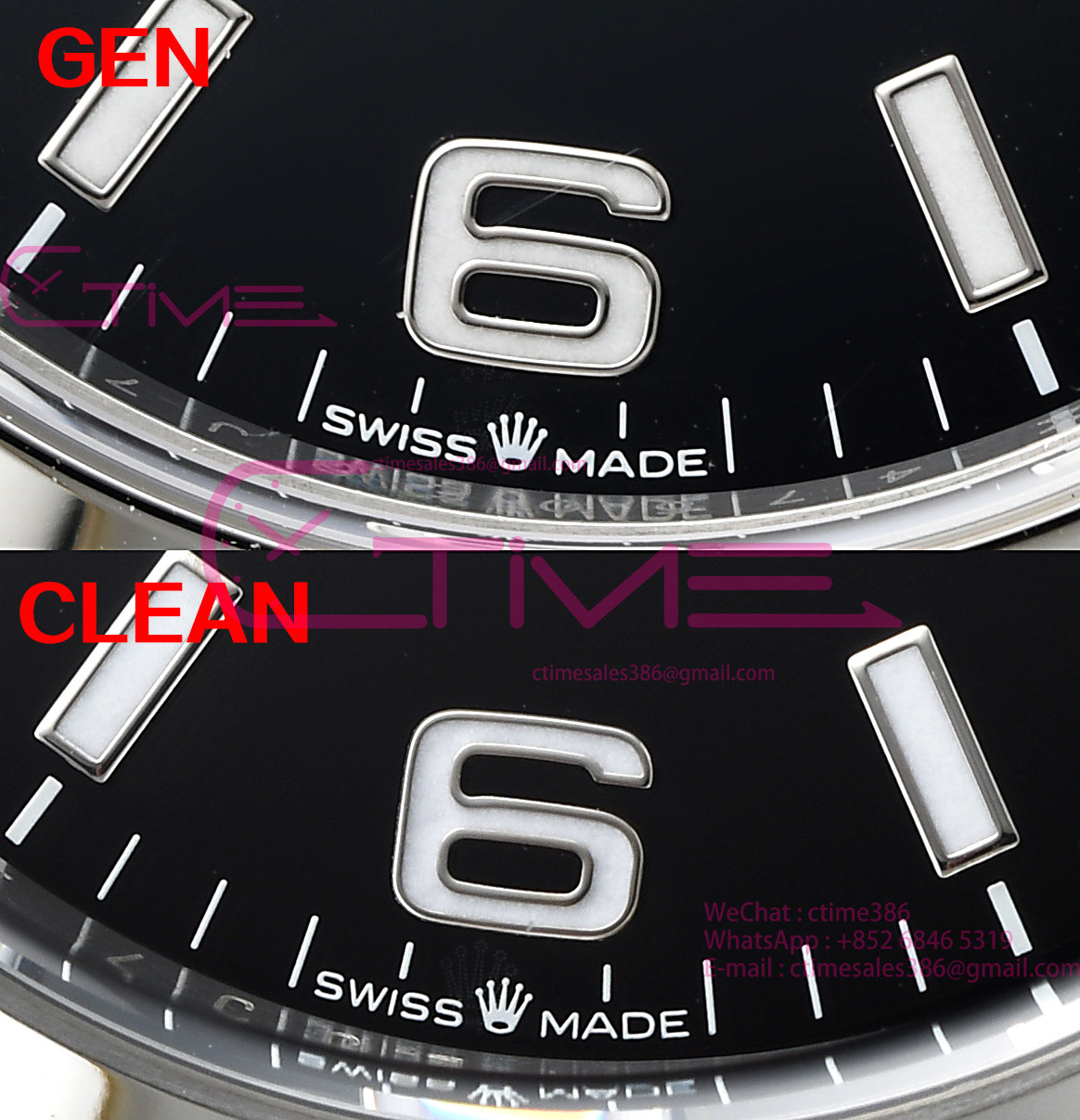
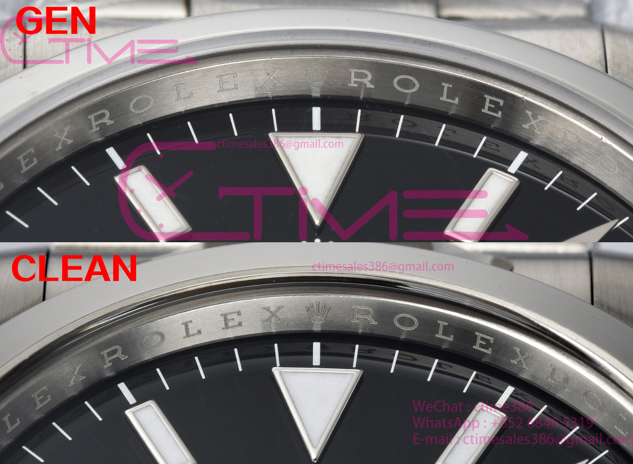
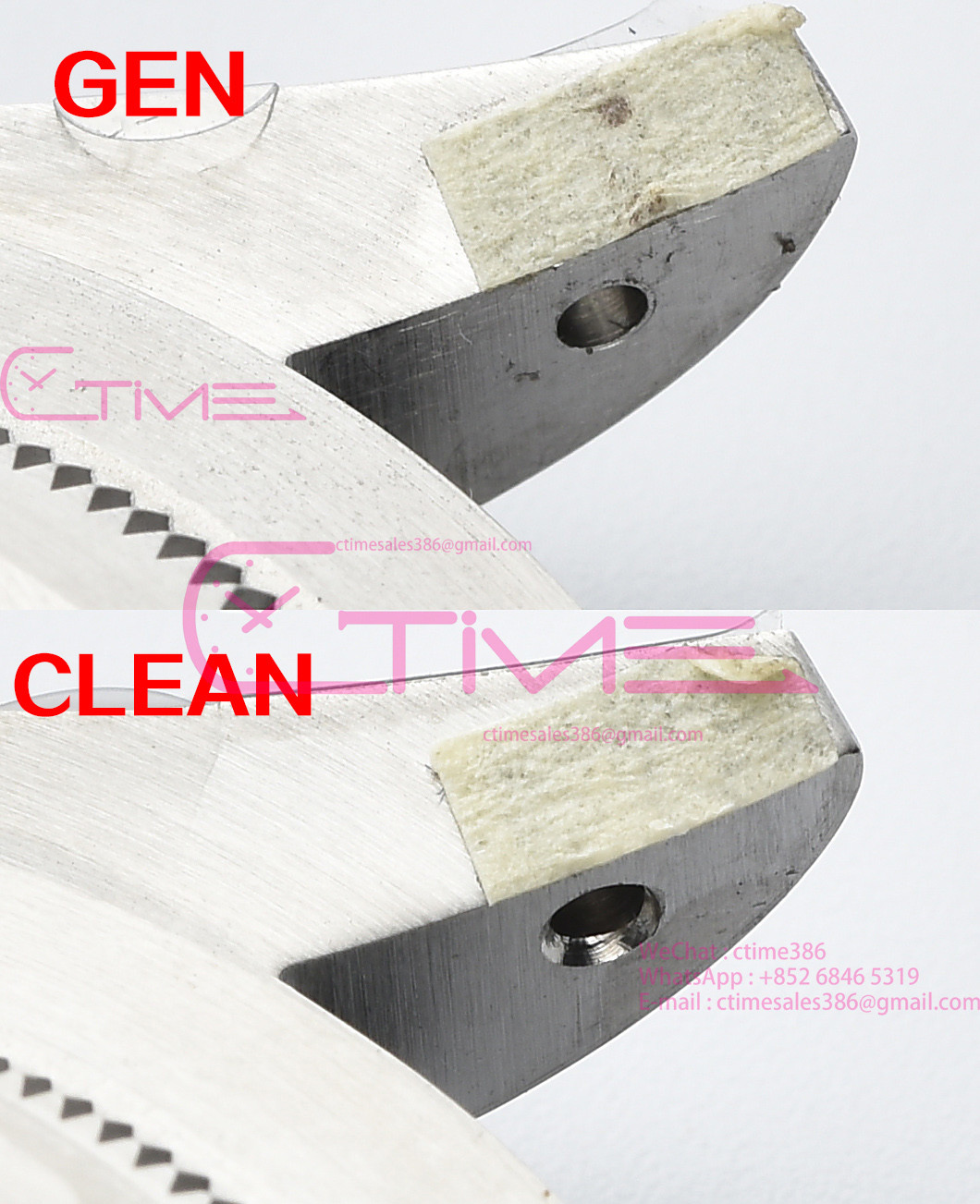
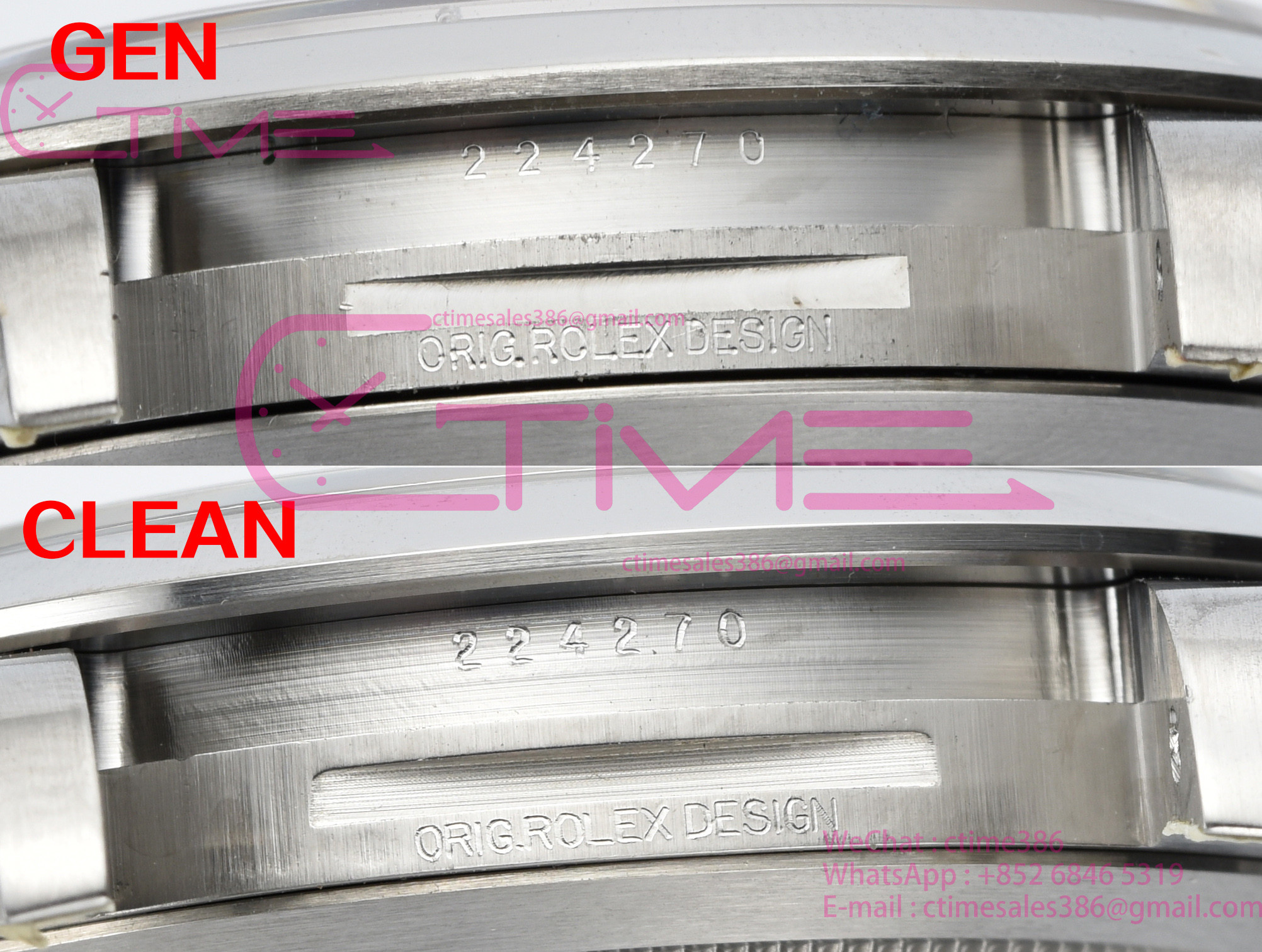
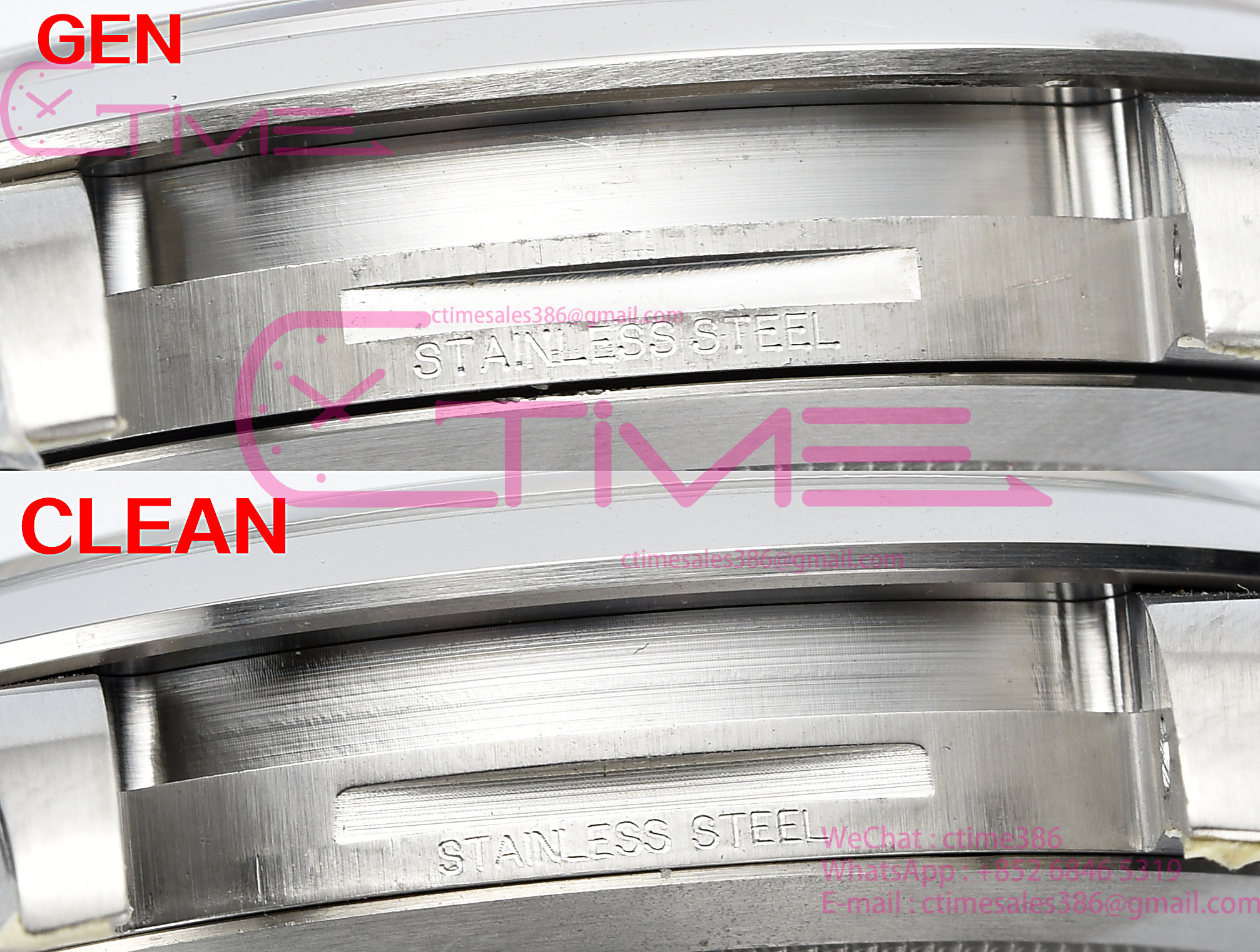
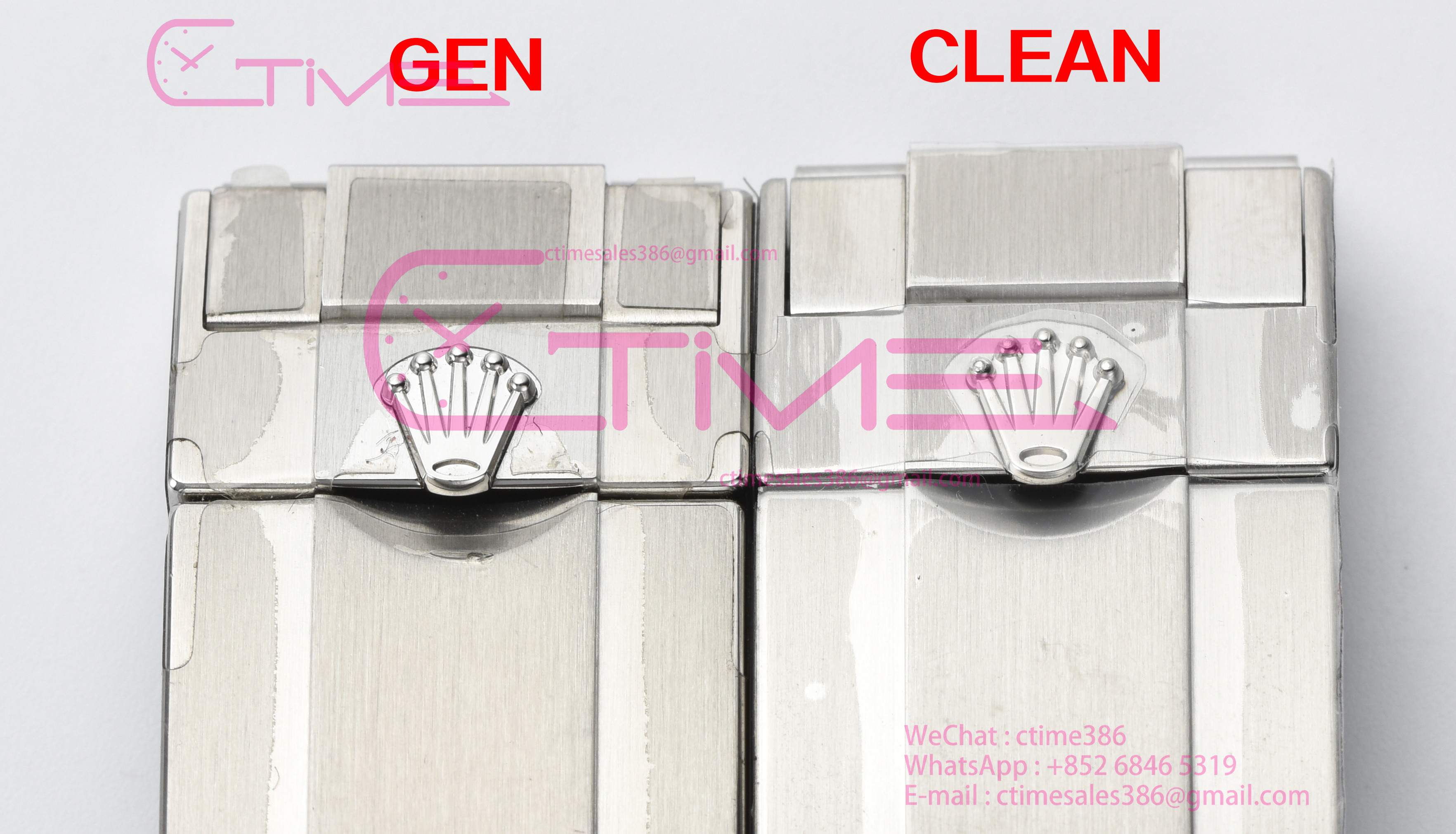
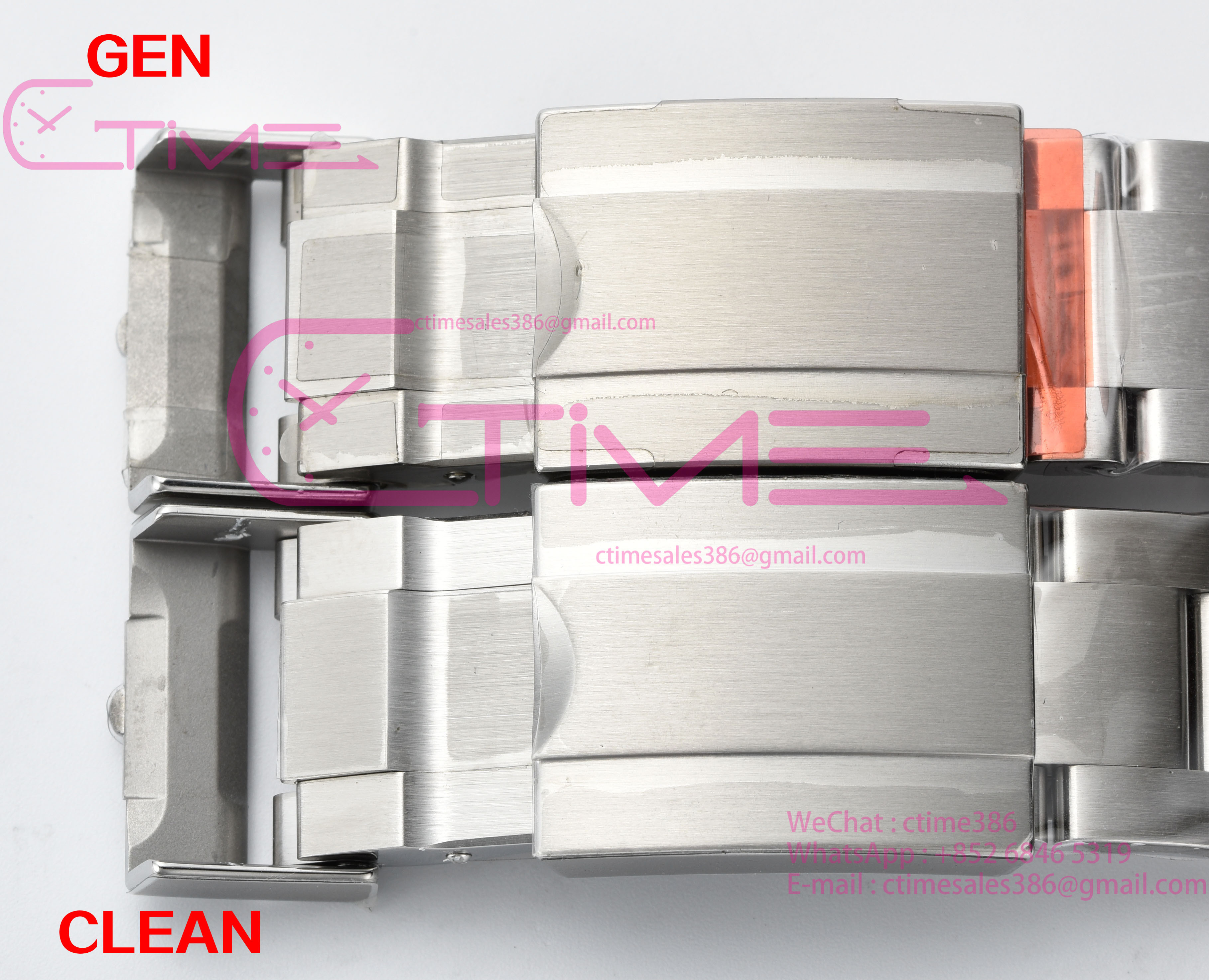
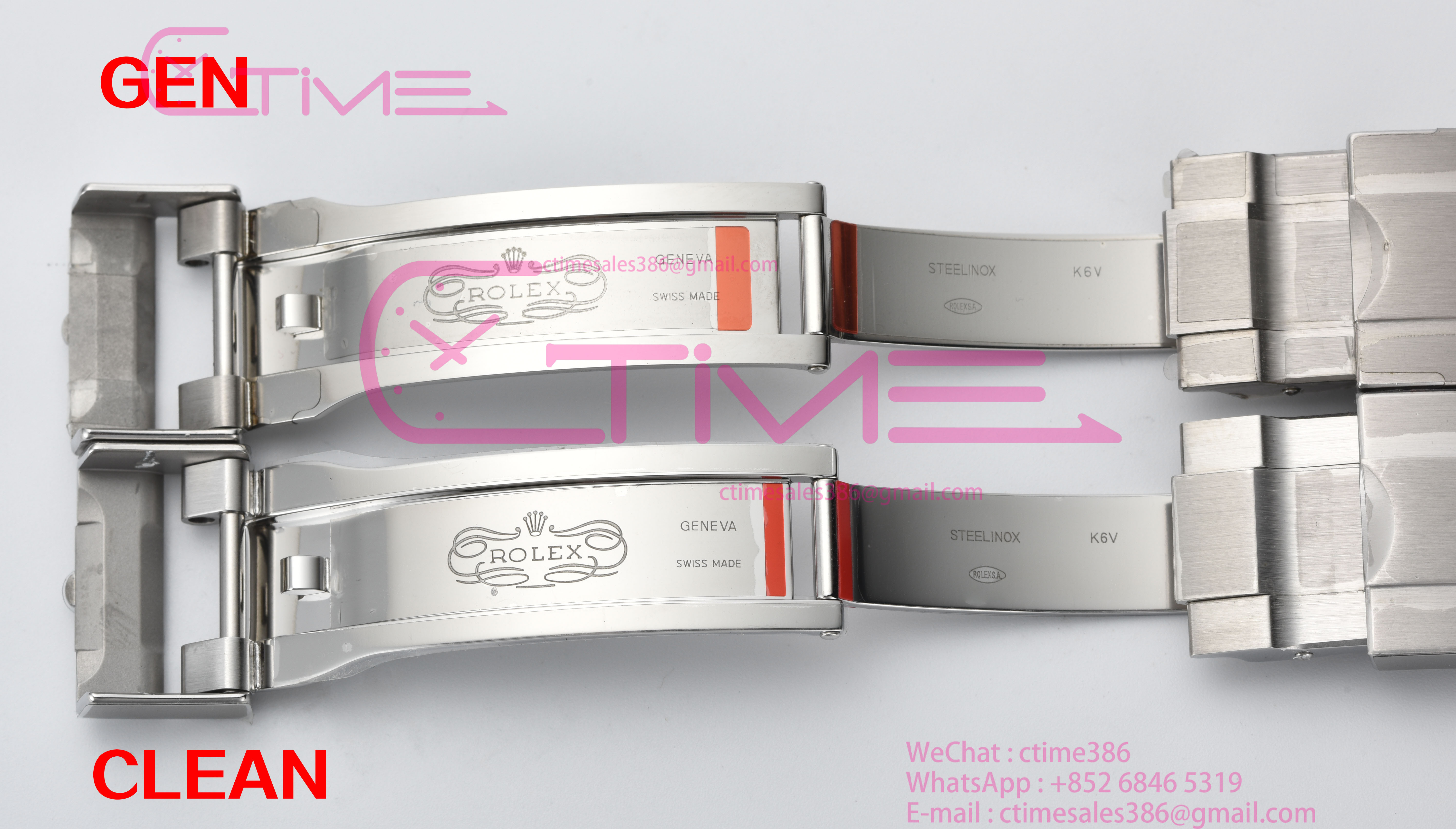
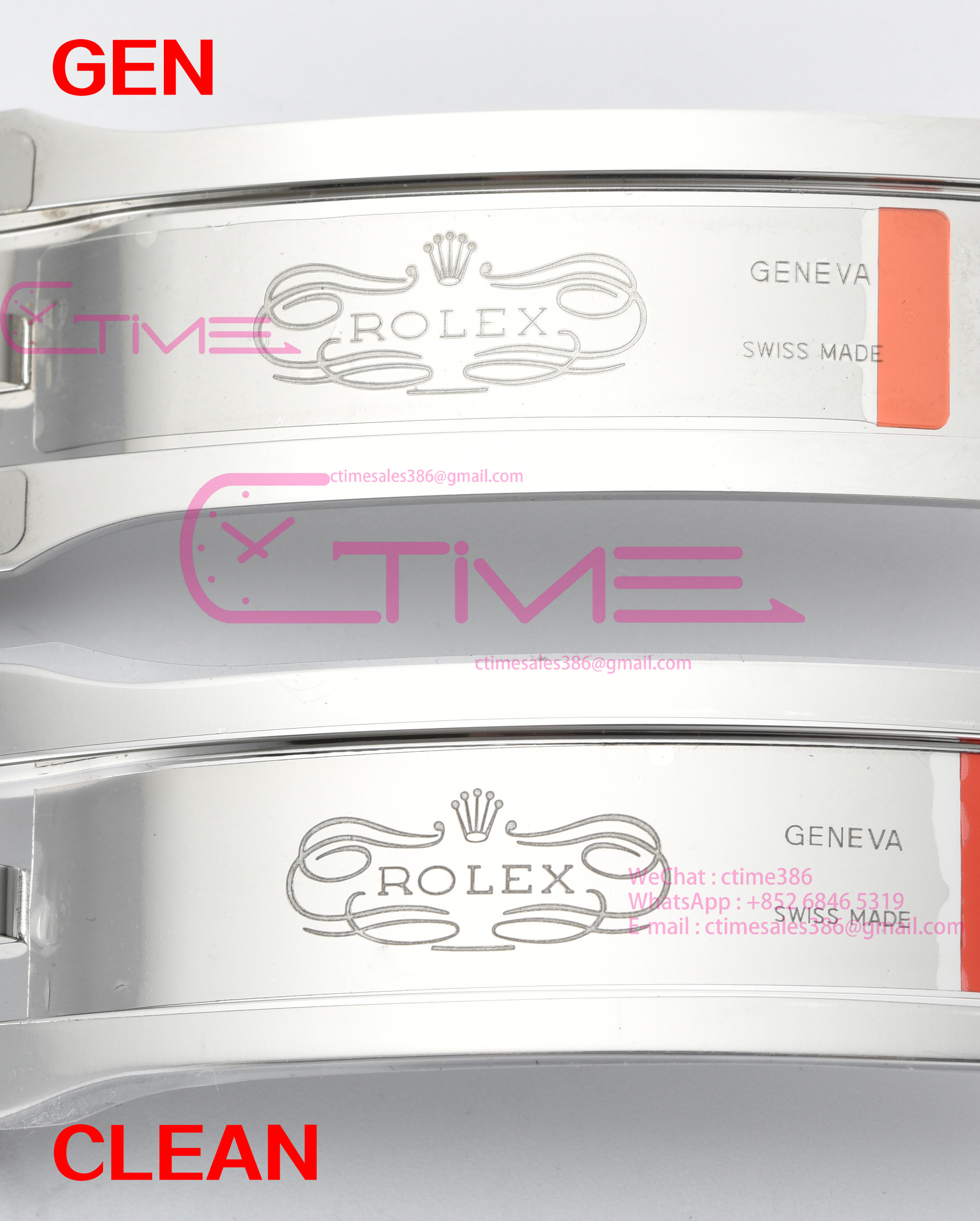
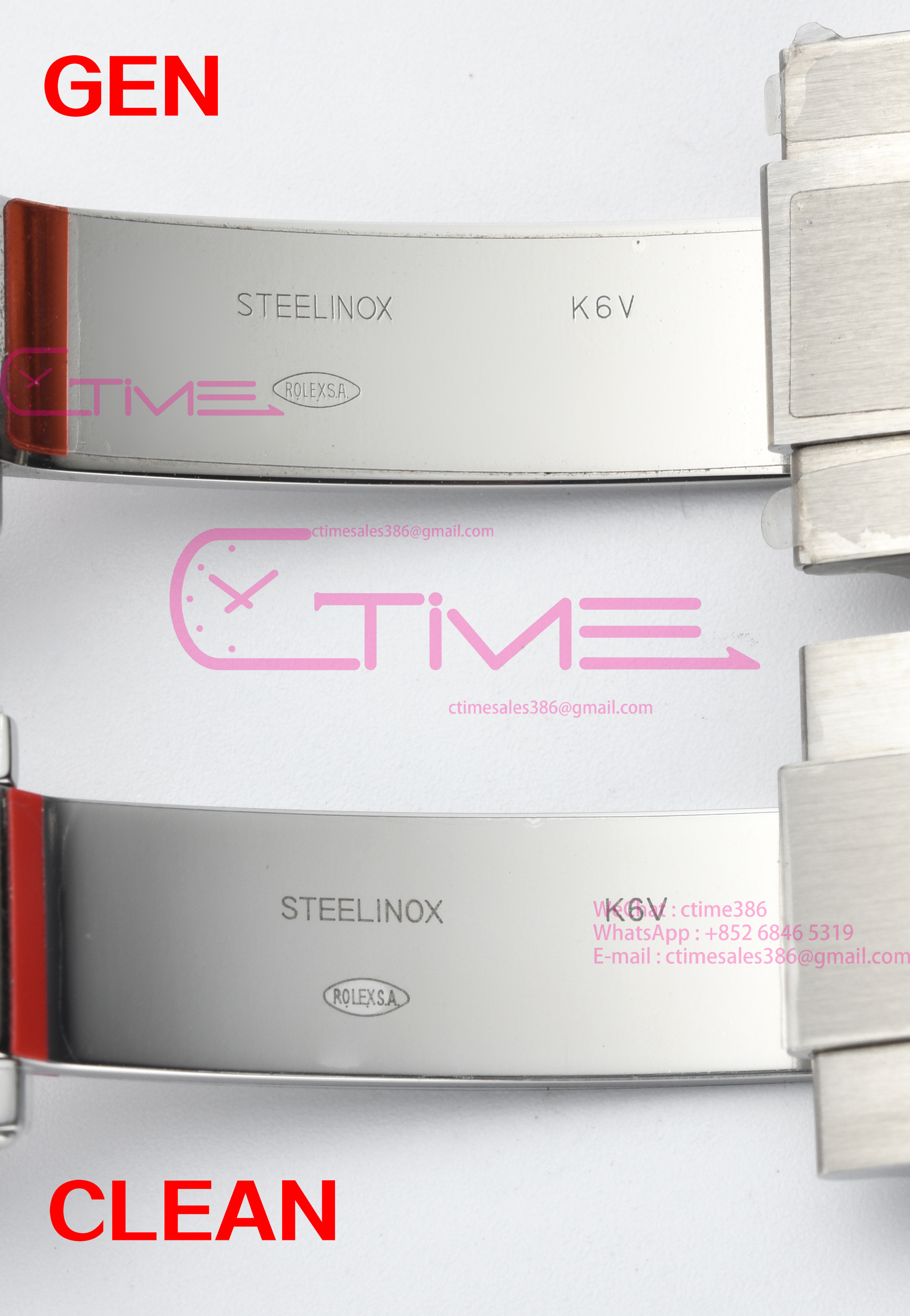
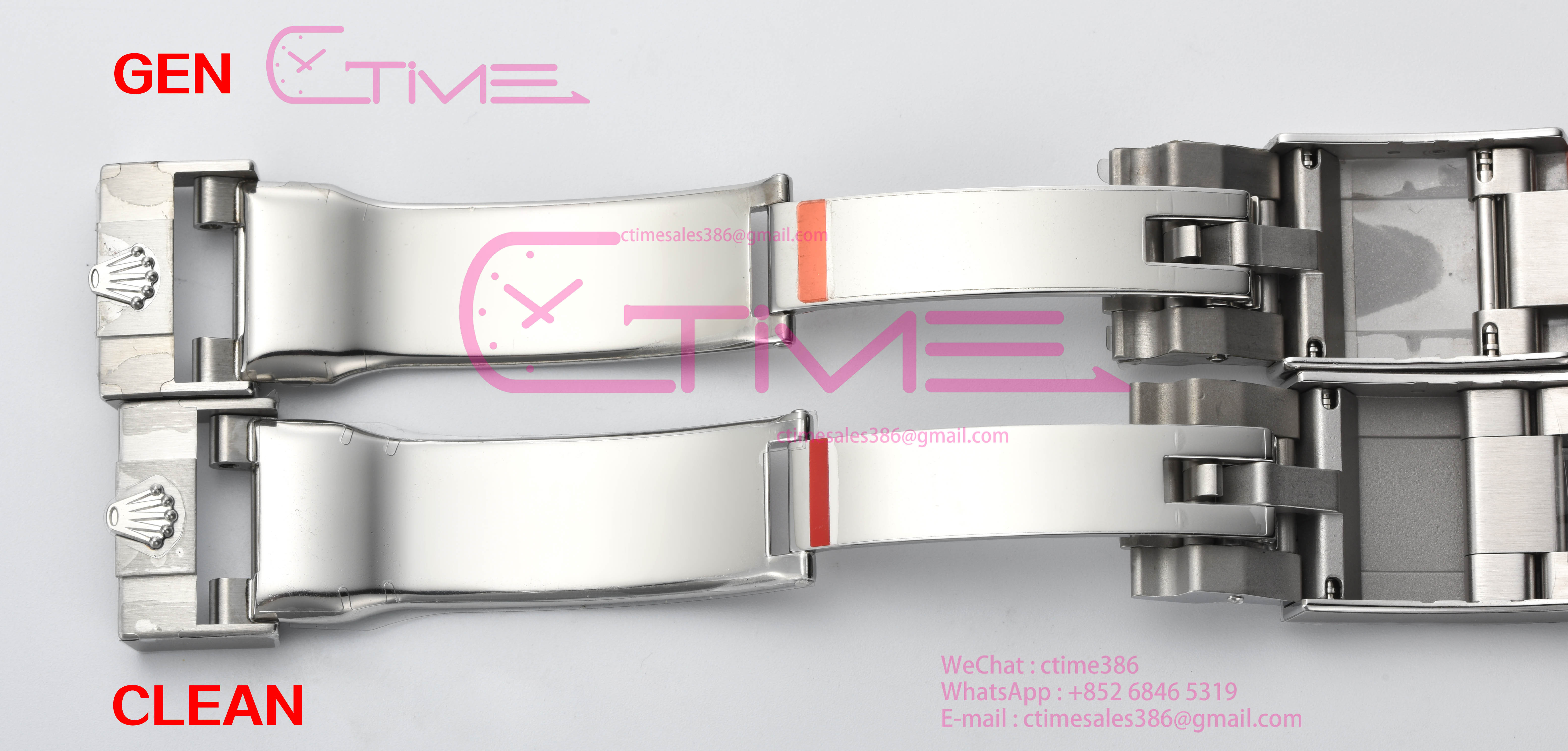
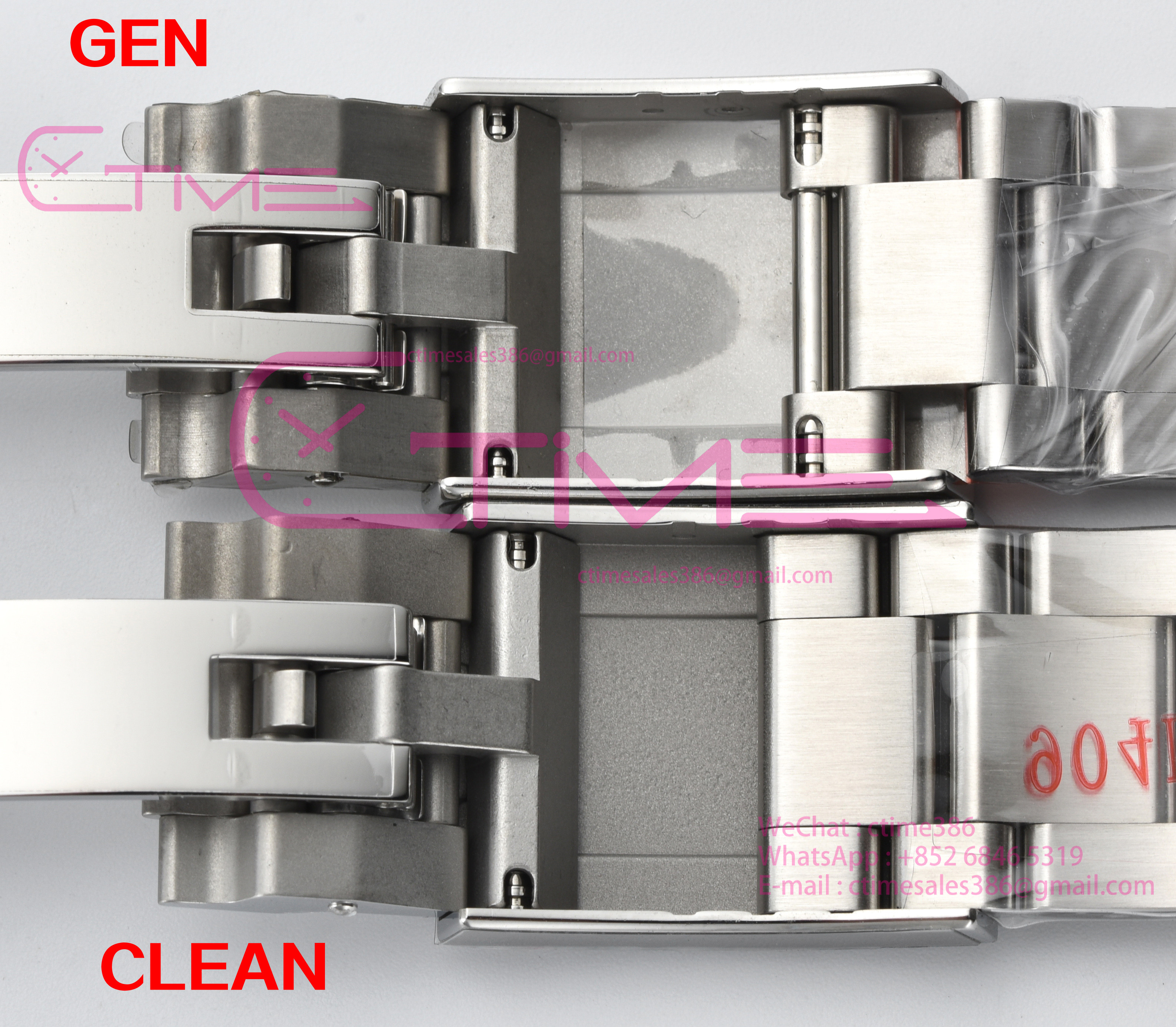
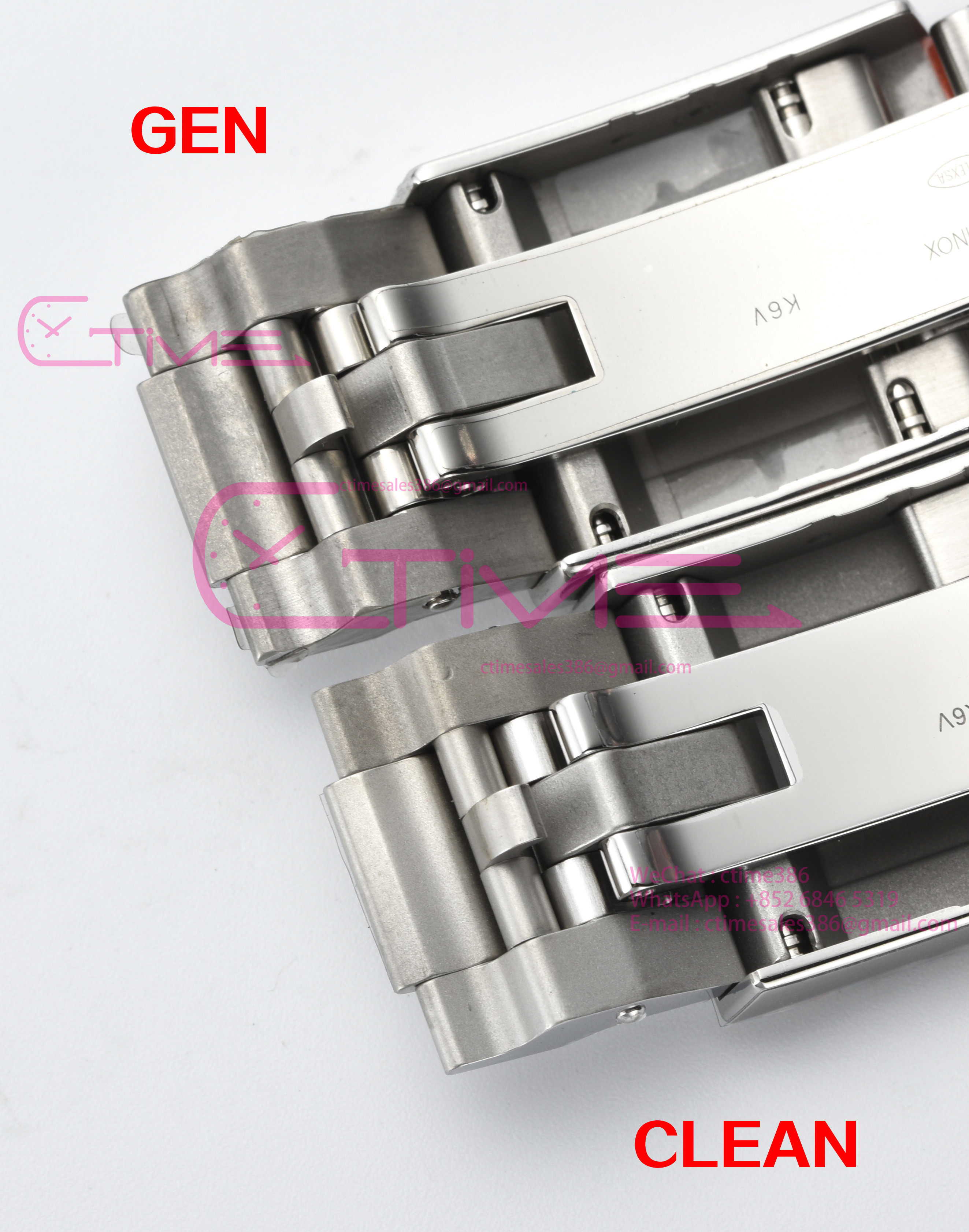
Clean new 224270 explorer I 40mm new release [GEN COMPARISON]
- Thread starter CTime
- Start date
- 18/6/24
- 310
- 277
- 63
Well, this is incredible and precisely what I was waiting for. I will defer to those with more experience, but this might be NWBIG for me now.
Price/Release @CTime ?
Price/Release @CTime ?
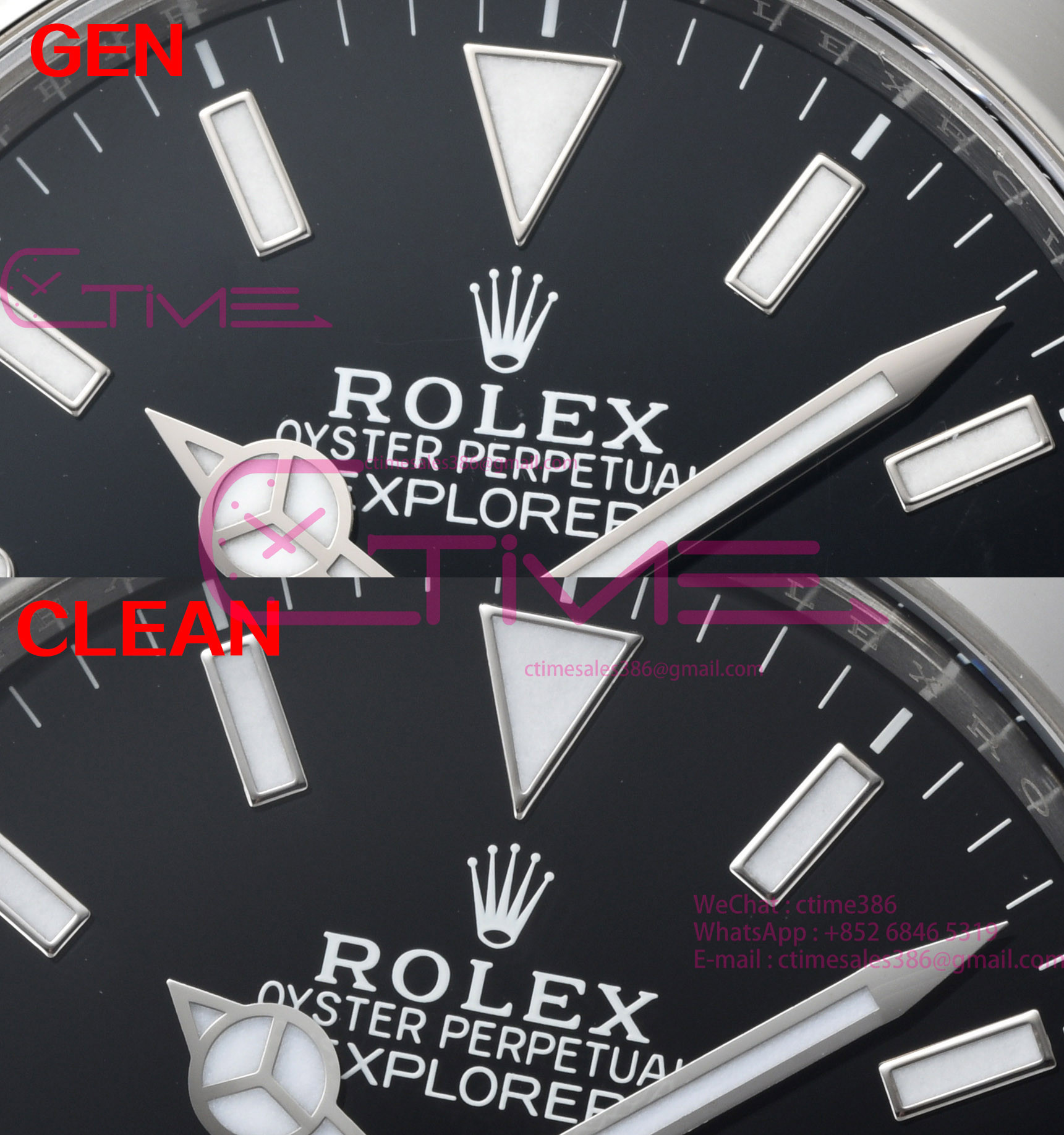
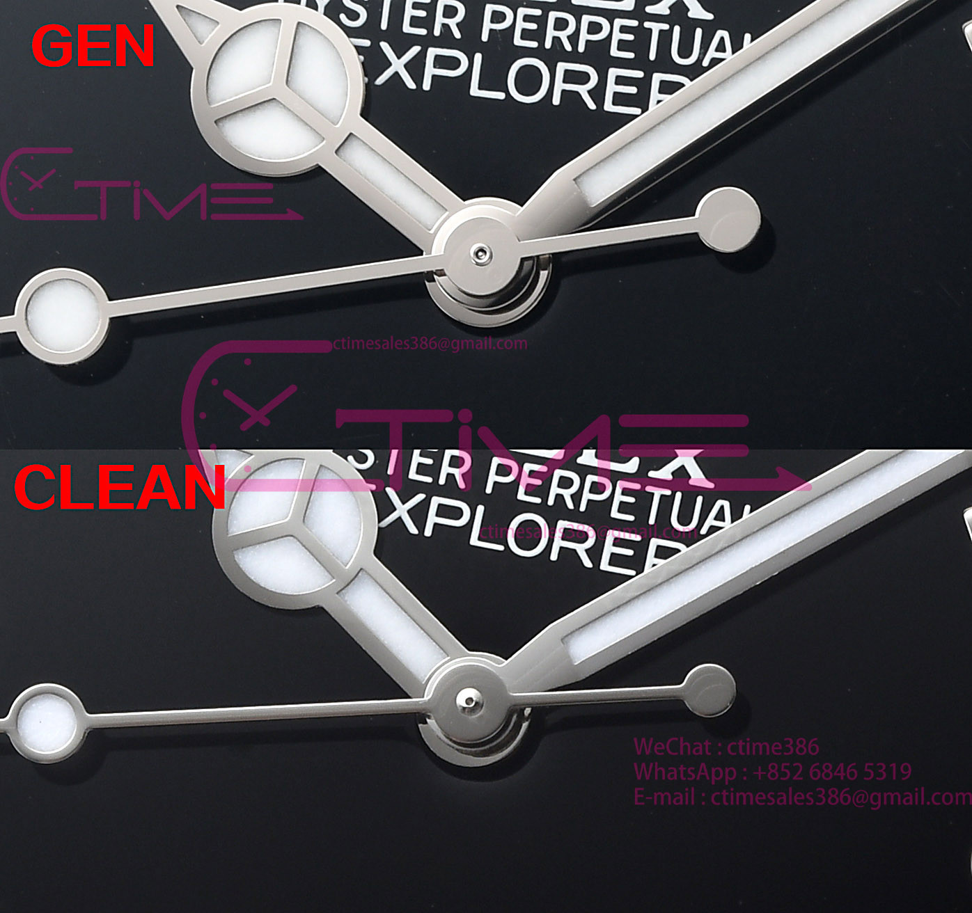
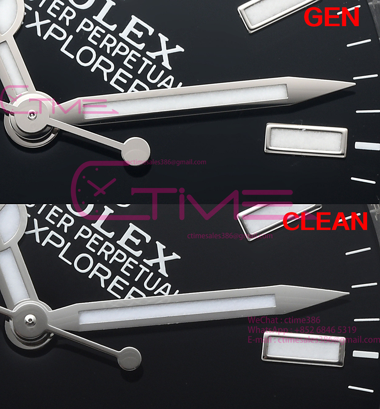
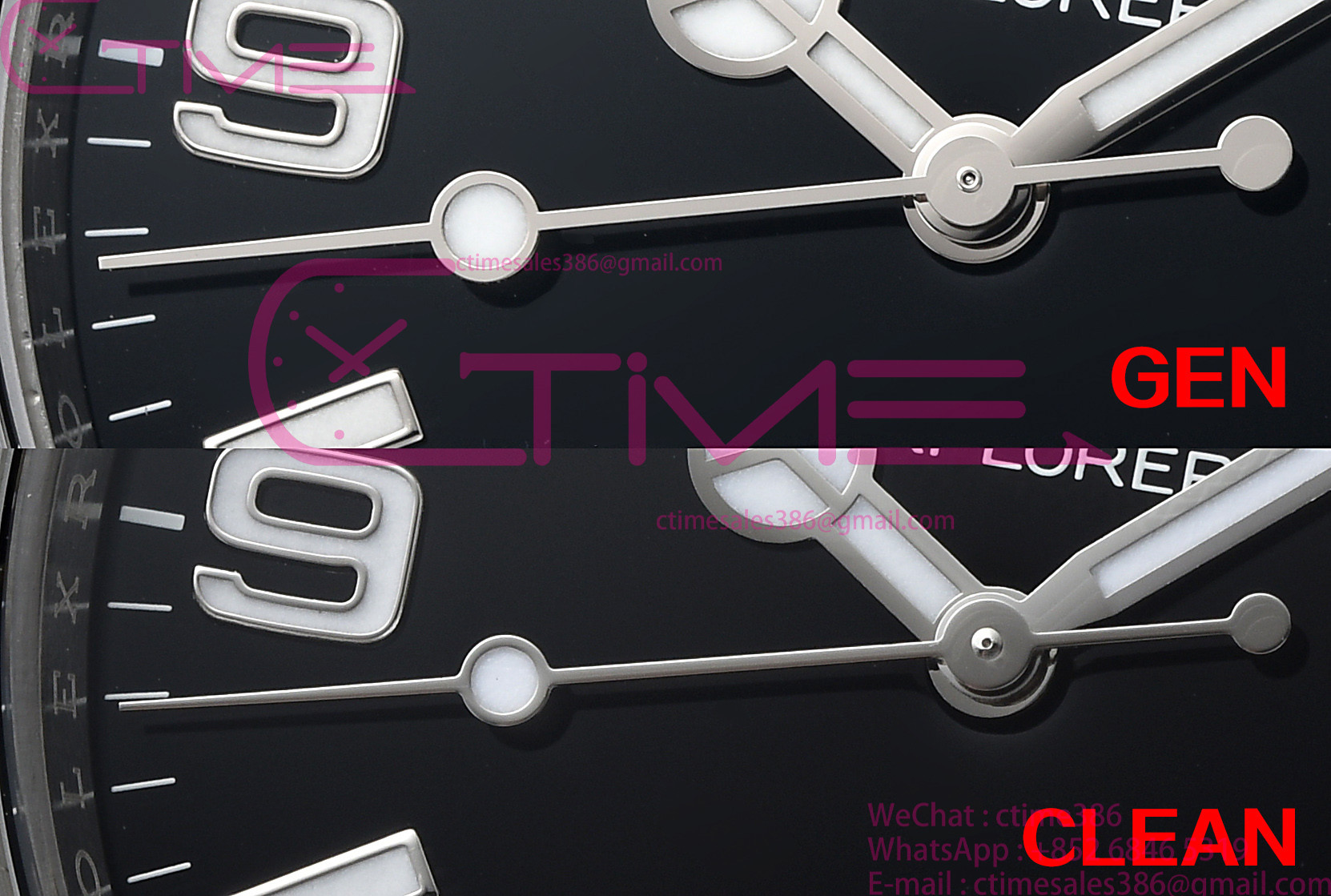
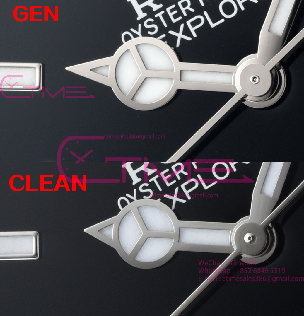
Thanks @CTime ! Very interesting comparison, the differences are very minor and invisible irl. The hands may be the biggest one, but again, barely noticeable irl and then only with a gen to compare to
- 18/6/24
- 310
- 277
- 63
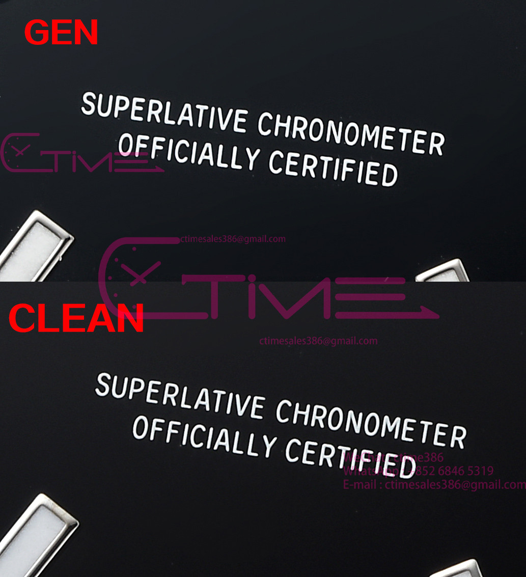
I won't say anything about font thickness then....Dangit now I've seen the hand differences I cannot unsee it.
- 18/6/24
- 310
- 277
- 63
I won't say anything about font thickness then....

patek_with_sellita
Getting To Know The Place
- 10/8/24
- 69
- 56
- 18
Great job @CTime. Great watch but some obvious flaws. Font thickness and middle axis needs to be addressed. That’s a no…
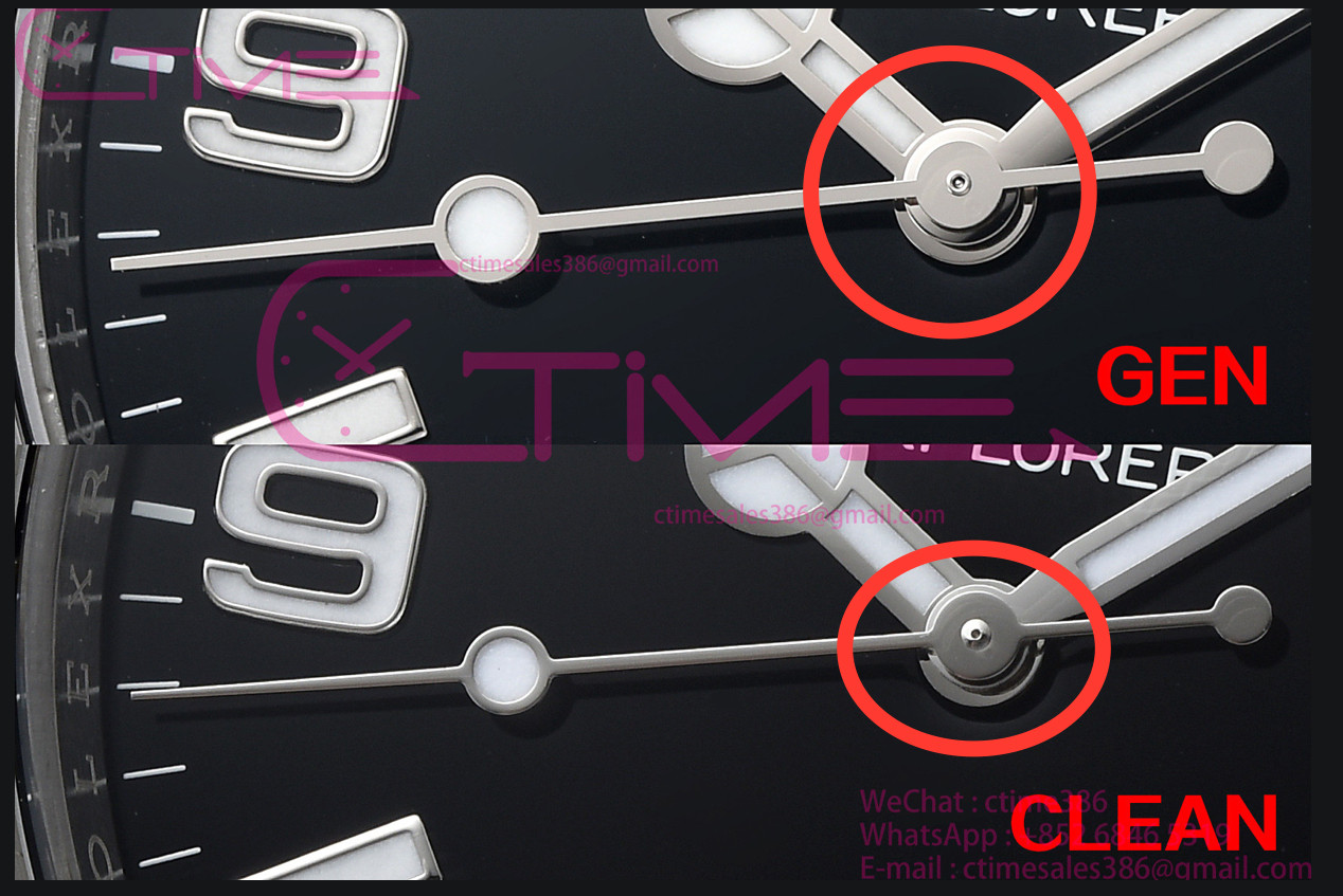

Come on, that's literally smaller than 0,3 mm.Great job @CTime. Great watch but some obvious flaws. Font thickness and middle axis needs to be addressed. That’s a no…

patek_with_sellita
Getting To Know The Place
- 10/8/24
- 69
- 56
- 18
No mate. This will be visually obvious. I got the gen and the first thing I did was to check if it’s visible or not. Just because something is small doesn’t mean we have to leave it out. We are here to discuss so we can improve things right?Come on, that's literally smaller than 0,3 mm.
patek_with_sellita
Getting To Know The Place
- 10/8/24
- 69
- 56
- 18
Same with the lollipop seconds hand (to small on clean).
Sorry, but "visually obvious" is hyperbole. You will not be able to see that at normal watch-reading distance. Unless you're very shortsighted and you have to look at the watch from 20-30cm. This is a rep that costs a fraction of gen. Let's be real.
Better proportions for the hands, all of them, not just the lollipop seconds hand, go for it, but the pivot is not visually obvious.
Better proportions for the hands, all of them, not just the lollipop seconds hand, go for it, but the pivot is not visually obvious.
- 12/3/18
- 34,662
- 66,753
- 113
The gen hour hand length and obnoxiously pointy tip is a much bigger tell than the second hand IMO. I daresay I like the CLEAN hour hand better. It looks like Rolex overcompensated for the larger model, it's not like they don't goof on these decisions now and then. Who can forget the silly shorty hand set they debuted the 39mm 214270 with?

IvorH
Getting To Know The Place
- 7/9/24
- 38
- 39
- 18
Frankly, these minor differences don’t bother me in the slightest as the overall quality is excellent.
if the errors were due to poor workmanship or bad finishing I might chime In, but I think Clean has done a great job.
just my humble opinion, of course!
if the errors were due to poor workmanship or bad finishing I might chime In, but I think Clean has done a great job.
just my humble opinion, of course!
ThisSorry, but "visually obvious" is hyperbole. You will not be able to see that at normal watch-reading distance. Unless you're very shortsighted and you have to look at the watch from 20-30cm. This is a rep that costs a fraction of gen. Let's be real.
Better proportions for the hands, all of them, not just the lollipop seconds hand, go for it, but the pivot is not visually obvious.
And this
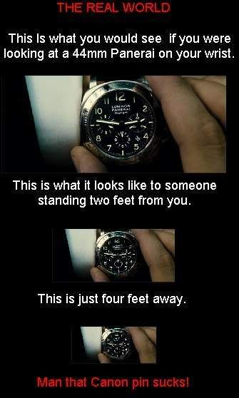
& I recall a quote elsewhere, can't remember who, but "If you want gen spec, you pay gen price"
- 9/9/19
- 2,277
- 1,682
- 113
I'm always happy when new members come in and help us opening our eyes. So grateful 
I'm always happy when new members come in and help us opening our eyes. So grateful
