• Tired of adverts on RWI? - Subscribe by clicking HERE and PMing Trailboss for instructions and they will magically go away!

BTF 116509 Daytona releases (blue dial, silver dial & black diamond dot dial) - coming soon?

KJ2020

Time Traveler
Supporter
12/3/18
32,778
59,009
113
I
One last thing would you say the dial color is better now , or did they improve it?. I remember when people were disappointed with the early pics from factory saying it’s too purple blah blah
I highly doubt there has been a dial change already though it's possible early pics were just a prototype. I do think think this dial is a tad darker than gen but to some extent I place more priority in my own liking of a piece than in its similarity to gen.

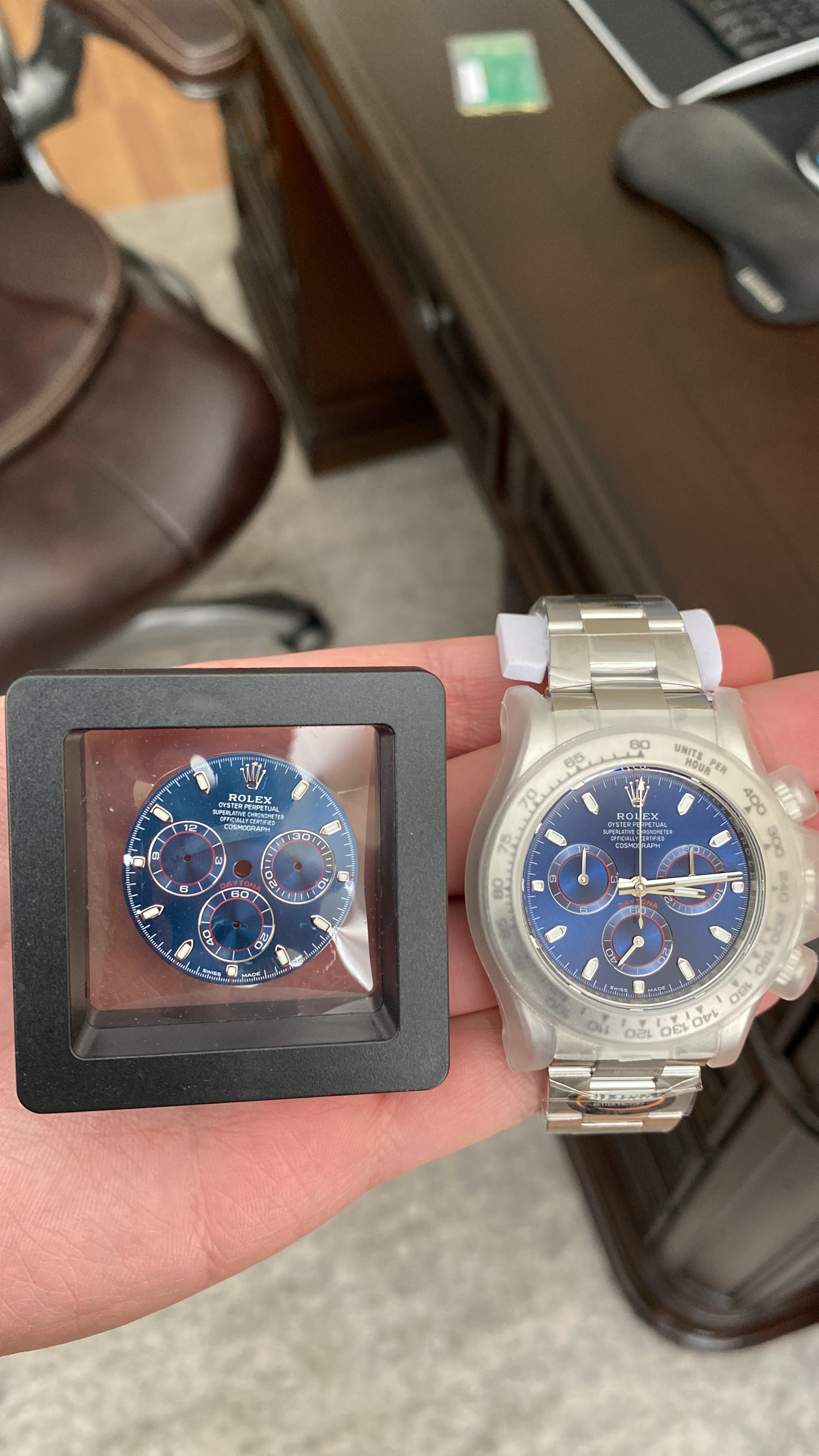
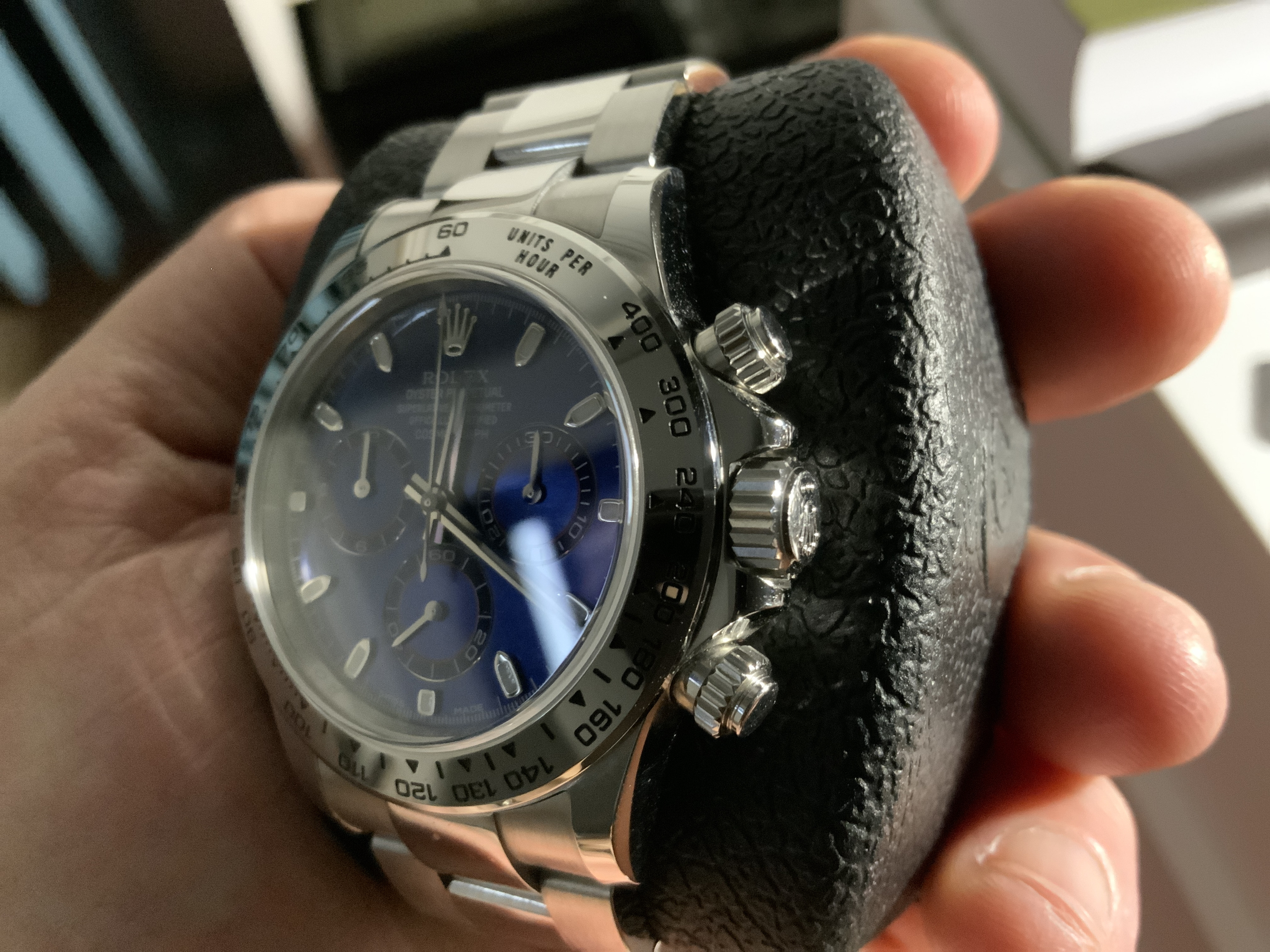
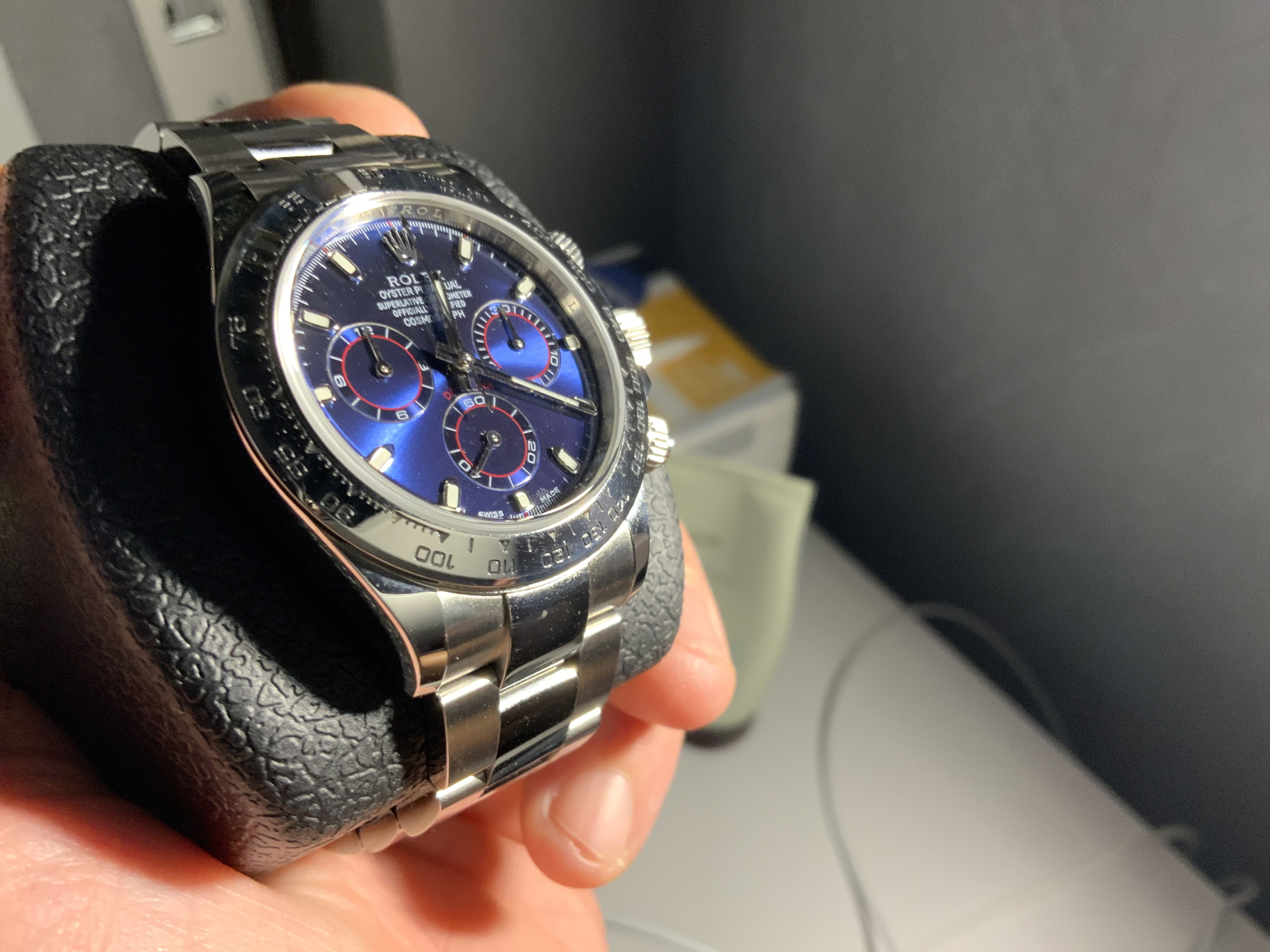
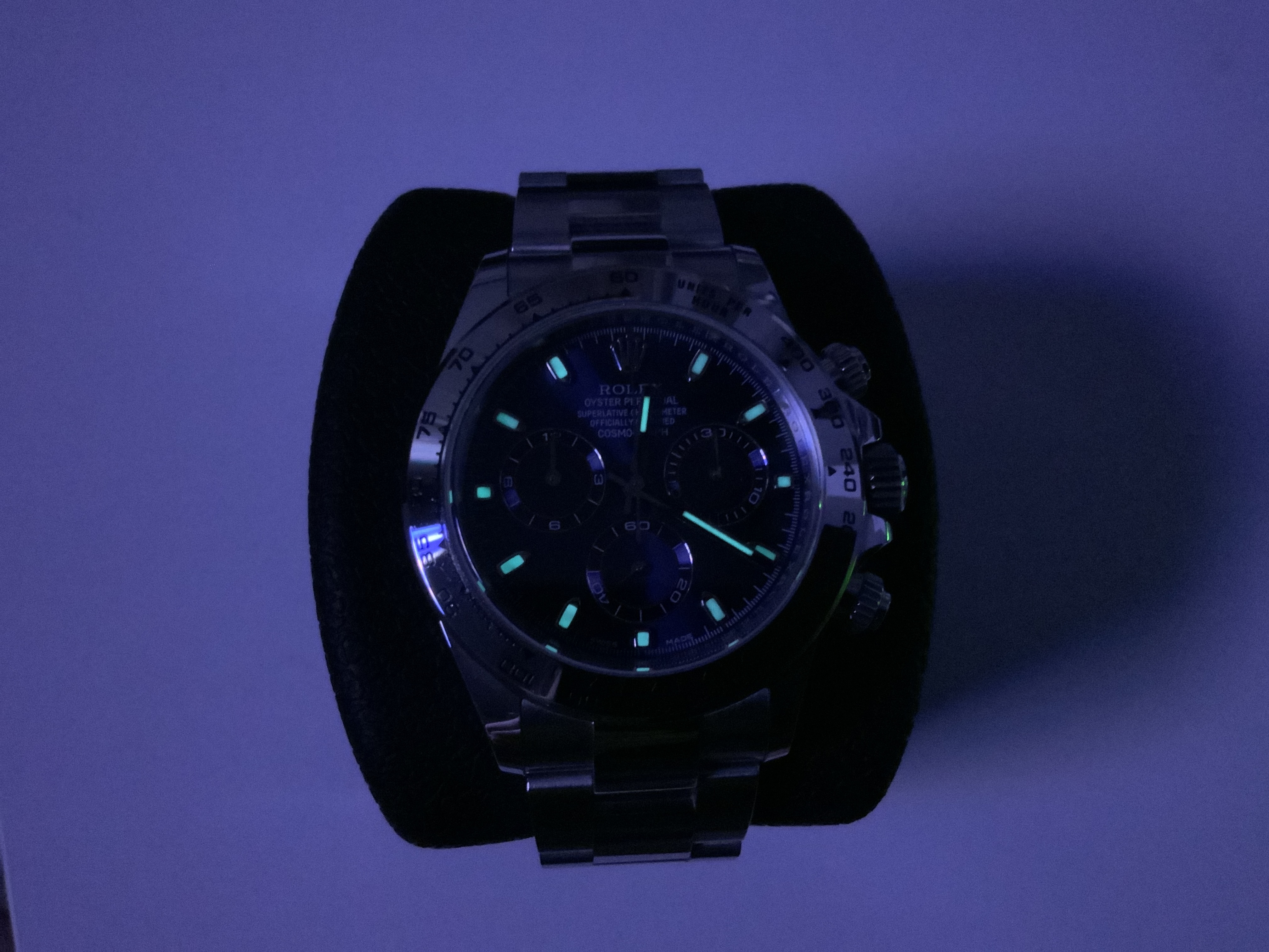
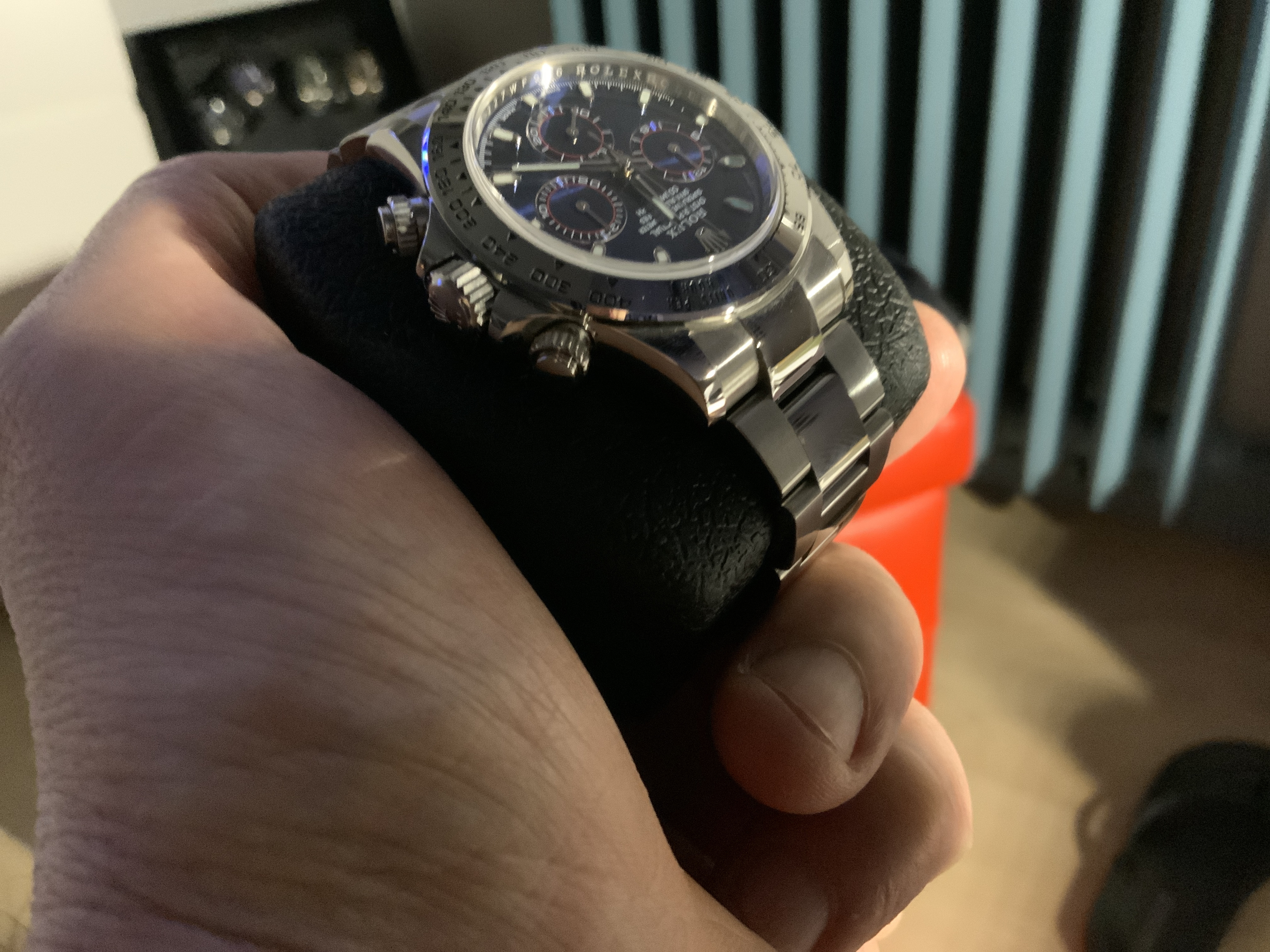
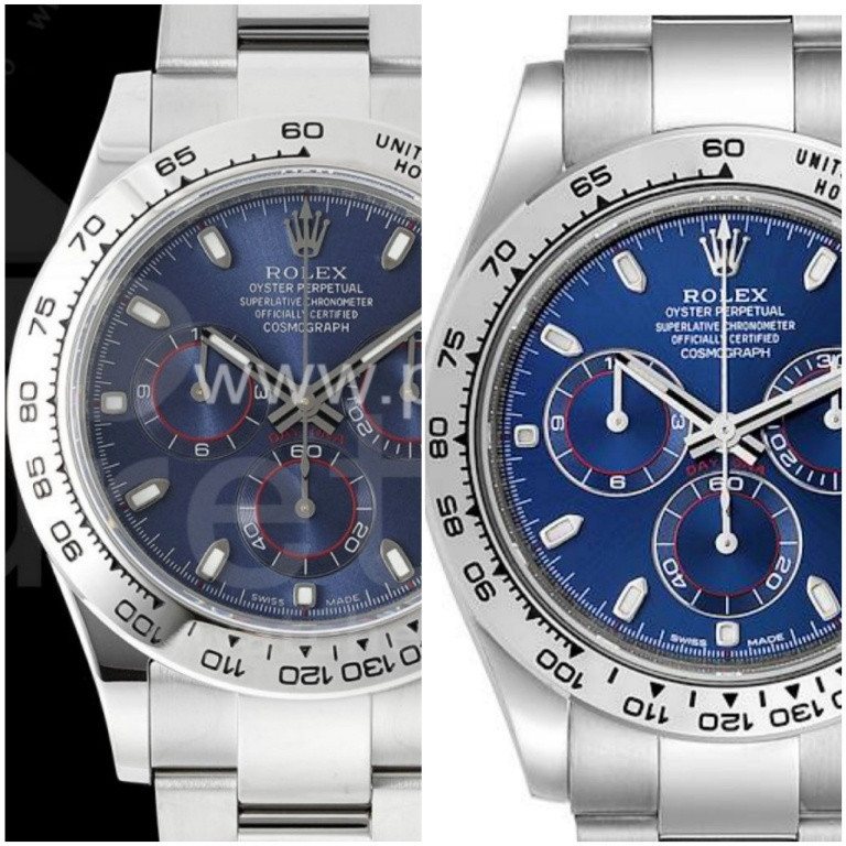
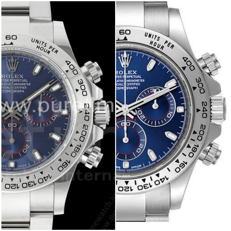
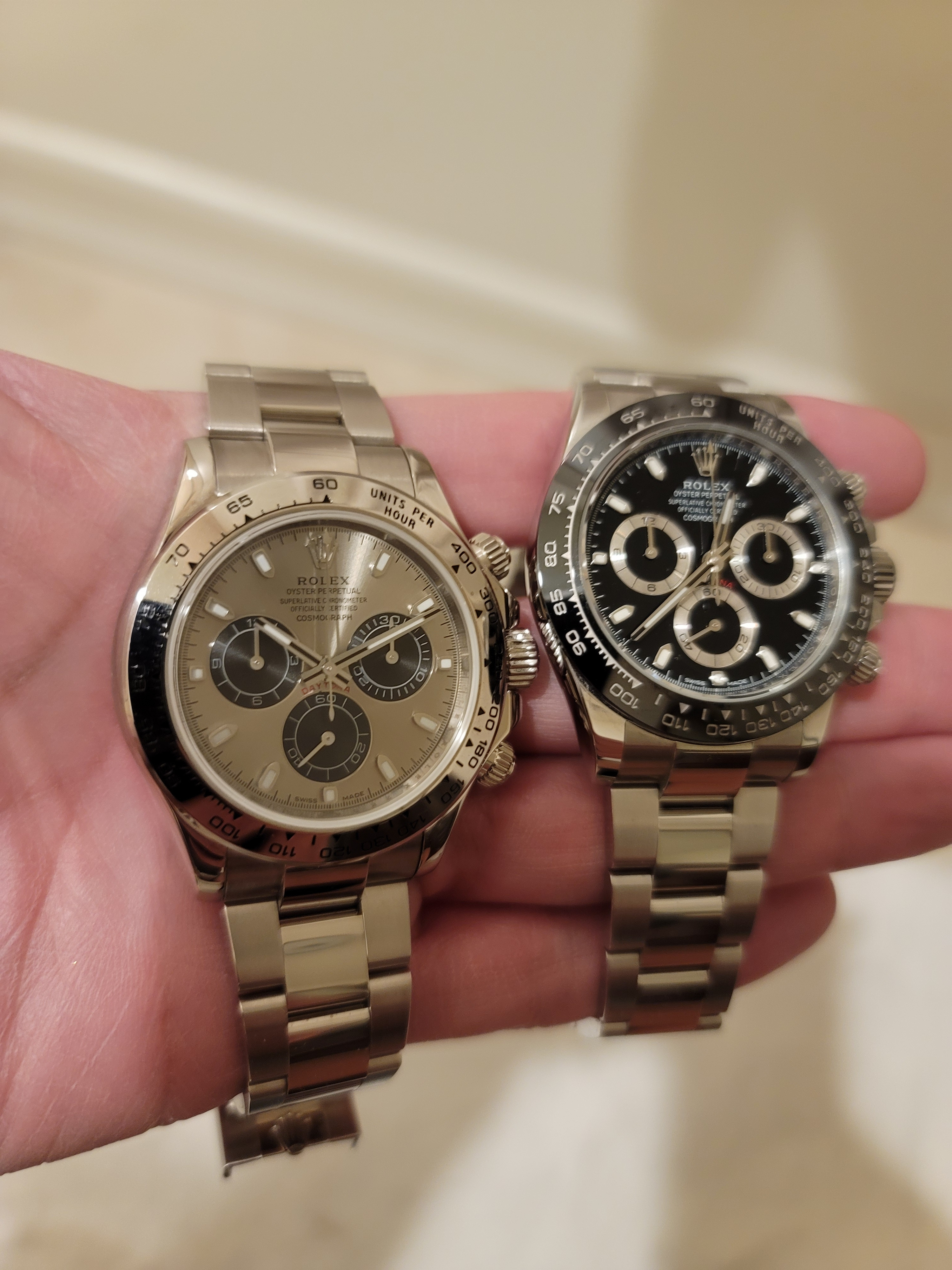
I really like my old Noob 7750 blue dial and still would like to put it in a 4130 case. It's a project that constantly drops off the bottom of the list though.
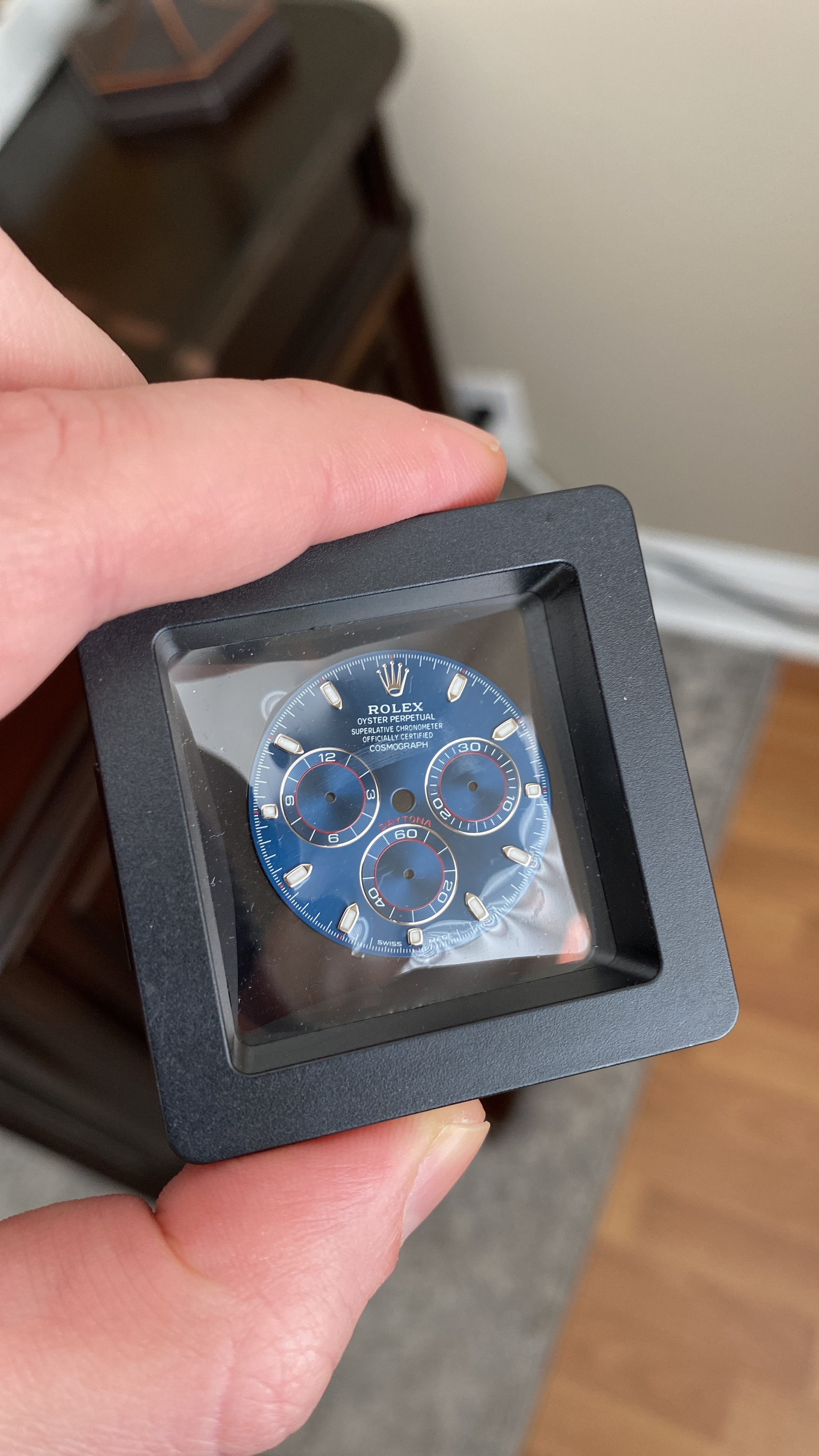
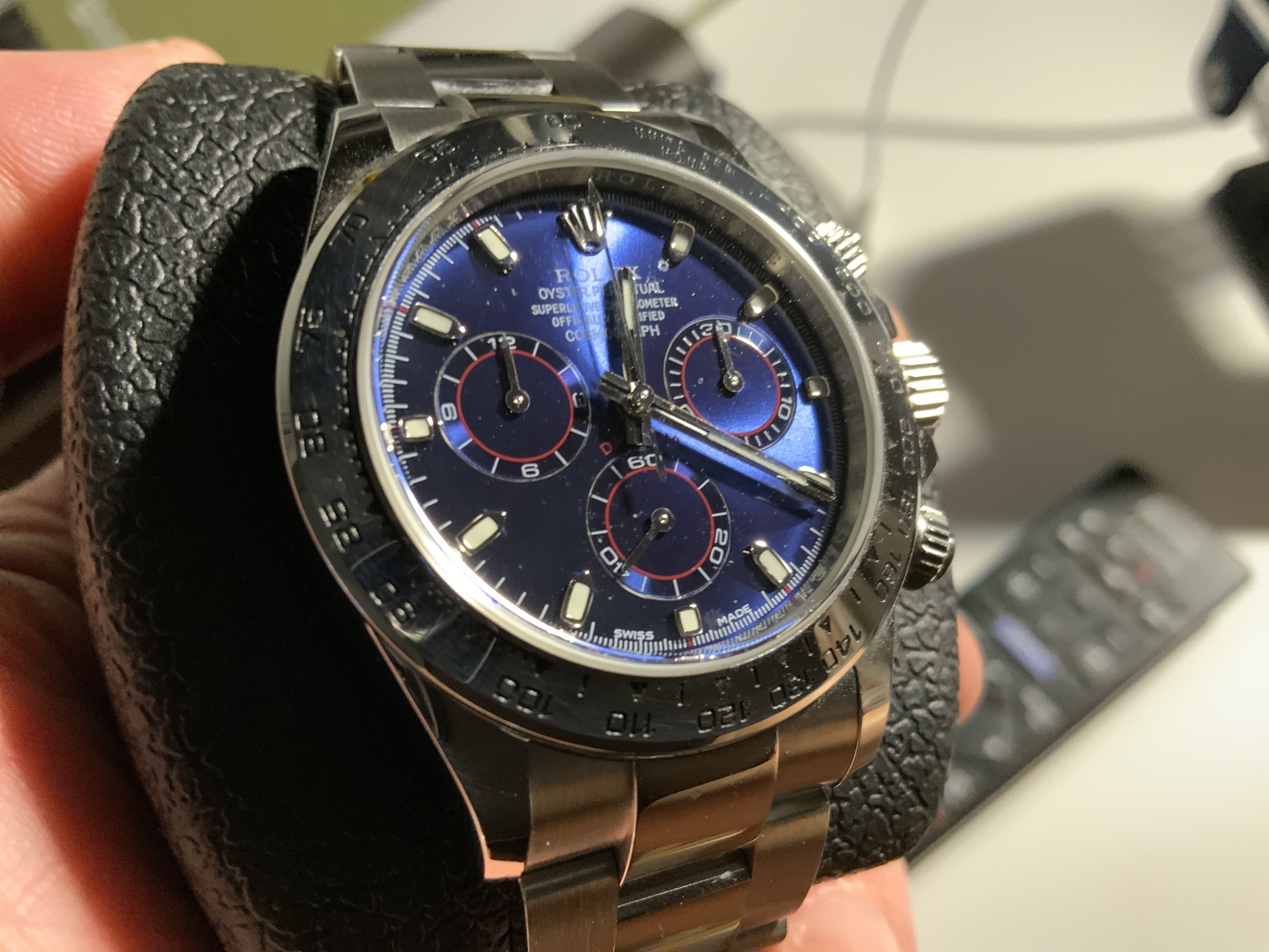
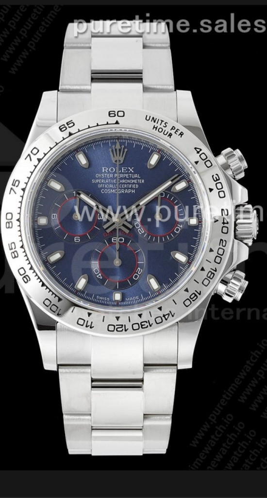
16270684807640.jpg


16231029134306.jpg


16216126070432.jpg


16216124042171.jpg


16216120217360.jpg
 

BlackJaguar

I'm Pretty Popular
22/3/18
1,316
636
113
One last thing would you say the dial color is better now , or did they improve it?. I remember when people were disappointed with the early pics from factory saying it’s too purple blah blah
I also purchased the watch, and I must say I was pleasantly surprised at the dial color. It's truly hard to describe. When you take the photos, it looks darker or even has a slight purple hue, but in person, it's a beautiful blue. I always subscribed to the mentality that the photos don't lie, but the dial just looks different on the camera vs in person. I don't know whether it's the BTF crystal/dial or the way the gen reflects the light, but it really is a nice blue. The photos above do a relatively better job than the prior photos.

Here's mine with the gen dial. I'm going to replace almost every part with gen (e.g., hands, dial, bezel, crown, pushers), so I'll follow up to show a before/after.

But here's a sneak peek in the interim.
zuwjPi.jpg


zuuDn5.jpg
 
Last edited:

ombre

So Young...So Naive
Supporter
Certified
13/5/16
898
864
93
Would you say that bezel is better enough to swap ? Thinking of getting this blue BTF Daytona
I'm not gonna lie, it's hard for me to notice the print on the bezel with it being metal with black inlay color. It's a lot easier for me to distinguish the font on the ceramic bezels with silver inlay. To me, it's not worth swapping and the trouble of making sure nothing is on the dial or crystal before putting back together or the bezel not being aligned accurately afterward. To each their own though.
 
  • Like
Reactions: KJ2020

masterpiece777

Active Member
17/6/19
493
272
63
EUROPE

here bro
Thanks bro,
what are the pro’s against the stock bezel and is the colour also closer to whitgold?
and is it a big difference in size and bevelling and engravings to the stock bezel?
 

KJ2020

Time Traveler
Supporter
12/3/18
32,778
59,009
113
Noob has released some new models, including a blue dial 116509


zubYhW.jpg


Gen on right
zub1sQ.jpg


zuby9S.jpg


zubIRP.jpg
 
  • Like
Reactions: dogwood

dogwood

I'm Pretty Popular
Patron
Certified
7/9/21
1,901
3,579
113
Canada
Noob has released some new models, including a blue dial 116509


zubYhW.jpg


Gen on right
zub1sQ.jpg


zuby9S.jpg


zubIRP.jpg
Very interesting. My guess is this is some small wild cat factory selling under the name "noob" for marketing purposes (not unlike how a small factory which was not BBR used the name BBR to sell the new RMs with clone movements). The other new "noob" daytonas on puretime look like a mish-mash of daytona parts, see specifically the 116506 Platona model which has so many errors on the hall marks and engraving that it's clear whoever was designing / assembling it had no idea what they were making.
 

mmaggi

Renowned Member
17/2/22
973
763
93
New York, USA
The numbers aren't bad - proper height placement and close to correct thickness. The letters are too spread out laterally.
Yes. The numbers placement with respect to the triangles is good. However the "Units Per Hour" font is really bad. And the numbers font is too thin for my eyes.

I looked at the NOOB ceramic bezel Daytona's and the font is much, much better. I realize that SS is not ceramic but they really have to work on that (or whoever produces them).
 
  • Like
Reactions: KJ2020

KJ2020

Time Traveler
Supporter
12/3/18
32,778
59,009
113
Yes. The numbers placement with respect to the triangles is good. However the "Units Per Hour" font is really bad. And the numbers font is too thin for my eyes.

I looked at the NOOB ceramic bezel Daytona's and the font is much, much better. I realize that SS is not ceramic but they really have to work on that (or whoever produces them).
zuxYp5.jpg
 
  • Like
Reactions: mmaggi

4bro

Renowned Member
Patron
Certified
29/1/21
834
1,366
93
Germany
Noob has released some new models, including a blue dial 116509


zubYhW.jpg


Gen on right
zub1sQ.jpg


zuby9S.jpg


zubIRP.jpg

like the bezel but lugs and Sel's doenst look good on this one
 
  • Like
Reactions: KJ2020

bhehe6813

Renowned Member
Supporter
Certified
13/7/16
773
610
93
The BTF (not qf or “noob”) looks pretty good. Subdials seem a bit “flat” compared to gen though, gen has quite an apparent sunburst IMO and I don’t see that “pop” on BTFs dial. Might just be the pictures though.
 
  • Like
Reactions: KJ2020