Tobel
Put Some Respect On My Name
- 6/7/17
- 5,425
- 3,618
- 113
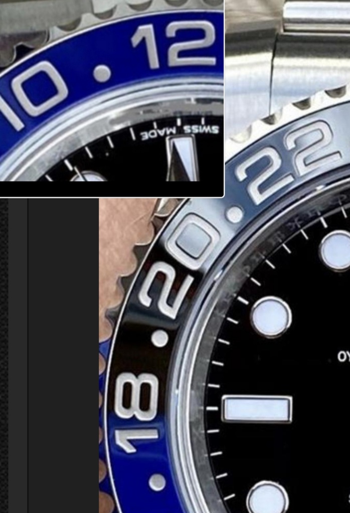
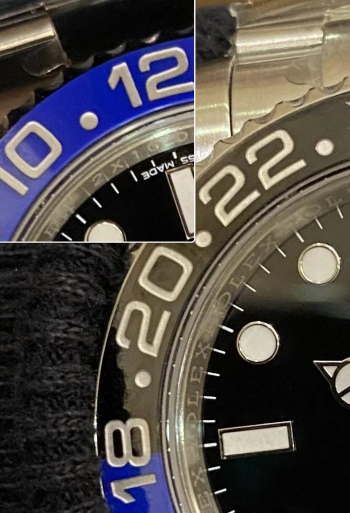
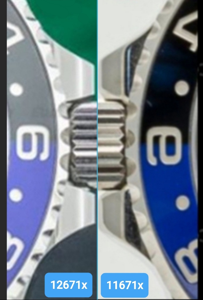
a good build in my opinion, after comparing them with mine, would be:
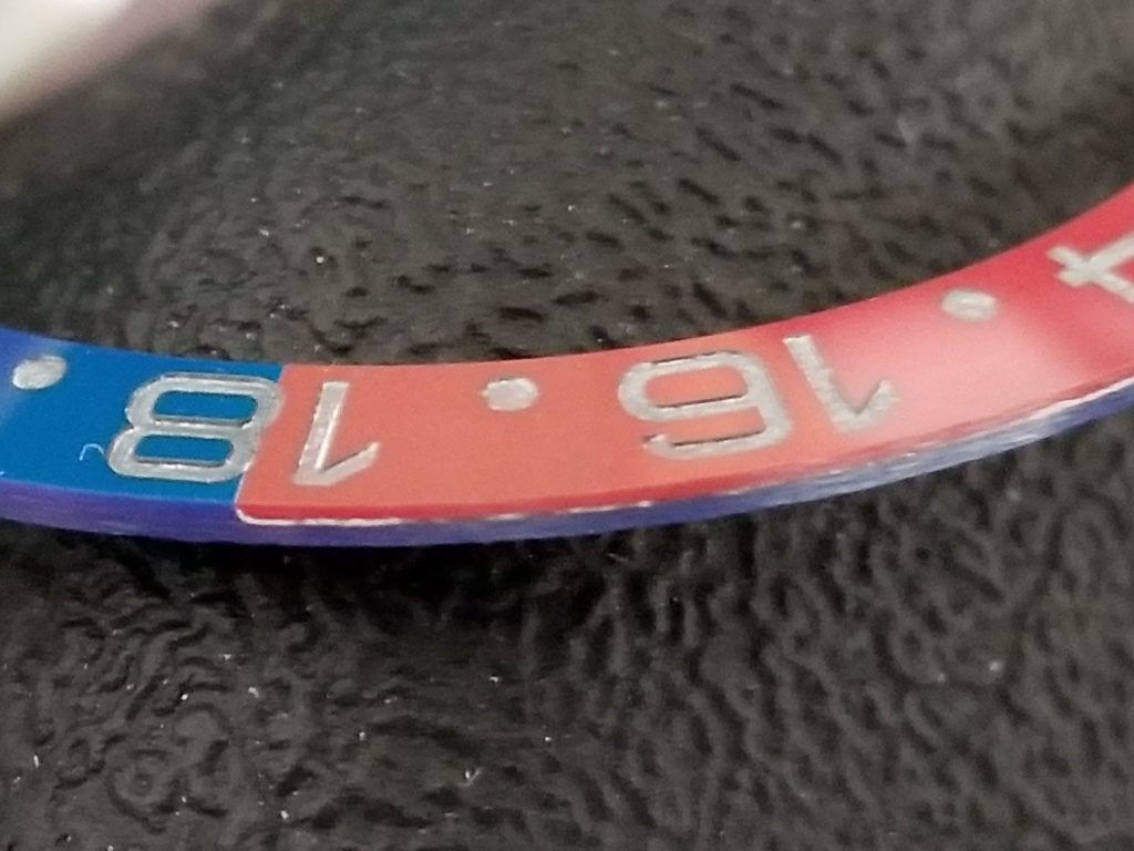
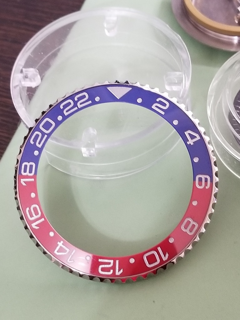
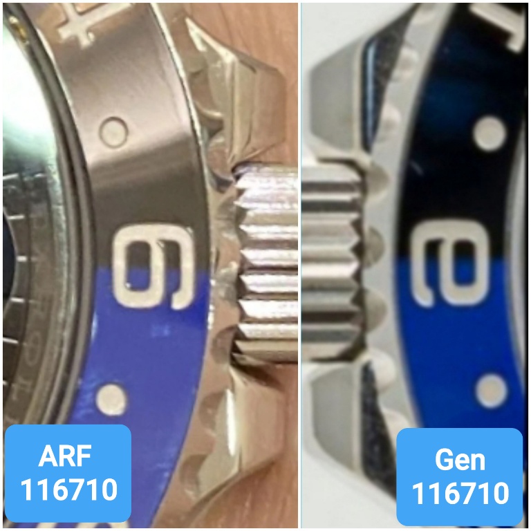
Base Watch ARF
Movement VR3185
Crystal gen
Saluti JD
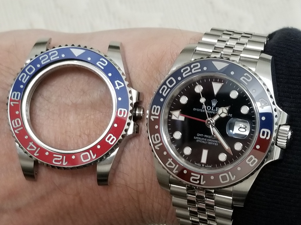
Hi Johnny, it seems that ARF has something strange in the case construction (depth of rehaut? not sure about the details), and because of that when you install a gen crystal, the date magnification looks off. Have you found a way to fix this? I've always liked ARF build quality but that's something that has prevented me from buying their 116710 so far
Thanks!