muiramas
Erect Aristocrat
- 18/1/17
- 5,727
- 7,092
- 113
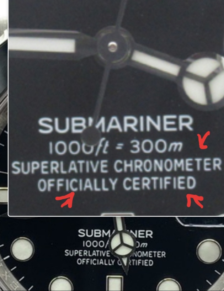
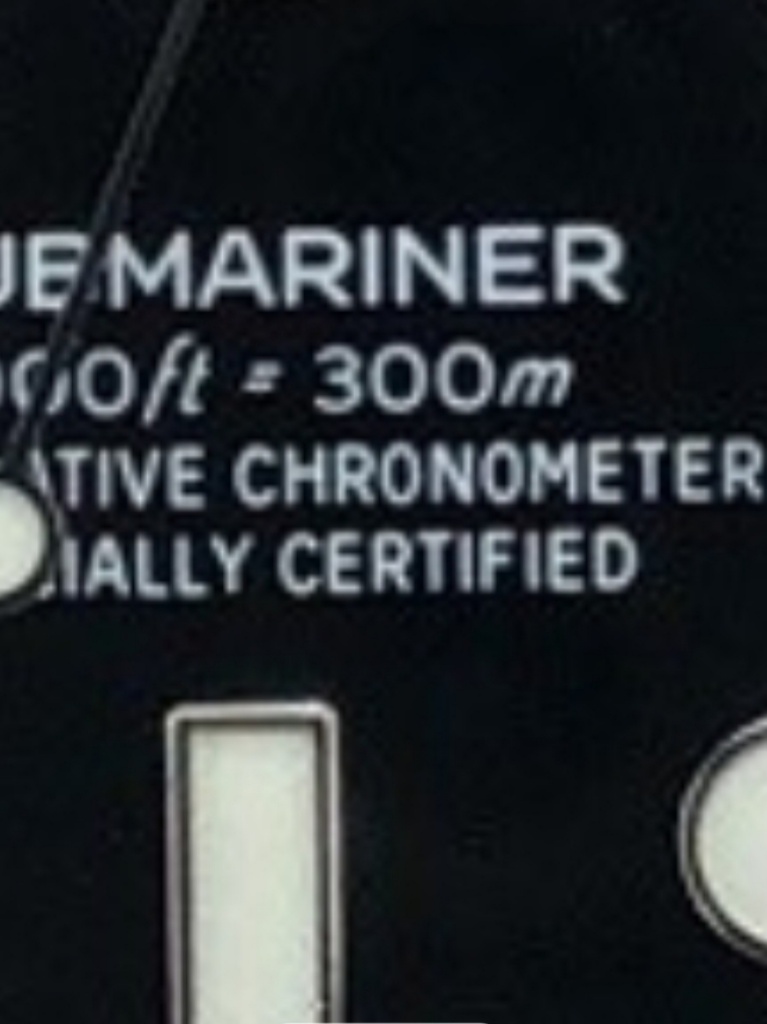
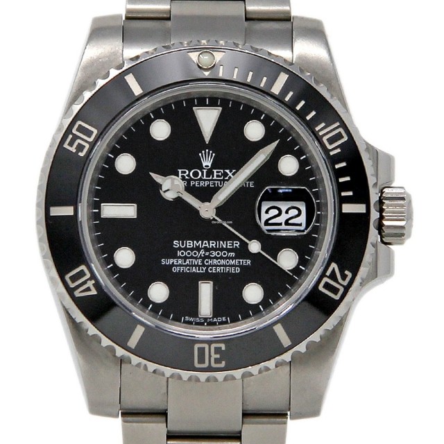
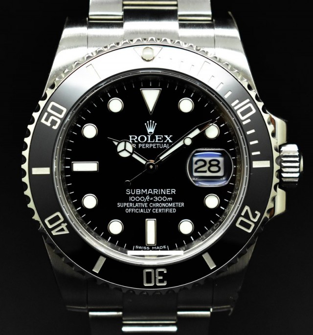
Look closely at some gen dials, they have it too. The rep dial makers have tried to copy these anomalies exactly.
Best not to get too hung up on these details. Rolex certainly doesn't.
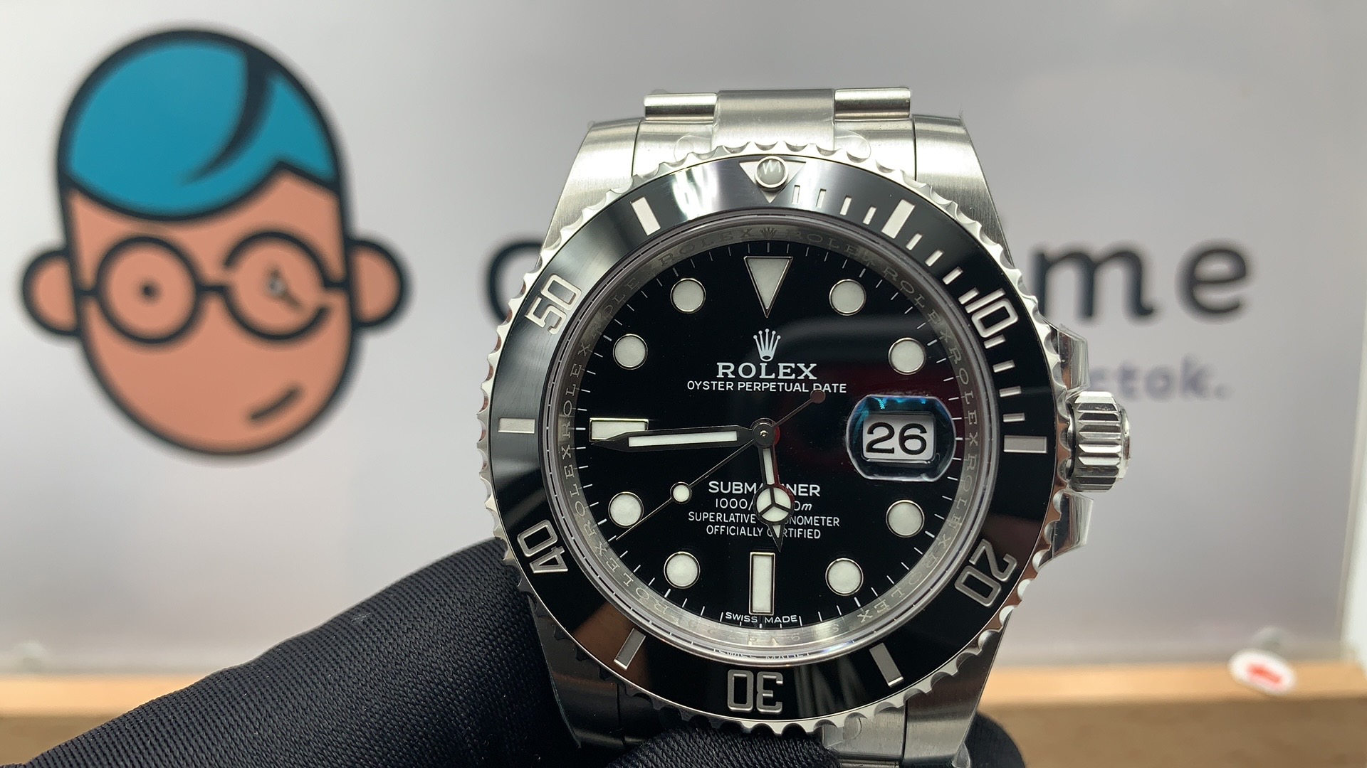
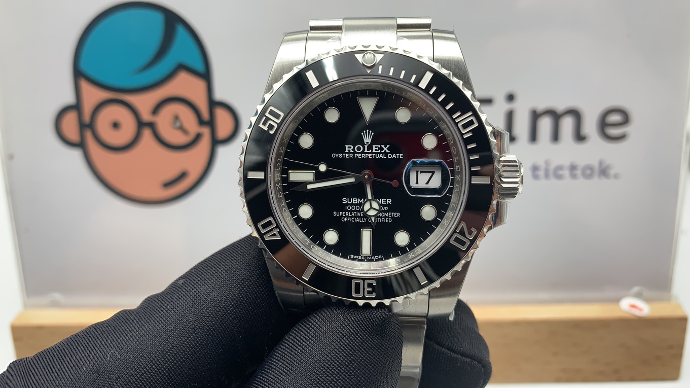
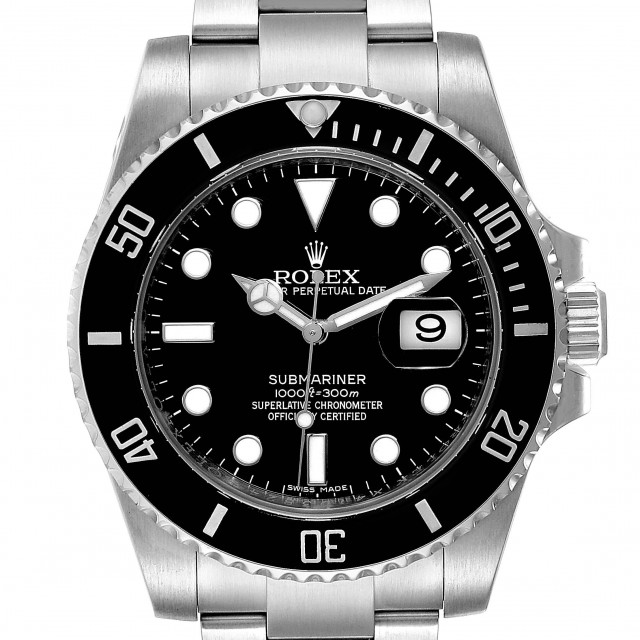
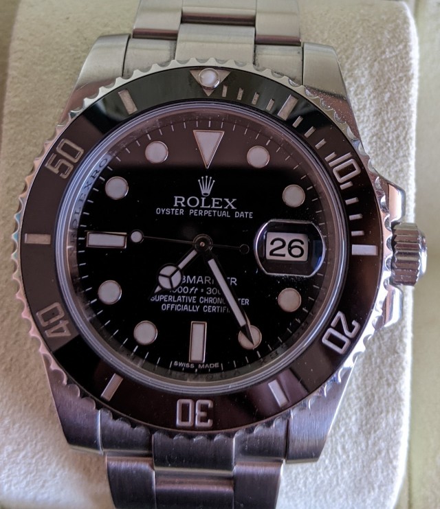
In no other luxury brand will you find such a mashup of logos, brand marks, and fonts combined with such a sloppy, slapdash approach in using them.
Yo Rolex, your graphic designers all suck. My daughter could do a better job of typesetting that dial using MS Paint. And she's 7.
Last edited: