-
Tired of adverts on RWI? - Subscribe by clicking HERE and PMing Trailboss for instructions and they will magically go away!
You are using an out of date browser. It may not display this or other websites correctly.
You should upgrade or use an alternative browser.
You should upgrade or use an alternative browser.
Noob V4 Daytona's
- Thread starter Fervid
- Start date
ettorefranco
Active Member
Crown guard
ah ok, but I'm not sure about that because looking in the web length and shape seem the same to me. Moreover the seller is very referenced and the site too
marcoxxxx84
Active Member
- 17/4/17
- 232
- 36
- 28
ettorefranco
Active Member
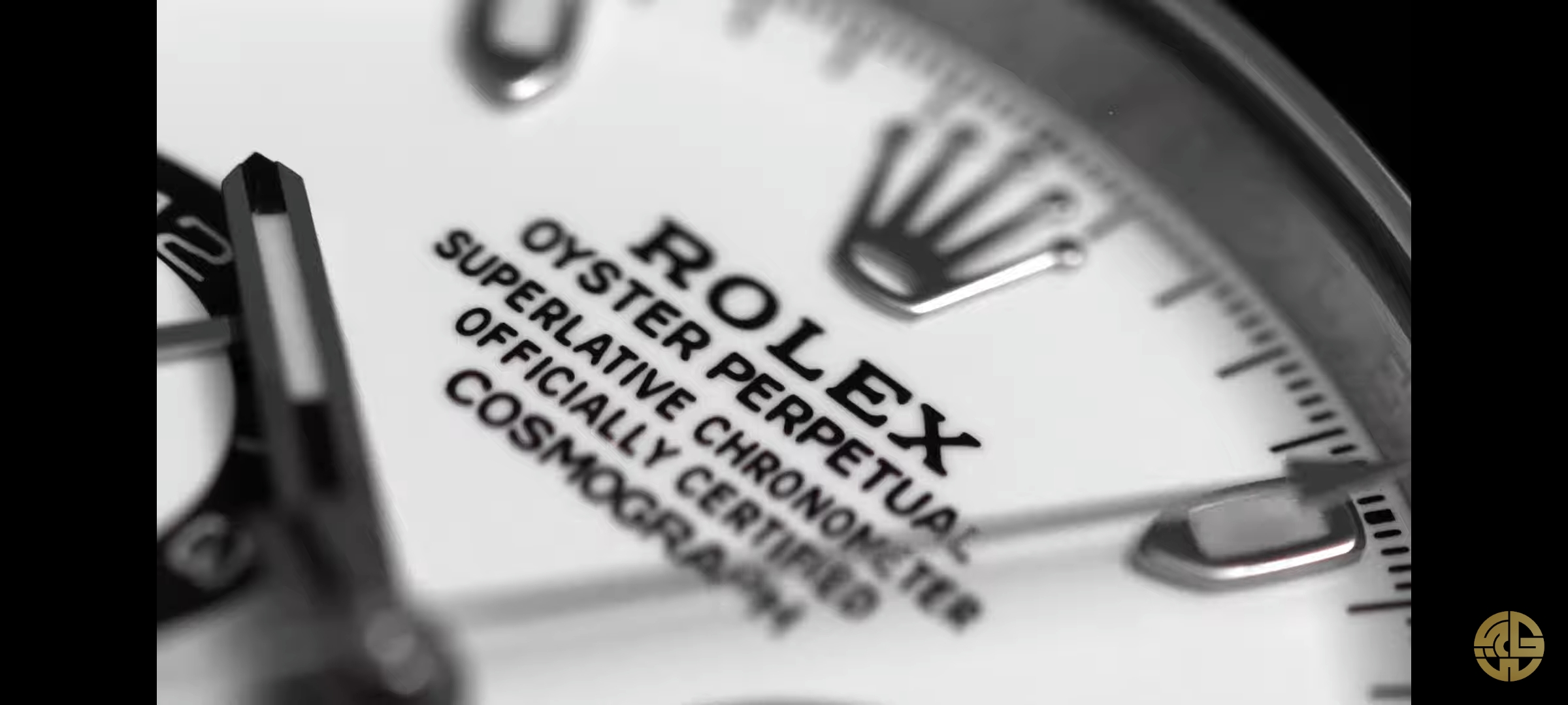
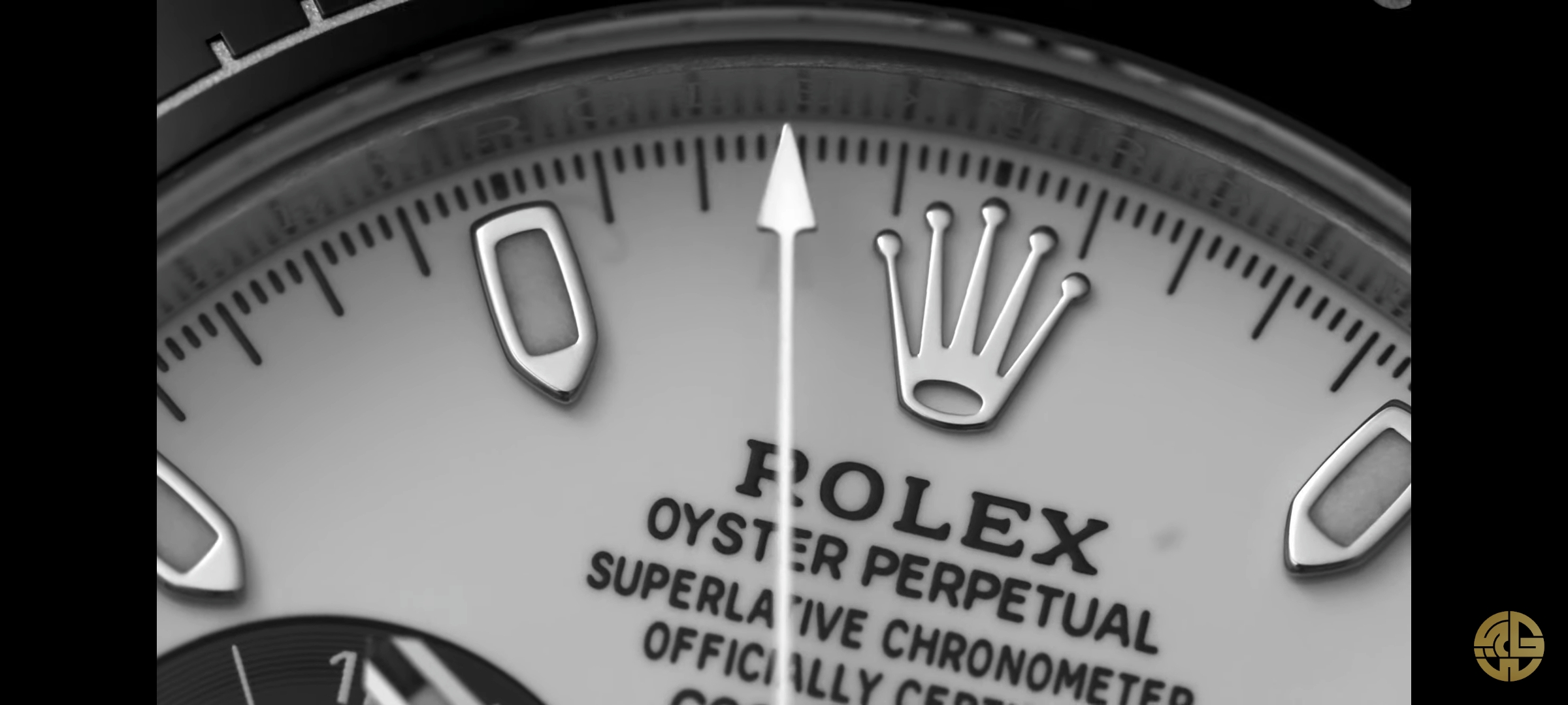
To me bold fonts are an instant tell. I prefer ARF white dial
I also prefer the Arf dial, but the Arf dial could itself be an instant tell if compared to a 2020 gen Rolex 116500. Noob dial, incredible to say, in this case it's more gen like, contradicting what has been said in many posts of this thread.
I subscribe this, I looked a lot of 116500 on the internet to compare to V4 Noob, I think it's very similar to 2020 dial. The print is fat, but many gen are like that, the coronet has the same shape. I just think that Daytona text is a little different color, but I have to check in person. Even the clasp is almost perfect to 2020 one (perhaps is just me, but the coronet seems different from the ARF one).

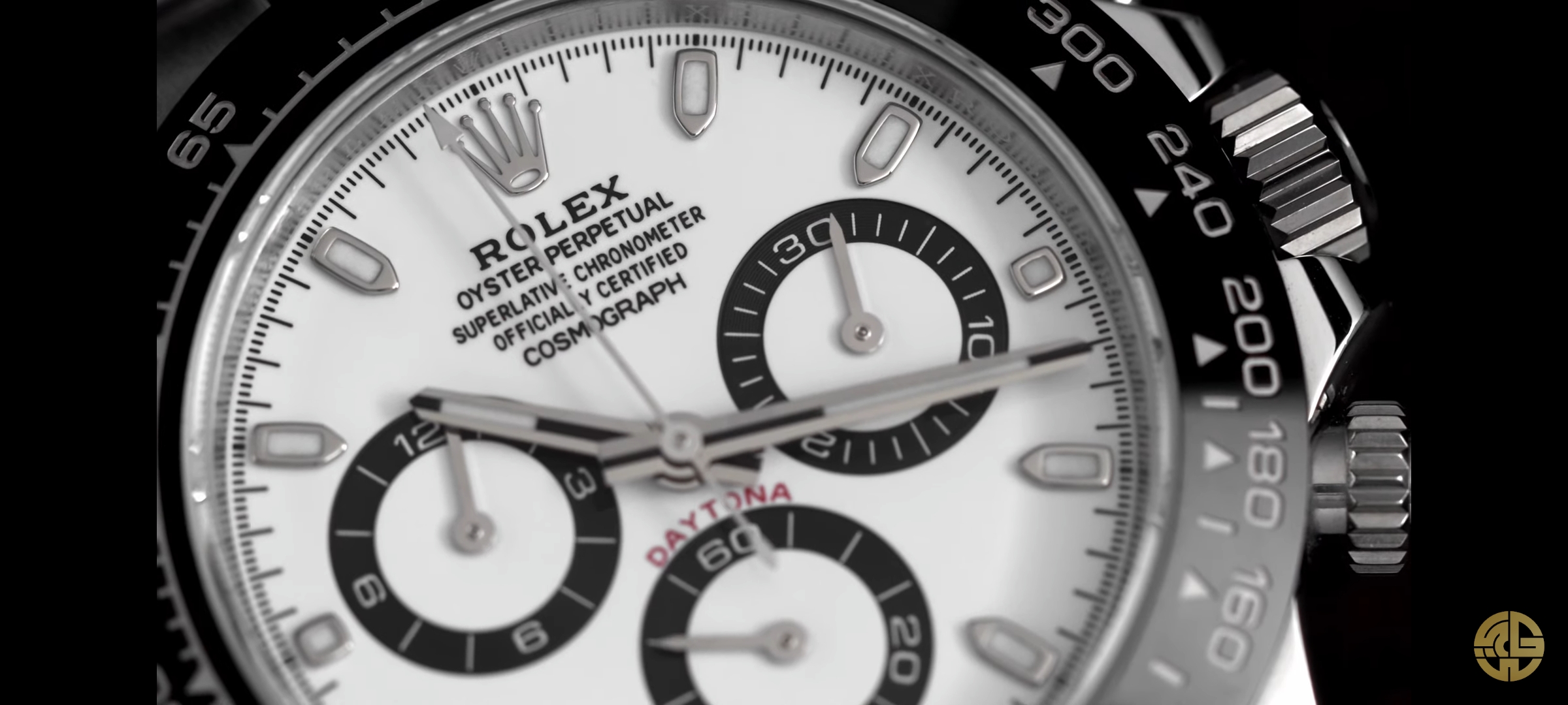
I have been wearing the black V4 for about a week now and I must say, that the bezel is hard to read when the light is not bright, for me no comparision to a CF bezel which I had on a different watch (sold in the meantime).
It is quite diffcult to capture this in a picture but it looks something like this:

It is quite diffcult to capture this in a picture but it looks something like this:
Last edited:
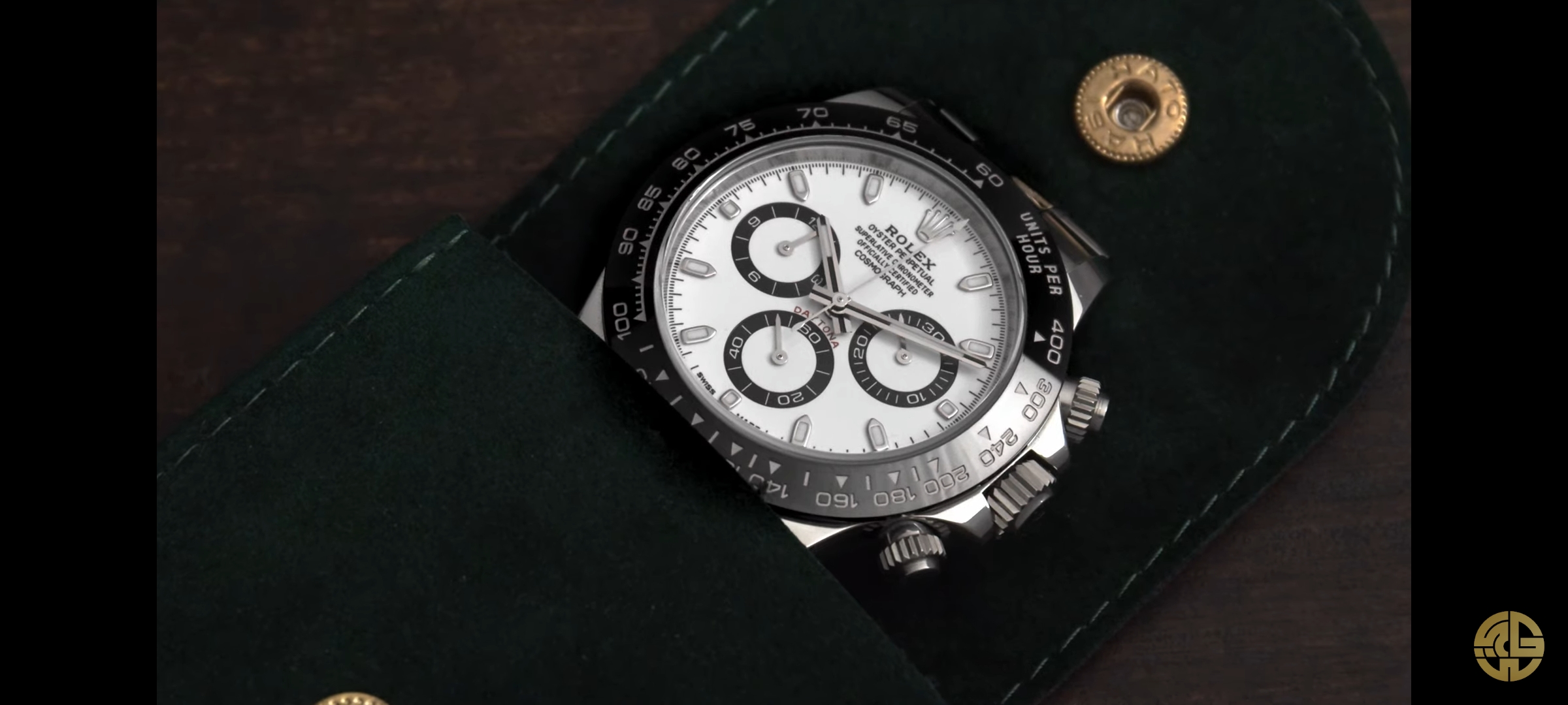
Noob daytona v4 vs arf dial
both white and black.. arf dials are ones with thicker dial rim
obviously arf white dial have better font and finish but that creamy color killing me..also is this dial batch with thinner subdials?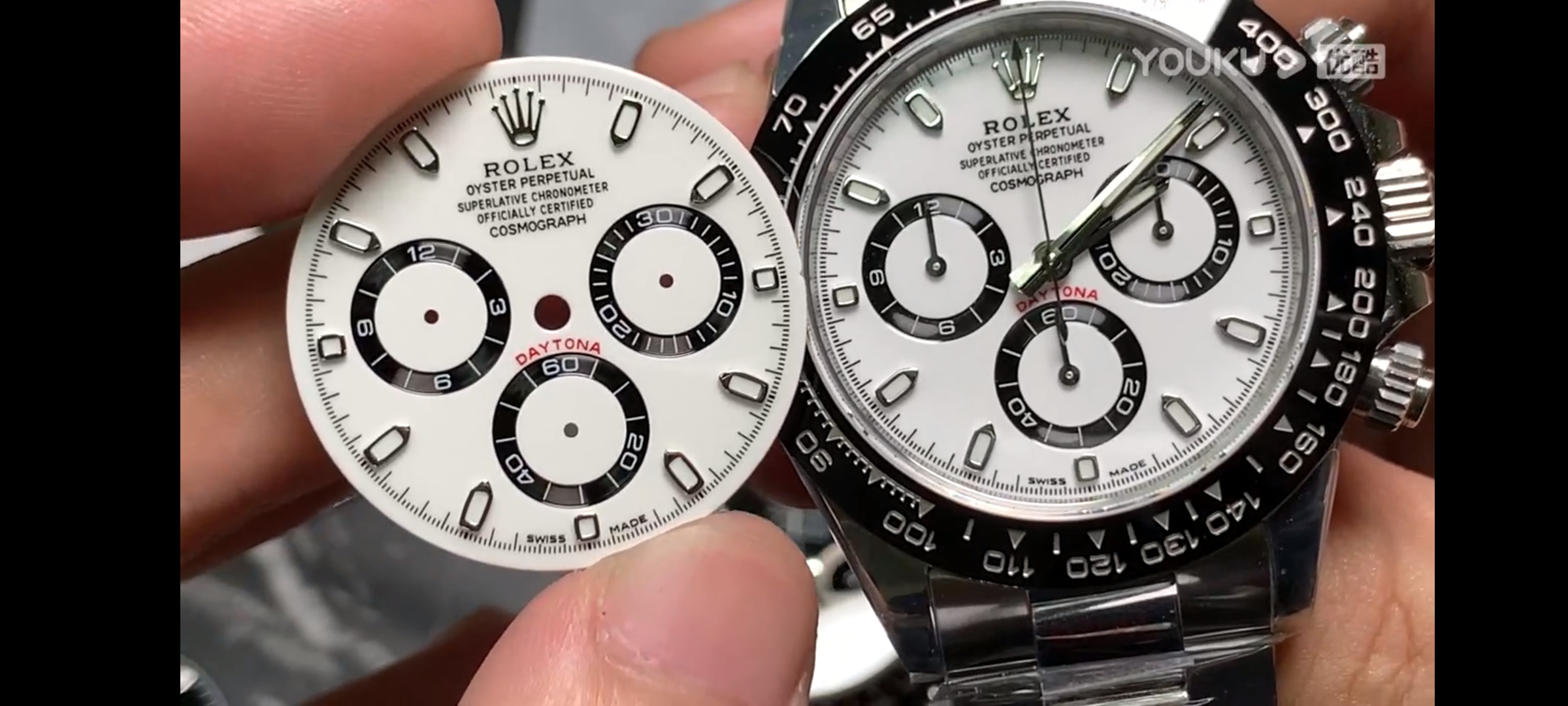
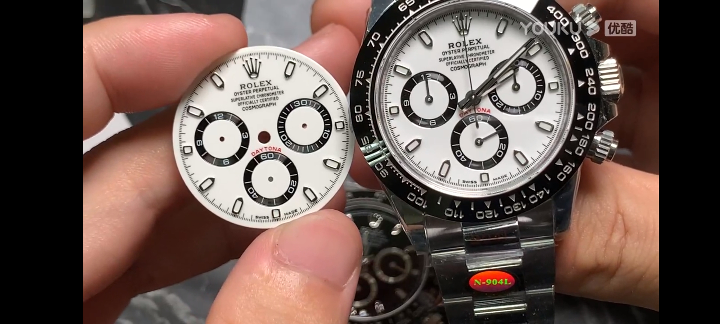
-3N 4130 V4 迪通拿 http://m.youku.com/v_show/id_XNDg2M...==&sharekey=effba2d3ae16091b2c40037d7de845347 长按复制此口令$e4qSc7c3Xw5$,打开【优酷APP】就可以看了~!
Thanks for posting this photos.
The black Noob dial (I assume it’s in the watch) seems better than the ARF, the subdials in the Noob have a closer tone to the gen one. That titanium look, while the ARF looks more aluminum. I’m ok with the texts.
The numbers in the subdials appear a bit crispier in the ARF.
The white dial seems better in ARF (I assume not installed in the watch) as the boldness of the texts is more noticeable in the Noob, but the white tone in the ARF is more creamy. This wouldn’t bother me to much because the only way to catch that difference would be to place the watch next to a gen under the same lightning and really look to it.
Chances of that happening are close to none.
Choose your poison
Sent from my iPad using Tapatalk
ettorefranco
Active Member
The white dial seems better in ARF (I assume not installed in the watch) as the boldness of the texts is more noticeable in the Noob, but the white tone in the ARF is more creamy. This wouldn’t bother me to much because the only way to catch that difference would be to place the watch next to a gen under the same lightning and really look to it.
Chances of that happening are close to none.
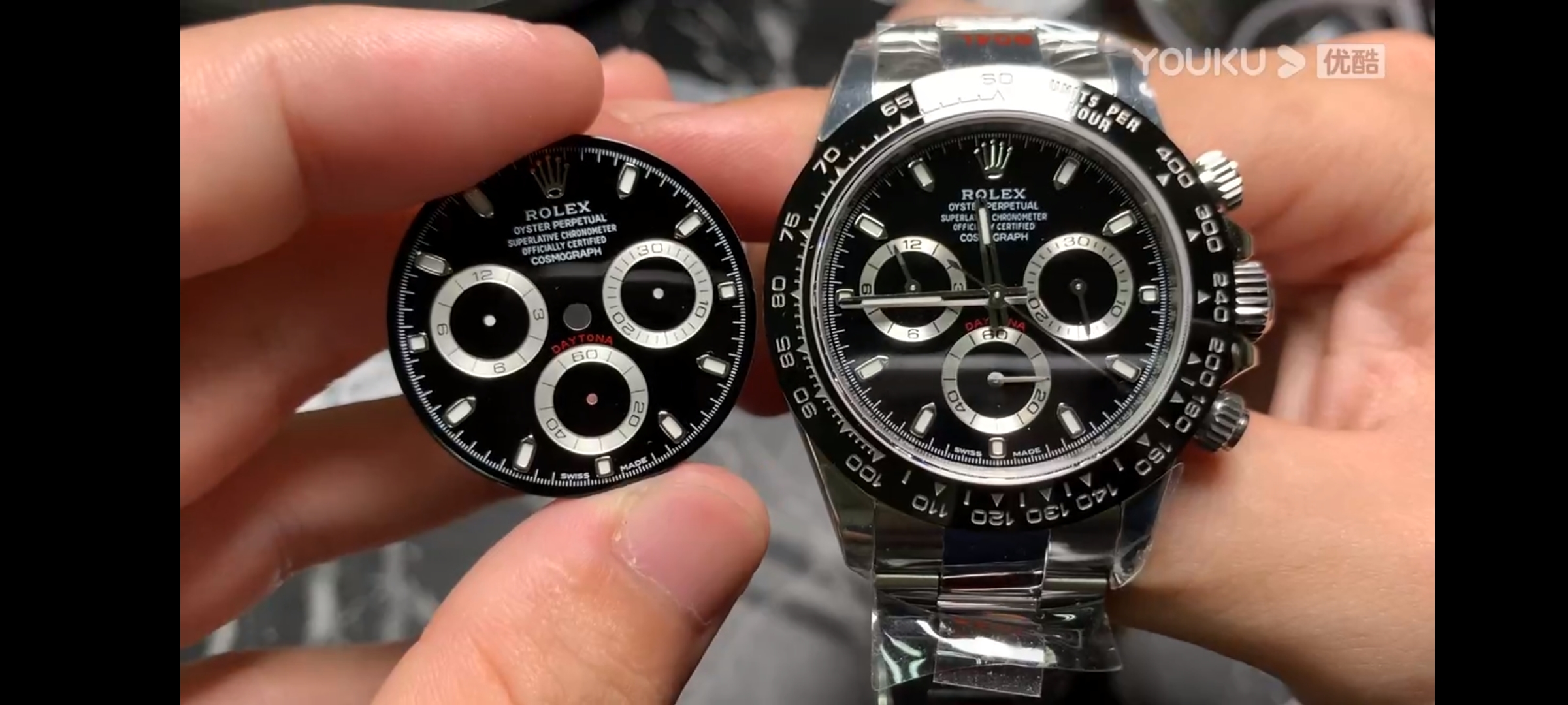
That big hole in the crown (white dial) doesn't suggest it's a V4
That big hole in the crown (white dial) doesn't suggest it's a V4
Definitely not a V1 or 2 because of the thickness of the subdials
Sent from my iPad using Tapatalk
marcoxxxx84
Active Member
- 17/4/17
- 232
- 36
- 28
how can you say it is like 2020
gen fonts?
I guess it’s a Noob, not sure if it’s a V4, but the fonts look to bold IMO
Sent from my iPad using Tapatalk
marcoxxxx84
Active Member
- 17/4/17
- 232
- 36
- 28
V4 for sure
Best way to go there it’s to accept it and change to a ARF dial + bracelet, and a CF bezel.
Sent from my iPad using Tapatalk
marcoxxxx84
Active Member
- 17/4/17
- 232
- 36
- 28
Bobi01
Put Some Respect On My Name
- 2/2/19
- 3,764
- 3,162
- 113
Found this video of gen and for sure thst some gens have bold text...also the link of video..noob definetly copied this thing
https://youtu.be/Zpwu7laQIqc
https://youtu.be/Zpwu7laQIqc
Found this video of gen and for sure thst some gens have bold text...also the link of video..noob definetly copied this thing
For me it's not only the boldness of the text, it's also the quality.
You have to see the Daytona dial in real life, It's hard to explain, but even in the pictures you posted here, the font is slightly bolder, but it still looks crisp, precise and uniform. That goes for everything on the gen dial. Text, numbers and Daytona text.
Thats what i like about (SOME) of the ARF dials. They have pretty much the same level of quality and crispness to them. Where as many of the v4 Noob dials looks like a retarded kid with a crayon wrote the text.
mistermagoo
Active Member
- 9/8/17
- 344
- 138
- 43
Thats what i like about (SOME) of the ARF dials. They have pretty much the same level of quality and crispness to them. Where as many of the v4 Noob dials looks like a retarded kid with a crayon wrote the text.
Under magnification or on the wrist?
Found this video of gen and for sure thst some gens have bold text...also the link of video..noob definetly copied this thing
https://youtu.be/Zpwu7laQIqc
Correct mate. Texts are bolder in that watch. Of course we assume it’s a gen and not a Noob V4 dial ????
Most gen videos I’ve seen have texts with a small 3D effect that’s not noticeable in this video.
Sent from my iPad using Tapatalk
marcoxxxx84
Active Member
- 17/4/17
- 232
- 36
- 28
Bobi01
Put Some Respect On My Name
- 2/2/19
- 3,764
- 3,162
- 113
For me it's not only the boldness of the text, it's also the quality.
You have to see the Daytona dial in real life, It's hard to explain, but even in the pictures you posted here, the font is slightly bolder, but it still looks crisp, precise and uniform. That goes for everything on the gen dial. Text, numbers and Daytona text.
Thats what i like about (SOME) of the ARF dials. They have pretty much the same level of quality and crispness to them. Where as many of the v4 Noob dials looks like a retarded kid with a crayon wrote the text.
I saw gen daytonas and also i compared side by side and it is not noticable on wrist..you must picture and zoom..i know that arf have crispier fonts but also many of them have incorect numbers position in subdials while v4 have genlike..also i dont know how looks creamy dial compared to gen in real life,anyway im waiting qc for arf dial and my source will compare it side by side with noob v4 and i will decide which to choose