-
Tired of adverts on RWI? - Subscribe by clicking HERE and PMing Trailboss for instructions and they will magically go away!
You are using an out of date browser. It may not display this or other websites correctly.
You should upgrade or use an alternative browser.
You should upgrade or use an alternative browser.
NEW V9F GMTs [pics inside] !!!
- Thread starter Cadows
- Start date
natasjames
Active Member
- 22/10/12
- 260
- 44
- 28
Clocking number of posts?

- 12/3/18
- 32,738
- 58,877
- 113
- 11/7/16
- 2,409
- 2,260
- 113
It's a good question though, the bezel in the promo pics looks good (where it has the bezels separate). I wonder when that will be released?
Bobi01
Put Some Respect On My Name
- 2/2/19
- 3,763
- 3,160
- 113
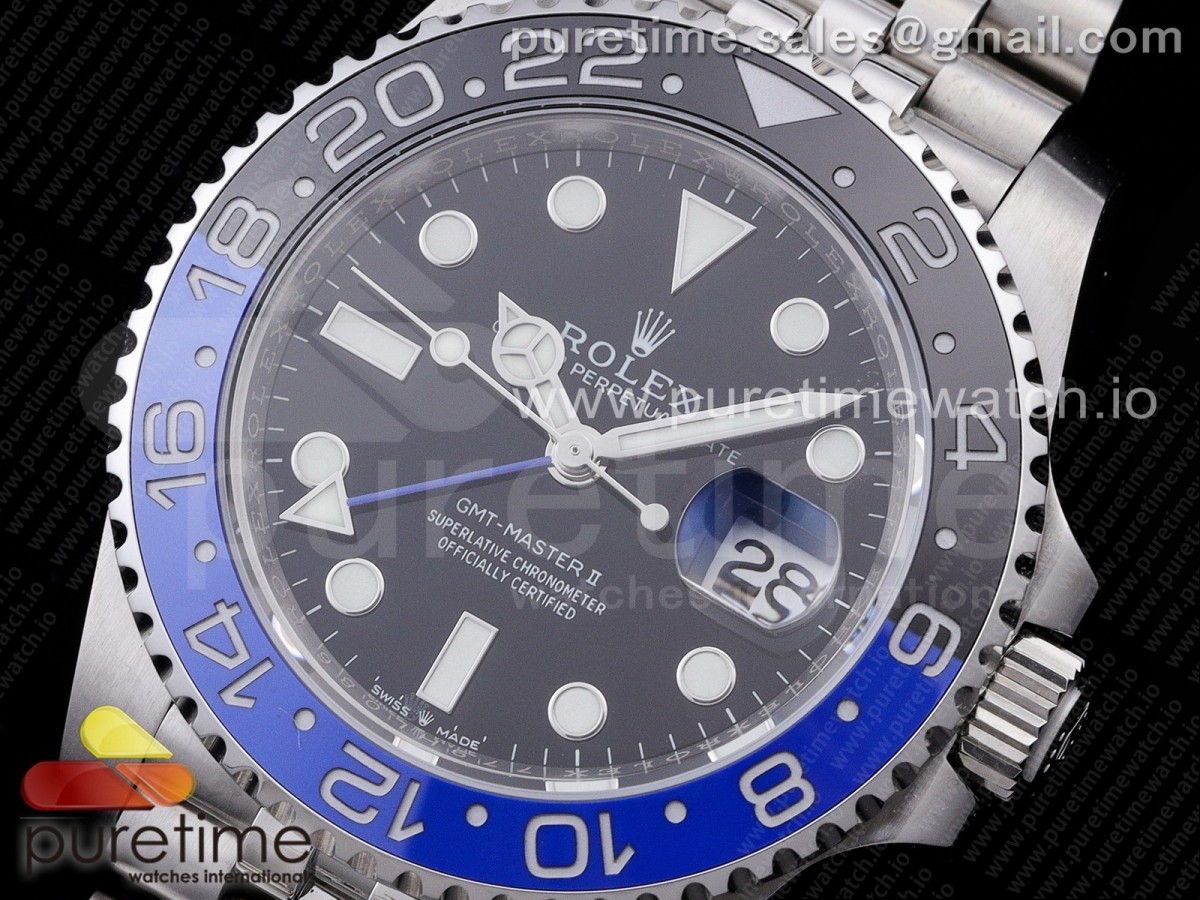
https://puretimewatch.io/rlx2020051405.html
puretime listed it
i must be honest and say that if that number 1 is with serif like gen i wouldnt wait any minute to pull the thrigger for this watch
nice reliable movement,nice and corect sels,transition is corect,date and cyclops look so decent,best out of box so far imo
puretime listed it
i must be honest and say that if that number 1 is with serif like gen i wouldnt wait any minute to pull the thrigger for this watch
nice reliable movement,nice and corect sels,transition is corect,date and cyclops look so decent,best out of box so far imo
- 12/3/18
- 32,738
- 58,877
- 113
https://puretimewatch.io/rlx2020051405.html
puretime listed it
i must be honest and say that if that number 1 is with serif like gen i wouldnt wait any minute to pull the thrigger for this watch
nice reliable movement,nice and corect sels,transition is corect,date and cyclops look so decent,best out of box so far imo
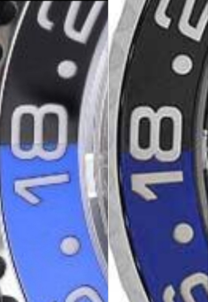
I posted this previously, here it is again
The bicolor inserts are an epic fail. The Pepsi is even worse than this Batman comparison.
Speed bumps, blue in the 8 holes, markers too thin, blue color too light, too much angle off between digits, 1 serif not curved, 1 serif tip diagonal not parallel to 1 main body, different "platinum" color between upper and lower markers, engravings don't line up at the transition.
Last edited:
Alessandro
Active Member
- 6/3/09
- 246
- 43
- 28
Bobi01
Put Some Respect On My Name
- 2/2/19
- 3,763
- 3,160
- 113
I posted this previously, here it is again
The bicolor inserts are an epic fail. The Pepsi is even worse than this Batman comparison.
Speed bumps, blue in the 8 holes, too thin, blue color too light, too much angle off between digits, 1 serif not curved, 1 serif tip diagonal not (nearly) parallel to 1 main body, different "platinum" color between upper and lower markers.
Yeah bro but it is not side by side comparison,if color of blue is corect it is best out of box isnt it
- 12/3/18
- 32,738
- 58,877
- 113
Yeah bro but it is not side by side comparison,if color of blue is corect it is best out of box isnt it
Wouldn't keep the insert if I bought the watch. The engravings aren't even aligned between upper and lower halves. Only worse one I've seen is the new version VRF. Look back in this thread for actual watch pics, this insert is terrible.
Bobi01
Put Some Respect On My Name
- 2/2/19
- 3,763
- 3,160
- 113
Wouldn't keep the insert if I bought the watch. The engravings aren't even aligned between upper and lower halves. Only worse one I've seen is the new version VRF. Look back in this thread for actual watch pics, this insert is terrible.
You are right,so all except insert is good,lets wait and see first QC pictures
sickopsycho
Active Member
https://puretimewatch.io/rlx2020051405.html
puretime listed it
i must be honest and say that if that number 1 is with serif like gen i wouldnt wait any minute to pull the thrigger for this watch
nice reliable movement,nice and corect sels,transition is corect,date and cyclops look so decent,best out of box so far imo
Wow- i Guess I'm not a font guy, because even knowing about that flaw it doesn't bug me the slightest bit. That's just a good looking watch. =) They kind of nailed the color transition there.
- 9/12/17
- 1,092
- 389
- 83
My contact say V9 only launched LN and Batman/Batgirl. Pepsi will be ready in a month
https://puretimewatch.io/rlx2020051405.html
puretime listed it
i must be honest and say that if that number 1 is with serif like gen i wouldnt wait any minute to pull the thrigger for this watch
nice reliable movement,nice and corect sels,transition is corect,date and cyclops look so decent,best out of box so far imo
Whoa whoa easy bro we dont do that lol say some flaws FLAWS damnit LMFAOOOO
Fervid
I'm Pretty Popular
The bezel looks a lot better on PT than it does on the actual promo... Interesting.
The bezel looks a lot better on PT than it does on the actual promo... Interesting.
Does hands look a bit empty to you? Like not filled enough with lume
sickopsycho
Active Member
Does hands look a bit empty to you? Like not filled enough with lume
Interesting that you mention that. I watched the video that was posted here and thought the hands looked really good. Like *really* good. I wonder if it's just the lighting, because the shape and the 3d effect on these hands is spot on.
Does hands look a bit empty to you? Like not filled enough with lume
3D effect dude
Fervid
I'm Pretty Popular
Does hands look a bit empty to you? Like not filled enough with lume
Hard to tell, my ZZF V2 handset is nearly the same but has excellent lume. I cancelled my GMF order and went for the V9F so I'll share QC's when I've made a decision.
Worst case scenario I get a bad bezel but at least it's a good base with a good movement so I can go from there and upgrade the bezel.
Btadl1997
Active Member
- 12/2/18
- 202
- 181
- 43
http://m.youku.com/v_show/id_XNDY3M...==&sharekey=60b1b9d2af1da05ff8ca7182fb0623af8
Sent from my iPhone using RWI
Sent from my iPhone using RWI