xxBlack
Active Member
Did anyone get their Tracking Number on monday? Mine is still not working. Last time with my Daytona it was faster.
Did anyone get their Tracking Number on monday? Mine is still not working. Last time with my Daytona it was faster.
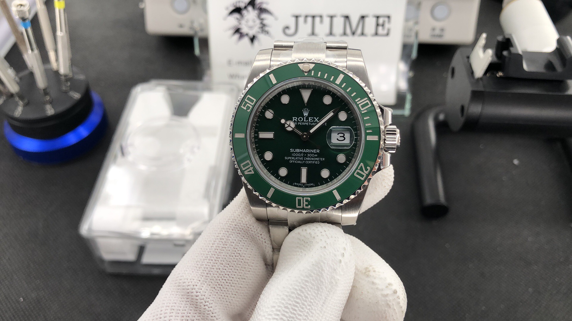
Ok guys I just received my QCs.
Overall the watch looks gorgeous : everything pretty much aligned, acceptable rehaut engravings (to me at least), DW centered and acceptable font size, SELs look ok. The insert engravings, they do look a bit bigger than gen, but I think the sputter coated walls add to the thickening effect on pictures, I'll see once it's on my wrist IRL. All in all, it's a good check for me, and unless I missed something I'm going to accept this watch.
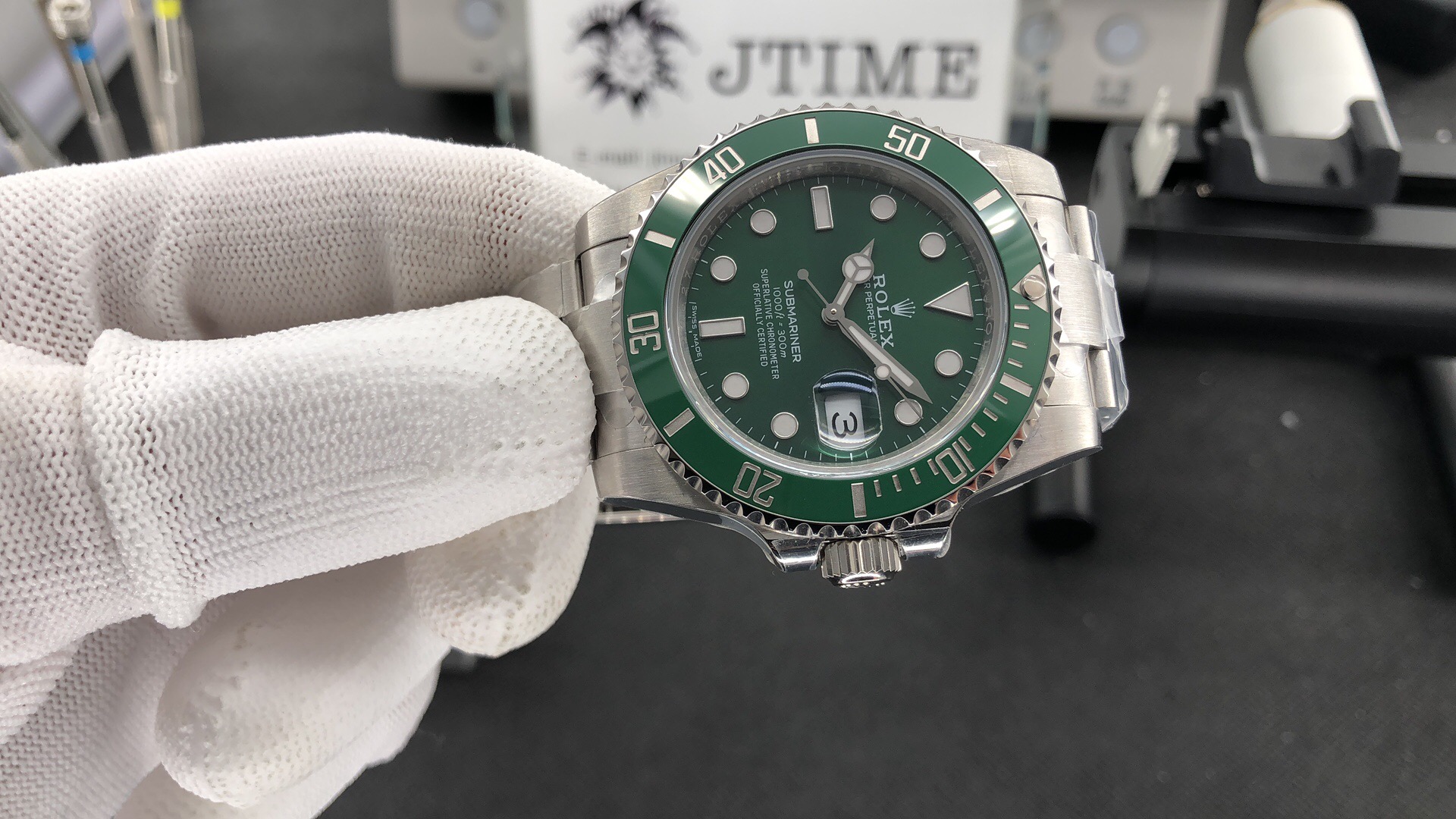
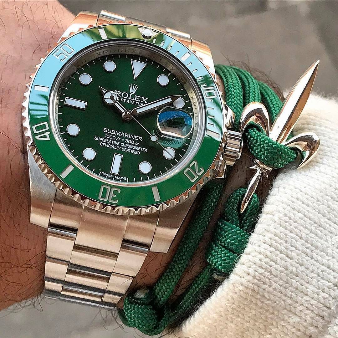
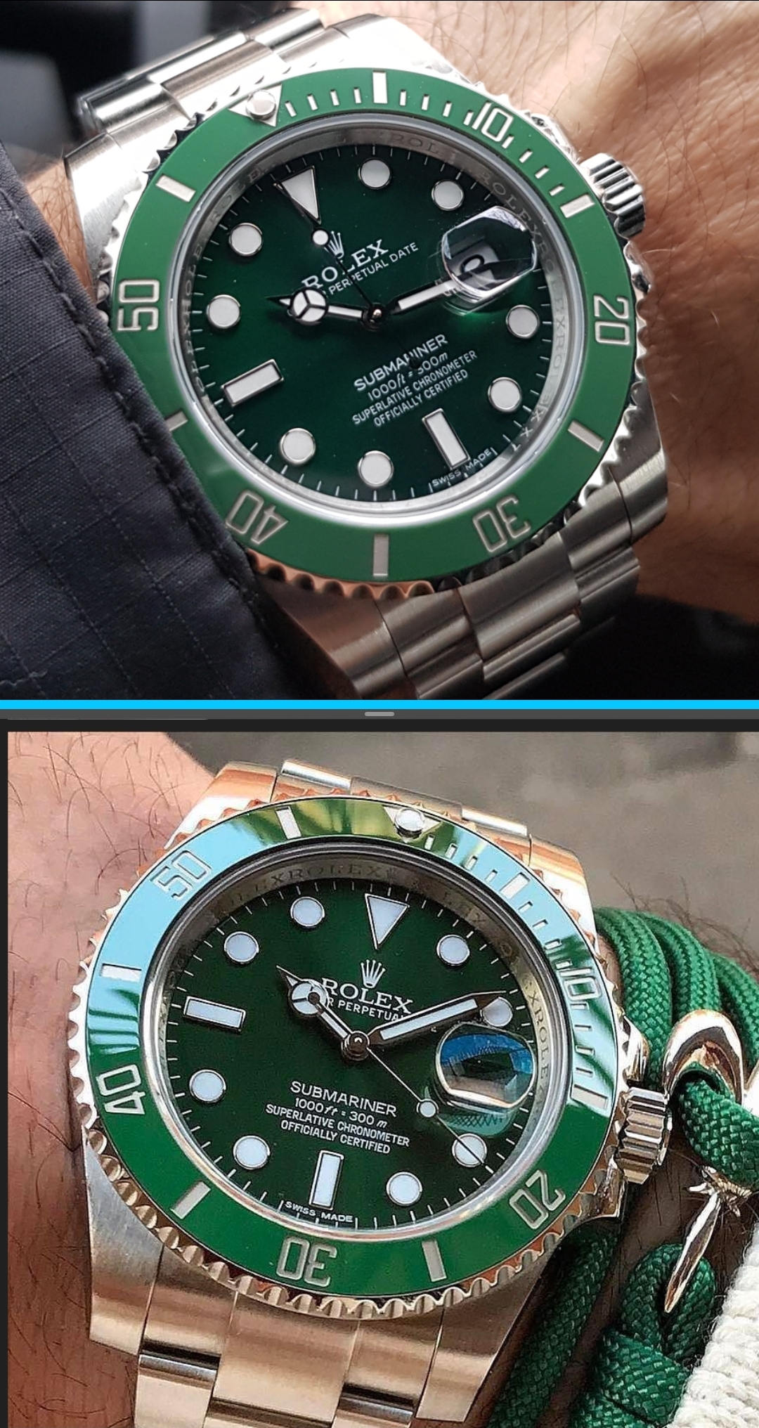
For your information, my only concern is the way the insert sits in the bezel. From front pics it's ok, but once at an angle it looks like there's quite a gap between insert and crystal. For comparison I put here 2 pics of my QC and one of a gen found on the web. I don't forget it's stil a rep and won't be a gen, but I hope it's a matter of angle on the picture and that it won't be a flaw in itself.
Comments welcome.
I went back and examined LI's insert pics in the first post of this thread more closely and you can clearly see that the marker cutouts for the numerals are slightly deeper and thicker than the gen. The bar cutouts at 5,15,30, etc do not look thicker to me, nor do the mini-bar cutouts for single minutes. But on the numerals, the 1 looks thicker, and the thickness is really apparent if you look at the size of the green rectangles inside all of the zeroes. It's not off that much, but the extra depth and thickness that smoke saw indeed indicates it's noticeable to the eye and once we see it we can't unsee it. I'm hoping it will be like the ARF LN GMT insert which is also too deep but looks quite good on the wrist anyway. I won't ever be putting mine next to a gen. Pics credit to Li jtimewatch
I agree that slightly thicker is better than thinner. And anyone whose ever had a Spongebob mod knows that the way he chamfers the top of the cutout walls where they join the insert flats makes the markers look slightly thicker all the way around. So I believe this will be OK, for most of us.
Ok guys I just received my QCs.
Overall the watch looks gorgeous : everything pretty much aligned, acceptable rehaut engravings (to me at least), DW centered and acceptable font size, SELs look ok. The insert engravings, they do look a bit bigger than gen, but I think the sputter coated walls add to the thickening effect on pictures, I'll see once it's on my wrist IRL. All in all, it's a good check for me, and unless I missed something I'm going to accept this watch.
For your information, my only concern is the way the insert sits in the bezel. From front pics it's ok, but once at an angle it looks like there's quite a gap between insert and crystal. For comparison I put here 2 pics of my QC and one of a gen found on the web. I don't forget it's stil a rep and won't be a gen, but I hope it's a matter of angle on the picture and that it won't be a flaw in itself.
Comments welcome.
Insert V2 has too thin engravings...
Ok guys I just received my QCs.
Overall the watch looks gorgeous : everything pretty much aligned
Comments welcome.
Yes it is, CF supply ZZF with their inserts.
Envoyé de mon ELE-L29 en utilisant Tapatalk
i'm just wondering what tf ZZF/Clean is doing with their insert. They did a perfect insert for their v2s prototype, just look at smoke's prototype insert. It's so damn perfect.
It's really really bad imo. ARF also have tendency to make too deep markers and can easily be spotted irl imo.
They seriously need to work on that.
Same goes for short CGs, poor rehaut (incl. serial), clasp, bezel, dial and hands. (just writing this in case of "the gods" is lurking the comments, so they can improve in their v3).
But as we know, they won't improve anything. A perfect rep is bad business for them and they are giving us too deep engravings so we all buy their v3 once released.
I think its more because they used another engraving paint, so it looks a little different on pictures... should look pretty good in natural light and irl
"Engraving paint".
Since when did they start to use paint in stead of platinum?
"Engraving paint".
Since when did they start to use paint in stead of platinum?
 Its sputter coating using a "platinum like" material...but I maybe wrong.
I don't think they use real platinum in the reps