• Tired of adverts on RWI? - Subscribe by clicking HERE and PMing Trailboss for instructions and they will magically go away!

Bezel and Dial Review of ZZF V2S 116610LV Submariner and Comparison vs. Gen, ARF V3 and Noob V10

Smoke

Legendary Member
18/3/13
14,093
2,220
113
The markers on the insert is definitely too ARF-like. Too bold and too thick.

Yeah I'm sure of this bro definitely a step back on the engravings. And a step forward on the green shade.i feel the pearl is impossible to replicate because they never get it right.but the pre production insert I have is almost perfect in colour and font .so not sure what zzf are doing
 
Last edited:
  • Like
Reactions: rockdaytona

xxBlack

Active Member
5/9/19
332
168
0
Bavaria, Germany
99a7a7f47341aeac0c2c7c772f7446e3.png
abb3920f9116423811ca886bc71a85d9.png


You can already see it there. The question is how noticeable is it on the wrist. I‘m not that optimistic


Gesendet von iPhone mit Tapatalk Pro
 

Smoke

Legendary Member
18/3/13
14,093
2,220
113
Thanks! Are those fingerprints able to be cleaned?

Yes I would use dish dishwashing liquid on a cloth and gently clean the insert.if it dont come off ask for a replacement insert .but should come off people get this same stain off the gen GMT all the time
 
  • Like
Reactions: Saul Goodman

Kitosarg

Known Member
13/7/18
167
90
28
I own the v2. I feel the top cg is bigger then the other one
84f6d1d2bc5e4372f618ea7407f1d87e.jpg


Enviado desde mi iPhone utilizando Tapatalk
 

rockdaytona

Put Some Respect On My Name
Supporter
Certified
17/12/19
3,229
2,769
113
Parts Unknown
Yeah I'm sure of this bro definitely a step back on the engravings. And a step forward on the green shade.i feel the pearl is impossible to replicate because they never get it right.but the pre production insert I have is almost perfect in colour and font .so not sure what zzf are doing

I’ve got $500, would you go ARFv3 or ZZFv2s on the Hulk? Directed to Smoke
 

d3s19n

Renowned Member
12/6/18
646
518
93
Question: In all the gen subs (not just LV), what is the dark gap between where the inner side of the bezel ends and the crystal starts. No rep seems to ever have this? Is it due to the bezel or crystal?


See below from 12 to 6:

VOnAao.jpg

Can’t see the picture but if you are talking about the gap between outer edge of crystal and inner edge of insert then know that the difference between inner and outer diameter of rep Rolex ceramic inserts is pretty much always bigger than gen (gen ceramic inserts are thinner)
 

d3s19n

Renowned Member
12/6/18
646
518
93
I’d rather the font be a little too thicc than thin like the original clean inserts. Pics where gen font looks thicker than usual is just because the engravings are picking up more light and the walls are being included
 
Last edited:
  • Like
Reactions: KJ2020

KJ2020

Time Traveler
Supporter
12/3/18
32,738
58,889
113
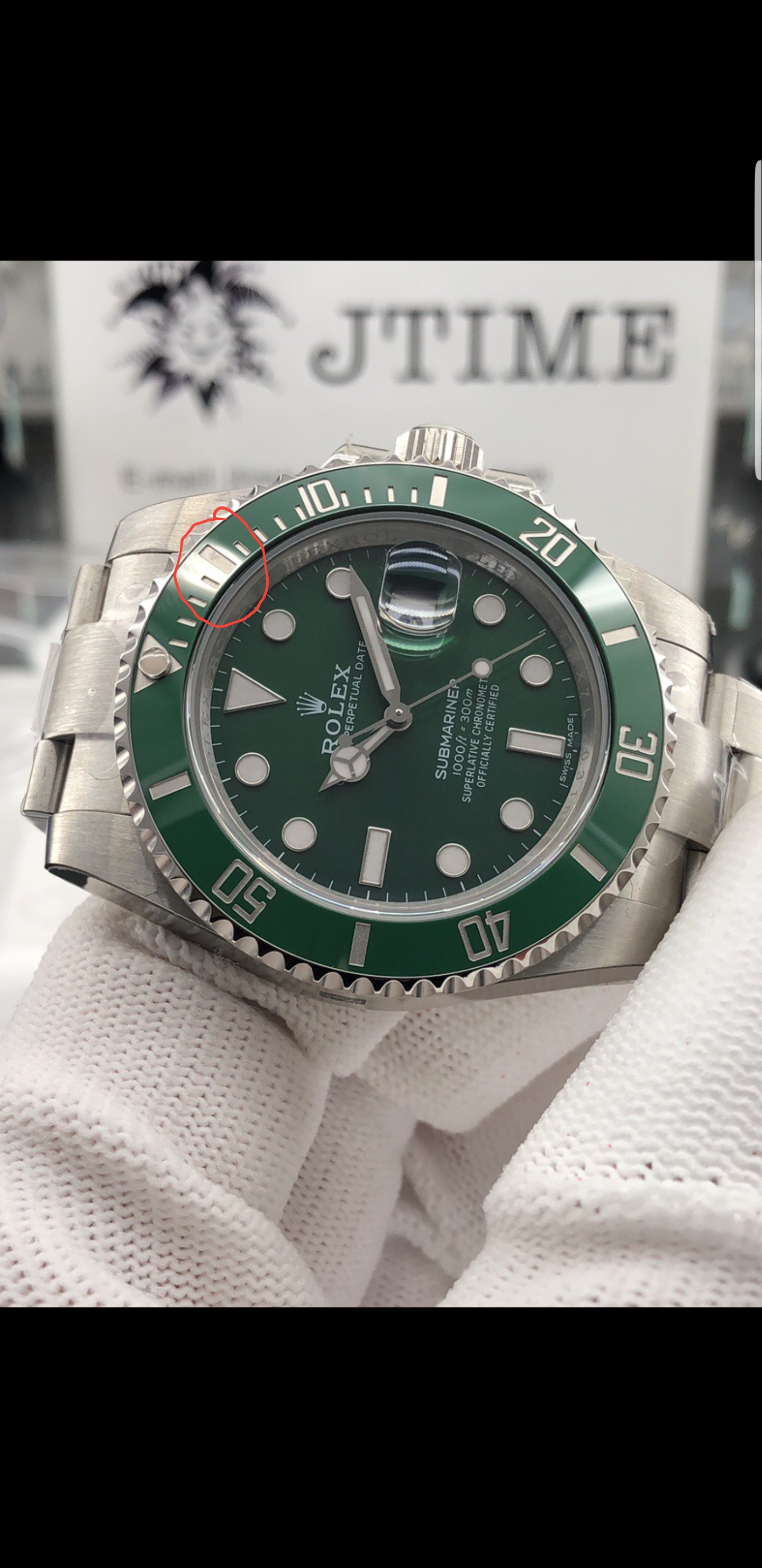
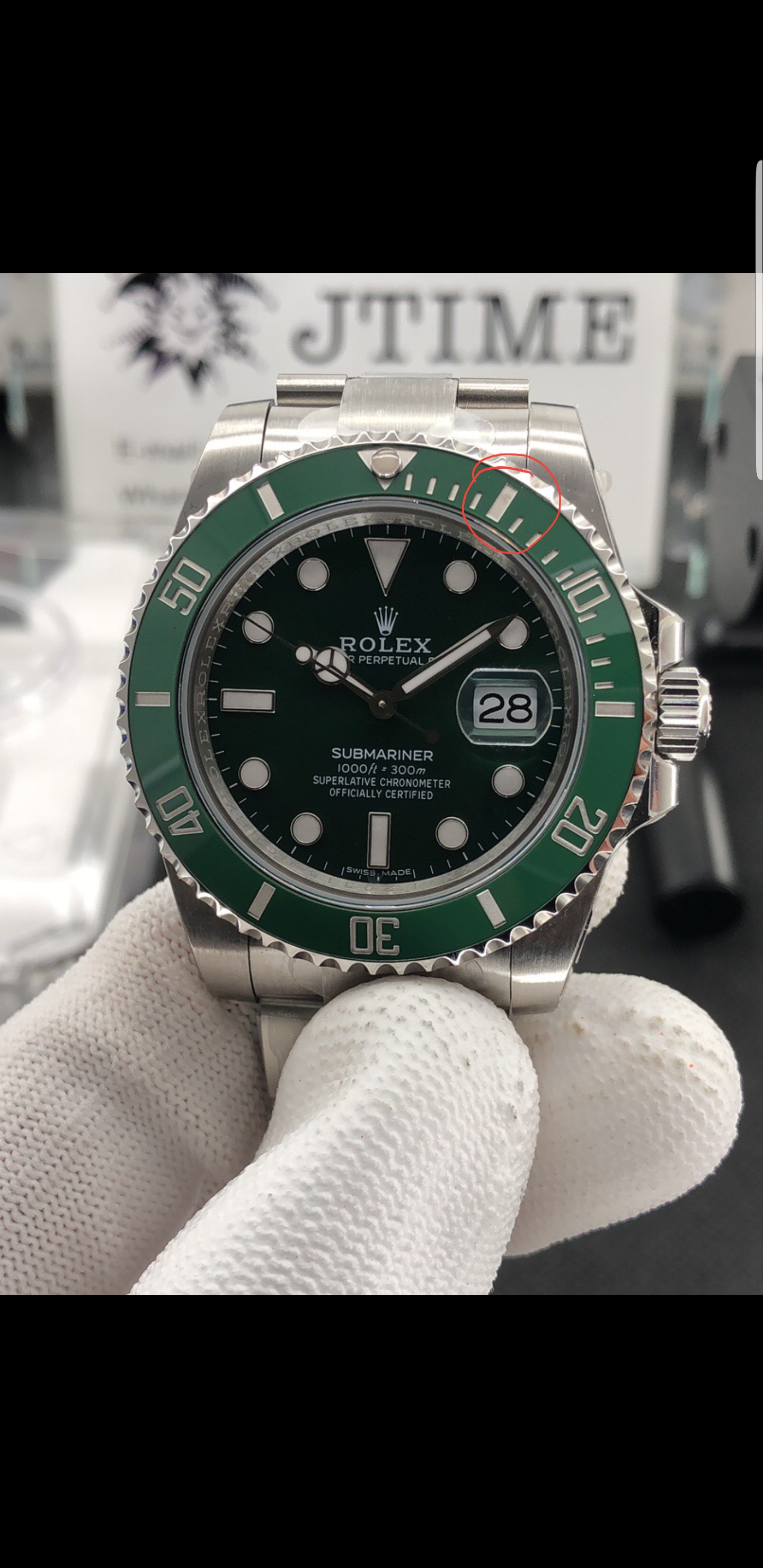
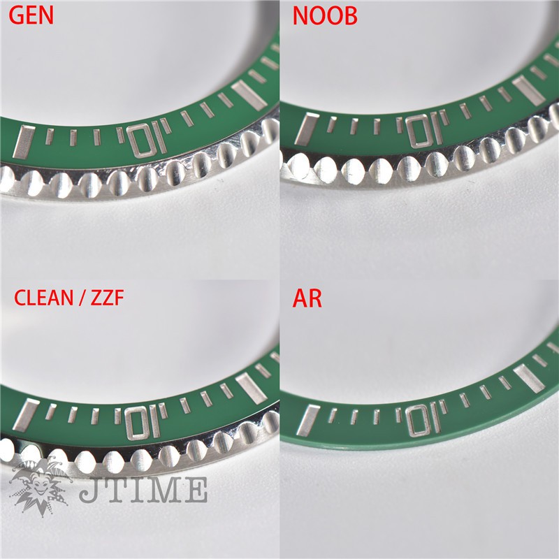
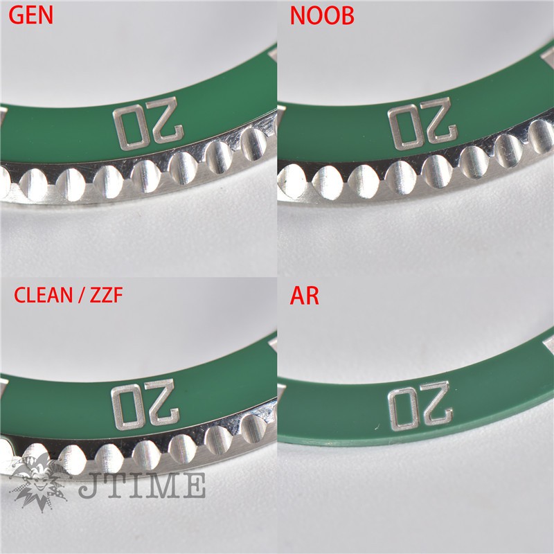
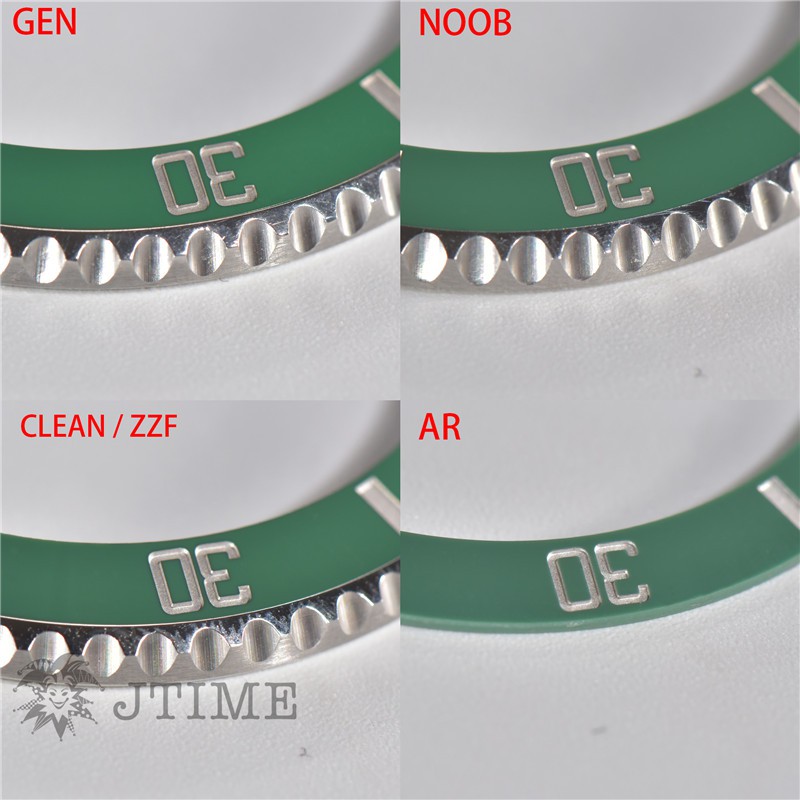
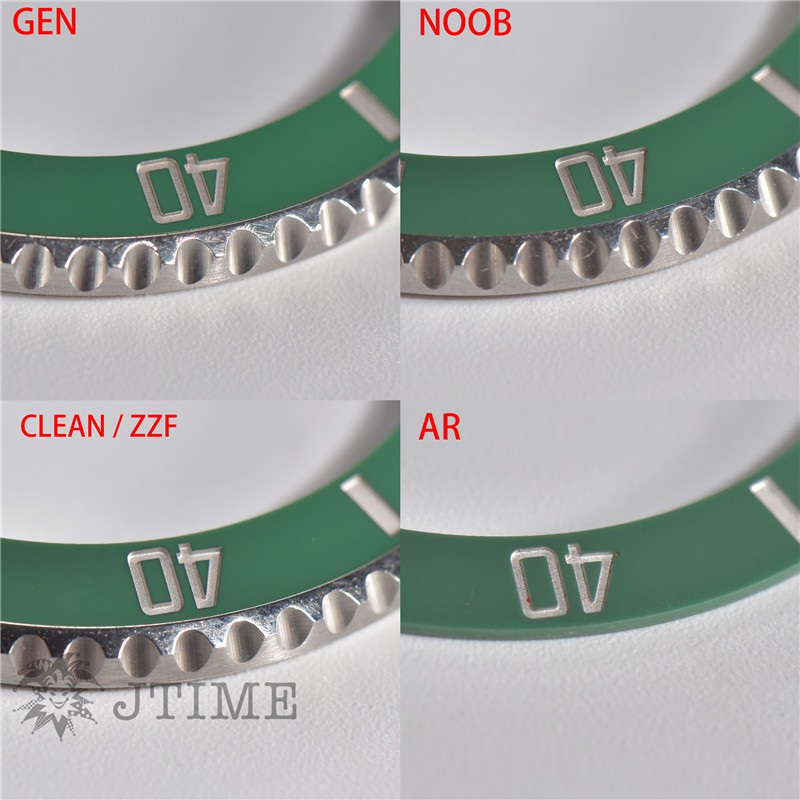
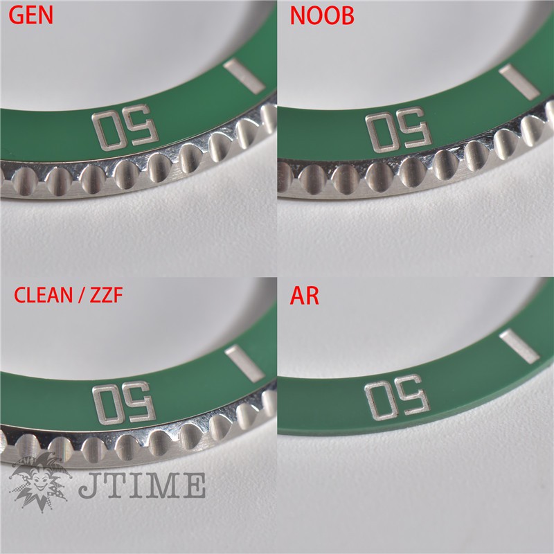
I went back and examined LI's insert pics in the first post of this thread more closely and you can clearly see that the marker cutouts for the numerals are slightly deeper and thicker than the gen. The bar cutouts at 5,15,30, etc do not look thicker to me, nor do the mini-bar cutouts for single minutes. But on the numerals, the 1 looks thicker, and the thickness is really apparent if you look at the size of the green rectangles inside all of the zeroes. It's not off that much, but the extra depth and thickness that smoke saw indeed indicates it's noticeable to the eye and once we see it we can't unsee it. I'm hoping it will be like the ARF LN GMT insert which is also too deep but looks quite good on the wrist anyway. I won't ever be putting mine next to a gen. Pics credit to Li
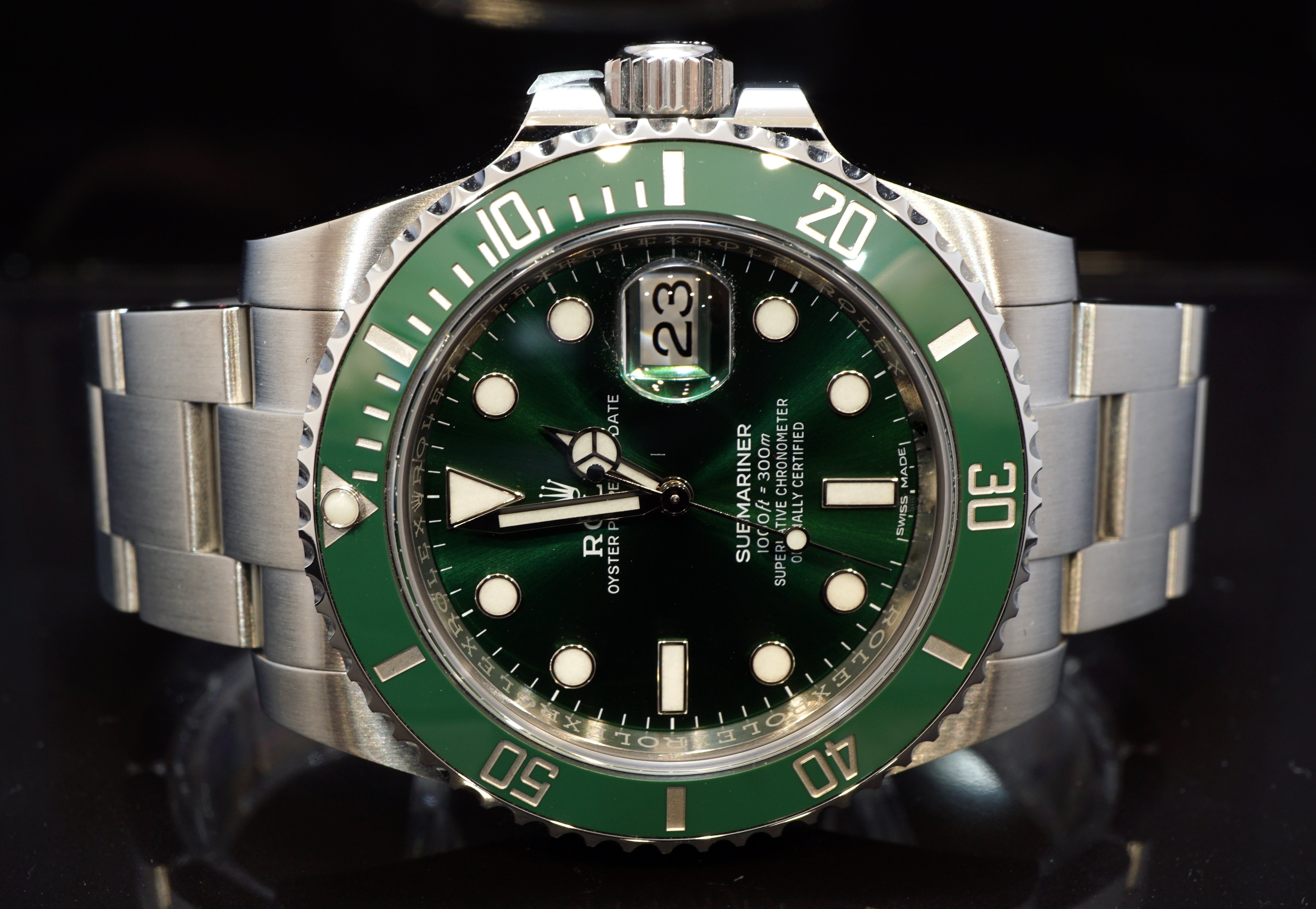
 jtimewatch

6TebP.jpg


6TLTJ.jpg


6T2Dk.jpg


6TAqo.jpg


6TUUW.jpg


I agree that slightly thicker is better than thinner. And anyone whose ever had a Spongebob mod knows that the way he chamfers the top of the cutout walls where they join the insert flats makes the markers look slightly thicker all the way around. So I believe this will be OK, for most of us.
 
Last edited:

srhoque

Put Some Respect On My Name
28/11/18
3,259
2,463
113
Is it fair to say:

v2s = v2
+ better insert green color (remains to be seen in outside sunlight)
- thicker and deeper font on insert numbers (but maybe ok on wrist)
- CG is narrower

The insert color is one of the first things you notice on the hulk. So v2s is still probably a step forward.
 
Last edited:
  • Like
Reactions: KJ2020

KJ2020

Time Traveler
Supporter
12/3/18
32,738
58,889
113
Is it fair to say:

v2s = v2
+ better insert green color (remains to be seen in outside sunlight)
- thicker and deeper font on insert numbers (but maybe ok on wrist)
- CG is narrower

The insert color is one of the first things you notice on the hulk. So v2s is still probably a step forward.

That's a good summary IMO
 
  • Like
Reactions: stufuse

Samgobigs

Active Member
11/2/20
204
61
28
Great post. One thing I've wondered (and this could just be me being nit-picky), but does the 12 o'clock triangular marker seem a little angled to the left? I would imagine the tip of the trinagle should point directly the the middle of the Rolex Crown Logo, but in almost all the pictures, it seems to be pointing slightly to the left. Anyone else see that?