I'm going to add to the ARF V.3 bluesy threads by sharing my comparison to the gen. There are a lot of things this rep gets right; enough that I think it's really nice. However, there are four aspects of the V.3 ARF 2824 that allow a quick visual determination that this is not a genuine watch. This is not to say that I would spot these on someone else's wrist. To the contrary, these popped out at as soon as I held the watch. Of these four aspects, one really bothers me and the other three not as much.
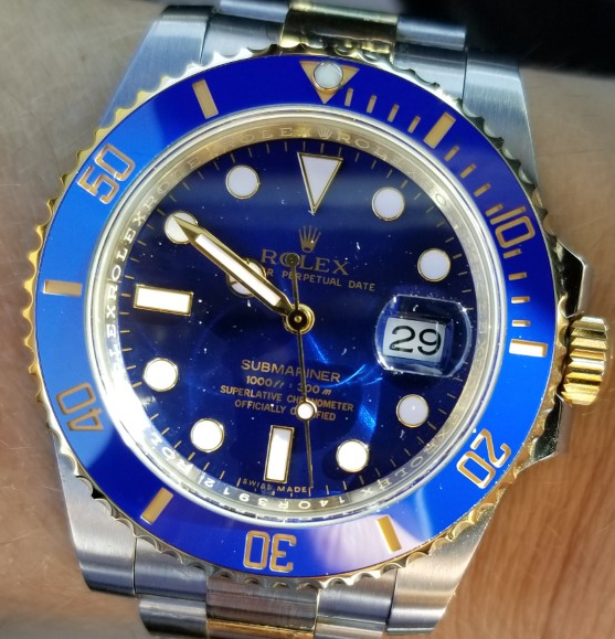
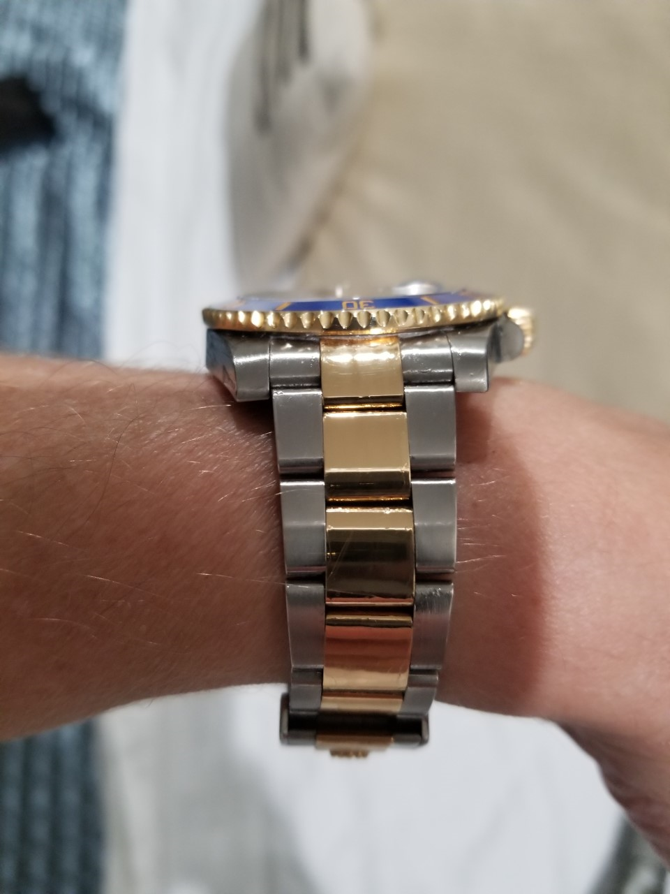
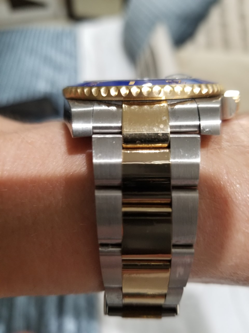
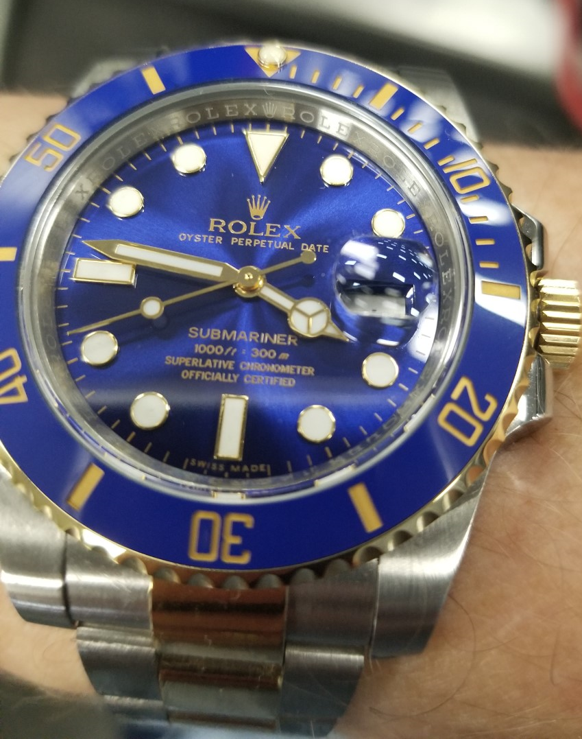
First in my subjective order of significance is the inner case, or rehaut. I'm not referring to the engraving, but rather the angle of the rehaut. It's a little wokky. This is the first thing I noticed when I unboxed it, and I believe that most ARFs have this issue, but I don't see it discussed on the forum. Gen rehaut is nearly perpendicular to the dial, like a wall. When the face of the gen is viewed head-on, the dial and insert appear *almost* seamless. The nearly perpendicular angle of the rehaut means it doesn't reflect a lot of light. The ARF rehaut is angled about 5-10 degrees more than the gen. That may not sound like much, but the effect of that angle around the entire circumference of the dial is noticeable under many lighting conditions, such that the rehaut appears more as a ring than a wall round the dial. As a result, the rehaut is a little wokky, and reflects more light (not in a good way IMHO b/c it takes away from the dial) and makes the dial look smaller (because it actually is). See below:
Gen
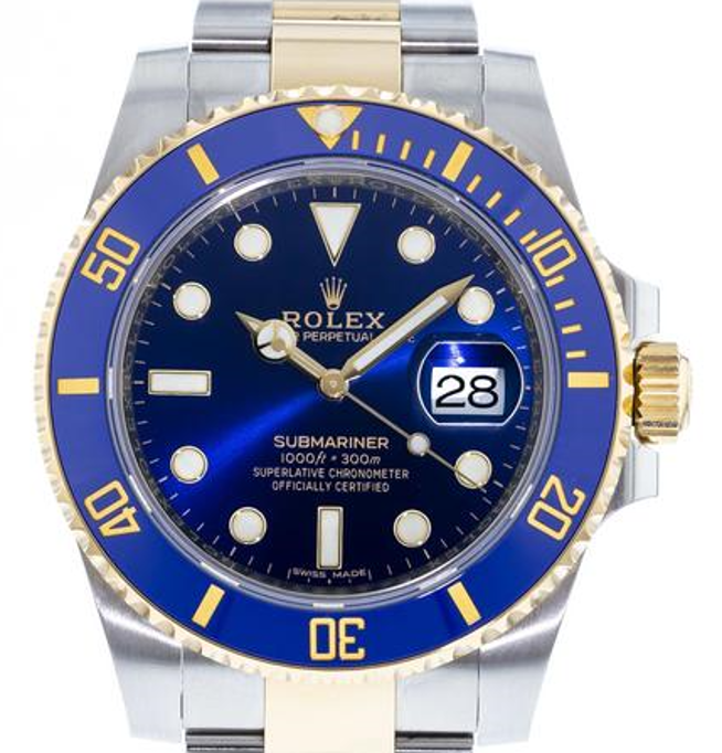
ARF
The next major tell is the lackluster bezel. The gen bezel scallops refract light in a way that sparkles and twinkles. As you tilt your wrist up or down, the light refraction moves from the center of the insert to toward the outer edges, one notch (on each side) at a time. It's like a string of lights that blink in sequence, from middle to both ends. The ARF doesn't do anything remotely like this. All of the bezel notches catch light simultaneously with no sequencing effect. Of course, the gen scallops are polished and the ARF's are not. The ARF would also have to be cut differently to duplicate this effect. Watching the gen sparkle is one of the joys of wearing it. Still, not a dealbreaker.
It's hard to catch w/ pictures, but here are two pictures showing how the scallops light up in sequence. In this first one, the scallops in the center part of the bezel are catching light. In the second one, the outer scallops start to shimmer as I turn my wrist:
And the ARF - the bezel notches all catch light at the same time in a linear effect vs. sequential effect of gen:
Notice that you really can't see a difference in the gold here. In person you can, but it's really passable.
The next two tells are about tied as far as their significance to me. One is the "gold." The color is not far off the gen at all, and I would not have noticed any difference if I wasn't handling them side-by-side. Thee ARF's is, as my 14-year-old put it, more mustard colored and doesn't have the depth of shine that the gen does. OK, forgiven, ARF. The gen is "solid" 18k gold, and the rep is...well, who knows how much gold is actually in that plating. Still, in some lighting, they look basically the same. And like I said, I wouldn't have noticed it if they weren't both in front of me at the same time, and it would never get called out on the wrist.
The other tell is the lume color. It glows the same blue as the gen, and almost (but not quite) as bright. But the ARF hour markers--and just about all of the other Rolex sports model reps I have--are too white. Rolex hour markers are more of a crème color. This is always an obvious tell to me. Doesn't bother me one bit when I'm wearing it, but I can tell the difference easily.
The 904 B.S. and all the other minute details they got right leave me scratching my head as to why they can't get something as simple and structurally basic as the inner case right. I get the bezel and gold properties being off. Rolex polishes the bezel notches in a way that would probably add cost to the rep, so they don't do it. And faking Rolex's 18k gold is tough, I suppose.
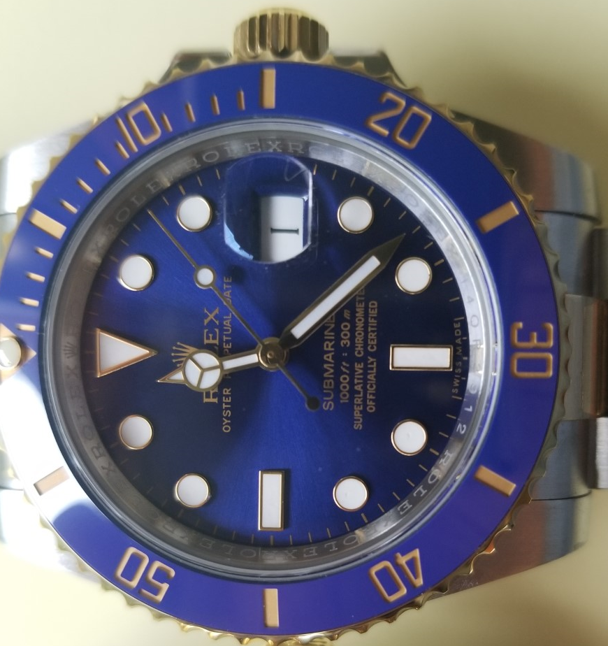
The rest of the watch is spectacular in my opinion. The dial, while not exactly substitutable for the gen, has a beautiful blue color very close to gen. I would not shell out several thousand dollars to get the gen dial over the ARF. Other posts have shown this comparison well.
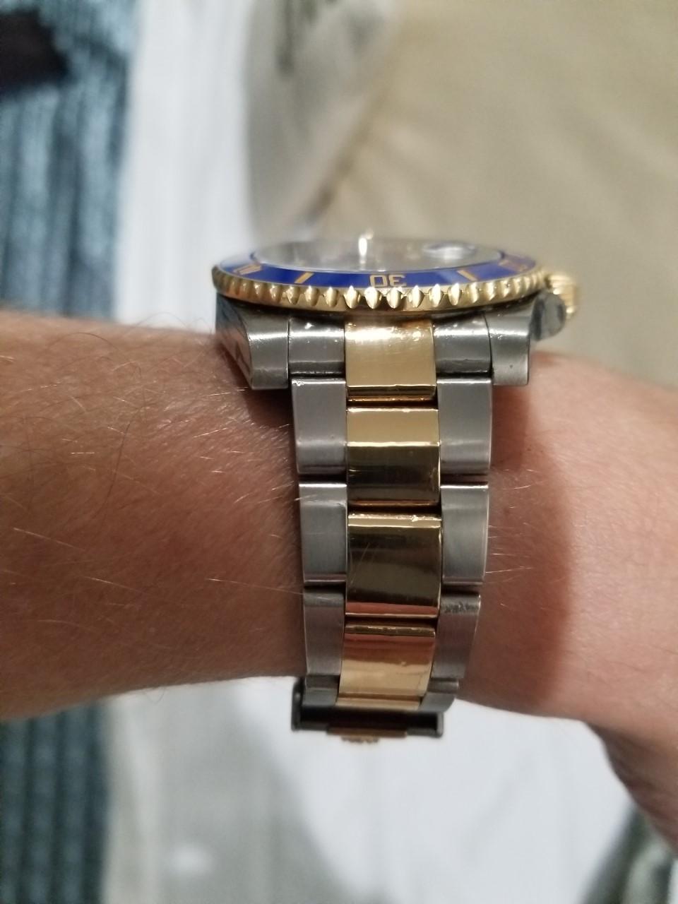
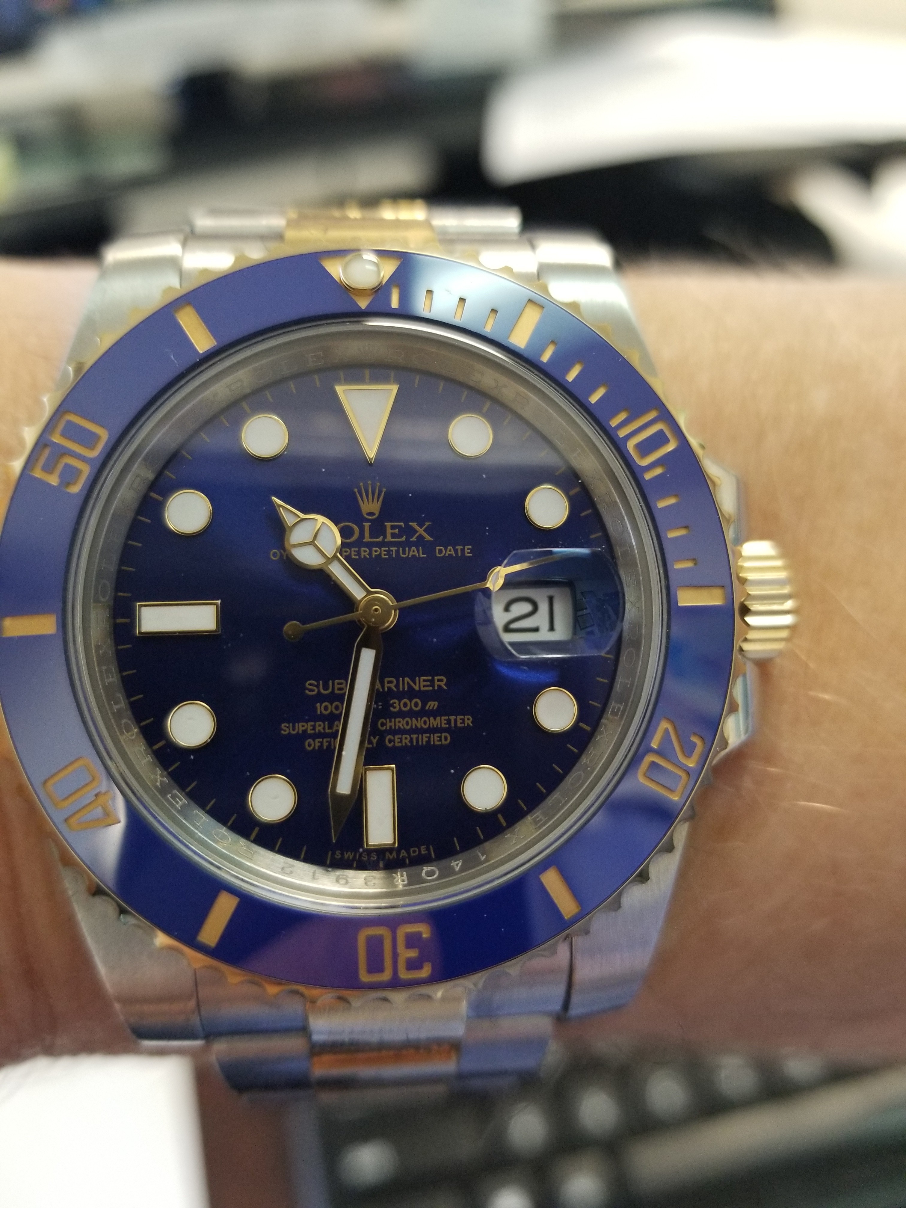
The bezel insert color is spot on. The bezel action is OK...cheaper sounding and feeling than gen, with more play than the gen, but still pretty good. No complaints here. It's fine. The faux gold numerals on the insert are also spot on. They even have a slight granular effect like the gen has when it's in the sun. The pearl is spot on, the crown is excellent, and the clasp is the best I've had in a rep. It functions and engages identical to the gen except that the adjustment sled slides around whereas the gen's tolerances are tighter. Again, a picky detail because all of my other six-digit Rolex rep clasps (with notable exception of my DJF DJ 41) have crap tolerances and don't engage or sound the way the gen does. Notably, ARF does a great job with the date window and cyclops. The cyclops has at least one layer of AR and doesn't reflect much light. And they totally rectified the lousy date wheel font. This is one area where lesser reps give it away.
I'm not anal about dial printing, but it looks fine to my eyes. So does the rehaut engraving. On mine, everything was well aligned. QC wise, the crystal has a series of fine scatches that are visible in sunlight, and a couple of the hour markers have pin-prick indentations. The movement so far runs great, and is accurate to within 5 seconds a day.
Anyway, hope this was helpful to somebody out there.
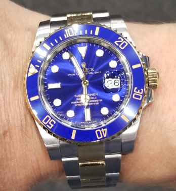
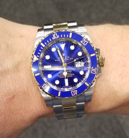
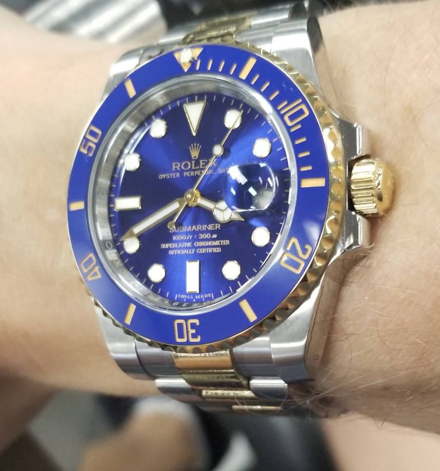
Here are some pictures showing how beautiful this rep is, despite its flaws.
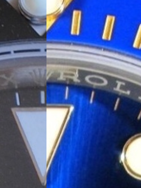
First in my subjective order of significance is the inner case, or rehaut. I'm not referring to the engraving, but rather the angle of the rehaut. It's a little wokky. This is the first thing I noticed when I unboxed it, and I believe that most ARFs have this issue, but I don't see it discussed on the forum. Gen rehaut is nearly perpendicular to the dial, like a wall. When the face of the gen is viewed head-on, the dial and insert appear *almost* seamless. The nearly perpendicular angle of the rehaut means it doesn't reflect a lot of light. The ARF rehaut is angled about 5-10 degrees more than the gen. That may not sound like much, but the effect of that angle around the entire circumference of the dial is noticeable under many lighting conditions, such that the rehaut appears more as a ring than a wall round the dial. As a result, the rehaut is a little wokky, and reflects more light (not in a good way IMHO b/c it takes away from the dial) and makes the dial look smaller (because it actually is). See below:
Gen
ARF
Closeup comparison (ARF on left). You can see that the gen dial is actually a tad wider, hence the top of the triangle does not line up with that of the rep.
The next major tell is the lackluster bezel. The gen bezel scallops refract light in a way that sparkles and twinkles. As you tilt your wrist up or down, the light refraction moves from the center of the insert to toward the outer edges, one notch (on each side) at a time. It's like a string of lights that blink in sequence, from middle to both ends. The ARF doesn't do anything remotely like this. All of the bezel notches catch light simultaneously with no sequencing effect. Of course, the gen scallops are polished and the ARF's are not. The ARF would also have to be cut differently to duplicate this effect. Watching the gen sparkle is one of the joys of wearing it. Still, not a dealbreaker.
It's hard to catch w/ pictures, but here are two pictures showing how the scallops light up in sequence. In this first one, the scallops in the center part of the bezel are catching light. In the second one, the outer scallops start to shimmer as I turn my wrist:
And the ARF - the bezel notches all catch light at the same time in a linear effect vs. sequential effect of gen:
Notice that you really can't see a difference in the gold here. In person you can, but it's really passable.
The next two tells are about tied as far as their significance to me. One is the "gold." The color is not far off the gen at all, and I would not have noticed any difference if I wasn't handling them side-by-side. Thee ARF's is, as my 14-year-old put it, more mustard colored and doesn't have the depth of shine that the gen does. OK, forgiven, ARF. The gen is "solid" 18k gold, and the rep is...well, who knows how much gold is actually in that plating. Still, in some lighting, they look basically the same. And like I said, I wouldn't have noticed it if they weren't both in front of me at the same time, and it would never get called out on the wrist.
The other tell is the lume color. It glows the same blue as the gen, and almost (but not quite) as bright. But the ARF hour markers--and just about all of the other Rolex sports model reps I have--are too white. Rolex hour markers are more of a crème color. This is always an obvious tell to me. Doesn't bother me one bit when I'm wearing it, but I can tell the difference easily.
The 904 B.S. and all the other minute details they got right leave me scratching my head as to why they can't get something as simple and structurally basic as the inner case right. I get the bezel and gold properties being off. Rolex polishes the bezel notches in a way that would probably add cost to the rep, so they don't do it. And faking Rolex's 18k gold is tough, I suppose.
The rest of the watch is spectacular in my opinion. The dial, while not exactly substitutable for the gen, has a beautiful blue color very close to gen. I would not shell out several thousand dollars to get the gen dial over the ARF. Other posts have shown this comparison well.
The bezel insert color is spot on. The bezel action is OK...cheaper sounding and feeling than gen, with more play than the gen, but still pretty good. No complaints here. It's fine. The faux gold numerals on the insert are also spot on. They even have a slight granular effect like the gen has when it's in the sun. The pearl is spot on, the crown is excellent, and the clasp is the best I've had in a rep. It functions and engages identical to the gen except that the adjustment sled slides around whereas the gen's tolerances are tighter. Again, a picky detail because all of my other six-digit Rolex rep clasps (with notable exception of my DJF DJ 41) have crap tolerances and don't engage or sound the way the gen does. Notably, ARF does a great job with the date window and cyclops. The cyclops has at least one layer of AR and doesn't reflect much light. And they totally rectified the lousy date wheel font. This is one area where lesser reps give it away.
I'm not anal about dial printing, but it looks fine to my eyes. So does the rehaut engraving. On mine, everything was well aligned. QC wise, the crystal has a series of fine scatches that are visible in sunlight, and a couple of the hour markers have pin-prick indentations. The movement so far runs great, and is accurate to within 5 seconds a day.
Anyway, hope this was helpful to somebody out there.
Here are some pictures showing how beautiful this rep is, despite its flaws.
Last edited: