• Tired of adverts on RWI? - Subscribe by clicking HERE and PMing Trailboss for instructions and they will magically go away!

NOOB Pepsi GMT 126710 BLRO mini review

mrsullivan

Replicaddict
Staff member
Moderator Sales
Certified
18/8/19
5,909
12,519
113
EU
I agree with the screen rendering of the colors, the debate goes nowhere until you see it IRL.

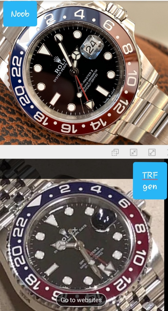
The major upgrade here IMO is the smooth color transition on the insert, for once it's not some sort of straight line between the colors.

Envoyé de mon SM-G950F en utilisant Tapatalk
 

m5smg2

Mythical Poster
Supporter
Certified
23/8/07
6,108
7,884
113
Post #52 is Noob’s pic with the gen.
 

HawaiiHal

You're Saying I Can Sell?
14/9/19
25
5
3
Beautiful. I've never been a big Pepsi fan but this looks great. Been looking for a DSSD and Batman but may have to add one of these to my collection too.
 

m5smg2

Mythical Poster
Supporter
Certified
23/8/07
6,108
7,884
113
With some flash:

2f1c0aa66307b689fcc228160dd92e0b.jpg
b5f738a0711320e6aeab0f6bb5c73a53.jpg
1673242fa46a038d168a20f263744eca.jpg
 
  • Like
Reactions: KJ2020

clayj

Horology Curious
4/5/19
15
7
3
newbie here : about the insert (best gmt insert on the market) and engravings no questions, flaws spotted so far ? Crown guards, then?
 

Tobel

Put Some Respect On My Name
6/7/17
5,425
3,618
113
newbie here : about the insert (best gmt insert on the market) and engravings no questions, flaws spotted so far ? Crown guards, then?

I don't agree with the best insert statement. It may be the highest quality insert, but colours are off. Blue doesn't have any shade of purple when it should, and red doesn't have any shade of pink when it should. There is not a single gen picture that you'll find out there that is even remotely close to this insert. The only exception is the single one presented in this thread as a side by side, and it's coming from guess who? Noob itself. I really don't understand you guys.
 
  • Like
Reactions: pickler and clayj

KJ2020

Time Traveler
Supporter
12/3/18
32,737
58,666
113
I don't agree with the best insert statement. It may be the highest quality insert, but colours are off. Blue doesn't have any shade of purple when it should, and red doesn't have any shade of pink when it should. There is not a single gen picture that you'll find out there that is even remotely close to this insert. The only exception is the single one presented in this thread as a side by side, and it's coming from guess who? Noob itself. I really don't understand you guys.

The new "MK3" gen insert shown on this thread looks very much like the Noob IMO

https://www.rolexforums.com/showthread.php?t=698687

ZDJet.jpg
 
  • Like
Reactions: kennygconspiracy

Genera74

Active Member
29/12/14
379
91
28
Think the color is very close. Have been overlooking this one and focused more on the batman but this has just come under my radar. If not for the CHS and 7 bill price tag. I ordered the batman yesterday, was deciding between GMF and Noob (TD keep pushing noob one as the best in the market). But in the end I went with GMF as TD said Noob will only be making CHS from now on (so get use to the extravagant price tag fellas).
 
Last edited:
  • Like
Reactions: Star70 and RiffRalf

molivio

I'm Pretty Popular
Supporter
Certified
19/10/15
1,084
173
63
I would say 1. Make based 2. Blue is close enough 3. The red seems to dirty/brownish but less obvious than the baboon ass inserts color from prior and an absolute improvement but 4. Still priced too much based upon the hot demand for it
 

Tobel

Put Some Respect On My Name
6/7/17
5,425
3,618
113
The new "MK3" gen insert shown on this thread looks very much like the Noob IMO

https://www.rolexforums.com/showthread.php?t=698687

ZDJet.jpg

Even in your example you can see exactly what I'm saying: there is no shade of purple in the blue, it's just dark blue, and there's no shade of pink in the red, it's just dark red. However you can clearly see these shades in the gen. And these are taken in rather low light conditions. The difference would be more obvious under full light.
 

shortlegs

Active Member
31/5/19
493
271
63
Actually, the color difference is less obvious under strong lighting, as both rep and gen colors appear brighter. Under low lighting however, the difference is more apparent.

It's really the best insert we have at the moment, but it's still off. The blue may still be passable, but that red isn't IMO. Too much brown mixed with the red. A shame, really.
 

KJ2020

Time Traveler
Supporter
12/3/18
32,737
58,666
113
I think Rolex may not be finished tweaking the insert colors on this model. With so many variations out there in gen, even gen owners aren't sure which version they have or why. I think this Noob would pass pretty easily amidst the 3 in this pic "as one of the boys"

I honestly don't see any pink in the MK3, a little more cherry maybe. And I don't see purple in it either, a little more royal blue maybe which tends to purple. But we're talking a pretty minuscule difference here, this is nothing like the difference between a rep Hulk insert and a gen.


26d00ad30e38726095197876f625ad04.jpg
 
Last edited:

Tobel

Put Some Respect On My Name
6/7/17
5,425
3,618
113
I think Rolex may not be finished tweaking the insert colors on this model. With so many variations out there in gen, even gen owners aren't sure which version they have or why. I think this Noob would pass pretty easily amidst the 3 in this pic "as one of the boys"

I honestly don't see any pink in the MK3, a little more cherry maybe. And I don't see purple in it either, a little more royal blue maybe which tends to purple. But we're talking a pretty minuscule difference here, this is nothing like the difference between a rep Hulk insert and a gen.

I guess beauty is in the eye of the beholder my friend ;)
 

KJ2020

Time Traveler
Supporter
12/3/18
32,737
58,666
113
I guess beauty is in the eye of the beholder my friend ;)

So true. I think I actually prefer the blue and red from the MK2, but the markers look better on the MK3. They are definitely going pretty dark with the colors, rich and saturated. Old school Pepsi colors were much prettier IMO.

15354130656660.jpg
 
  • Like
Reactions: m5smg2

Mark1937

Put Some Respect On My Name
Patron
Certified
25/3/17
4,247
3,623
113
Hey dude, you should calm down, have some herbal tea or something. Every post you make has at least 4 exclamation marks

The insert is different!!!!!

The numbers are white!!!!!

The subdials are shiny!!!!


Sent from my iPhone using Tapatalk

maybe I should add more !!!!!!!!!!!!!!!!!!!!!!!!!!!!!!!!!!!!! Since you find it so hard to see the obvious things, and make the Factorys tease you. If they wanted to make identical watches they would do it without problems. It doesn't take anything to make the same colors in 2019 !!!!!!!!!!!!!!!!!!!!!!!!!!!!!!!!!!!!!