- 19/2/16
- 471
- 149
- 43


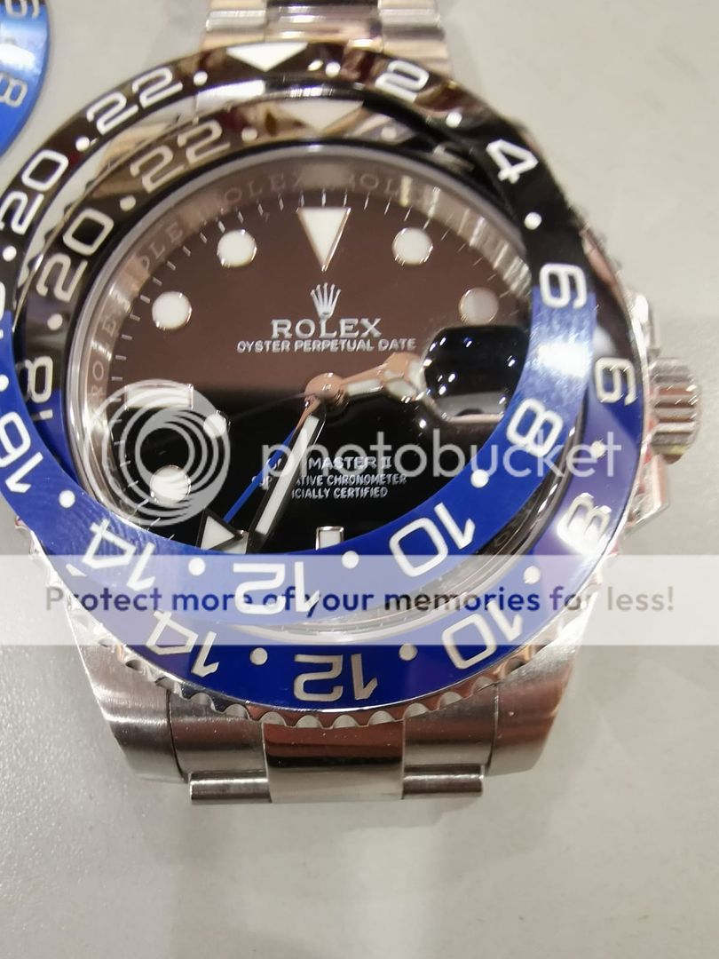
Got my new insert
I am so confused right now....
They look almost the same
The new insert is a bit darker under certain angles, the numbers are shallower and the white isnt as noticable... it is pretty close to the number colors on the noob v9
Numbers on the new insert are thinner but not by much
What do you guys think?
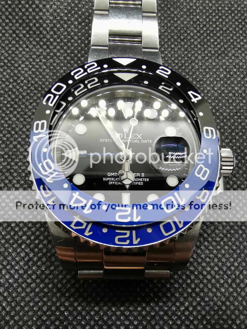
+ Blue is slightly darker
+ No transition lines at 6 and 18
+ the serif (hook) on the 1 numerals more gen-like
- Markers are thinner
- Markers are white
- Insert is thinner
Depending on how bad your Noob transition lines at 6 and 18 are (can't see in your pics), this should be an improvement. The NOOB speed bumps are a dealbreaker in most cases. I wouldn't try doing a paint mod on the replacement unless you are willing to dig out the white paint first. Even then it's pretty challenging to get a smooth fill of silver. I easily spent 15 hours on mine over a month trying different techniques.


Vitor747 can you post a link to where you got the insert?
+ Blue is slightly darker
+ No transition lines at 6 and 18
+ the serif (hook) on the 1 numerals more gen-like
- Markers are thinner
- Markers are white
- Insert is thinner
Depending on how bad your Noob transition lines at 6 and 18 are (can't see in your pics), this should be an improvement. The NOOB speed bumps are a dealbreaker in most cases. I wouldn't try doing a paint mod on the replacement unless you are willing to dig out the white paint first. Even then it's pretty challenging to get a smooth fill of silver. I easily spent 15 hours on mine over a month trying different techniques.
Just a quick question
Received this Noob GMT Master II and a cyclops lens is in wrong position. The crown at 6 it's fine. So is it wrong position of crystal and possible fix moving it or its defects in crystal themselves ?
Enviado desde mi Mi MIX 2S mediante Tapatalk
https://rover.ebay.com/rover/0/0/0?mpre=https://www.ebay.com/ulk/itm/303131159338
Quite expensive but was the best one I could find on ebay
Sent from my iPhone using Tapatalk
Yeah, that's pricey. Are the markers white? At that price and no returns I'd be inclined to install it as is and see how I like it. Making the markers silver isn't going to make it completely gen-like due to marker thinness.
+ Blue is slightly darker
+ No transition lines at 6 and 18
+ the serif (hook) on the 1 numerals more gen-like
- Markers are thinner
- Markers are white
- Insert is thinner
Depending on how bad your Noob transition lines at 6 and 18 are (can't see in your pics), this should be an improvement. The NOOB speed bumps are a dealbreaker in most cases. I wouldn't try doing a paint mod on the replacement unless you are willing to dig out the white paint first. Even then it's pretty challenging to get a smooth fill of silver. I easily spent 15 hours on mine over a month trying different techniques.
My HK supplier
aftermarket bezel vs batman
The only way to get the closer color tone is compare with a Gen watch.
Do not compare the color with internet photo
Its will never match with the actual watch
My HK supplier
aftermarket bezel vs batman
The only way to get the closer color tone is compare with a Gen watch.
Do not compare the color with internet photo
Its will never match with the actual watch
")

