I just wanted to do a little review of my latest explorer II version 2 black dial. I am really impressed with the watch and they have made some improvements to it over the version one. As we have seen with watches with this second version, somehow they managed to screw up the lume on the hands and the hour markers. the lume on the hour markers has been darker, almost a grayish tint, and the lume on the hands a very stark white. The very first thing I notice when I got this one was that the lume now matches on the hands and the hour marker indices. It's the proper slightly off white color as per gen. Needless to say I was very surprised to see that. I don't think I've seen a factory make a change during the run of a model before. So I'll be interested to hear from anyone else who gets the version 2 now if yours has matching lume on the hands and hour markers also.
Another major improvement with the version 2 is the bezel font. It is now correct. the numbers are the right size, width and height. This is a major improvement because the bezel is something that is very visible, and now makes the watch look so much more gen like. the numbers on the bezel are cut out very nicely. the edges and corners are crisp and straight, just very well done.
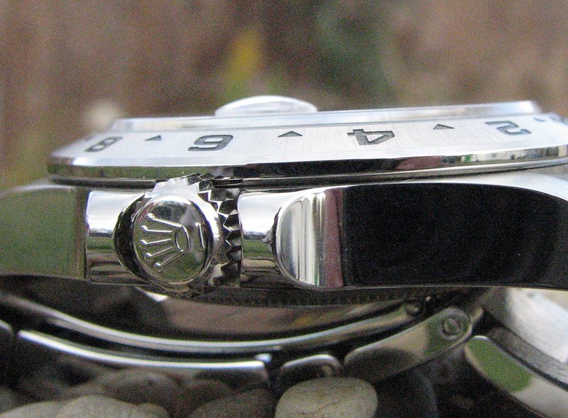
Another improvement is that they fixed the clasp issue. the version one clasp didn't close and lay flat. so that issue has been addressed and fixed as well.
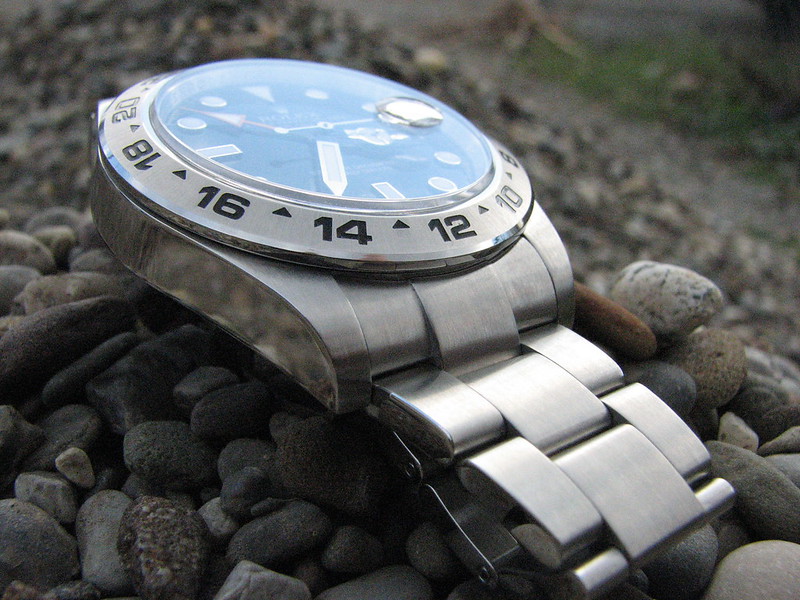
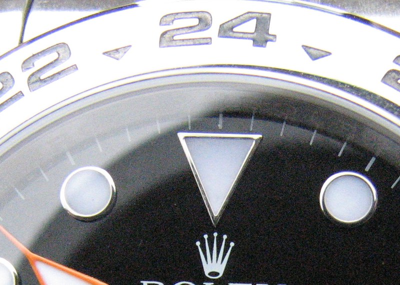
The last improvement made on this version 2 are the hour marker indices. On the gen they are white gold. On this watch the are obviously steel, but they have polished them so finely that you could almost mistake them for white gold. That really makes the dial pop out at you now and it looks great.
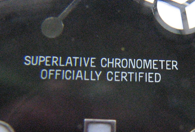
Other great features about this watch are the dial. the dial is great. The letters are printed nicely and spaced properly like the gen. The black is now more of a satin instead of glossy. the gen is advertised as a satin finish, not a matte finish which we see people often mistakenly say.
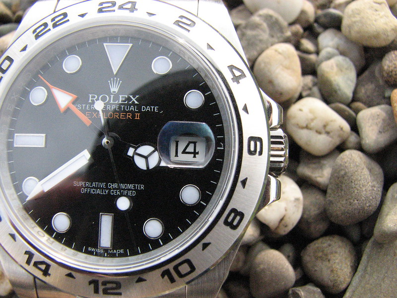
The cyclops like the version one has the double AR coating which is done very nicely on my watch. Gives it a very gen like look.
Also like the version one, the polishing on the side of the bezel, and on the side of the case is just perfect. They really nailed it with the polishing, and the brushing on the links and the top of the bezel and top of the lugs is excellent too. very uniform and nicely done.
The lume is very nicely applied. very even and flat just like the gen. and the lume is just outstanding. The lume lasts all night long.
The watch weighs 154 grams which is actually 3 grams less than the gen. the gen weighs 157 grams. Not a huge difference but it is a difference. but the weight of the watch is perfect for me. Its not too heavy, but heavy enough to not let you forget you have a watch on your wrist.
Something else that I did with this version is compare the crown height to the gen and the crown height is just the same as the gen. I didn't pay attention to the version one to see if teh crown height was right or not.. so I can't comment on the version one crown height, but it is correct on this version.
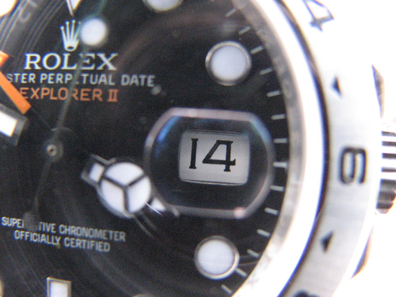
One issue that has somehow arisen with this version 2 is the datewheel being off to the left. I'm not sure how that happened because with the version one the datewheel was perfectly centered, and nothing has been changed as far as the movement or case or anything like that, so the left justified datewheel on this version is kind of a mystery to me. I'm not sure how they created a new problem when it didn exist before. but it is what it is. With that said, when I ordered my watch from Lucy I knew very well that the datewheels were off to the left. and I just asked her if she possibly could find one that wasnt so far to the left as the ones we have seen people posting. but if not I would accept it with the left justified datewheel because I like the watch. Some how Lucy worked her magic and found a great one for me. There are just a few numbers that are just the slightest bit off to the left. but most numbers are perfectly centered. so once again Lucy did an awesome job.
Hopefully with the version 3 they will address the datewheel issue and make it so it's centered again. I'm just honestly baffled how this problem even happened.
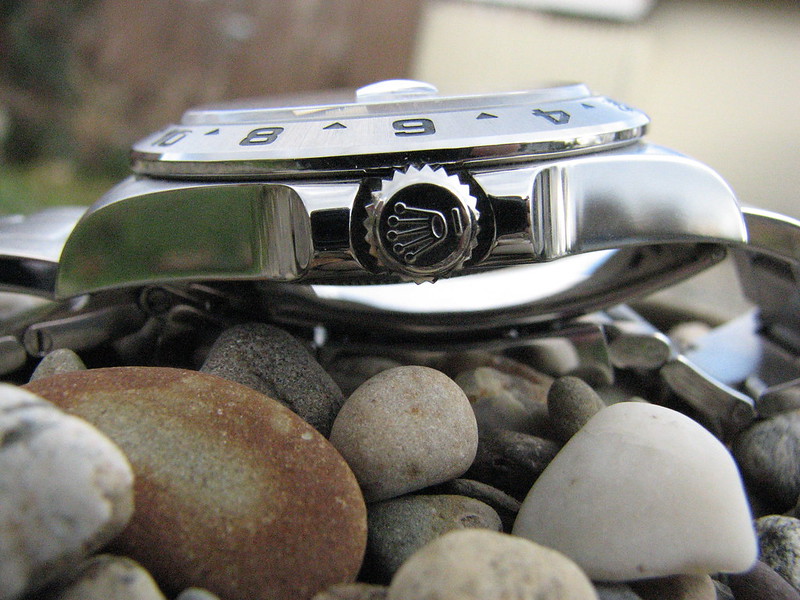
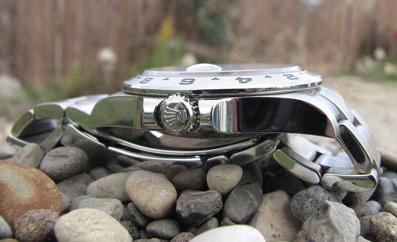
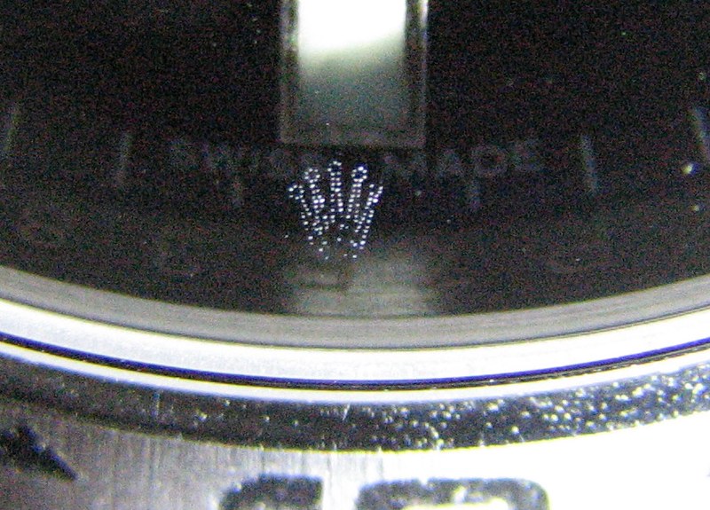
The laser etched crown at 6 oclock is done very well as far as being "semi invisible" like the gen. It is difficult to see the crown on most gen rolex's but some are more visible than others. and unlike most people say, they are not supposed to be invisible. they are advertised as semi invisible. and yes, you can see them on gens sometimes. Now the quality of the etching which you can see in the macro pics below is not the greatest. there are some etching dots missing in the risers of the crown, but it's not a noticeable flaw unless you are looking at it with macro pics.
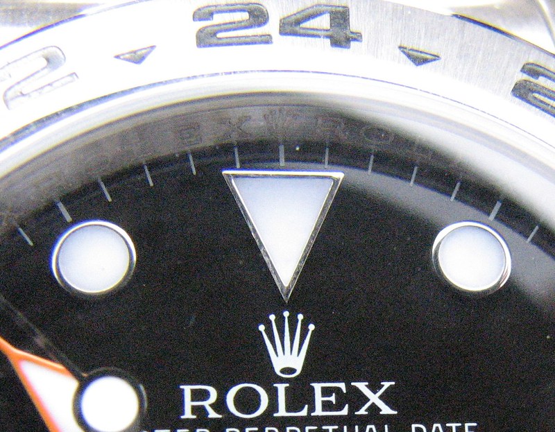
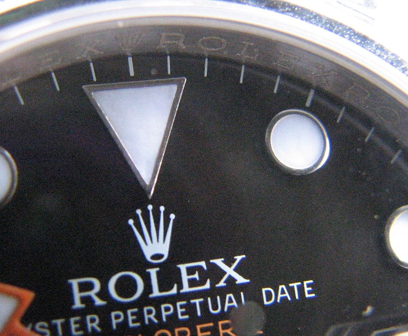
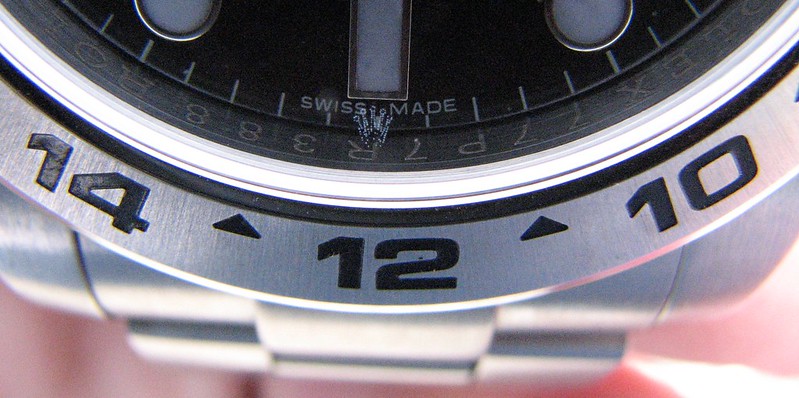
the rehaut engraving seems decent. although a close up view of it shows that the ROLEXXROLEX engraving is not done like the gen with 2 distinct outlines to form each letter. but once again this is only noticeable in macro pics or by using a loupe. from looking at it with the naked eye it looks very good.
the bracelet as advertised by noob factory as being the best bbracelet they have produced I feel is very true. This is by far the best bracelet I have had on any rep.
Overall I think it's a great replica. the brushing and polishing are outstanding. The improvement of the bezel font and the lume on the hands and hour markers make it so much more gen like.
I wasn't too happy with how my pics turned out. It was an overcast day and they are not the greatest, but I plan on doing another set of photos when the lighting is better.
also, my watch has the asian 2836
Now on to the pics.
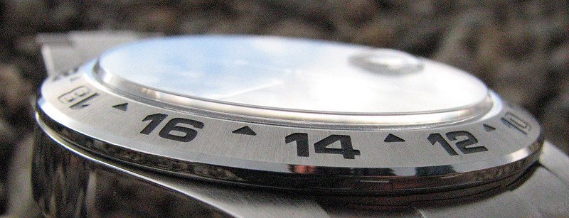

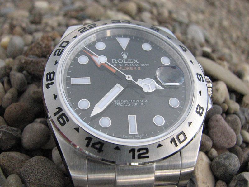
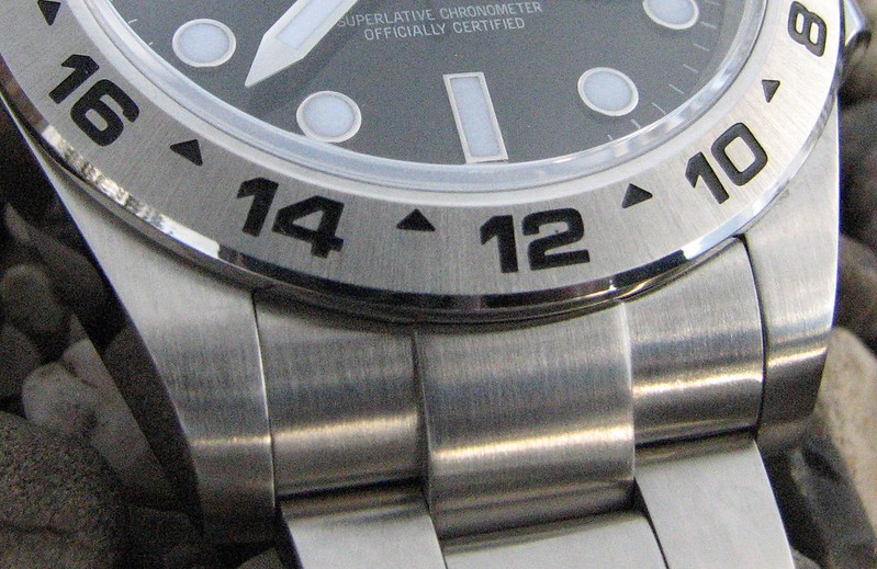
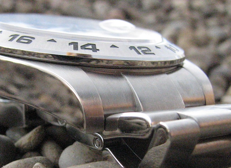

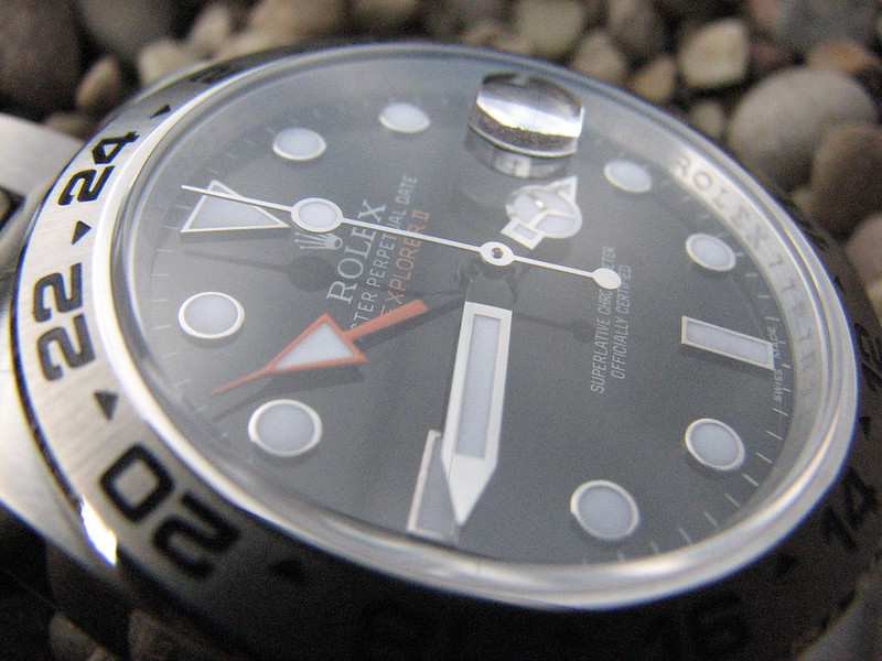
Another major improvement with the version 2 is the bezel font. It is now correct. the numbers are the right size, width and height. This is a major improvement because the bezel is something that is very visible, and now makes the watch look so much more gen like. the numbers on the bezel are cut out very nicely. the edges and corners are crisp and straight, just very well done.
Another improvement is that they fixed the clasp issue. the version one clasp didn't close and lay flat. so that issue has been addressed and fixed as well.
The last improvement made on this version 2 are the hour marker indices. On the gen they are white gold. On this watch the are obviously steel, but they have polished them so finely that you could almost mistake them for white gold. That really makes the dial pop out at you now and it looks great.
Other great features about this watch are the dial. the dial is great. The letters are printed nicely and spaced properly like the gen. The black is now more of a satin instead of glossy. the gen is advertised as a satin finish, not a matte finish which we see people often mistakenly say.
The cyclops like the version one has the double AR coating which is done very nicely on my watch. Gives it a very gen like look.
Also like the version one, the polishing on the side of the bezel, and on the side of the case is just perfect. They really nailed it with the polishing, and the brushing on the links and the top of the bezel and top of the lugs is excellent too. very uniform and nicely done.
The lume is very nicely applied. very even and flat just like the gen. and the lume is just outstanding. The lume lasts all night long.
The watch weighs 154 grams which is actually 3 grams less than the gen. the gen weighs 157 grams. Not a huge difference but it is a difference. but the weight of the watch is perfect for me. Its not too heavy, but heavy enough to not let you forget you have a watch on your wrist.
Something else that I did with this version is compare the crown height to the gen and the crown height is just the same as the gen. I didn't pay attention to the version one to see if teh crown height was right or not.. so I can't comment on the version one crown height, but it is correct on this version.
One issue that has somehow arisen with this version 2 is the datewheel being off to the left. I'm not sure how that happened because with the version one the datewheel was perfectly centered, and nothing has been changed as far as the movement or case or anything like that, so the left justified datewheel on this version is kind of a mystery to me. I'm not sure how they created a new problem when it didn exist before. but it is what it is. With that said, when I ordered my watch from Lucy I knew very well that the datewheels were off to the left. and I just asked her if she possibly could find one that wasnt so far to the left as the ones we have seen people posting. but if not I would accept it with the left justified datewheel because I like the watch. Some how Lucy worked her magic and found a great one for me. There are just a few numbers that are just the slightest bit off to the left. but most numbers are perfectly centered. so once again Lucy did an awesome job.
Hopefully with the version 3 they will address the datewheel issue and make it so it's centered again. I'm just honestly baffled how this problem even happened.
The laser etched crown at 6 oclock is done very well as far as being "semi invisible" like the gen. It is difficult to see the crown on most gen rolex's but some are more visible than others. and unlike most people say, they are not supposed to be invisible. they are advertised as semi invisible. and yes, you can see them on gens sometimes. Now the quality of the etching which you can see in the macro pics below is not the greatest. there are some etching dots missing in the risers of the crown, but it's not a noticeable flaw unless you are looking at it with macro pics.
the rehaut engraving seems decent. although a close up view of it shows that the ROLEXXROLEX engraving is not done like the gen with 2 distinct outlines to form each letter. but once again this is only noticeable in macro pics or by using a loupe. from looking at it with the naked eye it looks very good.
the bracelet as advertised by noob factory as being the best bbracelet they have produced I feel is very true. This is by far the best bracelet I have had on any rep.
Overall I think it's a great replica. the brushing and polishing are outstanding. The improvement of the bezel font and the lume on the hands and hour markers make it so much more gen like.
I wasn't too happy with how my pics turned out. It was an overcast day and they are not the greatest, but I plan on doing another set of photos when the lighting is better.
also, my watch has the asian 2836
Now on to the pics.
")