WatchaholicMallorca
Renowned Member
- 2/9/16
- 696
- 365
- 63
Yes maybe but nobody wants a gap, gen or rep
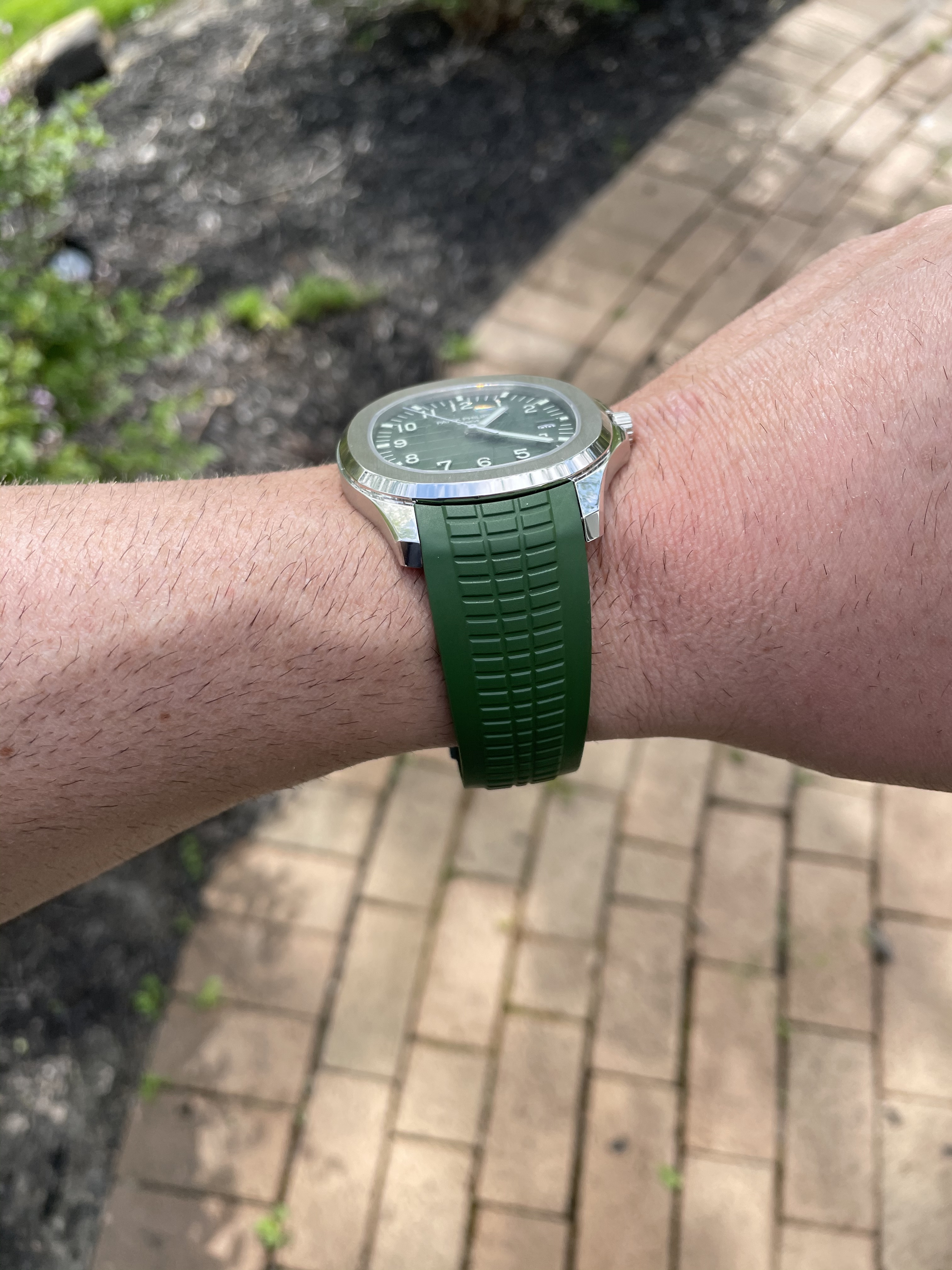
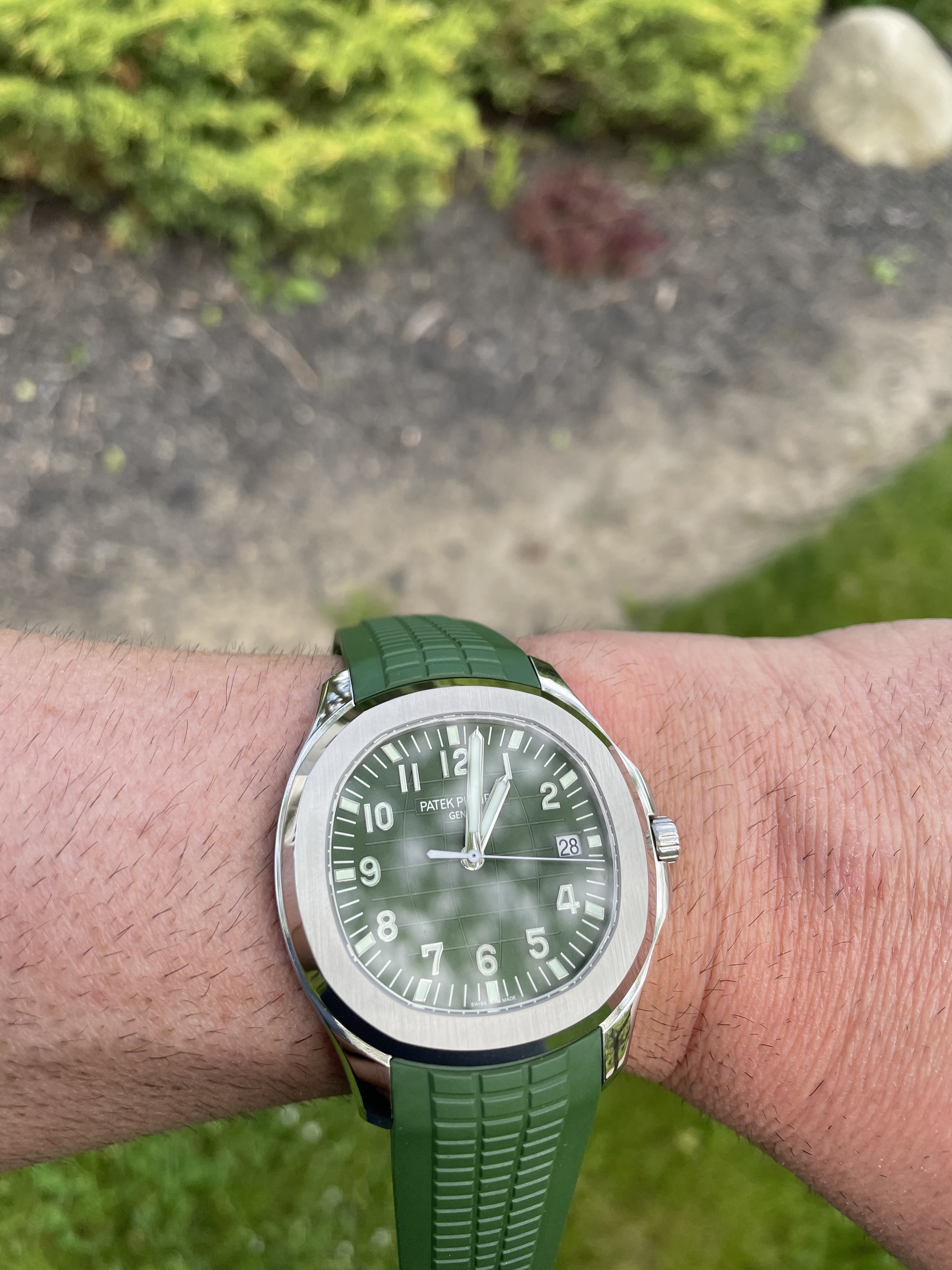
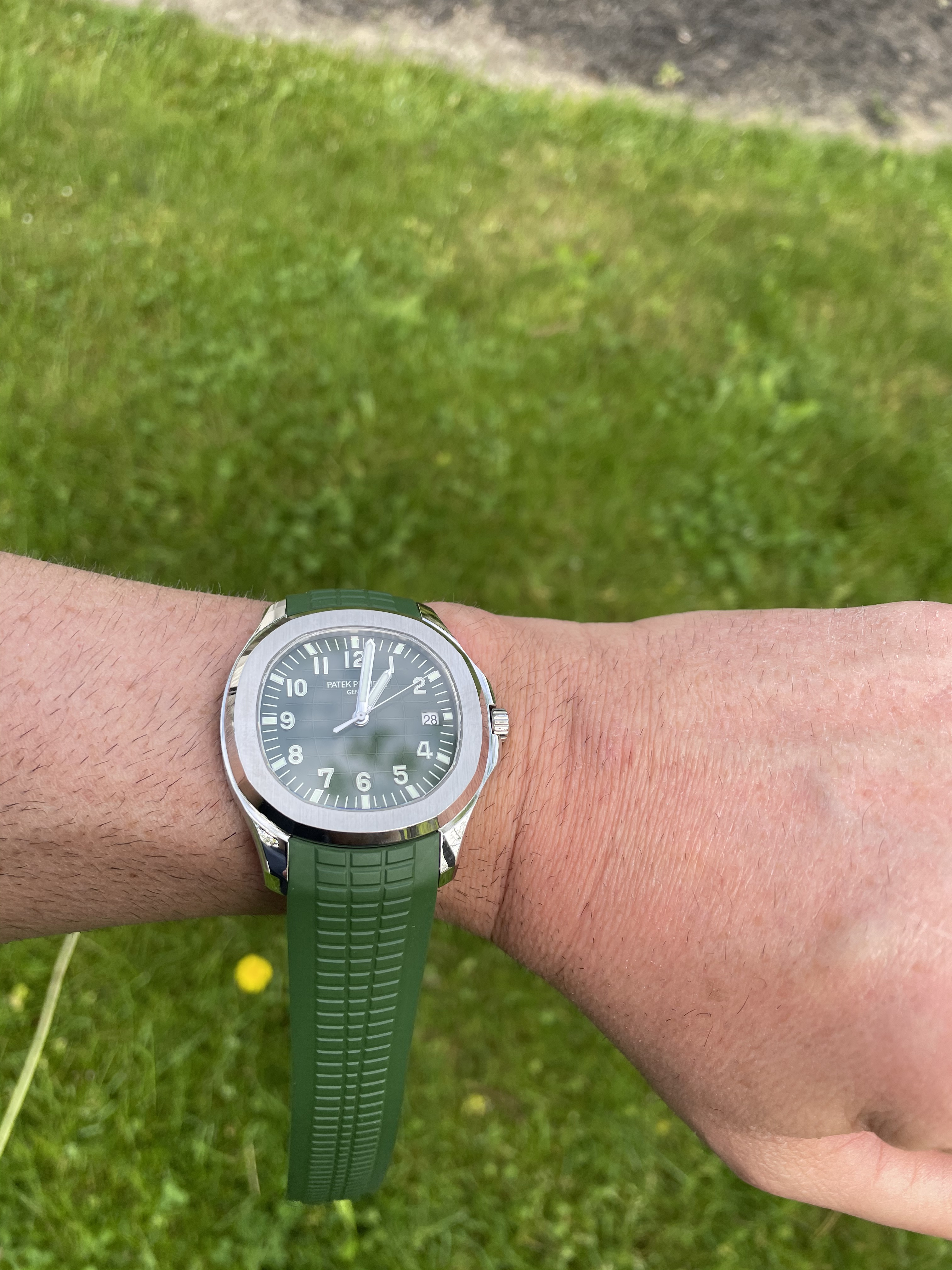
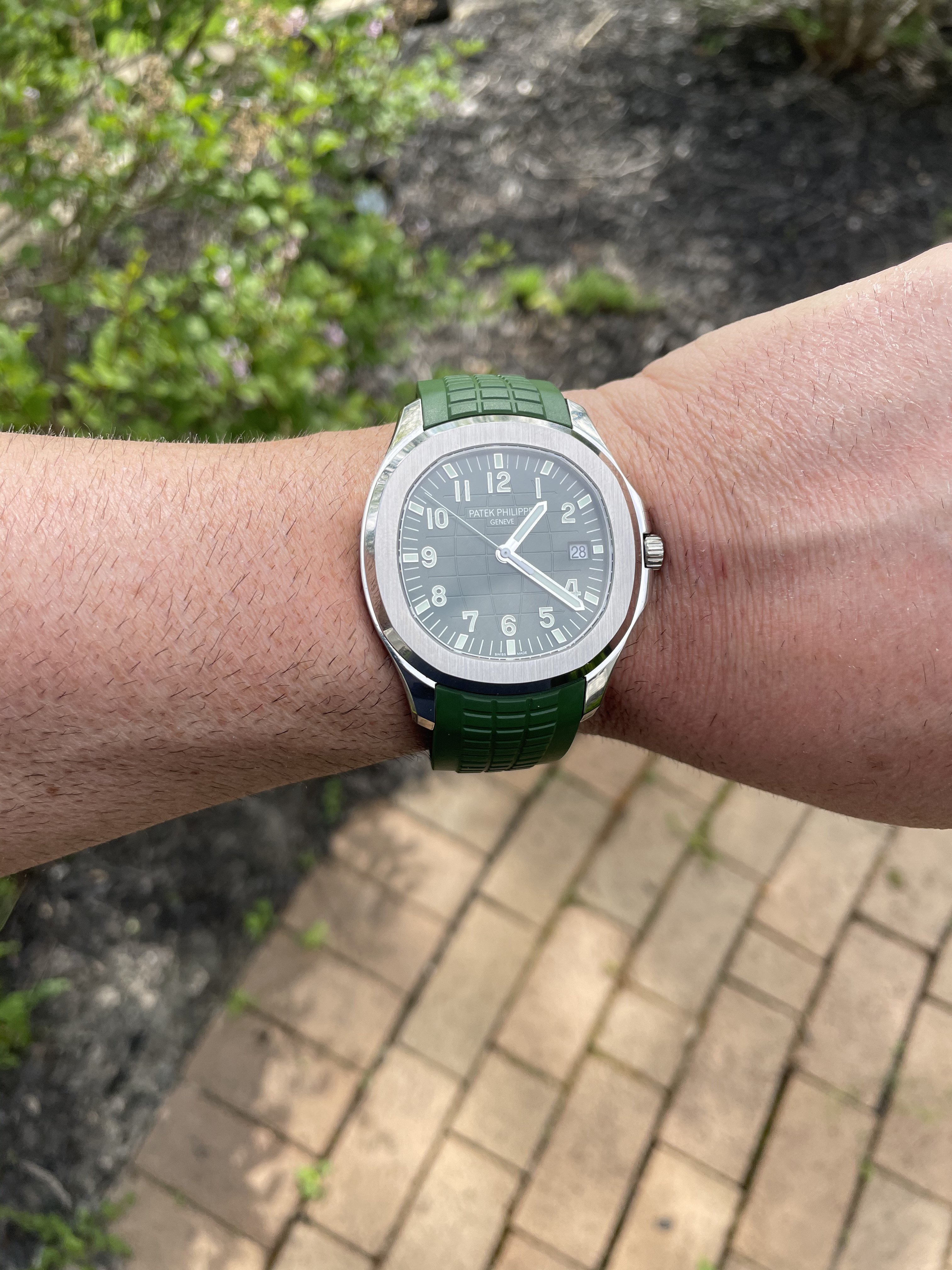
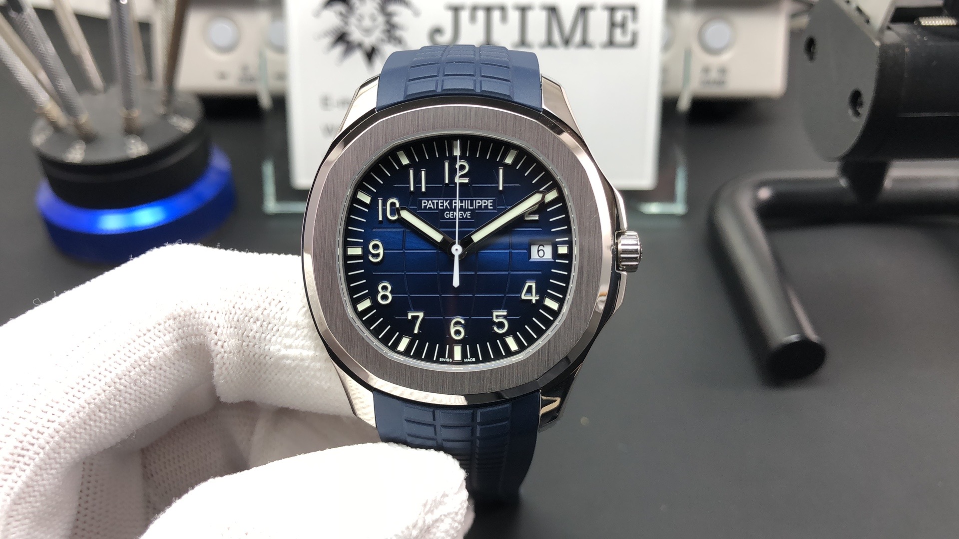
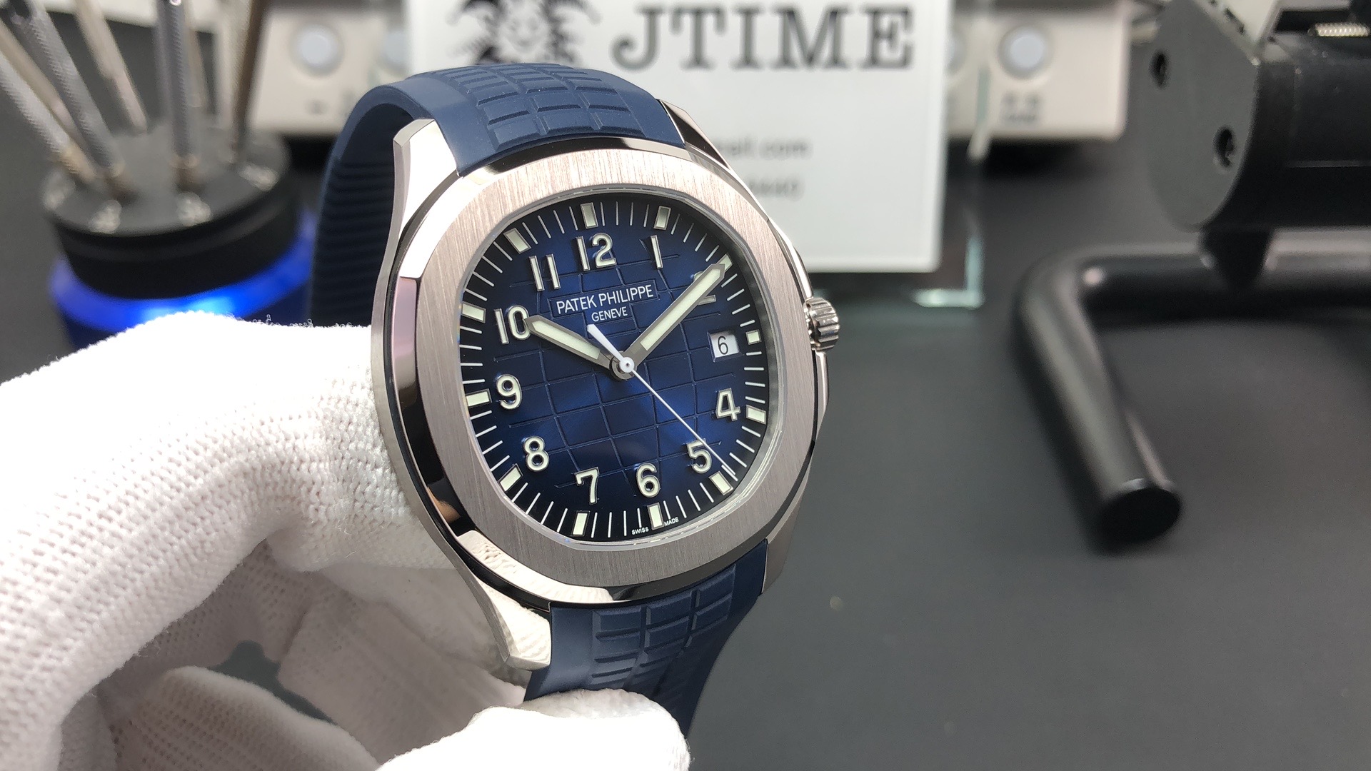
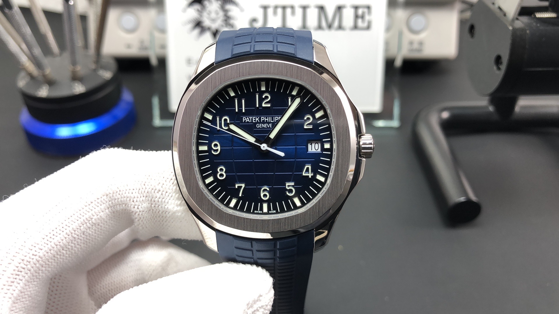
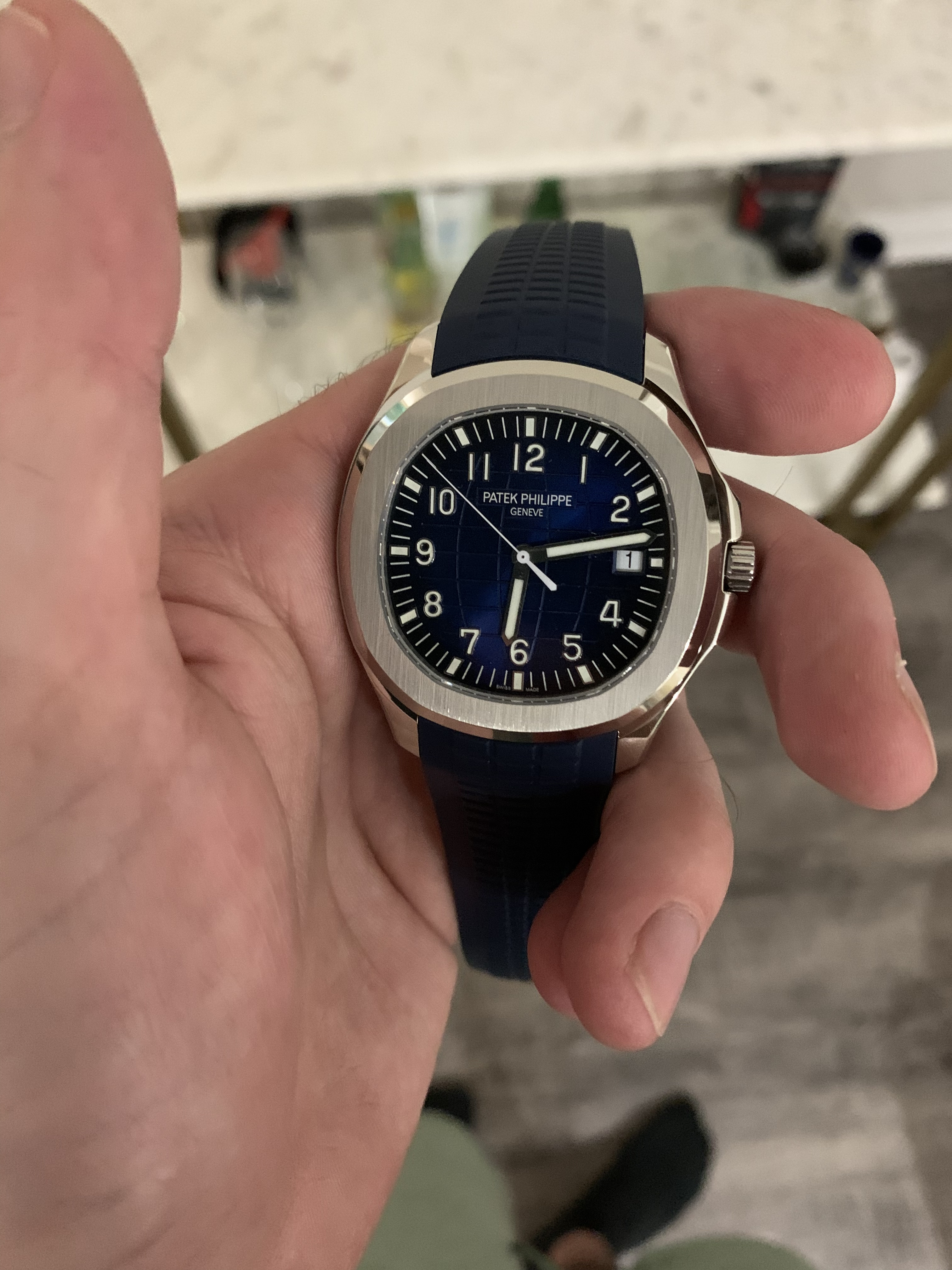
The green is better than I had hoped. Not the dull creamy khaki of the gen but close.
That green looks great. Might have to pull the trigger on that one as well....
Nice, the real life pics posted has convinced me as well. I am ordering now LOL. Wear yourself in good health, posy some pics
") will post a few more tomorrow once I get the strap cut down
will post a few more tomorrow once I get the strap cut down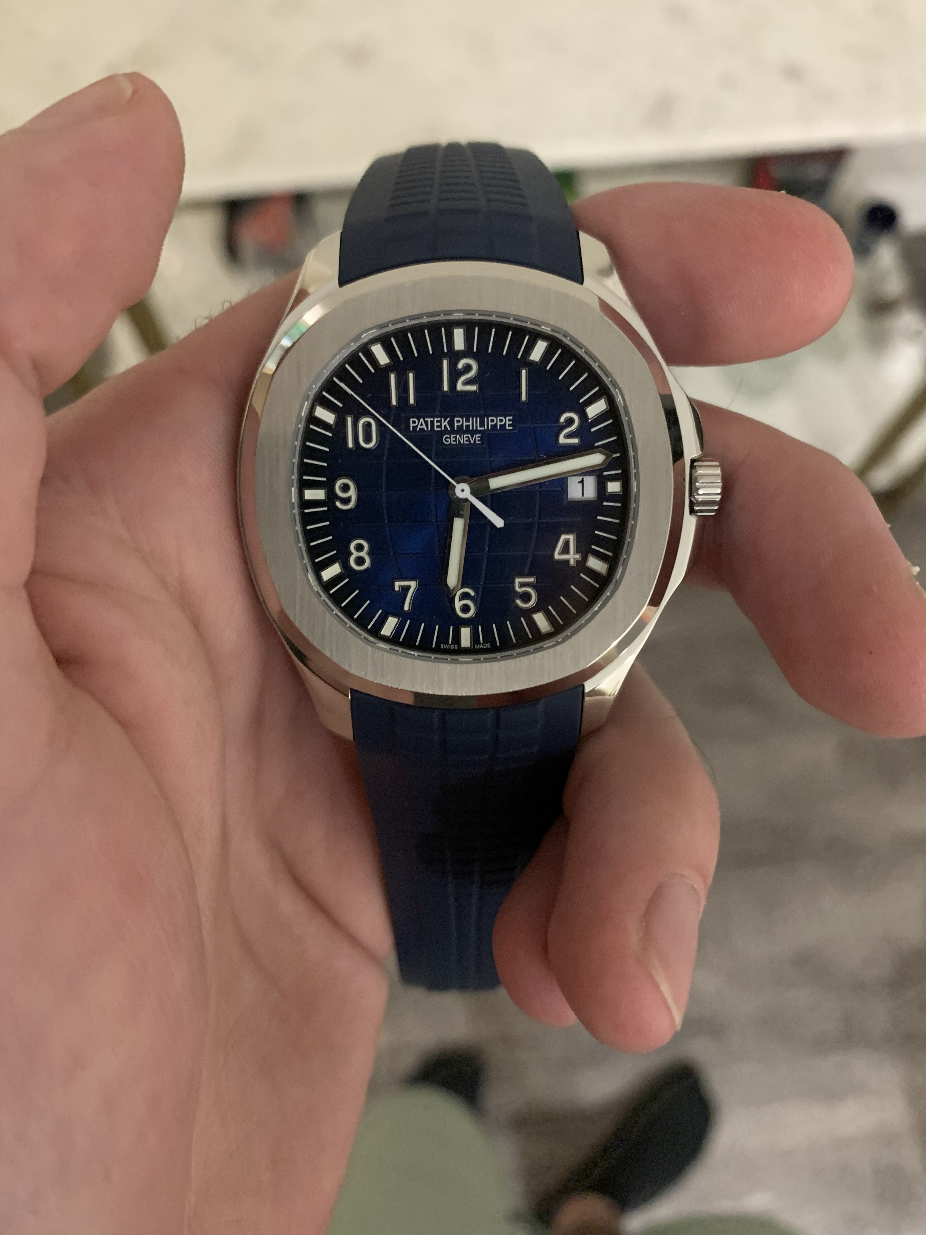
The green is better than I had hoped. Not the dull creamy khaki of the gen but close.
Very nice bro! The green dial does look good. I think if we can a solid khaki strap substitute it would really pop
The green is better than I had hoped. Not the dull creamy khaki of the gen but close.
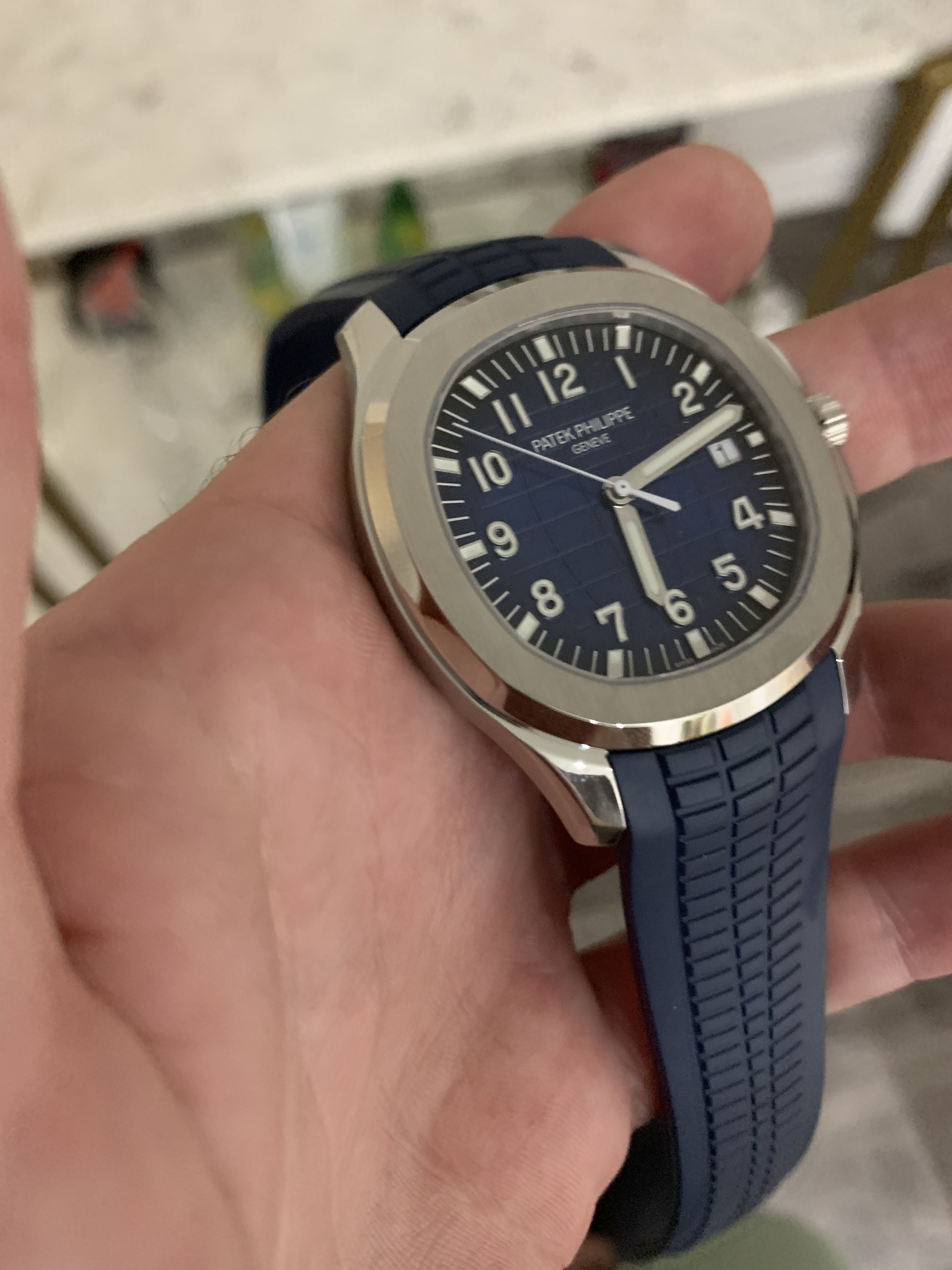
Can’t wait to get my hands on that new 5712 as well. I would definitely say the 3K strap is on par with the ZF one. It has those subtle curves and feels more quality. Much better than the first 5167 strap.
Thanks mate
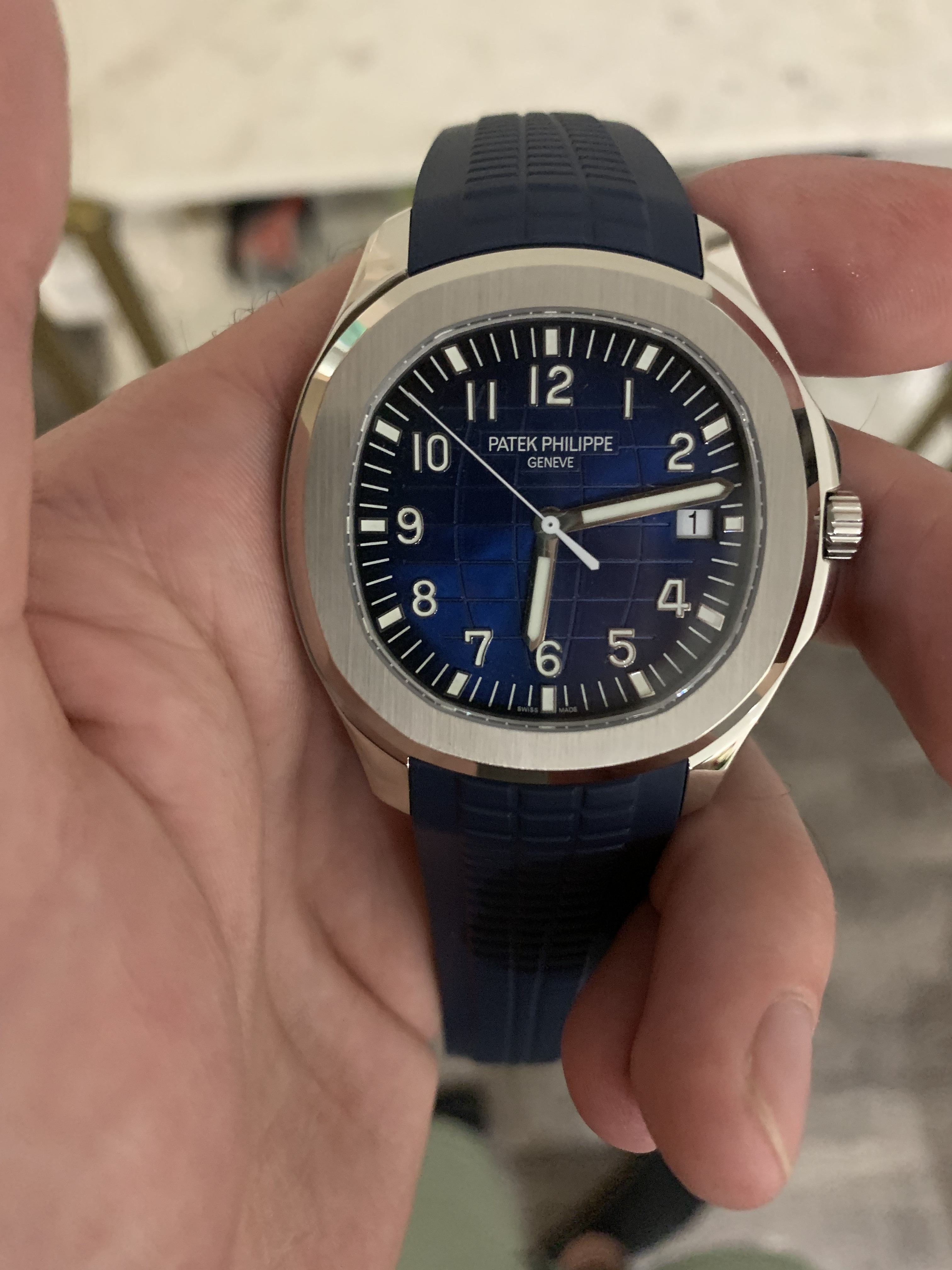
While I am very impressed by the color of strap/dial from real life pics, that obnoxious DW is killing me. Can't wait for keylog or legend project to finish sooner
What's wrong with the date wheel? I mean, to me it looks pretty good. Not perfection to PP standard, but the date windows are so small anyway. Seems good enough to me.
The font is thin, needs to be a bit more bolder.
Yeah fair enough, but doesn't seem like a deal-breaker. Anyway as you say, maybe a new date wheel mod comes out and it'll look even better. But I think I could live with that very easily.
If you don't compare to gen, this DW is decent (in fact better than their 5167 release). But given the "nit picky" LOL people we all are in this forum, it is hard to unsee the font after seeing gen pics. Anyways, I feel this release is better than their 5167 (DW, they have fixed the lume mismatch between hands and markers and the rubber quality seems improved)