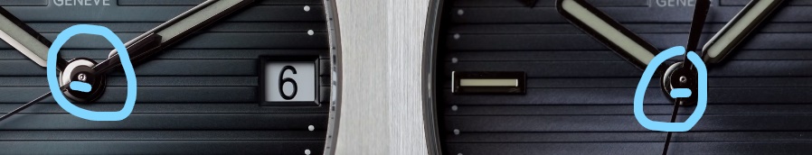
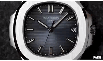
• Tired of adverts on RWI? - Subscribe by clicking HERE and PMing Trailboss for instructions and they will magically go away!

Nautilus Gen vs. Rep Video

Tobel

Put Some Respect On My Name
6/7/17
5,425
3,618
113
Thanks for sharing, interesting comparison indeed. That's a PPF. Curious which version though. If I recall the v1 had a purple shaded dial, which the one on the video seems to have
 
  • Like
Reactions: jm_brc_7057

sfbatman787

Renowned Member
Certified
17/4/17
751
593
93
Extremely good video, esp with those macros. Gotta say, the rep dial, though a different color all together, the markers and the printing is very impressive. One of the cleanest rep dials I have ever seen.

Sent from my SM-G973U using Tapatalk
 

Rainbowkin

Renowned Member
15/4/20
951
281
63
Geneve, China
The cannon pinion tip is also a minor tell on the rep Miyota movement.
XEStF.jpg
 
Last edited:

Rainbowkin

Renowned Member
15/4/20
951
281
63
Geneve, China
Gen's left crown guard's taper seems to be steeper than PPF's, but the right crown guards of the two look almost identical.
 

Fat Dave

Active Member
1/6/13
288
172
43
Australia
Bezel is definitely fatter than gen

This to me is the most frustrating aspect of this rep. The flat portion of the bezel is far too wide, and you see much less of the beautiful polished angled portion. It just looks... wrong, unfortunately. It makes it look heavy and bloated. For me, that sticks in my craw far more than the protruding crown, and I am NOT a fan of that either.

The other slight differences in case shape around the crown guard and on the opposite side of the porthole are more subtle, and I think less annoying, at least for me.

OverTheTop - great comparison gif! Looks like it's giving birth to that oversized crown... But that bezel just LEAPS out.
 

roadtofreedom

Renowned Member
26/12/18
550
267
0
This to me is the most frustrating aspect of this rep. The flat portion of the bezel is far too wide, and you see much less of the beautiful polished angled portion. It just looks... wrong, unfortunately. It makes it look heavy and bloated. For me, that sticks in my craw far more than the protruding crown, and I am NOT a fan of that either.

The other slight differences in case shape around the crown guard and on the opposite side of the porthole are more subtle, and I think less annoying, at least for me.

OverTheTop - great comparison gif! Looks like it's giving birth to that oversized crown... But that bezel just LEAPS out.

Just with a larger hour hand and a thinner bezel would be one of the best reps of the year.
 

Tobel

Put Some Respect On My Name
6/7/17
5,425
3,618
113
Just with a larger hour hand and a thinner bezel would be one of the best reps of the year.

Not sure about the larger hour hand, are you basing your comment on the animated gif on the previous page or on other pics ? Because in the animated gif lighting plays a big part, with the hour hand being either in the light or in the dark and when in the dark it looks smaller. If you look at the hour markers you get the same illusion
 
  • Like
Reactions: OverTheTop

roadtofreedom

Renowned Member
26/12/18
550
267
0
Not sure about the larger hour hand, are you basing your comment on the animated gif on the previous page or on other pics ? Because in the animated gif lighting plays a big part, with the hour hand being either in the light or in the dark and when in the dark it looks smaller. If you look at the hour markers you get the same illusion

Based on animated gif.

Taking into consideration the light impact, the hour hand seems a little bit longer.
 

OverTheTop

Known Member
12/11/14
117
74
28
This to me is the most frustrating aspect of this rep. The flat portion of the bezel is far too wide, and you see much less of the beautiful polished angled portion. It just looks... wrong, unfortunately. It makes it look heavy and bloated. For me, that sticks in my craw far more than the protruding crown, and I am NOT a fan of that either.

The other slight differences in case shape around the crown guard and on the opposite side of the porthole are more subtle, and I think less annoying, at least for me.

OverTheTop - great comparison gif! Looks like it's giving birth to that oversized crown... But that bezel just LEAPS out.

Thanks man!
 

sfbatman787

Renowned Member
Certified
17/4/17
751
593
93
This to me is the most frustrating aspect of this rep. The flat portion of the bezel is far too wide, and you see much less of the beautiful polished angled portion. It just looks... wrong, unfortunately. It makes it look heavy and bloated. For me, that sticks in my craw far more than the protruding crown, and I am NOT a fan of that either.

The other slight differences in case shape around the crown guard and on the opposite side of the porthole are more subtle, and I think less annoying, at least for me.

OverTheTop - great comparison gif! Looks like it's giving birth to that oversized crown... But that bezel just LEAPS out.

Likewise. the curve of the bezel gives a nice lustering look to the face/front of the watch. But this video definitely shows how the rep bezel's brushing is much rougher than the gen, which also attributes to the overall smoothness of the watch.