Happy Thanksgiving RWI!
Today I wanted to share something very exciting with all of you.. I have been incredibly lucky to have had the opportunity to purchase a genuine Aquanaut dial - of which is something I'm very thankful for.
A big shout out to Spongebob for the incredible work putting it all together - and all photo credit goes to him!
Another shout out to majwilliams0308 for being an enabler first and foremost, but also for his awesome Aquanaut Showdown post which inspired me to put together this review. His photography is bar none and I'll be following up on this post with some macros pictures that should be incoming shortly!
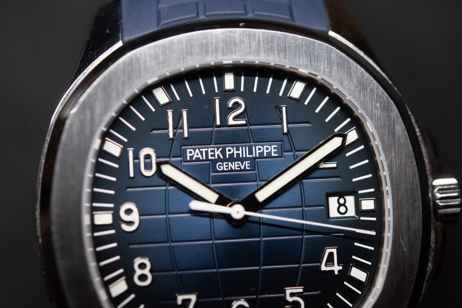
Now for some background... The Patek Philippe Aquanaut 5167A is probably my favorite watch on rotation. I've spent a stupid amount of time obsessing between ZF & KMF dials and their details. There has always been debate in the threads here on which factory offers the most accurate Aquanaut dial.
While I don't think I'll be able to answer that conclusively here, I would instead like to present all the details as clearly as I can with a direct comparison to gen - so that you all may form your own opinions!
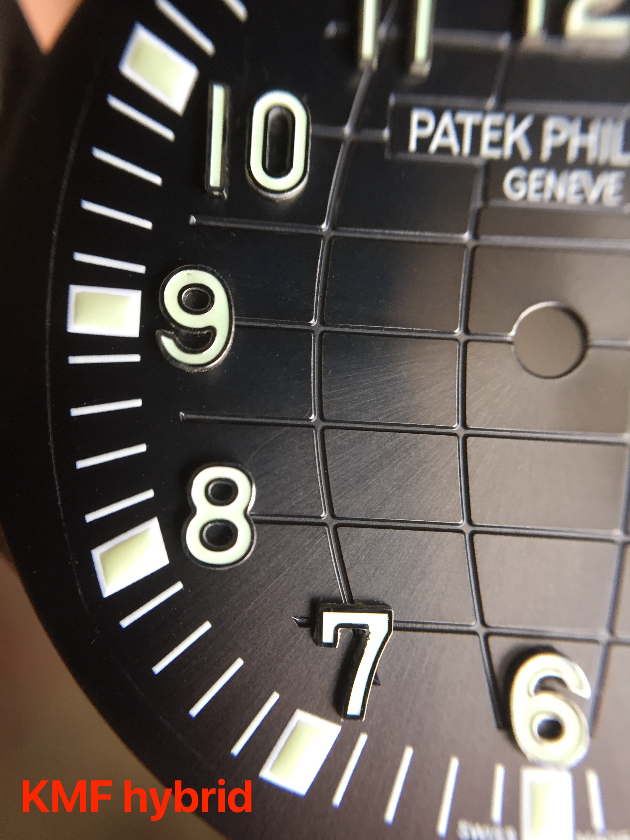
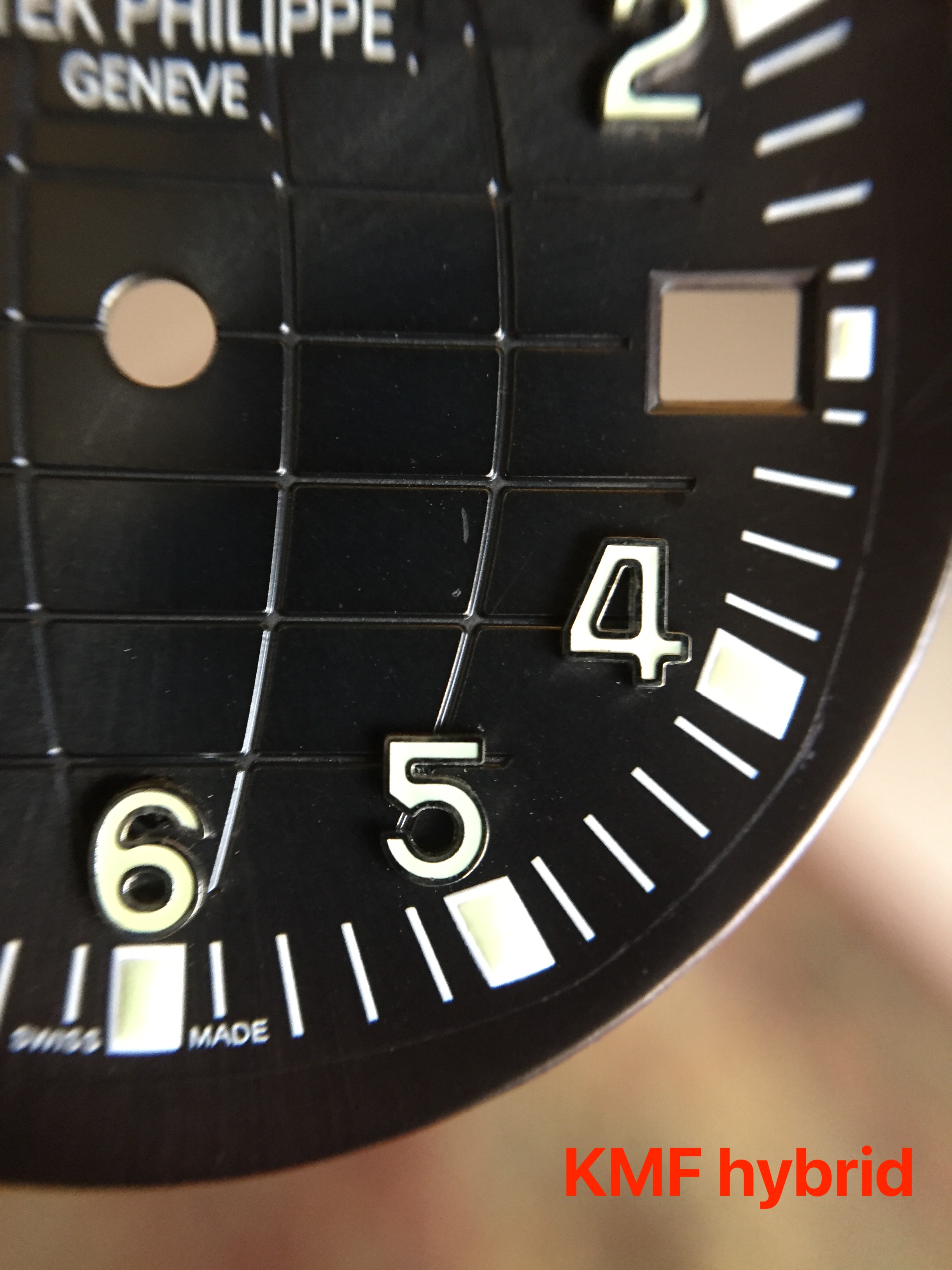
One small caveat before we begin: the KMF dial was taken from my earlier build, before installing the gen dial. I had modified the KMF dial by replacing the markers with ZF markers. For this reason the dial is not a perfect representation for KMF, however I feel there is no debate that the KMF dial markers are trash anyway, so theres really no new insight to gain in that regard..
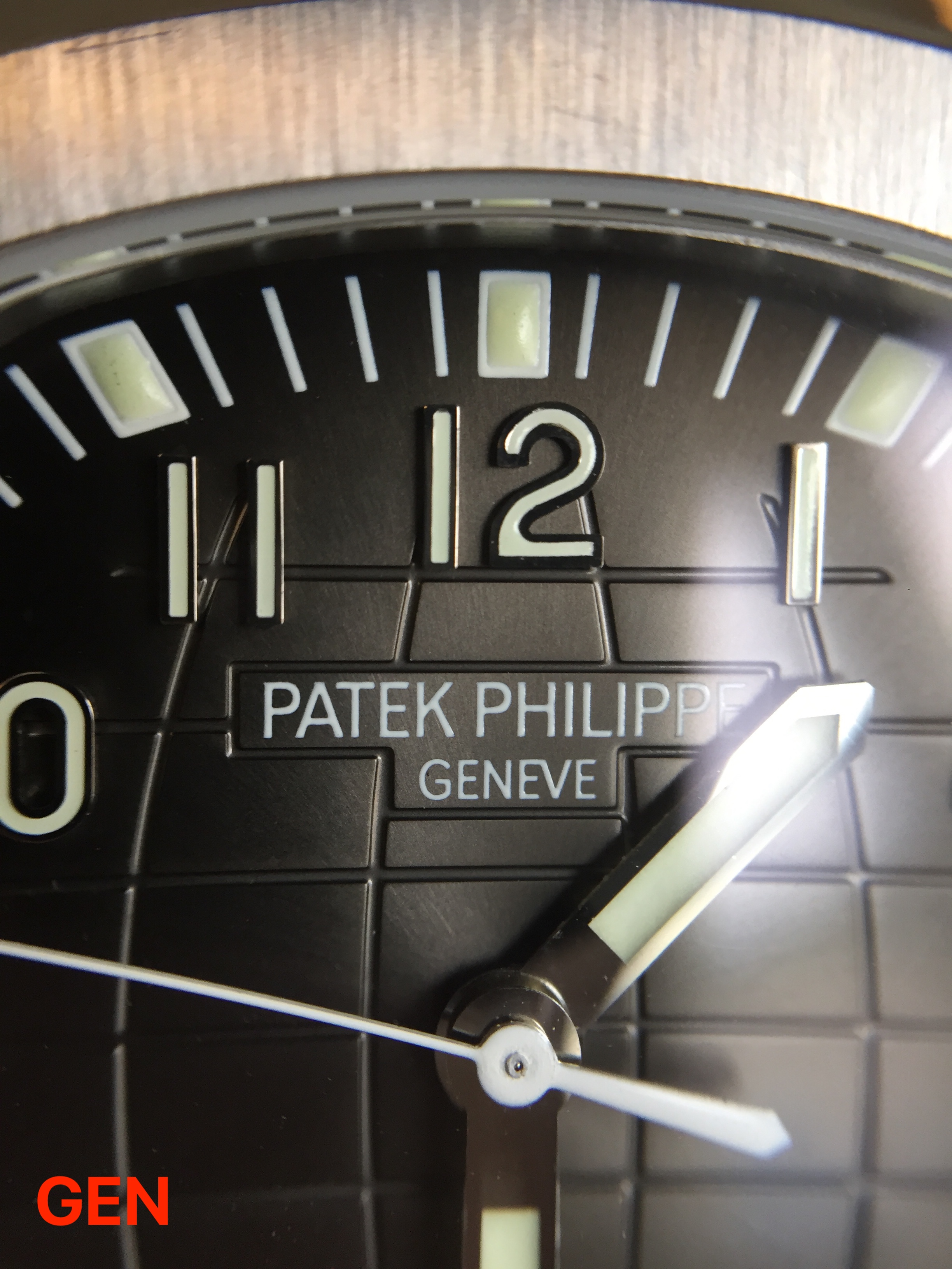
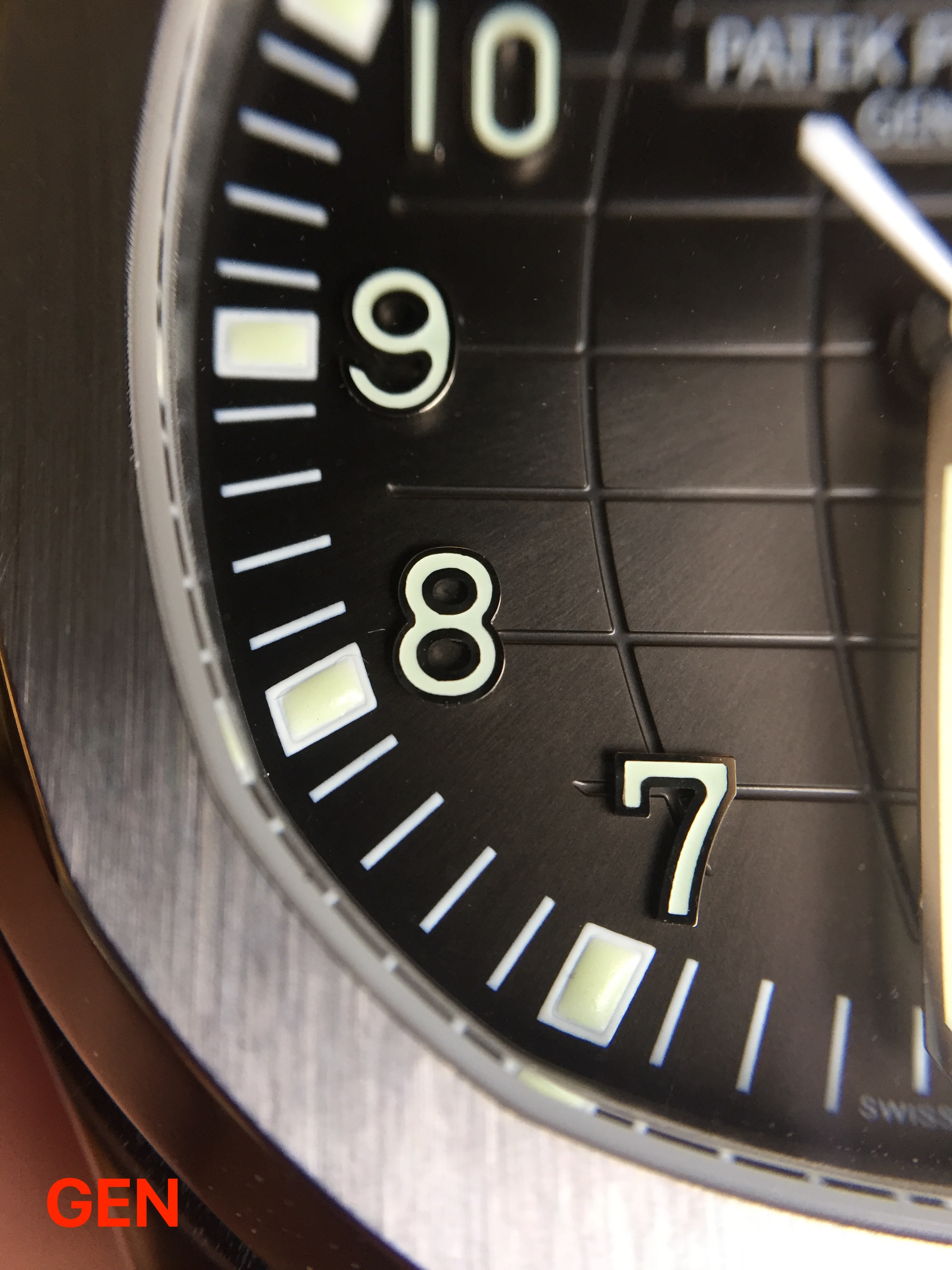
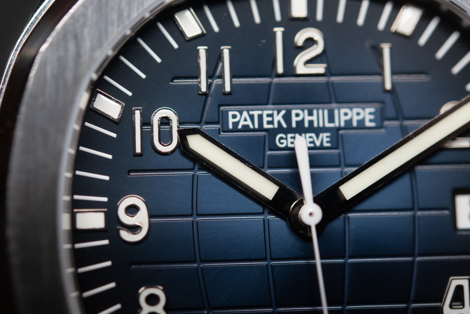
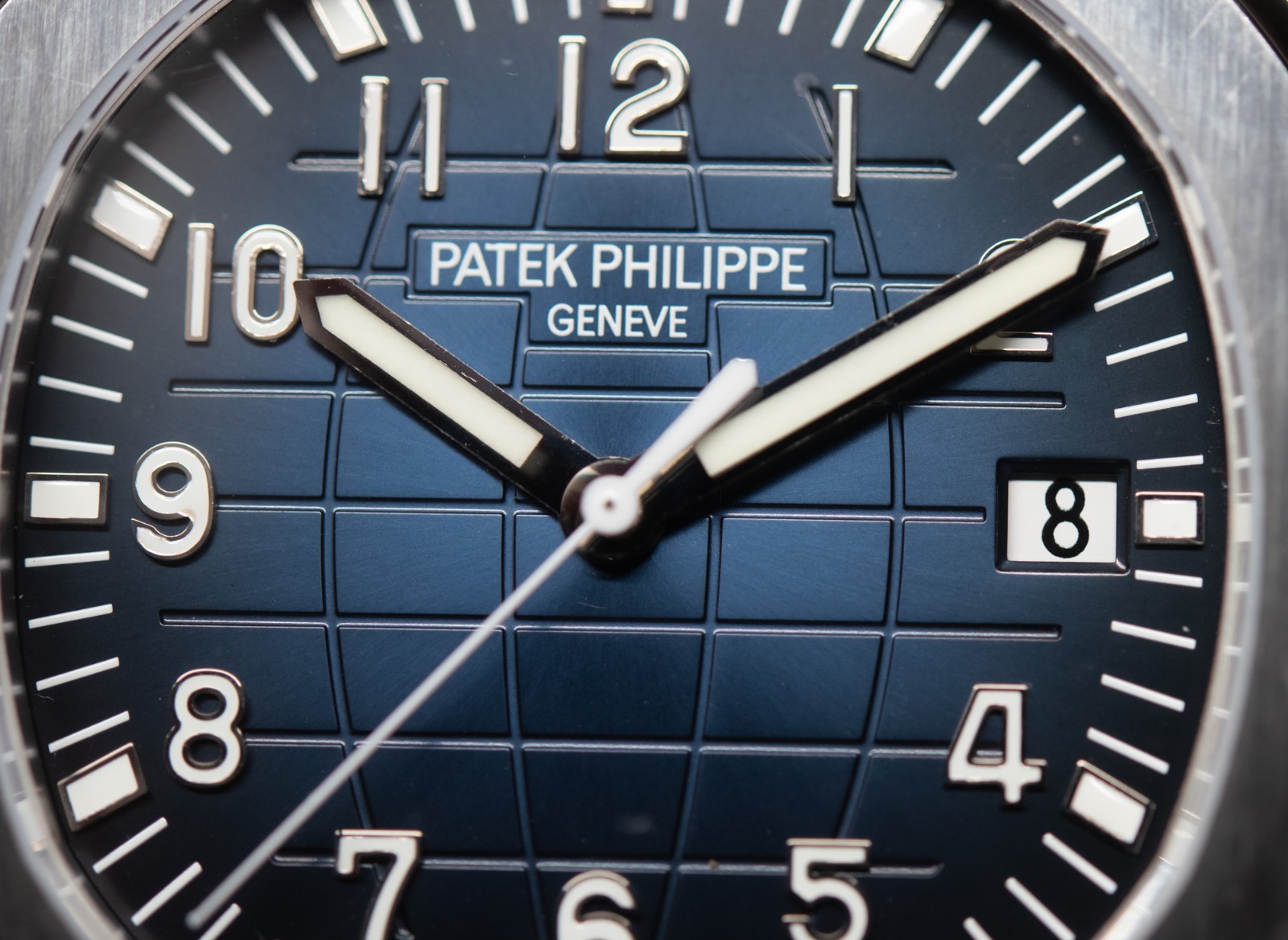
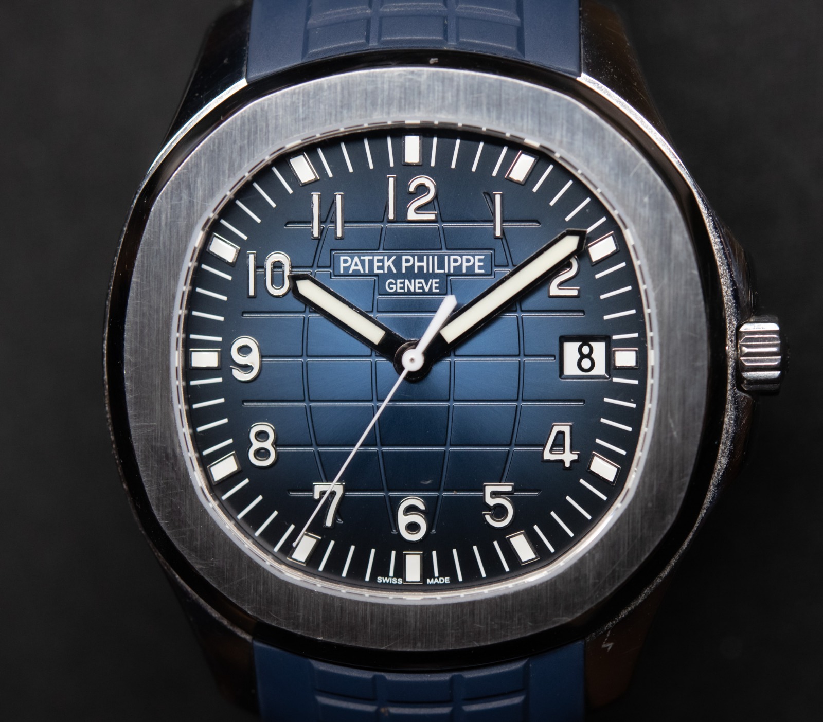
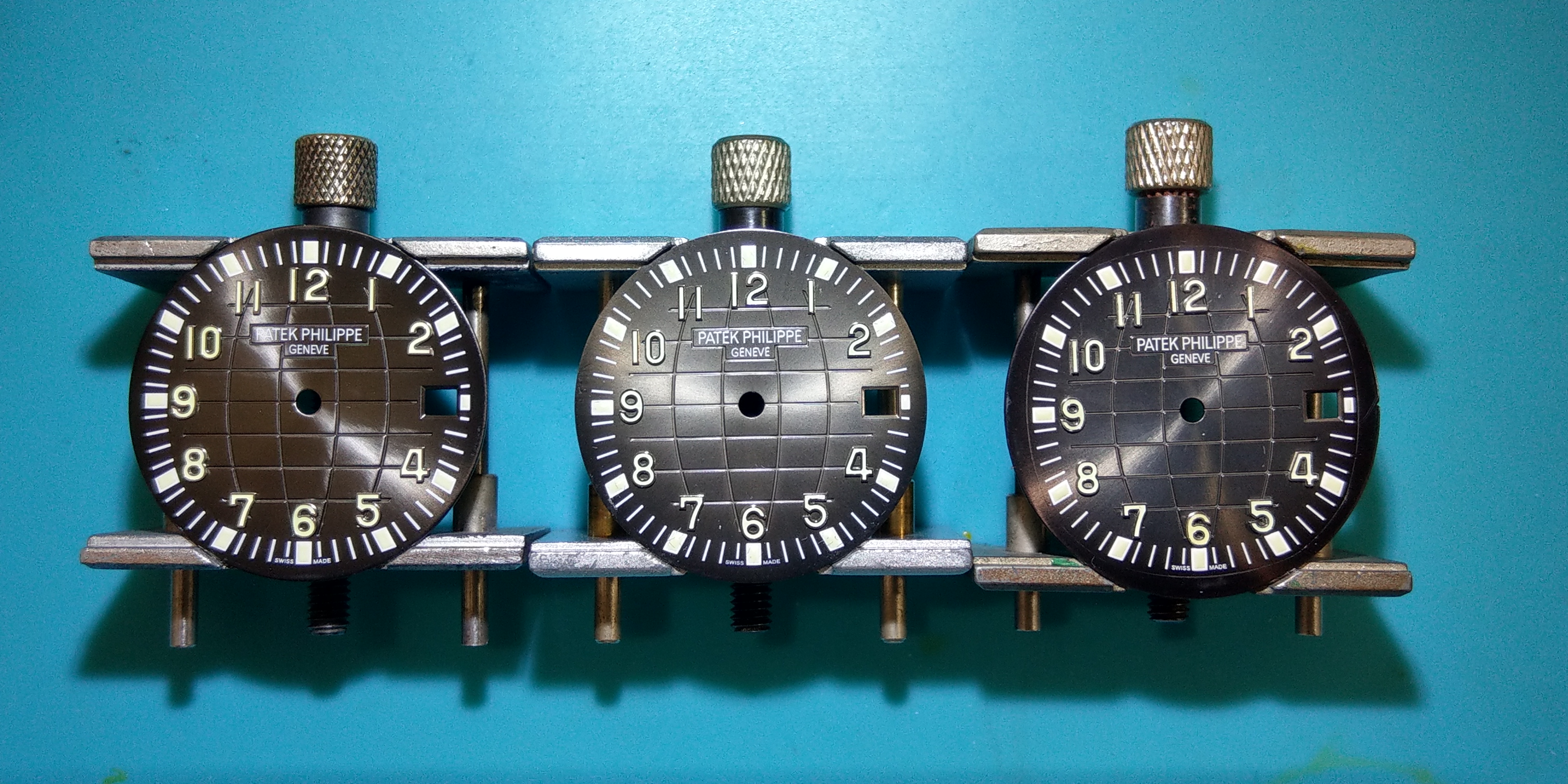
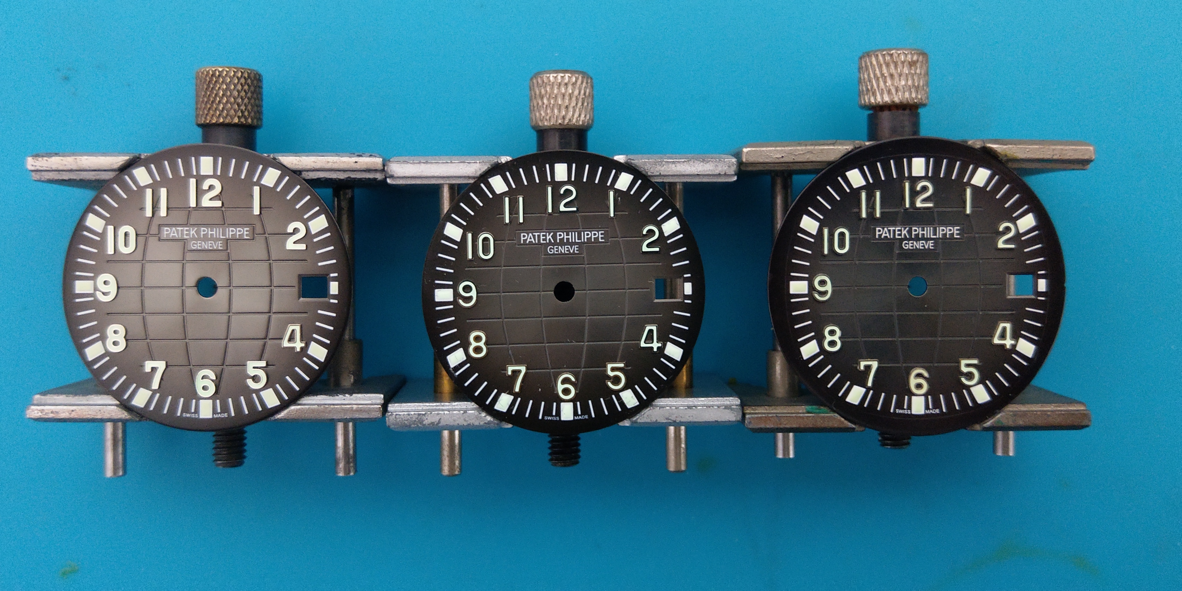
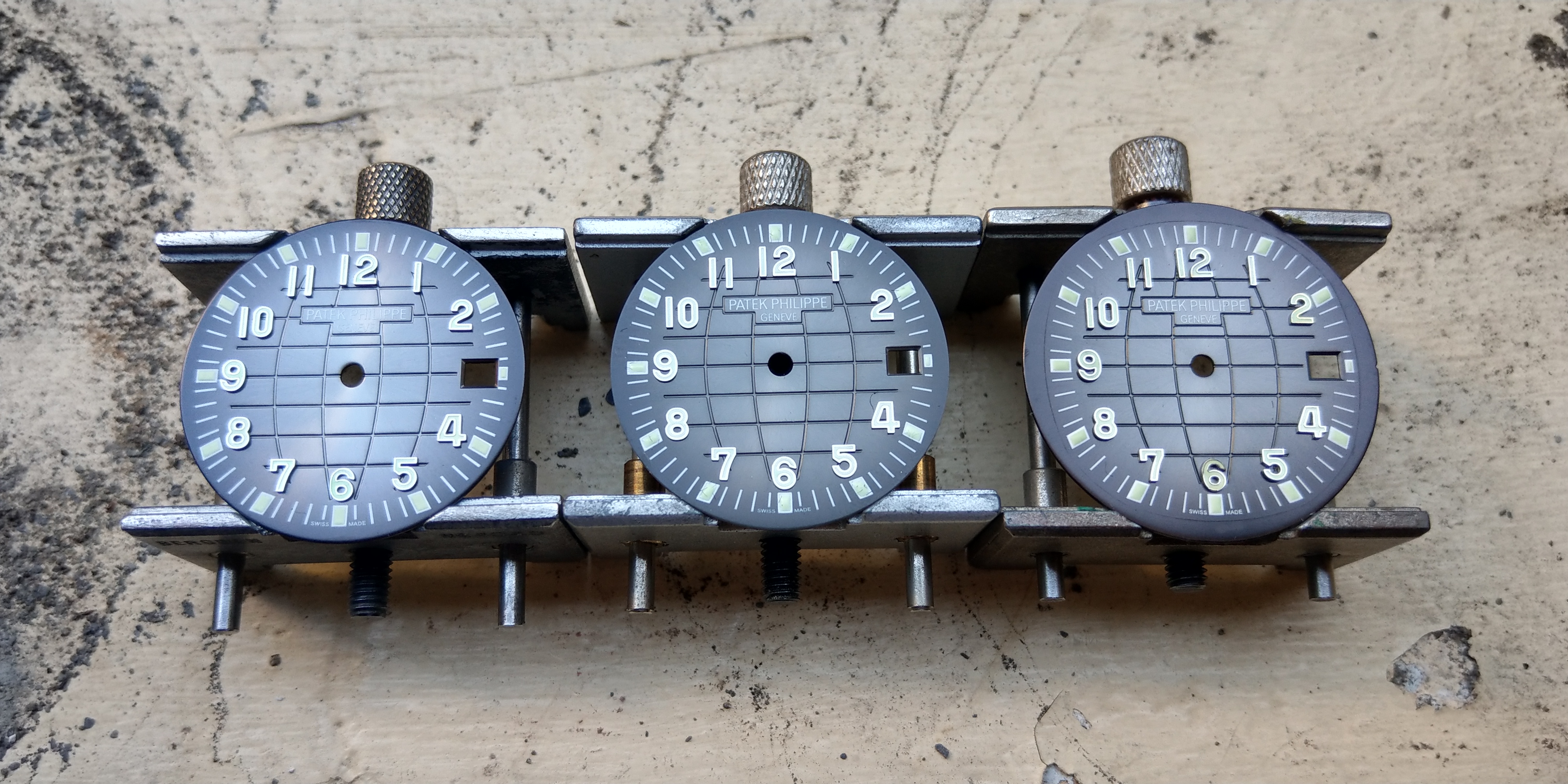
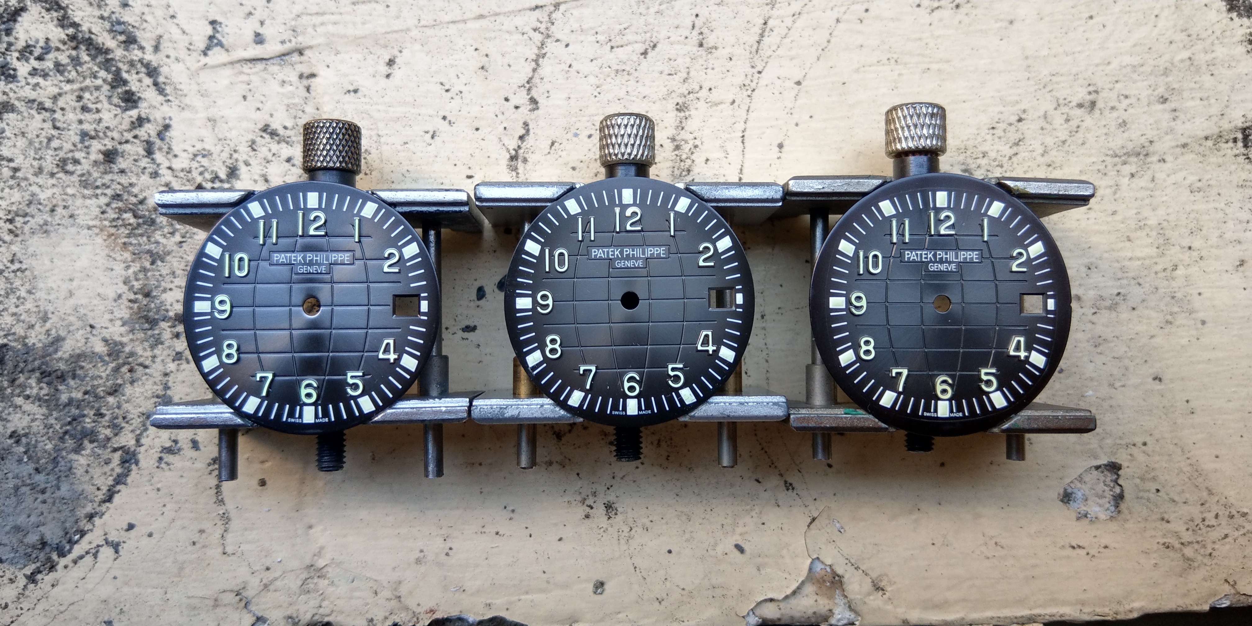
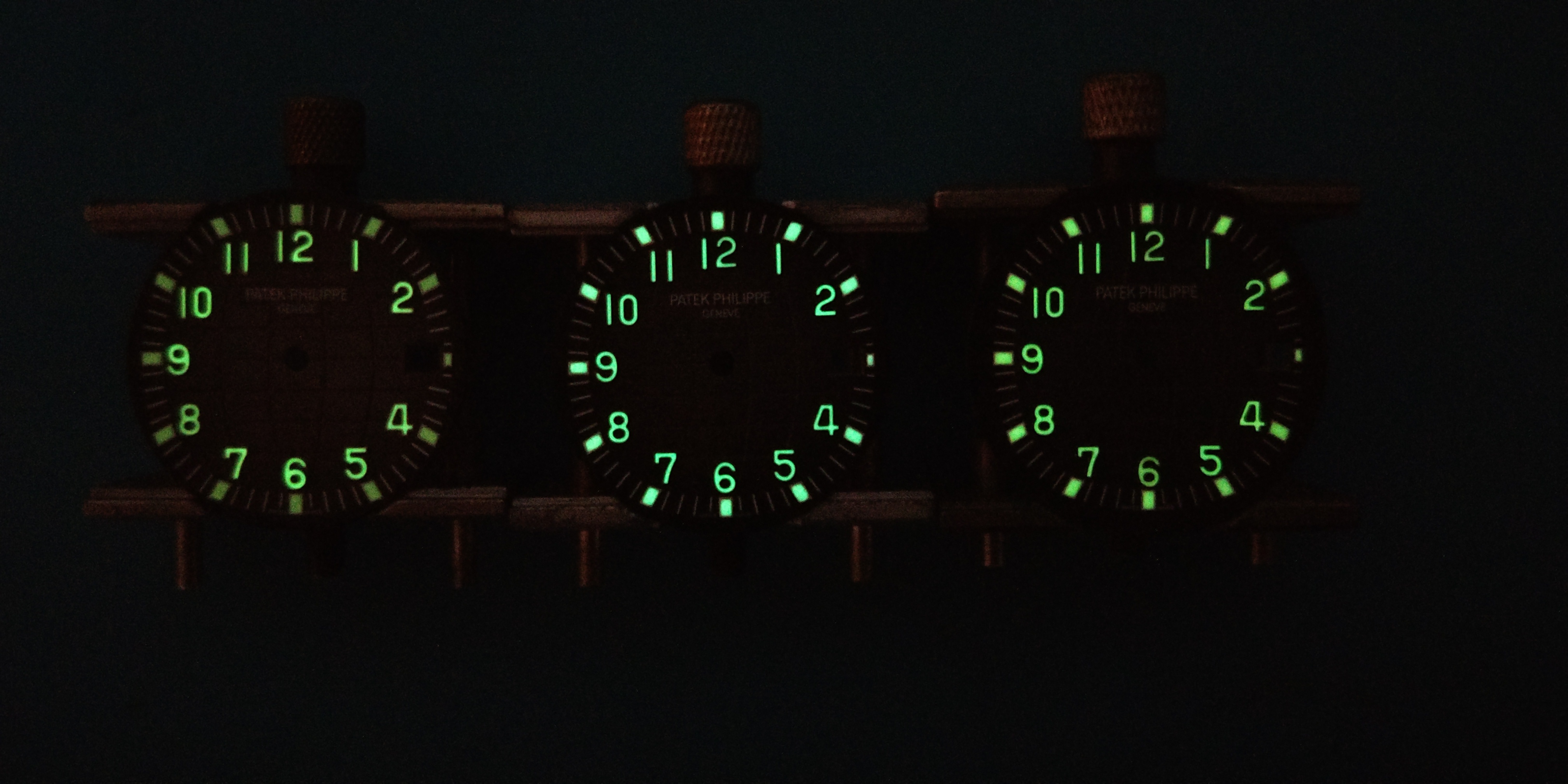
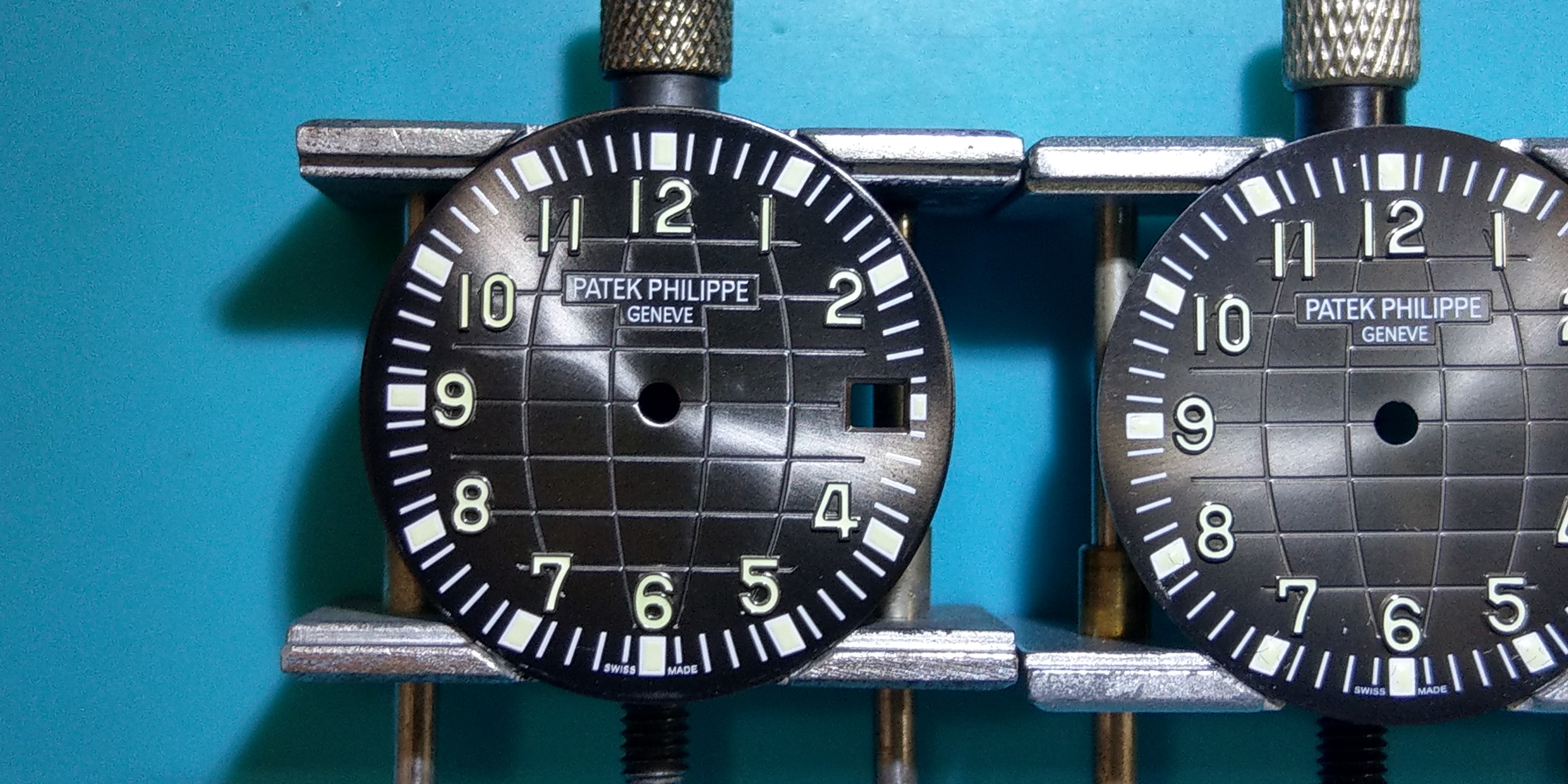
I do not believe there has been a side by side comparison from either factory with a genuine dial until now, so without further delay here are some pics of all three dials together.. (From left to right: ZF , Gen , KMF)
Indoor Lighting
Outdoor Lighting
Lume Shot
Video
https://youtu.be/Q8JRNHJTUlo
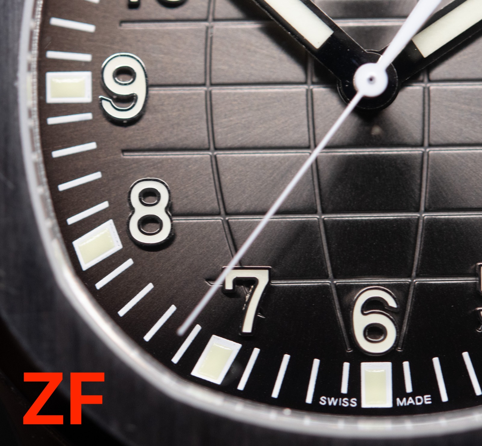
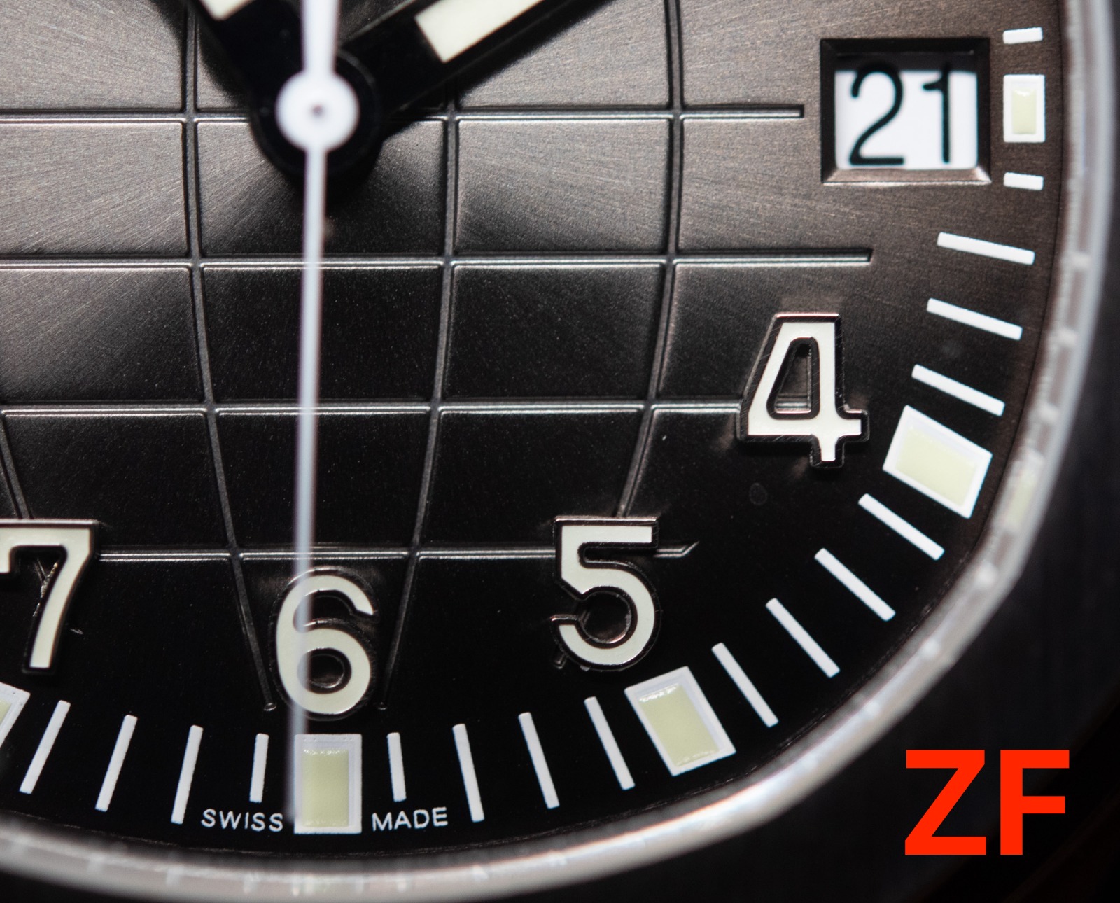
ZF Review
(ZF on the left / Gen on the right)
The Good:
Print quality - Well printed Patek box logo. The font is correct and the print quality looks sharp and clean.
Dial color - ZF did a great job paying attention to the copper hues of the genuine dial, however may have over-executed on this as it almost looks a bit too brown-ish in some lighting conditions.
Dial markers - ZF absolutely nailed it with their Arabic markers. Looking closely at the details of gen, it appears the lume application from ZF might be more precise!
The Bad:
Surface texture - I feel like this is a big one, but its also difficult to get correct because the gen is not quite 100% matte finish. Has a bit of a shine to it. The ZF dial is very matted on the surface.
Lume - The application on the arabic numerals is fantastic, however the small lume "dots" on the outer portion of the dial is poorly finished. It is not as good as KMF. While the color looks okay, the glow is not nearly as bright, it is lacking a bit of the glossy surface texture, and lastly the dots appear a bit too flat.
Sunburst - This is another issue I found with ZF, the sunburst effect is a bit too harsh and it looks very obvious in certain light. The gen has a much softer 'metallic' texture rather than an outright sunburst texture.
The Ugly:
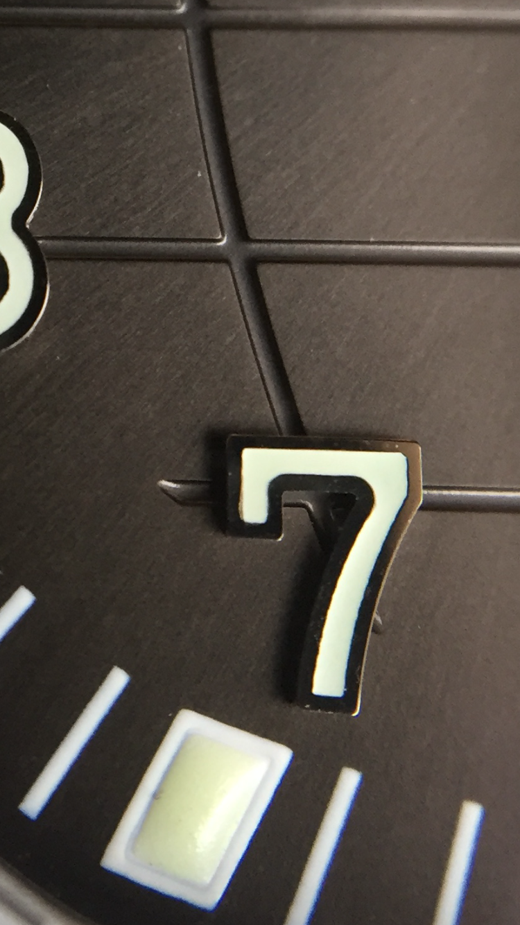
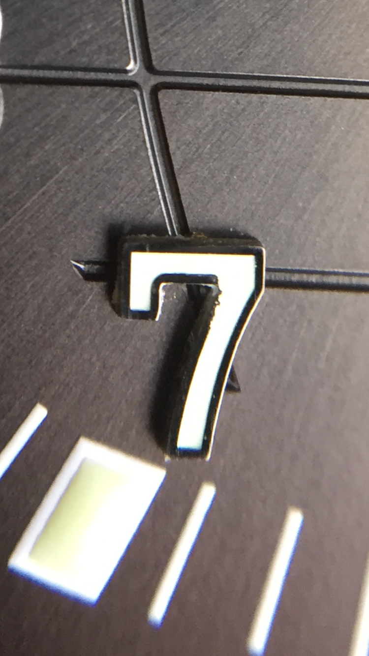
Geosphere pattern - This is a big issue with the ZF dial. The geosphere line underneath "5" extends too far out which becomes an instant tell. Although this is very subtle, and mostly forgivable, the other issue I have found with the ZF dial is the width and depth of the geosphere grooves. The genuine dial has a very delicate pattern, which isn't captured correctly in the ZF dial.
Final comments & takeaways:
Everything on this dial has been well executed overall. There is nothing egregious about the existing flaws as they are mostly quite subtle. I still recommend anyone who is looking for an excellent Aquanaut out of the box without the need for any mods - go with the ZF dial. The two characteristics it gets right are the coloring of the dial, and the arabic dial markers - both of which give it a very authentic appearance at wrist distance.
KMF Review
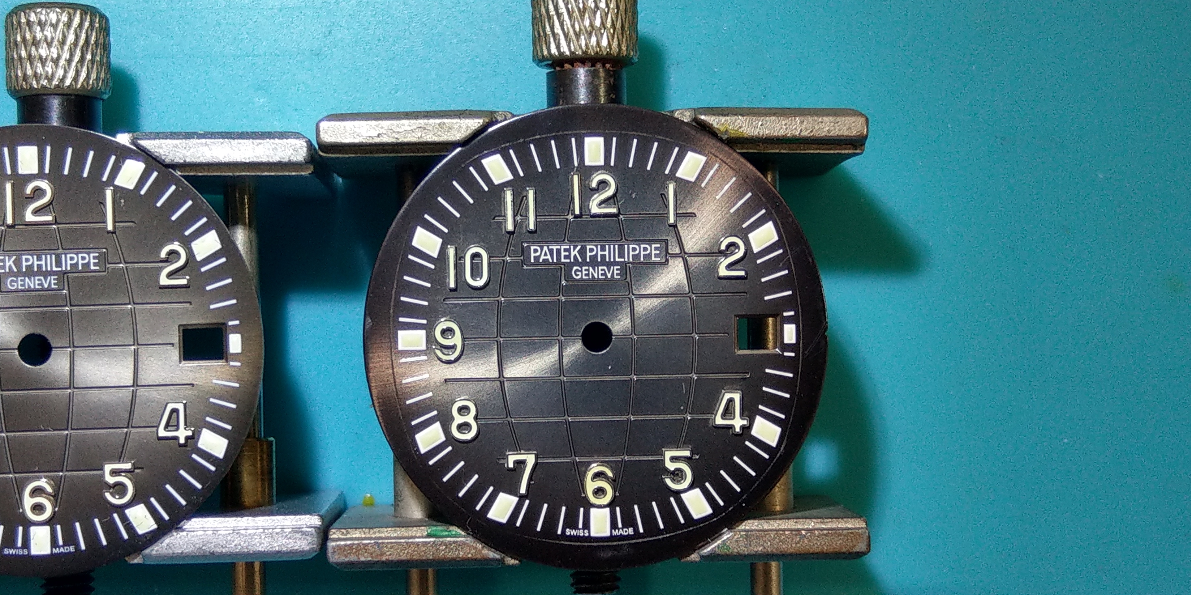
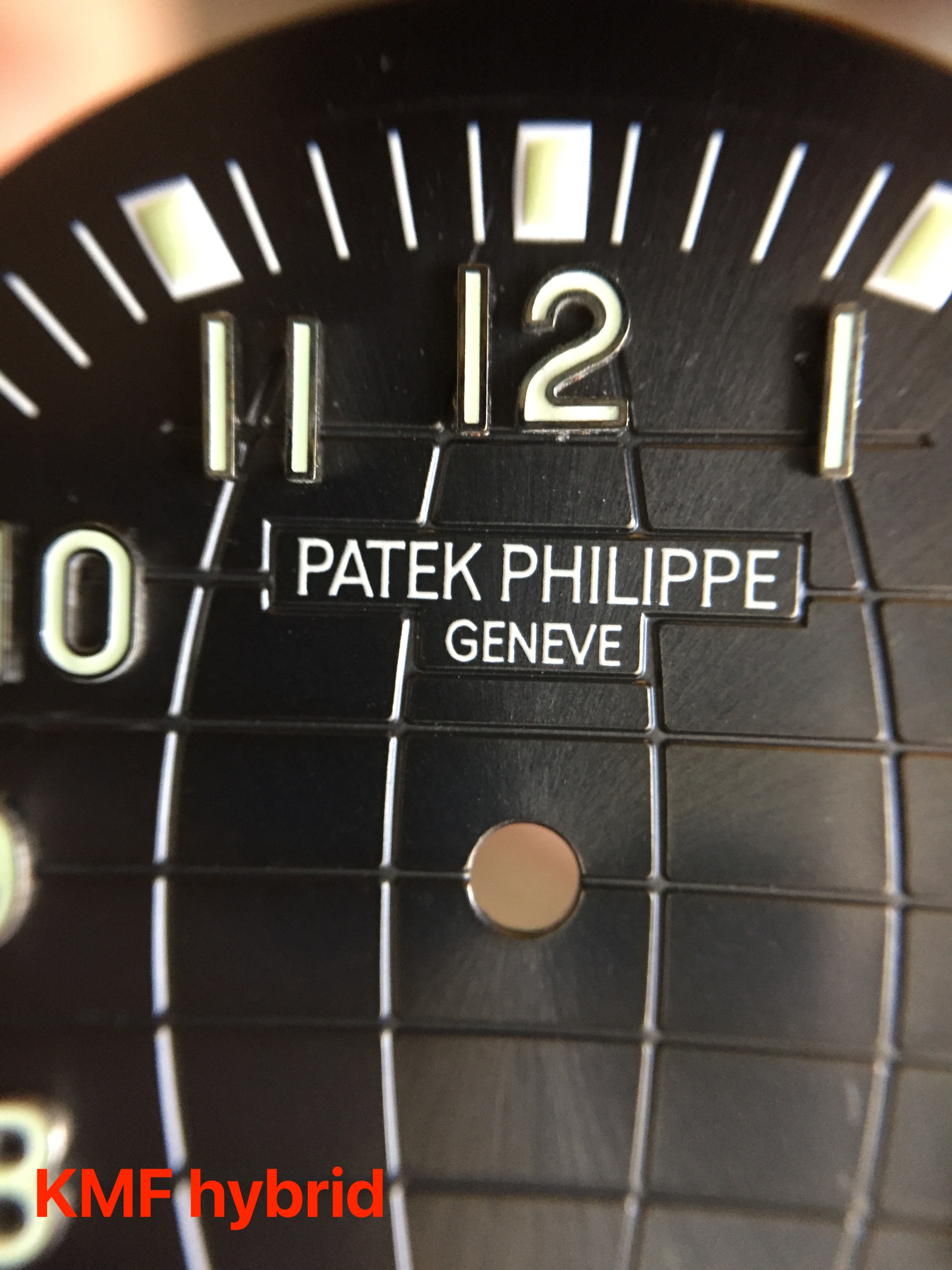
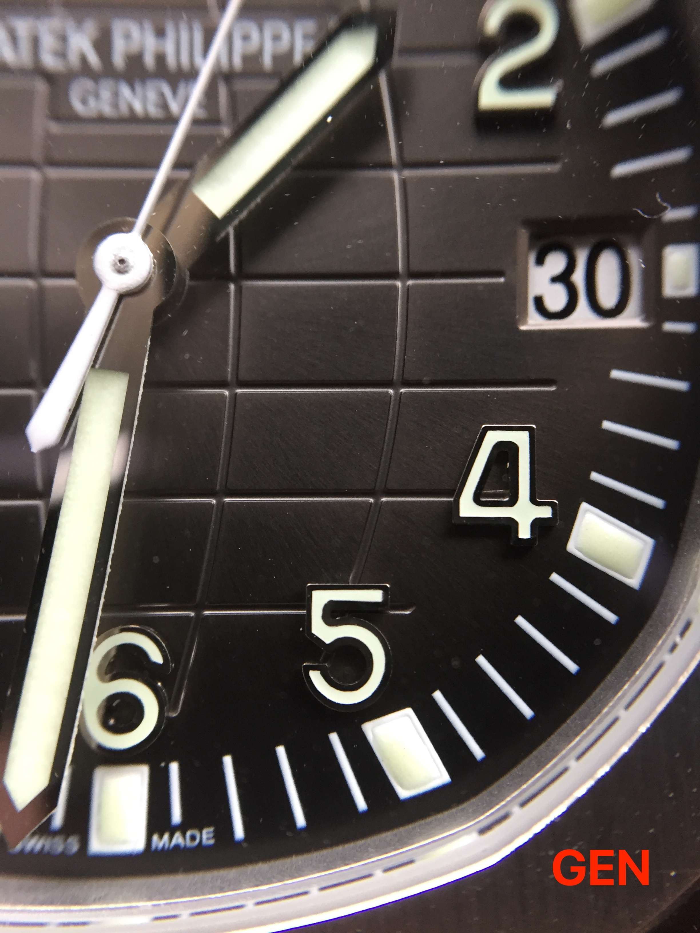
(Gen on the left / KMF on the right)
The Good:
Print quality - Well printed Patek box logo. Similarly to ZF the KMF printing looks really great. The print is very clean and sharp, with a nice font.
Dial color - I must say that the lack of any brown hues in the dial color was a misstep from KMF. However the detailing is quite subtle and for the most part they did a great job getting the grey tones correct on this dial. At certain angles the dial goes from its normal greyish hue to a dark deep charcoal, almost black.
Lume - The lume application on the KMF arabic numerals is atrocious.. But I'll elaborate on that later. Regarding the lume itself, the dots on the outer marker have the correct glossy "bubble" texture and glow beautifully. The detailing on this is great, so I'm leaving this in the "Good" category.
Geosphere pattern - While KMF did not manage a perfected geosphere pattern, they are still much better than ZF in my opinion. The grooves of the geosphere are a bit more refined and not as deeply cut as on ZF. There is also no "line flaw" sticking out under the 5:00 marker.
EDIT 01/12/2019:
Surface Texture - Upon closer inspection today while observing the gen dial in different lighting, I realized that the surface of the dial has a very very thin coating of a glossy finishing on top of the dial. I think this is why the KMF dial color responds to light at different angles very similarly to gen - they both have a lightly glossed surface. I had not noticed this earlier on gen. Keeping my original comment below under "Bad" but I feel I have to give credit to KMF here that they attempted to replicate this detail which is honestly incredibly subtle..
The Bad:
Surface texture -This is honestly quite subtle with the KMF dial surface, but if you look closely they have treated the top of the dial with an almost "glossy" lacquer. At certain angles, and under certain lighting, this becomes more obvious. For the most part it is quite difficult to notice, but still, not quite correct - since gen is somewhere in-between matte and glossy. Overall however, I think this lacquer has worked in favor of the dial color as I believe it is part of the reason the color seems to change from grey to charcoal in certain lighting.
Sunburst - Similarly to ZF, the sunburst effect on the KMF dial is too bright. Neither dial has managed to correctly execute this, but I have to say that comparing ZF & KMF side by side, the sunburst effect is a bit softer on KMF. In softer light such as an overcast outdoor setting, the KMF dial will show almost no sunburst at all.
The Ugly:
Dial markers - Don't even get me started. I don't know how KMF isn't totally ashamed to have released such atrocious dial markers on what could be considered a beautifully executed dial otherwise. I have not even included pictures of it here but if anyone is unfamiliar with how it looks out of the box, here is the Puretime link: https://puretimewatch.io/aquanaut-51...324-clone.html (scroll to the 4th picture listed)
The lume is completely sunken into the markers, it looks malnourished and sickly. It appears nothing like gen.
Final comments & takeaways:
The dial is beautiful in almost every detail, except for the dial markers themselves, which is a HUGE part of the overall aesthetic of the dial.
They managed to execute a nice color dial with subtleties that mimic gen (such as the changing of color). As well as a really beautiful geosphere pattern.
However, the lume application in the dial markers themselves is really damn awful. It might be as offensive to everyone, but to me it is something of a deal breaker.. They're so bad that, in my opinion, it negates the rest of the details that KMF did correctly. Just my $0.02...
However each dial has its own flaws, and there are also details that each respective dial has executed much better than the other.
Therefore I leave it to you guys to assess the differences and decide which dial you prefer.
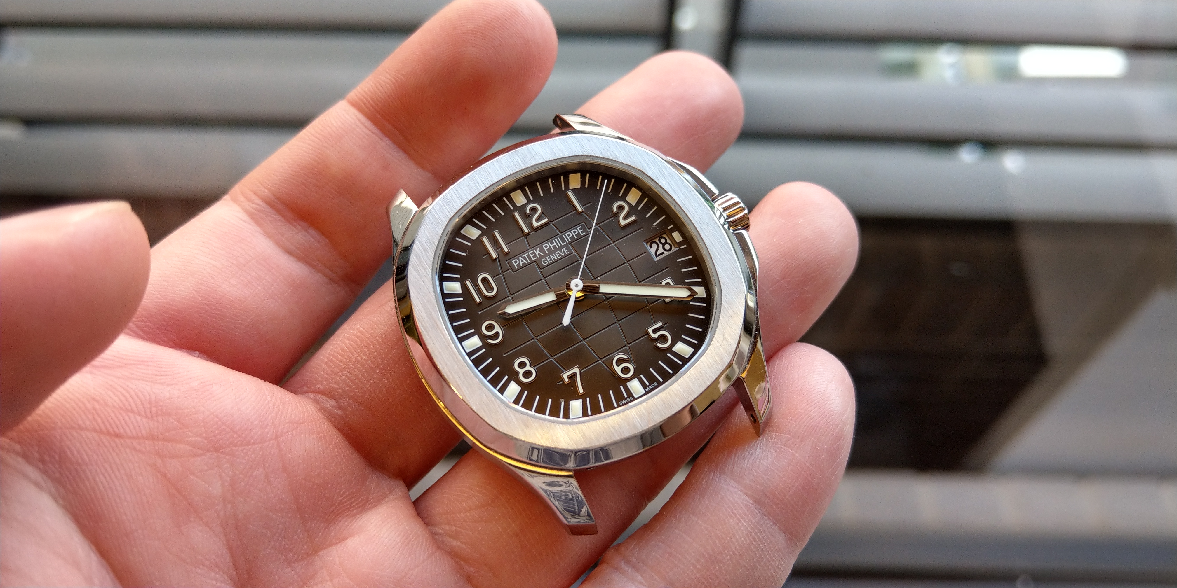
One last picture of the completed Franken!
Will follow up shortly with some additional macro pictures comparing the details in each dial.
I was just a bit too excited to wait, and wanted to share this mini Showdown with you guys first.
Thanks for reading!
Today I wanted to share something very exciting with all of you.. I have been incredibly lucky to have had the opportunity to purchase a genuine Aquanaut dial - of which is something I'm very thankful for.
A big shout out to Spongebob for the incredible work putting it all together - and all photo credit goes to him!
Another shout out to majwilliams0308 for being an enabler first and foremost, but also for his awesome Aquanaut Showdown post which inspired me to put together this review. His photography is bar none and I'll be following up on this post with some macros pictures that should be incoming shortly!
Now for some background... The Patek Philippe Aquanaut 5167A is probably my favorite watch on rotation. I've spent a stupid amount of time obsessing between ZF & KMF dials and their details. There has always been debate in the threads here on which factory offers the most accurate Aquanaut dial.
While I don't think I'll be able to answer that conclusively here, I would instead like to present all the details as clearly as I can with a direct comparison to gen - so that you all may form your own opinions!
One small caveat before we begin: the KMF dial was taken from my earlier build, before installing the gen dial. I had modified the KMF dial by replacing the markers with ZF markers. For this reason the dial is not a perfect representation for KMF, however I feel there is no debate that the KMF dial markers are trash anyway, so theres really no new insight to gain in that regard..
I do not believe there has been a side by side comparison from either factory with a genuine dial until now, so without further delay here are some pics of all three dials together.. (From left to right: ZF , Gen , KMF)
Indoor Lighting
Outdoor Lighting
Lume Shot
Video
https://youtu.be/Q8JRNHJTUlo
ZF Review
(ZF on the left / Gen on the right)
The Good:
Print quality - Well printed Patek box logo. The font is correct and the print quality looks sharp and clean.
Dial color - ZF did a great job paying attention to the copper hues of the genuine dial, however may have over-executed on this as it almost looks a bit too brown-ish in some lighting conditions.
Dial markers - ZF absolutely nailed it with their Arabic markers. Looking closely at the details of gen, it appears the lume application from ZF might be more precise!
The Bad:
Surface texture - I feel like this is a big one, but its also difficult to get correct because the gen is not quite 100% matte finish. Has a bit of a shine to it. The ZF dial is very matted on the surface.
Lume - The application on the arabic numerals is fantastic, however the small lume "dots" on the outer portion of the dial is poorly finished. It is not as good as KMF. While the color looks okay, the glow is not nearly as bright, it is lacking a bit of the glossy surface texture, and lastly the dots appear a bit too flat.
Sunburst - This is another issue I found with ZF, the sunburst effect is a bit too harsh and it looks very obvious in certain light. The gen has a much softer 'metallic' texture rather than an outright sunburst texture.
The Ugly:
Geosphere pattern - This is a big issue with the ZF dial. The geosphere line underneath "5" extends too far out which becomes an instant tell. Although this is very subtle, and mostly forgivable, the other issue I have found with the ZF dial is the width and depth of the geosphere grooves. The genuine dial has a very delicate pattern, which isn't captured correctly in the ZF dial.
Final comments & takeaways:
Everything on this dial has been well executed overall. There is nothing egregious about the existing flaws as they are mostly quite subtle. I still recommend anyone who is looking for an excellent Aquanaut out of the box without the need for any mods - go with the ZF dial. The two characteristics it gets right are the coloring of the dial, and the arabic dial markers - both of which give it a very authentic appearance at wrist distance.
KMF Review
(Gen on the left / KMF on the right)
The Good:
Print quality - Well printed Patek box logo. Similarly to ZF the KMF printing looks really great. The print is very clean and sharp, with a nice font.
Dial color - I must say that the lack of any brown hues in the dial color was a misstep from KMF. However the detailing is quite subtle and for the most part they did a great job getting the grey tones correct on this dial. At certain angles the dial goes from its normal greyish hue to a dark deep charcoal, almost black.
Lume - The lume application on the KMF arabic numerals is atrocious.. But I'll elaborate on that later. Regarding the lume itself, the dots on the outer marker have the correct glossy "bubble" texture and glow beautifully. The detailing on this is great, so I'm leaving this in the "Good" category.
Geosphere pattern - While KMF did not manage a perfected geosphere pattern, they are still much better than ZF in my opinion. The grooves of the geosphere are a bit more refined and not as deeply cut as on ZF. There is also no "line flaw" sticking out under the 5:00 marker.
EDIT 01/12/2019:
Surface Texture - Upon closer inspection today while observing the gen dial in different lighting, I realized that the surface of the dial has a very very thin coating of a glossy finishing on top of the dial. I think this is why the KMF dial color responds to light at different angles very similarly to gen - they both have a lightly glossed surface. I had not noticed this earlier on gen. Keeping my original comment below under "Bad" but I feel I have to give credit to KMF here that they attempted to replicate this detail which is honestly incredibly subtle..
The Bad:
Surface texture -
Sunburst - Similarly to ZF, the sunburst effect on the KMF dial is too bright. Neither dial has managed to correctly execute this, but I have to say that comparing ZF & KMF side by side, the sunburst effect is a bit softer on KMF. In softer light such as an overcast outdoor setting, the KMF dial will show almost no sunburst at all.
The Ugly:
Dial markers - Don't even get me started. I don't know how KMF isn't totally ashamed to have released such atrocious dial markers on what could be considered a beautifully executed dial otherwise. I have not even included pictures of it here but if anyone is unfamiliar with how it looks out of the box, here is the Puretime link: https://puretimewatch.io/aquanaut-51...324-clone.html (scroll to the 4th picture listed)
The lume is completely sunken into the markers, it looks malnourished and sickly. It appears nothing like gen.
Final comments & takeaways:
The dial is beautiful in almost every detail, except for the dial markers themselves, which is a HUGE part of the overall aesthetic of the dial.
They managed to execute a nice color dial with subtleties that mimic gen (such as the changing of color). As well as a really beautiful geosphere pattern.
However, the lume application in the dial markers themselves is really damn awful. It might be as offensive to everyone, but to me it is something of a deal breaker.. They're so bad that, in my opinion, it negates the rest of the details that KMF did correctly. Just my $0.02...
However each dial has its own flaws, and there are also details that each respective dial has executed much better than the other.
Therefore I leave it to you guys to assess the differences and decide which dial you prefer.
One last picture of the completed Franken!
Will follow up shortly with some additional macro pictures comparing the details in each dial.
I was just a bit too excited to wait, and wanted to share this mini Showdown with you guys first.
Thanks for reading!
Last edited: