-
Tired of adverts on RWI? - Subscribe by clicking HERE and PMing Trailboss for instructions and they will magically go away!
You are using an out of date browser. It may not display this or other websites correctly.
You should upgrade or use an alternative browser.
You should upgrade or use an alternative browser.
Official 5711 PPF V2 Thread
- Thread starter Suux88
- Start date
Nessuno
Horology Curious
- 17/6/19
- 9
- 16
- 0
Ultra929 I would agree that there isn't quite the same green sheen that comes through
I took a quick photo and video with the watch in direct sunlight (as opposed to the other photos which had light cloud cover)
Video: https://cl.ly/7d71983daa87
Photo
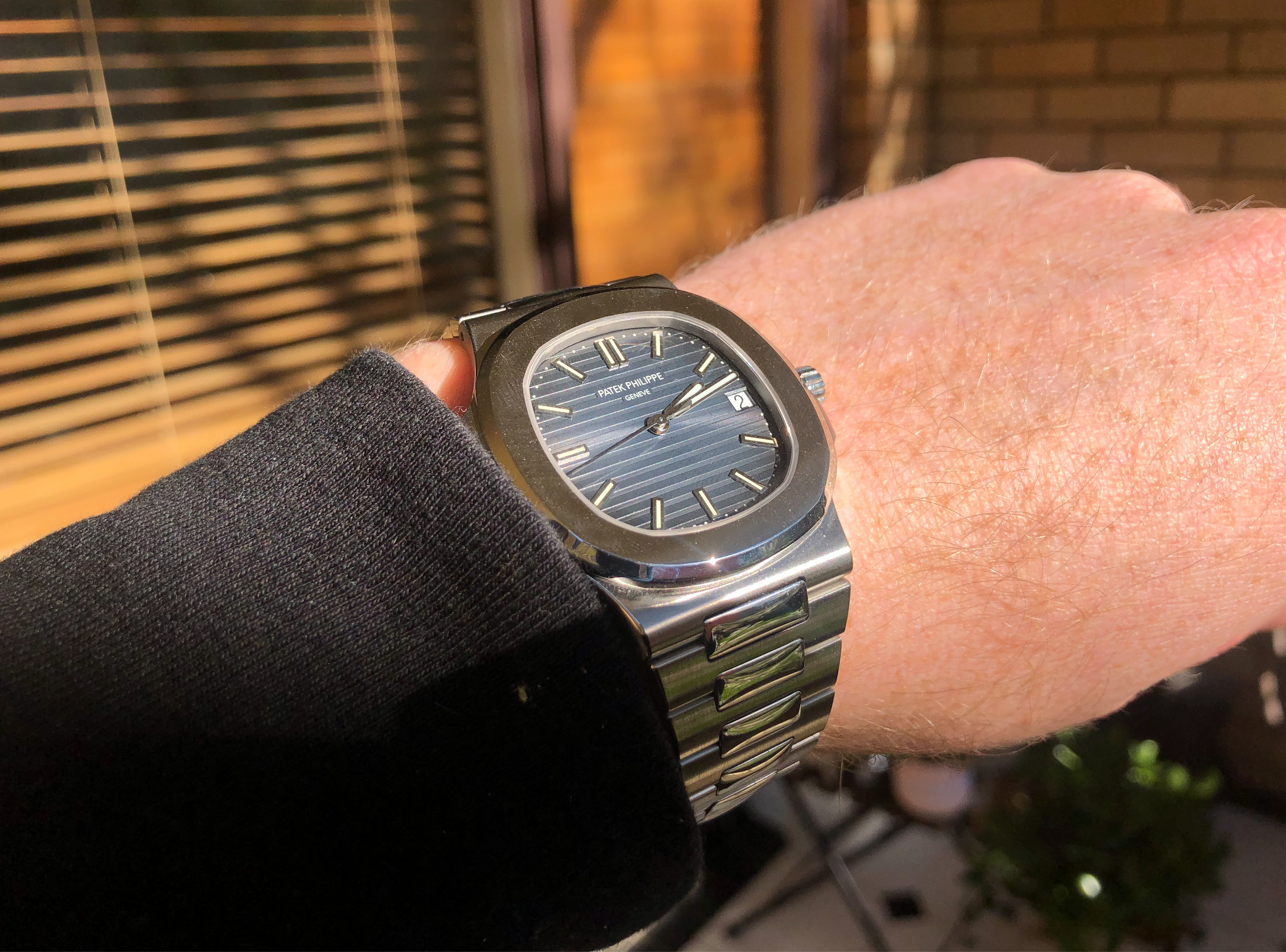
I took a quick photo and video with the watch in direct sunlight (as opposed to the other photos which had light cloud cover)
Video: https://cl.ly/7d71983daa87
Photo
Last edited:
roflwaffles
Active Member
Great photos! This dial is seriously the most confusing thing ever, with QC pictures looking like the grey dial and whatnot.
I think we can firmly establish that it’s an improvement over the violet hues of the v1, but it is missing the green tint and dark borders of the gen. I haven’t seen a gen in real life so it’s hard for me to judge, but I have seen some Instagram photos of the gen that make it look like the pictures you posted - this could just be filtering though.

I think we can firmly establish that it’s an improvement over the violet hues of the v1, but it is missing the green tint and dark borders of the gen. I haven’t seen a gen in real life so it’s hard for me to judge, but I have seen some Instagram photos of the gen that make it look like the pictures you posted - this could just be filtering though.
- 26/9/12
- 1,071
- 412
- 83
Great photos! This dial is seriously the most confusing thing ever, with QC pictures looking like the grey dial and whatnot.
I think we can firmly establish that it’s an improvement over the violet hues of the v1, but it is missing the green tint and dark borders of the gen. I haven’t seen a gen in real life so it’s hard for me to judge, but I have seen some Instagram photos of the gen that make it look like the pictures you posted - this could just be filtering though.
This pic is a 2014 - 2015 dial with no cartouche. The MKF replicates this dial pretty well. The 5711 dial got grayer and greener in 2018.
Last edited:
Nessuno - this was the best insight so far! Awesome to get quite a good feeling for how the dial behaves in various light settings.
Enjoy your new piece it looks simply breathtaking IMO
Enjoy your new piece it looks simply breathtaking IMO
Nessuno
Horology Curious
- 17/6/19
- 9
- 16
- 0
Great photos! This dial is seriously the most confusing thing ever, with QC pictures looking like the grey dial and whatnot.
I think we can firmly establish that it’s an improvement over the violet hues of the v1, but it is missing the green tint and dark borders of the gen. I haven’t seen a gen in real life so it’s hard for me to judge, but I have seen some Instagram photos of the gen that make it look like the pictures you posted - this could just be filtering though.
This is a video made by someone who owns a 5711, and due to the high res macro shots I've often referenced it closely.
I've found with the PPF V2 that the darkness around the edges does occure when there isn't a direct light illuminating all angles of the dial (because the darkness around the edges is essentially caused by shadowing)
In the video below by Brian shows in certain angles the dark shadowing around the sides, as well as clear illumination (depending on the lighting angles)
(skip to 5:40 for the 5711 )
Last edited:
Tobel
Put Some Respect On My Name
- 6/7/17
- 5,425
- 3,618
- 113
what do you means by this? sorry my english is not perfect !...
That the only change is the blue colour, everything else seems unchanged, and that the blue looks more gen like
Nessuno great pics and vid thanks for posting.
One thing ive noticed besides the lack of green is there’s no sheen to this dial. It appears to be a flat or satin grey. Anyway here’s a gen comparison.


Nessuno thanks for sharing your pics, awesome work!
It seems to me that the v2 dial is way more greyish and thus darker than the gen. I don’t really see more or less green, but the blue note of the gen seems to be way stronger.
Gesendet von iPhone mit Tapatalk
roflwaffles
Active Member
Nessuno
Horology Curious
- 17/6/19
- 9
- 16
- 0
Thanks Nessuno for sharing your input on this! How are you enjoying it so far?
Does this version still have the hard to open clasp issue?
I’m really enjoying it. It is accurate enough that without close examination you wouldn’t pick it apart from the genuine. Primarily because of the thickness (or lack there of) and the dial colour.
The clasp is a little hard to open. On side is just right, the other side (with the clasp cover) it a good bit harder. But not unusable by any means. (I’m certainly not worried of it accidentally opening.
Sent from my iPhone using Tapatalk
MisterFancypantsthesecond
Active Member
- 10/6/13
- 388
- 23
- 18
And here are a couple videos I took
On the wrist: https://cl.ly/9a01d810065f
In my hand: https://cl.ly/a50c1c9ee5e4
thanks for the vids. IN all honesty, the v2 dial does not look like gen at all.. I have the pf now, and this dial is WAY closer to gen. I have 4 friends who have a gen and I can confirm
Tobel
Put Some Respect On My Name
- 6/7/17
- 5,425
- 3,618
- 113
thanks for the vids. IN all honesty, the v2 dial does not look like gen at all.. I have the pf now, and this dial is WAY closer to gen. I have 4 friends who have a gen and I can confirm
Do they have the 2018/2019 gen with the new dial colour and the "panel" around the "Patek Philippe"?
I believe it's called "cartouche".Do they have the 2018/2019 gen with the new dial colour and the "panel" around the "Patek Philippe"?
")
So the new one with the panel = cartouche-dial
And the old one without panel = non-cartouche dial
mottykytu
Active Member
- 4/6/13
- 355
- 69
- 0
Thank you Nessuno nessuno it is a very well information and pictures.
I must admit that although not come that close to gen, this dial is one of the best among all the Blue Rep Dial offered on the market ! Only some things I'm consider
1/ The blue dial is darker and have more grey tint than green tint compare to gen
2/ it is me or the hands and markers lu me are differents? The marker have green lúme while the hands have blue ??? (The gen both hands and marker have green lume )
Tobel
Put Some Respect On My Name
- 6/7/17
- 5,425
- 3,618
- 113
I believe it's called "cartouche".
So the new one with the panel = cartouche-dial
And the old one without panel = non-cartouche dial
Thanks mate for the information
Nessuno
Horology Curious
- 17/6/19
- 9
- 16
- 0
Thank you Nessuno nessuno it is a very well information and pictures.
I must admit that although not come that close to gen, this dial is one of the best among all the Blue Rep Dial offered on the market ! Only some things I'm consider
1/ The blue dial is darker and have more grey tint than green tint compare to gen
2/ it is me or the hands and markers lu me are differents? The marker have green lúme while the hands have blue ??? (The gen both hands and marker have green lume )
The lume for both is green (pic below)

Sent from my iPhone using Tapatalk
