• Tired of adverts on RWI? - Subscribe by clicking HERE and PMing Trailboss for instructions and they will magically go away!

NAUTILUS 5711 PPF Blue Dial OUTTTTTT!!!

Ultra929

I'm Pretty Popular
Supporter
Certified
26/9/12
1,071
412
83
Second thing that stood out was the gradient and hue of the blue dial. Is the blue on the V5 accurate to gen? To my eyes it's very close. Although if you really pay close attention the gen is a bit lighter...and by "a bit" I mean that very conservatively. I can say that the MKF did an excellent job with the blue to black gradient because it was spot on.

Third thing is obviously the DW.

Overall, I think it's passable (or wearable some would say) and I would even go as far to say that the MK looks pretty damn great despite its flaws (DW, crown guards, misspelling,etc).

Great info and not often do you get to inspect the 2 side by side. Sounds like the owner thought yours was legit and didnt bother inspecting yours as there was no reason to. Only rep owners care about these issues.
 
  • Like
Reactions: vcappp

manoamano

Horology Curious
11/1/19
18
7
0


HEY GUYS! I bought this last year from some dude. His personal collection, i dont know which factory its from but the dial is pretty spot on. Im always in awe and so have many others!
 

Chemicalz

Renowned Member
27/2/15
890
129
43


HEY GUYS! I bought this last year from some dude. His personal collection, i dont know which factory its from but the dial is pretty spot on. Im always in awe and so have many others!

It could be a bp v1, dial is far from accurate, surely it looks good but its nothing like the real thing
 
  • Like
Reactions: vcappp

Chemicalz

Renowned Member
27/2/15
890
129
43
Guys i am actually taking back everything i have said about this dial, its not terrible, i have taken some screenshots from the yt video which popped up
I'd say this shade actually corresponds to some gen batch, maybe it is a tad too dark but it certainly isnt terrible
VQq6bX.png

VQqVlf.png

VQqKqp.png

VQqzMs.png


See the gen now:
patek_5711_blue_1525918388_c523dd34.jpg

patek_5711_blue_1525918388_c523dd34.jpg
 

Chemicalz

Renowned Member
27/2/15
890
129
43
Of course, but currently, nobody can match this greyish hue, PF is electric blue, MKF has a green shade, and this one is too dark.
You just have to choose the shade you prefer the most and if you cant live with the issue then you should get a white nautilus
 

Tobel

Put Some Respect On My Name
6/7/17
5,425
3,618
113
The pics of the gen are pre 2018 without the box around the Patek Philippe, whereas the PPF is meant to be the newer model so they're not auppsupp to match. I'm not saying that the blue is good, just let's wait until we see some pics in natural light.
 
  • Like
Reactions: vcappp and stufuse

Frank3073

Horology Curious
9/4/19
14
7
0
Hi to all!!! I am new here, but already made some investigation :) Sorry seems that ppf blue dial is replicated from platinum version, isn't it?

2017W2A3956LOW0.jpg
 

SwissWatchFan

Banned member, the goat does not approve
Banned
16/3/19
8
4
0
I agree. Until now I was quite put off, but in this video the dial looks better than the 2 others

Envoyé de mon CLT-L29 en utilisant Tapatalk
 
  • Like
Reactions: vcappp

majwilliams0308

Reptime Mod
Patron
Certified
11/7/16
2,409
2,260
113
Hi to all!!! I am new here, but already made some investigation :) Sorry seems that ppf blue dial is replicated from platinum version, isn't it?

2017W2A3956LOW0.jpg

Interesting, I've never seen a blue dial with a metallic square around the date window. I kinda like that look.
 
  • Like
Reactions: vcappp

Doud

I'm Pretty Popular
5/11/12
1,068
185
63
Interesting, I've never seen a blue dial with a metallic square around the date window. I kinda like that look.

Both the regular 5711P and anniversary edition 5711P have it! They also have a little diamond in the bezel at 6. Nice subtle details.

Regular 5711P
0eee353d244784d53af6845e8961cfdc.jpg


Anniversary 5711P
cd60dc67590c88cd28ced914b2e5fe3a.jpg


Sent from my iPhone using Tapatalk
 

Ultra929

I'm Pretty Popular
Supporter
Certified
26/9/12
1,071
412
83
I agree. Until now I was quite put off, but in this video the dial looks better than the 2 others

Envoyé de mon CLT-L29 en utilisant Tapatalk

I cannot tell any of them apart except for the fatter bezel on the PPF. The positive thing is all 3 dial colors look the same. But the dial color is greyer on the 2018, and not deep blue from what I can see in all gen pics available.

 
  • Like
Reactions: vcappp

jrodshibuya

I'm Pretty Popular
11/2/11
1,482
122
0
My impression of the video is that all 3 dials (PPF, PF, MK) are similar in accuracy to gen (not enough greenish/greyish tinge), with MK possibly the best of the lot. So while the PPF isn't an improvement in blue dial, nor is it really a regression.
 
  • Like
Reactions: vcappp

XLR8R

Renowned Member
16/8/18
692
354
63
From HKRWF
[h=1]
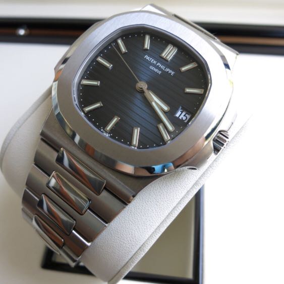
PPF Super 1:1 Patek Philippe Nautilus Blue Comes!![/h] Collectionkobe posted on 2019-04-08 19:44
xuanchuandashi.png
yuanchuangdaren.png
shequmingxing.png
zuiaishafa.png
shimingrenzheng.png
yunliaoxianfeng.png

The most popular blue nautilus, plus the strongest workmanship of PPF... It's perfect... The younger brother has already left a self-wearing, listening to the manufacturer saying that it has been sold, and the pre-sale is very much... Things are always in short supply, but fortunately I started quickly, the first detoxification :kenny:in the first 1:1 production, there is original contrast, the thickness is only 0.2mm thicker than the original thickness, ppf's nautilus counts this year's most influential imitation table Up

Spawn00001 04-09 15:23 6#
shimingrenzheng.png
shequlaomo.png

This post last edited by the spawn00001 at 2019-4-9 15:33

there are several points, let PPF blue nautilus victory over other plants, have been included in the 2019 Annual basically recommend one paragraph

1. Starting and leading spin sense for the bridge The opening is the same as the original version, and the eye protection of the bridge is no longer present
. 2. The edge of the lug and the bezel are chamfered to the polished surface. It is not like the other factory shaving hands. It is consistent with the original version.
3. The buckle lettering is deeper, consistent with the original version.
4 Strap and wrist, unlike other factories will bulge, consistent with the original version
5. The beads in the table are slightly raised, consistent with the original version
6. Luminous effect is green with a slight blue, consistent with the original
7. Butterfly buckle unfolds Shun, not 涩
8. The left and right sides of the movement are not like the other factories leaving two large hollows, the powerful
9. The lower edge of the pendulum is very delicate, no longer like the melon cloth
10. The sound when the automatic winding is not big, The sound of other factories is too loud.
11. The movement of the ruby ​​is correct.
12. The balance wheel is at 6 o'clock, which is consistent with the original.