Hello for dear friends.
We are all glad that in addition to new panerai models, factories began to produce, including old models, because many believe that a new and obviously superfluous modern chromosome has settled in the famous PANERAI DNA, which is why the old models have become very popular.
(Sorry for the stupid joke, could not resist)
NOOB was one of the leaders and many of the models he performed were incredible. My 299 would be almost indistinguishable from a GEN. Therefore, now there are questions about reissues, better / worse / the same as ~ 5 years ago? There is no definite answer. 005 seems to be better than it was in the N series, 111 is swapping things around and is essentially no improvement over v3. But with the 390 it wasn't obvious, from 911 had a lot of omissions, with a "recipe for success" ready at 2015.
By the will of fate, in my hands was a new noob 390 and one old (only declared) noob 390. I want to subjectively compare, give a little photo, and let everyone draw their own conclusions, whether it is NOOB or not, better or worse, NOOB is in the end, or his wife's cousin (as they have repeatedly said in different topics).
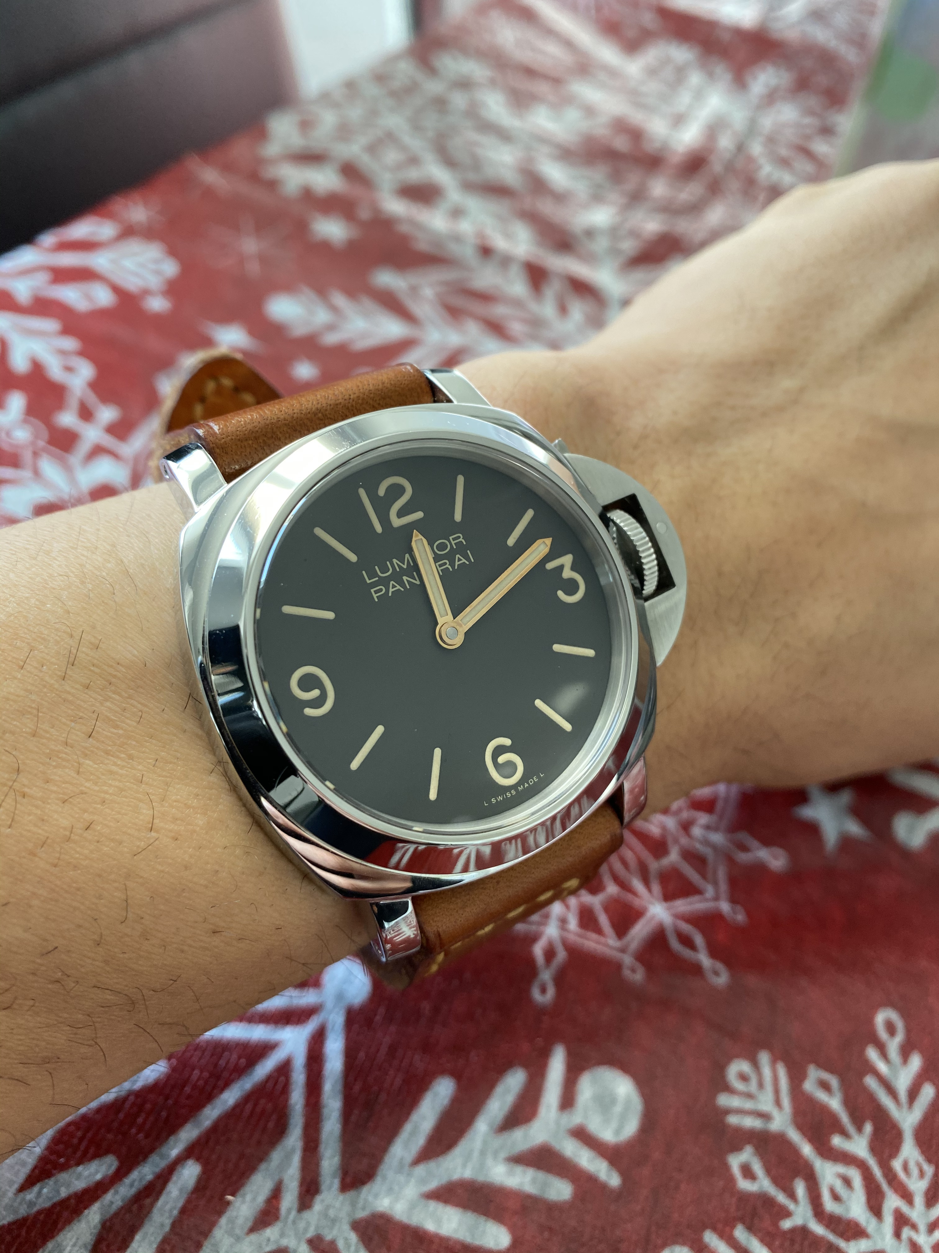
For a start, a few photos in daylight, for a general impression.


Old on the left, new on the right. It is clear in some photos.
It is immediately evident that different AR. I heard that gen 390 supposedly has a pronounced AR, but I usually don't see it in the photo. Here it is obvious that the new NOOB has a clear blue color, and low transparency at an angle.
In view of this, it is very difficult to compare the tone of the golden hands and tobacco of the dial.
However, as you can see immediately, the dial font of the old one looks gray, the new one is almost yellow. This is not AR, and not an optical illusion, it is.
It is also noticeable that the hands of the old are redder. It is believed that this is not true, but I like it better. As for the ZF372, the hands look "more expensive" due to the reddish tint relative to the SF372.
The lume glow on the new one dies out faster, has a different color, and is less charged.
In fact, in these 2 watches , different is everything. It is more difficult to say what is in common, but more specifically - further....
Now the photo is in room light. The first group of photos is not processed so that you can understand the specifics of the color, but in any case, it is distorted, due to the fact that there are several light sources in the room of different tones.


Now a look from the sides. The photos were taken separately, so the angles may not match, but it doesn't hurt to see the key differences.
The phone camera tries to look smart, and changes the light settings, blur the edges of the picture, and so on, but sorry, that's all I can do. Yes, a new one on top of all 4 photos.


The CG shape is completely different, but it is blurry in most of the photos, so we'll come back to that later. What you can see: the height of the watch is the same, but on the new 390 the bezel is higher at the base, the bevel angle is sharper, the case is thinner (perhaps, to the extent of the bezel height), and the protrusions are thicker. It is difficult to compare the shape of the pillow on a polished watch in this light, but my opinion is that it is less "straight", that is, the angles are more chamfered down.
Also, the crystal is higher and the bevel is wider, this is especially noticeable from the front. Like it's a very old crystal noob.
Now let's look at the back. I think the backcase is an important part of this model. Models with a solid backcase are always better than a transparent backcase, but only all engravings must be done in a dignified manner. What do we have here ...
(It's not hard to guess that the new 390 has the number 0008)


I think the difference is noticeable to the naked eye, both in geometry, and in fonts, and in the quality of metal processing and in the elaboration and quality of engravings.
Let's consider the individual elements in comparison:


I think it would be difficult to confuse them during assembly.
Since I had to open the backcase, I’ll quickly show movt., Realizing that nobody is interested in it, but nevertheless. Indeed, there is a difference finishing bridges, incablock, well-finished balance wheel base, engraved with blue paint, in general, it is felt that the difference between the two 6497 is about 5 years ...


Now CG. This is a complex element, consisting of a huge number of shapes and angles, which can be completely disassembled all day long. I think that in these photos you can find the answer to any question, I will highlight the main thing, including in order to understand where which one:
The old one opens to a very large angle, in general, as previously attributed to the v6f factory, and also has a narrower roller support on the lever. This is noticeable from the front with the naked eye. Also, old dirty, it's a second hand watch.
On the new one, you need to pay attention to the terrible pin, which has a chamfer in a circle, on the reverse side, for some reason, everyone always floods, and in this case, also a nervous chamfer along the ellipse from the hole. Also, a very strange shape of the inner cutout on the back side, while everything is in order from the front. Profile, lever shape, tip shape, roller, everything and absolutely everything else. It is difficult to comment on the profile form, it should be compared with gen, moreover, of this particular case. The only conclusion I can give is that 2 noob differ more than often the watches of 2 different factories.
Even the fastening screws are different in shape and length and along the side of the cap, and even in thickness.


I will continue on the dial. Hands have different shapes. The old one is sharper and brighter in gold. Gold is redder, Moderately AR color, or its own hard to say, but I think it's a different color of gilding.


When CP doesn't bother me much, there is nothing worse than my 089 hf, and I love him, so I learned to close my eyes to it.
Now the dial font.

The font is similar. The distance near the letter "R" is different, but not much, the famous "A" with a low horizontal line on the new 390, the error is strange, I thought it was a very old error, and did not think it would be repeated. The thickness of the text is the same, but the color is different. Absolutely. What's more like gen? I don’t know, I like the new warm one more, it is closer to the general color scheme.
Finally, indices and labels. The new one has no padding, but is flatter and smoother. In general, the photos are spoken, although they are difficult to take due to the difficult angle that AR prevents. A very narrow phase in which you can catch its structure. In any case, both are not even close to gen, so we'll just see:
(Don't look at the colors, they are distorted for the sake of contrast and volume, also forgive where swapped. Overall, it seems clear who is who)


For a snack: the crown, one of the few details that seems to be the same.


The most delicious, and oh, what you need to be ready for, are the rods. In the new 390 they are made of cheese, and the cheese is not polished, the thread is shorter and for some reason sharpened. As a result, from the opposite side of the protrusion, it does not reach the end, moreover, it has gaps to the walls of the hole. There is almost no slot, there is no reason to catch on, and the thread is clogged with dirt to the eyeballs. You need to have a lot of patience to open them without scratching them. You need to be ready to immediately change them, and possibly cut them if you cannot unscrew them, since the straps are of controversial quality in set 2.
I am glad that the tip is even polished, and does not scratch the ledge when you do not get into the hole.


What conclusions can be drawn? Well, the new noob 390 has as much in common with the past as it can have with absolutely anyone else. I will be glad to know that my second 390 is not really a noob, but most of the watch is a case, and it looks like, also about crystal and hands. At different points in time, I looked for different pams, read everything about them, and realized that they often differ from each other more than between factories. 508, 382, 089 and many others that I saw not in a single copy, from the same factory, could be completely different from each other. DS, there are "business cards" like the "border" around the CP on ZF, or the rounded corners of the CG from HF, but I'm sure in this game there are more exceptions than the rules.
What about 390?
Well, first of all, in terms of overall quality, detail, finish and sheer feel, the new noob seems to be either a cheap or an old version of itself. This is my subjective opinion, I do not offer anyone to accept it, just get acquainted.
There is a list of problems that are present in most of the QCs that I have seen on the forum and beyond:
- At least a lot of strange AR. If gen has one, I would be disappointed with this model.
- PIN CG is recessed, not polished, has side gaps.
- Low "A".
- A very controversial form of CG, yes, possibly a case. I have to include gen as well, for a full comparison, but for now, I think so.
- The backcase is badly engraved, and that's in every detail.
- Serial numbers seem to be not 2, but not endless. It could be 777 or something more popular...
- Screw rods which, if you can unscrew, even after cleaning, do not put back. Such a chance is given once, and it is better to cut the rep strap than your favorite, which was specially waiting for this watch.
I think there are no more common problems. If these problems are not on your QC, then I envy you.
You can say that I find fault and seek perfection, but alas, I did not come up with my understanding of quality myself. The noob himself set this bar, and I hope he can meet it again.
Anyway, for anyone who wants 390 and doesn't want to get a residency in the M2M section, this is a great and inexpensive option.
Thank you for your patience reading, and sorry for:
- My English, bad camera, hairy watch, bad light, poor analysis, incorrect conclusions, incorrect angles of images, and anything else you can.
Happy New Year.
Addition:
it seems not entirely obvious that many of the photos that I have posted, with the exception of those that I specifically mentioned, have been processed to improve clarity. This distorts the color.
It is difficult to compare the color of the lume and the dial, due to the too different crystals and AR.
Anyone who has had tobacco dials knows how changeable they are, and often the lighting prevents even the eyes from seeing the desired color, and the camera lens multiplies that complexity by 10.
I even wanted to take off the dials to compare them and give an objective idea of the color, but I think it makes no sense. In any case, we buy the watch as a whole, and secondly, gen also has some kind of color distortion by the crystal.
Therefore, all that I decided to offer is a heap of unprocessed photos, in a different order, at different angles, with different lighting and my 056 for comparison (I used to think that all tobacco dials should be the same, not counting the chocolate ones on gold models, but on 056/061/240 the color seemed insufficient in brightness. It slips more into gray. Now I see that everything is learned compared).


I will not try to express the difference in color in words. It seems that this will only add confusion.
I will only say my opinion, after viewing the photo gen. I think the color of the dial looks better on the old one. It seems lighter and more coffee-like.
The color of the lum of numbers and marks - on the new one it seems yellower, and perhaps this is true.
The dial font is lighter beige on the old one and more yellowish on the new one, as I said I like the new one better. The old one often looks gray.
But the lum of the hands on the new one is noticeably lighter than the old hands, and most importantly, it does not coincide with the new lum of marks and numbers. Hands are lighter.
Two sets of additional photos at similar angles.
Under warm artificial light, AR does not have such a pronounced effect, and it is clear that the color of the dials is similar.


We are all glad that in addition to new panerai models, factories began to produce, including old models, because many believe that a new and obviously superfluous modern chromosome has settled in the famous PANERAI DNA, which is why the old models have become very popular.
(Sorry for the stupid joke, could not resist)
NOOB was one of the leaders and many of the models he performed were incredible. My 299 would be almost indistinguishable from a GEN. Therefore, now there are questions about reissues, better / worse / the same as ~ 5 years ago? There is no definite answer. 005 seems to be better than it was in the N series, 111 is swapping things around and is essentially no improvement over v3. But with the 390 it wasn't obvious, from 911 had a lot of omissions, with a "recipe for success" ready at 2015.
By the will of fate, in my hands was a new noob 390 and one old (only declared) noob 390. I want to subjectively compare, give a little photo, and let everyone draw their own conclusions, whether it is NOOB or not, better or worse, NOOB is in the end, or his wife's cousin (as they have repeatedly said in different topics).
For a start, a few photos in daylight, for a general impression.
Old on the left, new on the right. It is clear in some photos.
It is immediately evident that different AR. I heard that gen 390 supposedly has a pronounced AR, but I usually don't see it in the photo. Here it is obvious that the new NOOB has a clear blue color, and low transparency at an angle.
In view of this, it is very difficult to compare the tone of the golden hands and tobacco of the dial.
However, as you can see immediately, the dial font of the old one looks gray, the new one is almost yellow. This is not AR, and not an optical illusion, it is.
It is also noticeable that the hands of the old are redder. It is believed that this is not true, but I like it better. As for the ZF372, the hands look "more expensive" due to the reddish tint relative to the SF372.
The lume glow on the new one dies out faster, has a different color, and is less charged.
In fact, in these 2 watches , different is everything. It is more difficult to say what is in common, but more specifically - further....
Now the photo is in room light. The first group of photos is not processed so that you can understand the specifics of the color, but in any case, it is distorted, due to the fact that there are several light sources in the room of different tones.
Now a look from the sides. The photos were taken separately, so the angles may not match, but it doesn't hurt to see the key differences.
The phone camera tries to look smart, and changes the light settings, blur the edges of the picture, and so on, but sorry, that's all I can do. Yes, a new one on top of all 4 photos.
The CG shape is completely different, but it is blurry in most of the photos, so we'll come back to that later. What you can see: the height of the watch is the same, but on the new 390 the bezel is higher at the base, the bevel angle is sharper, the case is thinner (perhaps, to the extent of the bezel height), and the protrusions are thicker. It is difficult to compare the shape of the pillow on a polished watch in this light, but my opinion is that it is less "straight", that is, the angles are more chamfered down.
Also, the crystal is higher and the bevel is wider, this is especially noticeable from the front. Like it's a very old crystal noob.
Now let's look at the back. I think the backcase is an important part of this model. Models with a solid backcase are always better than a transparent backcase, but only all engravings must be done in a dignified manner. What do we have here ...
(It's not hard to guess that the new 390 has the number 0008)
I think the difference is noticeable to the naked eye, both in geometry, and in fonts, and in the quality of metal processing and in the elaboration and quality of engravings.
Let's consider the individual elements in comparison:
I think it would be difficult to confuse them during assembly.
Since I had to open the backcase, I’ll quickly show movt., Realizing that nobody is interested in it, but nevertheless. Indeed, there is a difference finishing bridges, incablock, well-finished balance wheel base, engraved with blue paint, in general, it is felt that the difference between the two 6497 is about 5 years ...
Now CG. This is a complex element, consisting of a huge number of shapes and angles, which can be completely disassembled all day long. I think that in these photos you can find the answer to any question, I will highlight the main thing, including in order to understand where which one:
The old one opens to a very large angle, in general, as previously attributed to the v6f factory, and also has a narrower roller support on the lever. This is noticeable from the front with the naked eye. Also, old dirty, it's a second hand watch.
On the new one, you need to pay attention to the terrible pin, which has a chamfer in a circle, on the reverse side, for some reason, everyone always floods, and in this case, also a nervous chamfer along the ellipse from the hole. Also, a very strange shape of the inner cutout on the back side, while everything is in order from the front. Profile, lever shape, tip shape, roller, everything and absolutely everything else. It is difficult to comment on the profile form, it should be compared with gen, moreover, of this particular case. The only conclusion I can give is that 2 noob differ more than often the watches of 2 different factories.
Even the fastening screws are different in shape and length and along the side of the cap, and even in thickness.
I will continue on the dial. Hands have different shapes. The old one is sharper and brighter in gold. Gold is redder, Moderately AR color, or its own hard to say, but I think it's a different color of gilding.
When CP doesn't bother me much, there is nothing worse than my 089 hf, and I love him, so I learned to close my eyes to it.
Now the dial font.
The font is similar. The distance near the letter "R" is different, but not much, the famous "A" with a low horizontal line on the new 390, the error is strange, I thought it was a very old error, and did not think it would be repeated. The thickness of the text is the same, but the color is different. Absolutely. What's more like gen? I don’t know, I like the new warm one more, it is closer to the general color scheme.
Finally, indices and labels. The new one has no padding, but is flatter and smoother. In general, the photos are spoken, although they are difficult to take due to the difficult angle that AR prevents. A very narrow phase in which you can catch its structure. In any case, both are not even close to gen, so we'll just see:
(Don't look at the colors, they are distorted for the sake of contrast and volume, also forgive where swapped. Overall, it seems clear who is who)
For a snack: the crown, one of the few details that seems to be the same.
The most delicious, and oh, what you need to be ready for, are the rods. In the new 390 they are made of cheese, and the cheese is not polished, the thread is shorter and for some reason sharpened. As a result, from the opposite side of the protrusion, it does not reach the end, moreover, it has gaps to the walls of the hole. There is almost no slot, there is no reason to catch on, and the thread is clogged with dirt to the eyeballs. You need to have a lot of patience to open them without scratching them. You need to be ready to immediately change them, and possibly cut them if you cannot unscrew them, since the straps are of controversial quality in set 2.
I am glad that the tip is even polished, and does not scratch the ledge when you do not get into the hole.
What conclusions can be drawn? Well, the new noob 390 has as much in common with the past as it can have with absolutely anyone else. I will be glad to know that my second 390 is not really a noob, but most of the watch is a case, and it looks like, also about crystal and hands. At different points in time, I looked for different pams, read everything about them, and realized that they often differ from each other more than between factories. 508, 382, 089 and many others that I saw not in a single copy, from the same factory, could be completely different from each other. DS, there are "business cards" like the "border" around the CP on ZF, or the rounded corners of the CG from HF, but I'm sure in this game there are more exceptions than the rules.
What about 390?
Well, first of all, in terms of overall quality, detail, finish and sheer feel, the new noob seems to be either a cheap or an old version of itself. This is my subjective opinion, I do not offer anyone to accept it, just get acquainted.
There is a list of problems that are present in most of the QCs that I have seen on the forum and beyond:
- At least a lot of strange AR. If gen has one, I would be disappointed with this model.
- PIN CG is recessed, not polished, has side gaps.
- Low "A".
- A very controversial form of CG, yes, possibly a case. I have to include gen as well, for a full comparison, but for now, I think so.
- The backcase is badly engraved, and that's in every detail.
- Serial numbers seem to be not 2, but not endless. It could be 777 or something more popular...
- Screw rods which, if you can unscrew, even after cleaning, do not put back. Such a chance is given once, and it is better to cut the rep strap than your favorite, which was specially waiting for this watch.
I think there are no more common problems. If these problems are not on your QC, then I envy you.
You can say that I find fault and seek perfection, but alas, I did not come up with my understanding of quality myself. The noob himself set this bar, and I hope he can meet it again.
Anyway, for anyone who wants 390 and doesn't want to get a residency in the M2M section, this is a great and inexpensive option.
Thank you for your patience reading, and sorry for:
- My English, bad camera, hairy watch, bad light, poor analysis, incorrect conclusions, incorrect angles of images, and anything else you can.
Happy New Year.
Addition:
it seems not entirely obvious that many of the photos that I have posted, with the exception of those that I specifically mentioned, have been processed to improve clarity. This distorts the color.
It is difficult to compare the color of the lume and the dial, due to the too different crystals and AR.
Anyone who has had tobacco dials knows how changeable they are, and often the lighting prevents even the eyes from seeing the desired color, and the camera lens multiplies that complexity by 10.
I even wanted to take off the dials to compare them and give an objective idea of the color, but I think it makes no sense. In any case, we buy the watch as a whole, and secondly, gen also has some kind of color distortion by the crystal.
Therefore, all that I decided to offer is a heap of unprocessed photos, in a different order, at different angles, with different lighting and my 056 for comparison (I used to think that all tobacco dials should be the same, not counting the chocolate ones on gold models, but on 056/061/240 the color seemed insufficient in brightness. It slips more into gray. Now I see that everything is learned compared).
I will not try to express the difference in color in words. It seems that this will only add confusion.
I will only say my opinion, after viewing the photo gen. I think the color of the dial looks better on the old one. It seems lighter and more coffee-like.
The color of the lum of numbers and marks - on the new one it seems yellower, and perhaps this is true.
The dial font is lighter beige on the old one and more yellowish on the new one, as I said I like the new one better. The old one often looks gray.
But the lum of the hands on the new one is noticeably lighter than the old hands, and most importantly, it does not coincide with the new lum of marks and numbers. Hands are lighter.
Two sets of additional photos at similar angles.
Under warm artificial light, AR does not have such a pronounced effect, and it is clear that the color of the dials is similar.
Last edited: