Good day to everyone who decided to take a look!
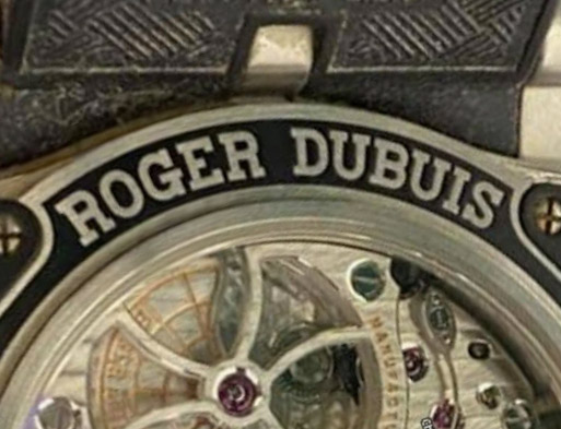
I decided to continue my excursion into the world of old Roger dubuis.
Unfortunately, there is a little more love and interest than watches, so this time the watch is not mine, but respected participant dadog13 , who provided all the necessary photos to consider this model.
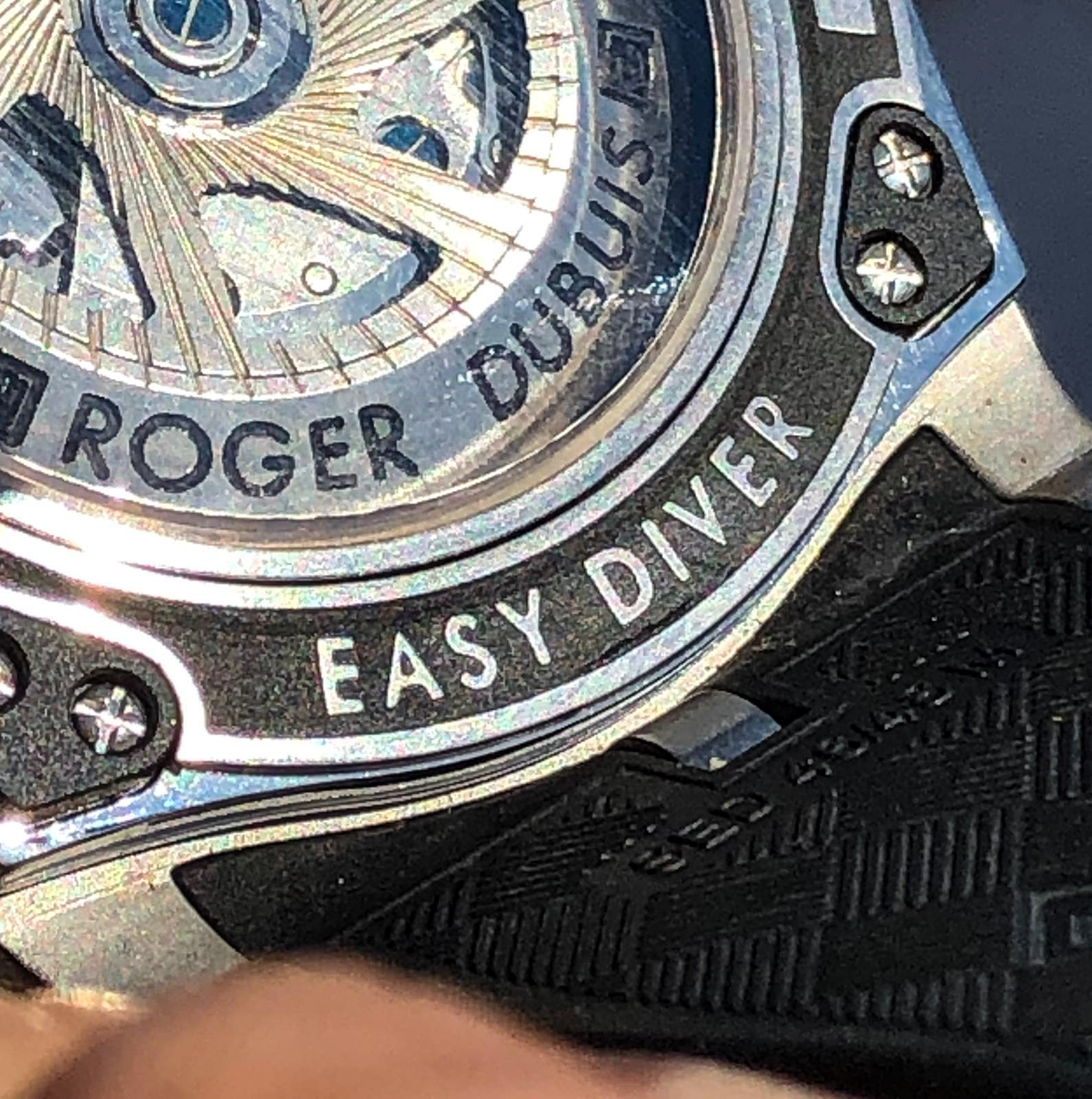
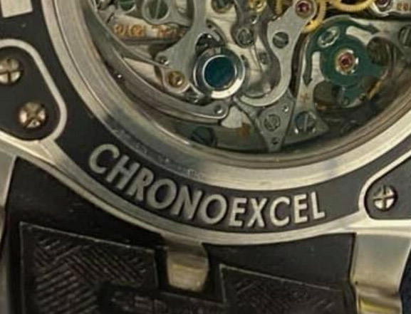
I have already expressed all the main thoughts and my attitude to this brand in the last review, and I will not repeat myself, I will just note that this watch, a logical continuation of the previous model in the SAW (Sport Activitiy Watch) line, is Roger Dubuis Easy diver II Chronoexel.
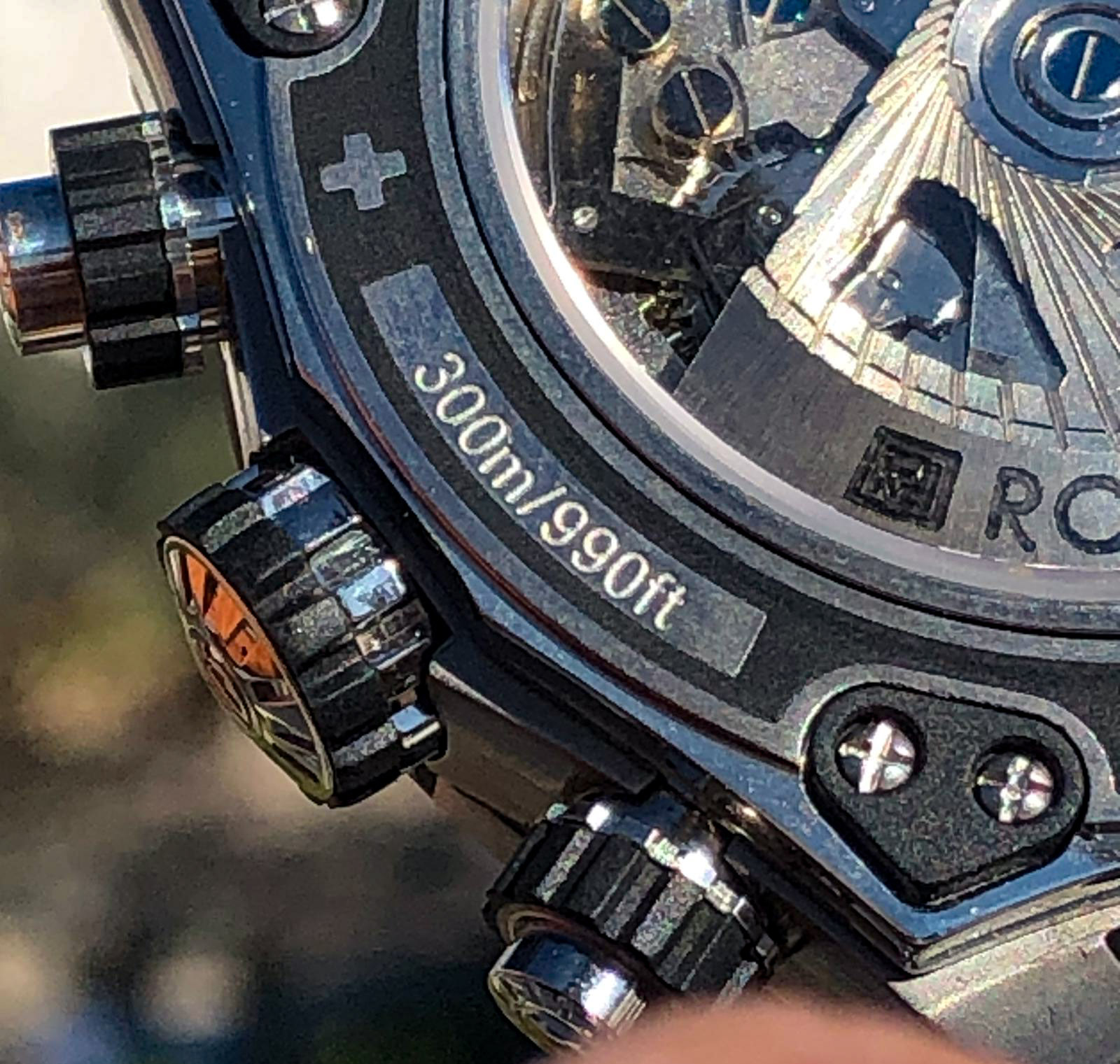
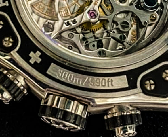
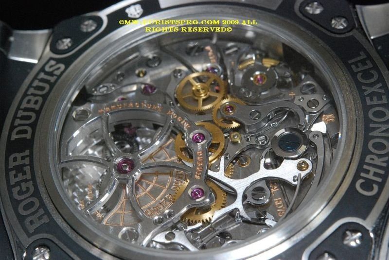
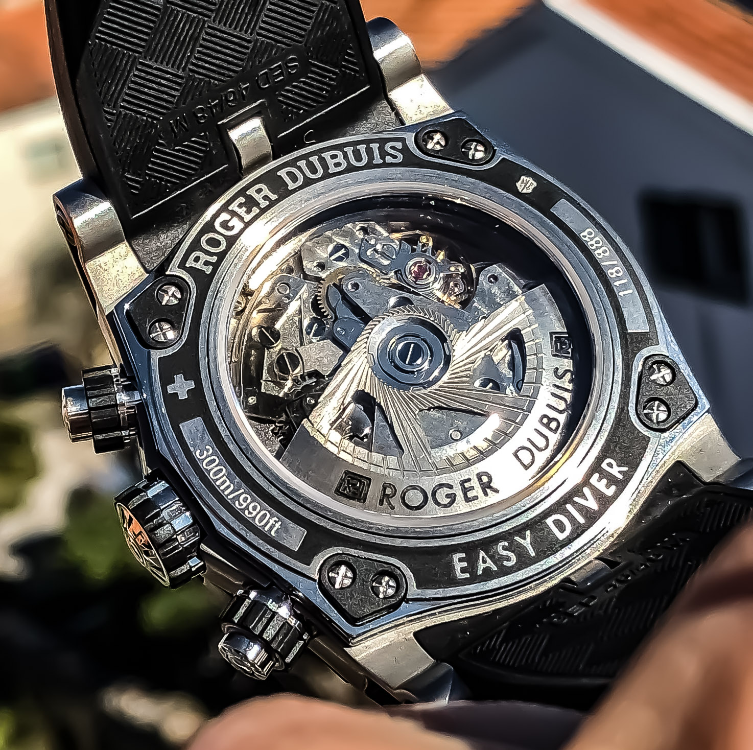
Also steel chronograph with WR 300m, with black dial and chronograph, only now, in a new case and completely in-house caliber RD78, instead of the previous generation RD56.
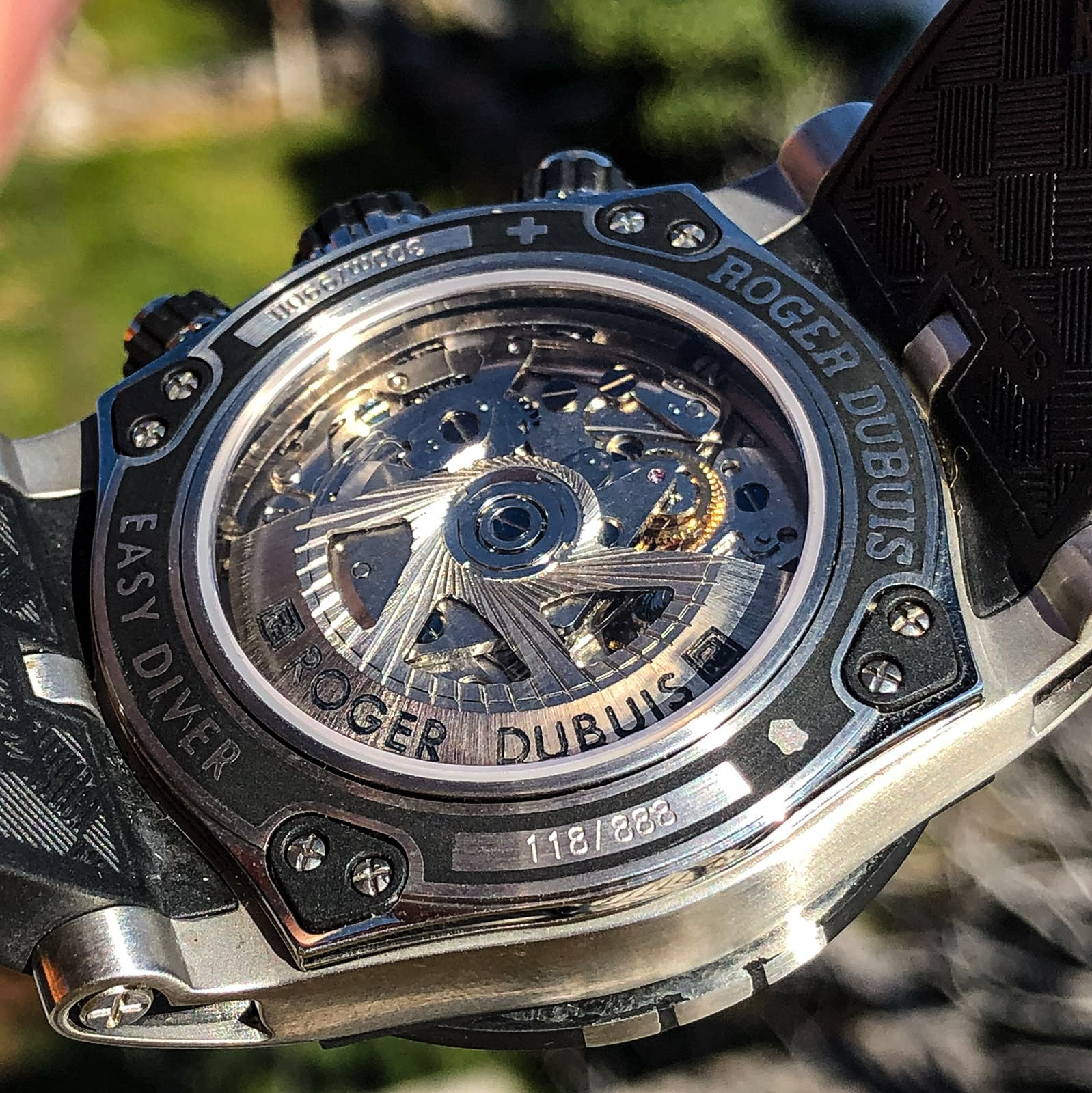
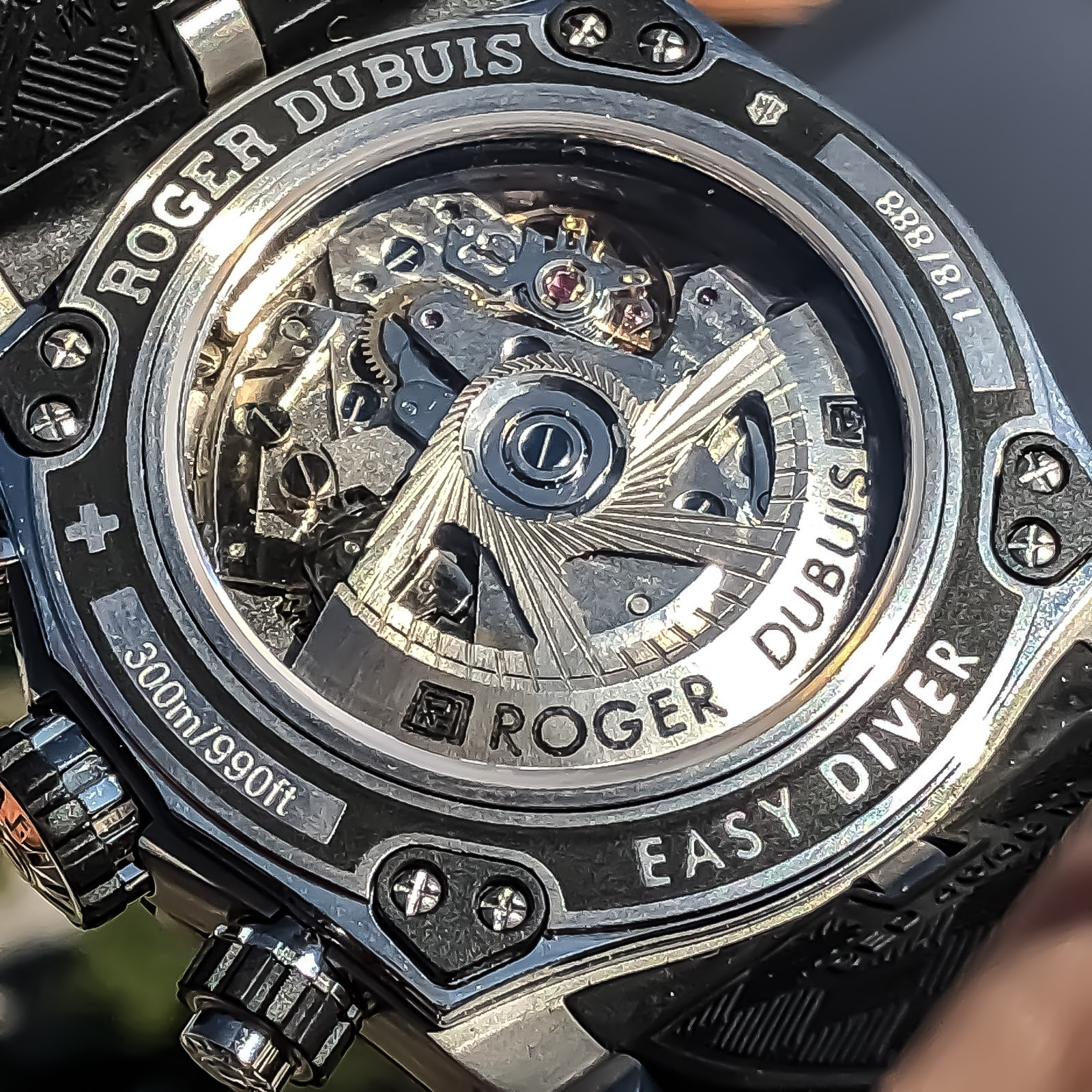
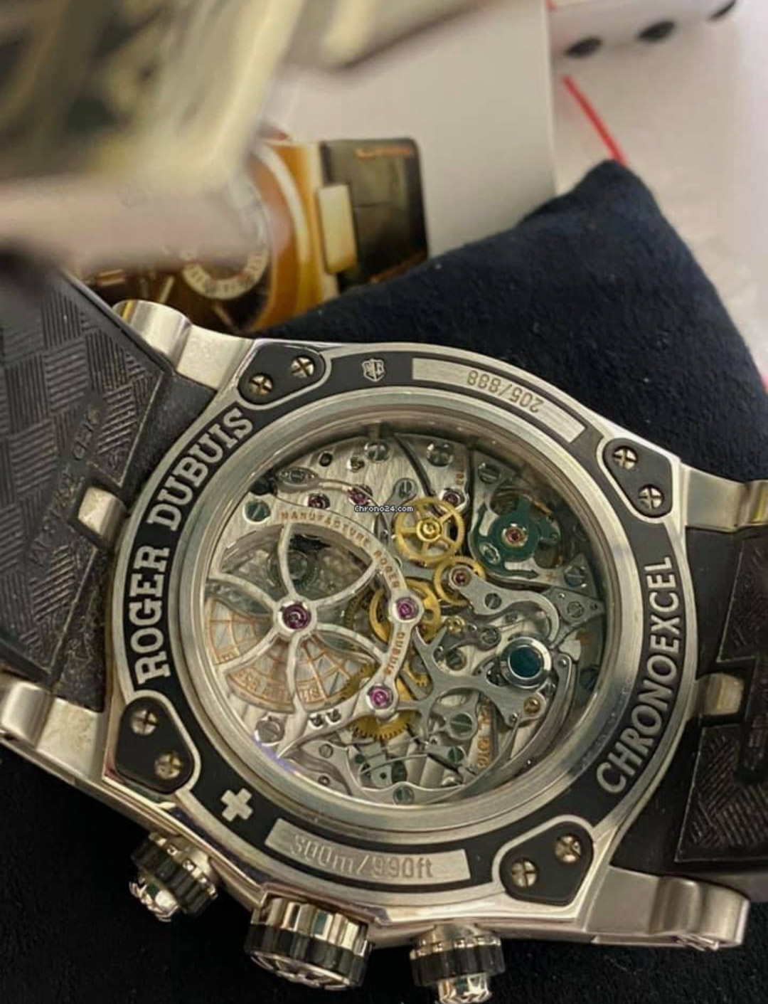
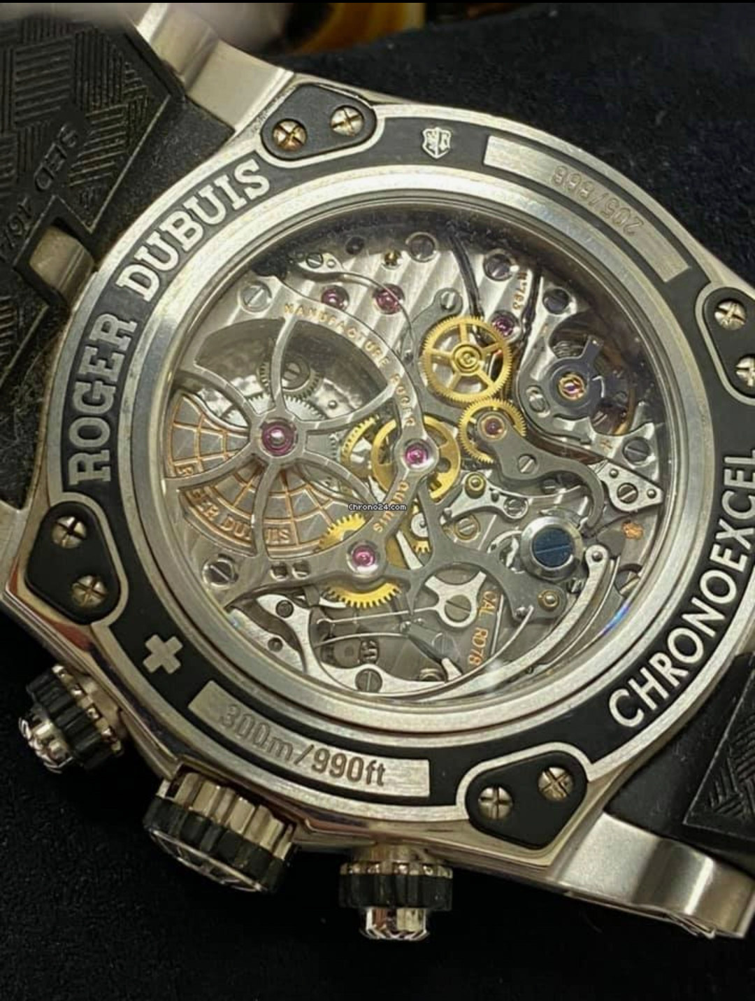
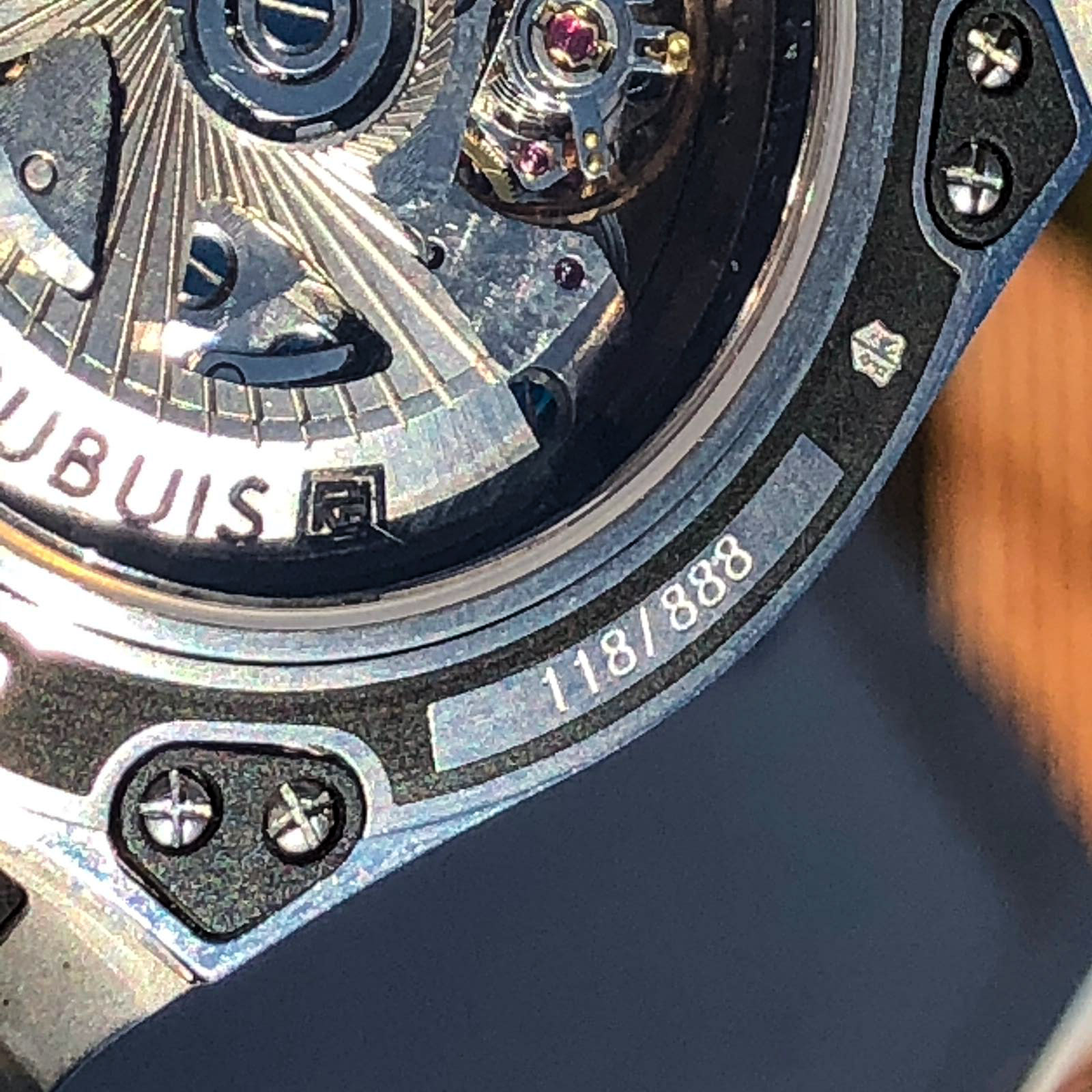
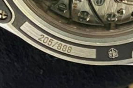
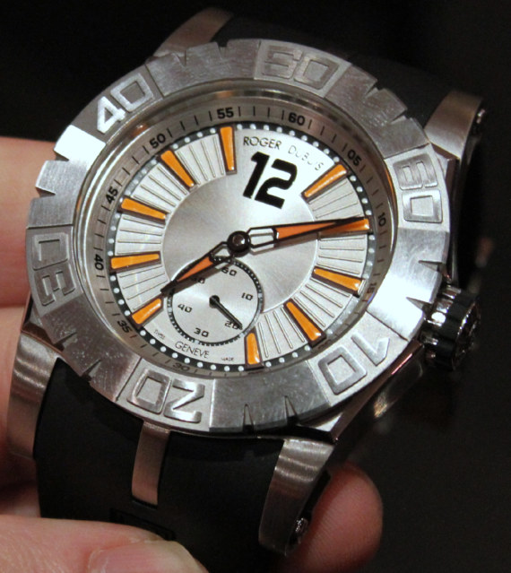
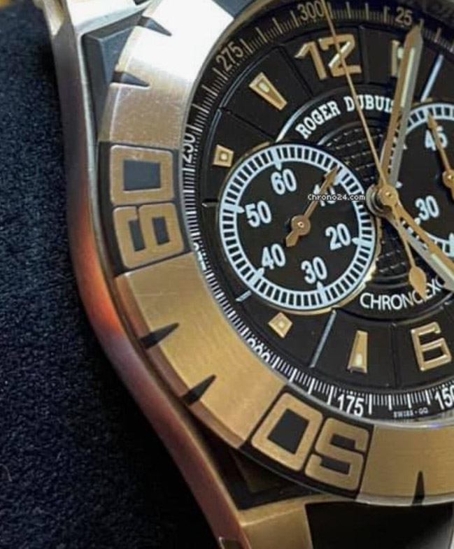
This is a large heavy watch with a diameter of 46mm ref .: RDDBse0174, made in a circulation of 888 pieces, with an RP of about $ 35,000.
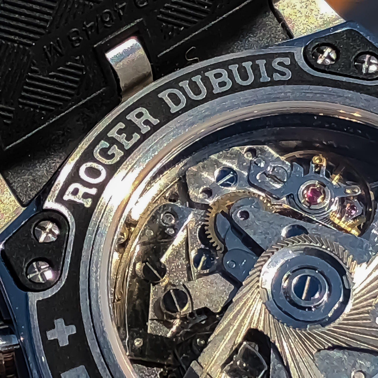
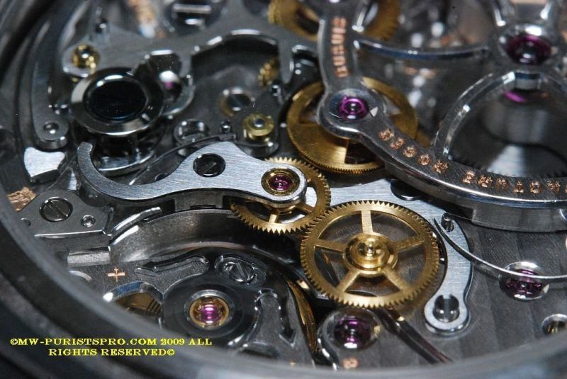
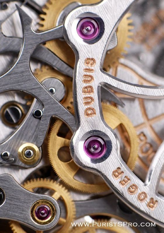
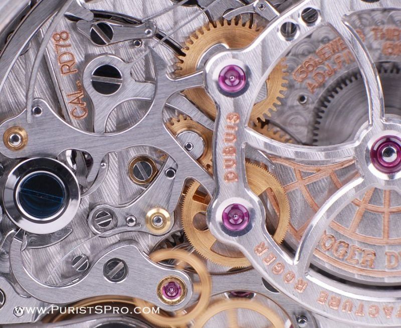
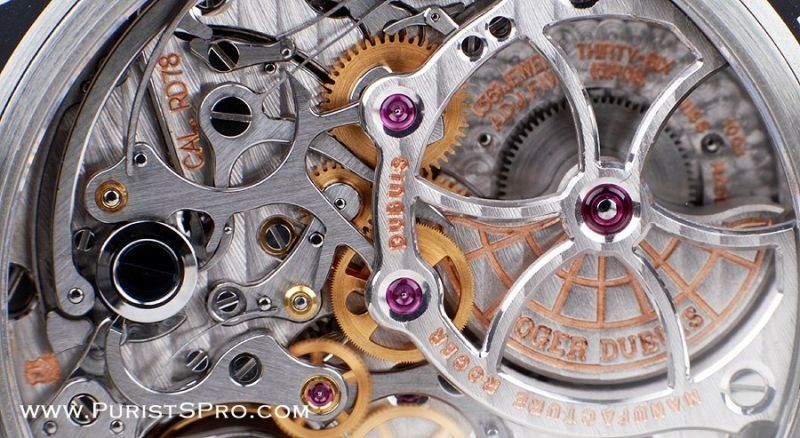
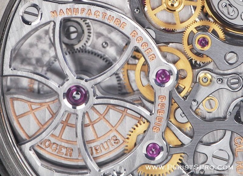
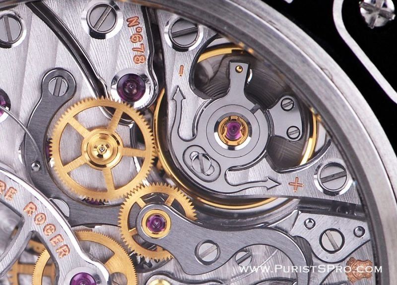
Of course, taking into account the complex, beautifully designed movt., With a chronograph and an asymmetric self-winding rotor, under a transparent caseback, there is no need to talk about a superrep.
Even so, it is movt., With a Geneva seal, and it cannot be copied.
Rep resembles gen even less than in the last generation, but this is clearly not the most important, in the case of this watch, especially since instead of this we have 7750, which may not be so beautiful, but retains functions and has a similar distance between sub dials, which is much more important, but there are also surprises there, more on that later.
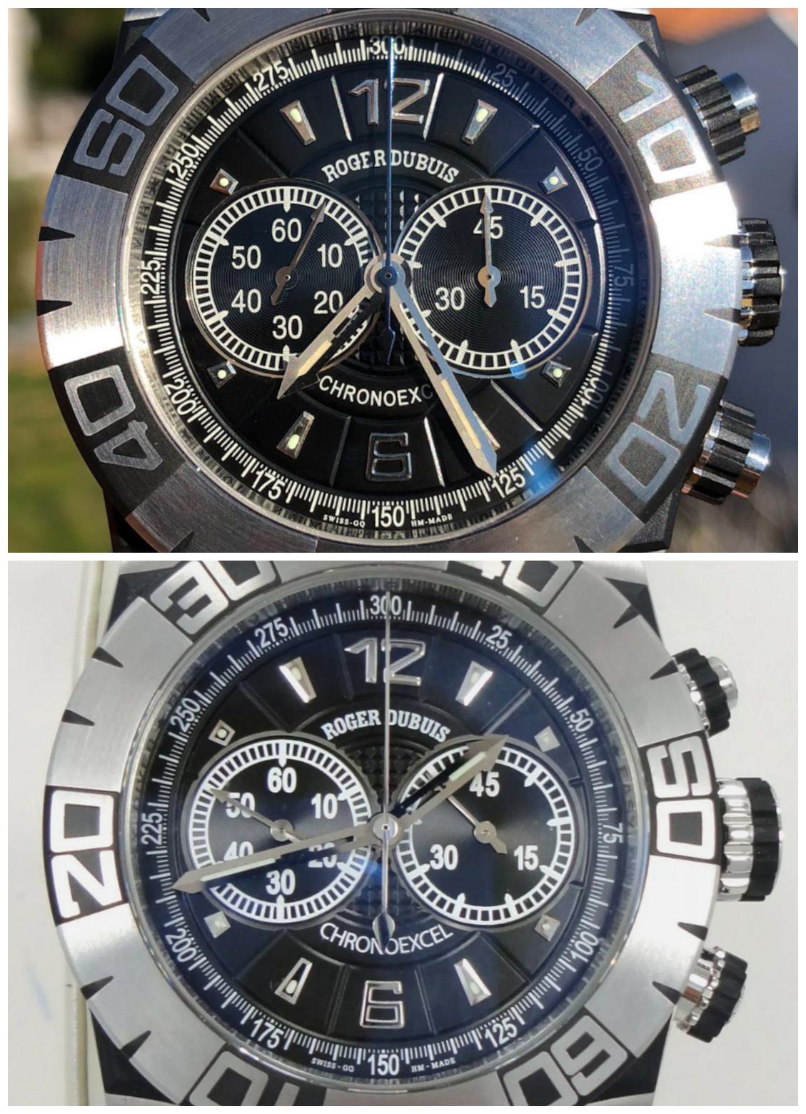
So let's see what happened.
I will warn you right away, gen is not the newest, most popular and widespread clock, so there are not enough all the correct angles for comparison, but this is not the clock in which you should overlay a grid in Photoshop, and most importantly, I will definitely show you.
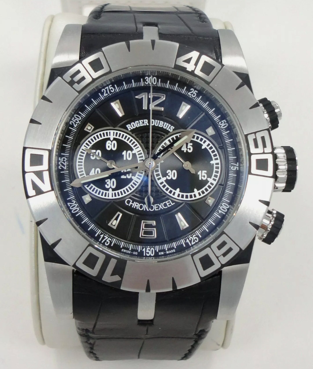
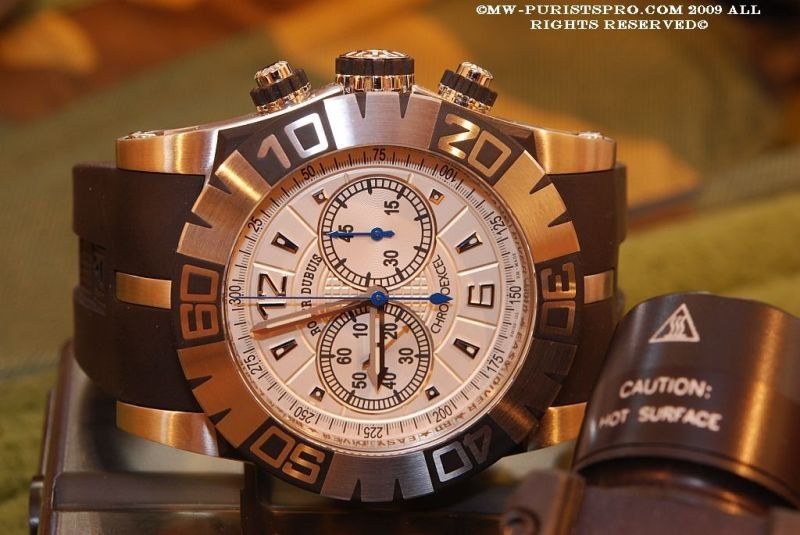
For starters, review photos from all sides of the rep:

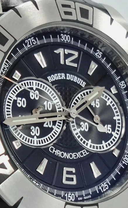
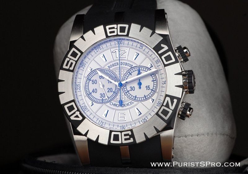
And a little gen, for a general understanding:


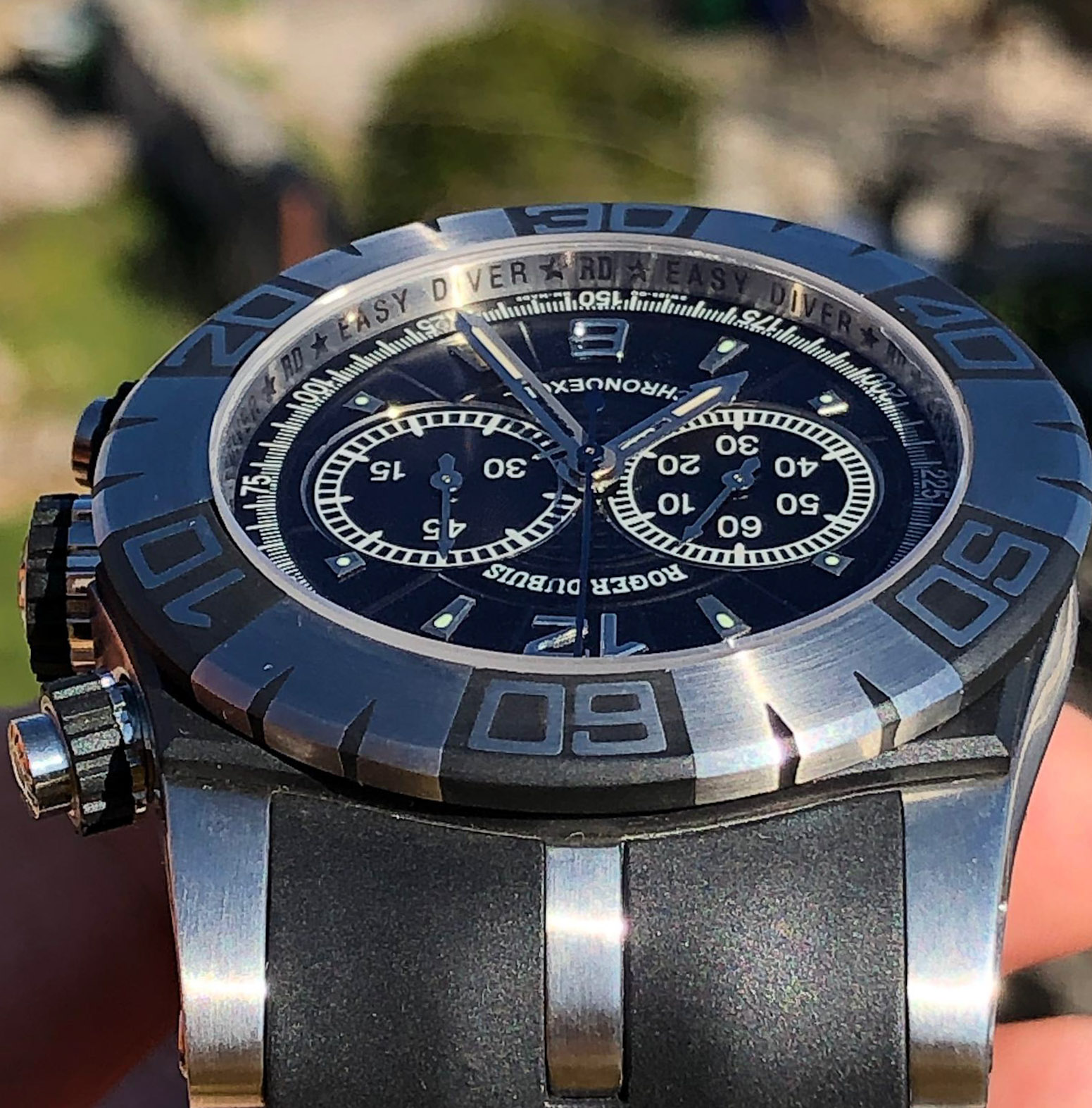
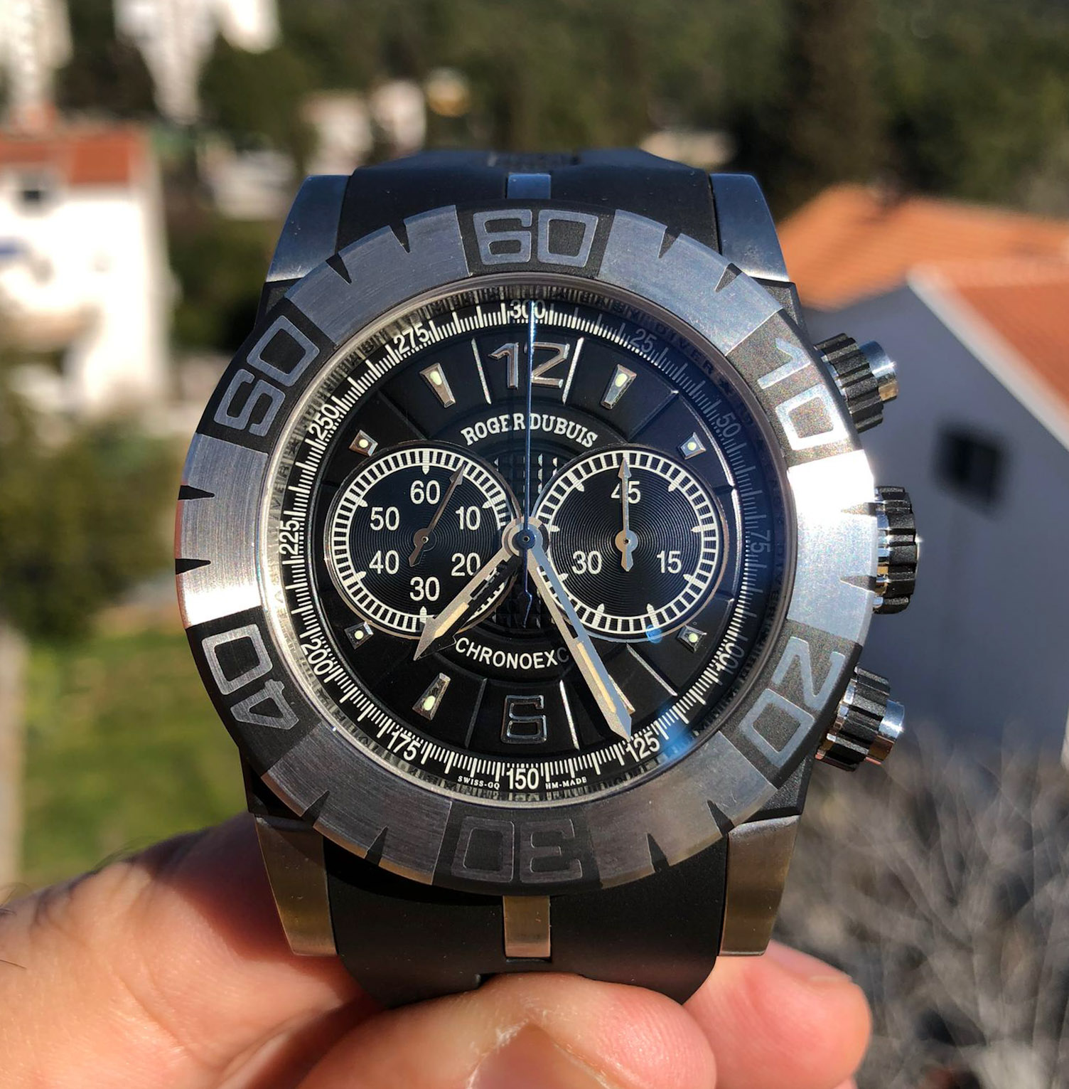
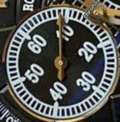
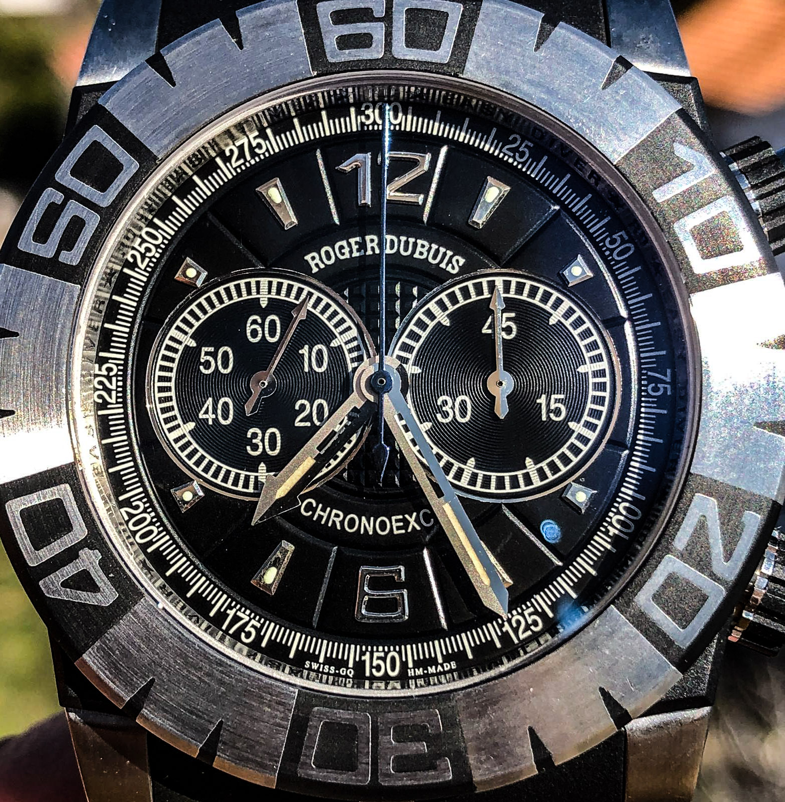
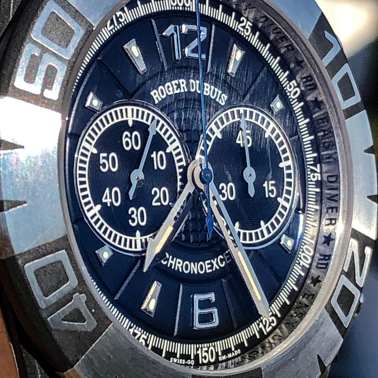
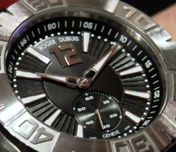
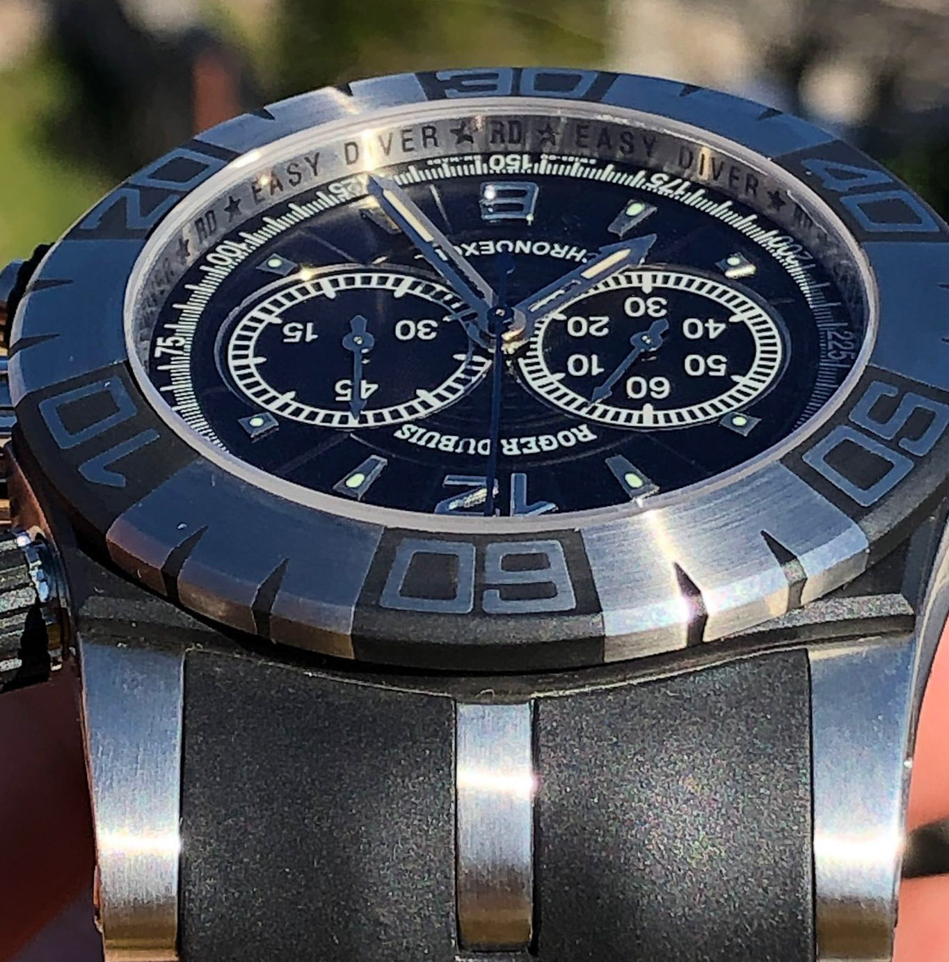
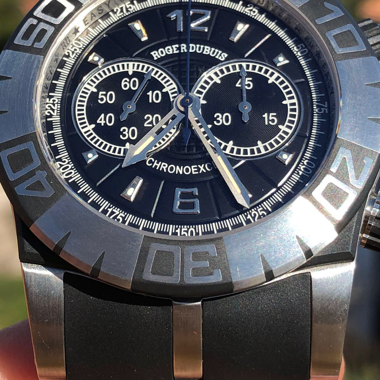
1. Dial.
Let's start with the obvious.
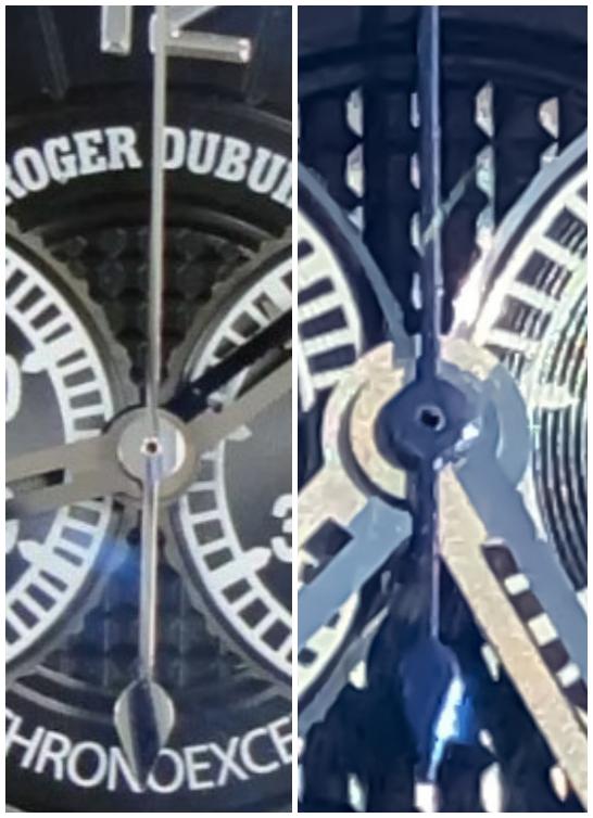
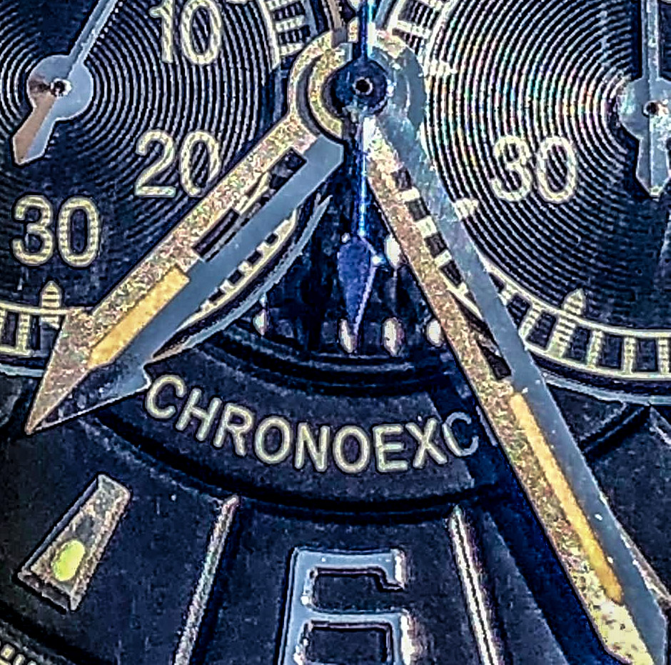
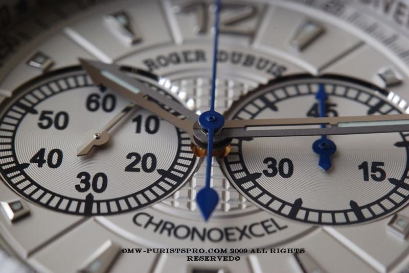
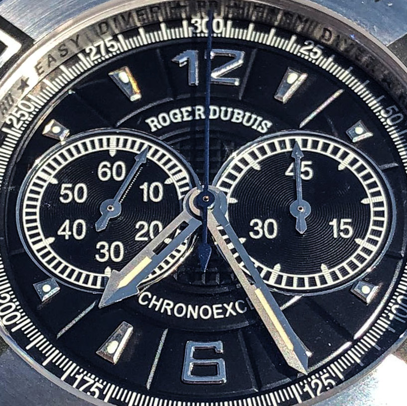
The biggest problem and actual error is the blue central chronograph seconds hand.
In fact, due to the fact that there were direct photos of the release with such a hand, but in the series the watch received a polished hand.
It should also be noted that the reverse side of the hand with the "leaf" is noticeably shorter, although it should reach the edge of the central circle of the guilloche dial, which makes modification impossible.
To be fair, the version with a white dial still has such a hand, but paired with the hand of the chronograph minute drive, and by the way, it is shown there in blue, which caused discontent among lovers of high-quality watches, because blue bluing was expected, and then rap surpassed gen, at least in terms of coverage.
An unfortunate difference, but we started with the worst, it will be better further.
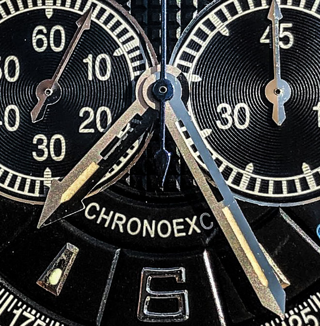
Let's continue for now about the hands, fortunately, there is a story to tell about them.
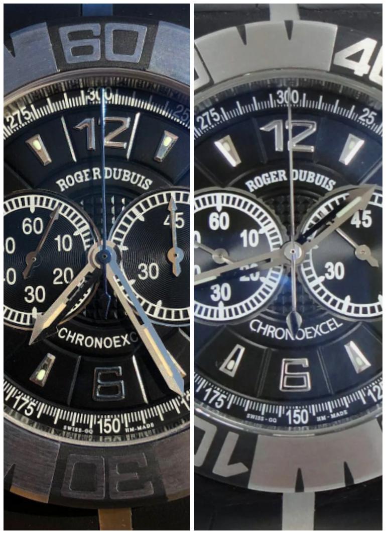
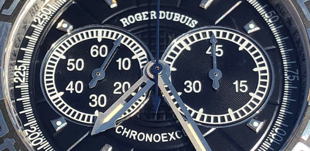
Hour and minute, the hands are excellent, and their design and shape are completely identical.
The hand on the watch hand, cutouts in the center on both, stripes of lume, it is difficult to find direct flaws.
But if you pay attention to their finish under good light and different angles, which is not visible in all photos, you will find something that is definitely not on your watch:
one side of each hand is polished and the other has a sandblasted finish.
In the understanding of RD designers and engineers, this increases readability and emphasizes their shape. It's nice that this little thing is repeated by the factory, at a time when most of the replicas are just thin stamped sheets of foil.
Rep hands:
Gen hands:
(The usual screenshots and downloaded ones are not of sufficient quality, but these photos belong to another model, but everything is visible)

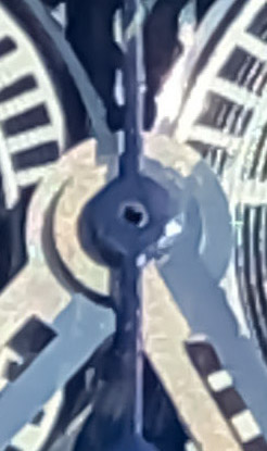
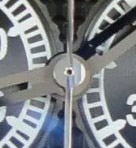
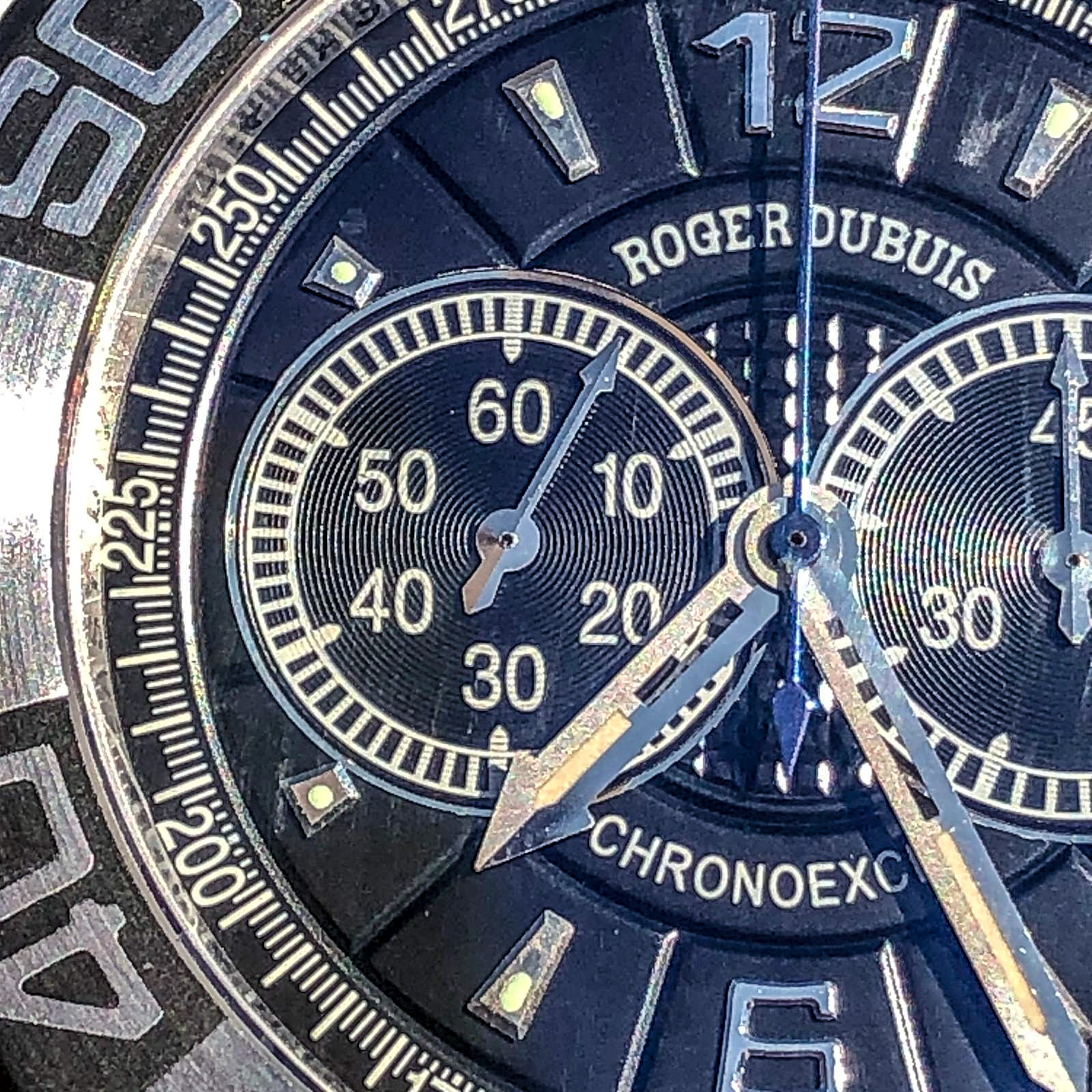
By the way, even a small hand of a constant second and a counter has an edge in the middle, the shape and size of which are also observed.
Rep:
Gen:
The stack of hands looks a little wider, the base of the watch hand is wider, it would be worth it, but this is not so significant.
Rep:
Gen:
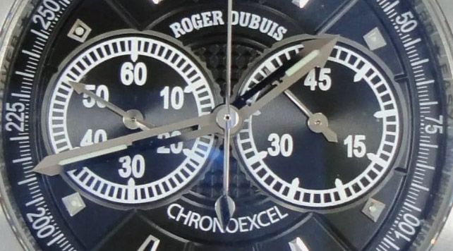
CP looks good.
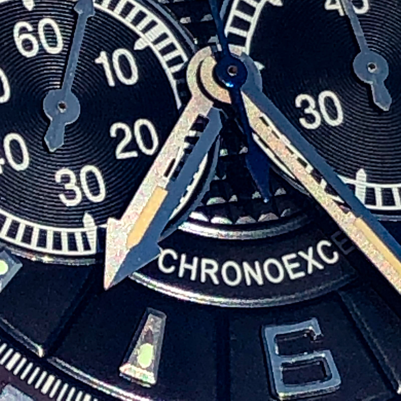
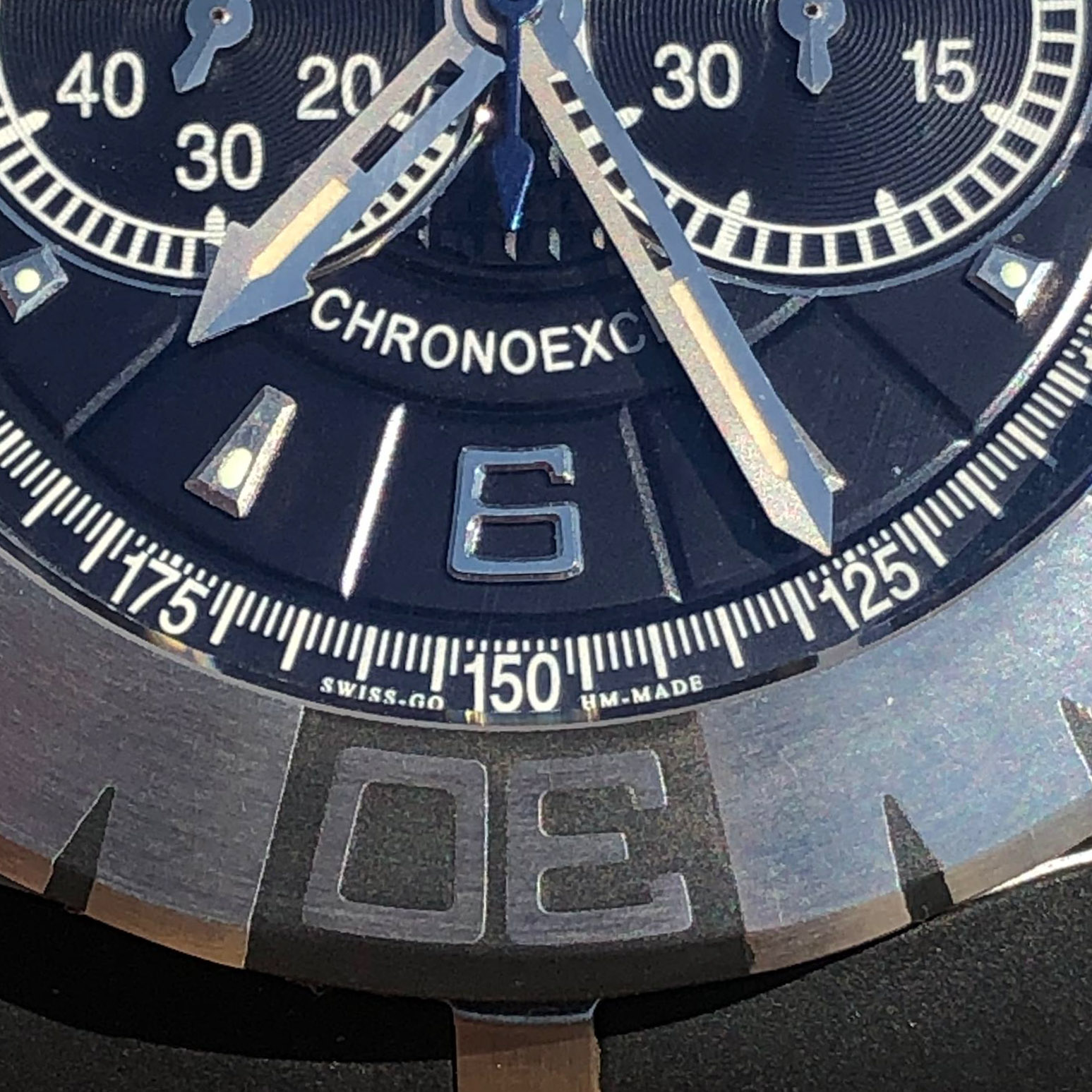
The dial fonts look worse than gen, they repeat the shape and typography, but are blurry to the limit, which is especially evident on the top line. However, since the font itself is similar, complex, due to small gaps, it looks normal on survey photos from a short distance.
Rep:
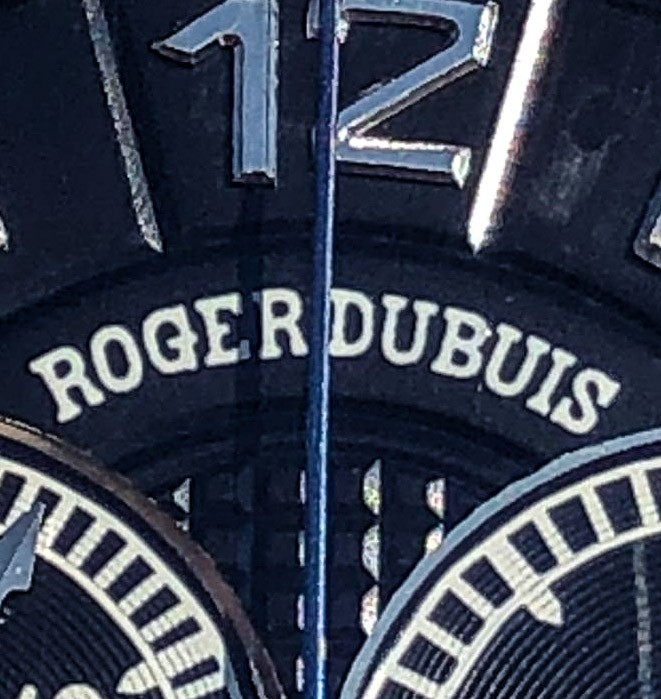
Gen:
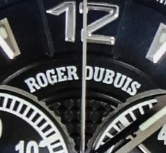
The fonts of the tachymeter scale were not followed. The shape of the numbers is normal, though bolder than the gen, but the strokes of the original watches are different in length and thickness, while the rep marks are not printed with a solid "fence", but do not respect the difference in thickness and length, of all types of position. I agree that this is small, but difficult to do, but it affects the general perception of the typography of the dial, which partially loses in this seemingly senseless complexity, which actually gives the feeling of "quality" and "high cost" gen, even if it does not stand out as a separate item.
Rep/Gen:
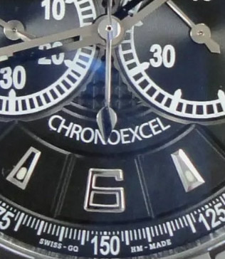
The gen sub-dial fonts are fatter than rep and compared to them the strokes are thinner, which is logical, first of all, to highlight more important indicators with brightness, but on rep the typographic scheme is slightly simplified. Oh, okay. There's a lot of good stuff here besides that.
You can see this in all the photos above.
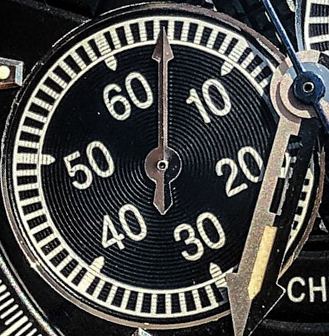
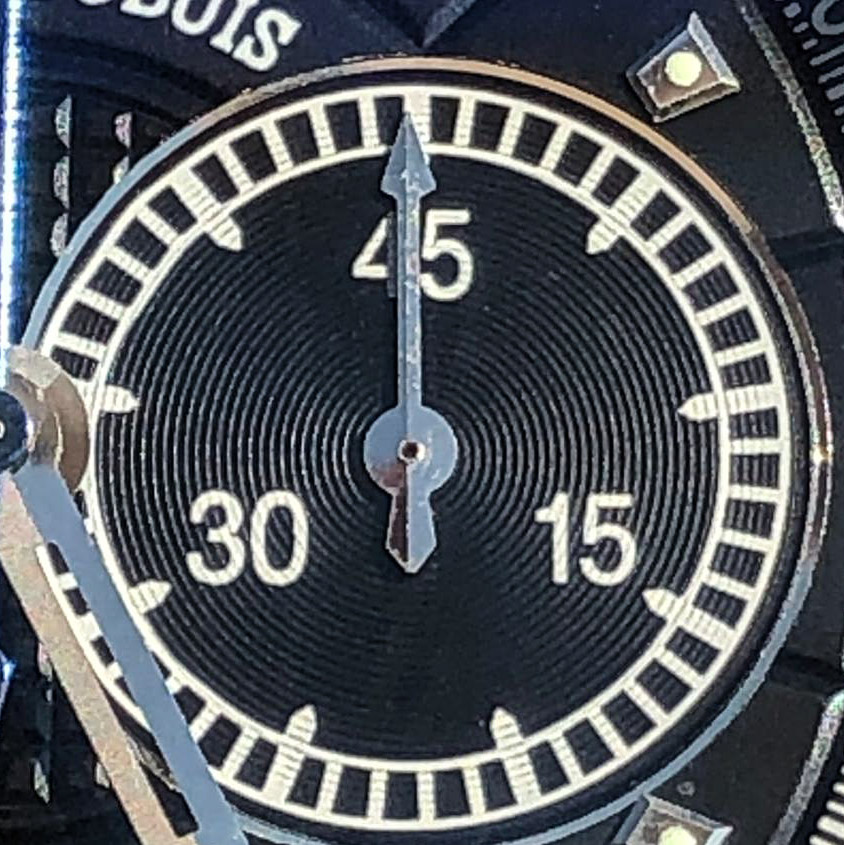
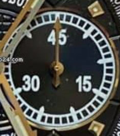
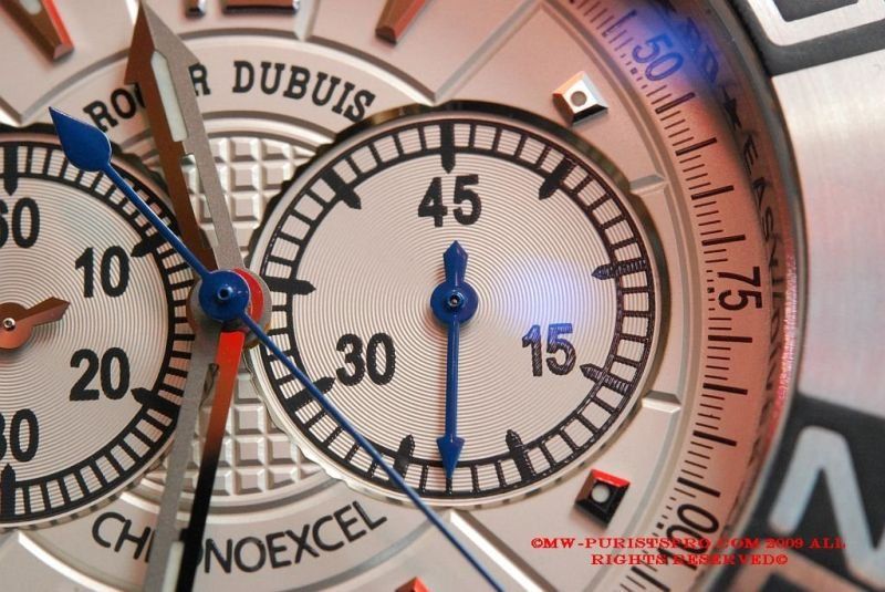
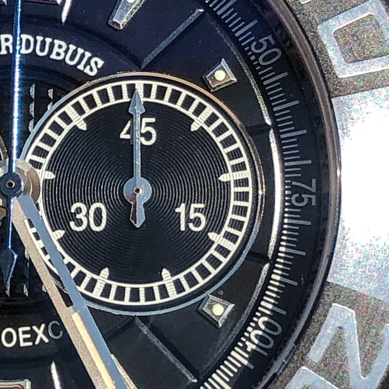
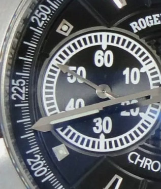
For some reason, the edges of the sub dials are made even and solid, apparently, they were engraved in front of the overall pattern of the dial.
You can see the uneven edges of the gen, which can sparkle in ragged lines in the light. They repeat the cut of the pattern of neighboring jewelry, as if it were a giloshe in the center, or grooves on the periphery.
I say "for some reason", because, running ahead of time, everything was done correctly on the version without a chronograph with a constant second hand at 6 @.
Rep:
Gen:
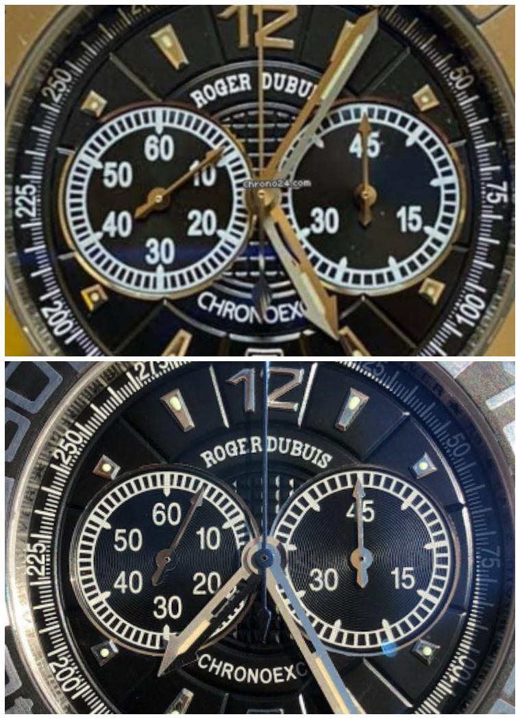
The location of the sub dials seems to be correct, and although the rep gap is slightly larger at the edges to the tachymeter scale, this is not critical, and may be caused not by the difference in the position of the hands, but by the general layout of the rep dial.
Rep:
Gen:
Concertric circles on rep look more pronounced, i.e., grooves are deeper and less frequent, but gen also has them, although they are not visible in all photos. I won’t go into it, this is a typical element of the gen / rep discussion of almost any chronograph, and I don’t see a problem here.
Rep:
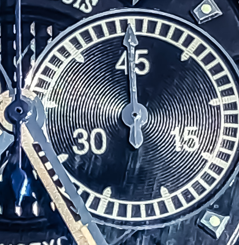
Gen:
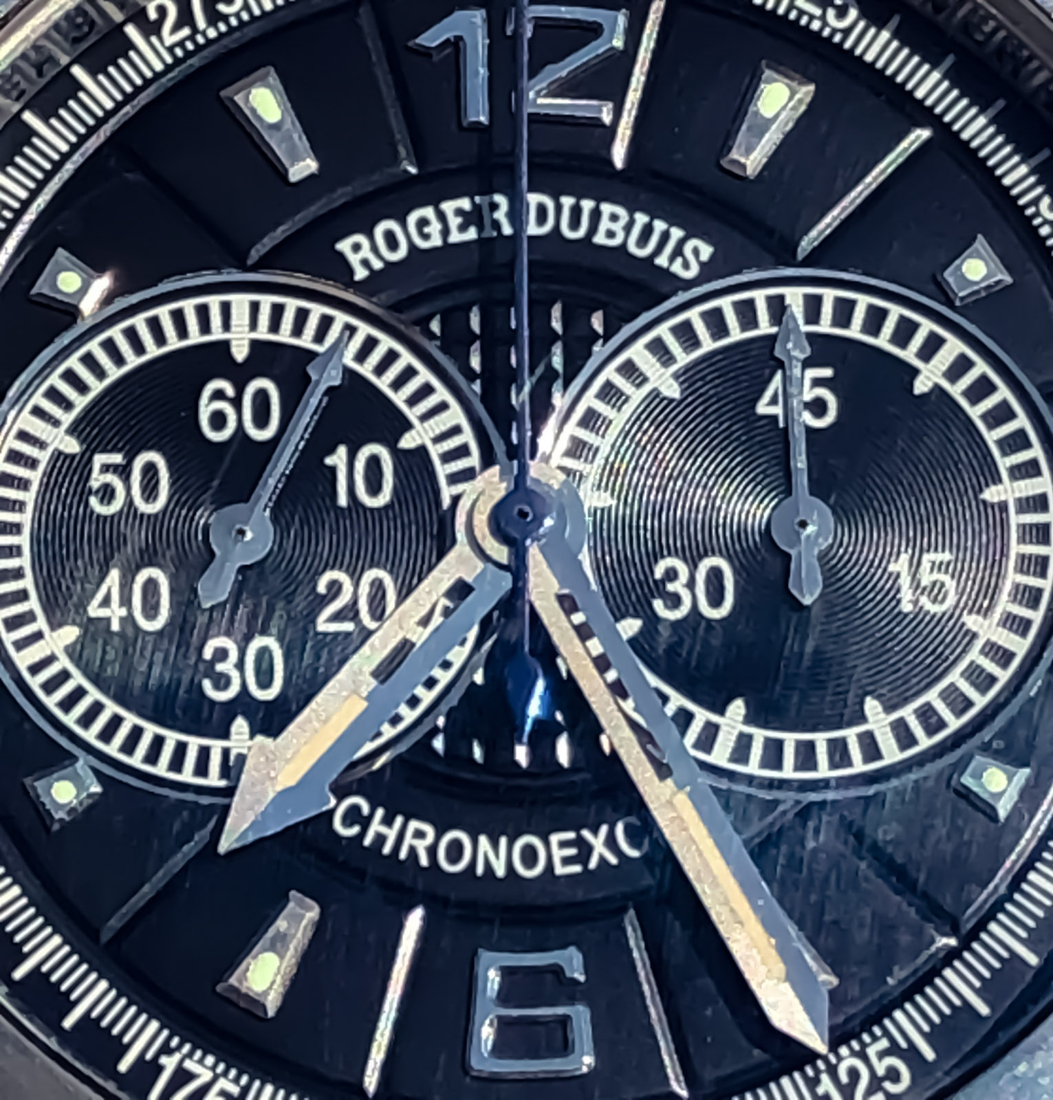
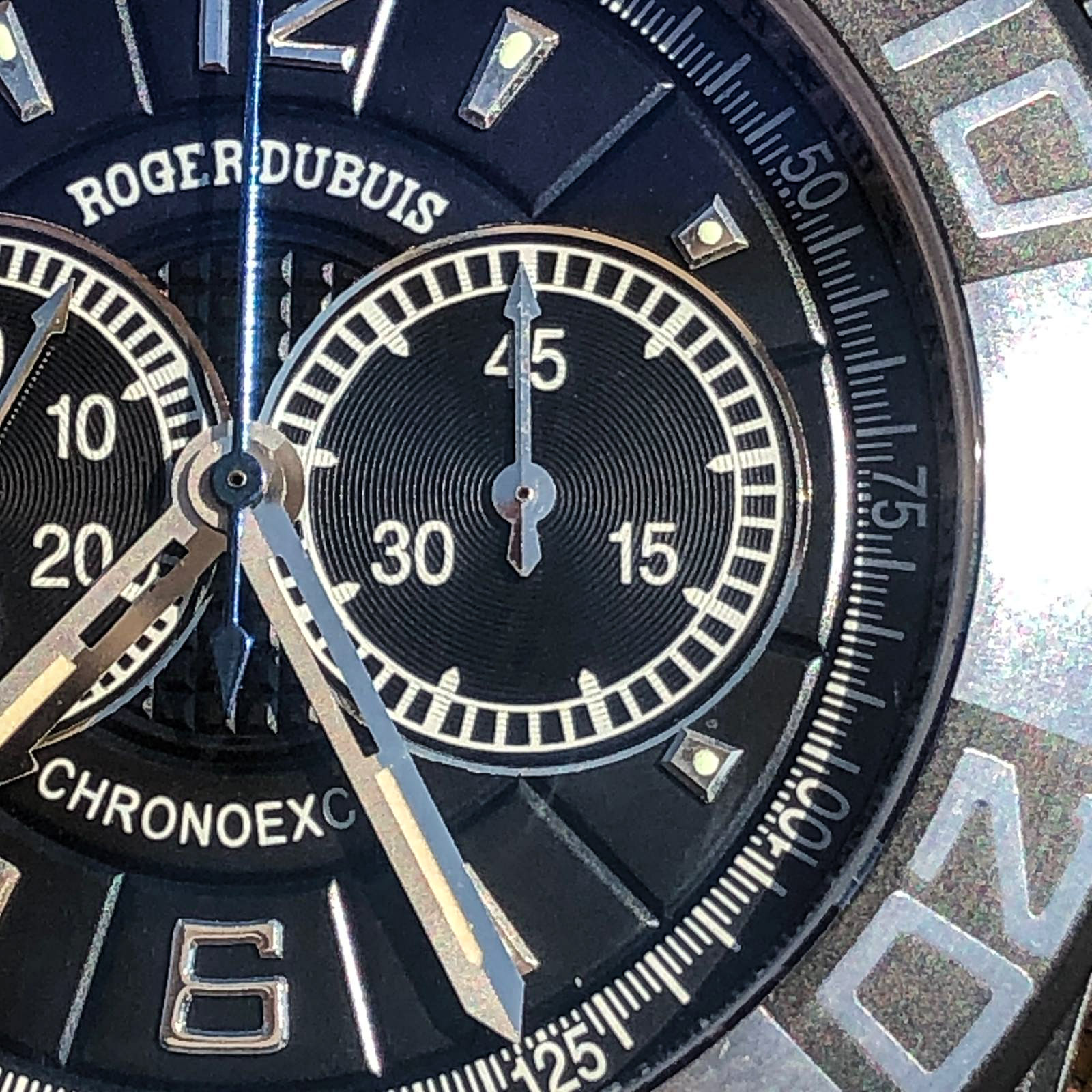
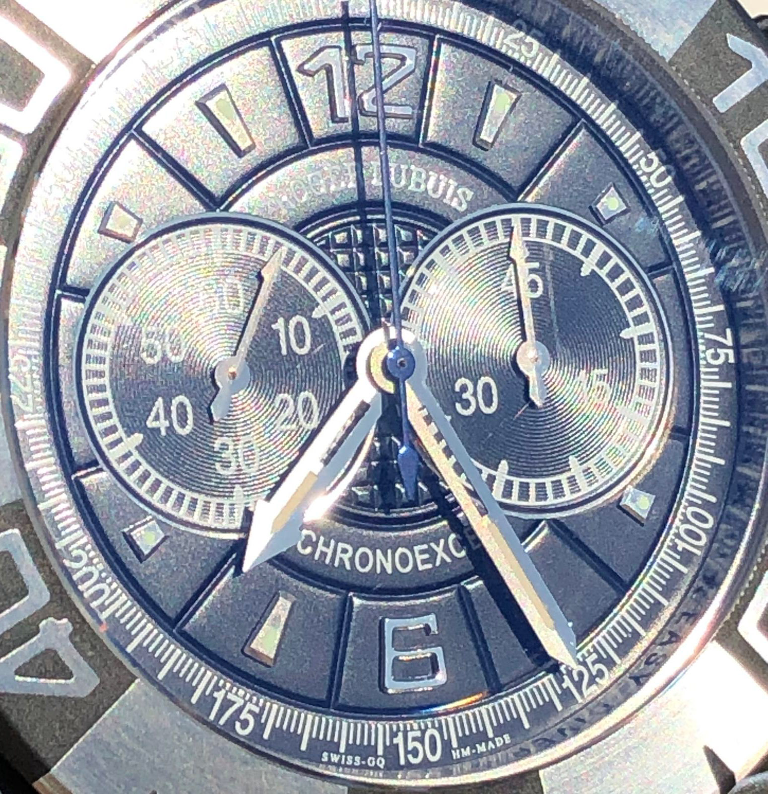
The applied indexes at 2, 4 and 8, 10 @ are not quite the correct shape, more elongated, which they inherited from the ED I, although they adjoin quite precisely to the edge of the sub-dial. I think the reason is the proportion of the dial, as well as at the edges, but in general, this moment could be played by the Factory in a more interesting way.
On the other hand, the rest of the hour marks are good, both in size, and in shape, location, and decoration, and although the lume points on them look a little awkward, RD solves this problem in exactly the same way, so there is no cause for concern.
Rep:
Gen:
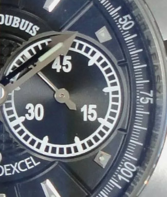
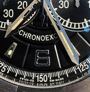
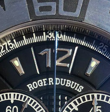
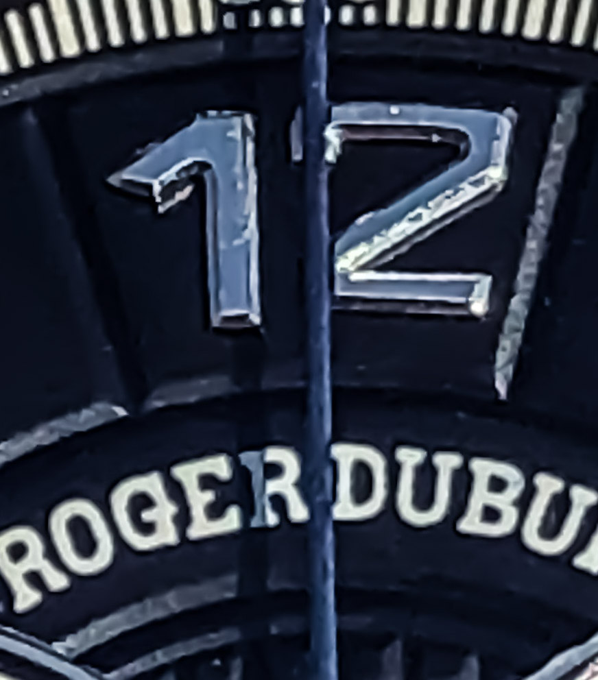
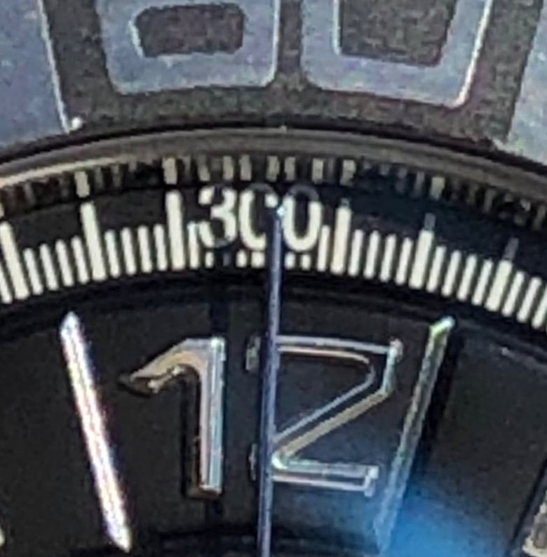
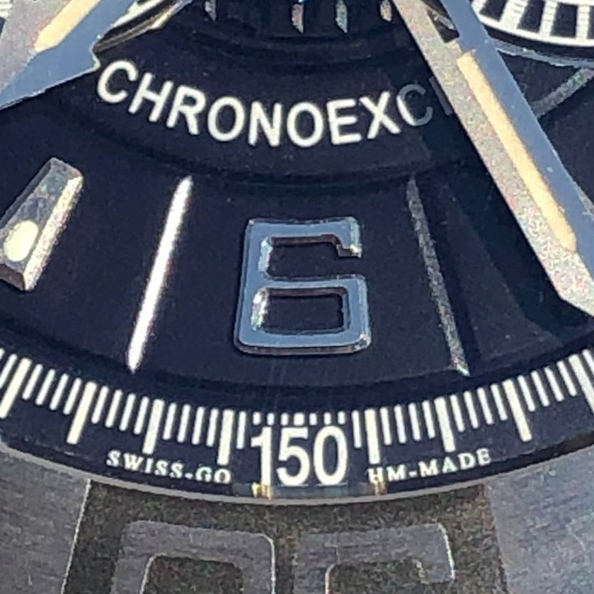
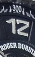
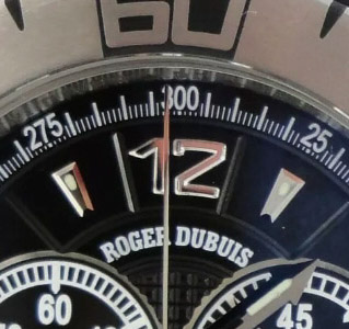
On the other hand, the overhead numbers have cause for concern.
If the number "6" looks good, then there are problems with "12", in particular with "2".
The shape of the numbers is complex, due to the expansion from the base to the top, in consonance with the pattern of the dial and the general design, and on the two-digit numbers it is difficult to maintain a cunning shape, and it is even more difficult to glue it exactly.
In this particular case, it would be enough to align 1 and 2 to the bottom at the same level, but if you look at any other instance, the questions may not be complete, but they will remain.
However, my attitude to this is that, taking into account all the details of this dial, the Chinese factory simply prophylactically lowers us from heaven to earth so that we do not forget how this watch is made.
Rep:
Gen:
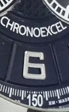
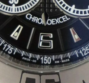
Pay attention to the rehaut, where there is an engraving filled with black paint. Perhaps the inscriptions are a little thicker, and not so neat, but even the fonts are correct, and in general this is a very cool and pleasant feature of this watch, which will please you, especially since, unlike the rolex, there is no clear correspondence to the marks in the position of the letters.
Rep:
Gen:
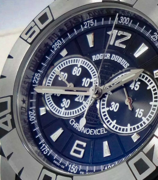
In conclusion, I would like to point out the magnificent pattern of the dial.
Both the guilloche and the grooves are clear and correct, including double lines between the text plates and the central guilloche circle.
This is a big and good job, and a little better than the ED I, given the depth and width of the grooves, and given the certain angle of the groove bevel, sometimes it seems even a little trickier than gen.
Rep:
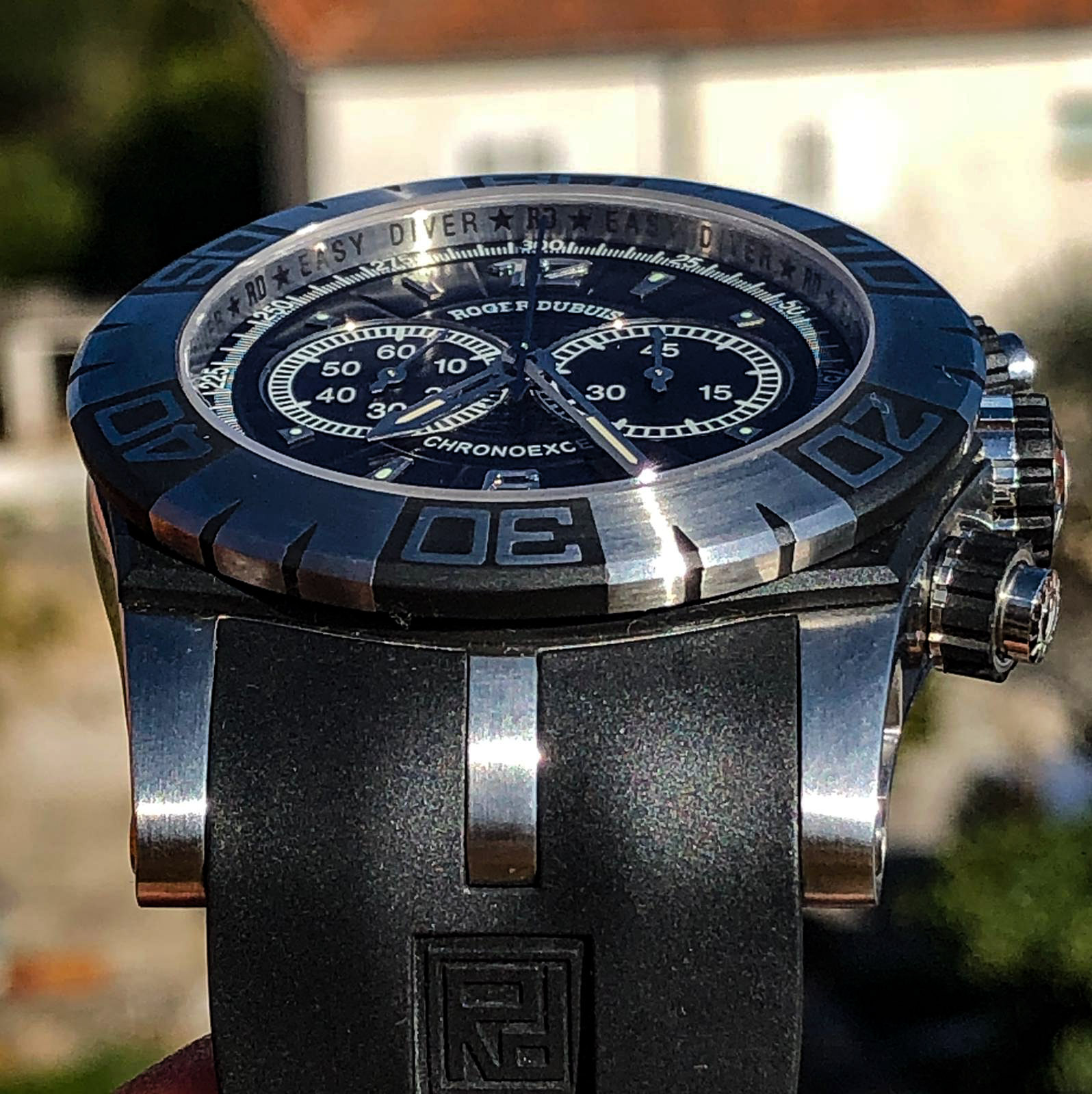
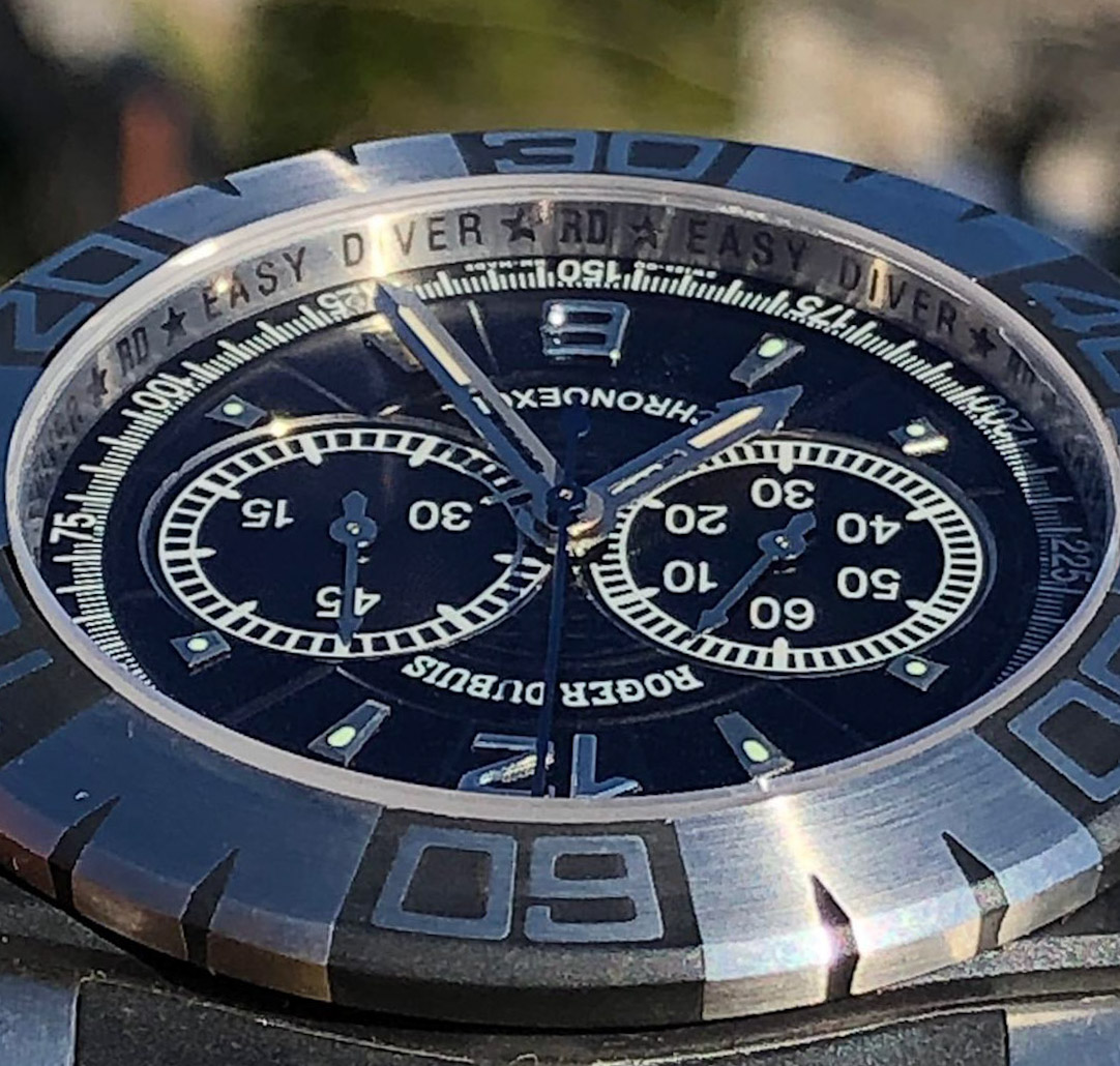
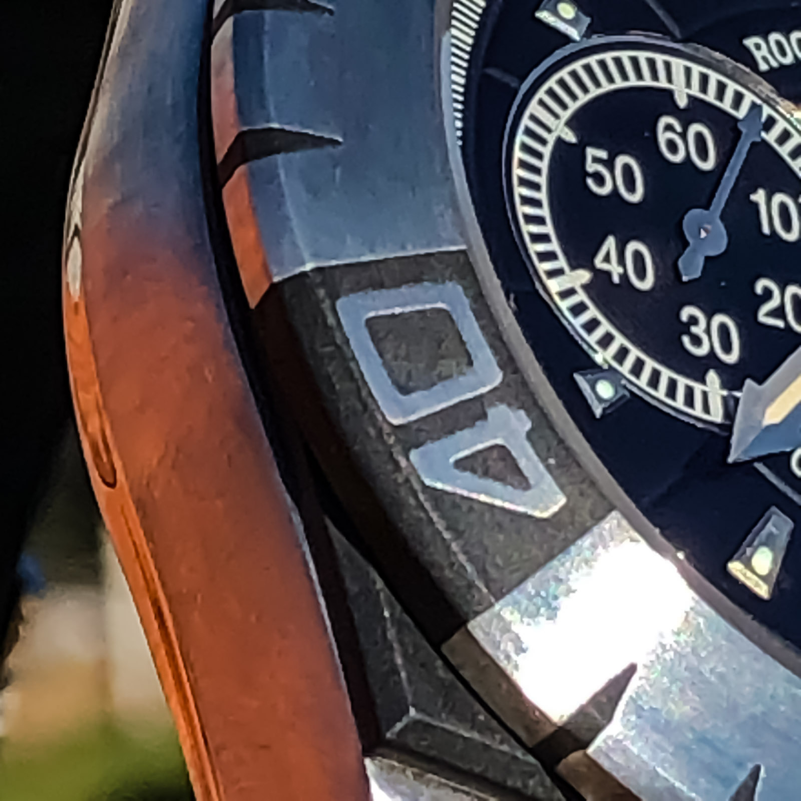
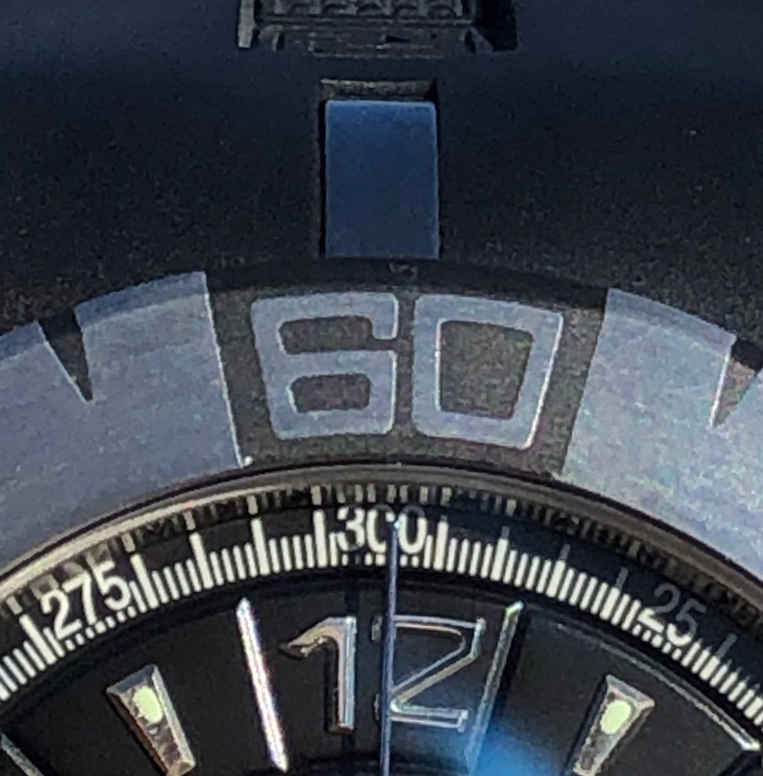
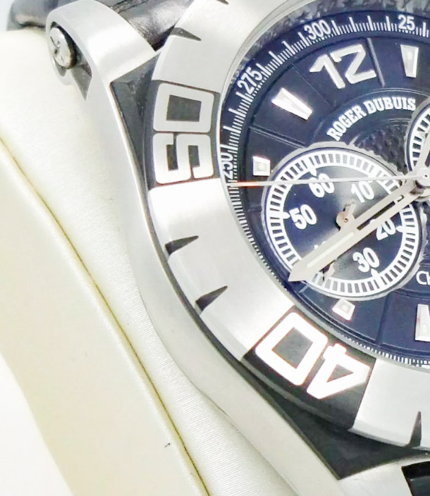
2. Bezel.
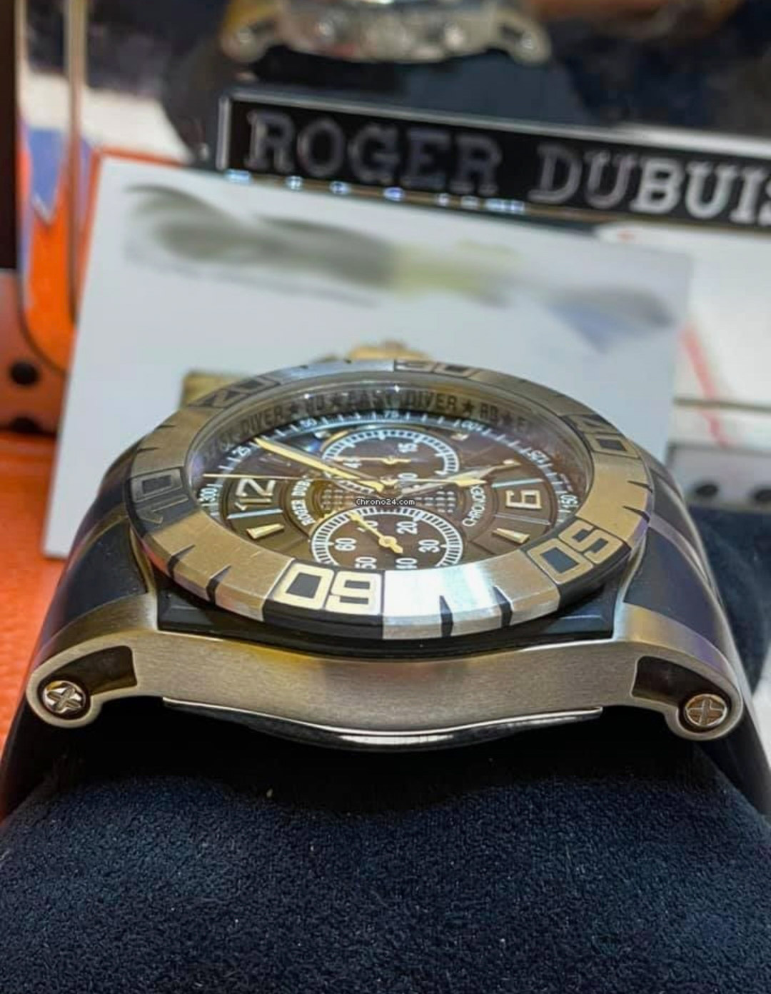
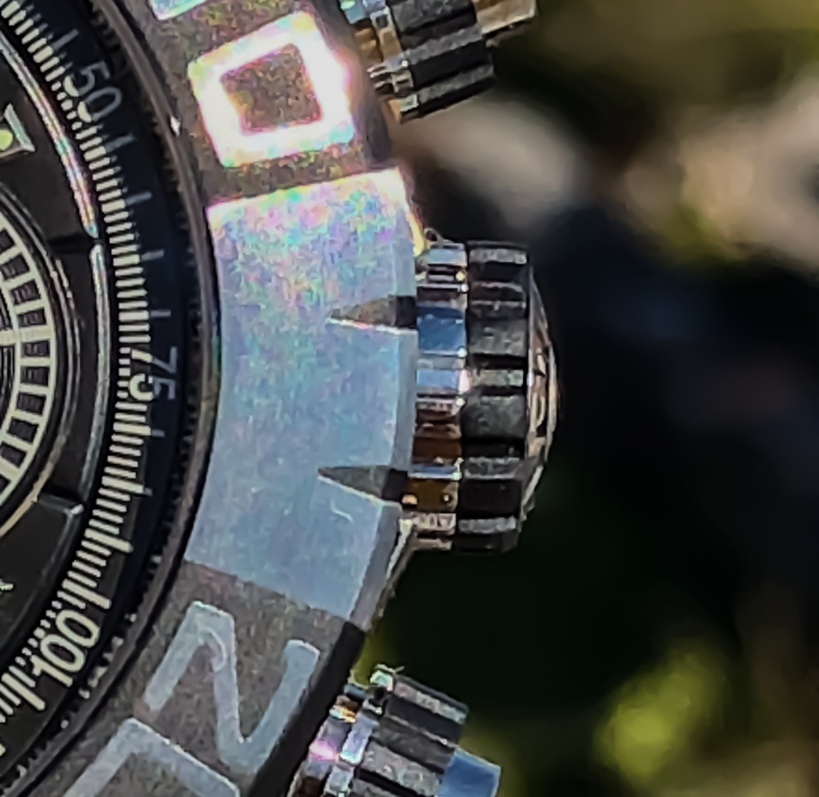
Regular in shape, beveled aspect ratio and size relative to midcase. This is a good job, and I am glad that it "hangs" around the circle exactly as much as it should, and the bevel angles are also correct. In general, the geometry is pleasing.
As expected, it is diving, unidirectional, 120 clicks, looks normally centered (I'm not paranoid about that), does not play either in a circle or vertically.
Rep:
Gen:
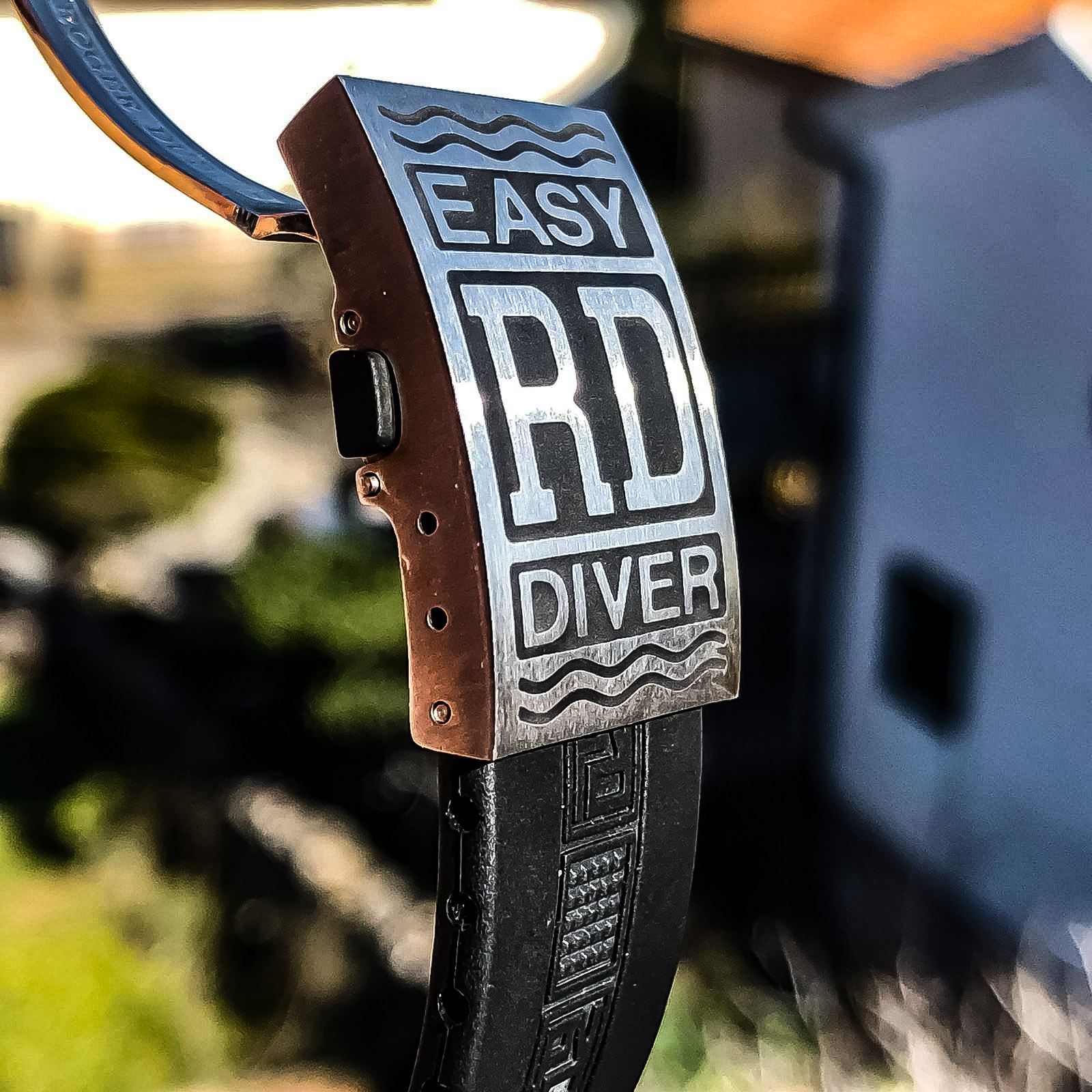
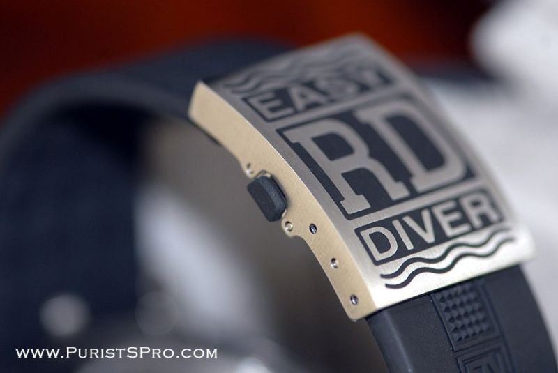
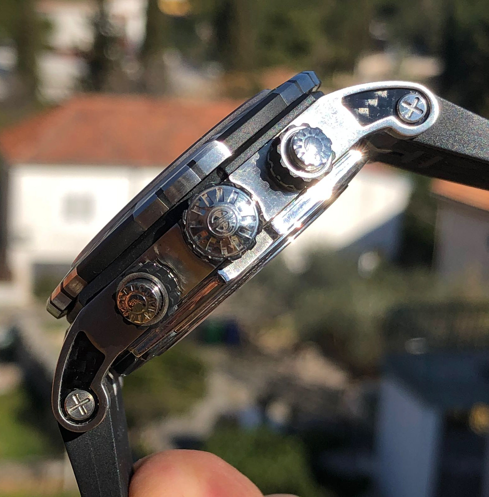
The important point is that one of the main design ideas of this watch is the black accents, which are made of some rubber that is fused to the metal parts, lined up, and finished.
In the case of the bezel, we can recall the chiseled sectors on the RD ED I bezel in which the numbers remain intact, it's just that now this depression with a sandblasted bottom is filled with rubber and leveled, and also 2 "fangs" are added between each "window" with numbers that go both along the plane of the bezel and along the end, repeating all its bends.
You can see variants in another gen design, where the already modern bezel does not have this rubber filling.
Gen, without rubber:
Gen with rubber:
I must admit that rep repeated this all technologically correct, however, the squares themselves, as in the case of ED I, are larger and the numbers are thinner and take up less space, forming a greater distance to the edge of the black plane.
Rep:

Gen:

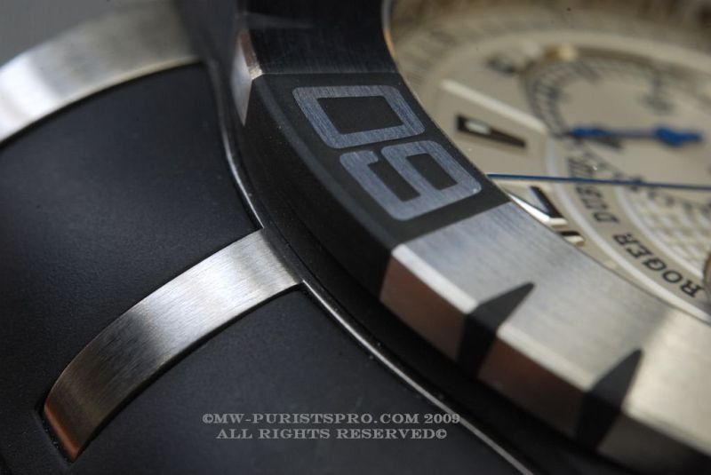
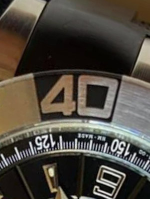
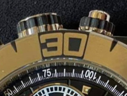
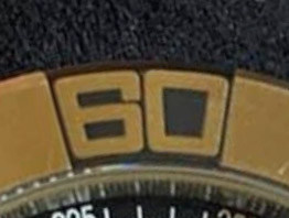
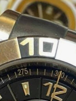
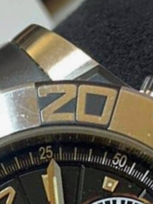
I'm not ready to say that this is a drawback, it does not spoil the design, but in this watch there are not so many differences from the GEN to keep silent about it.
By the way, the bezel seems a little thicker, but not significantly.
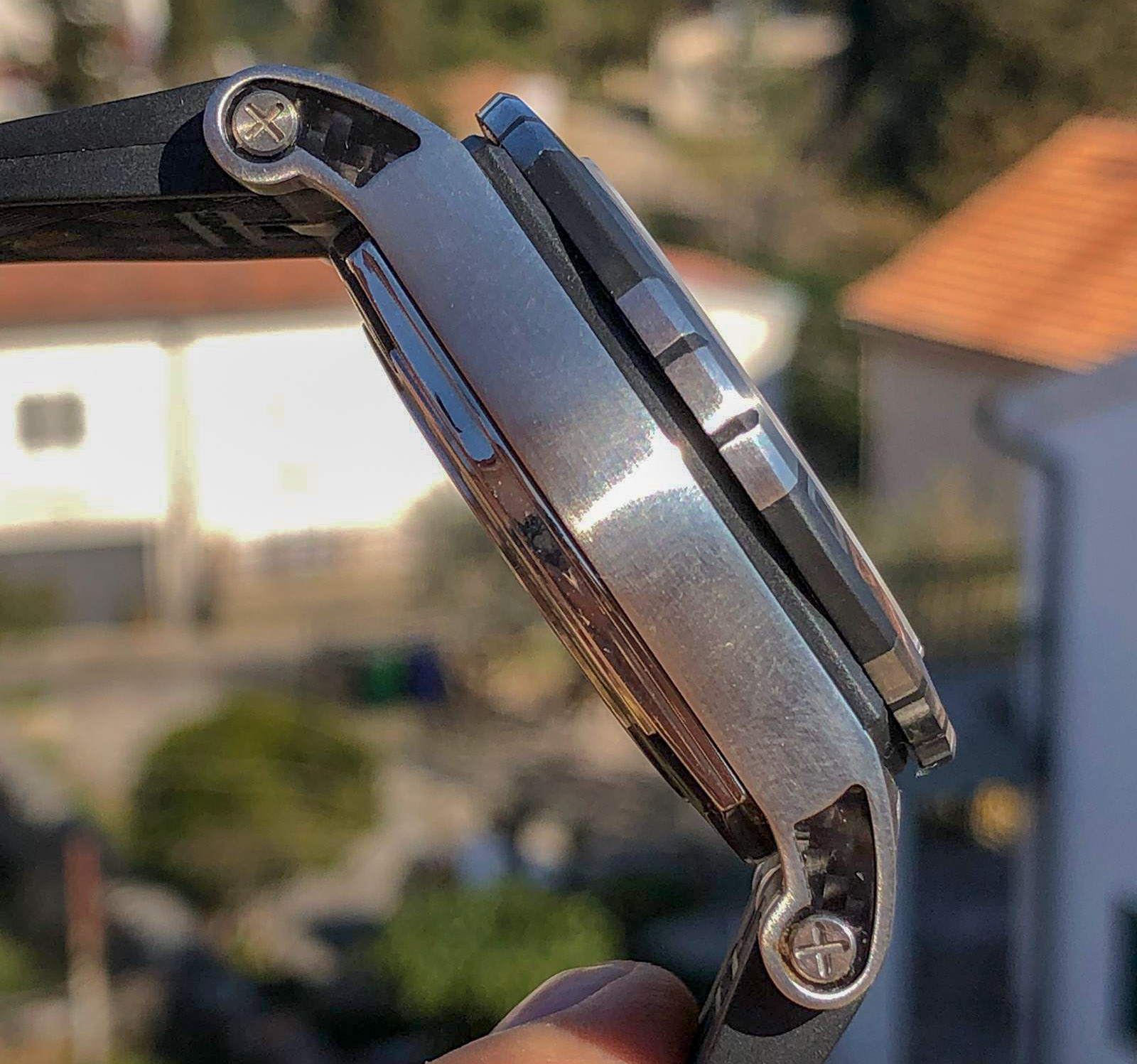
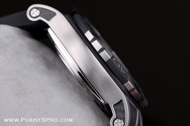
More worryingly, the rep crystal has a ledge where the light-domed gen, like the first-generation driver rep, grows right out of the bezel, with no visible gaps. In the photo that have already been presented, it can be seen.
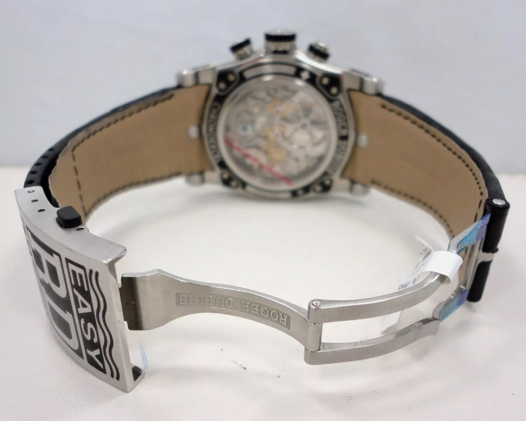
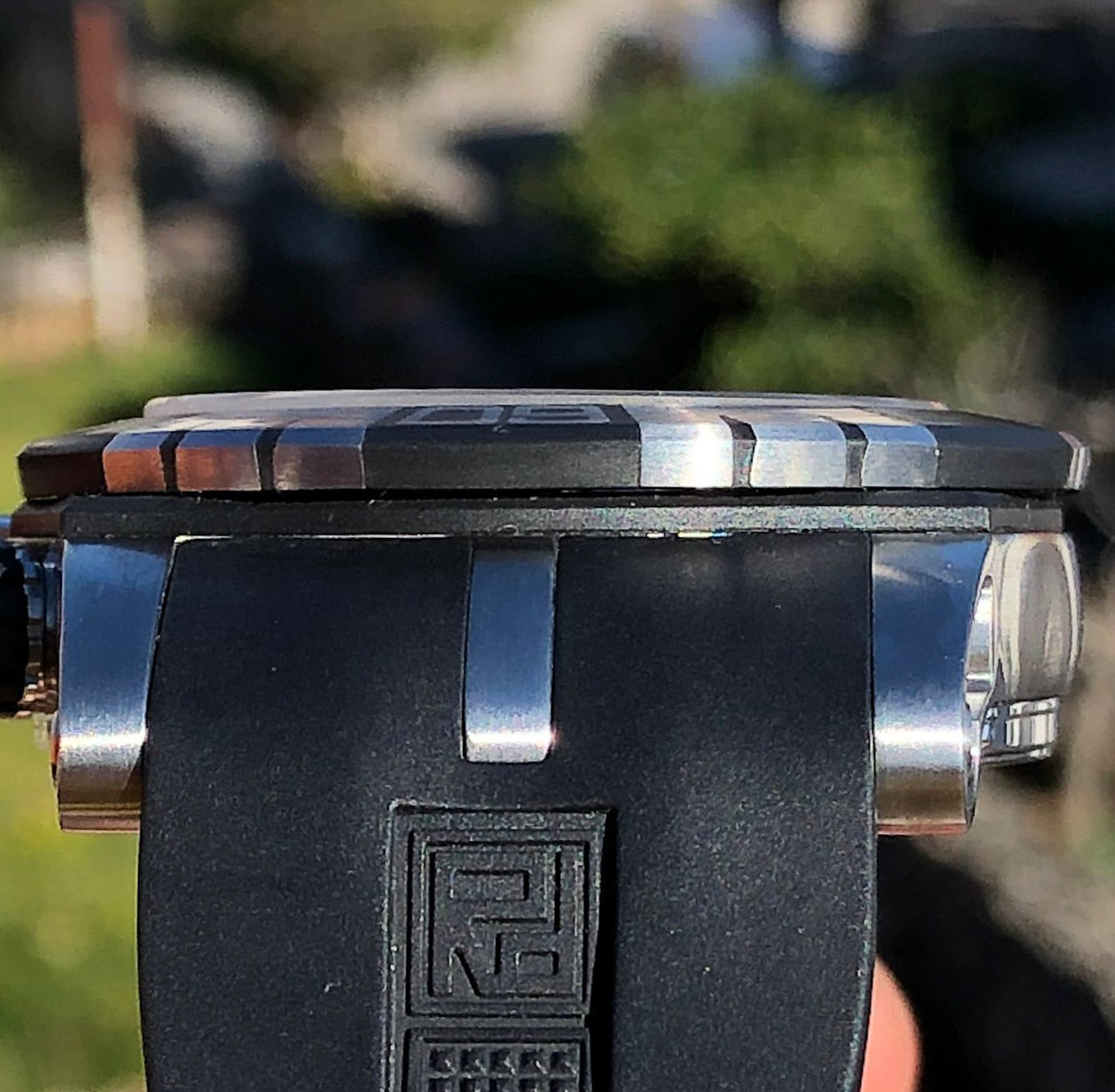
3. Case.
Complex, beautiful, with lots of details, and very well repeated, that's what I can say about it.
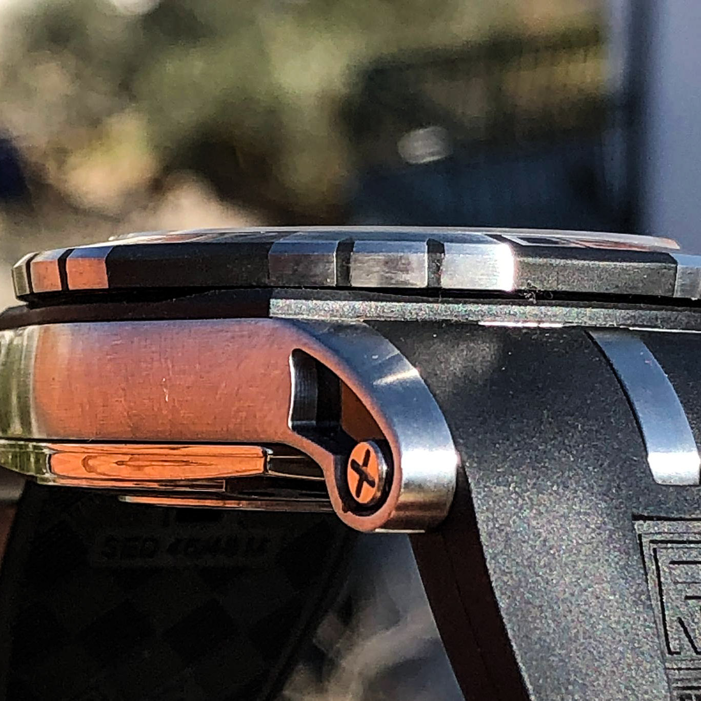
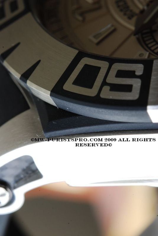
The design is such that from the profile we will see a sandwich from the back panel with a polished edge, the midcase itself, a symmetrical panel, in this ED generation, made of rubber, not steel, as in the first, and on top of the bezel.
The mid-panel follows the shape of the midcase from the front, and this beautiful and graceful figure is found in most models of the time.
The thickness, position, material and indent from the edge of the case (how much less it is in area from the front) are all correct. Not true, as in the previous model, is the bevel around the perimeter. It is narrower and more vertical, to the best of it. Fortunately, on matte black rubber, this is not as noticeable as on steel, especially when the bevel is polished and the surface is satin-finished, but why they cannot make this VERY important design element (in my opinion) correct - I don't know. Let's leave it as it is.
Rep:
Gen:
You can find fault with the midcase shape itself, but I won't. It is complex, beautiful, and conveys all the sensation of gen to the fullest, in terms of size, shape, finish.
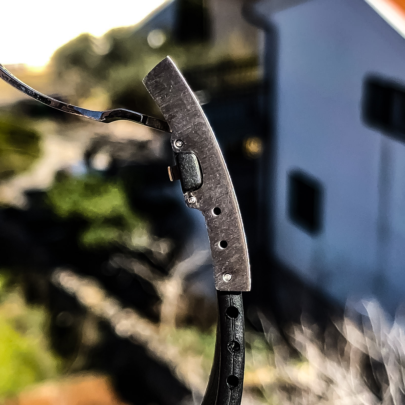
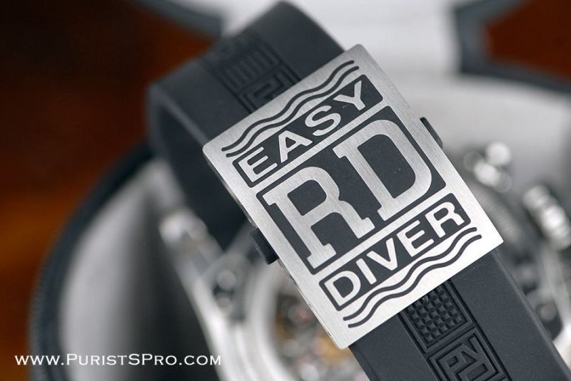
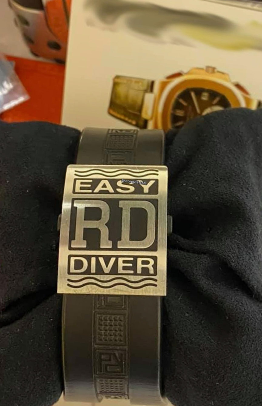
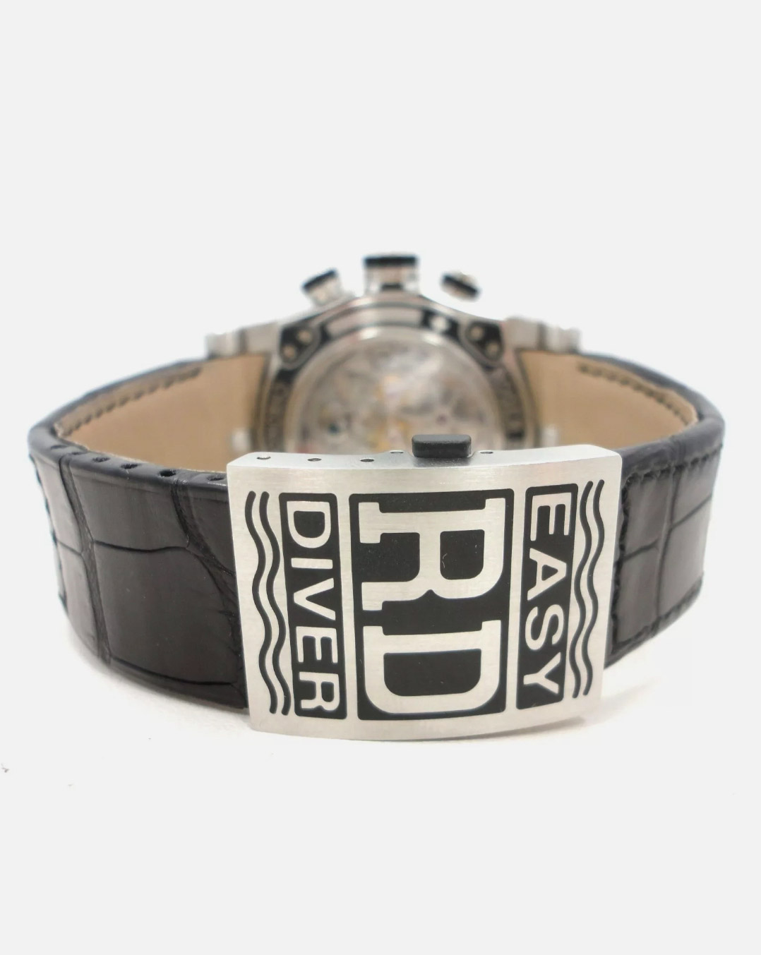
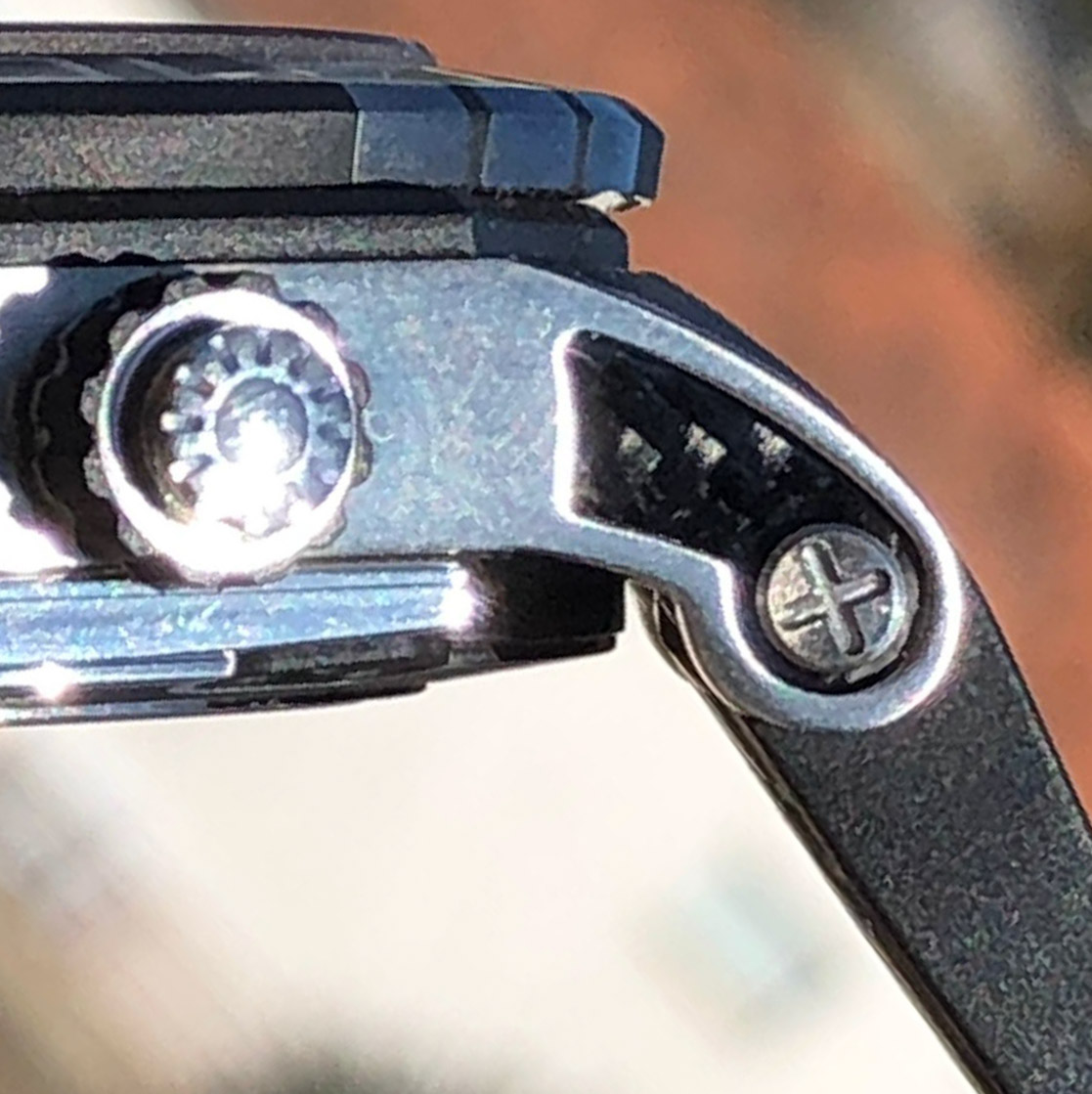
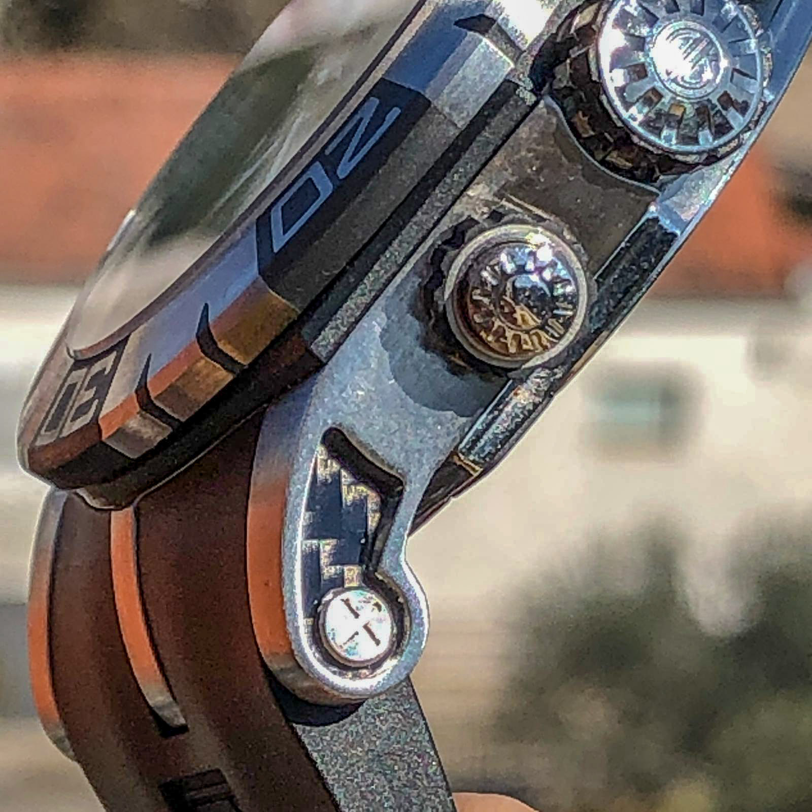
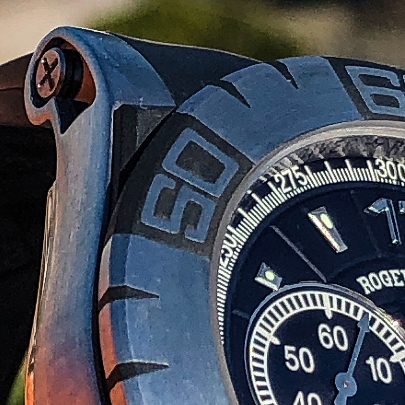
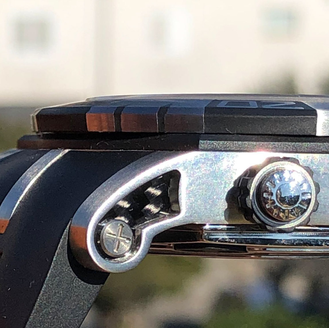
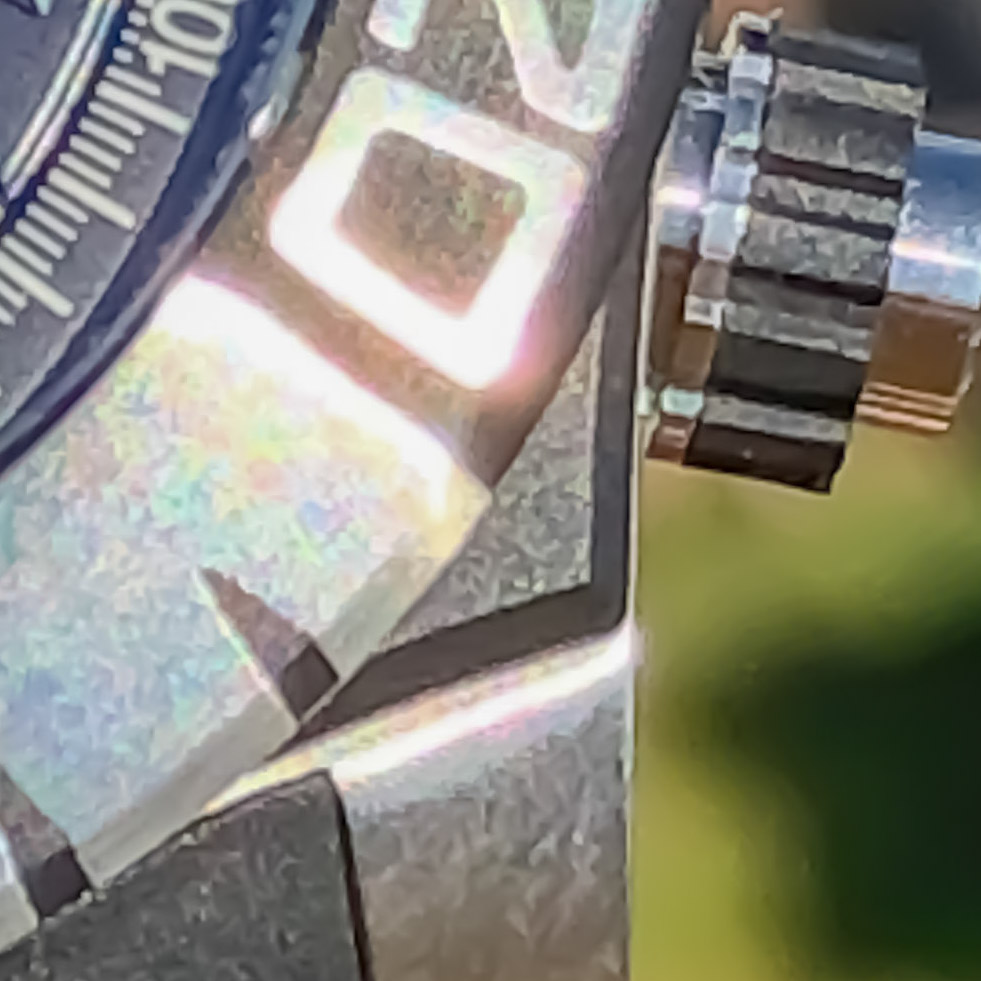
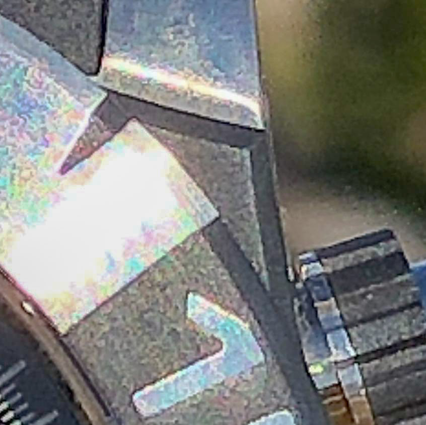
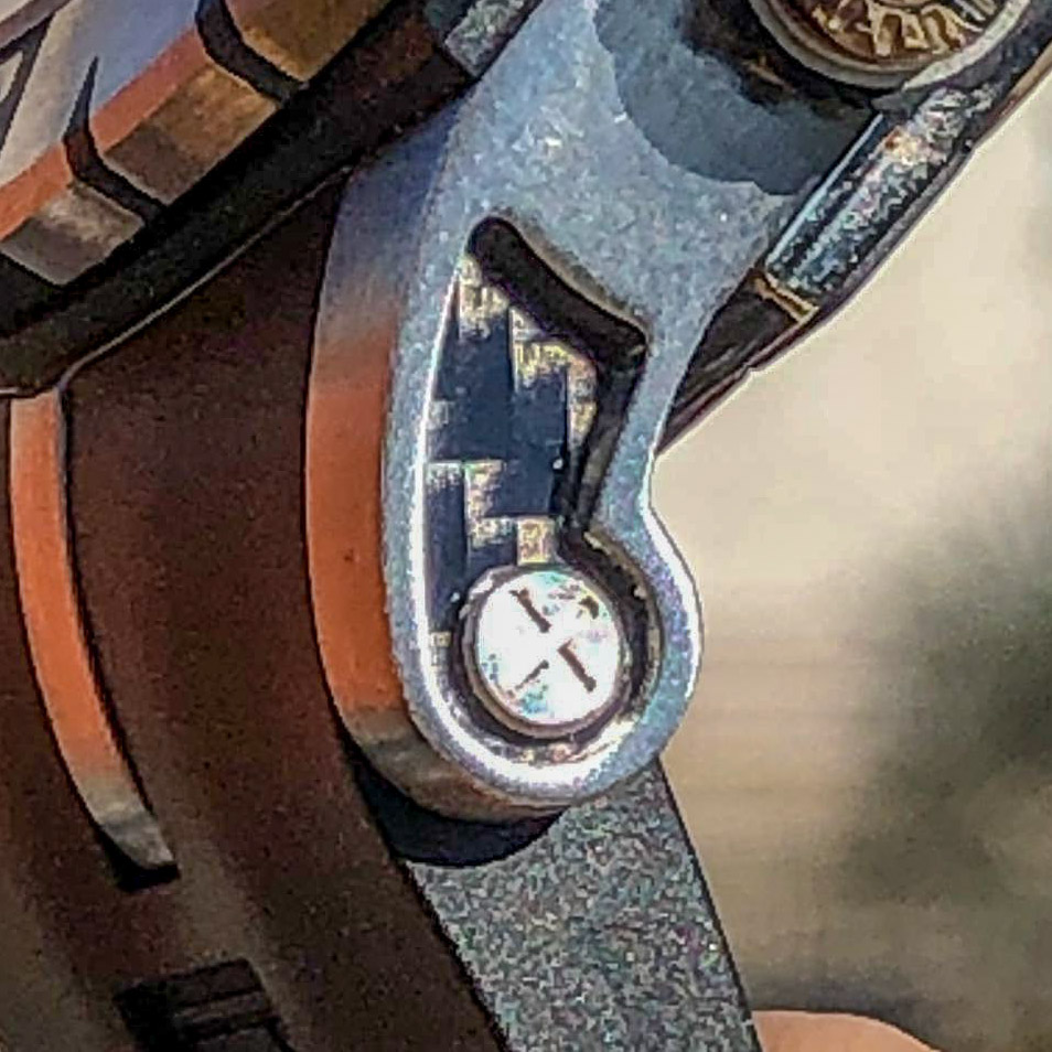
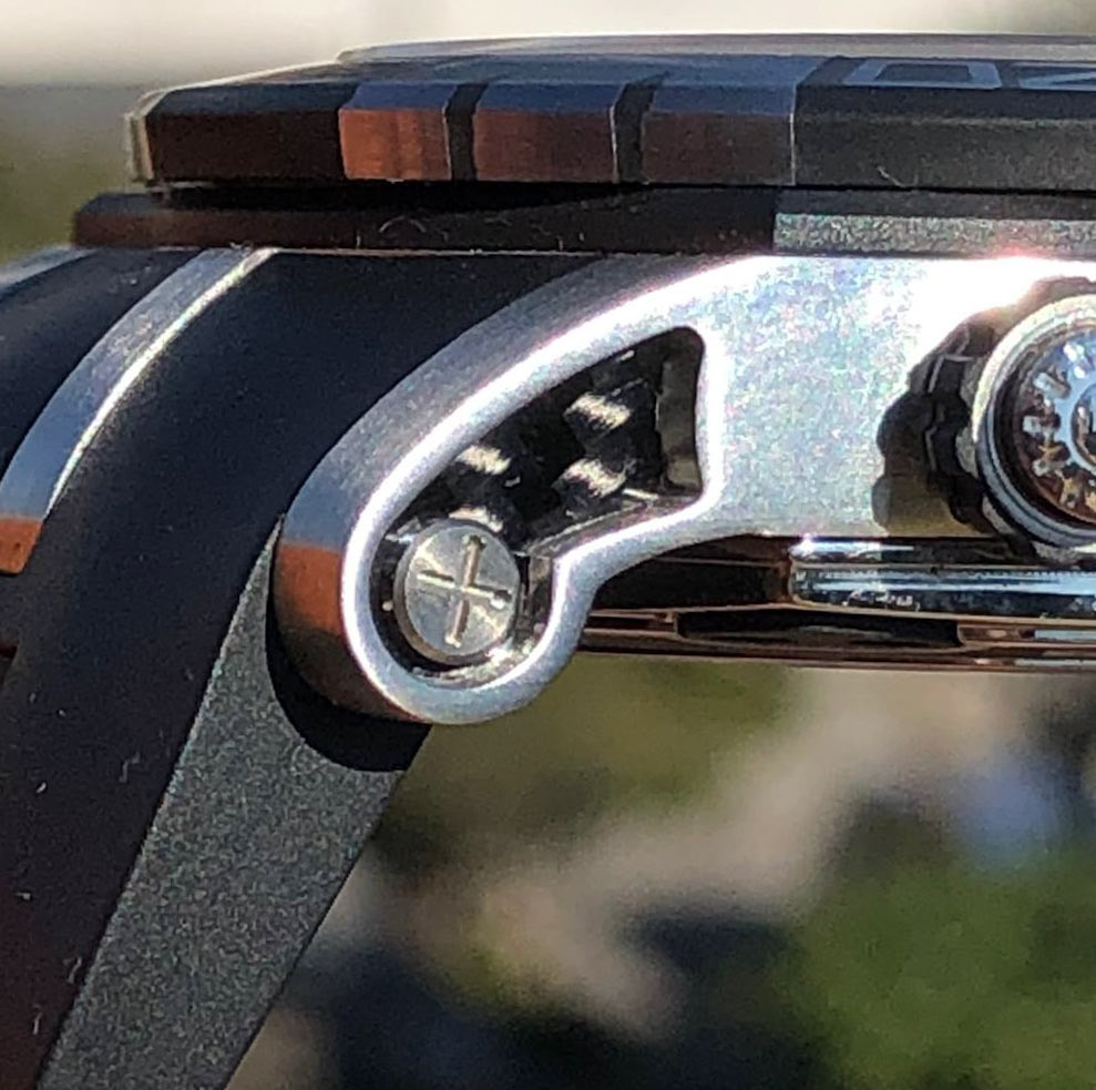
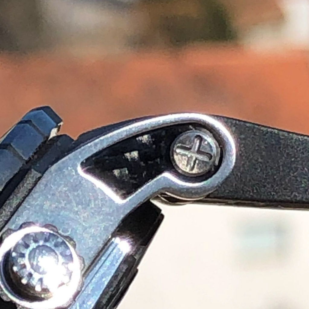
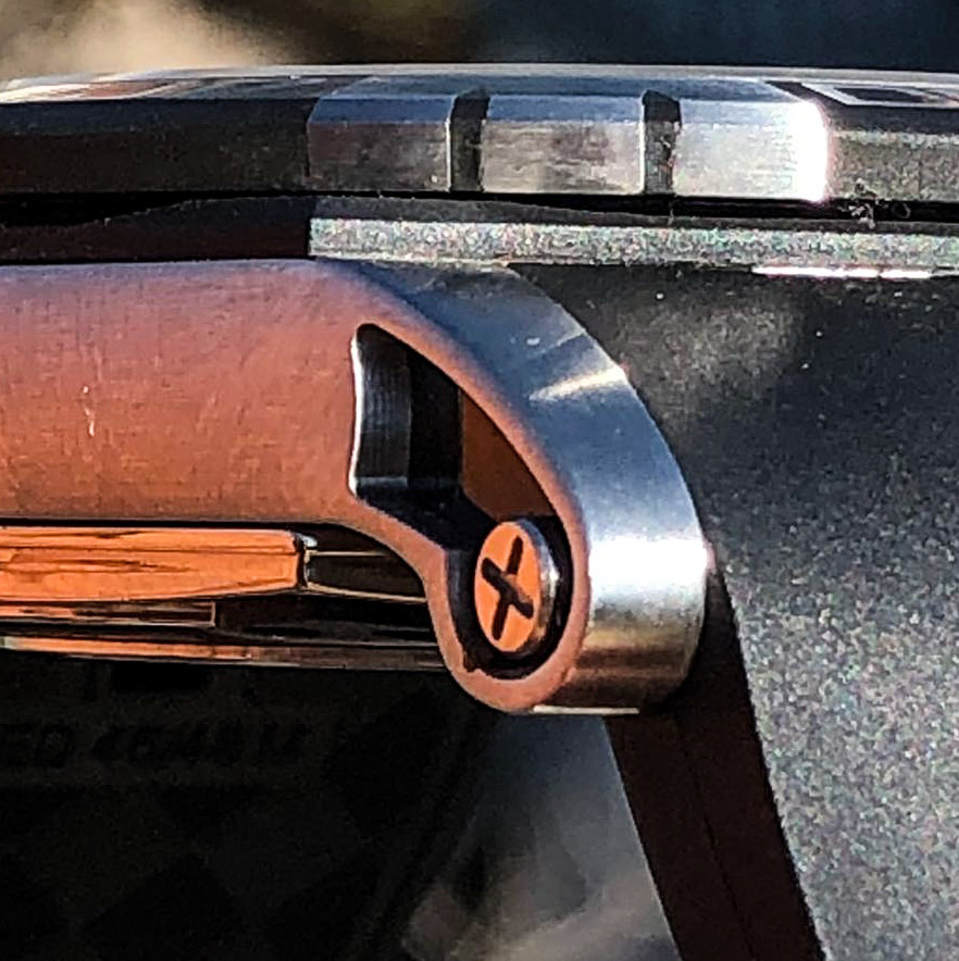
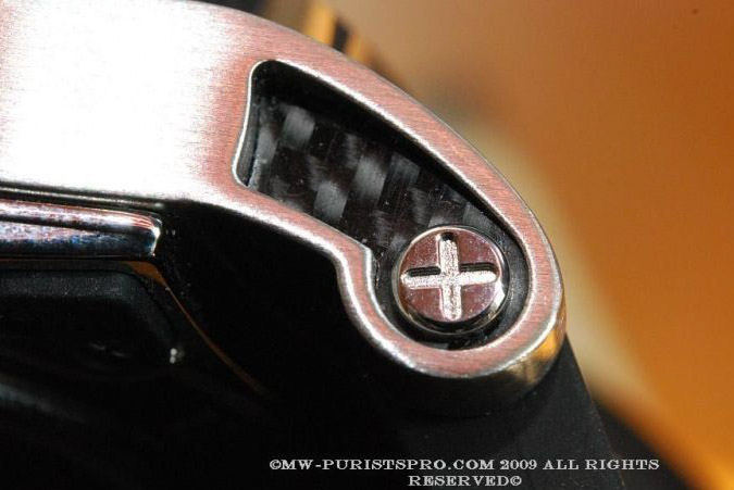
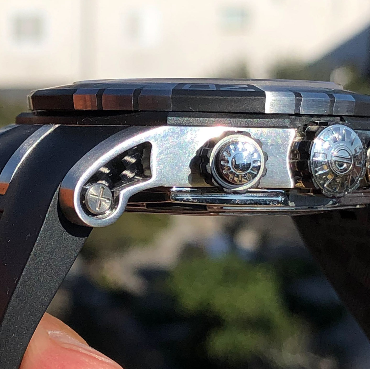
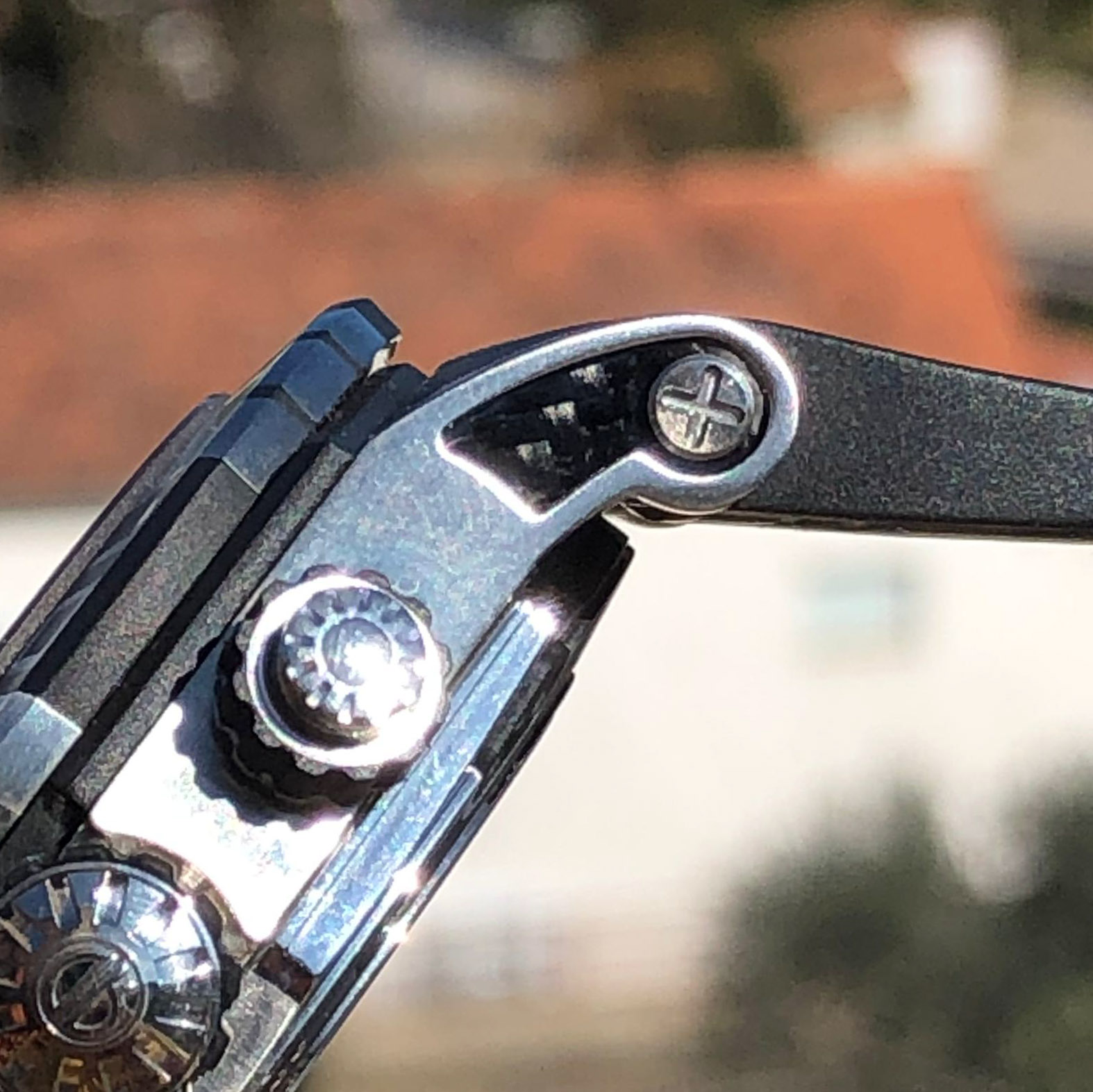
Traditionally, the RD has 3 lugs and the side ones have carbon recessed inserts. It's a nice and stylish little touch that's perfectly copied. Fortunately, they sit quite deeply, and it will not be easy to lose them.
There are also Phillips-head screws that perform the same function, if you unscrew them, you can push out the pin, like a nail, sharpened on one side to facilitate the insert that holds the strap.
The screw is the correct size, and has a chamfer around the head, but does not look so well polished, and the slot is not so beautiful, you can see that it is a strip milled on top of the other, when on gen, the grooves are joined in the middle.
If you do not change the straps, then do not touch them, it is not difficult to lose them, but it is better to fix them immediately with a thread lock, because they do not have a deep thread, and having lost one, you will hardly ever find a similar replacement.
Rep:
Gen:
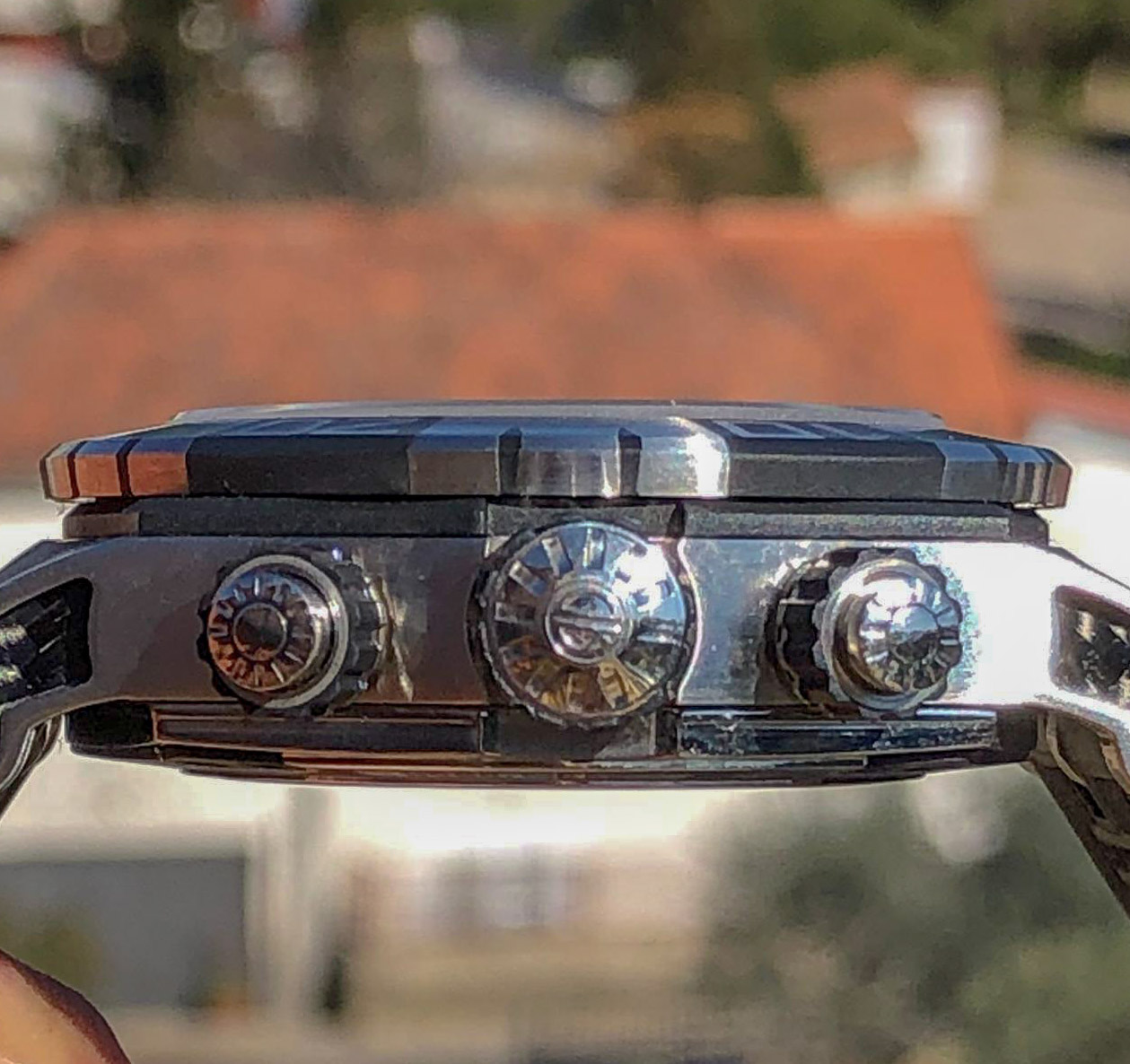
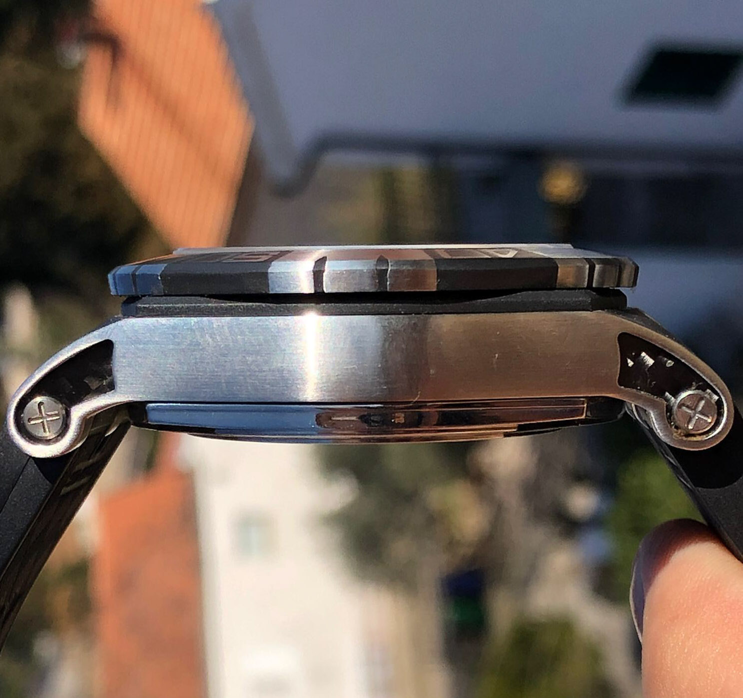
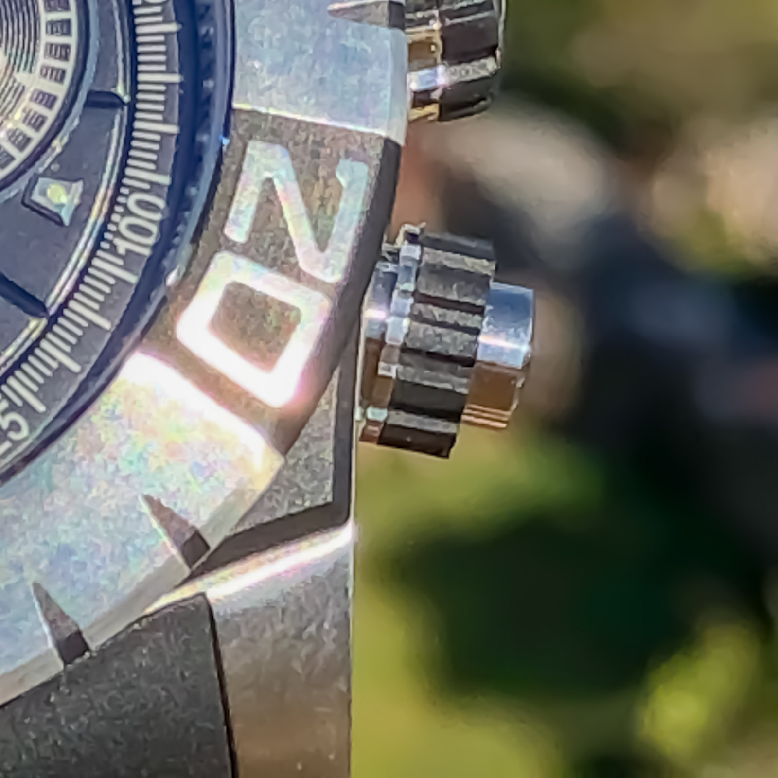
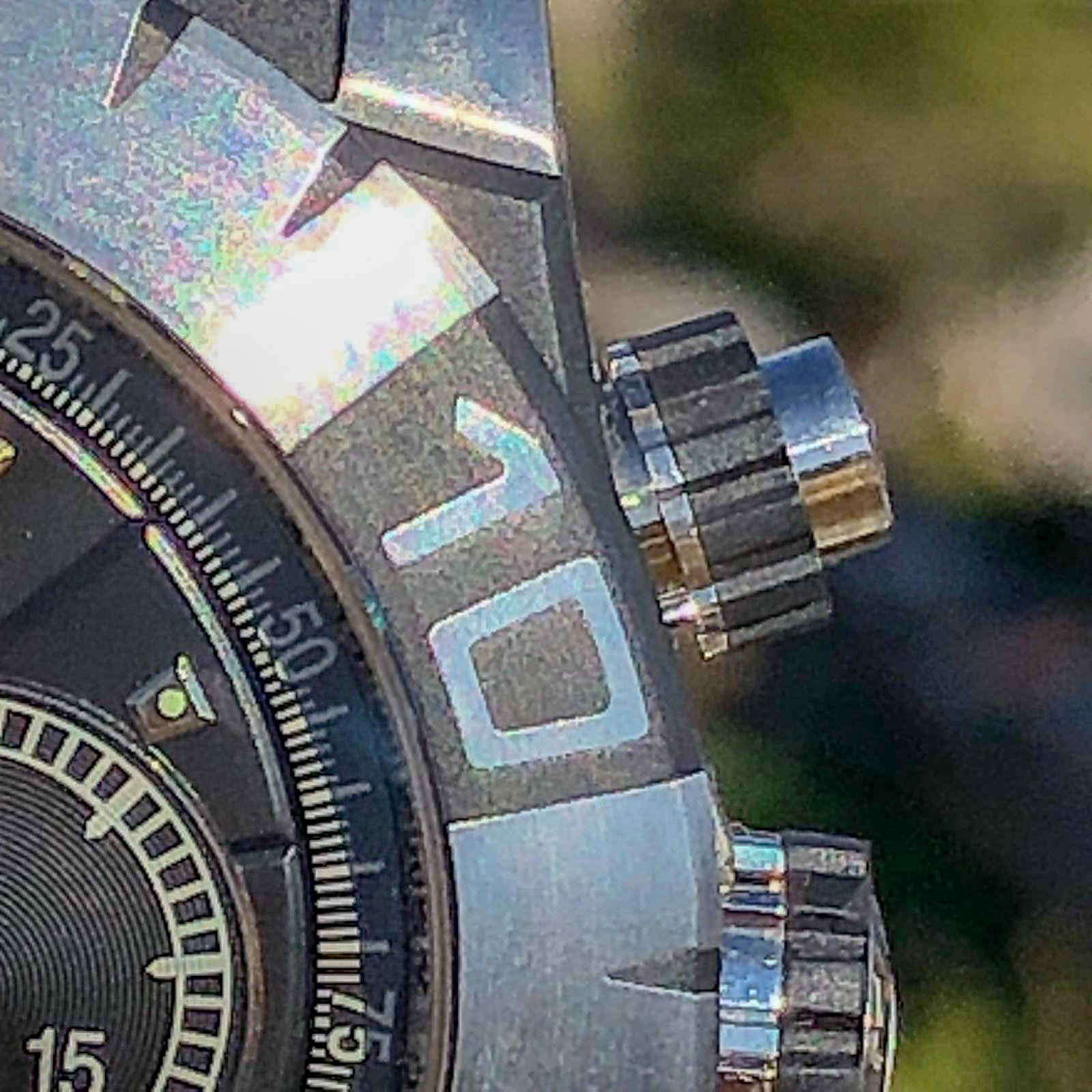
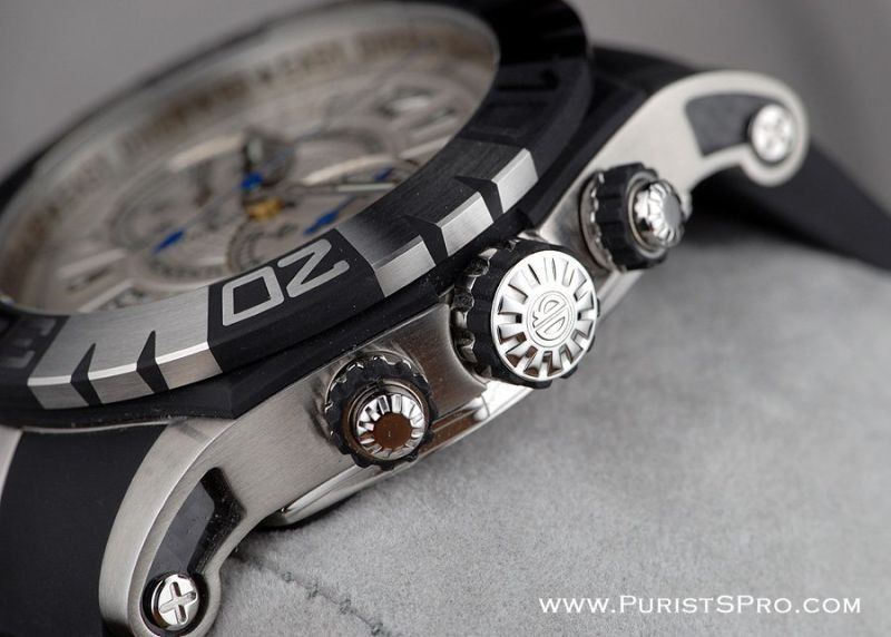
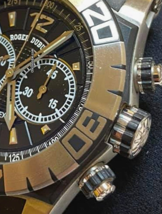
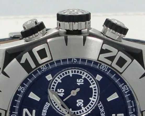
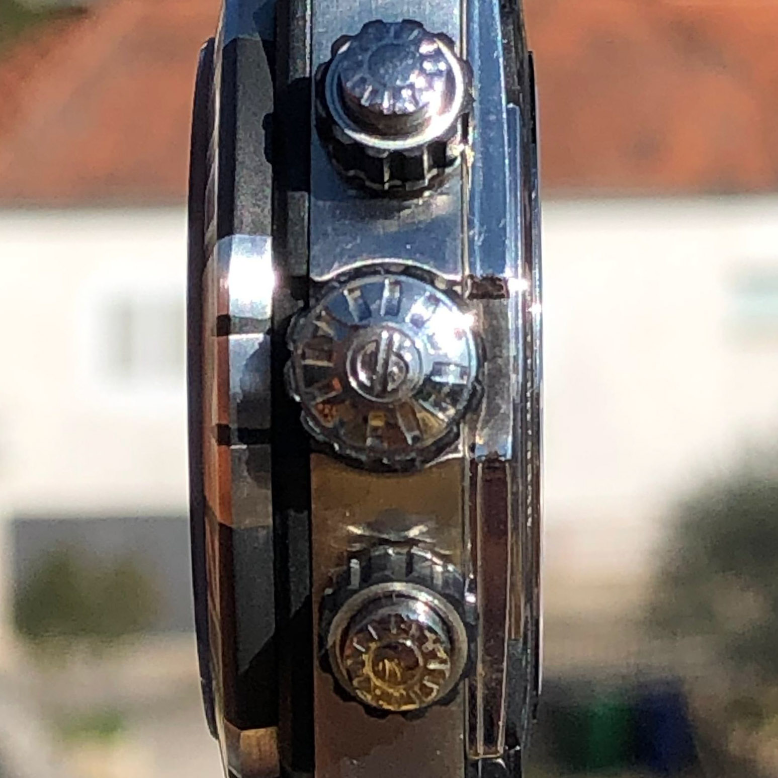
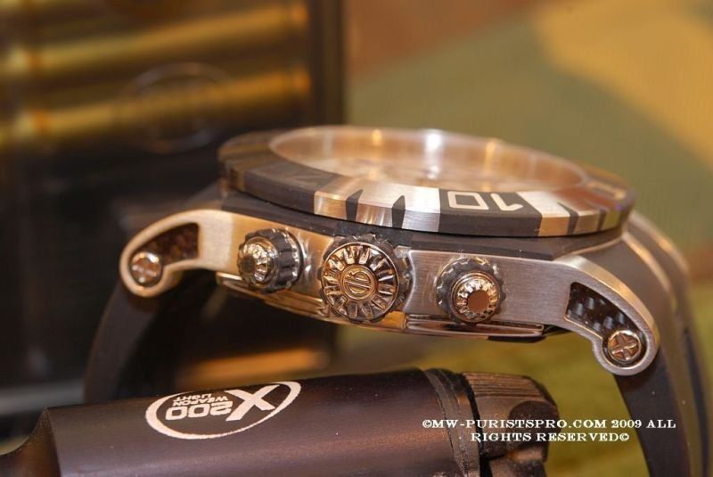
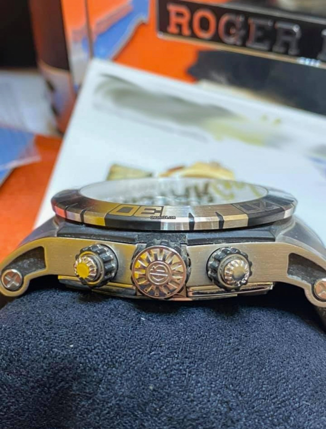
The chronograph pushers and crown on the side have received a major upgrade from the first generation rep model, and they are all screwed down.
This is such a victory that all the other shortcomings simply carry no weight in the discussion.
But they are:
Pushers are longer and do not have a pronounced rounding at the end.
Also, the rubber ring is clearly too wide, apparently to minimize excess length.
If you look from the end, then the complex engraving is repeated a little schematically and weakly, either on the crown or on the buttons, which is most important, without a rounding, which is visible not only when you look at the watch profile, but even from the front.
Working with the chronograph buttons is always difficult, just look at any daytona, and here there are enough details to distract from these little things, and their shape, but we have what we have, no one will modify it, and we will never change the V2 we won't get it, so just another fact in the piggy bank.
Rep:


Gen:


I decided to continue my excursion into the world of old Roger dubuis.
Unfortunately, there is a little more love and interest than watches, so this time the watch is not mine, but respected participant dadog13 , who provided all the necessary photos to consider this model.
I have already expressed all the main thoughts and my attitude to this brand in the last review, and I will not repeat myself, I will just note that this watch, a logical continuation of the previous model in the SAW (Sport Activitiy Watch) line, is Roger Dubuis Easy diver II Chronoexel.
Also steel chronograph with WR 300m, with black dial and chronograph, only now, in a new case and completely in-house caliber RD78, instead of the previous generation RD56.
This is a large heavy watch with a diameter of 46mm ref .: RDDBse0174, made in a circulation of 888 pieces, with an RP of about $ 35,000.
Of course, taking into account the complex, beautifully designed movt., With a chronograph and an asymmetric self-winding rotor, under a transparent caseback, there is no need to talk about a superrep.
Even so, it is movt., With a Geneva seal, and it cannot be copied.
Rep resembles gen even less than in the last generation, but this is clearly not the most important, in the case of this watch, especially since instead of this we have 7750, which may not be so beautiful, but retains functions and has a similar distance between sub dials, which is much more important, but there are also surprises there, more on that later.
So let's see what happened.
I will warn you right away, gen is not the newest, most popular and widespread clock, so there are not enough all the correct angles for comparison, but this is not the clock in which you should overlay a grid in Photoshop, and most importantly, I will definitely show you.
For starters, review photos from all sides of the rep:
And a little gen, for a general understanding:
1. Dial.
Let's start with the obvious.
The biggest problem and actual error is the blue central chronograph seconds hand.
In fact, due to the fact that there were direct photos of the release with such a hand, but in the series the watch received a polished hand.
It should also be noted that the reverse side of the hand with the "leaf" is noticeably shorter, although it should reach the edge of the central circle of the guilloche dial, which makes modification impossible.
To be fair, the version with a white dial still has such a hand, but paired with the hand of the chronograph minute drive, and by the way, it is shown there in blue, which caused discontent among lovers of high-quality watches, because blue bluing was expected, and then rap surpassed gen, at least in terms of coverage.
An unfortunate difference, but we started with the worst, it will be better further.
Let's continue for now about the hands, fortunately, there is a story to tell about them.
Hour and minute, the hands are excellent, and their design and shape are completely identical.
The hand on the watch hand, cutouts in the center on both, stripes of lume, it is difficult to find direct flaws.
But if you pay attention to their finish under good light and different angles, which is not visible in all photos, you will find something that is definitely not on your watch:
one side of each hand is polished and the other has a sandblasted finish.
In the understanding of RD designers and engineers, this increases readability and emphasizes their shape. It's nice that this little thing is repeated by the factory, at a time when most of the replicas are just thin stamped sheets of foil.
Rep hands:
Gen hands:
(The usual screenshots and downloaded ones are not of sufficient quality, but these photos belong to another model, but everything is visible)
By the way, even a small hand of a constant second and a counter has an edge in the middle, the shape and size of which are also observed.
Rep:
Gen:
The stack of hands looks a little wider, the base of the watch hand is wider, it would be worth it, but this is not so significant.
Rep:
Gen:
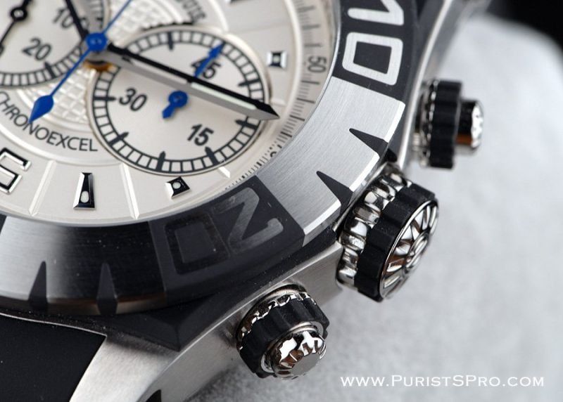
CP looks good.
The dial fonts look worse than gen, they repeat the shape and typography, but are blurry to the limit, which is especially evident on the top line. However, since the font itself is similar, complex, due to small gaps, it looks normal on survey photos from a short distance.
Rep:
Gen:
The fonts of the tachymeter scale were not followed. The shape of the numbers is normal, though bolder than the gen, but the strokes of the original watches are different in length and thickness, while the rep marks are not printed with a solid "fence", but do not respect the difference in thickness and length, of all types of position. I agree that this is small, but difficult to do, but it affects the general perception of the typography of the dial, which partially loses in this seemingly senseless complexity, which actually gives the feeling of "quality" and "high cost" gen, even if it does not stand out as a separate item.
Rep/Gen:
The gen sub-dial fonts are fatter than rep and compared to them the strokes are thinner, which is logical, first of all, to highlight more important indicators with brightness, but on rep the typographic scheme is slightly simplified. Oh, okay. There's a lot of good stuff here besides that.
You can see this in all the photos above.
For some reason, the edges of the sub dials are made even and solid, apparently, they were engraved in front of the overall pattern of the dial.
You can see the uneven edges of the gen, which can sparkle in ragged lines in the light. They repeat the cut of the pattern of neighboring jewelry, as if it were a giloshe in the center, or grooves on the periphery.
I say "for some reason", because, running ahead of time, everything was done correctly on the version without a chronograph with a constant second hand at 6 @.
Rep:
Gen:
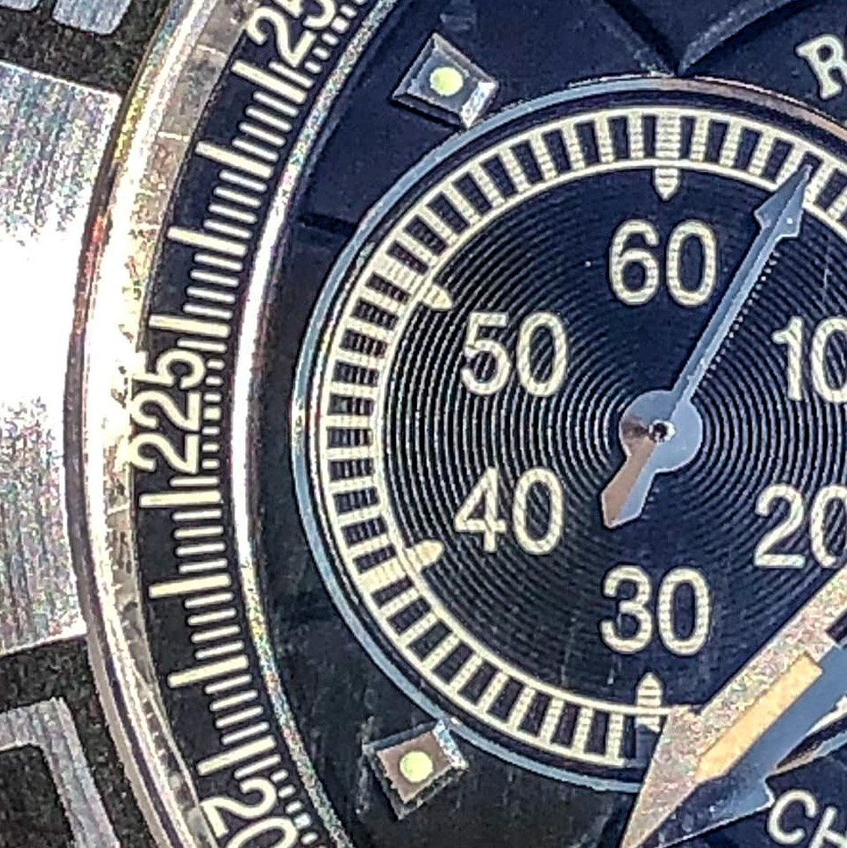
The location of the sub dials seems to be correct, and although the rep gap is slightly larger at the edges to the tachymeter scale, this is not critical, and may be caused not by the difference in the position of the hands, but by the general layout of the rep dial.
Rep:
Gen:
Concertric circles on rep look more pronounced, i.e., grooves are deeper and less frequent, but gen also has them, although they are not visible in all photos. I won’t go into it, this is a typical element of the gen / rep discussion of almost any chronograph, and I don’t see a problem here.
Rep:
Gen:
The applied indexes at 2, 4 and 8, 10 @ are not quite the correct shape, more elongated, which they inherited from the ED I, although they adjoin quite precisely to the edge of the sub-dial. I think the reason is the proportion of the dial, as well as at the edges, but in general, this moment could be played by the Factory in a more interesting way.
On the other hand, the rest of the hour marks are good, both in size, and in shape, location, and decoration, and although the lume points on them look a little awkward, RD solves this problem in exactly the same way, so there is no cause for concern.
Rep:
Gen:
On the other hand, the overhead numbers have cause for concern.
If the number "6" looks good, then there are problems with "12", in particular with "2".
The shape of the numbers is complex, due to the expansion from the base to the top, in consonance with the pattern of the dial and the general design, and on the two-digit numbers it is difficult to maintain a cunning shape, and it is even more difficult to glue it exactly.
In this particular case, it would be enough to align 1 and 2 to the bottom at the same level, but if you look at any other instance, the questions may not be complete, but they will remain.
However, my attitude to this is that, taking into account all the details of this dial, the Chinese factory simply prophylactically lowers us from heaven to earth so that we do not forget how this watch is made.
Rep:
Gen:
Pay attention to the rehaut, where there is an engraving filled with black paint. Perhaps the inscriptions are a little thicker, and not so neat, but even the fonts are correct, and in general this is a very cool and pleasant feature of this watch, which will please you, especially since, unlike the rolex, there is no clear correspondence to the marks in the position of the letters.
Rep:
Gen:
In conclusion, I would like to point out the magnificent pattern of the dial.
Both the guilloche and the grooves are clear and correct, including double lines between the text plates and the central guilloche circle.
This is a big and good job, and a little better than the ED I, given the depth and width of the grooves, and given the certain angle of the groove bevel, sometimes it seems even a little trickier than gen.
Rep:
2. Bezel.
Regular in shape, beveled aspect ratio and size relative to midcase. This is a good job, and I am glad that it "hangs" around the circle exactly as much as it should, and the bevel angles are also correct. In general, the geometry is pleasing.
As expected, it is diving, unidirectional, 120 clicks, looks normally centered (I'm not paranoid about that), does not play either in a circle or vertically.
Rep:
Gen:
The important point is that one of the main design ideas of this watch is the black accents, which are made of some rubber that is fused to the metal parts, lined up, and finished.
In the case of the bezel, we can recall the chiseled sectors on the RD ED I bezel in which the numbers remain intact, it's just that now this depression with a sandblasted bottom is filled with rubber and leveled, and also 2 "fangs" are added between each "window" with numbers that go both along the plane of the bezel and along the end, repeating all its bends.
You can see variants in another gen design, where the already modern bezel does not have this rubber filling.
Gen, without rubber:
Gen with rubber:
I must admit that rep repeated this all technologically correct, however, the squares themselves, as in the case of ED I, are larger and the numbers are thinner and take up less space, forming a greater distance to the edge of the black plane.
Rep:
Gen:
I'm not ready to say that this is a drawback, it does not spoil the design, but in this watch there are not so many differences from the GEN to keep silent about it.
By the way, the bezel seems a little thicker, but not significantly.
More worryingly, the rep crystal has a ledge where the light-domed gen, like the first-generation driver rep, grows right out of the bezel, with no visible gaps. In the photo that have already been presented, it can be seen.
3. Case.
Complex, beautiful, with lots of details, and very well repeated, that's what I can say about it.
The design is such that from the profile we will see a sandwich from the back panel with a polished edge, the midcase itself, a symmetrical panel, in this ED generation, made of rubber, not steel, as in the first, and on top of the bezel.
The mid-panel follows the shape of the midcase from the front, and this beautiful and graceful figure is found in most models of the time.
The thickness, position, material and indent from the edge of the case (how much less it is in area from the front) are all correct. Not true, as in the previous model, is the bevel around the perimeter. It is narrower and more vertical, to the best of it. Fortunately, on matte black rubber, this is not as noticeable as on steel, especially when the bevel is polished and the surface is satin-finished, but why they cannot make this VERY important design element (in my opinion) correct - I don't know. Let's leave it as it is.
Rep:
Gen:
You can find fault with the midcase shape itself, but I won't. It is complex, beautiful, and conveys all the sensation of gen to the fullest, in terms of size, shape, finish.
Traditionally, the RD has 3 lugs and the side ones have carbon recessed inserts. It's a nice and stylish little touch that's perfectly copied. Fortunately, they sit quite deeply, and it will not be easy to lose them.
There are also Phillips-head screws that perform the same function, if you unscrew them, you can push out the pin, like a nail, sharpened on one side to facilitate the insert that holds the strap.
The screw is the correct size, and has a chamfer around the head, but does not look so well polished, and the slot is not so beautiful, you can see that it is a strip milled on top of the other, when on gen, the grooves are joined in the middle.
If you do not change the straps, then do not touch them, it is not difficult to lose them, but it is better to fix them immediately with a thread lock, because they do not have a deep thread, and having lost one, you will hardly ever find a similar replacement.
Rep:
Gen:
The chronograph pushers and crown on the side have received a major upgrade from the first generation rep model, and they are all screwed down.
This is such a victory that all the other shortcomings simply carry no weight in the discussion.
But they are:
Pushers are longer and do not have a pronounced rounding at the end.
Also, the rubber ring is clearly too wide, apparently to minimize excess length.
If you look from the end, then the complex engraving is repeated a little schematically and weakly, either on the crown or on the buttons, which is most important, without a rounding, which is visible not only when you look at the watch profile, but even from the front.
Working with the chronograph buttons is always difficult, just look at any daytona, and here there are enough details to distract from these little things, and their shape, but we have what we have, no one will modify it, and we will never change the V2 we won't get it, so just another fact in the piggy bank.
Rep:
Gen:
Last edited: