• Tired of adverts on RWI? - Subscribe by clicking HERE and PMing Trailboss for instructions and they will magically go away!

2021 AP Diver

904L

Known Member
Certified
11/9/10
188
24
18
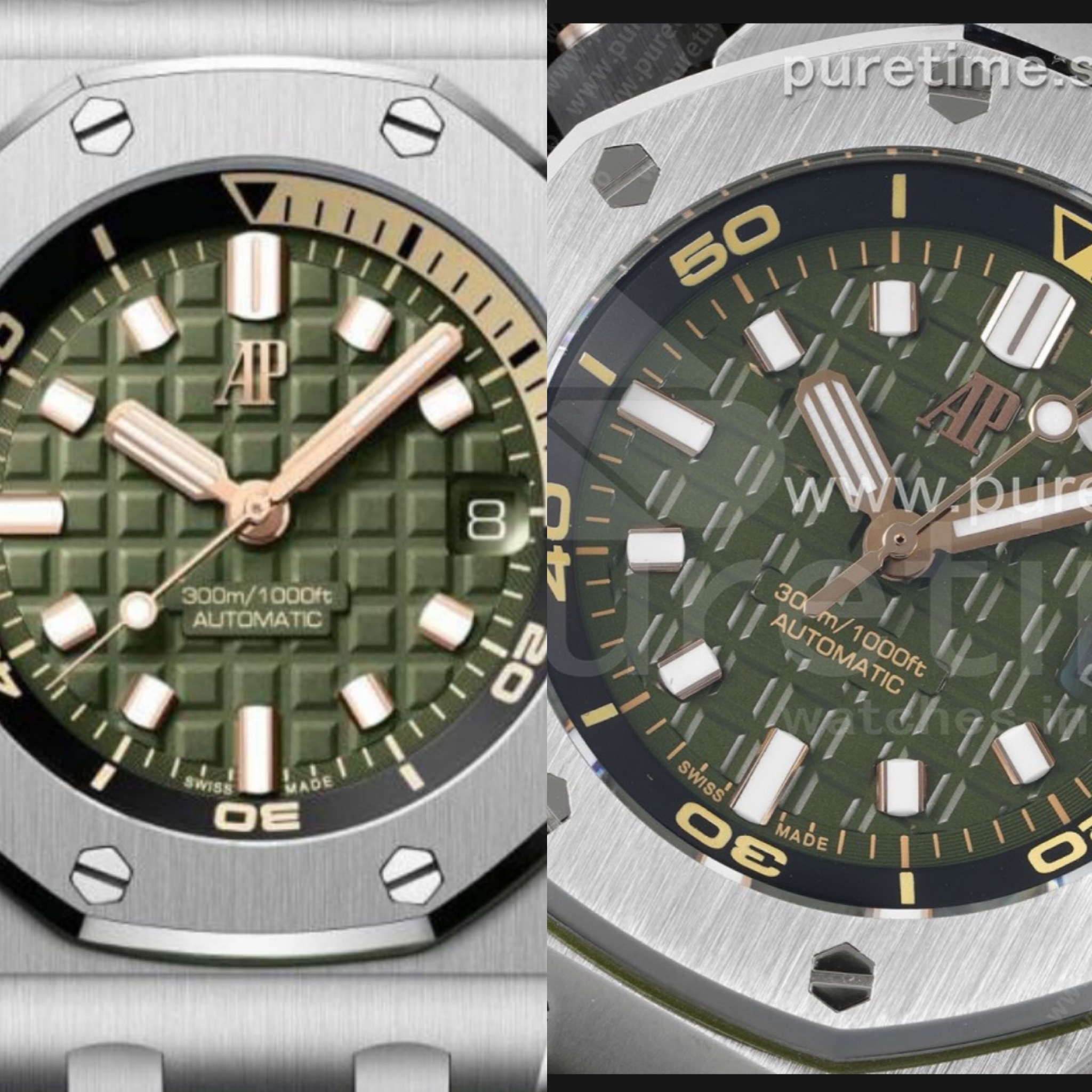
the green one takes the cake, but the price man...


Green was definitely the watch colour of the year with releases. The price is hefty but then I would rather pay retail for the Diver than double retail for a Pepsi etc

I can't get over how the gen market has been ruined (my opinion)
 

SuperLory

Well-Known Repist
22/10/15
8,436
4,995
113
Green was definitely the watch colour of the year with releases. The price is hefty but then I would rather pay retail for the Diver than double retail for a Pepsi etc

I can't get over how the gen market has been ruined (my opinion)

1 AP diver at RRP is almost 2 Pepsi at grey price here..

35k SGD = 27k USD
 

Bombardier

I'm Pretty Popular
Supporter
Certified
12/11/20
1,091
316
83
That is a substantial change in design after a few decades :D
 

SuperLory

Well-Known Repist
22/10/15
8,436
4,995
113
If you click on it it's a gif, I realized now only it doesn't work


legend

The RWI Dragon
Staff member
Global Moderator
Certified
20/9/10
60,389
74,768
113
Where I need to be.
Well Rolex and Omega also use small markers. In my opinion this looks better and more contemporary than the outgoing model.

I think what penguine meant was not just about the marker size and shape but how they fit in with the overall design, size and visual of the watch. I’m sure AP has given due consideration to the design of the watch and often, seeing the watch in person changes the perspective. Pics give an idea but seeing the watch in person is always the point where I make my decision on the watch.
We each have different preferences and it’s absolutely ok to either like or dislike any design or feature. Even the ugliest and most eccentric of watches get bought much as we cannot appreciate or understand the appeal lol
 
  • Like
Reactions: Allure

RonP

Renowned Member
11/10/19
559
273
63
UK
I think what penguine meant was not just about the marker size and shape but how they fit in with the overall design, size and visual of the watch. I’m sure AP has given due consideration to the design of the watch and often, seeing the watch in person changes the perspective. Pics give an idea but seeing the watch in person is always the point where I make my decision on the watch.
We each have different preferences and it’s absolutely ok to either like or dislike any design or feature. Even the ugliest and most eccentric of watches get bought much as we cannot appreciate or understand the appeal lol

Yes beauty is in the eye of the beholder. I'm not at all surprised by these smaller markers from AP, they did a similar (although not as drastic) thing with the 15500 in comparison to the 15400. In my opinion the result is a more contemporary cleaner looking dial.
 
  • Like
Reactions: legend

legend

The RWI Dragon
Staff member
Global Moderator
Certified
20/9/10
60,389
74,768
113
Where I need to be.
Yes beauty is in the eye of the beholder. I'm not at all surprised by these smaller markers from AP, they did a similar (although not as drastic) thing with the 15500 in comparison to the 15400. In my opinion the result is a more contemporary cleaner looking dial.

I prefer the long and sleek markers myself but I see your point and you’re right it does change the appeal of the watch a fair bit! Not better or worse for me but just different.
 
  • Like
Reactions: Allure