• Tired of adverts on RWI? - Subscribe by clicking HERE and PMing Trailboss for instructions and they will magically go away!

AP 15202 JF - New Release

SHB

Mythical Poster
31/10/18
6,357
2,700
113
Earth
I don't know exactly what to think of this rotor - even if the typo is fixed and we won't ever (want to) fool anybody with the opened case back - the old supplier delivered a better color and finish in terms of quality judging from pictures under artificial lighting from different perspectives...

old typo error:

royal-oak-39mm-15202-ss-jf-1-1-best-edition-blue-textured-dial-on-ss-bracelet-a2121.jpg


new fixed rotor:

ap2018121501-12.jpg


But anyways - i will get this watch as soon as possible hehe - throw the decoration away, thin the case back and we have a winner until something better releases (i doubt it as JF has got the AP monopoly)

Looks RG now just like 15400, not gen look at all.
 
  • Like
Reactions: vcappp

MonsieurMax

I'm Pretty Popular
22/10/16
1,748
127
63
Earth
btw if you didnt know theres a 4k video of it on it's product page, theres a video tab next to specifications. I just saw that now
 
  • Like
Reactions: vcappp

Tigerdragon

Mythical Poster
19/10/13
7,292
1,684
113
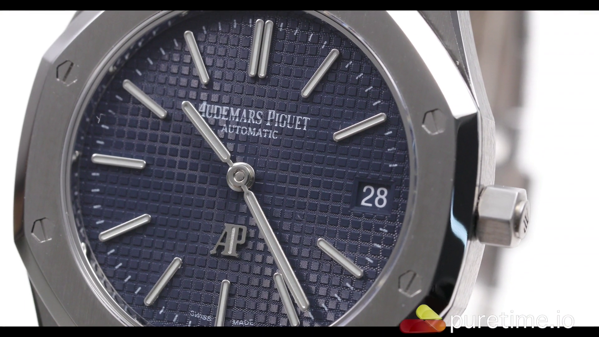
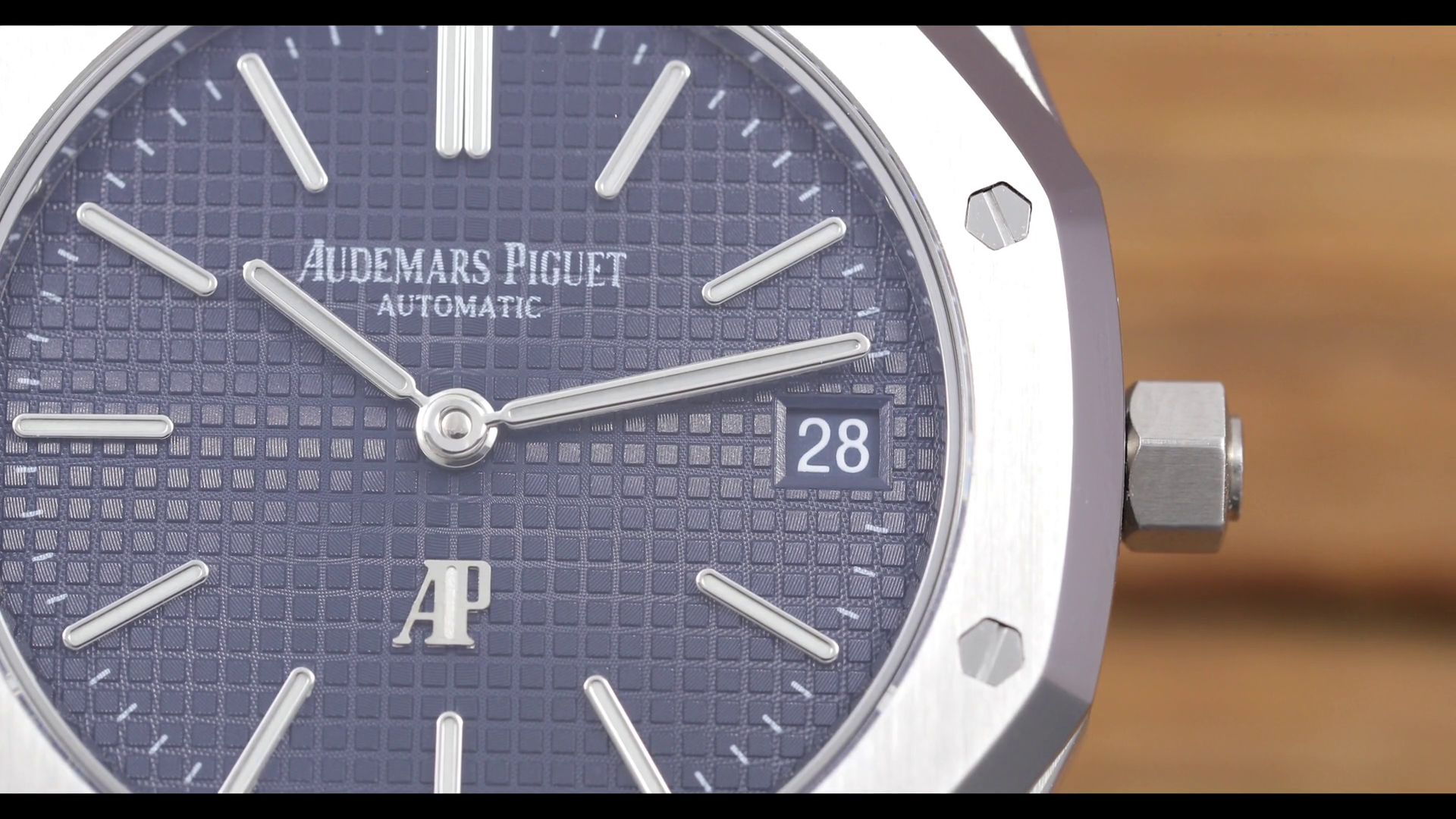
Let's wait for QC pictures maybe it's just looking that bad in white light

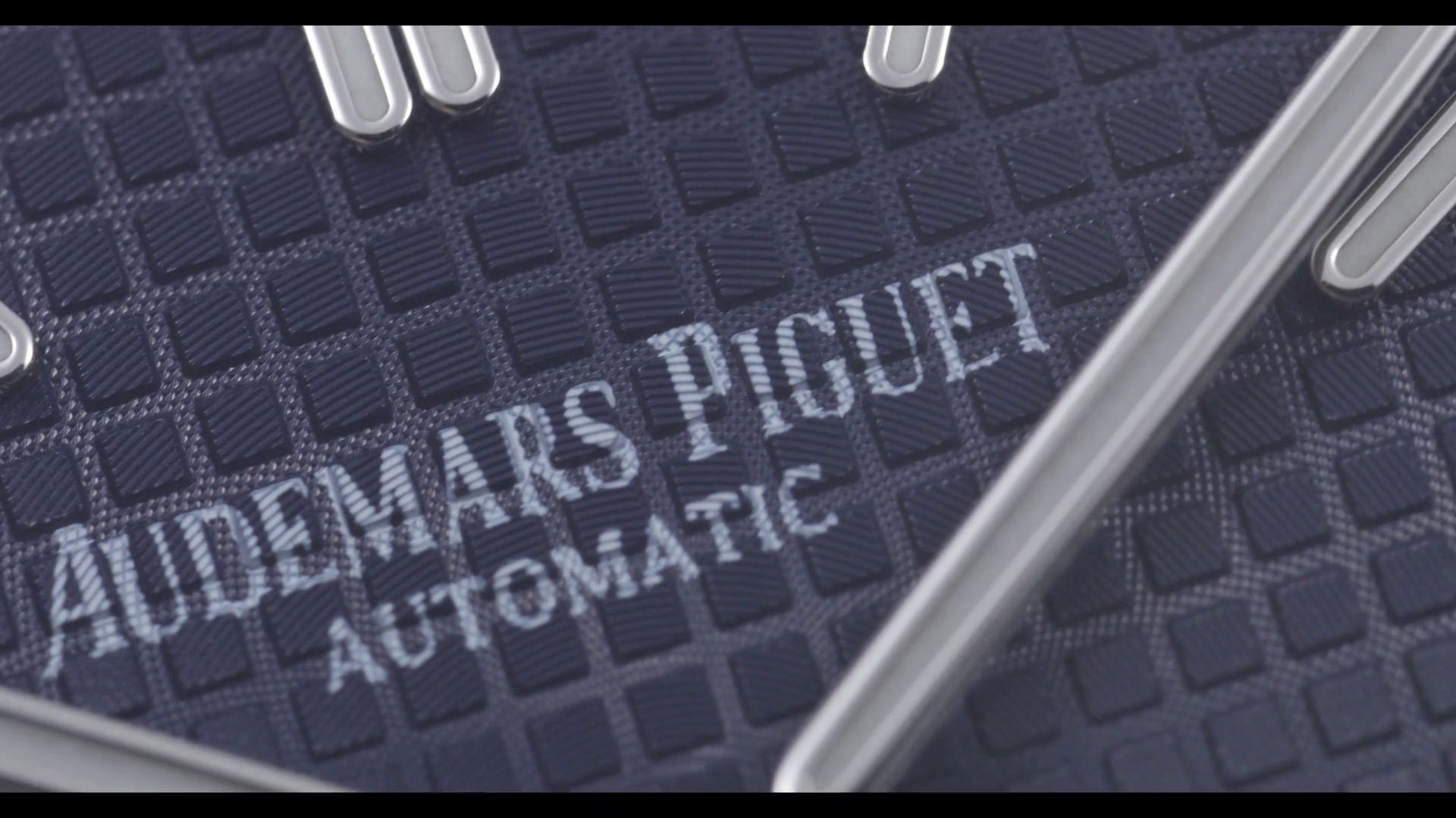
Don't care about the datewheel but the printing is really not good lol
 
  • Like
Reactions: vcappp

Tigerdragon

Mythical Poster
19/10/13
7,292
1,684
113
[video]https://player.vimeo.com/video/306531538?color=ffffff&title=0&byline=0&portrait=0[/video]

The question is how they want to make it better? If they print on the dial it will always looks that shitty (see the new V4 some are good some are completly terrible) and honestly iam a big fan of the 15202 BUT the printing looks terrible. Maybe i buy one and put my quartz dial in it or something lol because seriously does this look worth almost 500 usd to anybody?
 

theREALgoat

Put Some Respect On My Name
Patron
Certified
14/8/14
5,033
2,773
113
[video]https://player.vimeo.com/video/306531538?color=ffffff&title=0&byline=0&portrait=0[/video]

The question is how they want to make it better? If they print on the dial it will always looks that shitty (see the new V4 some are good some are completly terrible) and honestly iam a big fan of the 15202 BUT the printing looks terrible. Maybe i buy one and put my quartz dial in it or something lol because seriously does this look worth almost 500 usd to anybody?

It certainly doesn't, I really wonder where the price difference between this and the 15400 comes from.

Also, your video isn't accessible because of privacy settings.
 
  • Like
Reactions: vcappp

Tigerdragon

Mythical Poster
19/10/13
7,292
1,684
113
yeah sorry i put the frame out of the puretime video its the same like on puretime seems like they put a pw on the vimedo page :D

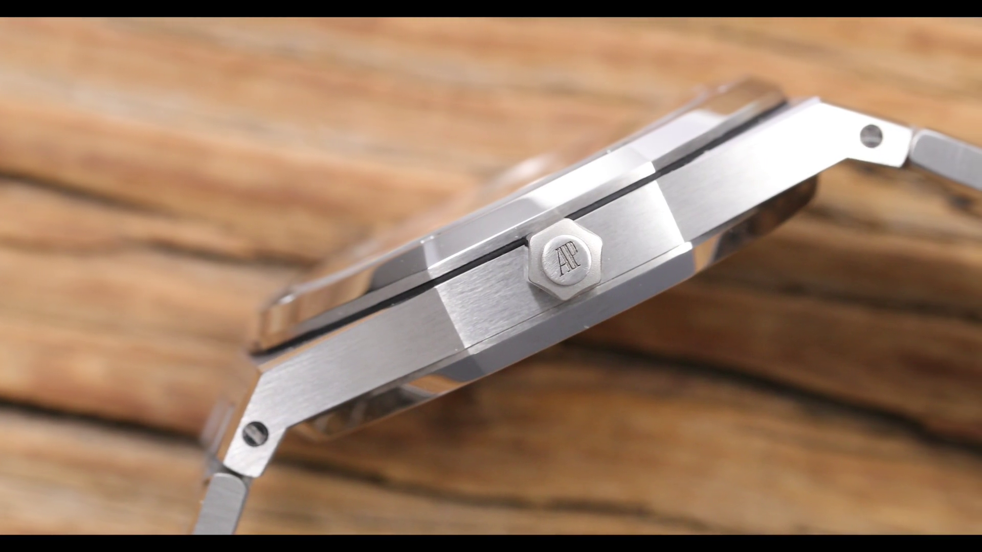
Some shots which looks cool:


Some not so much...


and the thickness looks not really 9.5 mm
 
  • Like
Reactions: vcappp

Tigerdragon

Mythical Poster
19/10/13
7,292
1,684
113
Best way to get better printing is to simply boycot this release until they fix it

The question is if they can ever fix that problem i mean the 15400 has the same problems since 5 years.

Edit:
I uploaded the video on Youtube for everyone who has problems with vimeo (like me):
 
Last edited:
  • Like
Reactions: vcappp

vcappp

I'm Pretty Popular
20/6/18
1,000
296
83
puretime needs to change the way how the photographer takes the pictures of a product. It doesn’t help anything to realize how the product looks. It just increasing frustration and confusion.


Sent from my iPhone using Tapatalk