-
Tired of adverts on RWI? - Subscribe by clicking HERE and PMing Trailboss for instructions and they will magically go away!
You are using an out of date browser. It may not display this or other websites correctly.
You should upgrade or use an alternative browser.
You should upgrade or use an alternative browser.
Comparative Review: BREITLING Superocean Vs OMEGA UPO
- Thread starter By-Tor
- Start date
- 13/6/06
- 1,248
- 0
- 0
Nice review.
But i have to disagree: I have owned both and this is my take:
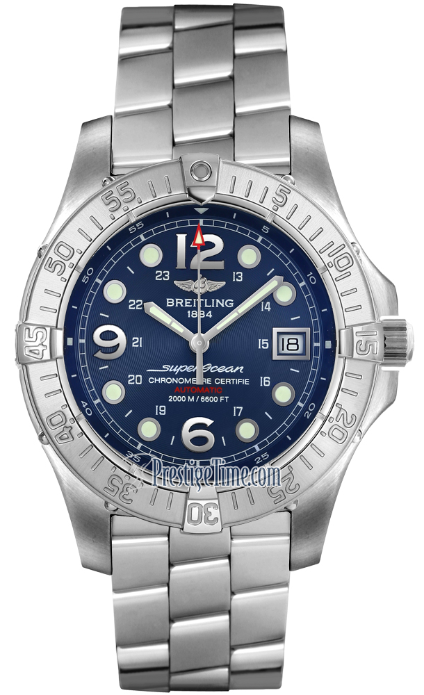
the SO is big and thick. But most of its size, from a frontal view is taken up by steel and the dial is proportionally small compared to the rest of the watch. In other words, there is more steel than dial to look at.
Then, the blue dial is nice but not accurate to the gen. Also, the numerical markers are dead wrong. Also, the bezel is not up to the level of the rest of the watch: kinda OK.
Also... the stamping job done on the clasp is unacceptable: they screwed up on the "heavily stamped G"...
When i owned my SO, I looked very closely at the AR and on the very edges of the crystal I had noticed slight flaking and inconsistencies overall on the outer AR. Also, the double AR is so thick on the SO that my blue dial hardly showed up as blue because the AR dominated and was blue enough already: so , in the end I felt it did not matter if I had a blue face or a black face, the AR was "covering" it anyways... and because the blue hue of the rep dial is wrong and rather flat, the dial never really stood out like the electric blue of the Seamaster Pro from Omega...I think the SO should have had a metallic blue type of dial to match its very name: STEELfish
Also, the dial had QC issues too typical of cheap Asian reps: dirt specs, less than sharp printing...
And like ByTor said: mine came with three screws missing!!!
About the buckle on the SO: like Rolexes, yes, but like Rolex, I hate how these buckles are made so thinly and flimsy and not a good match to the rest of the watch, which is thick, chunky and generous on the steel.
But overall, the best part of the SO was the way the double AR reflected against light from about 3 feet away.
As for the PO: a simple and rather bland looking watch but whenever i go to the AD and compare it to the gen in the case, I get blown away. Because of its matte finished dial, the single AR performs well enough and reflections on the crystal is indeed reduced somewhat hence the appeal of its simple elegance and functionality. Also, the PO's bracelet is outstanding with its curved design and its secure buckle. The contour allows it to wrap around the wrist nicely...to me no brand has really made better bracelets than Omega's.
Also, despite its hefty size, the PO does lay on the wrist well enough that indeed it does NOT feel like a hockey puck. Also, the marriage of silver and black on the bezel in contrast with the matte black of the dial makes for one of the most elegant look that can match most outfits a man can ever wear. And comparing the two watches sporting straps, the PO wins with its sleek look on the newly produced PO rubber strap.
My two cents.
Good visuals, By-Tor :wink:
But i have to disagree: I have owned both and this is my take:
the SO is big and thick. But most of its size, from a frontal view is taken up by steel and the dial is proportionally small compared to the rest of the watch. In other words, there is more steel than dial to look at.
Then, the blue dial is nice but not accurate to the gen. Also, the numerical markers are dead wrong. Also, the bezel is not up to the level of the rest of the watch: kinda OK.
Also... the stamping job done on the clasp is unacceptable: they screwed up on the "heavily stamped G"...
When i owned my SO, I looked very closely at the AR and on the very edges of the crystal I had noticed slight flaking and inconsistencies overall on the outer AR. Also, the double AR is so thick on the SO that my blue dial hardly showed up as blue because the AR dominated and was blue enough already: so , in the end I felt it did not matter if I had a blue face or a black face, the AR was "covering" it anyways... and because the blue hue of the rep dial is wrong and rather flat, the dial never really stood out like the electric blue of the Seamaster Pro from Omega...I think the SO should have had a metallic blue type of dial to match its very name: STEELfish
Also, the dial had QC issues too typical of cheap Asian reps: dirt specs, less than sharp printing...
And like ByTor said: mine came with three screws missing!!!
About the buckle on the SO: like Rolexes, yes, but like Rolex, I hate how these buckles are made so thinly and flimsy and not a good match to the rest of the watch, which is thick, chunky and generous on the steel.
But overall, the best part of the SO was the way the double AR reflected against light from about 3 feet away.
As for the PO: a simple and rather bland looking watch but whenever i go to the AD and compare it to the gen in the case, I get blown away. Because of its matte finished dial, the single AR performs well enough and reflections on the crystal is indeed reduced somewhat hence the appeal of its simple elegance and functionality. Also, the PO's bracelet is outstanding with its curved design and its secure buckle. The contour allows it to wrap around the wrist nicely...to me no brand has really made better bracelets than Omega's.
Also, despite its hefty size, the PO does lay on the wrist well enough that indeed it does NOT feel like a hockey puck. Also, the marriage of silver and black on the bezel in contrast with the matte black of the dial makes for one of the most elegant look that can match most outfits a man can ever wear. And comparing the two watches sporting straps, the PO wins with its sleek look on the newly produced PO rubber strap.
My two cents.
Good visuals, By-Tor :wink:
- 13/6/06
- 1,248
- 0
- 0
From a long time friend on TZ, the markers are fatter and not in the same location.
Again, some of these TZ guys are GOOOOD...
They can pick any rep apart and some....
Again, some of these TZ guys are GOOOOD...
They can pick any rep apart and some....
- 13/6/06
- 1,248
- 0
- 0
From a long time friend on TZ, the markers are fatter and not in the same location.
Again, some of these TZ guys are GOOOOD...
They can pick any rep apart and some....
Apparently, the biggest giveaway is when you see it in person: the gen. The dial is a world apart from the rep
Again, some of these TZ guys are GOOOOD...
They can pick any rep apart and some....
Apparently, the biggest giveaway is when you see it in person: the gen. The dial is a world apart from the rep
- 13/6/06
- 1,248
- 0
- 0
From a long time friend on TZ, the markers are fatter and not in the same location.
Again, some of these TZ guys are GOOOOD...
They can pick any rep apart and some....
Apparently, the biggest giveaway is when you see it in person: the gen. The dial is a world apart from the rep
And ...what is the deal with the lumpy lume???
Again, some of these TZ guys are GOOOOD...
They can pick any rep apart and some....
Apparently, the biggest giveaway is when you see it in person: the gen. The dial is a world apart from the rep
And ...what is the deal with the lumpy lume???
By-Tor, thank you so very much once more. When i first laned on this scene I was very lucky to come across ome of your posts, were you have links to many reviews you have made and others regarding all different types of watches, and with that i have gained soo much knoledge it scares me sometimes. This is simply another fine addition to your reviews.
Keep them comming.
Keep them comming.
another decent review, excellent reading.
i have been faced with the choice between these 2 watches and just sorted an order for the SOSF with PT. more cash, but a much nicer watch, with fewer issues imo
just have to wait 2 weeks for it which surprised me, but hey, nevermind eh lol
i have been faced with the choice between these 2 watches and just sorted an order for the SOSF with PT. more cash, but a much nicer watch, with fewer issues imo
just have to wait 2 weeks for it which surprised me, but hey, nevermind eh lol
- 13/6/06
- 1,248
- 0
- 0
- 13/6/06
- 1,248
- 0
- 0
By-Tor said:Could you be more specific and describe how the bracelet is "wrong". Again, it looks good to me.
Perhaps you're referring to the older model of the Steelfish, which had different middle links and bracelet construction?

OOOOh I like the SO with the pro bracelet...nice,
Anyways, my last post may originate from misinformation, not sure but a TZ member had told me that the rep links are not as sharp angled as the gen??
I just threw it in as you By-Tor could probably address this better than me.
lovepanerai
Active Member
- 28/7/06
- 423
- 0
- 0
paneraifreak said:Also...
the rep bracelet on the SO is wrong.
Compare and see.
I think your friend has been comparing the older version of the SO. This one is much closer. His comments are right for the older version and wrong for this version.
Hope this helps.
- 13/6/06
- 1,248
- 0
- 0
robertk said:paneraifreak said:Also...
the rep bracelet on the SO is wrong.
Compare and see.
I think your friend has been comparing the older version of the SO. This one is much closer. His comments are right for the older version and wrong for this version.
Hope this helps.
That could be the case indeed.
trevor2079
Renowned Member
- 2/5/07
- 544
- 0
- 0
Great post! Thanks for taking the time to write it.
I own both these watches and enjoy them quite a bit.
I agreed with most of it except the bracelet. Only one button on the PO opens the clasp.
This is my least favorite part of the PO. The omega often comes undone while wearing it.
I agree the that the clasp on the steelfish is a bit flimsy but really not to much different from the gen.
The AR coat on the steelfish makes it my favorite. Really makes the crystal disappear.
Thanks for the nice comments again everyone. Appreciated.
@trevor: You must have a bad clasp on your PO. Mine has never, ever opened accidentally. It closes and opens firmly. Unfortunately reps have individual differences, due to bad or non-existant QC.
@trevor: You must have a bad clasp on your PO. Mine has never, ever opened accidentally. It closes and opens firmly. Unfortunately reps have individual differences, due to bad or non-existant QC.
SilverSurfer
Known Member
- 25/8/06
- 181
- 0
- 0
By-Tor said:@pf: What about the numerical markers is "dead wrong"? Compared to the gen reference pics they look spot on to me. I'm not saying you're wrong, just curious.
I believe what he is getting at is that the 12, 6 and 9 are slightly rounded on top, while the gen's numbers have a flatter top. Similar to the issue with the Planet Ocean's Omega logo.
andreww said:By-Tor said:@pf: What about the numerical markers is "dead wrong"? Compared to the gen reference pics they look spot on to me. I'm not saying you're wrong, just curious.
I believe what he is getting at is that the 12, 6 and 9 are slightly rounded on top, while the gen's numbers have a flatter top. Similar to the issue with the Planet Ocean's Omega logo.
Ahh, I couldn't spot that. I have to compare the new and old models again. Perhaps the dial is different too? The bracelet is definitely different, and the rep bracelet is very good copy of the new version.
Here's a picture I found of a gen full gold (1995 model) SuperOcean. 18K yellow gold ref K10040.
Fugly, and proves once again that gold & bulky sports watches don't go well together.

